The Surprising Truth About High-Converting Paywalls
Why ugly designs, extra friction, and getting rid of the paywall entirely might be the secret to doubling your revenue.
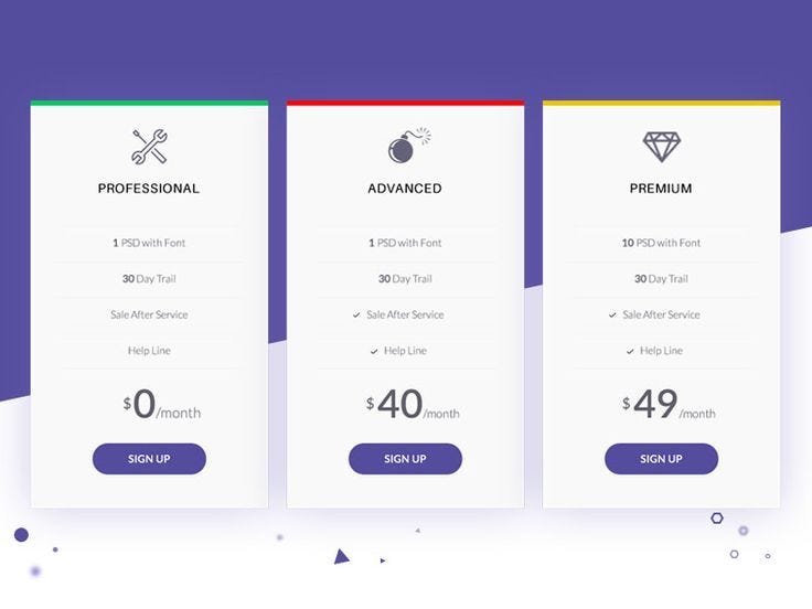
You've probably built one. You’ve definitely tapped through one. The paywall is the single most critical screen in any app’s lifecycle—it’s the only part that actually makes money. But despite the endless debates over button colors, layouts, and pricing tiers, most paywalls today look exactly the same. So what actually separates the ones that convert from the ones that get swiped away?
After studying nearly 3,000 paywalls and talking to designers who have built thousands more, a counterintuitive truth emerges. The best-performing paywalls often break every rule of "good" design. Sometimes, the ugly, text-heavy page outperforms the beautifully minimalist one. Sometimes, adding friction actually increases your bottom line.
The Myth of the Single Screen
We often think the decision to subscribe happens on the paywall itself. But the reality is that the user’s decision is usually made before that screen ever appears.
A paywall isn't just a screen; it's a flow. The best apps spend time selling the outcome long before they ask for a credit card. For example, instead of just dropping a price tag after onboarding, an app like Opal shows users exactly how many years of their life they could get back by reducing screen time. By the time the paywall appears, it doesn't feel like an interruption—it feels like the natural next step.
This is why multi-page paywalls almost always outperform single-page designs. Information that unfolds gradually gives users time to process the decision, rather than forcing them to absorb a wall of pricing tiers and features all at once.
Why Friction and "Ugly" Design Can Win
Our instinct as designers and builders is to make things seamless and beautiful. But when it comes to monetization, that instinct can lead us astray.
Consider the case of adding friction. One app, Outset, required users to enter their credit card details just to start a free trial. Naturally, signups plummeted by more than half. But the conversion rate to paid customers? It increased by five times. The extra friction acted as a filter, weeding out users who were never serious and leaving only those genuinely committed to the product.
Then there is the aesthetic paradox. A compact, aggressive, "ugly" squeeze page with a ton of text can sometimes blow a highly polished, breathable design out of the water. The lesson isn't to intentionally design bad interfaces, but to realize that clarity and persuasion matter more than aesthetics.
The Psychology of Reducing Risk
Even when the timing is perfect and the product is great, users hesitate. They wonder: Will I forget to cancel? Is this actually worth it? The highest-converting paywalls directly attack this anxiety by actively reducing perceived risk.
The timeline approach — popularized by apps like Blinkist — is a masterclass in this. By showing a step-by-step visual timeline of exactly when a user will be charged and reminding them before the trial ends, trial signups go up, complaints drop, and trust is built.
The "no commitment" guarantee — adding a simple subtitle like "Cancel anytime" under the main call-to-action is a small tweak that almost universally bumps up conversions. Pairing this with a longer free trial (like a 14-day trial for an annual plan instead of a 7-day one) makes the larger upfront cost feel infinitely less risky.
The pay ramp — what if you just removed the paywall completely? Apps like Slopes took inspiration from Apple and built a single-action "redeem your free week" screen instead of a traditional paywall. Removing the visual hurdle of a pricing table increased their trial starts by 25%.
Dark Patterns vs. Long-Term Value
There is an uncomfortable truth in paywall optimization: some of the tactics that work the best are the ones you might feel worst about using.
Take the "spin the wheel" paywall. Users spin a predetermined wheel to win a "discount," creating a fake sense of urgency and luck. If you are optimizing purely for immediate, short-term revenue, it works. But as more apps adopt these e-commerce drop-shipping tactics, users become blind to them. They learn to close paywalls, knowing a "last-minute offer" will pop up later.
Fake urgency and aggressive squeeze tactics might win the battle, but they often lose the war. Platform holders like Apple actively crack down on confusing free trial mechanics. In the end, getting people to subscribe is only half the battle. Building something they continue to pay for is much harder.
What This Means for Product Design
If you're building a monetization flow, the playbook doesn't start with copying the most beautiful design you can find. It looks something like this:
Test radically different concepts. Don't just tweak the button color. Test a video paywall against a long-form text paywall, or a multi-page flow against a table-based design.
Sell the outcome, not the features. Frame your value in a way that matches what the user actually cares about before they ever see a price tag.
Default to simple. Offer an annual and a weekly/monthly plan. Hide the rest behind a "view all plans" button to decrease cognitive load.
Optimize for LTV, not just day-one conversion. If your retention is terrible, your paywall isn't the problem—your product is.
There is literally no universal "best" paywall. There are only better experiments.
The Honest Verdict
We can optimize pricing tiers, add right-facing chevrons to our buttons, and build elegant exit-intent sheets. But the ultimate metric of success isn't just a high conversion rate—it's retention and Lifetime Value (LTV).
Maybe the most important question isn't how do I get people to pay?
Maybe it's how do I create something worth paying for?
This article was inspired by the video "We Studied 2,995 Paywalls. Here’s What Actually Converts." by Mobbin. Watch it here: https://www.youtube.com/watch?v=9ypqs_2fAl8