Our Work
Selected projects showcasing our expertise in design and development
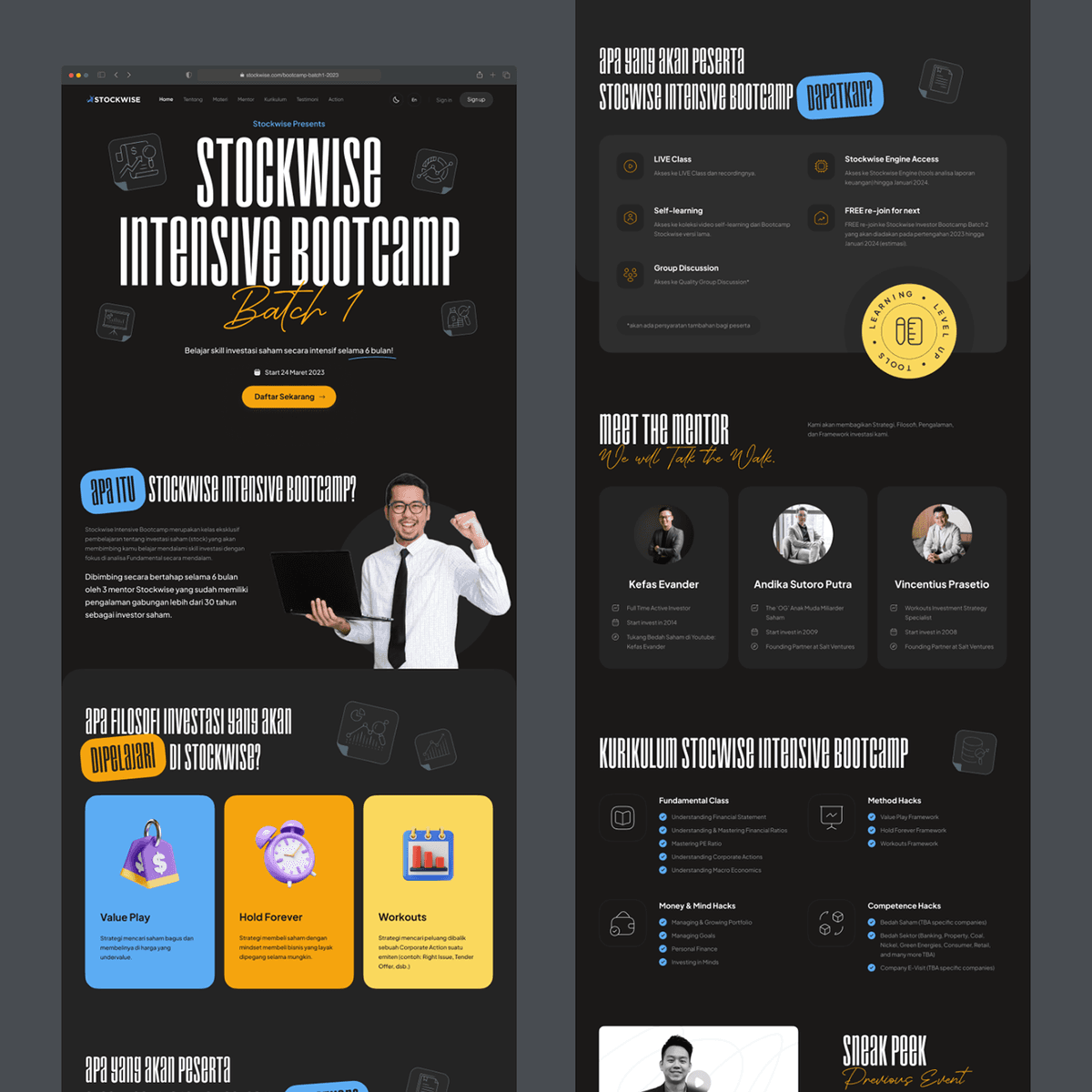
Stockwise Bootcamp - Landing Page
{"type":"doc","content":[{"type":"paragraph","attrs":{"textAlign":null},"content":[{"type":"text","text":"A bold, high-energy landing page for a stock investment bootcamp — designed to convert skeptics into serious investors before they even scroll."}]},{"type":"image","attrs":{"src":"https://mir-s3-cdn-cf.behance.net/project_modules/1400_opt_1/f36d2b164614065.64060f6cbdd61.png","alt":null,"title":null,"width":null,"height":null}},{"type":"paragraph","attrs":{"textAlign":null}},{"type":"image","attrs":{"src":"https://mir-s3-cdn-cf.behance.net/project_modules/1400_opt_1/672b00164614065.64060f0f26c1a.png","alt":null,"title":null,"width":null,"height":null}},{"type":"paragraph","attrs":{"textAlign":null},"content":[{"type":"text","marks":[{"type":"bold"}],"text":"UI/UX Design — Stockwise Bootcamp"}]},{"type":"paragraph","attrs":{"textAlign":null},"content":[{"type":"text","marks":[{"type":"italic"}],"text":"Landing Page · Stock Investment · Education · Indonesia"}]},{"type":"paragraph","attrs":{"textAlign":null},"content":[{"type":"text","text":"A dark, energetic landing page for Stockwise Intensive Bootcamp Batch 1 — a 6-month stock investment training program guided by three experienced mentors. The hero section leads with a massive display headline and an orange \"Daftar Sekarang\" CTA that cuts through the dark background with urgency."}]},{"type":"paragraph","attrs":{"textAlign":null},"content":[{"type":"text","text":"Two visual directions are explored: one with a grunge/distressed typographic treatment that pushes the edgy, street-credibility angle; another with a cleaner, editorial weight that reads more confidently as a premium learning platform. Both share the same dark foundation, yellow-orange accent system, and structured content sections — philosophy cards (Value Play, Hold Forever, Workouts), mentor profiles, a detailed curriculum breakdown, and a benefits checklist featuring live class, self-learning, group discussion, and Stockwise Engine Access."}]},{"type":"paragraph","attrs":{"textAlign":null},"content":[{"type":"text","text":"The layout balances hype with credibility — equal parts motivational poster and serious financial education product."}]}]}
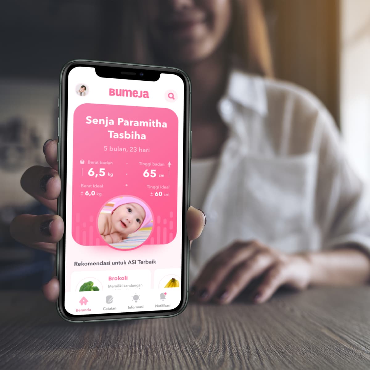
BUMEJA: A Maternal & Child Health Book Digitization
{"type":"doc","content":[{"type":"paragraph","attrs":{"textAlign":null},"content":[{"type":"text","text":"Indonesia's iconic pink baby health book, reimagined as a mobile app — so every mom can track her baby's growth anytime, without losing the booklet."}]},{"type":"image","attrs":{"src":"https://farooq-agent.web.app/assets/images/works/large/bumeja.jpg","alt":null,"title":null,"width":null,"height":null}},{"type":"paragraph","attrs":{"textAlign":null},"content":[{"type":"text","marks":[{"type":"bold"}],"text":"BUMEJA: A Maternal & Child Health Book Digitization"},{"type":"hardBreak"},{"type":"hardBreak"},{"type":"text","marks":[{"type":"italic"}],"text":"Mobile App · Baby Health · Growth Tracker · Indonesia"}]},{"type":"paragraph","attrs":{"textAlign":null},"content":[{"type":"text","text":"Buku Merah Jambu (Mother & Child Health Book) provided by the Republic of Indonesia Health Service for pregnant women and will be used by information centers and media for recording fetal and children's growth and development up to the age of five."}]},{"type":"horizontalRule"},{"type":"paragraph","attrs":{"textAlign":null}},{"type":"heading","attrs":{"textAlign":null,"level":2},"content":[{"type":"text","text":"Empathize"}]},{"type":"heading","attrs":{"textAlign":null,"level":3},"content":[{"type":"text","text":"Map"}]},{"type":"paragraph","attrs":{"textAlign":null}},{"type":"image","attrs":{"src":"https://farooq-agent.web.app/assets/images/works/details/214-bumeja/bumeja-conventional-map.jpg","alt":"BUMEJA Map","title":null,"width":null,"height":null}},{"type":"heading","attrs":{"textAlign":null,"level":3},"content":[{"type":"text","text":"Data"}]},{"type":"heading","attrs":{"textAlign":null,"level":4},"content":[{"type":"text","text":"Jumlah kelahiran"}]},{"type":"paragraph","attrs":{"textAlign":null},"content":[{"type":"text","text":"Until the end of 2018, the Population and Family Planning Agency (BKKBN) noted that Indonesia's Population Growth Rate (LPP) was at 1.39%, meaning that every year there were 4.2 million to nearly 4.8 million newborn babies in Indonesia."}]},{"type":"paragraph","attrs":{"textAlign":null},"content":[{"type":"text","text":"Source: "},{"type":"text","marks":[{"type":"link","attrs":{"href":"https://www.beritasatu.com/kesehatan/536962/bkkbn-48-juta-bayi-lahir-tiap-tahun","target":"_blank","rel":"noopener noreferrer nofollow","class":null,"title":null}}],"text":"Jumlah kelahiran"}]},{"type":"heading","attrs":{"textAlign":null,"level":4},"content":[{"type":"text","text":"Kasus Stunting"}]},{"type":"paragraph","attrs":{"textAlign":null},"content":[{"type":"text","text":"The prevalence (Prevalensi) of stunting for infants under five years old in Indonesia in 2015 is 36.4%. This means that more than one third or around 8.8 million children under five experience nutritional problems where their height is below the standard according to their age."}]},{"type":"paragraph","attrs":{"textAlign":null},"content":[{"type":"text","text":"Source: "},{"type":"text","marks":[{"type":"link","attrs":{"href":"https://databoks.katadata.co.id/datapublish/2018/11/22/prevalensi-stunting-balita-indonesia-tertinggi-kedua-di-asean","target":"_blank","rel":"noopener noreferrer nofollow","class":null,"title":null}}],"text":"Kasus Stunting"}]},{"type":"paragraph","attrs":{"textAlign":null},"content":[{"type":"text","text":"-> prevalensi/pre·va·len·si/ /prévalénsi/ n 1 hal yang umum; kelaziman; 2 Dok total number of cases of disease occurring at any given time in an area"}]},{"type":"horizontalRule"},{"type":"paragraph","attrs":{"textAlign":null}},{"type":"paragraph","attrs":{"textAlign":null},"content":[{"type":"text","text":"⇒ Survey (to be able to LOT data but not in / shallow data, can be done online)"}]},{"type":"paragraph","attrs":{"textAlign":null},"content":[{"type":"text","marks":[{"type":"bold"}],"text":"Survey Questions:"}]},{"type":"orderedList","attrs":{"start":1,"type":null},"content":[{"type":"listItem","content":[{"type":"paragraph","attrs":{"textAlign":null},"content":[{"type":"text","text":"What is your name? (nickname is okay too)"}]}]},{"type":"listItem","content":[{"type":"paragraph","attrs":{"textAlign":null},"content":[{"type":"text","text":"Are you a boy or a girl?"}]}]},{"type":"listItem","content":[{"type":"paragraph","attrs":{"textAlign":null},"content":[{"type":"text","text":"What age are you now?"}]}]},{"type":"listItem","content":[{"type":"paragraph","attrs":{"textAlign":null},"content":[{"type":"text","text":"Where do you live now?"}]}]},{"type":"listItem","content":[{"type":"paragraph","attrs":{"textAlign":null},"content":[{"type":"text","text":"What is your current profession?"}]}]},{"type":"listItem","content":[{"type":"paragraph","attrs":{"textAlign":null},"content":[{"type":"text","text":"According to the BKKBN there are around 4 million babies born every year in Indonesia, and from other data there are around 8 million infants stunted, how do you think how to monitor the growth and development of children and the health of pregnant and lactating mothers?"}]}]},{"type":"listItem","content":[{"type":"paragraph","attrs":{"textAlign":null},"content":[{"type":"text","text":"Why do we need to know the conditions of growth and development of babies and the health of pregnant and lactating women?"}]}]},{"type":"listItem","content":[{"type":"paragraph","attrs":{"textAlign":null},"content":[{"type":"text","text":"Did you already know about the Mother and Child Health Book (Pink Book)?"}]}]},{"type":"listItem","content":[{"type":"paragraph","attrs":{"textAlign":null},"content":[{"type":"text","text":"Do you need the Pink Book? Give me the reason too!"}]}]},{"type":"listItem","content":[{"type":"paragraph","attrs":{"textAlign":null},"content":[{"type":"text","text":"What do you expect in the Pink Book?"}]}]}]},{"type":"paragraph","attrs":{"textAlign":null},"content":[{"type":"text","marks":[{"type":"bold"}],"text":"Link Survey "},{"type":"text","marks":[{"type":"link","attrs":{"href":"https://saladin129084.typeform.com/to/ZTd2Uj","target":"_blank","rel":"noopener noreferrer nofollow","class":null,"title":null}},{"type":"bold"}],"text":"here"},{"type":"text","marks":[{"type":"bold"}],"text":"."}]},{"type":"paragraph","attrs":{"textAlign":null},"content":[{"type":"text","marks":[{"type":"bold"}],"text":"Insight obtained from the Survey:"}]},{"type":"bulletList","content":[{"type":"listItem","content":[{"type":"paragraph","attrs":{"textAlign":null},"content":[{"type":"text","text":"Many do not know what a pink book is"}]}]},{"type":"listItem","content":[{"type":"paragraph","attrs":{"textAlign":null},"content":[{"type":"text","text":"No need for a pink book, just browse"}]}]},{"type":"listItem","content":[{"type":"paragraph","attrs":{"textAlign":null},"content":[{"type":"text","text":"Sheet to be filled by a doctor (medical officer) is limited, will run out if parents diligently check and ask the doctor to record something on the sheet"}]}]},{"type":"listItem","content":[{"type":"paragraph","attrs":{"textAlign":null},"content":[{"type":"text","text":"There are features that are not available in the pink book, such as recording the baby's head circumference and mother's waist circumference"}]}]},{"type":"listItem","content":[{"type":"paragraph","attrs":{"textAlign":null},"content":[{"type":"text","text":"There are no detailed records for the condition of the fetus, there are only records of the baby after birth"}]}]},{"type":"listItem","content":[{"type":"paragraph","attrs":{"textAlign":null},"content":[{"type":"text","text":"It's better if there is a digital version"}]}]}]},{"type":"horizontalRule"},{"type":"paragraph","attrs":{"textAlign":null}},{"type":"paragraph","attrs":{"textAlign":null},"content":[{"type":"text","text":"⇒ Interview (to obtain DEEP data from participants interviewed)"}]},{"type":"paragraph","attrs":{"textAlign":null},"content":[{"type":"text","marks":[{"type":"bold"}],"text":"Interview Questions:"}]},{"type":"orderedList","attrs":{"start":1,"type":null},"content":[{"type":"listItem","content":[{"type":"paragraph","attrs":{"textAlign":null},"content":[{"type":"text","text":"What is your name? (nickname is okay too)"}]}]},{"type":"listItem","content":[{"type":"paragraph","attrs":{"textAlign":null},"content":[{"type":"text","text":"Are you a boy or a girl?"}]}]},{"type":"listItem","content":[{"type":"paragraph","attrs":{"textAlign":null},"content":[{"type":"text","text":"What age are you now?"}]}]},{"type":"listItem","content":[{"type":"paragraph","attrs":{"textAlign":null},"content":[{"type":"text","text":"Where do you live now?"}]}]},{"type":"listItem","content":[{"type":"paragraph","attrs":{"textAlign":null},"content":[{"type":"text","text":"What is your current profession?"}]}]},{"type":"listItem","content":[{"type":"paragraph","attrs":{"textAlign":null},"content":[{"type":"text","text":"According to the BKKBN there are around 4 million babies born every year in Indonesia, and from other data there are around 8 million infants stunted, how do you think how to monitor the growth and development of children and the health of pregnant and lactating mothers?"}]}]},{"type":"listItem","content":[{"type":"paragraph","attrs":{"textAlign":null},"content":[{"type":"text","text":"Why do we need to know the conditions of growth and development of babies and the health of pregnant and lactating women?"}]}]},{"type":"listItem","content":[{"type":"paragraph","attrs":{"textAlign":null},"content":[{"type":"text","text":"Did you already know about the Mother and Child Health Book (Pink Book)?"}]}]},{"type":"listItem","content":[{"type":"paragraph","attrs":{"textAlign":null},"content":[{"type":"text","text":"Do you need the Pink Book? Give me the reason too!"}]}]},{"type":"listItem","content":[{"type":"paragraph","attrs":{"textAlign":null},"content":[{"type":"text","text":"What do you expect in the Pink Book?"}]}]},{"type":"listItem","content":[{"type":"paragraph","attrs":{"textAlign":null},"content":[{"type":"text","text":"Are you married?"}]}]},{"type":"listItem","content":[{"type":"paragraph","attrs":{"textAlign":null},"content":[{"type":"text","text":"Have you been blessed with children?"}]}]},{"type":"listItem","content":[{"type":"paragraph","attrs":{"textAlign":null},"content":[{"type":"text","text":"During pregnancy (and giving birth) how to monitor the child's growth and development and the health of the mother?"}]}]},{"type":"listItem","content":[{"type":"paragraph","attrs":{"textAlign":null},"content":[{"type":"text","text":"Do you know about maternal and child health books?"}]}]},{"type":"listItem","content":[{"type":"paragraph","attrs":{"textAlign":null},"content":[{"type":"text","text":"Where did you find out about maternal and child health books?"}]}]},{"type":"listItem","content":[{"type":"paragraph","attrs":{"textAlign":null},"content":[{"type":"text","text":"Have you ever read the contents of the book? If not, why not?"}]}]},{"type":"listItem","content":[{"type":"paragraph","attrs":{"textAlign":null},"content":[{"type":"text","text":"Do you always carry the book when consulting with a midwife / doctor?"}]}]},{"type":"listItem","content":[{"type":"paragraph","attrs":{"textAlign":null},"content":[{"type":"text","text":"Do you think the book helps provide information about child development? Why?"}]}]},{"type":"listItem","content":[{"type":"paragraph","attrs":{"textAlign":null},"content":[{"type":"text","text":"Is the book easy to carry?"}]}]},{"type":"listItem","content":[{"type":"paragraph","attrs":{"textAlign":null},"content":[{"type":"text","text":"Have you ever forgotten to bring the book while consulting with a doctor?"}]}]},{"type":"listItem","content":[{"type":"paragraph","attrs":{"textAlign":null},"content":[{"type":"text","text":"What will happen if the book is forgotten when brought in consultation with a doctor?"}]}]},{"type":"listItem","content":[{"type":"paragraph","attrs":{"textAlign":null},"content":[{"type":"text","text":"Have the books ever been lost / can't be found?"}]}]},{"type":"listItem","content":[{"type":"paragraph","attrs":{"textAlign":null},"content":[{"type":"text","text":"What is the process of changing books that have been lost?"}]}]},{"type":"listItem","content":[{"type":"paragraph","attrs":{"textAlign":null},"content":[{"type":"text","text":"Are you used to using devices? For what usually?"}]}]},{"type":"listItem","content":[{"type":"paragraph","attrs":{"textAlign":null},"content":[{"type":"text","text":"Do you often visit the website of your device? What website?"}]}]},{"type":"listItem","content":[{"type":"paragraph","attrs":{"textAlign":null},"content":[{"type":"text","text":"Which is more convenient for you when accessing information, is it a mobile website (from a browser) or directly from the application? What is the reason?"}]}]},{"type":"listItem","content":[{"type":"paragraph","attrs":{"textAlign":null},"content":[{"type":"text","text":"Are you lazy or not installing new applications? Why?"}]}]}]},{"type":"paragraph","attrs":{"textAlign":null},"content":[{"type":"text","marks":[{"type":"bold"}],"text":"Insight obtained from the Interview:"}]},{"type":"bulletList","content":[{"type":"listItem","content":[{"type":"paragraph","attrs":{"textAlign":null},"content":[{"type":"text","text":"Many do not know what a pink book is"}]}]},{"type":"listItem","content":[{"type":"paragraph","attrs":{"textAlign":null},"content":[{"type":"text","text":"More and more people are familiar with using gadgets"}]}]},{"type":"listItem","content":[{"type":"paragraph","attrs":{"textAlign":null},"content":[{"type":"text","text":"Not everyone wants to install a native app (limited memory, or lazy if not too necessary)"}]}]},{"type":"listItem","content":[{"type":"paragraph","attrs":{"textAlign":null},"content":[{"type":"text","text":"There are many who really care because they know that from the fetus to the age of 2 years is the golden age"}]}]},{"type":"listItem","content":[{"type":"paragraph","attrs":{"textAlign":null},"content":[{"type":"text","text":"Many who want to install the app if it can help find out the child's growth and development"}]}]},{"type":"listItem","content":[{"type":"paragraph","attrs":{"textAlign":null},"content":[{"type":"text","text":"It's time to go digital because it's not practical to bring pink books here and there"}]}]}]},{"type":"horizontalRule"},{"type":"paragraph","attrs":{"textAlign":null}},{"type":"heading","attrs":{"textAlign":null,"level":3},"content":[{"type":"text","text":"Problems"}]},{"type":"bulletList","content":[{"type":"listItem","content":[{"type":"paragraph","attrs":{"textAlign":null},"content":[{"type":"text","text":"The book is large enough to be less portable"}]}]},{"type":"listItem","content":[{"type":"paragraph","attrs":{"textAlign":null},"content":[{"type":"text","text":"The book is a mix of information and forms that will be used by doctors and paramedics to note the child's growth and development"}]}]},{"type":"listItem","content":[{"type":"paragraph","attrs":{"textAlign":null},"content":[{"type":"text","text":"Books in physical form where if books are left at home, they cannot be used"}]}]},{"type":"listItem","content":[{"type":"paragraph","attrs":{"textAlign":null},"content":[{"type":"text","text":"The book is prone to missing"}]}]},{"type":"listItem","content":[{"type":"paragraph","attrs":{"textAlign":null},"content":[{"type":"text","text":"Book vulnerable to damage (wet, burned, eaten by termites and other damage)"}]}]},{"type":"listItem","content":[{"type":"paragraph","attrs":{"textAlign":null},"content":[{"type":"text","text":"Some features aren't in the pink book yet"}]}]},{"type":"listItem","content":[{"type":"paragraph","attrs":{"textAlign":null},"content":[{"type":"text","text":"Pink book updates are expensive because they need to be printed and distributed throughout the country"}]}]}]},{"type":"heading","attrs":{"textAlign":null,"level":3},"content":[{"type":"text","text":"Matrics"}]},{"type":"bulletList","content":[{"type":"listItem","content":[{"type":"paragraph","attrs":{"textAlign":null},"content":[{"type":"text","text":"The pink book is concise and easy to carry"}]}]},{"type":"listItem","content":[{"type":"paragraph","attrs":{"textAlign":null},"content":[{"type":"text","text":"The process of monitoring children's growth and development can be monitored anywhere"}]}]},{"type":"listItem","content":[{"type":"paragraph","attrs":{"textAlign":null},"content":[{"type":"text","text":"Knowledge of fetal and child care measures can be obtained at any time"}]}]}]},{"type":"heading","attrs":{"textAlign":null,"level":3},"content":[{"type":"text","text":"Find Right User"}]},{"type":"paragraph","attrs":{"textAlign":null},"content":[{"type":"text","text":"Prioritize User Categories"}]},{"type":"paragraph","attrs":{"textAlign":null}},{"type":"image","attrs":{"src":"https://farooq-agent.web.app/assets/images/works/details/214-bumeja/user-kuadran.jpg","alt":"BUMEJA Map","title":null,"width":null,"height":null}},{"type":"heading","attrs":{"textAlign":null,"level":3},"content":[{"type":"text","text":"Target User"}]},{"type":"blockquote","content":[{"type":"paragraph","attrs":{"textAlign":null},"content":[{"type":"text","marks":[{"type":"italic"}],"text":"“Working young women and housewives aged 16 to 35 years who are familiar with using smartphones”"}]}]},{"type":"heading","attrs":{"textAlign":null,"level":3},"content":[{"type":"text","text":"User Persona"}]},{"type":"paragraph","attrs":{"textAlign":null},"content":[{"type":"text","text":"Name: Yanti Female gender Ages: 26 years Occupation: Housewife Application commonly used:"}]},{"type":"bulletList","content":[{"type":"listItem","content":[{"type":"paragraph","attrs":{"textAlign":null},"content":[{"type":"text","text":"Instagram"}]}]},{"type":"listItem","content":[{"type":"paragraph","attrs":{"textAlign":null},"content":[{"type":"text","text":"WhatsApp"}]}]},{"type":"listItem","content":[{"type":"paragraph","attrs":{"textAlign":null},"content":[{"type":"text","text":"Facebook"}]}]}]},{"type":"heading","attrs":{"textAlign":null,"level":3},"content":[{"type":"text","text":"User Story"}]},{"type":"paragraph","attrs":{"textAlign":null},"content":[{"type":"text","marks":[{"type":"italic"}],"text":"“As a housewife, I want to monitor the condition of my child from birth to the age of 5 years”"}]},{"type":"paragraph","attrs":{"textAlign":null},"content":[{"type":"text","marks":[{"type":"italic"}],"text":"“As a mother, I want to know the best thing I can do before problems arise related to my child's health and development”"}]},{"type":"paragraph","attrs":{"textAlign":null},"content":[{"type":"text","marks":[{"type":"italic"}],"text":"“As a woman who is pregnant for the first time, I need a lot of input information about fetal growth, delivery and breastfeeding”"}]},{"type":"horizontalRule"},{"type":"paragraph","attrs":{"textAlign":null}},{"type":"heading","attrs":{"textAlign":null,"level":2},"content":[{"type":"text","text":"Define"}]},{"type":"heading","attrs":{"textAlign":null,"level":3},"content":[{"type":"text","text":"How Might We"}]},{"type":"bulletList","content":[{"type":"listItem","content":[{"type":"paragraph","attrs":{"textAlign":null},"content":[{"type":"text","text":"How can we help working mothers to get the pink book function without the hassle of carrying it, so that the data collection of their children's health records can continue to run"}]}]},{"type":"listItem","content":[{"type":"paragraph","attrs":{"textAlign":null},"content":[{"type":"text","text":"How can we help working mothers to read and update the contents of a pink book every day without having to bring the book, so that he always remembers the condition of his child even though he did not bring a pink book"}]}]},{"type":"listItem","content":[{"type":"paragraph","attrs":{"textAlign":null},"content":[{"type":"text","text":"How can we help mothers to access pink books anytime and anywhere including remote areas and without internet signal"}]}]},{"type":"listItem","content":[{"type":"paragraph","attrs":{"textAlign":null},"content":[{"type":"text","text":"How can we find a solution so that book size is no longer a problem"}]}]},{"type":"listItem","content":[{"type":"paragraph","attrs":{"textAlign":null},"content":[{"type":"text","text":"How can we help mothers obtain information according to their current conditions (pregnancy, preparation for childbirth, breastfeeding, etc.)"}]}]},{"type":"listItem","content":[{"type":"paragraph","attrs":{"textAlign":null},"content":[{"type":"text","text":"How can we help mothers take appropriate actions related to what is currently experienced (contractions, breast milk not coming out, thin children and others)"}]}]},{"type":"listItem","content":[{"type":"paragraph","attrs":{"textAlign":null},"content":[{"type":"text","text":"How can we give notification so that the mother is always attentive and does not forget to give the right actions for her baby"}]}]}]},{"type":"heading","attrs":{"textAlign":null,"level":3},"content":[{"type":"text","text":"Pain Points"}]},{"type":"bulletList","content":[{"type":"listItem","content":[{"type":"paragraph","attrs":{"textAlign":null},"content":[{"type":"text","text":"There are still many mothers and expectant mothers who don't even know that there is a pink book"}]}]},{"type":"listItem","content":[{"type":"paragraph","attrs":{"textAlign":null},"content":[{"type":"text","text":"The number of mothers who have pink books but are not enough to be able to maximize the benefits of pink books"}]}]},{"type":"listItem","content":[{"type":"paragraph","attrs":{"textAlign":null},"content":[{"type":"text","text":"Pink books are not practical in carrying, sometimes can forget to bring the book when consulting"}]}]},{"type":"listItem","content":[{"type":"paragraph","attrs":{"textAlign":null},"content":[{"type":"text","text":"Pink books are prone to missing / damaged"}]}]}]},{"type":"heading","attrs":{"textAlign":null,"level":3},"content":[{"type":"text","text":"Constraint"}]},{"type":"bulletList","content":[{"type":"listItem","content":[{"type":"paragraph","attrs":{"textAlign":null},"content":[{"type":"text","text":"Case study ini hanya membahas tentang buku pink dari dinas kesehatan, dan tidak membahas apa-apa yang tidak terkandung dalam isi buku pink"}]}]}]},{"type":"horizontalRule"},{"type":"paragraph","attrs":{"textAlign":null}},{"type":"heading","attrs":{"textAlign":null,"level":2},"content":[{"type":"text","text":"Ideation"}]},{"type":"heading","attrs":{"textAlign":null,"level":3},"content":[{"type":"text","text":"Notes"}]},{"type":"bulletList","content":[{"type":"listItem","content":[{"type":"paragraph","attrs":{"textAlign":null},"content":[{"type":"text","text":"The child's current condition"}]}]},{"type":"listItem","content":[{"type":"paragraph","attrs":{"textAlign":null},"content":[{"type":"text","text":"Ideal conditions that can be strived to be achieved"}]}]},{"type":"listItem","content":[{"type":"paragraph","attrs":{"textAlign":null},"content":[{"type":"text","text":"Registration of children's conidition"}]}]},{"type":"listItem","content":[{"type":"paragraph","attrs":{"textAlign":null},"content":[{"type":"text","text":"History of the child's condition"}]}]},{"type":"listItem","content":[{"type":"paragraph","attrs":{"textAlign":null},"content":[{"type":"text","text":"Details of children's biodata"}]}]},{"type":"listItem","content":[{"type":"paragraph","attrs":{"textAlign":null},"content":[{"type":"text","text":"free search"}]}]},{"type":"listItem","content":[{"type":"paragraph","attrs":{"textAlign":null},"content":[{"type":"text","text":"F.A.Q"}]}]}]},{"type":"heading","attrs":{"textAlign":null,"level":3},"content":[{"type":"text","text":"Ideas"}]},{"type":"paragraph","attrs":{"textAlign":null}},{"type":"image","attrs":{"src":"https://farooq-agent.web.app/assets/images/works/details/214-bumeja/bumeja-ideation-sketch.jpg","alt":"BUMEJA Map","title":null,"width":null,"height":null}},{"type":"heading","attrs":{"textAlign":null,"level":3},"content":[{"type":"text","text":"Crazy 8s"}]},{"type":"paragraph","attrs":{"textAlign":null}},{"type":"image","attrs":{"src":"https://farooq-agent.web.app/assets/images/works/details/214-bumeja/bumeja-crazy-eights.jpg","alt":"BUMEJA Map","title":null,"width":null,"height":null}},{"type":"heading","attrs":{"textAlign":null,"level":3},"content":[{"type":"text","text":"Storyboard"}]},{"type":"paragraph","attrs":{"textAlign":null}},{"type":"image","attrs":{"src":"https://farooq-agent.web.app/assets/images/works/details/214-bumeja/bumeja-storyboard.jpg","alt":"BUMEJA Map","title":null,"width":null,"height":null}},{"type":"heading","attrs":{"textAlign":null,"level":3},"content":[{"type":"text","text":"User Journey Map"}]},{"type":"paragraph","attrs":{"textAlign":null}},{"type":"image","attrs":{"src":"https://farooq-agent.web.app/assets/images/works/details/214-bumeja/bumeja-user-jurney-map.jpg","alt":"BUMEJA Map","title":null,"width":null,"height":null}},{"type":"horizontalRule"},{"type":"paragraph","attrs":{"textAlign":null}},{"type":"heading","attrs":{"textAlign":null,"level":2},"content":[{"type":"text","text":"Prototype"}]},{"type":"heading","attrs":{"textAlign":null,"level":3},"content":[{"type":"text","text":"Wireframe"}]},{"type":"paragraph","attrs":{"textAlign":null}},{"type":"image","attrs":{"src":"https://farooq-agent.web.app/assets/images/works/details/214-bumeja/wireframes.jpg","alt":"BUMEJA Map","title":null,"width":null,"height":null}},{"type":"heading","attrs":{"textAlign":null,"level":3},"content":[{"type":"text","text":"UI Design"}]},{"type":"paragraph","attrs":{"textAlign":null}},{"type":"image","attrs":{"src":"https://farooq-agent.web.app/assets/images/works/details/214-bumeja/web-preview-opening.png","alt":"Opening","title":null,"width":null,"height":null}},{"type":"paragraph","attrs":{"textAlign":"center"},"content":[{"type":"text","text":"Opening"}]},{"type":"paragraph","attrs":{"textAlign":null}},{"type":"image","attrs":{"src":"https://farooq-agent.web.app/assets/images/works/details/214-bumeja/web-preview-home.png","alt":"Home","title":null,"width":null,"height":null}},{"type":"paragraph","attrs":{"textAlign":"center"},"content":[{"type":"text","text":"Home"}]},{"type":"paragraph","attrs":{"textAlign":null}},{"type":"image","attrs":{"src":"https://farooq-agent.web.app/assets/images/works/details/214-bumeja/web-preview-records.png","alt":"Records","title":null,"width":null,"height":null}},{"type":"paragraph","attrs":{"textAlign":"center"},"content":[{"type":"text","text":"Records"}]},{"type":"paragraph","attrs":{"textAlign":null}},{"type":"image","attrs":{"src":"https://farooq-agent.web.app/assets/images/works/details/214-bumeja/web-preview-record-create.png","alt":"Create Record","title":null,"width":null,"height":null}},{"type":"paragraph","attrs":{"textAlign":"center"},"content":[{"type":"text","text":"Create Record"}]},{"type":"paragraph","attrs":{"textAlign":null}},{"type":"image","attrs":{"src":"https://farooq-agent.web.app/assets/images/works/details/214-bumeja/web-preview-informations.png","alt":"Informations","title":null,"width":null,"height":null}},{"type":"paragraph","attrs":{"textAlign":"center"},"content":[{"type":"text","text":"Informations"}]},{"type":"paragraph","attrs":{"textAlign":null}},{"type":"image","attrs":{"src":"https://farooq-agent.web.app/assets/images/works/details/214-bumeja/web-preview-information-details.png","alt":"Information Details","title":null,"width":null,"height":null}},{"type":"paragraph","attrs":{"textAlign":"center"},"content":[{"type":"text","text":"Information Details"}]},{"type":"paragraph","attrs":{"textAlign":null}},{"type":"image","attrs":{"src":"https://farooq-agent.web.app/assets/images/works/details/214-bumeja/web-preview-faq.png","alt":"FAQ","title":null,"width":null,"height":null}},{"type":"paragraph","attrs":{"textAlign":"center"},"content":[{"type":"text","text":"FAQ"}]},{"type":"paragraph","attrs":{"textAlign":null}},{"type":"image","attrs":{"src":"https://farooq-agent.web.app/assets/images/works/details/214-bumeja/web-preview-ask.png","alt":"Ask Something","title":null,"width":null,"height":null}},{"type":"paragraph","attrs":{"textAlign":"center"},"content":[{"type":"text","text":"Ask Something"}]},{"type":"paragraph","attrs":{"textAlign":null}},{"type":"image","attrs":{"src":"https://farooq-agent.web.app/assets/images/works/details/214-bumeja/web-preview-notification.png","alt":"Notification","title":null,"width":null,"height":null}},{"type":"paragraph","attrs":{"textAlign":"center"},"content":[{"type":"text","text":"Notification"}]},{"type":"paragraph","attrs":{"textAlign":null}},{"type":"image","attrs":{"src":"https://farooq-agent.web.app/assets/images/works/details/214-bumeja/web-preview-notification-details.png","alt":"Notification Details","title":null,"width":null,"height":null}},{"type":"paragraph","attrs":{"textAlign":"center"},"content":[{"type":"text","text":"Notification Details"}]},{"type":"paragraph","attrs":{"textAlign":null}},{"type":"image","attrs":{"src":"https://farooq-agent.web.app/assets/images/works/details/214-bumeja/web-preview-baby-details.png","alt":"Daby Details","title":null,"width":null,"height":null}},{"type":"paragraph","attrs":{"textAlign":"center"},"content":[{"type":"text","text":"Daby Details"}]},{"type":"paragraph","attrs":{"textAlign":null}},{"type":"image","attrs":{"src":"https://farooq-agent.web.app/assets/images/works/details/214-bumeja/web-preview-graphic.png","alt":"Chart","title":null,"width":null,"height":null}},{"type":"paragraph","attrs":{"textAlign":"center"},"content":[{"type":"text","text":"Chart"}]},{"type":"paragraph","attrs":{"textAlign":null}},{"type":"image","attrs":{"src":"https://farooq-agent.web.app/assets/images/works/details/214-bumeja/web-preview-search.png","alt":"Search","title":null,"width":null,"height":null}},{"type":"paragraph","attrs":{"textAlign":"center"},"content":[{"type":"text","text":"Search"}]},{"type":"paragraph","attrs":{"textAlign":null}},{"type":"image","attrs":{"src":"https://farooq-agent.web.app/assets/images/works/details/214-bumeja/web-preview-search-result.png","alt":"Search Result","title":null,"width":null,"height":null}},{"type":"paragraph","attrs":{"textAlign":"center"},"content":[{"type":"text","text":"Search Result"}]},{"type":"paragraph","attrs":{"textAlign":null}},{"type":"image","attrs":{"src":"https://farooq-agent.web.app/assets/images/works/details/214-bumeja/web-preview-account.png","alt":"Account","title":null,"width":null,"height":null}},{"type":"paragraph","attrs":{"textAlign":"center"},"content":[{"type":"text","text":"Account"}]},{"type":"paragraph","attrs":{"textAlign":null}},{"type":"image","attrs":{"src":"https://farooq-agent.web.app/assets/images/works/details/214-bumeja/web-preview-reminder.png","alt":"Reminder","title":null,"width":null,"height":null}},{"type":"paragraph","attrs":{"textAlign":"center"},"content":[{"type":"text","text":"Reminder"}]},{"type":"heading","attrs":{"textAlign":null,"level":3},"content":[{"type":"text","text":"Prototype Link"}]},{"type":"paragraph","attrs":{"textAlign":null},"content":[{"type":"text","text":"Prototype link "},{"type":"text","marks":[{"type":"link","attrs":{"href":"https://marvelapp.com/c992944/screen/60051427","target":"_blank","rel":"noopener noreferrer nofollow","class":null,"title":null}}],"text":"here"}]},{"type":"paragraph","attrs":{"textAlign":null}},{"type":"image","attrs":{"src":"https://farooq-agent.web.app/assets/images/works/details/214-bumeja/web-bumeja-1.jpg","alt":"BUMEJA Map","title":null,"width":null,"height":null}},{"type":"heading","attrs":{"textAlign":null,"level":3},"content":[{"type":"text","text":"Expected Impacts"}]},{"type":"bulletList","content":[{"type":"listItem","content":[{"type":"paragraph","attrs":{"textAlign":null},"content":[{"type":"text","text":"Users can carry pink books in digital form whenever they go"}]}]},{"type":"listItem","content":[{"type":"paragraph","attrs":{"textAlign":null},"content":[{"type":"text","text":"Users can monitor the growth and development of their children at any time"}]}]},{"type":"listItem","content":[{"type":"paragraph","attrs":{"textAlign":null},"content":[{"type":"text","text":"Users can get notifications about what actions are appropriate related to the development of the fetus and child"}]}]}]},{"type":"horizontalRule"},{"type":"paragraph","attrs":{"textAlign":null}},{"type":"paragraph","attrs":{"textAlign":null},"content":[{"type":"text","text":"Team: UX BALI Team"}]},{"type":"paragraph","attrs":{"textAlign":null},"content":[{"type":"text","text":"Time: Nov 26, 2019 - Dec 4, 2019"}]},{"type":"paragraph","attrs":{"textAlign":null},"content":[{"type":"text","text":"Tools:"}]},{"type":"bulletList","content":[{"type":"listItem","content":[{"type":"paragraph","attrs":{"textAlign":null},"content":[{"type":"text","text":"Adobe XD"}]}]},{"type":"listItem","content":[{"type":"paragraph","attrs":{"textAlign":null},"content":[{"type":"text","text":"MarvelApp"}]}]}]},{"type":"horizontalRule"},{"type":"paragraph","attrs":{"textAlign":null}},{"type":"heading","attrs":{"textAlign":null,"level":1},"content":[{"type":"text","text":"Thank You"}]},{"type":"paragraph","attrs":{"textAlign":null}}]}
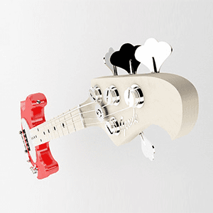
Geonk Bass 3D
{"type":"doc","content":[{"type":"paragraph","attrs":{"textAlign":null},"content":[{"type":"text","text":"Every string, every tuner, every chrome detail rendered with the kind of obsessive precision that only a designer who actually plays bass would bring to a 3D model."}]},{"type":"image","attrs":{"src":"https://farooq-agent.web.app/assets/images/works/large/7foAinlQ_work_image.png","alt":null,"title":null,"width":null,"height":null}},{"type":"paragraph","attrs":{"textAlign":null},"content":[{"type":"text","marks":[{"type":"bold"}],"text":"3D Design — Geonk Bass"}]},{"type":"paragraph","attrs":{"textAlign":null},"content":[{"type":"text","marks":[{"type":"italic"}],"text":"3D Product Render · Bass Guitar · Personal Project · 3D Modeling"}]},{"type":"paragraph","attrs":{"textAlign":null},"content":[{"type":"text","text":"A beautifully precise 3D product render of a bass guitar — a personal project that doubles as a technical flex, demonstrating 3D modeling and rendering craft applied to the object closest to the creator's identity: the instrument."}]},{"type":"paragraph","attrs":{"textAlign":null},"content":[{"type":"text","text":"The render presents the bass guitar in a dramatically cropped, tilted composition — the headstock dominating the upper right frame while the body recedes into the left, the neck cutting diagonally across the scene with the angular confidence of a product photography shot. The perspective transforms a familiar instrument into something sculptural, architectural, and worthy of extended visual attention."}]},{"type":"paragraph","attrs":{"textAlign":null},"content":[{"type":"text","text":"The material rendering is the piece's primary achievement: a cream-white body with the warm, slightly off-white finish of a vintage instrument; a deep red bridge assembly with the slightly rough texture of anodized metal; chrome tuning pegs that catch the studio light with sharp, convincing reflections; and the precisely fretted maple neck with its white fret markers and taut silver strings — each detail confirming the model was built from real-world reference and rendered with material accuracy that holds up at any zoom level."}]},{"type":"paragraph","attrs":{"textAlign":null},"content":[{"type":"text","text":"The studio lighting setup — a neutral grey gradient background with soft, diffused key light — is the work of someone who understands that great product rendering is 50% lighting. The shadows are soft and directionally correct; the reflections are plausible; the whole object exists in space rather than floating in it."}]},{"type":"paragraph","attrs":{"textAlign":null},"content":[{"type":"text","text":"A 3D render that earns equal respect from musicians who know what a bass looks like and 3D artists who know how hard it is to make chrome look that good."}]}]}
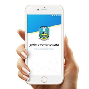
Jatim Electronic Data Icons
{"type":"doc","content":[{"type":"paragraph","attrs":{"textAlign":null},"content":[{"type":"text","text":"When government data needs to reach every citizen — icon design becomes the language that makes it universally understood, and Jatim Electronic Data gets it exactly right."}]},{"type":"image","attrs":{"src":"https://farooq-agent.web.app/assets/images/works/large/vlBUtgck_work_image.jpg","alt":null,"title":null,"width":null,"height":null}},{"type":"paragraph","attrs":{"textAlign":null},"content":[{"type":"text","marks":[{"type":"bold"}],"text":"Icon Design — Jatim Electronic Data"}]},{"type":"paragraph","attrs":{"textAlign":null},"content":[{"type":"text","marks":[{"type":"italic"}],"text":"UI Icon Set · Government Data App · East Java Province · \"Data untuk Semua\""}]},{"type":"paragraph","attrs":{"textAlign":null},"content":[{"type":"text","text":"A focused icon design project for Jatim Electronic Data — the official electronic data platform of East Java Province, built under the banner \"Data untuk Semua\" (Data for Everyone). The project's contribution is a cohesive custom icon set designed to make complex government data categories immediately recognizable and navigable for citizens across all demographics and digital literacy levels."}]},{"type":"paragraph","attrs":{"textAlign":null},"content":[{"type":"text","text":"The splash screen reveals the app's visual identity: a clean blue-and-white gradient backdrop carries the official East Java provincial crest — a heraldic shield representing the region's governmental authority — paired with the app name in a confident, institutional sans-serif. The ghost icon set visible in the lower half of the splash screen serves as a subtle visual preview of the icon system beneath — a sophisticated design choice that layers context and function simultaneously."}]},{"type":"paragraph","attrs":{"textAlign":null},"content":[{"type":"text","text":"Icon design for a government data application is a discipline of its own: every mark must communicate its data category — population statistics, economic data, infrastructure, agriculture, health — at a glance, without language barriers, and at small screen sizes where clarity is non-negotiable. The icons visible suggest a line-icon approach: clean, consistent stroke weights, minimal fill, and enough visual distinction between categories to eliminate ambiguity even in a crowded grid."}]},{"type":"paragraph","attrs":{"textAlign":null},"content":[{"type":"text","text":"A public-sector icon design contribution that serves not just an app — but an entire province's worth of citizens who deserve data that is clear, accessible, and genuinely for everyone."}]}]}
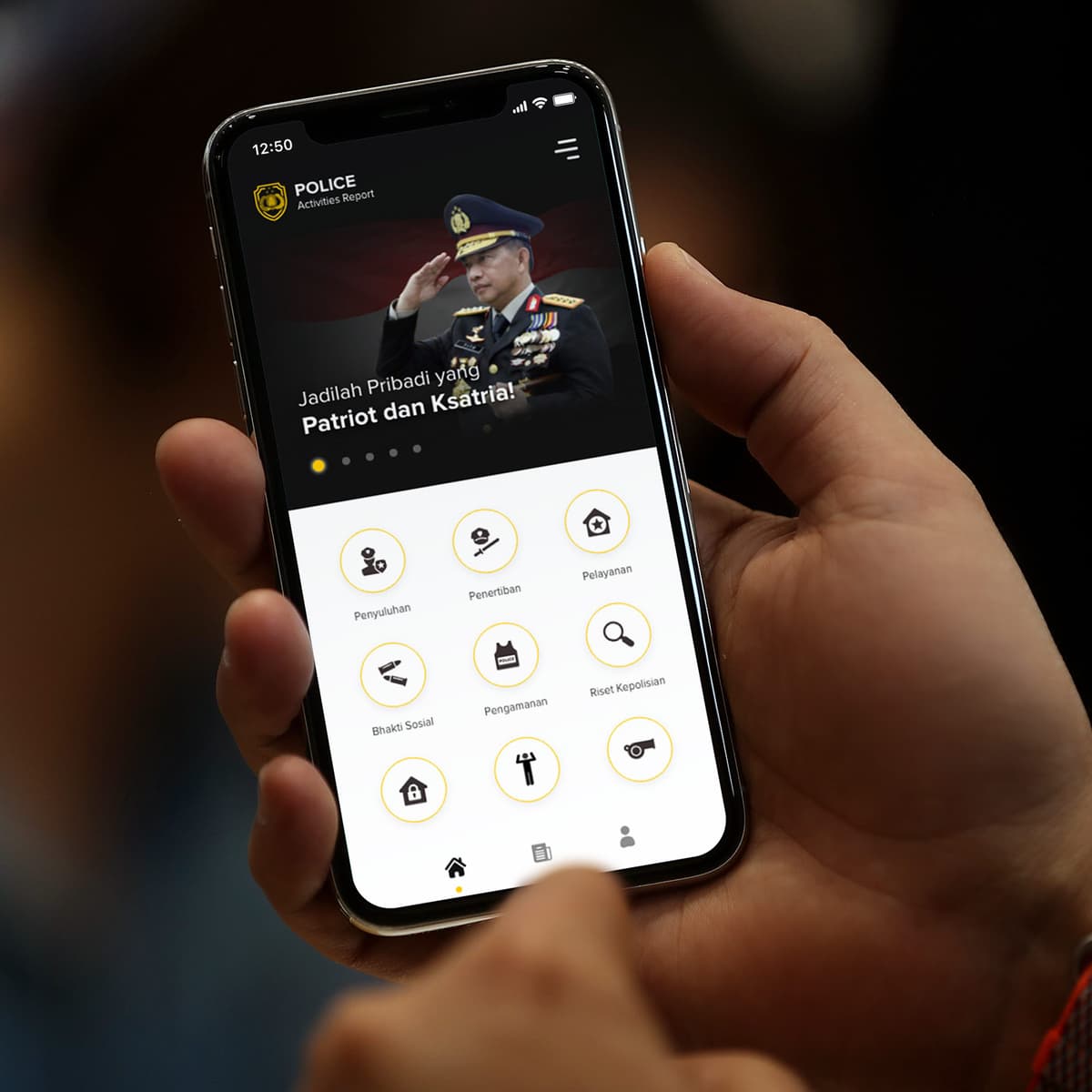
Police Activities Report
{"type":"doc","content":[{"type":"paragraph","attrs":{"textAlign":null},"content":[{"type":"text","text":"\"Be a Person of Patriotism and Chivalry\" — Police Activities Report gives Indonesian law enforcement a structured digital tool to document, track, and report their service activities in the field."}]},{"type":"image","attrs":{"src":"https://farooq-agent.web.app/assets/images/works/large/police-activities-report.jpg","alt":null,"title":null,"width":null,"height":null}},{"type":"paragraph","attrs":{"textAlign":null},"content":[{"type":"text","marks":[{"type":"bold"}],"text":"App UI Design — Police Activities Report"}]},{"type":"paragraph","attrs":{"textAlign":null},"content":[{"type":"text","marks":[{"type":"italic"}],"text":"Mobile App · Indonesian National Police · Internal Reporting Tool"}]},{"type":"paragraph","attrs":{"textAlign":null},"content":[{"type":"text","text":"A clean, purpose-built mobile app UI for Police Activities Report — an internal reporting platform for the Indonesian National Police (POLRI), designed to help officers document, categorize, and submit their daily service activities from the field."}]},{"type":"paragraph","attrs":{"textAlign":null},"content":[{"type":"text","text":"The home screen opens with a leadership banner — a senior officer in full dress uniform saluting, overlaid with the motivational tagline \"Jadilah Pribadi yang Patriot dan Ksatria!\" (Be a Person of Patriotism and Chivalry) — the institutional culture message that frames the app's purpose before a single report is filed."}]},{"type":"paragraph","attrs":{"textAlign":null},"content":[{"type":"text","text":"The activity category grid below is the app's functional core — six circular icon buttons covering the key activity types an Indonesian police officer reports: Penyuluhan (Outreach/Education), Penertiban (Enforcement/Order), Pelayanan (Public Service), Bhakti Sosial (Social Service), Pengamanan (Security), Riset Kepolisian (Police Research), plus additional categories partially visible. The icon-based navigation is fast, clear, and usable in the field — a practical choice for officers who need to log activities quickly between duties."}]},{"type":"paragraph","attrs":{"textAlign":null},"content":[{"type":"text","text":"The gold and dark palette — the Police Activities Report logo badge in gold on black, gold circular icon rings, black category labels — mirrors Indonesian police institutional colors, creating an app that feels authoritative and official while remaining approachable for daily use."}]},{"type":"paragraph","attrs":{"textAlign":null},"content":[{"type":"text","text":"The bottom navigation (Home, Reports, Profile) confirms a complete reporting workflow from activity logging to submission and account management."}]},{"type":"paragraph","attrs":{"textAlign":null},"content":[{"type":"text","text":"An institutional app that makes field reporting feel professional — and makes compliance feel like duty, not bureaucracy."}]}]}

Adinstronaut
{"type":"doc","content":[{"type":"paragraph","attrs":{"textAlign":null},"content":[{"type":"text","text":"Floating through the digital universe with a wave and a smile — Adinstronaut is the character that makes digital advertising feel like an adventure worth launching into."}]},{"type":"image","attrs":{"src":"https://cdn.dribbble.com/users/5057025/screenshots/14280065/media/fb22781eb03666b81d9201ee469c06b6.jpg?compress=1&resize=800x600&vertical=top","alt":null,"title":null,"width":null,"height":null}},{"type":"paragraph","attrs":{"textAlign":null},"content":[{"type":"text","marks":[{"type":"bold"}],"text":"Mascot Illustration — Adinstronaut"}]},{"type":"paragraph","attrs":{"textAlign":null},"content":[{"type":"text","marks":[{"type":"italic"}],"text":"Character Design · Digital Advertising · Ad Tech Brand"}]},{"type":"paragraph","attrs":{"textAlign":null},"content":[{"type":"text","text":"A richly atmospheric mascot illustration for Adinstronaut — a brand or platform living at the intersection of digital advertising and outer space ambition — rendered in a deep, cinematic purple cosmos that immediately transports the viewer beyond the ordinary."}]},{"type":"paragraph","attrs":{"textAlign":null},"content":[{"type":"text","text":"The Adinstronaut is a youthful astronaut figure drifting weightlessly through dark space — lavender-purple spacesuit, glass bubble helmet with a warm interior glow, red-tinted hair visible through the visor, expression open and welcoming with one hand raised in a friendly wave. The character's floating pose is natural and unhurried — this is an explorer at home in the void, not a stranger to it."}]},{"type":"paragraph","attrs":{"textAlign":null},"content":[{"type":"text","text":"The yellow smiley face patch on the left arm is the illustration's most quietly brilliant detail — a single cheerful icon in a sea of cool purples, communicating the brand's personality in the smallest possible space: an ad tech brand that doesn't take itself too seriously, in an industry that often does. The small white device held in the other hand hints at mobile advertising, content delivery, or the tools of the digital trade."}]},{"type":"paragraph","attrs":{"textAlign":null},"content":[{"type":"text","text":"Shattered purple geometric fragments drift behind the character — debris of the digital world, or perhaps the remnants of an old paradigm breaking apart as the Adinstronaut moves through it. The atmospheric dark purple background, painted in layered wave-like gradients, creates depth and vastness without a single star — intimate and cosmic simultaneously."}]},{"type":"paragraph","attrs":{"textAlign":null},"content":[{"type":"text","text":"The illustration style is confident flat-vector with painterly shading — detailed enough for hero placements, clean enough for icon reduction — a character built to anchor a brand across every screen it inhabits."}]},{"type":"paragraph","attrs":{"textAlign":null},"content":[{"type":"text","text":"A mascot that says: advertising doesn't have to be earthbound."}]}]}

Confuse Man
{"type":"doc","content":[{"type":"paragraph","attrs":{"textAlign":null},"content":[{"type":"text","text":"Phone in hand, one shoulder raised, brows furrowed — Confuse Man is the illustration that every UX designer keeps on standby for empty states, onboarding gaps, and \"now what?\" moments."}]},{"type":"image","attrs":{"src":"https://cdn.dribbble.com/users/5057025/screenshots/10951474/media/e9ae4494dc4dd618fb2fbcf093b694b1.jpg?compress=1&resize=1200x900&vertical=top","alt":null,"title":null,"width":null,"height":null}},{"type":"paragraph","attrs":{"textAlign":null},"content":[{"type":"text","marks":[{"type":"bold"}],"text":"Vector Illustration — Confuse Man"}]},{"type":"paragraph","attrs":{"textAlign":null},"content":[{"type":"text","marks":[{"type":"italic"}],"text":"Character Illustration · UI Empty State · Flat Vector"}]},{"type":"paragraph","attrs":{"textAlign":null},"content":[{"type":"text","text":"A clean, expressive flat vector illustration of a confused man character — the universal visual shorthand for uncertainty, indecision, and the very human moment of not knowing what to do next. The piece is a versatile UI asset as much as it is a standalone illustration, designed to communicate a specific emotional state with immediate, wordless clarity."}]},{"type":"paragraph","attrs":{"textAlign":null},"content":[{"type":"text","text":"The character is rendered in a warm amber-orange palette — a rounded, geometric flat-illustration style with smooth gradient shading that gives the figure soft dimensionality without photorealistic complexity. His expression is the illustration's core: furrowed brows pulled together in genuine bewilderment, mouth slightly downturned, eyes carrying just enough despair to be relatable without veering into distress. This is the face of someone who has read the instructions twice and is still not sure."}]},{"type":"paragraph","attrs":{"textAlign":null},"content":[{"type":"text","text":"The pose delivers the message with equal precision: left hand raised holding a phone — the source of the confusion, or perhaps the tool that should have the answer — while the right hand extends outward in a classic \"I don't know\" shrug, palm up, fingers splayed. The asymmetry between the two arms creates natural visual tension and movement within an otherwise static composition."}]},{"type":"paragraph","attrs":{"textAlign":null},"content":[{"type":"text","text":"The soft blue circular blob background grounds the character without adding environmental context, keeping the illustration universally applicable — empty states, error pages, onboarding flows, FAQ sections, customer support touchpoints, or any moment in a digital product where a user needs to feel understood rather than judged for being lost."}]},{"type":"paragraph","attrs":{"textAlign":null},"content":[{"type":"text","text":"An illustration that turns confusion into empathy — and reminds designers that their users are human."}]}]}
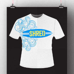
Shred T-Shirt
{"type":"doc","content":[{"type":"paragraph","attrs":{"textAlign":null},"content":[{"type":"text","text":"Waves curling, surfboard locked center chest, \"SHRED\" in yellow — this t-shirt doesn't just reference surf culture, it wears it."}]},{"type":"image","attrs":{"src":"https://farooq-agent.web.app/assets/images/works/large/mq4dHLsK_work_image.png","alt":null,"title":null,"width":null,"height":null}},{"type":"paragraph","attrs":{"textAlign":null},"content":[{"type":"text","marks":[{"type":"bold"}],"text":"T-Shirt Design — Shred"}]},{"type":"paragraph","attrs":{"textAlign":null},"content":[{"type":"text","marks":[{"type":"italic"}],"text":"Apparel Design · Surf Culture · Graphic Tee"}]},{"type":"paragraph","attrs":{"textAlign":null},"content":[{"type":"text","text":"A clean, ocean-inspired t-shirt design built around the surf culture identity of the word \"SHRED\" — the act of riding a wave with speed, skill, and controlled aggression — rendered here as a graphic that captures that energy in a single, well-composed chest print."}]},{"type":"paragraph","attrs":{"textAlign":null},"content":[{"type":"text","text":"The design centers on a classic surfboard silhouette in medium blue — long, tapered, with three racing stripes along its length — bearing the \"SHRED\" wordmark in bold yellow condensed type. The yellow-on-blue contrast is the design's chromatic anchor: the warmth of sunlight against the cool of deep water, exactly the visual temperature of a good surf session. The board shape is the natural container for the brand name, doubling as both object and logotype holder."}]},{"type":"paragraph","attrs":{"textAlign":null},"content":[{"type":"text","text":"Emanating from behind and around the surfboard, a cascade of decorative ocean wave flourishes fills the left side of the chest — ornate, swirling line work in the same blue tone, rendered in a style that bridges Polynesian tattoo aesthetics and Victorian decorative engraving. The scrolling waves are dense at the left shoulder and disperse organically across the chest, giving the composition movement, depth, and the sense of a wave breaking in real time."}]},{"type":"paragraph","attrs":{"textAlign":null},"content":[{"type":"text","text":"The design is confined to two print colors — blue and yellow on white — keeping it clean, cost-effective, and beach-appropriate. On a white tee against a black presentation background, the graphic achieves maximum visual impact."}]},{"type":"paragraph","attrs":{"textAlign":null},"content":[{"type":"text","text":"A surf tee that earns its place in the water — and looks just as good on the shore."}]}]}
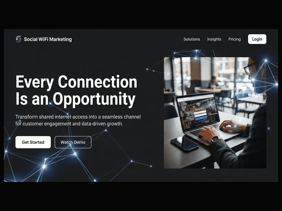
Social WiFi Marketing
{"type":"doc","content":[{"type":"paragraph","attrs":{"textAlign":null},"content":[{"type":"text","text":"Every Connection Is an Opportunity — Social WiFi Marketing transforms shared internet access into a seamless channel for customer engagement, data, and brand interaction."}]},{"type":"image","attrs":{"src":"https://farooq-agent.web.app/assets/images/works/large/social-wifi-marketing.jpg","alt":null,"title":null,"width":null,"height":null}},{"type":"paragraph","attrs":{"textAlign":null},"content":[{"type":"text","marks":[{"type":"bold"}],"text":"Platform Concept — Social WiFi Marketing"}]},{"type":"paragraph","attrs":{"textAlign":null},"content":[{"type":"text","marks":[{"type":"italic"}],"text":"MarTech · Connectivity · Customer Engagement · Business Ecosystem"}]},{"type":"paragraph","attrs":{"textAlign":null},"content":[{"type":"text","text":"A concept platform that reimagines public WiFi as more than just internet access — Social WiFi Marketing turns every connection into a strategic touchpoint between businesses and their customers."}]},{"type":"paragraph","attrs":{"textAlign":null},"content":[{"type":"text","text":"Designed for high-density commercial areas — such as café clusters, restaurants, and tourist hubs like Bali — the system leverages shared WiFi networks as a unified marketing layer. Instead of isolated hotspots, multiple businesses operate within a connected ecosystem, enabling consistent and scalable customer engagement."}]},{"type":"paragraph","attrs":{"textAlign":null},"content":[{"type":"text","text":"The experience begins at login. Users connecting to WiFi are introduced to branded entry points — promotions, offers, or content — tailored by the surrounding businesses. What is traditionally a passive utility becomes an active communication channel."}]},{"type":"paragraph","attrs":{"textAlign":null},"content":[{"type":"text","text":"From a business perspective, the platform provides valuable insights: customer presence, behavior patterns, visit frequency, and engagement data. This transforms WiFi infrastructure into a lightweight yet powerful marketing tool, especially for small to medium businesses that lack access to advanced digital channels."}]},{"type":"paragraph","attrs":{"textAlign":null},"content":[{"type":"text","text":"The interface likely balances simplicity for users with strategic depth for businesses. For customers, the process remains quick and unobtrusive. For business owners, it unlocks a new layer of visibility and interaction without requiring complex systems."}]},{"type":"paragraph","attrs":{"textAlign":null},"content":[{"type":"text","text":"Social WiFi Marketing reflects a shift toward ambient, infrastructure-based engagement — where marketing is embedded into everyday actions rather than interrupting them."}]},{"type":"paragraph","attrs":{"textAlign":null},"content":[{"type":"text","text":"A forward-thinking exploration of how connectivity itself can become a medium — turning shared networks into shared opportunities for growth, insight, and meaningful customer interaction."}]},{"type":"paragraph","attrs":{"textAlign":null}},{"type":"image","attrs":{"src":"https://hyperfantasy.web.app/assets/images/portfolios/bdbfcc9f-1f1f-44f5-a0fd-291fc429d350/platform_concept_social_wifi_marketing.png","alt":null,"title":null,"width":null,"height":null}},{"type":"paragraph","attrs":{"textAlign":null}}]}
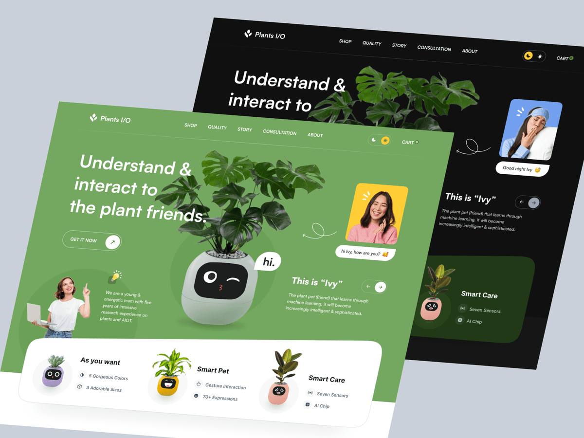
Plants IO Ivy Smart Planter - Web Design
{"type":"doc","content":[{"type":"paragraph","attrs":{"textAlign":null},"content":[{"type":"text","text":"A smart planter website that makes your houseplant feel like a pet — meet Ivy, the AI-powered pot that talks back, learns your routine, and keeps your plant alive."}]},{"type":"image","attrs":{"src":"https://cdn.dribbble.com/userupload/4083804/file/original-29cb7f7f2a6f07965270123e3586d447.png","alt":null,"title":null,"width":null,"height":null}},{"type":"paragraph","attrs":{"textAlign":null},"content":[{"type":"text","marks":[{"type":"bold"}],"text":"Web Design — Plants I/O Ivy Smart Planter"}]},{"type":"paragraph","attrs":{"textAlign":null},"content":[{"type":"text","marks":[{"type":"italic"}],"text":"Product Website · Smart Home · AIoT · Plant Tech"}]},{"type":"paragraph","attrs":{"textAlign":null},"content":[{"type":"text","text":"Plants I/O is a product website for Ivy — a machine-learning smart planter that bridges plant care and artificial intelligence. The hero opens with a bold green headline: \"Understand & interact to the plant friends\" — positioning the product not as a gadget, but as a companion. Ivy's character design (a rounded ceramic pot with expressive animated eyes) sits center-stage next to a lush Monstera, with a chat bubble \"hi.\" and a user interaction — \"hi Ivy, how are you?\" — demonstrating the product's conversational personality in real time."}]},{"type":"paragraph","attrs":{"textAlign":null},"content":[{"type":"text","text":"Three feature cards anchor the bottom of the hero: As You Want (5 colors, 3 sizes), Smart Pet (gesture interaction, 70+ expressions), and Smart Care (seven sensors, AI chip) — covering personalization, personality, and intelligence in a single scannable row. A \"This is Ivy\" panel introduces the product's ML backstory: a plant pet that grows increasingly intelligent and sophisticated over time."}]},{"type":"paragraph","attrs":{"textAlign":null},"content":[{"type":"text","text":"Both light (vibrant green) and dark (deep forest) modes are showcased, each maintaining the same playful character while adapting the mood — making the product feel equally at home in a bright studio or a moody bedroom."}]}]}

The Teacher
{"type":"doc","content":[{"type":"paragraph","attrs":{"textAlign":null},"content":[{"type":"text","marks":[{"type":"bold"}],"text":"Every programmer remembers the professor who first made algorithms click — this is a tribute to Pak Tri, immortalized in cartoon form with a pointer, a grin, and a flowchart that started it all."}]},{"type":"image","attrs":{"src":"https://farooq-agent.web.app/assets/images/works/details/211-saladin-college-works/pak-tri.jpg","alt":null,"title":null,"width":null,"height":null}},{"type":"paragraph","attrs":{"textAlign":null},"content":[{"type":"text","marks":[{"type":"bold"}],"text":"Character Illustration — The Teacher · Pak Tri"}]},{"type":"paragraph","attrs":{"textAlign":null},"content":[{"type":"text","marks":[{"type":"bold"},{"type":"italic"}],"text":"Caricature Illustration · College Work · Algorithm & Programming Lecturer"}]},{"type":"paragraph","attrs":{"textAlign":null},"content":[{"type":"text","marks":[{"type":"bold"}],"text":"A warm, affectionate caricature illustration of Pak Tri — the Algorithm and Programming lecturer whose classroom became one of the most formative spaces in a designer-developer's early education. Created during college, this piece is part tribute, part creative exercise, and entirely a love letter to the kind of teacher who leaves a lasting impression."}]},{"type":"paragraph","attrs":{"textAlign":null},"content":[{"type":"text","marks":[{"type":"bold"}],"text":"The illustration captures Pak Tri in his natural element: standing confidently beside a blackboard easel, pointer extended toward a flowchart — the fundamental diagram of algorithmic thinking. The flowchart itself is rendered with charming accuracy: oval for start/end, parallelogram for input/output, rectangle for process — the building blocks of every program ever written, drawn in chalk on black, exactly as a good lecturer would."}]},{"type":"paragraph","attrs":{"textAlign":null},"content":[{"type":"text","marks":[{"type":"bold"}],"text":"The character design is full of personality: spiky black hair, round glasses perched with knowing authority, a wide grin that makes even the most intimidating lecture feel approachable, a light blue shirt and sneakers that give him the casual confidence of someone who genuinely loves what he teaches. A green notebook tucked under one arm completes the portrait — the teacher who always comes prepared."}]},{"type":"paragraph","attrs":{"textAlign":null},"content":[{"type":"text","marks":[{"type":"bold"}],"text":"The caricature style is gentle and celebratory — not mocking, but affectionate. The kind of illustration a student makes when they want to say \"I remember you\" in the language they know best: design."}]},{"type":"paragraph","attrs":{"textAlign":null},"content":[{"type":"text","marks":[{"type":"bold"}],"text":"A piece that proves the best tribute to a great teacher is becoming someone who creates things — and remembering who first showed you how."}]}]}

Health Workers in Hazmat Suit
{"type":"doc","content":[{"type":"paragraph","attrs":{"textAlign":null},"content":[{"type":"text","text":"Suited up, armed with scanners and disinfectant — these health workers don't just face the virus, they stand ready for it, together."}]},{"type":"image","attrs":{"src":"https://cdn.dribbble.com/users/5057025/screenshots/11013383/media/dbf705aff6f59f30b9ce70e63e5a9573.jpg?compress=1&resize=1200x900&vertical=top","alt":null,"title":null,"width":null,"height":null}},{"type":"paragraph","attrs":{"textAlign":null},"content":[{"type":"text","marks":[{"type":"bold"}],"text":"Vector Illustration — Health Workers in Hazmat Suit"}]},{"type":"paragraph","attrs":{"textAlign":null},"content":[{"type":"text","marks":[{"type":"italic"}],"text":"Public Health Illustration · COVID-19 · Healthcare Heroes · Flat Vector"}]},{"type":"paragraph","attrs":{"textAlign":null},"content":[{"type":"text","text":"A flat vector illustration depicting three health workers in full personal protective equipment — hazmat suits, face shields, respirator masks, teal gloves and boots — standing in a unified, ready-for-anything formation against a deep cobalt blue backdrop. The piece is a tribute to the frontline healthcare teams who suited up every day during the pandemic, rendered with visual clarity and quiet heroism."}]},{"type":"paragraph","attrs":{"textAlign":null},"content":[{"type":"text","text":"The trio is composed with deliberate role differentiation: the left figure stands confidently holding a thermal infrared scanner — the tool of first detection, pointed and ready; the center figure stands in a commanding upright pose with one gloved hand raised in acknowledgment or direction — the team lead, the authority figure, the one who gives the signal; the right figure kneels on one knee, disinfectant spray gun in hand, aimed and operational — the specialist, positioned low and precise, ready to decontaminate."}]},{"type":"paragraph","attrs":{"textAlign":null},"content":[{"type":"text","text":"The white hazmat suits are detailed with subtle teal seam lines and PPE closures, communicating the layered construction of proper protective equipment without losing the illustration's flat vector clarity. The teal accent color — boots, gloves, mask elements — runs consistently across all three figures, unifying the team visually as a cohesive unit."}]},{"type":"paragraph","attrs":{"textAlign":null},"content":[{"type":"text","text":"The deep indigo-purple background with its irregular blob shape creates a theatrical backdrop that elevates the figures from informational graphics to something closer to a poster: these are not illustrations of procedures, they are portraits of courage."}]},{"type":"paragraph","attrs":{"textAlign":null},"content":[{"type":"text","text":"A public health illustration that honors the people who wore the suits — and the weight of what those suits meant."}]}]}
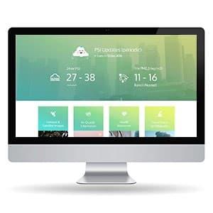
HAZE
{"type":"doc","content":[{"type":"paragraph","attrs":{"textAlign":null},"content":[{"type":"text","text":"PSI 27–38, PM2.5 11–16, Band 1 Normal — HAZE turns Singapore's most anxiety-inducing seasonal data into a calm, beautifully designed dashboard."}]},{"type":"image","attrs":{"src":"https://farooq-agent.web.app/assets/images/works/large/ge10XmE3_work_image.jpg","alt":null,"title":null,"width":null,"height":null}},{"type":"paragraph","attrs":{"textAlign":null},"content":[{"type":"text","marks":[{"type":"bold"}],"text":"Web Design — HAZE"}]},{"type":"paragraph","attrs":{"textAlign":null},"content":[{"type":"text","marks":[{"type":"italic"}],"text":"Air Quality Dashboard · PSI & PM2.5 Monitor · Singapore"}]},{"type":"paragraph","attrs":{"textAlign":null},"content":[{"type":"text","text":"A clean, data-forward web dashboard for monitoring haze and air quality in Singapore — one of the region's most practically important environmental tools during the annual haze season."}]},{"type":"paragraph","attrs":{"textAlign":null},"content":[{"type":"text","text":"The hero is a live PSI update panel: 24-hr PSI readings (27–38) and 1-hr PM2.5 readings (11–16, Band 1 Normal) displayed in large, bold numerals against a soft teal-to-green gradient backdrop. The city skyline visible through the gradient adds environmental context — this data is about the air above those buildings, right now."}]},{"type":"paragraph","attrs":{"textAlign":null},"content":[{"type":"text","text":"The design approach is notably calm and reassuring for what is potentially alarming information: the gradient palette is soft, the typography is clean and modern, and the cloud icon mascot at the top softens the clinical nature of air quality data without diminishing its accuracy. The color system visibly shifts with PSI levels — a critical UX decision for a health-information platform where color must communicate severity instantly."}]},{"type":"paragraph","attrs":{"textAlign":null},"content":[{"type":"text","text":"The four content cards below — Hotspot & Satellite Images, Air Quality Information, Health Advisories, Precautions for Patients — map the full public information need during a haze event, from real-time data to actionable guidance."}]},{"type":"paragraph","attrs":{"textAlign":null},"content":[{"type":"text","text":"A public health dashboard that makes critical environmental data accessible, readable, and calm under pressure."}]}]}
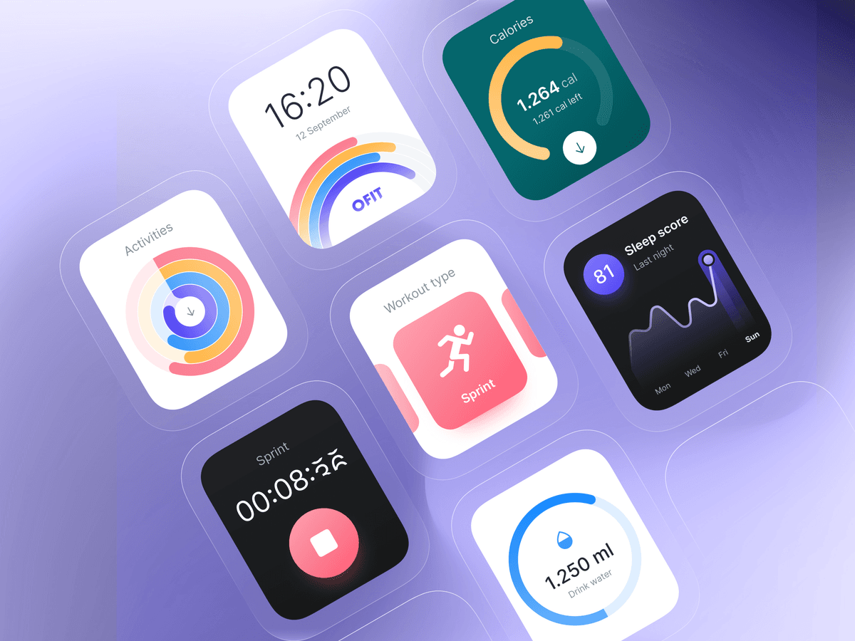
OFIT Healthy App Wearable
{"type":"doc","content":[{"type":"paragraph","attrs":{"textAlign":null},"content":[{"type":"text","text":"A smartwatch UI that turns your wrist into a full health dashboard — calories, sleep, hydration, and sprint timer, all wrapped in a soft, colorful design language."}]},{"type":"image","attrs":{"src":"https://cdn.dribbble.com/userupload/2772838/file/original-29828c4243abdce02d54222a6ba824fb.png","alt":null,"title":null,"width":null,"height":null}},{"type":"paragraph","attrs":{"textAlign":null},"content":[{"type":"text","marks":[{"type":"bold"}],"text":"UI/UX Design — OFIT Healthy App Wearable"}]},{"type":"paragraph","attrs":{"textAlign":null},"content":[{"type":"text","marks":[{"type":"italic"}],"text":"Wearable UI · Smartwatch · Health & Fitness"}]},{"type":"paragraph","attrs":{"textAlign":null},"content":[{"type":"text","text":"OFIT is a smartwatch app UI designed around seven distinct health-tracking screens, each optimized for glanceability on a small display. The watch face opens with the time (16:20, 12 September) and the OFIT rainbow arc logo — a set of stacked gradient curves that doubles as an activity ring teaser. From there, each screen handles a dedicated health metric:"}]},{"type":"paragraph","attrs":{"textAlign":null},"content":[{"type":"text","text":"Activities shows three concentric ring gauges for different movement categories. Calories displays a teal arc gauge tracking 1,264 cal burned against a daily target (1,261 cal left). Workout Type presents a vibrant coral card with a running figure icon and \"Sprint\" label — active session selection made visually satisfying. The Sprint Timer runs a live session counter (00:08:26) on a near-black background with a red stop button — minimal by design so nothing distracts during exercise. Sleep Score delivers a dark card with an 81/100 score and a weekly wave chart showing nightly quality trends. Drink Water closes the set with a clean blue arc gauge tracking 1,250 ml of hydration progress."}]},{"type":"paragraph","attrs":{"textAlign":null},"content":[{"type":"text","text":"Displayed on a soft purple gradient layout, the seven-screen mosaic demonstrates a fully-realized wearable design system — cohesive across modes yet distinct enough that each metric has its own visual personality."}]}]}
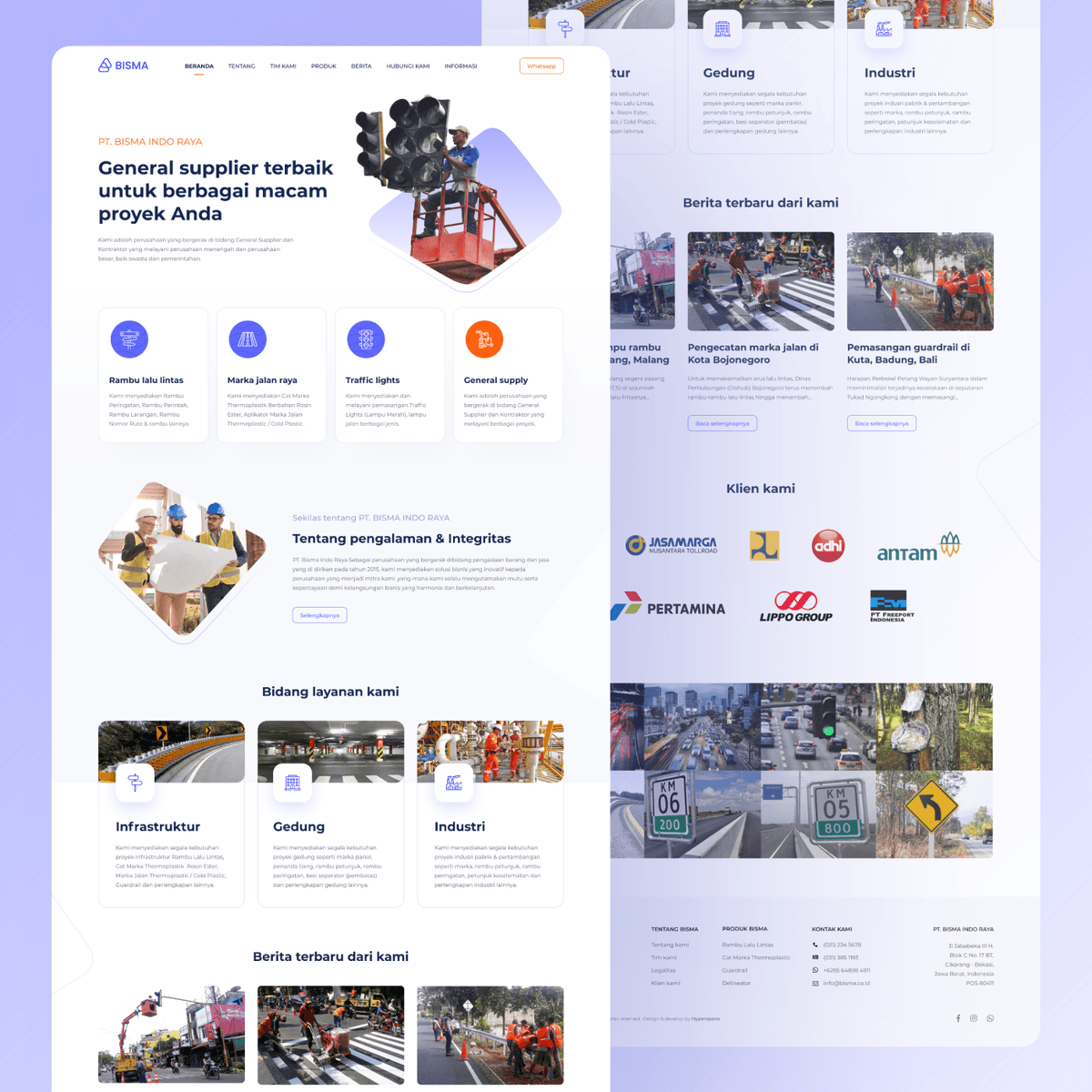
Bisma - Website Design
{"type":"doc","content":[{"type":"paragraph","attrs":{"textAlign":null},"content":[{"type":"text","text":"Bisma's website gives a serious infrastructure supply company a clean, credible digital presence that matches the scale of clients like Jasa Marga, Pertamina, and Lippo Group."}]},{"type":"image","attrs":{"src":"https://farooq-agent.web.app/assets/images/works/large/pd/bisma_square.png","alt":null,"title":null,"width":null,"height":null}},{"type":"paragraph","attrs":{"textAlign":null},"content":[{"type":"text","marks":[{"type":"bold"}],"text":"Web Design — PT. Bisma Indo Raya"}]},{"type":"paragraph","attrs":{"textAlign":null},"content":[{"type":"text","marks":[{"type":"italic"}],"text":"Company Website · Road Infrastructure & General Supply · Indonesia"}]},{"type":"paragraph","attrs":{"textAlign":null},"content":[{"type":"text","text":"A clean, professional corporate website for PT. Bisma Indo Raya — a general supplier and contractor specializing in road infrastructure products: traffic lights, road markings, rambu lalu lintas (traffic signs), guardrails, road separators, and thermoplastic road paint."}]},{"type":"paragraph","attrs":{"textAlign":null},"content":[{"type":"text","text":"The hero leads with a technician installing a traffic light signal cluster — the product and the service in a single image — alongside the positioning statement: \"General supplier terbaik untuk berbagai macam proyek Anda.\" Four service pillars follow in icon cards: Rambu Lalu Lintas, Marka Jalan Raya, Traffic Lights, and General Supply — the complete infrastructure product catalog at a glance."}]},{"type":"paragraph","attrs":{"textAlign":null},"content":[{"type":"text","text":"The \"Tentang Pengalaman & Integritas\" section establishes PT. Bisma Indo Raya's track record — founded 2005, serving both private and government clients — with a field team photograph that grounds the company in real operational credibility."}]},{"type":"paragraph","attrs":{"textAlign":null},"content":[{"type":"text","text":"\"Bidang Layanan Kami\" organizes services into three verticals: Infrastruktur (traffic signs, markings, guardrails), Gedung (building maintenance, road paint, signage), and Industri (industrial marking and safety) — showing breadth beyond the core road product line."}]},{"type":"paragraph","attrs":{"textAlign":null},"content":[{"type":"text","text":"The client logo strip is the page's most powerful trust signal: Jasa Marga, Adhi Karya, Adhi, Antam, Pertamina, Lippo Group, PT. Freeport Indonesia — a client roster that confirms Bisma operates at national infrastructure scale."}]},{"type":"paragraph","attrs":{"textAlign":null},"content":[{"type":"text","text":"Real project photography in the news section — road marking in Bojonegoro, guardrail installation in Kuta Bali — grounds every claim in documented work."}]},{"type":"paragraph","attrs":{"textAlign":null},"content":[{"type":"text","text":"A company website that earns its B2B credibility through the quality of its clients and the specificity of its projects."}]}]}
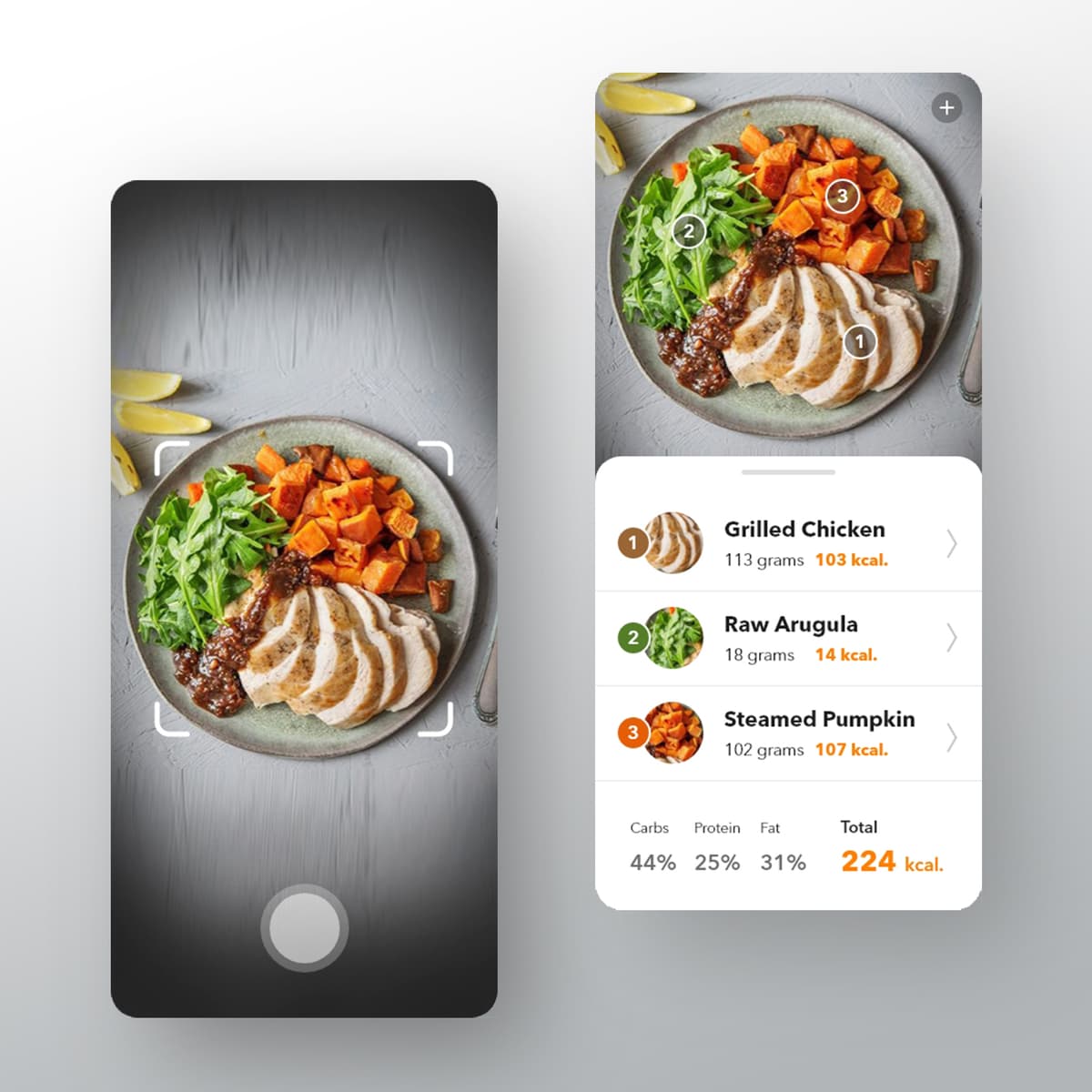
ViFit
{"type":"doc","content":[{"type":"paragraph","attrs":{"textAlign":null},"content":[{"type":"text","text":"Scan What You Eat, Understand What It Means — ViFit transforms everyday meals into actionable nutritional insight through a fast, intelligent, and human-centered experience."}]},{"type":"image","attrs":{"src":"https://farooq-agent.web.app/assets/images/works/details/224-vifit/vifit.jpg","alt":null,"title":null,"width":null,"height":null}},{"type":"paragraph","attrs":{"textAlign":null},"content":[{"type":"text","marks":[{"type":"bold"}],"text":"Mobile App Design — ViFit"}]},{"type":"paragraph","attrs":{"textAlign":null},"content":[{"type":"text","marks":[{"type":"italic"}],"text":"Health Tech · Food Scanner · Nutrition Tracking · UI/UX Design"}]},{"type":"paragraph","attrs":{"textAlign":null},"content":[{"type":"text","text":"A mobile application designed to turn food into data — ViFit explores how computer vision and intuitive interface design can simplify the way users understand their daily nutrition."}]},{"type":"paragraph","attrs":{"textAlign":null},"content":[{"type":"text","text":"At the center of the experience is the scanning interaction: quick, seamless, and frictionless. Users simply point their camera at a meal, and the system interprets it into structured nutritional information — removing the need for manual input, which is often the biggest barrier in traditional tracking apps."}]},{"type":"paragraph","attrs":{"textAlign":null},"content":[{"type":"text","text":"The interface likely balances clarity with depth. Nutritional data is presented in a digestible format — calories, macros, and key insights — without overwhelming the user. Visual hierarchy and clean data presentation help transform complex information into something instantly understandable."}]},{"type":"paragraph","attrs":{"textAlign":null},"content":[{"type":"text","text":"ViFit positions itself not just as a tracker, but as a translator — bridging the gap between what users eat and what their body receives. It reframes nutrition from guesswork into awareness, empowering users to make better decisions in real time."}]},{"type":"paragraph","attrs":{"textAlign":null},"content":[{"type":"text","text":"The product reflects a broader shift in health tech: from passive logging to intelligent assistance. By combining scanning technology with thoughtful UX, ViFit reduces friction and increases consistency — making healthy habits easier to maintain, not harder."}]},{"type":"paragraph","attrs":{"textAlign":null},"content":[{"type":"text","text":"A modern take on nutrition tracking, where insight is instant, and awareness begins with a single scan."}]}]}
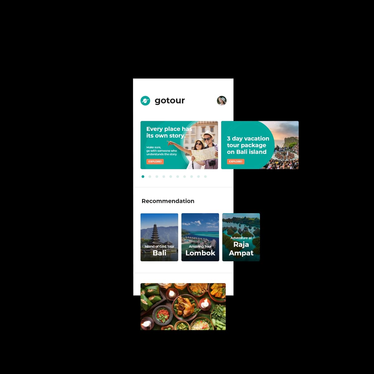
Go Tour
{"type":"doc","content":[{"type":"paragraph","attrs":{"textAlign":null},"content":[{"type":"text","text":"Travel With Someone Who Knows — Go Tour connects travelers with trusted local guides, turning unfamiliar places into curated, meaningful journeys."}]},{"type":"image","attrs":{"src":"https://farooq-agent.web.app/assets/images/works/large/go-tour.jpg","alt":null,"title":null,"width":null,"height":null}},{"type":"paragraph","attrs":{"textAlign":null},"content":[{"type":"text","marks":[{"type":"bold"}],"text":"Mobile App Design — Go Tour"}]},{"type":"paragraph","attrs":{"textAlign":null},"content":[{"type":"text","marks":[{"type":"italic"}],"text":"Travel & Tourism · Tour Guide Service · Local Experience · UI/UX Design"}]},{"type":"paragraph","attrs":{"textAlign":null},"content":[{"type":"text","text":"A mobile application designed to simplify and enrich the travel experience — Go Tour connects tourists with professional local guides, making exploration more structured, personal, and insightful."}]},{"type":"paragraph","attrs":{"textAlign":null},"content":[{"type":"text","text":"The experience centers on discovery and trust. Instead of navigating destinations alone, users can browse, select, and connect with guides who understand the local culture, routes, and hidden gems. This transforms travel from self-directed exploration into a guided journey with context and depth."}]},{"type":"paragraph","attrs":{"textAlign":null},"content":[{"type":"text","text":"The interface likely emphasizes clarity and ease of planning. Key actions — finding destinations, viewing guide profiles, booking services, and managing itineraries — are streamlined into a cohesive flow that reduces friction for travelers, especially in unfamiliar environments."}]},{"type":"paragraph","attrs":{"textAlign":null},"content":[{"type":"text","text":"Go Tour positions itself as more than a booking platform. It is a bridge between visitors and local knowledge — enabling more authentic, efficient, and meaningful travel experiences."}]},{"type":"paragraph","attrs":{"textAlign":null},"content":[{"type":"text","text":"Visually, the design is expected to evoke a sense of exploration and openness, while maintaining structure and reliability. Information is presented in a way that supports quick decisions without overwhelming the user."}]},{"type":"paragraph","attrs":{"textAlign":null},"content":[{"type":"text","text":"This project reflects a shift in modern tourism — where travelers seek not just places, but stories, context, and human connection."}]},{"type":"paragraph","attrs":{"textAlign":null},"content":[{"type":"text","text":"A thoughtful approach to travel design, where guidance is not optional, but essential — and every journey becomes more than just movement from one place to another."}]},{"type":"horizontalRule"},{"type":"paragraph","attrs":{"textAlign":null},"content":[{"type":"text","text":" "},{"type":"text","marks":[{"type":"bold"},{"type":"italic"}],"text":"Go Ride X"}]},{"type":"paragraph","attrs":{"textAlign":null},"content":[{"type":"text","marks":[{"type":"italic"}],"text":"2019-11-01 19:46:14"},{"type":"text","text":" "}]},{"type":"image","attrs":{"src":"https://farooq-agent.web.app/assets/images/works/large/go-ride-x.jpg","alt":null,"title":null,"width":null,"height":null}},{"type":"paragraph","attrs":{"textAlign":null},"content":[{"type":"text","text":"."}]}]}
RiskObs
{"type":"doc","content":[{"type":"heading","attrs":{"textAlign":null,"level":1},"content":[{"type":"text","marks":[{"type":"bold"}],"text":"Riskobs — Simple Project Explanation"}]},{"type":"paragraph","attrs":{"textAlign":null},"content":[{"type":"text","marks":[{"type":"bold"}],"text":"Riskobs"},{"type":"text","text":" is an AI-native SaaS platform that helps teams detect, track, and manage operational risks before they become real incidents."}]},{"type":"image","attrs":{"src":"https://www.vectorsolutions.com/wp-content/uploads/2024/02/5x420risk20matrix.webp","alt":null,"title":null,"width":null,"height":null}},{"type":"paragraph","attrs":{"textAlign":null},"content":[{"type":"text","text":"The platform combines:"}]},{"type":"bulletList","content":[{"type":"listItem","content":[{"type":"paragraph","attrs":{"textAlign":null},"content":[{"type":"text","text":"risk monitoring,"}]}]},{"type":"listItem","content":[{"type":"paragraph","attrs":{"textAlign":null},"content":[{"type":"text","text":"incident management,"}]}]},{"type":"listItem","content":[{"type":"paragraph","attrs":{"textAlign":null},"content":[{"type":"text","text":"team collaboration,"}]}]},{"type":"listItem","content":[{"type":"paragraph","attrs":{"textAlign":null},"content":[{"type":"text","text":"AI insights,"}]}]},{"type":"listItem","content":[{"type":"paragraph","attrs":{"textAlign":null},"content":[{"type":"text","text":"and analytics dashboards."}]}]}]},{"type":"paragraph","attrs":{"textAlign":null},"content":[{"type":"text","text":"It is designed for modern teams such as:"}]},{"type":"bulletList","content":[{"type":"listItem","content":[{"type":"paragraph","attrs":{"textAlign":null},"content":[{"type":"text","text":"startups,"}]}]},{"type":"listItem","content":[{"type":"paragraph","attrs":{"textAlign":null},"content":[{"type":"text","text":"fintech,"}]}]},{"type":"listItem","content":[{"type":"paragraph","attrs":{"textAlign":null},"content":[{"type":"text","text":"production houses,"}]}]},{"type":"listItem","content":[{"type":"paragraph","attrs":{"textAlign":null},"content":[{"type":"text","text":"software companies,"}]}]},{"type":"listItem","content":[{"type":"paragraph","attrs":{"textAlign":null},"content":[{"type":"text","text":"and operations teams."}]}]}]},{"type":"paragraph","attrs":{"textAlign":null},"content":[{"type":"text","text":"Core idea:"}]},{"type":"paragraph","attrs":{"textAlign":null},"content":[{"type":"text","text":"Observe risks before they become incidents."}]},{"type":"paragraph","attrs":{"textAlign":null}},{"type":"paragraph","attrs":{"textAlign":null},"content":[{"type":"text","text":"Example use cases:"}]},{"type":"bulletList","content":[{"type":"listItem","content":[{"type":"paragraph","attrs":{"textAlign":null},"content":[{"type":"text","text":"server downtime risk,"}]}]},{"type":"listItem","content":[{"type":"paragraph","attrs":{"textAlign":null},"content":[{"type":"text","text":"delayed vendors,"}]}]},{"type":"listItem","content":[{"type":"paragraph","attrs":{"textAlign":null},"content":[{"type":"text","text":"production blockers,"}]}]},{"type":"listItem","content":[{"type":"paragraph","attrs":{"textAlign":null},"content":[{"type":"text","text":"fraud indicators,"}]}]},{"type":"listItem","content":[{"type":"paragraph","attrs":{"textAlign":null},"content":[{"type":"text","text":"missed deadlines,"}]}]},{"type":"listItem","content":[{"type":"paragraph","attrs":{"textAlign":null},"content":[{"type":"text","text":"compliance issues."}]}]}]},{"type":"paragraph","attrs":{"textAlign":null},"content":[{"type":"text","text":"Main features:"}]},{"type":"bulletList","content":[{"type":"listItem","content":[{"type":"paragraph","attrs":{"textAlign":null},"content":[{"type":"text","text":"Risk Dashboard"}]}]},{"type":"listItem","content":[{"type":"paragraph","attrs":{"textAlign":null},"content":[{"type":"text","text":"Risk Register"}]}]},{"type":"listItem","content":[{"type":"paragraph","attrs":{"textAlign":null},"content":[{"type":"text","text":"Incident Tracking"}]}]},{"type":"listItem","content":[{"type":"paragraph","attrs":{"textAlign":null},"content":[{"type":"text","text":"AI Risk Insights"}]}]},{"type":"listItem","content":[{"type":"paragraph","attrs":{"textAlign":null},"content":[{"type":"text","text":"Severity Heatmap"}]}]},{"type":"listItem","content":[{"type":"paragraph","attrs":{"textAlign":null},"content":[{"type":"text","text":"Team Collaboration"}]}]}]},{"type":"paragraph","attrs":{"textAlign":null}},{"type":"horizontalRule"},{"type":"paragraph","attrs":{"textAlign":null}},{"type":"paragraph","attrs":{"textAlign":null},"content":[{"type":"text","text":"Try Before You Buy — Snap n’ Match brings products into your world through AR, turning uncertainty into instant visual confidence."}]},{"type":"image","attrs":{"src":"https://farooq-agent.web.app/assets/images/works/details/223-snap-n-match/snap-n-match.jpg","alt":null,"title":null,"width":null,"height":null}},{"type":"paragraph","attrs":{"textAlign":null},"content":[{"type":"text","marks":[{"type":"bold"}],"text":"Mobile App Design — Snap n’ Match"}]},{"type":"paragraph","attrs":{"textAlign":null},"content":[{"type":"text","marks":[{"type":"italic"}],"text":"Augmented Reality · Virtual Try-On · Fashion & Retail · UI/UX Design"}]},{"type":"paragraph","attrs":{"textAlign":null},"content":[{"type":"text","text":"An augmented reality mobile application designed to bridge the gap between browsing and buying — Snap n’ Match allows users to virtually try products in real time using their camera."}]},{"type":"paragraph","attrs":{"textAlign":null},"content":[{"type":"text","text":"At the core of the experience is the AR interaction: intuitive, responsive, and immediate. Users can simply open the camera, select an item, and see how it looks when worn — removing the guesswork that often comes with online shopping."}]},{"type":"paragraph","attrs":{"textAlign":null},"content":[{"type":"text","text":"The interface likely prioritizes fluidity and speed. Minimal friction between selection and visualization ensures that the experience feels natural, almost playful — like trying items in front of a mirror, but digitally enhanced. Controls are kept simple, allowing users to focus on the product and their reflection rather than navigating the app."}]},{"type":"paragraph","attrs":{"textAlign":null},"content":[{"type":"text","text":"Snap n’ Match transforms product discovery into an interactive experience. Instead of imagining how something might look, users can see it instantly — improving confidence and reducing hesitation in purchase decisions."}]},{"type":"paragraph","attrs":{"textAlign":null},"content":[{"type":"text","text":"This project reflects the growing role of AR in retail — not as a novelty, but as a practical tool for decision-making. By blending real-world context with digital overlays, the app creates a more informed and engaging shopping journey."}]},{"type":"paragraph","attrs":{"textAlign":null},"content":[{"type":"text","text":"A forward-looking exploration of how augmented reality can make online shopping more tangible, personal, and reliable — where trying becomes as easy as tapping the camera."}]}]}
SnapOrder
{"type":"doc","content":[{"type":"paragraph","attrs":{"textAlign":null},"content":[{"type":"text","text":"Order Without Thinking Twice — SnapOrder simplifies nightlife ordering into a quick scan, a few taps, and instant checkout."}]},{"type":"image","attrs":{"src":"https://farooq-agent.web.app/assets/images/works/large/snaporder.jpg","alt":null,"title":null,"width":null,"height":null}},{"type":"paragraph","attrs":{"textAlign":null},"content":[{"type":"text","marks":[{"type":"bold"}],"text":"Mobile App Concept — SnapOrder"}]},{"type":"paragraph","attrs":{"textAlign":null},"content":[{"type":"text","marks":[{"type":"italic"}],"text":"QR Ordering · Nightlife Experience · E-Wallet Integration · UI/UX Design"}]},{"type":"paragraph","attrs":{"textAlign":null},"content":[{"type":"text","text":"A mobile-first ordering experience designed for bars and clubs — SnapOrder removes friction from one of the most chaotic moments in nightlife: placing an order when attention, time, and clarity are limited."}]},{"type":"paragraph","attrs":{"textAlign":null},"content":[{"type":"text","text":"Built around a simple interaction model, users scan a QR code at their table, instantly access the menu, and place orders without needing to flag down staff. The flow is intentionally minimal — large touch targets, clear categories, and fast navigation — optimized for low-light environments and reduced focus."}]},{"type":"paragraph","attrs":{"textAlign":null},"content":[{"type":"text","text":"The integration with e-wallet systems completes the loop. Payment happens seamlessly within the same flow, eliminating the need for cash handling or repeated transactions at the bar. This not only speeds up service but also reduces crowding and operational bottlenecks."}]},{"type":"paragraph","attrs":{"textAlign":null},"content":[{"type":"text","text":"SnapOrder is designed with context in mind. In a setting where users may be distracted or tipsy, the interface avoids complexity and prioritizes clarity, speed, and confirmation feedback — ensuring that every interaction feels effortless and reliable."}]},{"type":"paragraph","attrs":{"textAlign":null},"content":[{"type":"text","text":"For businesses, the system offers more than convenience. It streamlines order management, reduces staff load, and enables better tracking of customer behavior and peak demand patterns."}]},{"type":"paragraph","attrs":{"textAlign":null},"content":[{"type":"text","text":"This concept reflects a shift toward environment-aware design — where products adapt to the user's state and surroundings, not the other way around."}]},{"type":"paragraph","attrs":{"textAlign":null},"content":[{"type":"text","text":"A practical and thoughtful approach to nightlife service design, where ordering becomes almost invisible — fast, intuitive, and exactly as simple as it needs to be."}]},{"type":"paragraph","attrs":{"textAlign":null}},{"type":"image","attrs":{"src":"https://hyperfantasy.web.app/assets/images/portfolios/02d89e58-64ac-4a94-8a98-c2bd2acc9f35/snaporder.png","alt":null,"title":null,"width":null,"height":null}},{"type":"paragraph","attrs":{"textAlign":null}}]}
Kelola Sampah
{"type":"doc","content":[{"type":"paragraph","attrs":{"textAlign":null},"content":[{"type":"text","text":"Turn Waste Into Action — Kelola Sampah empowers communities to manage, track, and reduce waste through a simple, actionable mobile experience."}]},{"type":"image","attrs":{"src":"https://farooq-agent.web.app/assets/images/works/details/240-kelola-sampah/kelola-sampah.jpg","alt":null,"title":null,"width":null,"height":null}},{"type":"paragraph","attrs":{"textAlign":null},"content":[{"type":"text","marks":[{"type":"bold"}],"text":"Mobile App Design — Kelola Sampah"}]},{"type":"paragraph","attrs":{"textAlign":null},"content":[{"type":"text","marks":[{"type":"italic"}],"text":"Waste Management · Sustainability · Community Engagement · UI/UX Design"}]},{"type":"paragraph","attrs":{"textAlign":null},"content":[{"type":"text","text":"A mobile application designed to make waste management accessible, trackable, and actionable — Kelola Sampah focuses on helping users organize, monitor, and reduce trash efficiently."}]},{"type":"paragraph","attrs":{"textAlign":null},"content":[{"type":"text","text":"The experience centers on clarity and engagement. Users can categorize waste, track collection schedules, and even participate in local recycling initiatives. By turning routine disposal into an organized workflow, the app reduces confusion and encourages consistent behavior."}]},{"type":"paragraph","attrs":{"textAlign":null},"content":[{"type":"text","text":"The interface likely emphasizes simplicity and visual cues. Color-coded categories, progress tracking, and notifications guide users toward proper disposal practices while maintaining motivation through measurable impact."}]},{"type":"paragraph","attrs":{"textAlign":null},"content":[{"type":"text","text":"Kelola Sampah positions itself as more than a utility — it is a community tool. By connecting households, waste collectors, and local authorities, it fosters awareness and collaboration around environmental responsibility."}]},{"type":"paragraph","attrs":{"textAlign":null},"content":[{"type":"text","text":"The design balances functionality with encouragement. Information is presented clearly, but the experience also subtly nudges users toward sustainable habits, making waste management feel both achievable and meaningful."}]},{"type":"paragraph","attrs":{"textAlign":null},"content":[{"type":"text","text":"This project reflects a growing need for digital tools that support environmental action — where technology transforms small daily acts into measurable community impact."}]},{"type":"paragraph","attrs":{"textAlign":null},"content":[{"type":"text","text":"A thoughtful exploration of how mobile design can drive sustainability — turning management of waste from a chore into an engaging, responsible, and impactful experience."}]},{"type":"paragraph","attrs":{"textAlign":null}},{"type":"image","attrs":{"src":"https://hyperfantasy.web.app/assets/images/portfolios/c56a834a-d338-4ba8-a75a-eb480b01e3f8/kelolasampah.png","alt":null,"title":null,"width":null,"height":null}},{"type":"paragraph","attrs":{"textAlign":null}}]}
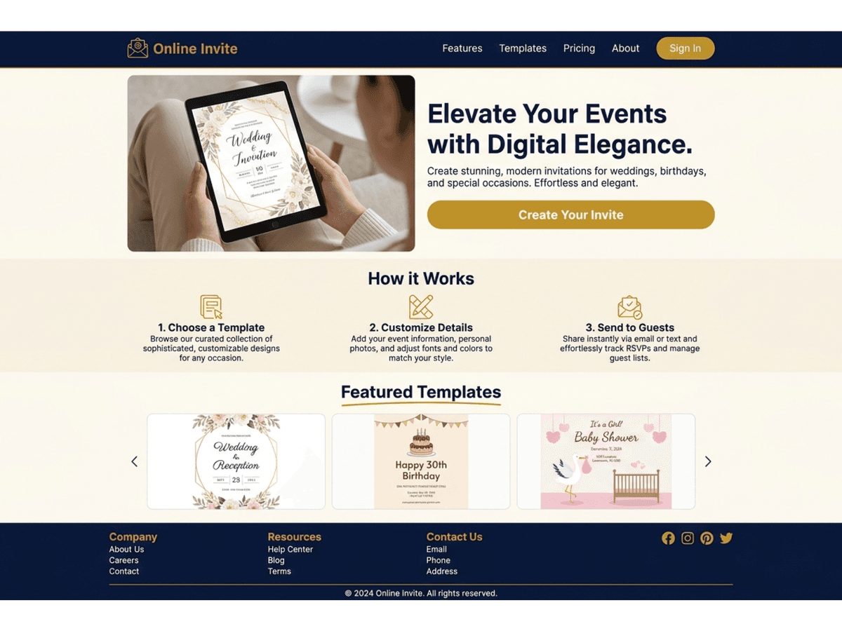
Nikahan
{"type":"doc","content":[{"type":"paragraph","attrs":{"textAlign":null},"content":[{"type":"text","text":"An Invitation That Feels Personal — Nikahan transforms wedding invitations into a beautifully crafted digital experience."}]},{"type":"image","attrs":{"src":"https://farooq-agent.web.app/assets/images/works/details/253-nikahan/nikahan.jpg","alt":null,"title":null,"width":null,"height":null}},{"type":"paragraph","attrs":{"textAlign":null},"content":[{"type":"text","marks":[{"type":"bold"}],"text":"Platform Design — Nikahan"}]},{"type":"paragraph","attrs":{"textAlign":null},"content":[{"type":"text","marks":[{"type":"italic"}],"text":"Wedding Invitation · Digital Experience · Event Platform · UI/UX Design"}]},{"type":"paragraph","attrs":{"textAlign":null},"content":[{"type":"text","text":"A digital platform designed to modernize the way wedding invitations are created and shared — Nikahan turns a traditional formality into a meaningful, interactive experience."}]},{"type":"paragraph","attrs":{"textAlign":null},"content":[{"type":"text","text":"At its core, the platform is about storytelling. Each invitation is more than just information — it becomes a narrative space where couples can present their journey, tone, and personality. From names and schedules to personal messages and visual themes, everything is crafted to feel intentional and expressive."}]},{"type":"paragraph","attrs":{"textAlign":null},"content":[{"type":"text","text":"The experience likely emphasizes elegance and clarity. Clean layouts, refined typography, and thoughtful spacing ensure that essential details — date, location, and event flow — remain easy to access while still feeling emotionally engaging."}]},{"type":"paragraph","attrs":{"textAlign":null},"content":[{"type":"text","text":"Nikahan removes the friction of physical distribution while enhancing reach and convenience. Invitations can be shared instantly, accessed anywhere, and updated when needed — making it especially relevant in a digitally connected world."}]},{"type":"paragraph","attrs":{"textAlign":null},"content":[{"type":"text","text":"Beyond convenience, the platform elevates the emotional value of invitations. It creates a moment for guests — not just to receive information, but to feel included in the story of the celebration."}]},{"type":"paragraph","attrs":{"textAlign":null},"content":[{"type":"text","text":"This project reflects a shift in how traditions evolve through technology — preserving meaning while adapting form."}]},{"type":"paragraph","attrs":{"textAlign":null},"content":[{"type":"text","text":"A refined exploration of digital craftsmanship, where a simple invitation becomes a memorable experience — personal, elegant, and effortlessly shareable."}]},{"type":"paragraph","attrs":{"textAlign":null}},{"type":"image","attrs":{"src":"https://hyperfantasy.web.app/assets/images/portfolios/bf84c4af-4df9-4bde-b6f1-0cb4bdc66d4b/invita.png","alt":null,"title":null,"width":null,"height":null}},{"type":"paragraph","attrs":{"textAlign":null}}]}
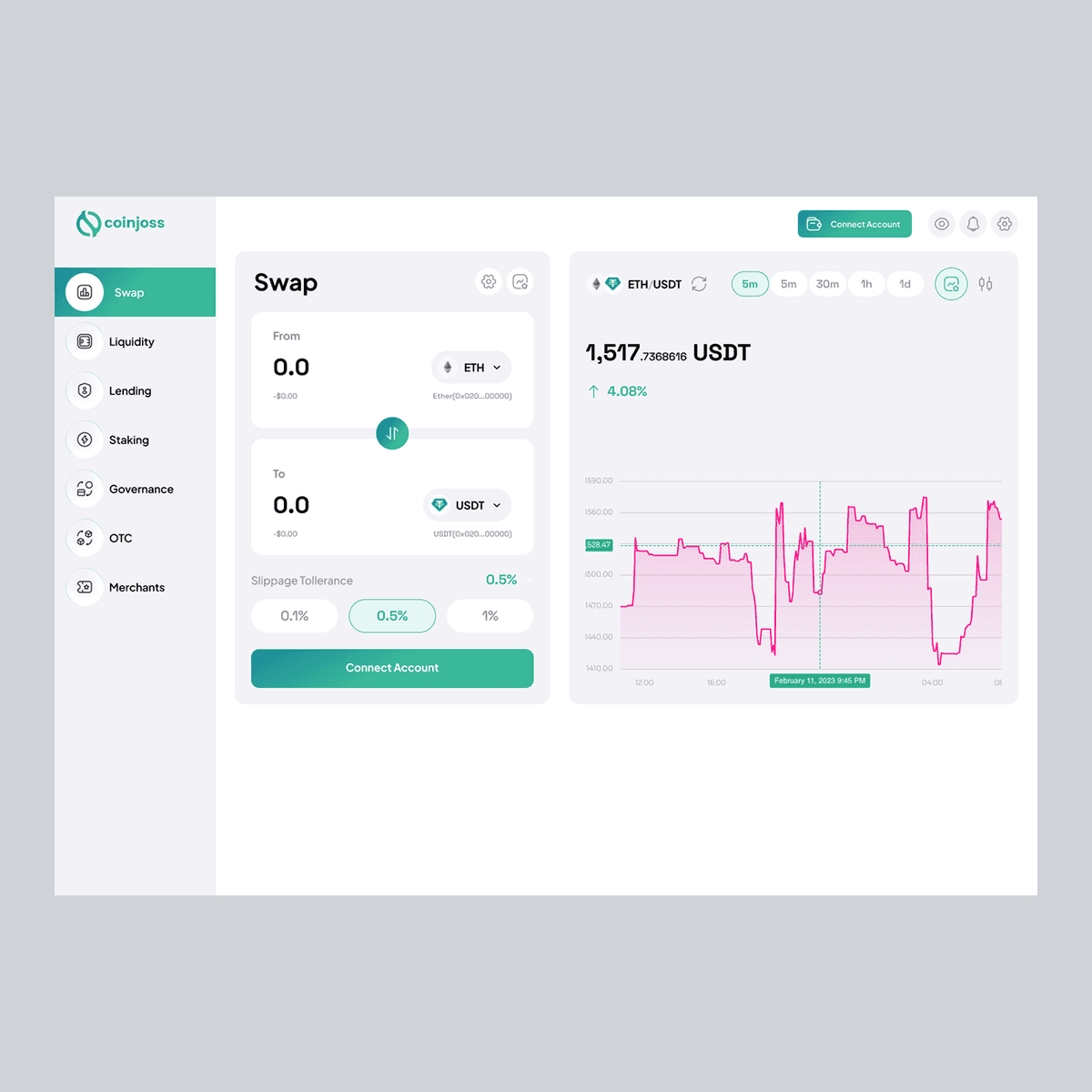
Dex CoinJoss Islami
{"type":"doc","content":[{"type":"paragraph","attrs":{"textAlign":null},"content":[{"type":"text","text":"Invest Ethically, Trade Confidently — Dex CoinJoss Islami combines cryptocurrency management with Sharia-compliant principles in a secure, intuitive platform."}]},{"type":"image","attrs":{"src":"https://mir-s3-cdn-cf.behance.net/project_modules/1400_opt_1/03fafb164613463.64060eb614abd.png","alt":null,"title":null,"width":null,"height":null}},{"type":"paragraph","attrs":{"textAlign":null},"content":[{"type":"text","marks":[{"type":"bold"}],"text":"Web & Mobile App Design — Dex CoinJoss Islami"}]},{"type":"paragraph","attrs":{"textAlign":null},"content":[{"type":"text","marks":[{"type":"italic"}],"text":"Sharia-Compliant Cryptocurrency · Ethical Trading · Digital Finance · UI/UX Design"}]},{"type":"paragraph","attrs":{"textAlign":null},"content":[{"type":"text","text":"A digital platform designed for cryptocurrency trading in accordance with Islamic finance principles — Dex CoinJoss Islami ensures users can engage with crypto markets while adhering to ethical and Sharia-compliant guidelines."}]},{"type":"paragraph","attrs":{"textAlign":null},"content":[{"type":"text","text":"The experience emphasizes trust, transparency, and clarity. Users can track permissible digital assets, manage portfolios, and execute trades confidently. Real-time market insights, portfolio analytics, and notifications are presented in a clean, digestible interface, enabling informed decisions without compromising religious principles."}]},{"type":"paragraph","attrs":{"textAlign":null},"content":[{"type":"text","text":"The interface likely balances comprehensive financial data with usability. Key information is structured through hierarchy, color coding, and intuitive navigation, allowing users to focus on compliant trading while reducing cognitive load."}]},{"type":"paragraph","attrs":{"textAlign":null},"content":[{"type":"text","text":"Dex CoinJoss Islami positions itself as more than a trading platform. It serves as a bridge between modern digital finance and ethical investment, fostering confidence and responsibility in every interaction."}]},{"type":"paragraph","attrs":{"textAlign":null},"content":[{"type":"text","text":"Visually, the design conveys integrity and sophistication. Clean layouts, clear typography, and dynamic data visualization create a professional yet approachable experience that aligns with both fintech standards and ethical values."}]},{"type":"paragraph","attrs":{"textAlign":null},"content":[{"type":"text","text":"This project reflects a growing demand for Islamic-compliant digital finance — where technology meets ethical principles without sacrificing usability or performance."}]},{"type":"paragraph","attrs":{"textAlign":null},"content":[{"type":"text","text":"A thoughtful exploration of how cryptocurrency can align with faith and ethics, creating a platform where trading is responsible, secure, and seamlessly integrated into modern finance."}]}]}
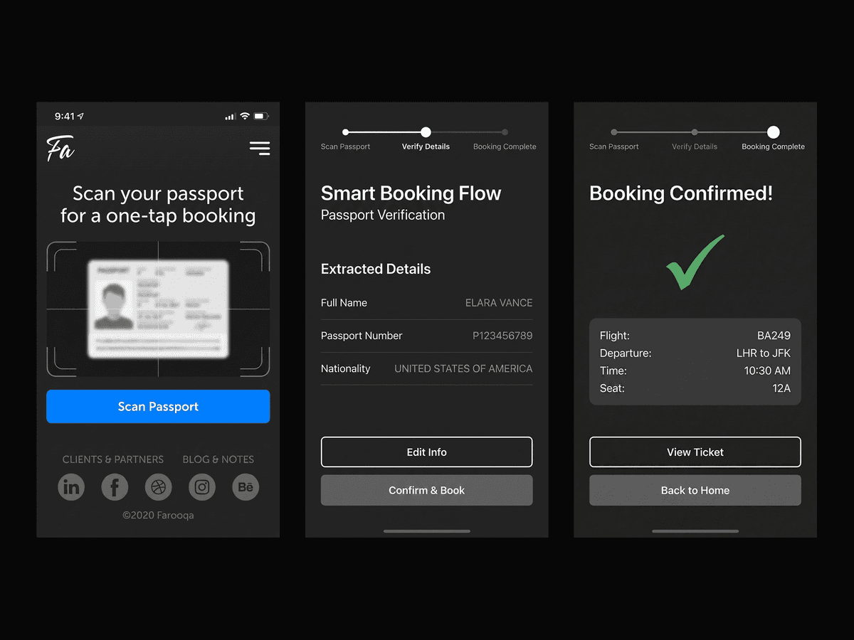
Smart Booking Flow
{"type":"doc","content":[{"type":"paragraph","attrs":{"textAlign":null},"content":[{"type":"text","text":"Book Instantly, Travel Smoothly — Smart Booking Flow turns passport scanning into a seamless, one-tap booking experience."}]},{"type":"image","attrs":{"src":"https://farooq-agent.web.app/assets/images/works/details/225-smart-booking-flow/smart-booking-flow.jpg","alt":null,"title":null,"width":null,"height":null}},{"type":"paragraph","attrs":{"textAlign":null},"content":[{"type":"text","marks":[{"type":"bold"}],"text":"Mobile App Concept — Smart Booking Flow"}]},{"type":"paragraph","attrs":{"textAlign":null},"content":[{"type":"text","marks":[{"type":"italic"}],"text":"Travel Tech · Smart Booking · Passport Scanning · UI/UX Design"}]},{"type":"paragraph","attrs":{"textAlign":null},"content":[{"type":"text","text":"A mobile application concept designed to simplify travel booking — Smart Booking Flow allows users to complete reservations instantly by scanning their passport, eliminating tedious form-filling and manual input."}]},{"type":"paragraph","attrs":{"textAlign":null},"content":[{"type":"text","text":"The experience focuses on speed, accuracy, and convenience. With camera-based scanning, personal and travel information is captured automatically, ensuring data integrity while reducing human error. Users can quickly verify details, confirm bookings, and receive instant confirmation, all within a streamlined flow."}]},{"type":"paragraph","attrs":{"textAlign":null},"content":[{"type":"text","text":"The interface likely emphasizes minimalism and clarity. Key actions — scan, verify, and confirm — are front and center, with clear feedback provided at each step. The design reduces friction and cognitive load, creating a confident and efficient booking journey."}]},{"type":"paragraph","attrs":{"textAlign":null},"content":[{"type":"text","text":"Smart Booking Flow positions itself as more than a transactional tool. It transforms the travel preparation experience into a smooth, guided process, enabling users to focus on their journey rather than administrative hassle."}]},{"type":"paragraph","attrs":{"textAlign":null},"content":[{"type":"text","text":"Visually, the design is expected to convey trust, security, and simplicity. Clear typography, intuitive progress indicators, and a calm color palette help communicate reliability and professionalism."}]},{"type":"paragraph","attrs":{"textAlign":null},"content":[{"type":"text","text":"This project reflects a modern approach to travel technology — where smart automation and thoughtful UX merge to create effortless, human-centered experiences."}]},{"type":"paragraph","attrs":{"textAlign":null},"content":[{"type":"text","text":"A refined exploration of how scanning technology can simplify complex processes — making booking not just faster, but smarter, safer, and more enjoyable."}]},{"type":"paragraph","attrs":{"textAlign":null}},{"type":"image","attrs":{"src":"https://hyperfantasy.web.app/assets/images/portfolios/2c976a44-5e4e-4340-b7f8-67195cc6f011/smart_booking_flow.png","alt":null,"title":null,"width":null,"height":null}},{"type":"paragraph","attrs":{"textAlign":null}}]}
One be You
{"type":"doc","content":[{"type":"paragraph","attrs":{"textAlign":null},"content":[{"type":"text","text":"From the ocean floor to the browser window — One Be You is a handcrafted HTML & CSS web presence built to bring fresh seafood and marine products directly to the customer's screen."}]},{"type":"image","attrs":{"src":"https://farooq-agent.web.app/assets/images/works/small/kfdWcO6B_work_image.jpg","alt":null,"title":null,"width":null,"height":null}},{"type":"paragraph","attrs":{"textAlign":null},"content":[{"type":"text","marks":[{"type":"bold"}],"text":"Web Development — One Be You"}]},{"type":"paragraph","attrs":{"textAlign":null},"content":[{"type":"text","marks":[{"type":"italic"}],"text":"Frontend Development · Fish & Sea Products Provider · HTML & CSS"}]},{"type":"paragraph","attrs":{"textAlign":null},"content":[{"type":"text","text":"A handcrafted frontend web development project for One Be You — a fish and sea products provider platform delivering fresh marine goods through a clean, purpose-built website. The project demonstrates focused frontend execution: semantic HTML structure, CSS styling, and a page layout optimized for a food retail audience operating in an East Asian market."}]},{"type":"paragraph","attrs":{"textAlign":null},"content":[{"type":"text","text":"The live website mockup reveals a well-organized seafood e-commerce interface — a prominent brand logo in the upper left, a full-width hero image of a working fish farm or aquaculture facility that immediately grounds the brand in authentic production, and a structured navigation menu in both Chinese and category-based organization. Product sections are clearly segmented, guiding the visitor from browsing to purchase with minimal friction."}]},{"type":"paragraph","attrs":{"textAlign":null},"content":[{"type":"text","text":"The open code editor alongside the live site is the portfolio's honest signature — raw HTML markup visible line by line, built by hand without shortcuts. Chinese-language navigation labels and href-linked menu items confirm a site built with cultural precision for its intended audience, not from a generic template."}]},{"type":"paragraph","attrs":{"textAlign":null},"content":[{"type":"text","text":"The dual-screen presentation — code on the left, live site on the right — communicates the fundamental truth of this project: every pixel of the interface was written, not dragged and dropped."}]},{"type":"paragraph","attrs":{"textAlign":null},"content":[{"type":"text","text":"A focused, market-specific web build that proves clean HTML and CSS, applied with intention, is still one of the most powerful tools in a developer's hands."}]}]}
GuluGulu Frontend Web Dev
{"type":"doc","content":[{"type":"paragraph","attrs":{"textAlign":null},"content":[{"type":"text","text":"Coded with the same energy it serves — Gulu Gulu's website is as bubbly, colorful, and irresistible as the drinks in its menu."}]},{"type":"image","attrs":{"src":"https://farooq-agent.web.app/assets/images/works/small/8yb4x85j_work_image.jpg","alt":null,"title":null,"width":null,"height":null}},{"type":"paragraph","attrs":{"textAlign":null},"content":[{"type":"text","marks":[{"type":"bold"}],"text":"Web Development — Gulu Gulu"}]},{"type":"paragraph","attrs":{"textAlign":null},"content":[{"type":"text","marks":[{"type":"italic"}],"text":"Frontend Development · Chinese Drink Brand · HTML & CSS"}]},{"type":"paragraph","attrs":{"textAlign":null},"content":[{"type":"text","text":"A vibrant, personality-packed frontend web project for Gulu Gulu (咕噜咕噜) — a Chinese drink brand whose onomatopoeic name mimics the satisfying sound of a drink being poured — glug, glug, glug. The web presence is built to match that energy entirely, delivering a visual experience as lively and appetite-stimulating as the brand itself."}]},{"type":"paragraph","attrs":{"textAlign":null},"content":[{"type":"text","text":"The design leads with the Gulu Gulu logo in full playful glory — the wordmark rendered in a warm gradient that flows from golden yellow to deep amber, with a fork and spoon cleverly integrated as the letter \"l\" stems, bridging the brand's drink identity with a broader food and beverage context. The Chinese characters 咕噜咕噜 sit alongside the Latin wordmark, ensuring equal cultural legibility for the brand's core audience."}]},{"type":"paragraph","attrs":{"textAlign":null},"content":[{"type":"text","text":"The background composition is a feast of overlapping colored circles — bold, rounded shapes in teal, red, olive, purple, and orange — an abstract visual language that communicates abundance, variety, and the layered, mixed-flavor world of specialty drinks. The decorative diamond-pattern footer band in warm copper adds a touch of cultural texture."}]},{"type":"paragraph","attrs":{"textAlign":null},"content":[{"type":"text","text":"The purple speech bubble icon containing the HTML "},{"type":"text","marks":[{"type":"code"}],"text":"</>"},{"type":"text","text":" code tag is a charming portfolio meta-element — a developer's signature embedded directly into the project thumbnail, signaling that what you see was handcrafted in HTML and CSS, line by line."}]},{"type":"paragraph","attrs":{"textAlign":null},"content":[{"type":"text","text":"A frontend build that proves a brand with this much personality deserves a website built with the same joy it was designed with."}]}]}
Inspiring Home Brand Value
{"type":"doc","content":[{"type":"paragraph","attrs":{"textAlign":null},"content":[{"type":"image","attrs":{"src":"https://farooq-agent.web.app/assets/images/works/small/DFN9VRZA_work_image.jpg","alt":null,"title":null,"width":300,"height":300}}]},{"type":"paragraph","attrs":{"textAlign":null},"content":[{"type":"text","text":" "},{"type":"text","marks":[{"type":"bold"}],"text":"Brand Identity Guidelines — Construction Brand"},{"type":"text","text":" "},{"type":"hardBreak"},{"type":"text","marks":[{"type":"italic"}],"text":"Logo & Stationery Design · Construction / Engineering Services"}]},{"type":"paragraph","attrs":{"textAlign":null},"content":[{"type":"text","text":"A sharp, geometry-driven brand identity for a construction services company, presented across a clean stationery suite that communicates structural precision and professional confidence. The identity system is anchored by a bold logomark constructed from isometric parallelogram forms — three interlocking planes in orange, dark orange, and slate grey — that together read as an abstracted architectural structure or assembled building component when viewed as a whole."}]},{"type":"paragraph","attrs":{"textAlign":null},"content":[{"type":"text","text":"The isometric perspective of the mark is a deliberate design choice: it evokes technical drawings, structural blueprints, and the three-dimensional thinking inherent in construction and engineering work. The layered planes also suggest depth, stability, and meticulous assembly — all core values of a credible construction brand."}]},{"type":"paragraph","attrs":{"textAlign":null},"content":[{"type":"text","text":"The color palette — energetic burnt orange paired with a grounding slate grey — strikes an effective balance between dynamism and dependability. Orange signals ambition, energy, and visibility on-site, while grey anchors the brand in technical rigor and trustworthiness."}]},{"type":"paragraph","attrs":{"textAlign":null},"content":[{"type":"text","text":"The stationery system — business cards, letterheads, and branded collateral — is presented in a clean flat-lay mockup that demonstrates how the identity scales gracefully from icon to full application. The white-dominant layout keeps the brand feeling clean and modern, avoiding the heaviness common in industrial branding."}]},{"type":"paragraph","attrs":{"textAlign":null},"content":[{"type":"text","text":"A confident, sector-appropriate identity that speaks the visual language of construction while maintaining a distinctly contemporary edge."}]}]}
Tunggal Jaya Steel Branding
{"type":"doc","content":[{"type":"image","attrs":{"src":"https://farooq-agent.web.app/assets/images/works/large/fO2zMMIq_work_image.png","alt":null,"title":null,"width":null,"height":null}},{"type":"paragraph","attrs":{"textAlign":null},"content":[{"type":"text","marks":[{"type":"bold"}],"text":"Brand Identity — PT. Tunggal Jaya Steel"},{"type":"text","text":" "},{"type":"hardBreak"},{"type":"text","marks":[{"type":"italic"}],"text":"Logo Design · Steel Manufacturing · Industrial Sector · Indonesia"}]},{"type":"paragraph","attrs":{"textAlign":null},"content":[{"type":"text","text":"A commanding monogram-based identity for PT. Tunggal Jaya Steel, presented on a deep textured dark card mockup that immediately evokes strength, precision, and industrial authority. The mark centers on a bold \"TJS\" lettermark — custom-crafted with strong geometric forms, deliberate negative space, and interlocking proportions that give the monogram a sense of engineered cohesion."}]},{"type":"paragraph","attrs":{"textAlign":null},"content":[{"type":"text","text":"The standout detail is the gold downward-pointing triangle that sits precisely atop the \"T\" — functioning simultaneously as a typographic crown and a symbolic arrowhead. In steel and construction contexts, this directional form speaks to structural load-bearing, precision targeting, and forward momentum. The gold accent against the silver-white letterforms creates a deliberate material contrast: steel meets gold, production meets prestige."}]},{"type":"paragraph","attrs":{"textAlign":null},"content":[{"type":"text","text":"The letterforms themselves are rendered in crisp, heavy-weight sans-serif geometry — clean cuts and sharp terminals that mirror the precision of steel fabrication. There is no excess, no decoration — only structural confidence. The full company name \"PT. TUNGGAL JAYA STEEL\" is set beneath in a restrained, widely-spaced uppercase type that reinforces the brand's corporate authority without competing with the monogram."}]},{"type":"paragraph","attrs":{"textAlign":null},"content":[{"type":"text","text":"Presented on a charcoal textured surface, the identity performs flawlessly — the silver-on-dark palette evoking brushed metal, embossed signage, and industrial heritage all at once."}]},{"type":"paragraph","attrs":{"textAlign":null},"content":[{"type":"text","text":"A refined, material-aware brand identity that earns its place at the gates of a steel factory and the cover of a corporate profile alike."}]}]}
Key Branding
{"type":"doc","content":[{"type":"image","attrs":{"src":"https://farooq-agent.web.app/assets/images/works/large/JPrR4n5n_work_image.jpg","alt":null,"title":null,"width":null,"height":null}},{"type":"paragraph","attrs":{"textAlign":null},"content":[{"type":"text","marks":[{"type":"bold"}],"text":"Brand Identity — Key"},{"type":"text","text":" "},{"type":"hardBreak"},{"type":"text","marks":[{"type":"italic"}],"text":"Logo Design · Agricultural Fertilizer Brand · Farming & Agribusiness"}]},{"type":"paragraph","attrs":{"textAlign":null},"content":[{"type":"text","text":"A quietly clever brand identity for Key — an agricultural fertilizer brand — that distills a complex dual promise into a single, elegantly integrated logomark. The design's central insight is the seamless fusion of two symbols: a leaf and a key, merged into one unified icon that sits atop the wordmark's ascending \"y\" stroke."}]},{"type":"paragraph","attrs":{"textAlign":null},"content":[{"type":"text","text":"The leaf form, rendered in a fresh, confident green, represents nature, growth, and agricultural vitality — the foundational values of any agri-brand. Embedded within it, a classic key silhouette rendered in white delivers the brand name literally while layering in a deeper symbolic meaning: this product is the "},{"type":"text","marks":[{"type":"italic"}],"text":"key"},{"type":"text","text":" to unlocking your soil's potential, the key to a better harvest, the key to agricultural prosperity. The concept is direct yet sophisticated — it rewards a second look."}]},{"type":"paragraph","attrs":{"textAlign":null},"content":[{"type":"text","text":"The wordmark \"Key\" is set in a warm, flowing script typeface in deep navy blue — a deliberate contrast to the category norm of bright greens and earthy browns. The navy lends the brand a sense of credibility and trustworthiness that sets it apart from more rustic competitors, while the handwritten character of the script keeps it approachable and human — important for a brand speaking to farmers and agronomists alike."}]},{"type":"paragraph","attrs":{"textAlign":null},"content":[{"type":"text","text":"Presented on a textured paper mockup, the logo demonstrates clean print performance and tactile warmth."}]},{"type":"paragraph","attrs":{"textAlign":null},"content":[{"type":"text","text":"A deceptively simple logo that carries real conceptual depth — the kind of identity that makes clients nod and say "},{"type":"text","marks":[{"type":"italic"}],"text":"\"of course, that's exactly right.\""}]}]}

Arroudhah branding
{"type":"doc","content":[{"type":"heading","attrs":{"textAlign":null,"level":1},"content":[{"type":"text","text":"Arroudhah branding"}]},{"type":"paragraph","attrs":{"textAlign":null},"content":[{"type":"image","attrs":{"src":"https://farooq-agent.web.app/assets/images/works/small/l4DKOS7A_work_image.jpg","alt":null,"title":null,"width":300,"height":300}}]},{"type":"paragraph","attrs":{"textAlign":null},"content":[{"type":"text","marks":[{"type":"bold"}],"text":"Brand Identity — Ar Raudhoh"},{"type":"text","text":" "},{"type":"hardBreak"},{"type":"text","marks":[{"type":"italic"}],"text":"Logo Design · Thibbun Nabawi · Islamic Herbal Medicine Brand"}]},{"type":"paragraph","attrs":{"textAlign":null},"content":[{"type":"text","text":"A beautifully composed brand identity for Ar Raudhoh — a Thibbun Nabawi herbal medicine brand specializing in prophetic remedies such as habbatussauda, propolis, honey, and other Nabawy medicines. Every element of this identity speaks the visual language of Islamic heritage, spiritual trust, and natural purity."}]},{"type":"paragraph","attrs":{"textAlign":null},"content":[{"type":"text","text":"The centerpiece is an Arabic calligraphic emblem — the brand name rendered in elegant classical script, enclosed within a teardrop-leaf form that simultaneously evokes a drop of honey, a seed of habbatussauda, and a divine mercy symbol. The calligraphy is fluid yet precise, communicating deep reverence for the prophetic tradition from which these remedies originate. The teardrop enclosure is a powerful visual metaphor: pure essence, distilled from nature and faith."}]},{"type":"paragraph","attrs":{"textAlign":null},"content":[{"type":"text","text":"The wordmark \"Ar Raudhoh\" is set in a graceful, flowing serif script — warm, organic, and culturally resonant — while the tagline "},{"type":"text","marks":[{"type":"italic"}],"text":"\"Thibbun Nabawi\""},{"type":"text","text":" beneath is rendered in an equally refined italic hand, immediately anchoring the brand within the world of prophetic medicine for its Muslim audience."}]},{"type":"paragraph","attrs":{"textAlign":null},"content":[{"type":"text","text":"The color palette — deep forest green and warm antique gold — is one of the most powerful combinations in Islamic visual culture. Green carries the weight of paradise, the Prophet's banner, and natural life; gold signals purity, divine blessing, and premium quality. Together on a textured dark green card surface, they create an identity that feels at home in both a premium apothecary and a mosque gift shop."}]},{"type":"paragraph","attrs":{"textAlign":null},"content":[{"type":"text","text":"A brand identity that earns deep trust from its audience before a single product is opened — because it speaks their spiritual language fluently. "}]}]}
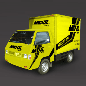
Max Tape Branding Needs
{"type":"doc","content":[{"type":"heading","attrs":{"textAlign":null,"level":1},"content":[{"type":"text","text":"Max Tape Branding Needs"}]},{"type":"paragraph","attrs":{"textAlign":null},"content":[{"type":"image","attrs":{"src":"https://farooq-agent.web.app/assets/images/works/small/X3I1blAQ_work_image.png","alt":null,"title":null,"width":1140,"height":1140}}]},{"type":"paragraph","attrs":{"textAlign":null},"content":[{"type":"text","marks":[{"type":"bold"}],"text":"Brand Identity — MAX TAPE"},{"type":"text","text":" "},{"type":"hardBreak"},{"type":"text","marks":[{"type":"italic"}],"text":"Vehicle Branding & Visual Identity · Adhesive Tape Manufacturer · FMCG / Industrial"}]},{"type":"paragraph","attrs":{"textAlign":null},"content":[{"type":"text","text":"A high-impact vehicle branding execution for MAX TAPE — an adhesive tape brand — that transforms a compact delivery truck into a rolling billboard of raw commercial energy. The design is built on an unmissable combination of electric yellow and bold black, a pairing that demands attention on any road or warehouse floor and carries immediate associations with caution, power, and industrial utility."}]},{"type":"paragraph","attrs":{"textAlign":null},"content":[{"type":"text","text":"The \"MAX TAPE\" logotype is rendered in a heavy, italicized custom typeface with aggressive forward momentum — the slanted letterforms convey speed, reliability, and the no-nonsense character of a brand that means business. The logo appears multiple times across the vehicle's surfaces — bonnet, door panels, and cargo box — ensuring brand visibility from every angle and distance."}]},{"type":"paragraph","attrs":{"textAlign":null},"content":[{"type":"text","text":"Dynamic diagonal stripe elements sweep across the cargo body in black, creating a sense of motion even when the vehicle is stationary. The tagline "},{"type":"text","marks":[{"type":"italic"}],"text":"\"STICK BETTER\""},{"type":"text","text":" is set prominently on a black band across the cargo panel, a confident brand promise delivered with the bluntness of a brand that knows exactly what it does and does it well."}]},{"type":"paragraph","attrs":{"textAlign":null},"content":[{"type":"text","text":"The 3D vehicle mockup presentation is a sophisticated portfolio choice — demonstrating not just logo design, but a full understanding of how brand identity wraps, scales, and performs across three-dimensional real-world surfaces."}]},{"type":"paragraph","attrs":{"textAlign":null},"content":[{"type":"text","text":"A viscerally effective piece of applied branding that communicates MAX TAPE's core promise — strength, visibility, and grip — in every element of its execution. "}]}]}
Welco Logo Guideline
{"type":"doc","content":[{"type":"paragraph","attrs":{"textAlign":null},"content":[{"type":"text","text":"Sweet precision — Welco's brand guide treats every curve of its logo with the same care its chocolate deserves."}]},{"type":"image","attrs":{"src":"https://farooq-agent.web.app/assets/images/works/large/2paQkfmi_work_image.jpg","alt":null,"title":null,"width":null,"height":null}},{"type":"paragraph","attrs":{"textAlign":null},"content":[{"type":"text","marks":[{"type":"bold"}],"text":"Brand Guidelines — Welco"}]},{"type":"paragraph","attrs":{"textAlign":null},"content":[{"type":"text","marks":[{"type":"italic"}],"text":"Logo Guide · Brand Perfection Document · Chocolate Company"}]},{"type":"paragraph","attrs":{"textAlign":null},"content":[{"type":"text","text":"A meticulous logo guideline document for Welco — a chocolate brand — presented as a formal \"Brand Guide: Perfecting Logo\" sheet that deconstructs the mark with the precision of a master confectioner measuring every ingredient to the gram."}]},{"type":"paragraph","attrs":{"textAlign":null},"content":[{"type":"text","text":"The Welco logomark is a bold, retro-styled wordmark set within a softly beveled octagonal badge — the signature form of classic confectionery branding. A confident script \"Welco\" sweeps across the center with warm, nostalgic energy, flanked by a smooth underline flourish that adds a handcrafted finish to an otherwise structured composition. The badge format evokes heritage quality, tin packaging, and the timeless appeal of a chocolate brand that has earned its reputation."}]},{"type":"paragraph","attrs":{"textAlign":null},"content":[{"type":"text","text":"The construction grid overlay — spacing marks, proportional guides, anchor indicators — demonstrates the design rigor behind what appears effortlessly classic. Presented on a deep red surface that mirrors the brand's appetite-stimulating color territory, the document is as considered as the logo it governs."}]}]}
Sungwoo Company Profile - Printed
{"type":"doc","content":[{"type":"paragraph","attrs":{"textAlign":null},"content":[{"type":"text","text":"When a factory's core promise is quality — its company profile needs to say so the moment it lands on the table, and Sungwoo's does exactly that."}]},{"type":"image","attrs":{"src":"https://farooq-agent.web.app/assets/images/works/large/floXG9HQ_work_image.png","alt":null,"title":null,"width":null,"height":null}},{"type":"paragraph","attrs":{"textAlign":null},"content":[{"type":"text","marks":[{"type":"bold"}],"text":"Print Design — Sungwoo Company Profile"}]},{"type":"paragraph","attrs":{"textAlign":null},"content":[{"type":"text","marks":[{"type":"italic"}],"text":"Printed Corporate Document · Seat Belt Manufacturer · Industrial"}]},{"type":"paragraph","attrs":{"textAlign":null},"content":[{"type":"text","text":"A clean, landscape-format company profile for Sungwoo — a seat belt manufacturing company — built around a single, unambiguous brand promise: \"Quality Is Our Concern.\" The cover delivers that message with architectural directness, letting the words do the weight-bearing work while the layout frames them with professional confidence."}]},{"type":"paragraph","attrs":{"textAlign":null},"content":[{"type":"text","text":"The cover composition leads with a full-bleed photograph of the Sungwoo factory building — a modern, well-maintained industrial facility with bold yellow and blue accent panels that signal a company investing in its physical infrastructure as seriously as its product quality. The building photography is a deliberate choice: for a manufacturer, the factory is the portfolio. Showing it proudly is a trust signal."}]},{"type":"paragraph","attrs":{"textAlign":null},"content":[{"type":"text","text":"The Sungwoo logo anchors the upper left — a circular mark in deep blue, communicating precision and reliability — beside the company name in a clean corporate typeface. The label \"Company Profile\" sits in the upper right, understated and properly positioned. The tagline \"Quality Is Our Concern\" is set in a bold, wide-spaced display treatment across the cover's right panel — confident, direct, and manufacturer-appropriate in tone."}]},{"type":"paragraph","attrs":{"textAlign":null},"content":[{"type":"text","text":"The landscape orientation is a considered format choice for an industrial company profile, lending the document a horizontal, stable gravitas that mirrors the physical product it represents."}]},{"type":"paragraph","attrs":{"textAlign":null},"content":[{"type":"text","text":"A company profile that opens with the same reliability its seat belts are built to deliver."}]}]}
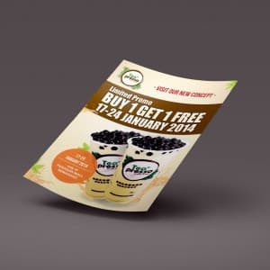
Teapresso Flyer
{"type":"doc","content":[{"type":"paragraph","attrs":{"textAlign":null},"content":[{"type":"text","text":"Buy 1 Get 1 Free — three words that sell themselves, and a flyer design that makes sure nobody misses them."}]},{"type":"image","attrs":{"src":"https://farooq-agent.web.app/assets/images/works/large/kzsxStpE_work_image.jpg","alt":null,"title":null,"width":null,"height":null}},{"type":"paragraph","attrs":{"textAlign":null},"content":[{"type":"text","marks":[{"type":"bold"}],"text":"Flyer Design — Teapresso"}]},{"type":"paragraph","attrs":{"textAlign":null},"content":[{"type":"text","marks":[{"type":"italic"}],"text":"Promotional Flyer · Boba Drink Brand · Limited Promo · 2014"}]},{"type":"paragraph","attrs":{"textAlign":null},"content":[{"type":"text","text":"A punchy promotional flyer for Teapresso — a boba drink brand — announcing a Buy 1 Get 1 Free limited offer running January 17–24, 2014. The design leads with exactly what a promo flyer must lead with: the deal, large, bold, and impossible to walk past."}]},{"type":"paragraph","attrs":{"textAlign":null},"content":[{"type":"text","text":"The deep chocolate brown header band dominates the upper half, carrying the \"BUY 1 GET 1 FREE\" headline in massive white display type — high contrast, high urgency. Below, two Teapresso boba cups loaded with pearls spill out across a warm cream background, the product photography doing the appetite work the headline can't. An orange circular badge on the lower left reinforces the date and location details in a layout that balances promotion with brand warmth."}]},{"type":"paragraph","attrs":{"textAlign":null},"content":[{"type":"text","text":"A flyer that converts browsers into buyers — one pearl tea at a time."}]}]}
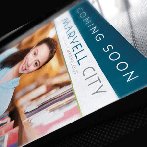
Marvell City Advertisement Needs
{"type":"doc","content":[{"type":"paragraph","attrs":{"textAlign":null},"content":[{"type":"text","text":"A property advertisement for Marvell City — an integrated real estate development that sells not just a home, but an entire lifestyle within a single connected area."}]},{"type":"image","attrs":{"src":"https://farooq-agent.web.app/assets/images/works/large/WzbjTjVN_work_image.png","alt":null,"title":null,"width":null,"height":null}},{"type":"paragraph","attrs":{"textAlign":null},"content":[{"type":"text","marks":[{"type":"bold"}],"text":"Graphic Design — Marvell City Advertisement"}]},{"type":"paragraph","attrs":{"textAlign":null},"content":[{"type":"text","marks":[{"type":"italic"}],"text":"Advertisement · Property · Real Estate · Integrated Area"}]},{"type":"paragraph","attrs":{"textAlign":null},"content":[{"type":"text","text":"A promotional advertisement designed for Marvell City, a large-scale integrated property development combining residential, commercial, and lifestyle zones within one master-planned area. The visual direction is built to communicate scale, prestige, and completeness — the kind of environment where residents can live, work, shop, and unwind without ever leaving the development."}]},{"type":"paragraph","attrs":{"textAlign":null},"content":[{"type":"text","text":"The design balances aspirational property photography with clear messaging hierarchy, guiding the viewer from headline to supporting copy to CTA in a single visual flow. Key selling points of an integrated area — connectivity, facilities, and community — are communicated through layout and imagery choices that position Marvell City as more than just real estate; it's a complete urban living ecosystem."}]},{"type":"paragraph","attrs":{"textAlign":null},"content":[{"type":"text","text":"Built for placement across print, digital, and outdoor advertising formats."}]}]}
Cap Tawon - Exhibition Needs
{"type":"doc","content":[{"type":"paragraph","attrs":{"textAlign":null},"content":[{"type":"text","text":"From the same trusted family — Cap Tawon brings its iconic wasp identity to the fields, and its exhibition design makes sure every farmer in the room takes notice."}]},{"type":"image","attrs":{"src":"https://farooq-agent.web.app/assets/images/works/large/BbXf8YdB_work_image.png","alt":null,"title":null,"width":null,"height":null}},{"type":"paragraph","attrs":{"textAlign":null},"content":[{"type":"text","marks":[{"type":"bold"}],"text":"Exhibition Design — Cap Tawon"}]},{"type":"paragraph","attrs":{"textAlign":null},"content":[{"type":"text","marks":[{"type":"italic"}],"text":"Poster, Banner & Booth Design · Agricultural Fertilizer · Trade Exhibition"}]},{"type":"paragraph","attrs":{"textAlign":null},"content":[{"type":"text","text":"A complete exhibition design suite for Cap Tawon — a well-established agricultural fertilizer brand and part of the broader Cap Tawon group — bringing its iconic red wasp identity into the trade exhibition environment with confidence and brand consistency."}]},{"type":"paragraph","attrs":{"textAlign":null},"content":[{"type":"text","text":"The poster design establishes the visual system across all exhibition touchpoints. A fresh lime green header band — the natural color of agriculture, growth, and soil vitality — anchors the brand's farming identity immediately. A subtle hexagonal pattern overlays the green field, referencing both the wasp's natural world and the molecular precision of modern fertilizer formulation."}]},{"type":"paragraph","attrs":{"textAlign":null},"content":[{"type":"text","text":"The Cap Tawon wasp mascot is centered in a clean architectural arch cutout at the crown of the composition — a brand placement device that frames the mark with authority, as if the wasp itself is presiding over the booth below. The red wasp illustration, with its decades of brand equity in the Indonesian agricultural market, needs no explanation to its audience — farmers across Java know it on sight."}]},{"type":"paragraph","attrs":{"textAlign":null},"content":[{"type":"text","text":"The generous white lower panel provides practical space for product range display, agronomic benefit claims, and event-specific calls to action — designed to scale from A2 poster to roll-up banner to full booth fascia without losing visual integrity."}]},{"type":"paragraph","attrs":{"textAlign":null},"content":[{"type":"text","text":"An exhibition identity built for the field and the floor — recognizable at distance, credible up close."}]}]}
Ledtron Packaging Design
{"type":"doc","content":[{"type":"paragraph","attrs":{"textAlign":null},"content":[{"type":"text","text":"When a light bulb's packaging outshines the competition before it's even switched on — that's the power of great product design."}]},{"type":"image","attrs":{"src":"https://farooq-agent.web.app/assets/images/works/large/cPxTb9QG_work_image.jpg","alt":null,"title":null,"width":null,"height":null}},{"type":"paragraph","attrs":{"textAlign":null},"content":[{"type":"text","marks":[{"type":"bold"}],"text":"Packaging Design — Ledtron HiPER"}]},{"type":"paragraph","attrs":{"textAlign":null},"content":[{"type":"text","marks":[{"type":"italic"}],"text":"Product Packaging · High Performance LED · Electronics Retail"}]},{"type":"paragraph","attrs":{"textAlign":null},"content":[{"type":"text","text":"A striking product packaging design for Ledtron's HiPER — High Performance LED — a premium LED lighting product that needed packaging to match its technical ambition. The result is a box design that commands retail shelf presence with the same confidence its bulb commands a room."}]},{"type":"paragraph","attrs":{"textAlign":null},"content":[{"type":"text","text":"The packaging adopts a deep charcoal black as its primary surface — a bold departure from the typically bright, clinical whites of the electronics lighting category. Against this dark canvas, warm gold and amber tones cascade from the upper left — a deliberate light-burst graphic that mimics the warm glow of the LED itself, turning the packaging into a demonstration of the product's output before the box is even opened."}]},{"type":"paragraph","attrs":{"textAlign":null},"content":[{"type":"text","text":"The product name \"HiPER\" is set in a large, confident display typeface in warm gold — premium, technical, and instantly legible across retail distances. The LED badge, Ledtron snowflake logomark, and product photography of the MR-type LED bulb are organized with clear hierarchy across the face panel, while the side panel carries full technical specifications for the informed buyer. Key selling points — \"Brighter & More Efficient,\" 5-year warranty, 120 lumens — are surfaced in bold callout badges that speak directly to the performance-conscious consumer."}]},{"type":"paragraph","attrs":{"textAlign":null},"content":[{"type":"text","text":"Presented as a two-box 3D mockup on a clean reflective surface, the packaging demonstrates strong three-dimensional design thinking — every visible face is designed, not just the front."}]},{"type":"paragraph","attrs":{"textAlign":null},"content":[{"type":"text","text":"A packaging design that positions HiPER exactly where it belongs: at the premium end of the shelf."}]}]}
PADI Company Profile - Printed
{"type":"doc","content":[{"type":"paragraph","attrs":{"textAlign":null},"content":[{"type":"text","text":"When a company claims International Standard — its documents need to look the part, and PADI's printed company profile delivers exactly that."}]},{"type":"image","attrs":{"src":"https://farooq-agent.web.app/assets/images/works/large/xUZ4eZNt_work_image.jpg","alt":null,"title":null,"width":null,"height":null}},{"type":"paragraph","attrs":{"textAlign":null},"content":[{"type":"text","marks":[{"type":"bold"}],"text":"Print Design — PADI Company Profile"}]},{"type":"paragraph","attrs":{"textAlign":null},"content":[{"type":"text","marks":[{"type":"italic"}],"text":"Printed Corporate Document · Company Profile Design · International Standard"}]},{"type":"paragraph","attrs":{"textAlign":null},"content":[{"type":"text","text":"A clean, professionally composed printed company profile for PADI — a company positioning itself firmly in the international market with the tagline \"We bring our products to the next level.\" The cover design communicates that ambition with quiet confidence through a masterfully restrained layout."}]},{"type":"paragraph","attrs":{"textAlign":null},"content":[{"type":"text","text":"The cover is split across two distinct visual zones: the upper two-thirds is a crisp, expansive white field — clean, premium, and uncluttered — bearing only the PADI logo in the upper left corner. The logomark is a geometric hexagonal form in teal, paired with the wordmark \"PADI\" in a sharp sans-serif — a mark that reads as modern, trustworthy, and internationally oriented."}]},{"type":"paragraph","attrs":{"textAlign":null},"content":[{"type":"text","text":"The lower third introduces a soft teal wash populated with a low-poly triangular geometric pattern — layered facets of varying opacity creating depth and dimension without visual noise. Against this structured background, the cover headline \"International Standard\" is set in a large, elegant italic serif — unhurried and authoritative — with the supporting tagline \"we bring our products to the next level\" flowing beneath in a lighter script, maintaining the document's aspirational tone."}]},{"type":"paragraph","attrs":{"textAlign":null},"content":[{"type":"text","text":"The deliberate restraint of the design is its greatest strength: white space used as a premium signal, teal as a color of precision and global credibility, geometry as a mark of technical sophistication. Every element earns its place."}]},{"type":"paragraph","attrs":{"textAlign":null},"content":[{"type":"text","text":"Presented as a tilted print mockup on a soft white surface, the document carries the weight of a brand that takes its international credentials as seriously as its product quality."}]}]}
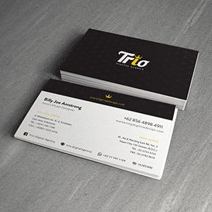
Trio Stationary
{"type":"doc","content":[{"type":"paragraph","attrs":{"textAlign":null},"content":[{"type":"text","text":"First impressions are permanent — Trio Digital Agency's business card stationery makes every handshake count with a design as sharp as the agency behind it."}]},{"type":"image","attrs":{"src":"https://farooq-agent.web.app/assets/images/works/large/xYB0FX57_work_image.png","alt":null,"title":null,"width":null,"height":null}},{"type":"paragraph","attrs":{"textAlign":null},"content":[{"type":"text","marks":[{"type":"bold"}],"text":"Stationery Design — Trio Digital Agency"}]},{"type":"paragraph","attrs":{"textAlign":null},"content":[{"type":"text","marks":[{"type":"italic"}],"text":"Business Card Design · Corporate Identity · Digital Agency · Indonesia & Taiwan"}]},{"type":"paragraph","attrs":{"textAlign":null},"content":[{"type":"text","text":"A sleek, premium business card design for Trio Digital Agency — a digital agency with dual offices in Surabaya, Indonesia and Taipei, Taiwan — presenting a stationery system that matches the sophistication any design-forward agency demands of its own brand collateral."}]},{"type":"paragraph","attrs":{"textAlign":null},"content":[{"type":"text","text":"The card system employs a bold two-sided design with maximum visual contrast: the front face is a striking all-black card bearing the Trio logotype in crisp white — the wordmark \"Trio\" set in a confident display typeface with the \"i\" dotted by a gold crown icon, a small but commanding detail that elevates the mark from wordmark to symbol of creative authority. The gold accent against deep black is a timeless premium pairing, immediately signaling a studio that operates at a higher standard."}]},{"type":"paragraph","attrs":{"textAlign":null},"content":[{"type":"text","text":"The reverse side flips to a clean white layout — a contact information card of architectural precision, organizing dual-office details, phone numbers, email, website, and social handles (including @triodigitalagency) with typographic clarity across two columns. The information hierarchy is immaculate: name and title anchored at top-left, contact details organized by office location, each section separated by subtle dividers that maintain order without adding visual noise."}]},{"type":"paragraph","attrs":{"textAlign":null},"content":[{"type":"text","text":"The stacked card mockup on a grey concrete surface — one card face-up revealing the contact side, the full stack face-down showing the black brand face — is a classic presentation technique that demonstrates the full two-sided design system in a single composition."}]},{"type":"paragraph","attrs":{"textAlign":null},"content":[{"type":"text","text":"A business card that does exactly what great stationery should: make the agency's work feel inevitable before a single brief has been discussed."}]}]}
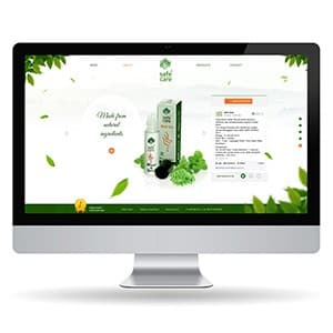
SafeCare - Website Design 3.0
{"type":"doc","content":[{"type":"paragraph","attrs":{"textAlign":null},"content":[{"type":"text","text":"Made from natural ingredients — SafeCare's website 3.0 wraps one of Indonesia's most trusted aromatherapy brands in a lush, botanical design that feels as natural as the product itself."}]},{"type":"image","attrs":{"src":"https://farooq-agent.web.app/assets/images/works/large/XcS4zjBi_work_image.jpg","alt":null,"title":null,"width":null,"height":null}},{"type":"paragraph","attrs":{"textAlign":null},"content":[{"type":"text","marks":[{"type":"bold"}],"text":"Web Design — SafeCare 3.0"}]},{"type":"paragraph","attrs":{"textAlign":null},"content":[{"type":"text","marks":[{"type":"italic"}],"text":"Product Website · Aromatherapy & Natural Health"}]},{"type":"paragraph","attrs":{"textAlign":null},"content":[{"type":"text","text":"A richly botanical website redesign for Safe Care — Indonesia's iconic aromatherapy brand known for its minyak angin and natural essential oil products. The design direction is immersive and nature-forward: cascading green leaves frame the layout from every edge, creating the feeling of browsing from inside a living herb garden rather than a product page."}]},{"type":"paragraph","attrs":{"textAlign":null},"content":[{"type":"text","text":"The hero section presents a single product — the Safe Care roll-on — center stage against a white background, with the tagline \"Made from natural ingredients\" in an elegant script that leads directly into a product detail panel on the right. This side-by-side hero layout is a deliberate e-commerce UX choice: it puts product information (description, variants, CTA) at immediate reach without requiring a scroll, reducing friction between discovery and purchase."}]},{"type":"paragraph","attrs":{"textAlign":null},"content":[{"type":"text","text":"The dark green footer strip with icon-based benefit highlights — ingredients, pricing, product range, sustainability — compresses the brand's trust signals into a single, scannable band. The overall system is warm, organic, and consistent: a brand that has been around for decades, given a web presence that finally matches its product quality."}]}]}
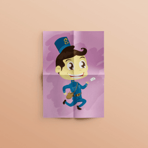
Pak Pos Illustration
{"type":"doc","content":[{"type":"paragraph","attrs":{"textAlign":null},"content":[{"type":"text","text":"Mid-stride, letter in hand, hat slightly tilted — Pak Pos is the kind of spontaneous illustration that reminds you why you started designing in the first place."}]},{"type":"image","attrs":{"src":"https://farooq-agent.web.app/assets/images/works/details/140-pak-pos-illustration/pak-pos.jpg","alt":null,"title":null,"width":null,"height":null}},{"type":"paragraph","attrs":{"textAlign":null},"content":[{"type":"text","marks":[{"type":"bold"}],"text":"Illustration — Pak Pos"}]},{"type":"paragraph","attrs":{"textAlign":null},"content":[{"type":"text","marks":[{"type":"italic"}],"text":"Character Illustration · Indonesian Postman · Spontaneous Personal Work"}]},{"type":"paragraph","attrs":{"textAlign":null},"content":[{"type":"text","text":"A charming, warmly personal illustration of Pak Pos — the Indonesian postman — created spontaneously at the request of a friend, and carrying all the lightness and joy that comes from making something simply because someone asked and the answer was yes."}]},{"type":"paragraph","attrs":{"textAlign":null},"content":[{"type":"text","text":"The character is a chibi-proportioned postal worker in a smart teal-blue uniform — pillbox cap bearing a gold \"S\" emblem, matching jacket and trousers with a gold belt buckle — caught mid-stride in a jaunty running pose, one letter clutched in his outstretched hand. The pose communicates urgency with delight: this is not a postman trudging through his route, but one who genuinely loves the act of delivering something to someone."}]},{"type":"paragraph","attrs":{"textAlign":null},"content":[{"type":"text","text":"The character's face is the illustration's most expressive detail: large, sparkle-dot eyes, a wide satisfied grin with a subtle dimple, and a swept curl of dark hair peeking beneath the cap — a face that belongs equally to a children's book character and a brand mascot, drawn with the kind of confident expressiveness that only comes from genuine enjoyment of the craft."}]},{"type":"paragraph","attrs":{"textAlign":null},"content":[{"type":"text","text":"A soft lavender-purple background with organic cloud-like abstract shapes gives the piece a dreamy, nostalgic quality — warm and personal rather than polished and commercial. The folded paper presentation places the illustration in the context of something made to be given, passed between hands, just like the letter Pak Pos carries."}]},{"type":"paragraph","attrs":{"textAlign":null},"content":[{"type":"text","text":"A piece that asks nothing of the viewer except to smile — and delivers on that promise completely."}]}]}
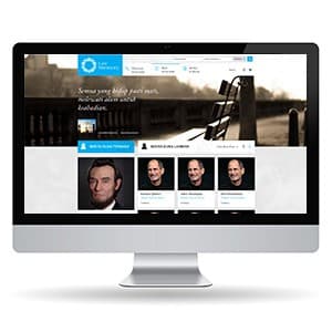
Last Memory - Website Design
{"type":"doc","content":[{"type":"paragraph","attrs":{"textAlign":null},"content":[{"type":"text","text":"Semua yang hidup pasti mati — Last Memory gives every life a permanent, dignified place on the internet to be remembered."}]},{"type":"image","attrs":{"src":"https://farooq-agent.web.app/assets/images/works/large/Wfjozuza_work_image.jpg","alt":null,"title":null,"width":null,"height":null}},{"type":"paragraph","attrs":{"textAlign":null},"content":[{"type":"text","marks":[{"type":"bold"}],"text":"Web Design — Last Memory"}]},{"type":"paragraph","attrs":{"textAlign":null},"content":[{"type":"text","marks":[{"type":"italic"}],"text":"Online Obituary Platform · Digital Memorial · Funeral Service Web"}]},{"type":"paragraph","attrs":{"textAlign":null},"content":[{"type":"text","text":"A thoughtful, emotionally considered website design for Last Memory — an online obituary and digital memorial platform that allows families to create lasting tributes for their loved ones."}]},{"type":"paragraph","attrs":{"textAlign":null},"content":[{"type":"text","text":"The hero opens with a sepia-toned photograph of an empty bench in a quiet park — a universal symbol of absence and remembrance — overlaid with the poetic headline \"Semua yang hidup pasti mati, melewati alam untuk keabadian.\" (Everything that lives must die, passing through the world toward eternity). The tone is set: this is not a transaction platform, it is a place of meaning."}]},{"type":"paragraph","attrs":{"textAlign":null},"content":[{"type":"text","text":"The Last Memory logo — a circular wreath-like mark — appears in blue on the dark header, with quick-access contact channels (phone, live chat) surfaced prominently for families navigating grief in real time. The profile grid below displays memorial pages — each a portrait and name, a person's digital legacy — organized in a clean card layout that treats every life with equal dignity."}]},{"type":"paragraph","attrs":{"textAlign":null},"content":[{"type":"text","text":"The blue and grey palette is calm and respectful without being clinical — a design that holds grief gently while remaining fully functional as a service platform."}]},{"type":"paragraph","attrs":{"textAlign":null},"content":[{"type":"text","text":"A rare UX challenge handled with real sensitivity: designing for users at their most vulnerable."}]}]}
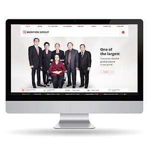
Maspion - Website Design
{"type":"doc","content":[{"type":"paragraph","attrs":{"textAlign":null},"content":[{"type":"text","text":"One of the largest consumer durable good producers in the world — Maspion Group's website exploration gives Indonesia's most iconic manufacturing conglomerate a digital presence that finally matches its scale."}]},{"type":"image","attrs":{"src":"https://farooq-agent.web.app/assets/images/works/large/QN7khuOA_work_image.jpg","alt":null,"title":null,"width":null,"height":null}},{"type":"paragraph","attrs":{"textAlign":null},"content":[{"type":"text","marks":[{"type":"bold"}],"text":"Web Design Exploration — Maspion Group"}]},{"type":"paragraph","attrs":{"textAlign":null},"content":[{"type":"text","marks":[{"type":"italic"}],"text":"Corporate Group Website · Consumer Goods Manufacturer · Indonesia"}]},{"type":"paragraph","attrs":{"textAlign":null},"content":[{"type":"text","text":"A corporate website exploration for Maspion Group — one of Indonesia's largest and most recognized conglomerates, manufacturing everything from household appliances to building materials under the iconic Maspion brand."}]},{"type":"paragraph","attrs":{"textAlign":null},"content":[{"type":"text","text":"The hero is a leadership portrait: the founding family and executive team photographed with the quiet gravitas of an institution that has shaped Indonesian manufacturing for decades. The editorial photography approach — formal, composed, studio-lit — is the right choice for a group website where the primary audience is investors, business partners, and regulators as much as consumers."}]},{"type":"paragraph","attrs":{"textAlign":null},"content":[{"type":"text","text":"\"One of the largest consumer durable good producers in the world\" positioned right of the portrait is a bold, factual claim delivered without embellishment — the confidence of a brand that doesn't need to oversell. The red accent on the Maspion Group logo and the ticker-style news band at the bottom add the institutional signals of a publicly listed, multi-division corporation."}]},{"type":"paragraph","attrs":{"textAlign":null},"content":[{"type":"text","text":"Navigation spans the full audience map: Home, About, For Consumer, For Business, Services, Career, Contact Us, Subscribe — a site that serves every stakeholder from day one."}]}]}

Drg Daniel - Website Design
{"type":"doc","content":[{"type":"paragraph","attrs":{"textAlign":null},"content":[{"type":"text","text":"Welcome to Dr. Daniel Dentistry — a clinic website as clean and reassuring as the smile it promises to deliver."}]},{"type":"image","attrs":{"src":"https://farooq-agent.web.app/assets/images/works/small/iwjqr1lJ_work_image.jpg","alt":null,"title":null,"width":null,"height":null}},{"type":"paragraph","attrs":{"textAlign":null},"content":[{"type":"text","marks":[{"type":"bold"}],"text":"Web Design — Dr. Daniel Dentistry"}]},{"type":"paragraph","attrs":{"textAlign":null},"content":[{"type":"text","marks":[{"type":"italic"}],"text":"Dental Clinic Website · Surabaya"}]},{"type":"paragraph","attrs":{"textAlign":null},"content":[{"type":"text","text":"A bright, confidence-building website for Dr. Daniel Dentistry — a dental clinic in Surabaya. The design leads with the doctor himself: Dr. Daniel appears in the hero alongside dental equipment, immediately establishing personal credibility and human warmth in a category where patient anxiety is real."}]},{"type":"paragraph","attrs":{"textAlign":null},"content":[{"type":"text","text":"The \"Welcome to Dr. Daniel Dentistry\" headline with dual CTAs — Features and Services — gets visitors to the information they need without friction. The all-white palette with teal accents communicates clinical cleanliness while keeping the overall tone approachable rather than cold."}]},{"type":"paragraph","attrs":{"textAlign":null},"content":[{"type":"text","text":"The four-icon strip below — Dental Cases, Recommended Treatments, Latest News, Dental Tips — is a smart UX structure: it serves both first-time patients (who want to understand the clinic) and returning patients (who want specific information), in a single scannable row."}]},{"type":"paragraph","attrs":{"textAlign":null},"content":[{"type":"text","text":"A clinic website that makes the dentist look like someone you'd trust before you've even called."}]}]}
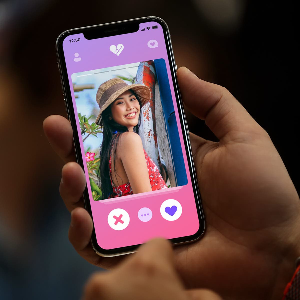
Tresnan
{"type":"doc","content":[{"type":"paragraph","attrs":{"textAlign":null},"content":[{"type":"text","text":"Tresnan — the Balinese word for love — is a dating app that carries its cultural identity in its name and delivers it through every pixel of its warm, intimate design."}]},{"type":"image","attrs":{"src":"https://farooq-agent.web.app/assets/images/works/details/248-tresnan/tresnan.jpg","alt":null,"title":null,"width":null,"height":null}},{"type":"paragraph","attrs":{"textAlign":null},"content":[{"type":"text","marks":[{"type":"bold"}],"text":"App UI Design — Tresnan"}]},{"type":"paragraph","attrs":{"textAlign":null},"content":[{"type":"text","marks":[{"type":"italic"}],"text":"Mobile App · Dating App · Balinese Culture · Indonesia"}]},{"type":"paragraph","attrs":{"textAlign":null},"content":[{"type":"text","text":"A warm, culturally grounded dating app UI for Tresnan — whose name comes from the Balinese/Javanese word \"tresna\" meaning love or affection — a platform designed to bring the spirit of Balinese romantic culture into the modern swipe-based dating format."}]},{"type":"paragraph","attrs":{"textAlign":null},"content":[{"type":"text","text":"The single hero screen shows the core discovery interaction: a full-bleed profile photo of a young Balinese woman in a red floral dress and woven hat, smiling against a colorful Bali-textured backdrop — natural, warm, and culturally specific in its photographic identity. The photography is editorial in quality, communicating that this is a platform that takes its users' presentation seriously."}]},{"type":"paragraph","attrs":{"textAlign":null},"content":[{"type":"text","text":"The interaction system at the bottom is the familiar three-button dating app pattern — Pass (✕), More Info (···), and Like (♥) — rendered in white circular buttons against a soft pink bottom bar. The purple heart for Like and the muted purple for More Info create a gentle, romantic color tension with the pink — warm, feminine, and entirely in keeping with Balinese aesthetics that favor floral, warm palettes."}]},{"type":"paragraph","attrs":{"textAlign":null},"content":[{"type":"text","text":"The Tresnan logomark at the top — a broken/healing heart — communicates the app's emotional territory: not just matching, but the vulnerability and hope of genuine romantic connection. The chat bubble icon in the upper right confirms the platform moves beyond matching into conversation."}]},{"type":"paragraph","attrs":{"textAlign":null},"content":[{"type":"text","text":"Photographed in-hand against a dark, blurred background — the intimacy of someone actually using the app to find someone — the mockup presentation is as considered as the design itself."}]},{"type":"paragraph","attrs":{"textAlign":null},"content":[{"type":"text","text":"A dating app that knows its culture, honors it in its name, and builds a UI worthy of it."}]}]}
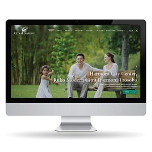
Citra Harmoni - Website Design
{"type":"doc","content":[{"type":"paragraph","attrs":{"textAlign":null},"content":[{"type":"text","text":"Harmoni City Center, Ruko Modern Citra Harmoni Trosobo — a property website that sells the life, not just the land."}]},{"type":"image","attrs":{"src":"https://farooq-agent.web.app/assets/images/works/large/0jrhdnPY_work_image.jpg","alt":null,"title":null,"width":null,"height":null}},{"type":"paragraph","attrs":{"textAlign":null},"content":[{"type":"text","marks":[{"type":"bold"}],"text":"Web Design — Citra Harmoni"}]},{"type":"paragraph","attrs":{"textAlign":null},"content":[{"type":"text","marks":[{"type":"italic"}],"text":"Property Website · Residential & Commercial · "},{"type":"text","text":"Sidoarjo"}]},{"type":"paragraph","attrs":{"textAlign":null},"content":[{"type":"text","text":"A warm, lifestyle-driven website for Citra Harmoni — a Sidoarjo property development covering residential housing, shophouses (ruko), and the Harmoni City Center township concept."}]},{"type":"paragraph","attrs":{"textAlign":null},"content":[{"type":"text","text":"The hero is a full-bleed lifestyle photograph — a young family laughing in a lush green park — delivering the brand promise before any copy is read: this is where happy families live. The bamboo grove and natural surroundings reinforce the \"harmoni\" brand positioning: a development that values greenery and quality of life, not just density."}]},{"type":"paragraph","attrs":{"textAlign":null},"content":[{"type":"text","text":"The hero copy \"Harmoni City Center, Ruko Modern Citra Harmoni Trosobo\" identifies the current featured property while the teal CTA button provides immediate action. The Citra Harmoni logo — an elegant bird/swan mark in white — sits confidently against the dark header, communicating premium residential brand trust."}]},{"type":"paragraph","attrs":{"textAlign":null},"content":[{"type":"text","text":"The broad navigation — Produk, Fasilitas, Tentang Kami, Galeri, Live Stream, Berita, Contact, Log In — signals a mature property platform with multiple engagement touchpoints, from discovery to post-purchase community."}]}]}
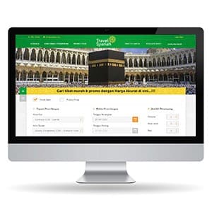
Travel Syariah - Frontend Website
{"type":"doc","content":[{"type":"paragraph","attrs":{"textAlign":null},"content":[{"type":"text","text":"\"Cari tiket murah & promo dengan Harga Akurat di sini\" — Travel Syariah brings the full pilgrimage booking experience into a single, spiritually grounded web platform."}]},{"type":"image","attrs":{"src":"https://farooq-agent.web.app/assets/images/works/large/Rprhqg8k_work_image.jpg","alt":null,"title":null,"width":null,"height":null}},{"type":"paragraph","attrs":{"textAlign":null},"content":[{"type":"text","marks":[{"type":"bold"}],"text":"Frontend Development — Travel Syariah"}]},{"type":"paragraph","attrs":{"textAlign":null},"content":[{"type":"text","marks":[{"type":"italic"}],"text":"Islamic Pilgrim Travel Web App · Umrah & Hajj Ticketing · Indonesia"}]},{"type":"paragraph","attrs":{"textAlign":null},"content":[{"type":"text","text":"A purpose-built travel web app for Travel Syariah — an Islamic pilgrim travel platform serving Indonesian Muslims planning Umrah, Hajj, and related religious journeys."}]},{"type":"paragraph","attrs":{"textAlign":null},"content":[{"type":"text","text":"The hero is the Masjidil Haram with the Kaabah center frame — an image that needs no explanation for the target audience. It communicates the destination before any copy is read, immediately establishing trust and emotional connection with users who have been saving for this journey for years."}]},{"type":"paragraph","attrs":{"textAlign":null},"content":[{"type":"text","text":"Below the hero, the ticketing engine takes over: a flight search form with one-way/round-trip toggle, departure/arrival city fields, date pickers, and passenger count selectors (Dewasa, Anak-anak, Bayi). The yellow promo banner — \"Cari tiket murah & promo dengan Harga Akurat di sini\" — prioritizes value discovery without compromising the platform's spiritual positioning."}]},{"type":"paragraph","attrs":{"textAlign":null},"content":[{"type":"text","text":"The green navigation bar with the Travel Syariah sun-crescent logo anchors the header — green as the color of Islam, executed cleanly across a full navigation that maps the platform's service breadth: ticketing, packages, umrah programs, and more."}]},{"type":"paragraph","attrs":{"textAlign":null},"content":[{"type":"text","text":"A frontend that serves both the practical and the profound — because planning a pilgrimage is both."}]}]}
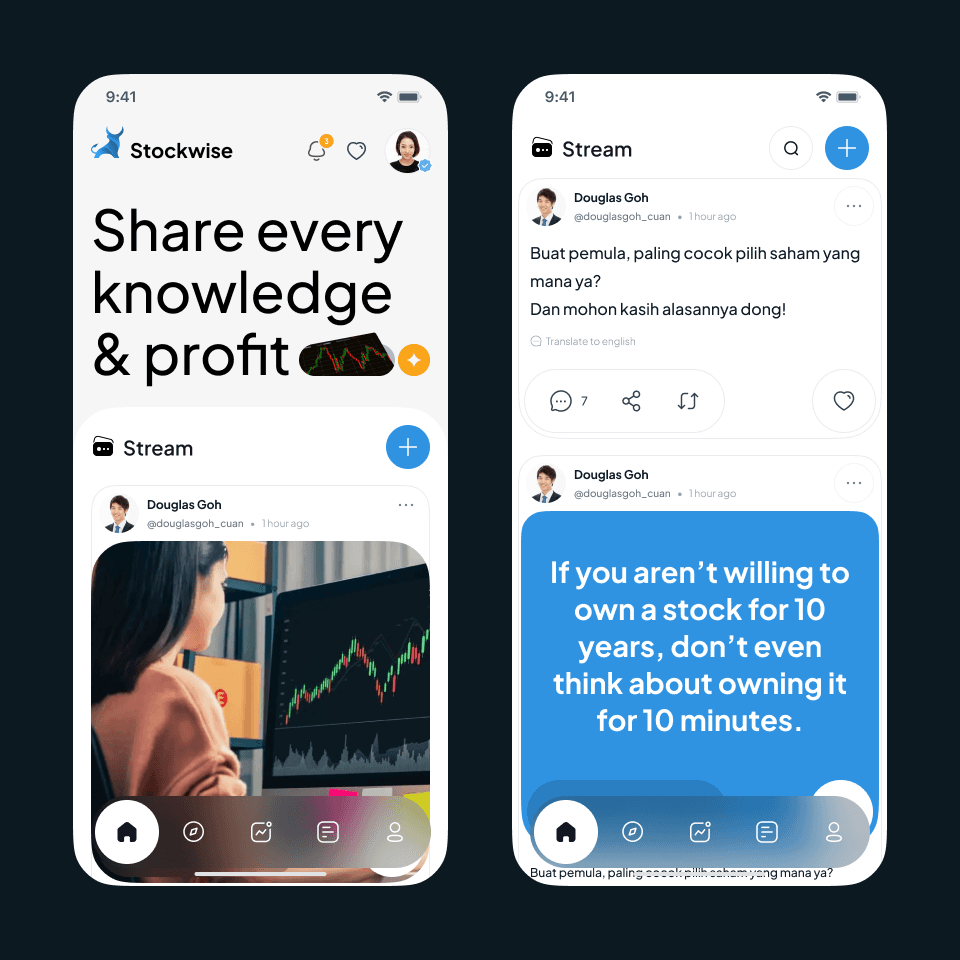
Stockwise - Stocks Management - Mobile App
{"type":"doc","content":[{"type":"paragraph","attrs":{"textAlign":null},"content":[{"type":"text","text":"A stock investment app that goes beyond charts — building a knowledge-sharing community where investors learn, discuss, and grow their portfolio together."}]},{"type":"image","attrs":{"src":"https://mir-s3-cdn-cf.behance.net/project_modules/max_1200/184ddd164614065.63f99abd76873.png","alt":null,"title":null,"width":null,"height":null}},{"type":"paragraph","attrs":{"textAlign":null},"content":[{"type":"text","marks":[{"type":"bold"}],"text":"UI/UX Design — Stockwise"}]},{"type":"paragraph","attrs":{"textAlign":null},"content":[{"type":"text","marks":[{"type":"italic"}],"text":"Mobile App · Stock Investment · Social Community · Indonesia"}]},{"type":"paragraph","attrs":{"textAlign":null},"content":[{"type":"text","text":"Stockwise combines stock investment tools with a social knowledge-sharing layer. The home screen leads with a bold editorial headline — \"Share every knowledge & profit\" — immediately positioning the app as a community platform, not just a portfolio tracker. A Stream feed below functions like a financial Twitter: users post market insights, ask questions, and share investment quotes, with reply, share, and repost actions on each post."}]},{"type":"paragraph","attrs":{"textAlign":null},"content":[{"type":"text","text":"The Stream detail screen surfaces community discussions in full — from beginner questions (\"Buat pemula, paling cocok pilih saham yang mana ya?\") to motivational investment quotes rendered as bold blue cards. A \"Translate to English\" option signals the app's Indonesian-first audience while keeping the door open for broader reach. The clean white UI with blue accents and a bottom tab bar (Home, Discover, Chart, Feed, Profile) keeps navigation familiar and frictionless."}]},{"type":"paragraph","attrs":{"textAlign":null},"content":[{"type":"text","text":"A smart blend of fintech utility and social engagement — making stock literacy feel less intimidating and more like a community conversation."}]}]}
Safecare - Website Design 2.0
{"type":"doc","content":[{"type":"paragraph","attrs":{"textAlign":null},"content":[{"type":"text","text":"\"Khasiat Alami dikemas Masa Kini\" — SafeCare 2.0 brings a classic Indonesian herbal brand into the modern web with a clean, green-forward design that stays true to its roots."}]},{"type":"image","attrs":{"src":"https://farooq-agent.web.app/assets/images/works/large/KCfaKpDn_work_image.jpg","alt":null,"title":null,"width":null,"height":null}},{"type":"paragraph","attrs":{"textAlign":null},"content":[{"type":"text","marks":[{"type":"bold"}],"text":"Web Design — SafeCare 2.0"}]},{"type":"paragraph","attrs":{"textAlign":null},"content":[{"type":"text","marks":[{"type":"italic"}],"text":"Product Website · Aromatherapy & Natural Health"}]},{"type":"paragraph","attrs":{"textAlign":null},"content":[{"type":"text","text":"An earlier iteration of the Safe Care website redesign — lighter and more minimal than the 3.0 version, but already establishing the botanical design language the brand needed."}]},{"type":"paragraph","attrs":{"textAlign":null},"content":[{"type":"text","text":"The hero leads with \"Khasiat Alami dikemas Masa Kini\" (Natural Benefits, Packaged for Today) — a tagline that perfectly captures the brand's positioning: heritage ingredients meeting contemporary presentation. The product photography sits clean against a soft gradient background of lime-green and warm white, letting the Safe Care roll-on read as the natural, premium product it is."}]},{"type":"paragraph","attrs":{"textAlign":null},"content":[{"type":"text","text":"The dark forest-green header with centered logo gives the navigation a grounded, earthy authority, while the three-tab content strip below the hero — Products, How to Buy, Health Tips — maps a user journey from brand discovery to purchase to ongoing engagement."}]},{"type":"paragraph","attrs":{"textAlign":null},"content":[{"type":"text","text":"Compared to 3.0, this version is less immersive but more structured — a useful comparison point that shows the design thinking evolving toward a richer botanical experience."}]}]}
Gelin
{"type":"doc","content":[{"type":"paragraph","attrs":{"textAlign":null},"content":[{"type":"text","text":"Cheerful, agile, and impossible not to love — Gelin is the mascot that makes learning feel like play, built in Adobe Illustrator and brought to life in Adobe Flash."}]},{"type":"image","attrs":{"src":"https://farooq-agent.web.app/assets/images/works/details/211-saladin-college-works/gelin.jpg","alt":null,"title":null,"width":null,"height":null}},{"type":"paragraph","attrs":{"textAlign":null},"content":[{"type":"text","marks":[{"type":"bold"}],"text":"Character Design — Gelin"}]},{"type":"paragraph","attrs":{"textAlign":null},"content":[{"type":"text","marks":[{"type":"italic"}],"text":"Interactive Learning Media Mascot · College Project · Adobe Illustrator + Adobe Flash"}]},{"type":"paragraph","attrs":{"textAlign":null},"content":[{"type":"text","text":"A delightful mascot character created during college for an interactive learning media project — introducing Gelin, whose name is an acronym for Gembira & Lincah (Cheerful & Agile), a name that captures the character's personality in its entirety before a single pixel is seen."}]},{"type":"paragraph","attrs":{"textAlign":null},"content":[{"type":"text","text":"The character is a young girl in an oversized pink bunny onesie — wide-eyed, button-nosed, one hand raised in a friendly wave — designed to guide young learners through educational content with warmth, energy, and zero intimidation. The anime-influenced art style is a deliberate choice: soft rounded forms, large expressive brown eyes, rosy cheeks, and a slightly mischievous raised eyebrow that hints at a character full of personality beyond the greeting pose. The bunny hood with its round ears adds a layer of costume playfulness, making Gelin instantly memorable as a visual anchor within the learning interface."}]},{"type":"paragraph","attrs":{"textAlign":null},"content":[{"type":"text","text":"The accompanying logomark — a bold yellow shield badge on chocolate brown, with \"GELIN\" in a chunky rounded display typeface and the tagline \"GEMBIRA & LINCAH\" beneath — grounds the character in a strong, badge-like brand identity. The shield communicates protection and reliability; the warm yellow-brown palette communicates energy and friendliness without aggression."}]},{"type":"paragraph","attrs":{"textAlign":null},"content":[{"type":"text","text":"Built in Adobe Illustrator for vector precision and Adobe Flash for animation and interactivity, this project represents an early convergence of character design, brand identity, and interactive media thinking — skills that have only grown deeper in the years since."}]},{"type":"paragraph","attrs":{"textAlign":null},"content":[{"type":"text","text":"A mascot that proves the best teachers — even digital ones — lead with joy."}]}]}
Gladysnatalia - Website
{"type":"doc","content":[{"type":"paragraph","attrs":{"textAlign":null},"content":[{"type":"text","text":"For the bride who knows exactly who she is — Gladysnatalia's bridal studio website is as considered and elegant as the gowns it exists to present."}]},{"type":"image","attrs":{"src":"https://farooq-agent.web.app/assets/images/works/small/yxW0iFmG_work_image.jpg","alt":null,"title":null,"width":null,"height":null}},{"type":"paragraph","attrs":{"textAlign":null},"content":[{"type":"text","marks":[{"type":"bold"}],"text":"Web Design — Gladysnatalia"}]},{"type":"paragraph","attrs":{"textAlign":null},"content":[{"type":"text","marks":[{"type":"italic"}],"text":"Website Design · Bridal Studio · Wedding Fashion · Luxury"}]},{"type":"paragraph","attrs":{"textAlign":null},"content":[{"type":"text","text":"A beautifully restrained website design for Gladysnatalia — a bridal studio whose digital presence communicates the same qualities as its gowns: elegance, intentionality, and the quiet confidence of someone who has mastered their craft. Presented in an iMac desktop mockup that frames the design in its natural viewing environment."}]},{"type":"paragraph","attrs":{"textAlign":null},"content":[{"type":"text","text":"The hero section opens with an editorial split composition — a warm beige textural upper band giving way to a deep charcoal hero field below, with a bride-adjacent figure commanding the frame in a dark ensemble. The photography is art-directed with the restraint of high bridal fashion: no overlit white studio, no obvious dress display — instead, atmosphere, mood, and the suggestion of a woman who chooses with intention."}]},{"type":"paragraph","attrs":{"textAlign":null},"content":[{"type":"text","text":"Centered over the hero, the \"GLADYSNATALIA\" logotype is set in a clean, widely-spaced capital serif — the letterform weight and tracking of a couture nameplate, not a high-street brand. Above it, a flowing calligraphic \"G\" monogram acts as the studio's signature mark: a personal, intimate symbol that bridges the owner's name with the brides she dresses. \"Studio\" sits beneath in a delicate italic, completing the identity with the understated confidence of someone who doesn't need to explain what th"}]}]}
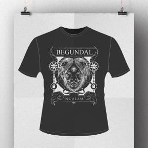
Begundal Ngalam T-shirt
{"type":"doc","content":[{"type":"paragraph","attrs":{"textAlign":null},"content":[{"type":"text","text":"A T-shirt design dedicated to metal music lovers and fans of the Indonesian metal band Burgerkill."}]},{"type":"paragraph","attrs":{"textAlign":null},"content":[{"type":"image","attrs":{"src":"https://farooq-agent.web.app/assets/images/works/details/70-begundal-ngalam-t-shirt/begunadal-kaos.jpg","alt":null,"title":null,"width":1140,"height":854}}]}]}

Hey Saladin
{"type":"doc","content":[{"type":"paragraph","attrs":{"textAlign":null},"content":[{"type":"text","text":"Laptop open, hand raised, ideas flying — this is Saladin: a designer-developer who builds with research, crafts with design, and ships with code."}]},{"type":"image","attrs":{"src":"https://cdn.dribbble.com/users/1863357/screenshots/7416004/media/57725e39707c0b829ea46918526ebe7b.jpg?compress=1&resize=800x600&vertical=top","alt":null,"title":null,"width":null,"height":null}},{"type":"paragraph","attrs":{"textAlign":null},"content":[{"type":"text","marks":[{"type":"bold"}],"text":"Personal Illustration — Hey Saladin"}]},{"type":"paragraph","attrs":{"textAlign":null},"content":[{"type":"text","marks":[{"type":"italic"}],"text":"Dribbble Profile Illustration · Designer & Developer · UX Research · UI Design · Frontend Development"}]},{"type":"paragraph","attrs":{"textAlign":null},"content":[{"type":"text","text":"A warm, energetic self-portrait illustration introducing Saladin — a product designer and frontend developer whose work lives at the intersection of user experience research, interface design, and code. The piece serves as both a Dribbble profile welcome and a personal brand statement, rendered in a vibrant flat-illustration style that communicates exactly who this person is before a single word of the bio is read."}]},{"type":"paragraph","attrs":{"textAlign":null},"content":[{"type":"text","text":"The character floats in a relaxed, cross-legged mid-air pose — yellow t-shirt, blue jeans, pink sneakers, and a matching pink cap — laptop balanced in one hand, the other raised in an open, genuine wave. It is the posture of someone who is comfortable in digital space, happy to be here, and eager to show you what they've been working on. The Dribbble logo sticker on the laptop lid closes the loop between the illustration and its platform context with a knowing, self-aware touch."}]},{"type":"paragraph","attrs":{"textAlign":null},"content":[{"type":"text","text":"Scattered paper and document fragments orbit the character in the background — sketches, wireframes, or simply the visual noise of a creative mind in motion — suggesting a work environment that is never static, always generating. The soft blue circular backdrop provides focus without weight, keeping the overall composition light, inviting, and scroll-stopping."}]},{"type":"paragraph","attrs":{"textAlign":null},"content":[{"type":"text","text":"The color palette — warm yellow, deep blue, pink accents — is vibrant without being loud, youthful without being immature. It is a palette that says: I take my work seriously, but I remember to enjoy it."}]},{"type":"paragraph","attrs":{"textAlign":null},"content":[{"type":"text","text":"A personal illustration that introduces a designer the way the best introductions always work — not with a list of skills, but with a feeling."}]},{"type":"paragraph","attrs":{"textAlign":null},"content":[{"type":"text","text":"Hi, Saladin. We like it. Have a great day too. 👋"}]}]}

Zoom Hotel - Countdown Page
{"type":"doc","content":[{"type":"paragraph","attrs":{"textAlign":null},"content":[{"type":"text","text":"We're Zooming Soon — a countdown page that makes waiting for a hotel launch feel like anticipation worth having."}]},{"type":"image","attrs":{"src":"https://farooq-agent.web.app/assets/images/works/large/5EBYtVxt_work_image.jpg","alt":null,"title":null,"width":null,"height":null}},{"type":"paragraph","attrs":{"textAlign":null},"content":[{"type":"text","marks":[{"type":"bold"}],"text":"Zoom Hotel Countdown Page"}]},{"type":"paragraph","attrs":{"textAlign":null},"content":[{"type":"text","marks":[{"type":"italic"}],"text":"Website Launch Countdown · Zoom Hotels · \"Smart People. Smart Stay.\""}]},{"type":"paragraph","attrs":{"textAlign":null},"content":[{"type":"text","text":"A clean pre-launch countdown page for Zoom Hotels — a budget-smart hotel brand positioned around the tagline \"Smart People. Smart Stay.\" The design isn't a full website; it's a single-purpose holding page that builds brand awareness and captures early interest while the main site awaits."}]},{"type":"paragraph","attrs":{"textAlign":null},"content":[{"type":"text","text":"The composition leads with the Zoom Hotels logotype — a distinctive wordmark where the \"O\"s are rendered as concentric circle targets, a typographic device that communicates focus, precision, and the brand's smart-stay philosophy. The palette is fresh and contemporary: teal, lime-green, and clean white — energetic, modern, and memorable without being loud."}]},{"type":"paragraph","attrs":{"textAlign":null},"content":[{"type":"text","text":"The screen mockup reveals the countdown page itself: \"We're Zooming Soon!\" as headline, the brand identity centered on a bright, diagonal layout with a teal-to-white split — a design that feels ready to move, exactly right for a brand named Zoom."}]},{"type":"paragraph","attrs":{"textAlign":null},"content":[{"type":"text","text":"A minimal piece of work that does a complete branding job in a single screen."}]}]}
SBY Layout
{"type":"doc","content":[{"type":"paragraph","attrs":{"textAlign":null},"content":[{"type":"text","text":"Where editorial craft meets appetite — this magazine layout turns a recipe page into a visual experience that makes you want to cook before you've finished reading."}]},{"type":"image","attrs":{"src":"https://farooq-agent.web.app/assets/images/works/small/TYdKaWXJ_work_image.png","alt":null,"title":null,"width":null,"height":null}},{"type":"paragraph","attrs":{"textAlign":null},"content":[{"type":"text","marks":[{"type":"bold"}],"text":"Editorial Design — SBY Layout"}]},{"type":"paragraph","attrs":{"textAlign":null},"content":[{"type":"text","marks":[{"type":"italic"}],"text":"Magazine Layout · Food & Recipe Publication · Print Design"}]},{"type":"paragraph","attrs":{"textAlign":null},"content":[{"type":"text","text":"A polished editorial layout for a food and recipe magazine — a double-page spread that demonstrates confident command of print design fundamentals: grid structure, typographic hierarchy, photography composition, and the seamless flow of content across a physical spread."}]},{"type":"paragraph","attrs":{"textAlign":null},"content":[{"type":"text","text":"The left page leads with a full-bleed, appetite-first photograph of a Smoked Salmon Terrine Jelly — elegantly plated layers of salmon, avocado, and colorful garnishes arranged with culinary precision against a warm white background. The dish is allowed to breathe across the majority of the page, interrupted only by the recipe title rendered in a warm green display script — fresh, organic, and entirely in keeping with the food's color story. A subtle golden arc at the bottom-left corner provides a gentle compositional frame without competing with the hero imagery."}]},{"type":"paragraph","attrs":{"textAlign":null},"content":[{"type":"text","text":"The right page shifts to a structured editorial column layout — a dark brown sidebar anchors the ingredients list in a warm, rustic tone, while three circular step-by-step photography insets provide visual cooking guidance. The chef portrait — a smiling figure in professional whites — adds a human, authoritative presence to the recipe content, building reader trust and personal connection. Body text in \"How to Cook\" and \"Cara Memasak\" sections demonstrates bilingual content management, confirming a publication serving both Indonesian and international audiences."}]},{"type":"paragraph","attrs":{"textAlign":null},"content":[{"type":"text","text":"The open book mockup, photographed at angle on a textured wooden surface, places the layout in its natural reading context — reinforcing the warmth and tactile quality of a well-designed print publication."}]},{"type":"paragraph","attrs":{"textAlign":null},"content":[{"type":"text","text":"A recipe spread that feeds the eyes as generously as the dish it presents."}]}]}
Karma Group - Mobile Web Concept
{"type":"doc","content":[{"type":"paragraph","attrs":{"textAlign":null},"content":[{"type":"text","text":"We Create... Experience — Karma Group's mobile web concept brings a world-class luxury hospitality brand into the palm of your hand, one destination at a time."}]},{"type":"image","attrs":{"src":"https://farooq-agent.web.app/assets/images/works/large/goldenhand.jpg","alt":null,"title":null,"width":null,"height":null}},{"type":"paragraph","attrs":{"textAlign":null},"content":[{"type":"text","marks":[{"type":"bold"}],"text":"Mobile Web Concept — Karma Group"}]},{"type":"paragraph","attrs":{"textAlign":null},"content":[{"type":"text","marks":[{"type":"italic"}],"text":"Luxury Hospitality · Mobile UI · Multi-Property Resort Brand"}]},{"type":"paragraph","attrs":{"textAlign":null},"content":[{"type":"text","text":"A three-screen mobile web concept for Karma Group — an international luxury hospitality brand with properties across Bali, India, Europe, and beyond. The design spans the full guest journey from exploration to booking, delivered in a dark, premium mobile UI that reflects the brand's upscale positioning."}]},{"type":"paragraph","attrs":{"textAlign":null},"content":[{"type":"text","marks":[{"type":"bold"}],"text":"Screen 1 — Services Hub"}]},{"type":"paragraph","attrs":{"textAlign":null},"content":[{"type":"text","text":"The home screen organizes the Karma ecosystem into a clean grid of lifestyle categories: Karma Kandara, Karma Royal Haathi Mahal, Karma Bavaro as the featured properties, followed by Karma Spa, Karma Restaurant, Karma Wedding, and Karma Beach — each with destination photography. An Exclusive Offers strip below drives upsell engagement. The bottom tab navigation — Home, Destinations, (active center), Contact, Membership — is constant across all screens."}]},{"type":"paragraph","attrs":{"textAlign":null},"content":[{"type":"text","marks":[{"type":"bold"}],"text":"Screen 2 — Destination Discovery"}]},{"type":"paragraph","attrs":{"textAlign":null},"content":[{"type":"text","text":"\"We Create... Experience\" hero with a couple at a clifftop ocean view sets the aspiration immediately. A \"Find Destination\" search bar and destination card grid allow exploration across the property portfolio — Karma Kandara, Karma Royal Haathi Mahal, and more — in a single scrollable view."}]},{"type":"paragraph","attrs":{"textAlign":null},"content":[{"type":"text","marks":[{"type":"bold"}],"text":"Screen 3 — Book Now"}]},{"type":"paragraph","attrs":{"textAlign":null},"content":[{"type":"text","text":"A full-screen booking widget: property selector (Karma Kandara), check-in/check-out date pickers, adult/children/infant counters, room/board type selectors, and a prominent gold \"BOOK NOW\" CTA. The booking flow is direct and complete — no unnecessary steps between desire and confirmation."}]},{"type":"paragraph","attrs":{"textAlign":null},"content":[{"type":"text","text":"The near-black header with the Karma Group script logotype and a warm gold/tan accent system communicates luxury without excess — a mobile experience worthy of the properties it represents."}]}]}
Brother - Website Design 1.0
{"type":"doc","content":[{"type":"paragraph","attrs":{"textAlign":null},"content":[{"type":"text","text":"STRONGER — Brother 1.0 leads with the one word that matters most when you're selling steel filing cabinets to businesses that can't afford to compromise."}]},{"type":"image","attrs":{"src":"https://farooq-agent.web.app/assets/images/works/large/1w2tX3Av_work_image.jpg","alt":null,"title":null,"width":null,"height":null}},{"type":"paragraph","attrs":{"textAlign":null},"content":[{"type":"text","marks":[{"type":"bold"}],"text":"Web Design — Brother Office Equipment 1.0"}]},{"type":"paragraph","attrs":{"textAlign":null},"content":[{"type":"text","marks":[{"type":"italic"}],"text":"Product Website · Lemari Arsip & Office Furniture · Surabaya"}]},{"type":"paragraph","attrs":{"textAlign":null},"content":[{"type":"text","text":"The first generation Brother website design — raw, industrial, and unapologetically bold. Where 2.0 went premium with black and gold, 1.0 goes gritty with a deep red/rose overlay on warehouse photography, establishing the brand's manufacturing credentials before a single product spec is read."}]},{"type":"paragraph","attrs":{"textAlign":null},"content":[{"type":"text","text":"The hero headline \"STRONGER\" in heavy compressed type says everything the product line needs to say. A large steel filing cabinet renders center-right — clean, solid, and product-photography precise against the atmospheric industrial backdrop. The red color wash over the warehouse background is a deliberate tonal choice: industrial strength, communicated through environment rather than copy."}]},{"type":"paragraph","attrs":{"textAlign":null},"content":[{"type":"text","text":"Below the hero, three icon strips — History, Work Flow, Services — organize the brand story in a structured three-column layout, giving buyers the full picture: who we are, how we operate, what we offer. The dark footer grounds the composition, giving the site a bottom-heavy weight that feels structural, appropriate for a brand that literally sells things built to last."}]},{"type":"paragraph","attrs":{"textAlign":null},"content":[{"type":"text","text":"A first iteration that established the brand's tough, industrial voice — the foundation 2.0 refined."}]}]}
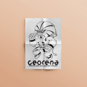
Georema Robot - Character Design
{"type":"doc","content":[{"type":"paragraph","attrs":{"textAlign":null},"content":[{"type":"text","text":"Born from the streets of Malang, powered by football pride — Georema is the robot warrior that turns AREMA's Singo Edan spirit into steel, fists, and a battle stance."}]},{"type":"image","attrs":{"src":"https://farooq-agent.web.app/assets/images/works/large/4vx4SZxe_work_image.png","alt":null,"title":null,"width":null,"height":null}},{"type":"paragraph","attrs":{"textAlign":null},"content":[{"type":"text","marks":[{"type":"bold"}],"text":"Character Design — Georema Robot"}]},{"type":"paragraph","attrs":{"textAlign":null},"content":[{"type":"text","marks":[{"type":"italic"}],"text":"Hand-Drawn Illustration · Football Club Fan Art · AREMA FC · Malang"}]},{"type":"paragraph","attrs":{"textAlign":null},"content":[{"type":"text","marks":[{"type":"italic"}],"text":"\"Spirit of Soul and Soul of Freedom\""}]},{"type":"paragraph","attrs":{"textAlign":null},"content":[{"type":"text","text":"A bold, hand-inked character design for Georema — a mecha robot warrior created as a personal tribute to AREMA FC, the beloved football club of Malang, East Java. The character fuses the raw passion of Indonesian football supporter culture with the visual language of Japanese mecha anime, producing something genuinely original: a robot built not from corporate briefs, but from hometown pride."}]},{"type":"paragraph","attrs":{"textAlign":null},"content":[{"type":"text","text":"The character stands in a low, aggressive combat stance — fists raised, knees bent, chest armored — every element of the design communicating readiness, resilience, and the never-back-down spirit that defines the Aremania supporter community. The helmet design echoes the aesthetic of AREMA's visual identity, while the segmented body armor, heavy mechanical joints, and layered plating give Georema the weight and presence of a frontline warrior."}]},{"type":"paragraph","attrs":{"textAlign":null},"content":[{"type":"text","text":"The illustration is executed entirely in black ink linework — clean, confident outlines with bold fills and hatching detail that give the character strong graphic contrast. The drawing is presented on folded paper, a deliberate presentation choice that honors the analogue origins of the work — this was made by hand, in Malang, for love of the club."}]},{"type":"paragraph","attrs":{"textAlign":null},"content":[{"type":"text","text":"The logotype \"Georema\" below is set in a custom sci-fi inspired letterform, with the tagline \"Spirit of Soul and Soul of Freedom\" — a rallying call that belongs equally to a football terrace and a robot's chest plate."}]},{"type":"paragraph","attrs":{"textAlign":null},"content":[{"type":"text","text":"A fan art piece that is also a design artifact — proof that the best creative work comes from the places and things that matter most."}]}]}
ITACOV
{"type":"doc","content":[{"type":"image","attrs":{"src":"https://farooq-agent.web.app/assets/images/works/details/246-itacov/itacov.jpg","alt":null,"title":null,"width":null,"height":null}},{"type":"paragraph","attrs":{"textAlign":null},"content":[{"type":"hardBreak"},{"type":"text","marks":[{"type":"bold"}],"text":"UI/UX Design — ITACOV"},{"type":"text","text":" "},{"type":"hardBreak"},{"type":"text","marks":[{"type":"italic"}],"text":"Indonesia Tanggap COVID-19 · Mobile App Design · Public Health & Crisis Management"}]},{"type":"paragraph","attrs":{"textAlign":null},"content":[{"type":"text","text":"A comprehensive mobile application designed at the height of the COVID-19 pandemic to serve as Indonesia's citizen-facing pandemic management platform — combining real-time data, public education, personal health monitoring, and emergency response into a single, accessible digital tool. ITACOV stands as a testament to design's role in public service: clear, urgent, and deeply human in its approach."}]},{"type":"paragraph","attrs":{"textAlign":null},"content":[{"type":"text","marks":[{"type":"bold"}],"text":"Visual Identity"},{"type":"text","text":" The app's identity is built on a bold purple-to-violet gradient system — a deliberate departure from the clinical whites and sterile blues common in healthcare apps. The rich purple palette communicates urgency without inducing panic, authority without coldness, and digital modernity without alienating less tech-savvy users. The wordmark \"ITA"},{"type":"text","marks":[{"type":"bold"}],"text":"COV"},{"type":"text","text":"\" uses typographic contrast — white for \"ITA,\" vibrant yellow-green for \"COV\" — to anchor the brand name in both acronym and meaning simultaneously."}]},{"type":"paragraph","attrs":{"textAlign":null},"content":[{"type":"text","marks":[{"type":"bold"}],"text":"Information Architecture"},{"type":"text","text":" The multi-screen layout reveals a thoughtfully layered information hierarchy across five key screens: an action hub (\"Apa yang bisa DILAKUKAN?\"), a live statistics dashboard, an onboarding splash, a brand identity screen, and a personal health status card — each serving a distinct user need without overlap."}]},{"type":"paragraph","attrs":{"textAlign":null},"content":[{"type":"text","marks":[{"type":"bold"}],"text":"Data Dashboard"},{"type":"text","text":" The central statistics screen delivers real-time national COVID-19 data with stark numerical clarity — positive cases, recoveries, and fatalities rendered in color-coded counters (orange, green, red) against a clean white card. A geographic spread map ("},{"type":"text","marks":[{"type":"italic"}],"text":"Peta Persebaran"},{"type":"text","text":") overlaid on the Indonesian archipelago provides spatial context, while a trend chart beneath tracks case progression over time. Updated every 3 hours, the dashboard positions ITACOV as a trusted, living information source."}]},{"type":"paragraph","attrs":{"textAlign":null},"content":[{"type":"text","marks":[{"type":"bold"}],"text":"Crisis Features"},{"type":"text","text":" The emergency section surfaces the national hotline (119 EXT 9) with a prominent red \"PANGGIL!\" CTA and a nearest hospital locator — placing life-critical resources one tap away. A donation module for frontline healthcare workers (\"Bantu Para Pahlawan Kita\") adds a civic solidarity dimension, while the personal health status card — displaying travel history, age, location, and ODP status — enables citizen self-monitoring and contact tracing support."}]},{"type":"paragraph","attrs":{"textAlign":null},"content":[{"type":"text","text":"A mature, civic-minded UI design that rises to the challenge of crisis communication — balancing data density with emotional clarity at a moment when both were desperately needed."}]}]}
Creator Earning Money
{"type":"doc","content":[{"type":"paragraph","attrs":{"textAlign":null},"content":[{"type":"text","text":"Fist pumped, heart floating, golden chicken in hand — this is what it looks like when a creator finally turns passion into income."}]},{"type":"image","attrs":{"src":"https://farooq-agent.web.app/assets/images/works/details/239-creco/ilus-5.jpg","alt":null,"title":null,"width":null,"height":null}},{"type":"paragraph","attrs":{"textAlign":null},"content":[{"type":"text","marks":[{"type":"bold"}],"text":"Illustration — Creator Earning Money"}]},{"type":"paragraph","attrs":{"textAlign":null},"content":[{"type":"text","marks":[{"type":"italic"}],"text":"Character Illustration · Process Sheet · Creco Platform · Content Creator Economy"}]},{"type":"paragraph","attrs":{"textAlign":null},"content":[{"type":"text","text":"A joyfully expressive illustration for the Creco creator platform — depicting the moment every content creator works toward: the realization that what they love is now paying them back. The piece is presented as a four-stage process sheet, once again revealing the full illustration journey from first sketch to finished render."}]},{"type":"paragraph","attrs":{"textAlign":null},"content":[{"type":"text","text":"The character — a young man in a deep blue long-sleeve — holds a golden chicken against his chest with one arm, fist pumped skyward in a silent victory shout, eyes closed in pure elation. The golden chicken is the illustration's most delightful conceptual choice: a direct visual metaphor for the golden goose — the asset that keeps giving, the platform that turns creativity into sustainable income. It communicates the earning story with warmth and wit, without a single currency symbol in sight."}]},{"type":"paragraph","attrs":{"textAlign":null},"content":[{"type":"text","text":"Floating hearts and a social media speech bubble with a heart icon orbit the figure — the visual language of likes, engagement, and the community love that fuels creator income. The composition is compact and energetic, designed to work as a standalone illustration within the app's UI, in onboarding flows, or across marketing materials communicating the platform's creator monetization promise."}]},{"type":"paragraph","attrs":{"textAlign":null},"content":[{"type":"text","text":"The process grid traces the work from loose pencil gesture (top-left) through refined pink linework (top-right) to flat color blocking (bottom-left) and the final shaded render with lighting passes (bottom-right) — a behind-the-scenes view that communicates craft, process, and the layers of intention behind what appears effortless in its final form."}]},{"type":"paragraph","attrs":{"textAlign":null},"content":[{"type":"text","text":"An illustration that makes earning feel like a celebration — because for a creator, it should be."}]}]}
Marisan
{"type":"doc","content":[{"type":"paragraph","attrs":{"textAlign":null},"content":[{"type":"text","text":"Kocok — Marisan digitalizes Indonesia's most beloved communal saving tradition, putting the arisan draw, member list, and payment history in one cheerful pink app."}]},{"type":"image","attrs":{"src":"https://farooq-agent.web.app/assets/images/works/details/230-marisan/marisan.jpg","alt":null,"title":null,"width":null,"height":null}},{"type":"paragraph","attrs":{"textAlign":null},"content":[{"type":"text","marks":[{"type":"bold"}],"text":"App UI Design — Marisan"}]},{"type":"paragraph","attrs":{"textAlign":null},"content":[{"type":"text","marks":[{"type":"italic"}],"text":"Mobile App · Arisan Management · Indonesian Community Savings"}]},{"type":"paragraph","attrs":{"textAlign":null},"content":[{"type":"text","text":"A bright, purpose-built app UI for Marisan (Mari Arisan) — a digital management tool for arisan, Indonesia's deeply rooted community savings and social gathering tradition where members take turns receiving a pooled sum of money through periodic draws."}]},{"type":"paragraph","attrs":{"textAlign":null},"content":[{"type":"text","text":"Three screens capture the app's core functions:"}]},{"type":"paragraph","attrs":{"textAlign":null},"content":[{"type":"text","marks":[{"type":"bold"}],"text":"Draw Screen:"},{"type":"text","text":" The star of the app — an illustrated arisan cup (the classic blue cylindrical container with rolled paper slips inside, shaking) with a prominent pink \"Kocok\" (Shake/Draw) button below. This single screen digitizes the most anticipated moment of every arisan gathering: the draw. The animation of the cup and rolled paper slips brings the physical ritual into the app with warmth and faithfulness to the tradition it represents."}]},{"type":"paragraph","attrs":{"textAlign":null},"content":[{"type":"text","marks":[{"type":"bold"}],"text":"Home Screen:"},{"type":"text","text":" A clean content area with \"Marisan\" as the header, a large primary content card, and a secondary panel below — with History, Home, and Account tabs at the bottom. The layout is minimal, giving space to whatever group information, upcoming schedule, or payment status is most relevant to display."}]},{"type":"paragraph","attrs":{"textAlign":null},"content":[{"type":"text","marks":[{"type":"bold"}],"text":"Member/Payment List — Arisan keluarga Blitar:"},{"type":"text","text":" \"Arisan keluarga di Desa Ngadirejo, Blitar\" — a family arisan group in a specific village, confirming the app's local, community-level use case. A color-coded list of members uses pink intensity to indicate payment status — darker pink for paid members, lighter pink for pending — communicating group financial status at a glance without numbers."}]},{"type":"paragraph","attrs":{"textAlign":null},"content":[{"type":"text","text":"The all-pink palette is a deliberate cultural choice: arisan in Indonesia is predominantly a women's social institution, and the color communicates warmth, community, and the social joy of the tradition as much as its financial function."}]},{"type":"paragraph","attrs":{"textAlign":null},"content":[{"type":"text","text":"A fintech app that respects the culture it digitizes — and makes \"Kocok!\" as exciting on screen as it is in person."}]},{"type":"paragraph","attrs":{"textAlign":null}},{"type":"image","attrs":{"src":"https://hyperfantasy.web.app/assets/images/portfolios/2ecfe2c4-fee0-4095-8b0e-77b0f0389cad/marisan.png","alt":null,"title":null,"width":null,"height":null}},{"type":"paragraph","attrs":{"textAlign":null}}]}
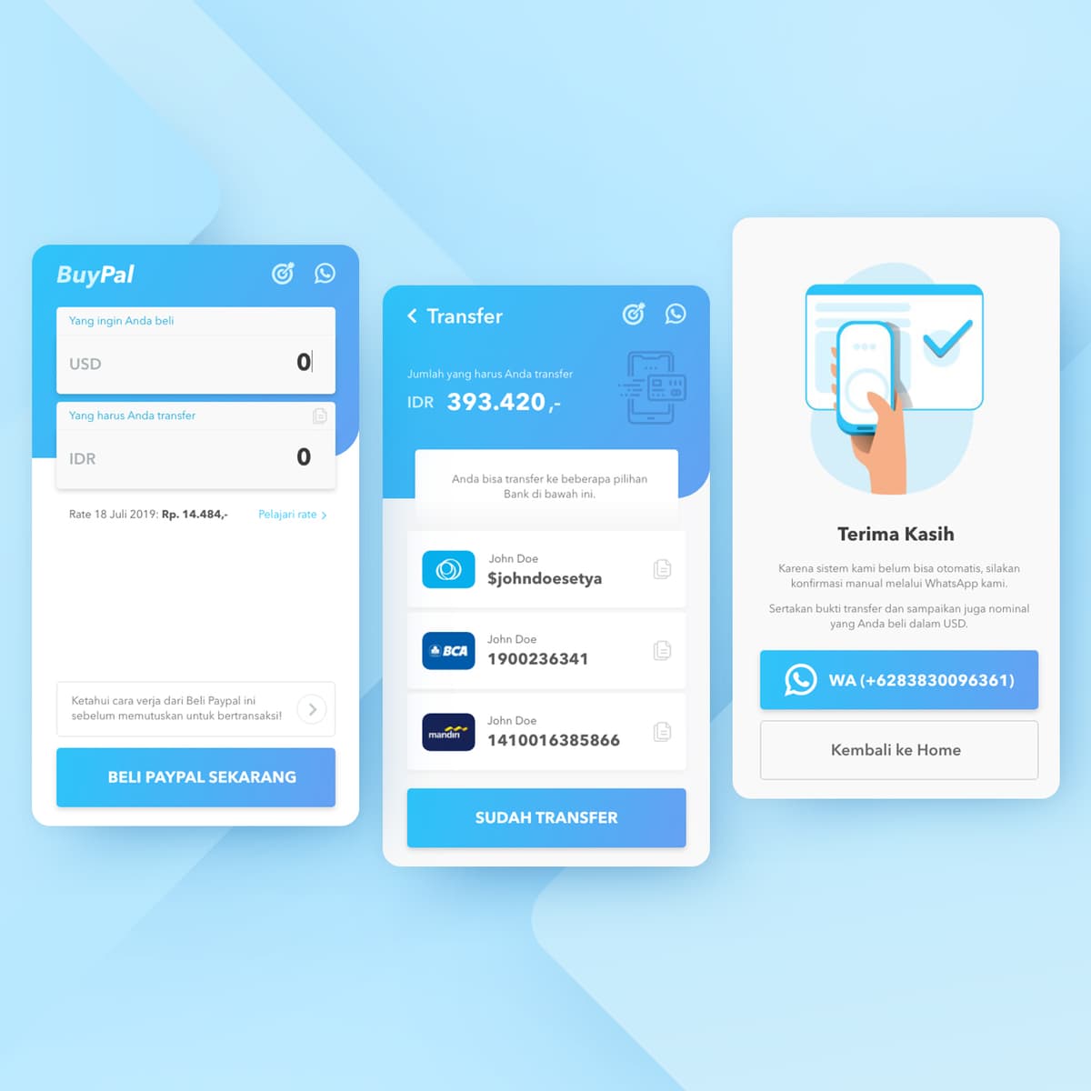
BuyPal
{"type":"doc","content":[{"type":"paragraph","attrs":{"textAlign":null},"content":[{"type":"text","text":"USD to IDR, IDR 393.420 transfer to BCA or Mandiri, confirm via WhatsApp — BuyPal makes buying PayPal balance in Indonesia a three-screen process instead of a headache."}]},{"type":"image","attrs":{"src":"https://farooq-agent.web.app/assets/images/works/large/buypal.jpg","alt":null,"title":null,"width":null,"height":null}},{"type":"paragraph","attrs":{"textAlign":null},"content":[{"type":"text","marks":[{"type":"bold"}],"text":"App UI Design — BuyPal"}]},{"type":"paragraph","attrs":{"textAlign":null},"content":[{"type":"text","marks":[{"type":"italic"}],"text":"Mobile App · PayPal Balance Buying Service · USD/IDR Currency Exchange · Indonesia"}]},{"type":"paragraph","attrs":{"textAlign":null},"content":[{"type":"text","text":"A clean, trust-focused three-screen app UI for BuyPal — a service that helps Indonesians purchase PayPal USD balance using local bank transfers, solving a genuine pain point for Indonesian freelancers, developers, and online sellers who need PayPal but face Indonesia's complex foreign currency access."}]},{"type":"paragraph","attrs":{"textAlign":null},"content":[{"type":"text","marks":[{"type":"bold"}],"text":"Screen 1 — Calculator:"},{"type":"text","text":" The entry point — a simple currency converter with \"Yang ingin Anda beli\" (What you want to buy) in USD and \"Yang harus Anda transfer\" (What you need to transfer) in IDR. The live rate is displayed (Rate 18 Juli 2019: Rp. 14.484,-) with a \"Pelajari rate\" link for transparency. The \"Beli Paypal Sekarang\" (Buy PayPal Now) CTA is bold and blue. An educational tooltip at the bottom encourages users to understand the service before transacting — a trust-building UX detail appropriate for a money service."}]},{"type":"paragraph","attrs":{"textAlign":null},"content":[{"type":"text","marks":[{"type":"bold"}],"text":"Screen 2 — Transfer Instructions:"},{"type":"text","text":" The exact IDR amount to transfer — IDR 393.420 — is displayed prominently. Three bank account options below: OVO (Sjohndoesetya), BCA (1900236341), and Mandiri (1410016385866) — each with a copy-to-clipboard icon, reducing manual error for a transaction where getting the number wrong costs money."}]},{"type":"paragraph","attrs":{"textAlign":null},"content":[{"type":"text","marks":[{"type":"bold"}],"text":"Screen 3 — Confirmation:"},{"type":"text","text":" A \"Terima Kasih\" (Thank You) screen explains that because the system can't automate yet, the user must confirm manually via WhatsApp — a transparent acknowledgment of the service's current limitations, handled gracefully. A green WhatsApp CTA (+6238830096361) makes the confirmation step one tap."}]},{"type":"paragraph","attrs":{"textAlign":null},"content":[{"type":"text","text":"A fintech app that solves a real Indonesian problem — accessibly, transparently, and without pretending to be more automated than it is."}]}]}
AyoBeliSaham Web Project
{"type":"doc","content":[{"type":"paragraph","attrs":{"textAlign":null},"content":[{"type":"text","text":"Built from scratch with real code and real intention — AyoBeliSaham is a full-stack stock management platform that proves design and development are most powerful when they work as one."}]},{"type":"image","attrs":{"src":"https://farooq-agent.web.app/assets/images/works/large/J54DT7Nc_work_image.jpg","alt":null,"title":null,"width":null,"height":null}},{"type":"paragraph","attrs":{"textAlign":null},"content":[{"type":"text","marks":[{"type":"bold"}],"text":"Web Development — AyoBeliSaham"}]},{"type":"paragraph","attrs":{"textAlign":null},"content":[{"type":"text","marks":[{"type":"italic"}],"text":"Full-Stack Web Project · Stock Management Platform · Laravel, PHP, HTML, CSS & JavaScript"}]},{"type":"paragraph","attrs":{"textAlign":null},"content":[{"type":"text","text":"A full-stack web development project for AyoBeliSaham — a stock and share management platform built end-to-end using Laravel and PHP on the backend, paired with HTML, CSS, and JavaScript on the frontend. The project demonstrates hands-on command of the complete web development stack, from database architecture and server-side routing through to pixel-level interface execution."}]},{"type":"paragraph","attrs":{"textAlign":null},"content":[{"type":"text","text":"The desktop mockup reveals a professionally structured web interface — a clean, corporate-toned layout with a prominent hero section featuring professional photography, navigation headers, and content zones organized for a financial services audience. The \"AYO\" branding is prominently visible, establishing a confident market-facing identity for the platform."}]},{"type":"paragraph","attrs":{"textAlign":null},"content":[{"type":"text","text":"Alongside the live UI mockup, an open code editor on a laptop display reveals the raw Laravel HTML/Blade template syntax — a deliberate compositional choice that communicates the builder behind the product. This dual-screen presentation speaks directly to technical clients and collaborators: the finished product on one screen, the craftsmanship on the other."}]},{"type":"paragraph","attrs":{"textAlign":null},"content":[{"type":"text","text":"The prominent Laravel logo badge anchors the project's technical identity, signaling a choice of framework known for its elegance, security, and scalability in enterprise web applications — precisely the qualities a stock management platform demands."}]},{"type":"paragraph","attrs":{"textAlign":null},"content":[{"type":"text","text":"A project that demonstrates full ownership of the development process — from architecture to interface, from server to screen."}]}]}
Bapanas
{"type":"doc","content":[{"type":"paragraph","attrs":{"textAlign":null},"content":[{"type":"text","text":"When a national institution wears its identity on a grain sack — and it looks this good — you know the brand design has done something genuinely rare."}]},{"type":"image","attrs":{"src":"https://farooq-agent.web.app/assets/images/works/large/pd/bapanas/bapanas-sack-SMALL.jpg","alt":null,"title":null,"width":null,"height":null}},{"type":"paragraph","attrs":{"textAlign":null},"content":[{"type":"text","marks":[{"type":"bold"}],"text":"Brand Identity — Bapanas"}]},{"type":"paragraph","attrs":{"textAlign":null},"content":[{"type":"text","marks":[{"type":"italic"}],"text":"Logo Design · Badan Pangan Nasional · National Food Agency · Republic of Indonesia"}]},{"type":"paragraph","attrs":{"textAlign":null},"content":[{"type":"text","text":"A dignified, grounded brand identity for Bapanas — Badan Pangan Nasional, Indonesia's National Food Agency — presented here in one of the most contextually resonant mockups in the portfolio: a traditional burlap grain sack, the oldest and most honest vessel of food supply, carrying a mark designed for the institution that oversees the nation's food sovereignty."}]},{"type":"paragraph","attrs":{"textAlign":null},"content":[{"type":"text","text":"The logomark is a stylized wheat or grain stalk enclosed within a circular form — a universal symbol of harvest, sustenance, and agricultural abundance. The mark is rendered with a dual-tone warm palette: deep earthy copper and bright harvest gold — colors that speak directly to the soil, the grain, and the cycle of cultivation that feeds a nation. The circular enclosure gives the mark institutional completeness and the visual weight of a national seal, without the rigidity of bureaucratic design."}]},{"type":"paragraph","attrs":{"textAlign":null},"content":[{"type":"text","text":"The wordmark \"bapanas\" is set in a clean, modern lowercase sans-serif — a deliberate choice that softens the brand's governmental authority into something more approachable and citizen-facing. In a public institution context, this lowercase humility signals a body that serves the people rather than ruling over them."}]},{"type":"paragraph","attrs":{"textAlign":null},"content":[{"type":"text","text":"The burlap sack application is a masterstroke of contextual design thinking. The coarse woven texture of the fabric, the gold drawstring tie, the small brand hang-tag — every element reinforces the brand's connection to its mission: real food, real supply, real impact. The logo performs beautifully at this scale, its grain motif echoing the very material of the sack it is printed on."}]},{"type":"paragraph","attrs":{"textAlign":null},"content":[{"type":"text","text":"A government brand identity that feels earned, grounded, and genuinely connected to the people it exists to serve."}]}]}
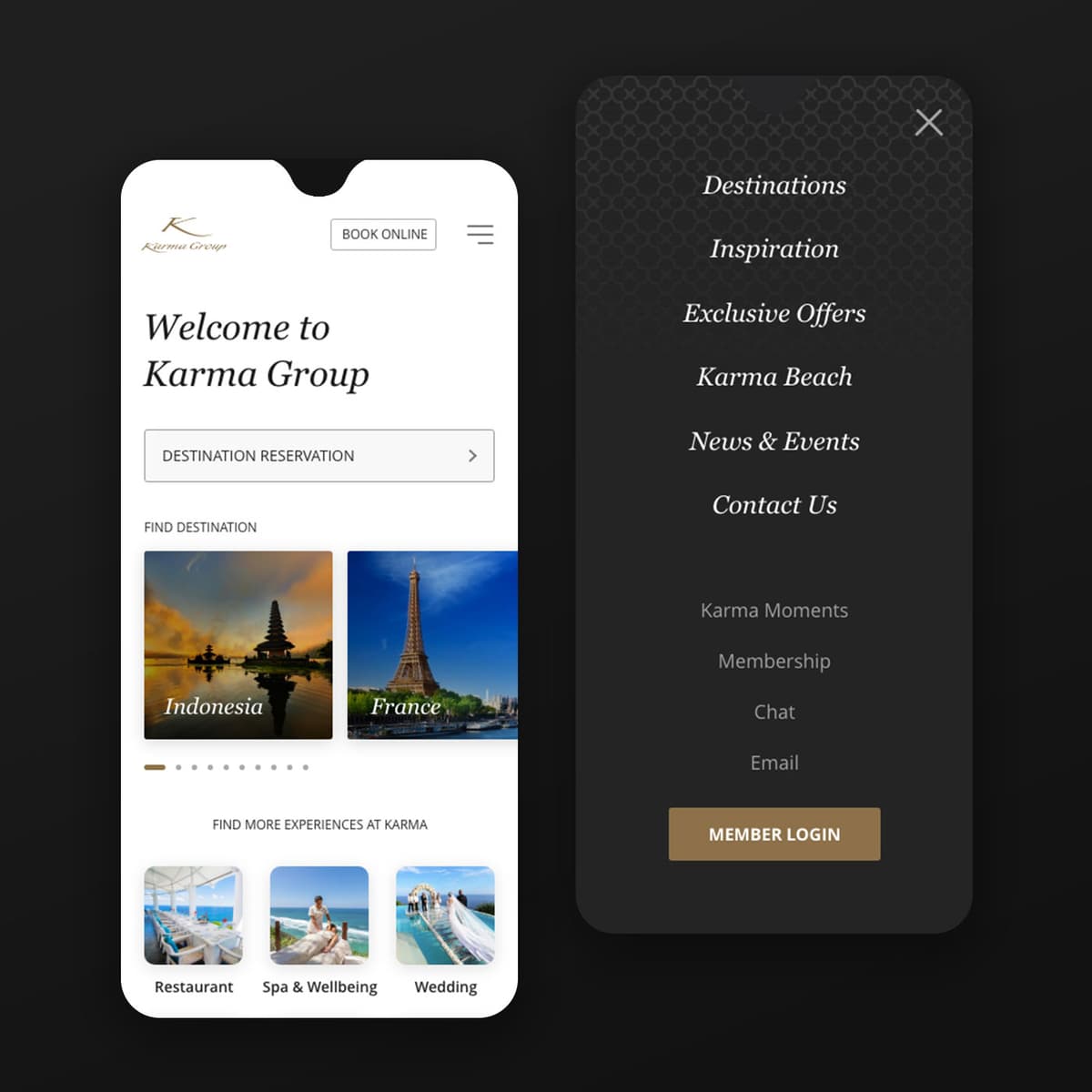
m.karmagroup
{"type":"doc","content":[{"type":"paragraph","attrs":{"textAlign":null},"content":[{"type":"text","text":"Indonesia, France, Karma Beach, Restaurant, Spa & Wellbeing, Wedding — m.karmagroup puts a world-class luxury hospitality brand's entire experience in your palm, beautifully."}]},{"type":"image","attrs":{"src":"https://farooq-agent.web.app/assets/images/works/large/m-karmagroup.jpg","alt":null,"title":null,"width":null,"height":null}},{"type":"paragraph","attrs":{"textAlign":null},"content":[{"type":"text","marks":[{"type":"bold"}],"text":"Mobile Web Design — m.Karma Group"}]},{"type":"paragraph","attrs":{"textAlign":null},"content":[{"type":"text","marks":[{"type":"italic"}],"text":"Luxury Hospitality · Mobile Web · International Resort Brand"}]},{"type":"paragraph","attrs":{"textAlign":null},"content":[{"type":"text","text":"A refined, premium mobile web design for Karma Group — an international luxury hospitality brand with properties across Indonesia, Europe, and beyond — presenting the full depth of the group's offering in a clean, gold-accented mobile experience."}]},{"type":"paragraph","attrs":{"textAlign":null},"content":[{"type":"text","text":"Two states are captured side by side: the homepage and the open navigation menu."}]},{"type":"paragraph","attrs":{"textAlign":null},"content":[{"type":"text","marks":[{"type":"bold"}],"text":"Homepage:"},{"type":"text","text":" \"Welcome to Karma Group\" leads in elegant serif typography — warm, unhurried, and entirely appropriate for a brand whose guests are never in a rush. A \"Destination Reservation\" entry field with a chevron provides immediate booking access. The \"Find Destination\" section below surfaces two destination cards — Indonesia (Pura Ulun Danu Batur at golden hour) and France (Eiffel Tower) — immediately communicating the brand's geographic reach with photography that earns every pixel. \"Find More Experiences at Karma\" follows with three lifestyle thumbnails: Restaurant, Spa & Wellbeing, and Wedding — the full hospitality ecosystem summarized in a single scroll."}]},{"type":"paragraph","attrs":{"textAlign":null},"content":[{"type":"text","marks":[{"type":"bold"}],"text":"Navigation Menu:"},{"type":"text","text":" A dark charcoal overlay with an Islamic geometric pattern background texture reveals the full site architecture in gold italic script: Destinations, Inspiration, Exclusive Offers, Karma Beach, News & Events, Contact Us — primary navigation — followed by Karma Moments, Membership, Chat, Email as secondary utilities, and a gold \"Member Login\" CTA that anchors the brand's membership program. The menu's visual treatment — dark, textured, gold — communicates luxury without announcing it."}]},{"type":"paragraph","attrs":{"textAlign":null},"content":[{"type":"text","text":"A mobile hospitality web that earns the brand's premium positioning in every design decision."}]}]}

Tammwel App
{"type":"doc","content":[{"type":"paragraph","attrs":{"textAlign":null},"content":[{"type":"text","text":"Personal Loan, Riding Loan, 2550 SR at 2% APR — Tammwel is the Saudi loan marketplace that puts every bank's best offer side by side, so the borrower always wins."}]},{"type":"image","attrs":{"src":"https://cdn.dribbble.com/users/1863357/screenshots/12892477/media/6ce4d0588cff057e97fe753479c419b9.png?compress=1&resize=1600x1200&vertical=top","alt":null,"title":null,"width":null,"height":null}},{"type":"image","attrs":{"src":"https://farooq-agent.web.app/assets/images/works/details/238-tammwel/tammwel.jpg","alt":null,"title":null,"width":null,"height":null}},{"type":"paragraph","attrs":{"textAlign":null},"content":[{"type":"text","marks":[{"type":"bold"}],"text":"App UI Design — Tammwel"}]},{"type":"paragraph","attrs":{"textAlign":null},"content":[{"type":"text","marks":[{"type":"italic"}],"text":"Mobile App · Loan Marketplace · Saudi Arabia · Sharia-Compliant Finance"}]},{"type":"paragraph","attrs":{"textAlign":null},"content":[{"type":"text","text":"A comprehensive, multi-screen app UI for Tammwel — a Saudi loan marketplace that aggregates financing offers from multiple banks, allowing users to compare, apply, and track loan products in a single platform. The design spans the complete borrower journey from offer discovery to active loan management."}]},{"type":"paragraph","attrs":{"textAlign":null},"content":[{"type":"text","marks":[{"type":"bold"}],"text":"Home / Loan Categories:"},{"type":"text","text":" The hero screen opens with two primary product cards — Personal Loan (\"Loan for everything your daily needs\") and Riding Loan — followed by \"Latest Loan Offers\" featuring real Saudi bank partners: Bank AlBilad (2550 SR, APR 2%), ANB / قدمي (2675 SR, APR 2%), Al Rajhi Bank (3999 SR, APR 3%). The side-by-side comparison structure is the platform's core UX value: borrowers can evaluate real installment amounts and rates from competing institutions at a glance."}]},{"type":"paragraph","attrs":{"textAlign":null},"content":[{"type":"text","marks":[{"type":"bold"}],"text":"Loan Offer Detail:"},{"type":"text","text":" A deep-dive screen for Bank AlBilad's offer — 2550 SR installment, APR 2%, with feature callouts: Sharia'a Complaints ✓, Low Annual Percentage Rate ✓, Early Settlement Fee warning. Star rating (3.5/5), \"Request Call\" and \"Submit Loan Now\" CTAs, and \"Add to Compare\" confirm a full evaluation and conversion flow."}]},{"type":"paragraph","attrs":{"textAlign":null},"content":[{"type":"text","marks":[{"type":"bold"}],"text":"Installment Tracker:"},{"type":"text","text":" A loan management screen for an active loan — 72% progress ring, installment details (7th, 6th, 5th installments at 250 SR with 2% interest, each marked early/late), and \"Active Loan\" badge. The donut chart progress visualization is a strong design choice: borrowers feel the loan getting smaller with each payment."}]},{"type":"paragraph","attrs":{"textAlign":null},"content":[{"type":"text","marks":[{"type":"bold"}],"text":"Lender Discovery:"},{"type":"text","text":" A scrollable list of Saudi bank logos with star ratings — Bank AlBilad, Alinma, Alanwal Bank, Riyad Bank, and more — functioning as the marketplace's partner directory."}]},{"type":"paragraph","attrs":{"textAlign":null},"content":[{"type":"text","marks":[{"type":"bold"}],"text":"Personal Profile:"},{"type":"text","text":" Abdullah bin Mas'ut, Marketing Manager — a Saudi professional user persona that grounds the product in its target demographic."}]},{"type":"paragraph","attrs":{"textAlign":null},"content":[{"type":"text","text":"The purple-and-gold palette communicates trust and premium positioning appropriate for a financial services platform in the Saudi market, while the clean card system keeps complex loan data scannable and comparable."}]},{"type":"paragraph","attrs":{"textAlign":null},"content":[{"type":"text","text":"A loan marketplace designed for the Saudi borrower who deserves to make an informed choice."}]}]}
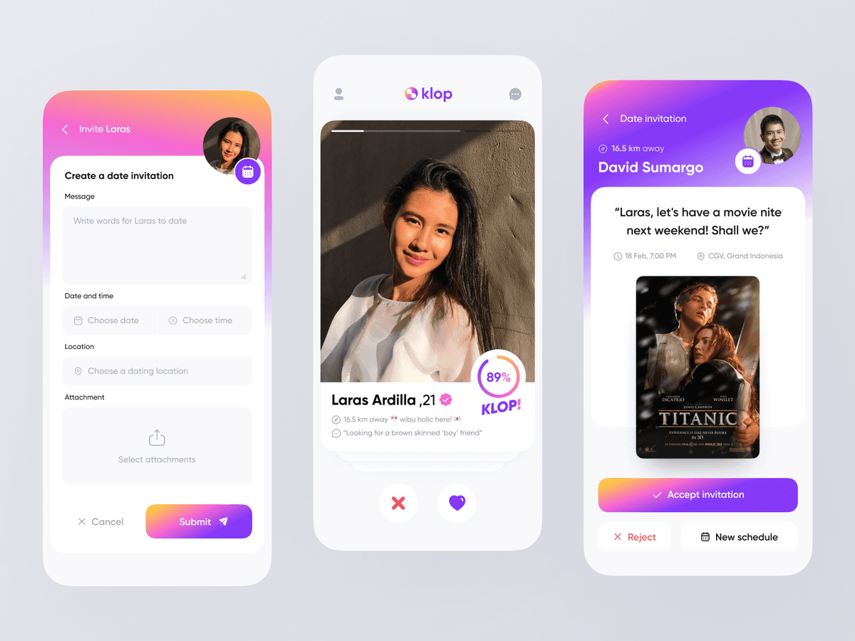
klop Dating App
{"type":"doc","content":[{"type":"paragraph","attrs":{"textAlign":null},"content":[{"type":"text","text":"89% Klop, 16.5 km away, movie night at CGV Grand Indonesia — Klop is the dating app that doesn't just match you, it gives you the tools to actually ask someone out."}]},{"type":"image","attrs":{"src":"https://cdn.dribbble.com/userupload/4778926/file/original-2fdf340769638234d32b60e3acfe92cc.png","alt":null,"title":null,"width":null,"height":null}},{"type":"paragraph","attrs":{"textAlign":null},"content":[{"type":"text","marks":[{"type":"bold"}],"text":"App UI Design — Klop"}]},{"type":"paragraph","attrs":{"textAlign":null},"content":[{"type":"text","marks":[{"type":"italic"}],"text":"Mobile App · Dating App · Indonesia"}]},{"type":"paragraph","attrs":{"textAlign":null},"content":[{"type":"text","text":"A fresh, well-considered three-screen dating app UI for Klop — an Indonesian dating app that distinguishes itself from the standard swipe-and-match format by building a structured date invitation system directly into the matching flow."}]},{"type":"paragraph","attrs":{"textAlign":null},"content":[{"type":"text","marks":[{"type":"bold"}],"text":"Discovery Screen:"},{"type":"text","text":" Laras Ardilla, 21, 16.5 km away — a full-bleed profile photo with a compatibility score badge: 89% KLOP! — a circular progress indicator that gamifies compatibility in a way that's playful without feeling algorithmic. Her bio tags confirm the personalization: \"wibu holic here 🌸\", \"Looking for a brown skinned 'boy' friend\" — real, specific, human. The standard pass/like buttons sit below."}]},{"type":"paragraph","attrs":{"textAlign":null},"content":[{"type":"text","marks":[{"type":"bold"}],"text":"Create Date Invitation:"},{"type":"text","text":" Rather than just sending a match notification, Klop lets users send a structured date proposal — a form with Message, Date and time, Location, and Attachment fields, with a \"Submit\" CTA. The \"Invite Laras\" header and the user's profile photo visible at the top confirm this is a personal, directed action — not a generic interaction. This feature is the app's most distinctive UX differentiator: turning the match into an actual invitation to do something real."}]},{"type":"paragraph","attrs":{"textAlign":null},"content":[{"type":"text","marks":[{"type":"bold"}],"text":"Received Invitation:"},{"type":"text","text":" David Sumargo, 16.5 km away, sends Laras an invitation: \"Laras, let's have a movie nite next weekend! Shall we?\" — 18 Feb, 7:00 PM, CGV Grand Indonesia, with a Titanic movie poster as the attached context. Accept Invitation / Reject / New Schedule — three responses that give the recipient full control. The gradient purple-to-warm card design gives the invitation screen warmth and occasion — this is something worth responding to."}]},{"type":"paragraph","attrs":{"textAlign":null},"content":[{"type":"text","text":"A dating app that closes the gap between matching and meeting — by making the ask as easy as the swipe."}]}]}
Bandar Pakan
{"type":"doc","content":[{"type":"paragraph","attrs":{"textAlign":null},"content":[{"type":"text","text":"The most well-dressed fish in the business — Bandar Pakan turns the humble world of fish feed supply into a brand with genuine personality and market presence."}]},{"type":"image","attrs":{"src":"https://farooq-agent.web.app/assets/images/works/large/pd/bandar-pakan.png","alt":null,"title":null,"width":null,"height":null}},{"type":"paragraph","attrs":{"textAlign":null},"content":[{"type":"text","marks":[{"type":"bold"}],"text":"Brand Identity — Bandar Pakan"}]},{"type":"paragraph","attrs":{"textAlign":null},"content":[{"type":"text","marks":[{"type":"italic"}],"text":"Logo Design · Fish Feed Supplier · Aquaculture & Ornamental Fish"}]},{"type":"paragraph","attrs":{"textAlign":null},"content":[{"type":"text","text":"A delightfully characterful brand identity for Bandar Pakan — a supplier of live fish feed specializing in Kutu Air Depok (Daphnia) and Cacing Darah (bloodworms) — two staple feeds for ornamental and freshwater fish enthusiasts across Indonesia. In a category that rarely bothers with branding, Bandar Pakan arrives with a mascot that immediately sets it apart."}]},{"type":"paragraph","attrs":{"textAlign":null},"content":[{"type":"text","text":"The logomark is a dapper fish in a top hat and bow tie — a charming, anthropomorphized illustration that transforms the product's subject matter into a mascot of irresistible personality. The fish stands with an air of distinguished authority, bubbles floating beside it, as if to say: this is no ordinary feed supplier. This is the one that knows its product, takes pride in its craft, and deserves a place on the shelf of every serious fish keeper. The top hat and bow tie are visual shorthand for quality, expertise, and a supplier who means business — even in the most niche of markets."}]},{"type":"paragraph","attrs":{"textAlign":null},"content":[{"type":"text","text":"The illustration is rendered in clean, confident linework with a single ocean blue — a natural, trustworthy color deeply connected to aquatic life, freshness, and the world of fish. The monochromatic treatment keeps the mark print-friendly and highly versatile across packaging, banners, and social media."}]},{"type":"paragraph","attrs":{"textAlign":null},"content":[{"type":"text","text":"The wordmark \"BANDAR PAKAN\" is set in a bold, wide serif with strong presence, anchored by the lighter tagline \"KUTU AIR DEPOK & CACING DARAH\" in a spaced uppercase sans-serif — clearly communicating the product range to the target buyer without ambiguity."}]},{"type":"paragraph","attrs":{"textAlign":null},"content":[{"type":"text","text":"A brand identity that proves even the most specialized niche deserves — and benefits from — a great logo."}]}]}
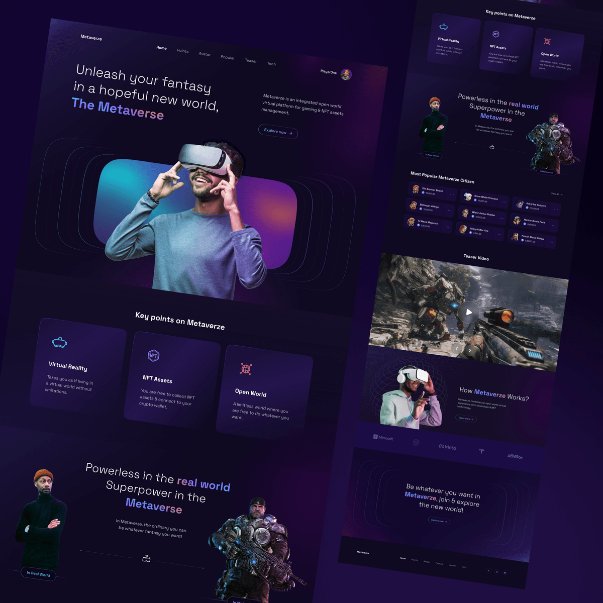
Metaverse
{"type":"doc","content":[{"type":"paragraph","attrs":{"textAlign":null},"content":[{"type":"text","text":"Powerless in the real world, Superpower in the Metaverse — this website concept captures the core promise of virtual existence in a single line and builds an entire dark, immersive world around it."}]},{"type":"image","attrs":{"src":"https://farooq-agent.web.app/assets/images/works/large/pd/metaverze-s.png","alt":null,"title":null,"width":null,"height":null}},{"type":"paragraph","attrs":{"textAlign":null},"content":[{"type":"text","marks":[{"type":"bold"}],"text":"Web Design Concept — Metaverze"}]},{"type":"paragraph","attrs":{"textAlign":null},"content":[{"type":"text","marks":[{"type":"italic"}],"text":"Metaverse Platform Website · VR / NFT / Open World · Gaming & Digital Assets"}]},{"type":"paragraph","attrs":{"textAlign":null},"content":[{"type":"text","text":"A cinematic, full-page website concept for Metaverze — \"an integrated open world virtual platform for gaming and NFT assets management\" — designed across multiple scrollable sections that communicate the platform's scope, features, and community."}]},{"type":"paragraph","attrs":{"textAlign":null},"content":[{"type":"text","marks":[{"type":"bold"}],"text":"Hero:"},{"type":"text","text":" \"Unleash your fantasy in a hopeful new world, The Metaverse\" — a man in a grey hoodie wearing a VR headset, reaching toward the viewer, framed within a floating portal-like composition against a deep purple-black gradient. The imagery and copy work together precisely: fantasy, hope, a new world. \"PaperDoc\" avatar badge in the upper right signals the platform's identity layer."}]},{"type":"paragraph","attrs":{"textAlign":null},"content":[{"type":"text","marks":[{"type":"bold"}],"text":"Key Points:"},{"type":"text","text":" Three pillars — Virtual Reality (\"Takes you as if living in a virtual world without limitations\"), NFT Assets (\"You are free to collect NFT Assets & connect to your crypto wallet\"), Open World (\"A limitless world where you are free to do whatever you want\") — the three axes of the modern metaverse value proposition, communicated with economy."}]},{"type":"paragraph","attrs":{"textAlign":null},"content":[{"type":"text","marks":[{"type":"bold"}],"text":"Real World vs Metaverse Split:"},{"type":"text","text":" A reserved man in black labeled \"In Real World\" stands beside a fully armored combat character — \"Powerless in the real world. Superpower in the Metaverse.\" The contrast is the platform's most compelling emotional argument: here, you can be who you can't be out there."}]},{"type":"paragraph","attrs":{"textAlign":null},"content":[{"type":"text","marks":[{"type":"bold"}],"text":"Community & Teaser:"},{"type":"text","text":" \"Most Popular Metaverze Citizen\" shows avatar profiles with names and ranks. A teaser video section with a combat gameplay preview confirms this is a live, playable world. Partner logos — Microsoft, Meta, Nvidia, Artificial — establish credibility."}]},{"type":"paragraph","attrs":{"textAlign":null},"content":[{"type":"text","marks":[{"type":"bold"}],"text":"CTA:"},{"type":"text","text":" \"Be whatever you want in Metaverze, join & explore the new world!\""}]},{"type":"paragraph","attrs":{"textAlign":null},"content":[{"type":"text","text":"A metaverse platform website that earns its ambition through consistent, immersive design execution across every section."}]}]}

Latulipe - Website Design
{"type":"doc","content":[{"type":"paragraph","attrs":{"textAlign":null},"content":[{"type":"text","text":"To Improve Appearance — La Tulipe's website matches the quiet, clinically-grounded confidence of a cosmetics brand that has been trusted by Indonesian women since 1980."}]},{"type":"image","attrs":{"src":"https://farooq-agent.web.app/assets/images/works/small/ESVI8BUV_work_image.jpg","alt":null,"title":null,"width":null,"height":null}},{"type":"paragraph","attrs":{"textAlign":null},"content":[{"type":"text","marks":[{"type":"bold"}],"text":"Web Design — La Tulipe"}]},{"type":"paragraph","attrs":{"textAlign":null},"content":[{"type":"text","marks":[{"type":"italic"}],"text":"Cosmetics & Skincare Website · Indonesian Beauty Brand · Halal & Dermatologically Tested"}]},{"type":"paragraph","attrs":{"textAlign":null},"content":[{"type":"text","text":"A premium, editorial website design for La Tulipe — one of Indonesia's most trusted local cosmetics brands, founded in 1980 and known for halal-certified, low-allergy, clinically tested formulas specifically designed for tropical skin."}]},{"type":"paragraph","attrs":{"textAlign":null},"content":[{"type":"text","text":"The hero is minimal and confident: a model with flawless skin placed right, the La Tulipe Face Powder compact center, against a clean white-to-light-grey gradient background. The headline \"To Improve Appearance — Face powder products\" is understated and direct — the language of a brand that doesn't oversell because decades of clinical credibility already speak for it."}]},{"type":"paragraph","attrs":{"textAlign":null},"content":[{"type":"text","text":"The purple tulip botanical logomark anchors the left — elegant, familiar, and immediately recognizable to La Tulipe's loyal customer base across Indonesia. The navigation is reserved to the bottom footer band, keeping the hero entirely uninterrupted as a product showcase."}]},{"type":"paragraph","attrs":{"textAlign":null},"content":[{"type":"text","text":"The overall aesthetic bridges Indonesian heritage brand and contemporary Korean beauty visual language — a smart positioning for a brand reaching both its loyal 40+ demographic and a new generation of skincare-conscious consumers."}]}]}
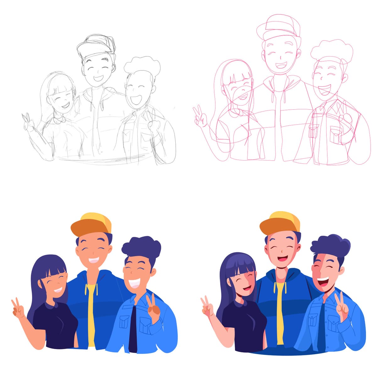
Creator Meet and Greets
{"type":"doc","content":[{"type":"paragraph","attrs":{"textAlign":null},"content":[{"type":"text","text":"From first pencil stroke to final render — this Creator Meet and Greets illustration shows not just the result, but the entire journey of bringing three friends to life on screen."}]},{"type":"image","attrs":{"src":"https://farooq-agent.web.app/assets/images/works/details/239-creco/ilus-4.jpg","alt":null,"title":null,"width":null,"height":null}},{"type":"paragraph","attrs":{"textAlign":null},"content":[{"type":"text","marks":[{"type":"bold"}],"text":"Illustration — Creator Meet and Greets"}]},{"type":"paragraph","attrs":{"textAlign":null},"content":[{"type":"text","marks":[{"type":"italic"}],"text":"Character Illustration · Process Sheet · Creco Platform · Content Creator Community"}]},{"type":"paragraph","attrs":{"textAlign":null},"content":[{"type":"text","text":"A warm, energetic group illustration for a creator meet and greet event — presented as a four-stage process sheet that reveals the full illustration workflow from rough sketch to final polished render. The transparency of process is itself a design statement: this is work made with craft, intention, and visible human effort at every stage."}]},{"type":"paragraph","attrs":{"textAlign":null},"content":[{"type":"text","text":"The composition depicts three young creators — a girl on the left, a center figure in a yellow-accented blue hoodie and orange cap, and a third on the right — huddled together in the universal pose of found community: arms around each other, peace signs raised, smiles wide enough to fill a room. The energy is that of a fan meeting their favorite creator, or a group of friends who found each other through shared passion — genuine, unposed, and entirely joyful."}]},{"type":"paragraph","attrs":{"textAlign":null},"content":[{"type":"text","text":"The four-panel process grid tells the making-of story with equal care. Top-left shows the initial pencil sketch — loose gestural lines finding the composition and character proportions. Top-right presents the refined structural linework in pink — tighter, more resolved, with clothing folds and facial expressions coming into focus. Bottom-left delivers the first full-color flat render — the palette locked in vibrant navy blues, warm yellow, and deep purple-blue hair — confident and clean. Bottom-right introduces the final lighting and shading pass — depth added through gradient shadows, rosy cheeks, and the subtle dimensionality that transforms flat illustration into a scene with warmth and life."}]},{"type":"paragraph","attrs":{"textAlign":null},"content":[{"type":"text","text":"An illustration that celebrates the creator community it depicts — and the creative process that made it."}]}]}
Kokola - Gifts Campaign System
{"type":"doc","content":[{"type":"paragraph","attrs":{"textAlign":null},"content":[{"type":"text","text":"Car In Tin — Kokoya's gift campaign system turns a biscuit tin into a lottery ticket, and a QR code scan into the moment you might win a car."}]},{"type":"image","attrs":{"src":"https://mir-s3-cdn-cf.behance.net/project_modules/fs/291fc2144094193.62a47333a6dee.png","alt":null,"title":null,"width":null,"height":null}},{"type":"paragraph","attrs":{"textAlign":null},"content":[{"type":"text","marks":[{"type":"bold"}],"text":"UI/UX Design — Kokoya Gifts Campaign System"}]},{"type":"paragraph","attrs":{"textAlign":null},"content":[{"type":"text","marks":[{"type":"italic"}],"text":"Campaign Website · Chocolate & Biscuit Brand · Gamification · Indonesia"}]},{"type":"paragraph","attrs":{"textAlign":null},"content":[{"type":"text","text":"A bold, high-impact campaign website design for Kokoya — a chocolate biscuit brand — built around one of the most attention-grabbing promotional mechanics a FMCG brand can deploy: a grand prize car hidden inside a product tin."}]},{"type":"paragraph","attrs":{"textAlign":null},"content":[{"type":"text","text":"The hero is unforgettable: \"CAR IN TIN\" in massive, compressed white display type fills the entire screen, with a Mitsubishi Xpander in signature red bursting through the center flanked by two Kokoya biscuit tins. The scale contrast — a full-size MPV emerging from a snack tin — is the campaign's visual punchline, executed with graphic precision and theatrical confidence. The deep crimson background amplifies the drama and locks the composition in Kokoya's brand red."}]},{"type":"paragraph","attrs":{"textAlign":null},"content":[{"type":"text","text":"The campaign mechanic is explained in two steps at the bottom:"}]},{"type":"paragraph","attrs":{"textAlign":null},"content":[{"type":"text","marks":[{"type":"bold"}],"text":"Step 1 — Open & Find:"},{"type":"text","text":" Buy and open a tin of Kokoya biscuits, then find the special QR code."}]},{"type":"paragraph","attrs":{"textAlign":null},"content":[{"type":"text","marks":[{"type":"bold"}],"text":"Step 2 — Scan & Surprise!:"},{"type":"text","text":" Scan the QR code and get various attractive gifts — including 1 car if you are lucky."}]},{"type":"paragraph","attrs":{"textAlign":null},"content":[{"type":"text","text":"The two-step flow is the cleanest possible expression of a QR-based promotional campaign: purchase, discover, scan, win. No registration walls, no lengthy forms — just a tin, a QR code, and the possibility of a car. The \"About campaign\" and \"Frequently-asked\" navigation links confirm this is a full campaign microsite, not just a poster."}]},{"type":"paragraph","attrs":{"textAlign":null},"content":[{"type":"text","text":"A campaign design that earns every second of consumer attention it asks for — because the prize is a car, and the design makes sure you never forget it."}]}]}
Semanggine Packaging
{"type":"doc","content":[{"type":"paragraph","attrs":{"textAlign":null},"content":[{"type":"text","text":"Fresh from the streets of Surabaya to the palm of your hand — Semanggine's packaging turns a humble street food into an artisan product worth gifting."}]},{"type":"image","attrs":{"src":"https://farooq-agent.web.app/assets/images/works/large/6JwwoPGo_work_image.jpg","alt":null,"title":null,"width":null,"height":null}},{"type":"paragraph","attrs":{"textAlign":null},"content":[{"type":"text","marks":[{"type":"bold"}],"text":"Packaging Design — Semanggine"}]},{"type":"paragraph","attrs":{"textAlign":null},"content":[{"type":"text","marks":[{"type":"italic"}],"text":"Product Packaging · Original Taste · Javanese Street Food Brand"}]},{"type":"paragraph","attrs":{"textAlign":null},"content":[{"type":"text","text":"A beautifully composed packaging design for Semanggine — the Javanese street food brand rooted in the heritage of Surabaya's iconic semanggi dish — that elevates a beloved local delicacy into a premium, gift-worthy product experience. The packaging is where the brand's botanical identity fully blooms."}]},{"type":"paragraph","attrs":{"textAlign":null},"content":[{"type":"text","text":"The box design is built on a pristine white base — clean, modern, and uncluttered — that allows the lush semanggi botanical illustration to take complete visual ownership of the surface. Fresh, vivid green clover-leaf sprigs cascade across the packaging in a naturalistic arrangement, immediately communicating the product's herbal, plant-based authenticity. The botanical illustration style — detailed, painterly, and abundant — is the visual language of artisan food brands that take provenance seriously."}]},{"type":"paragraph","attrs":{"textAlign":null},"content":[{"type":"text","text":"The brand mark — the Semanggine mascot in her traditional Javanese attire — sits quietly in the upper corner, grounding the packaging in its cultural origin story without competing with the botanical hero. The script wordmark \"Original taste\" flows across the face of the box in a hand-lettered style, warm and personal — the handwriting of someone who made this for you, not a factory that produced it for the masses."}]},{"type":"paragraph","attrs":{"textAlign":null},"content":[{"type":"text","text":"A small circular food photography window offers a preview of the product itself — an elegant detail that bridges the artisan packaging aesthetic with real consumer purchasing behavior."}]},{"type":"paragraph","attrs":{"textAlign":null},"content":[{"type":"text","text":"Two boxes presented together in a flat-lay product photography setting confirm the design's real-world performance: stacked, angled, and lit, Semanggine's packaging looks as good on a café counter as it does in a gift bag."}]},{"type":"paragraph","attrs":{"textAlign":null},"content":[{"type":"text","text":"Packaging that makes the product feel like it was always destined to be this beautiful."}]}]}

Wafy Mascot Design
{"type":"doc","content":[{"type":"paragraph","attrs":{"textAlign":null},"content":[{"type":"text","text":"Golden, grinning, and delivering happiness one letter at a time — Wafy is the waffle mascot that turns every message into a moment of pure joy."}]},{"type":"image","attrs":{"src":"https://cdn.dribbble.com/userupload/4476416/file/original-a622c1e93beb566bfcf254e2c3dc5c7a.png","alt":null,"title":null,"width":null,"height":null}},{"type":"paragraph","attrs":{"textAlign":null},"content":[{"type":"text","marks":[{"type":"bold"}],"text":"Mascot Design — Wafy"}]},{"type":"paragraph","attrs":{"textAlign":null},"content":[{"type":"text","marks":[{"type":"italic"}],"text":"Character Design · Waffle Brand · Retro Cartoon Style"}]},{"type":"paragraph","attrs":{"textAlign":null},"content":[{"type":"text","text":"A joyfully exuberant mascot illustration for Wafy — a waffle brand whose mission is to send the message of joy and happiness — brought to life through a character that embodies that mission in every line, curve, and grid square of its design."}]},{"type":"paragraph","attrs":{"textAlign":null},"content":[{"type":"text","text":"Wafy is a round waffle with a face, and the world is better for it. The character strides forward mid-step — one white-gloved hand raised in a cheerful wave, the other clutching a sealed envelope against its crispy golden body — letters scattering from the messenger bag bouncing at its back as if joy simply cannot be contained. The expression is pure retro delight: large, shining cartoon eyes with star-shaped highlights, a wide open smile with a hint of rosy cheek, and the kind of brow crinkle that says \"I am genuinely happy to see you and also I have mail.\""}]},{"type":"paragraph","attrs":{"textAlign":null},"content":[{"type":"text","text":"The design draws lovingly from the golden age of American cartoon mascots — the thick black outlines, white cartoon gloves, exaggerated proportions, and dynamic walking pose all speak the visual language of 1950s cereal boxes and Saturday morning animation. The backwards dark cap with a cream inner brim adds a touch of contemporary streetwear cool without betraying the retro spirit, while the warm honey-brown boots give the character grounded, physical presence."}]},{"type":"paragraph","attrs":{"textAlign":null},"content":[{"type":"text","text":"The waffle grid texture on the body is the piece's most delightful detail — the character isn't just representing a waffle brand, it literally "},{"type":"text","marks":[{"type":"italic"}],"text":"is"},{"type":"text","text":" a waffle, rendered with enough grid accuracy to make any brunch enthusiast nod in recognition."}]},{"type":"paragraph","attrs":{"textAlign":null},"content":[{"type":"text","text":"A mascot that delivers its brand promise in the most literal, most charming way possible — happiness, hand-delivered, one grid square at a time."}]}]}
HOLO
{"type":"doc","content":[{"type":"paragraph","attrs":{"textAlign":null},"content":[{"type":"text","text":"The next level of Holographic Computing — HOLO's website concept positions a Mixed Reality technology company as the design studio that builds the future, one immersive screen at a time."}]},{"type":"image","attrs":{"src":"https://farooq-agent.web.app/assets/images/works/details/135-oartscience-web-concept/holo.jpg","alt":null,"title":null,"width":null,"height":null}},{"type":"paragraph","attrs":{"textAlign":null},"content":[{"type":"text","marks":[{"type":"bold"}],"text":"Web Design Concept — HOLO"}]},{"type":"paragraph","attrs":{"textAlign":null},"content":[{"type":"text","marks":[{"type":"italic"}],"text":"Technology Company Website · Mixed Reality · Holographic Computing · Singapore"}]},{"type":"paragraph","attrs":{"textAlign":null},"content":[{"type":"text","text":"A dark, cinematic website concept for HOLO — a Mixed Reality and holographic computing technology company with clients including NUS, Singtel, RafflesMedical, DSTA, and SIEW — presenting a full multi-page web experience across two visible screens."}]},{"type":"paragraph","attrs":{"textAlign":null},"content":[{"type":"text","marks":[{"type":"bold"}],"text":"Hero Section:"},{"type":"text","text":" A woman in a sleek dark outfit touches a floating holographic cube while wearing a VR headset — the visual language of tomorrow, staged today. \"The next level of Holographic Computing\" in bold display type sets the positioning without ambiguity. An \"Explore sample\" CTA invites discovery. The dark blue-black gradient with particle-dot background grid communicates technical depth and spatial dimension."}]},{"type":"paragraph","attrs":{"textAlign":null},"content":[{"type":"text","marks":[{"type":"bold"}],"text":"About Section:"},{"type":"text","text":" \"Embracing the 4th Industrial Revolution.\" — 14 Years of Experience, 987 Projects Done. Three service pillars below: Conceptual & Design (Conceptualisation, Creative Design), Mixed Reality (Virtual Reality, Augmented Reality), and 360 Technology (360 Video & Virtual Tour, Immersive Multimedia, 4D Experience) — a complete XR service portfolio compressed into a scannable three-card layout."}]},{"type":"paragraph","attrs":{"textAlign":null},"content":[{"type":"text","marks":[{"type":"bold"}],"text":"Case Studies & Blog:"},{"type":"text","text":" The second screen reveals editorial VR photography alongside blog posts — \"Design Research in Mixed Reality\", \"The Mixed Reality Revolution is here, and it'll change your world forever\", \"You're doing Mixed Reality wrong\" — thought leadership content that positions HOLO as the expert, not just the vendor."}]},{"type":"paragraph","attrs":{"textAlign":null},"content":[{"type":"text","marks":[{"type":"bold"}],"text":"Testimonial & Contact:"},{"type":"text","text":" Daniel Wong's testimonial: \"HOLO had a great services... I love using HOLO when I'm collabs.\" — followed by a project estimation form (Name, Email, Project description, Submit)."}]},{"type":"paragraph","attrs":{"textAlign":null},"content":[{"type":"text","text":"A Singapore-based XR company website concept built with the same ambition as the technology it represents."}]}]}

Dr. Ratna - Website Design
{"type":"doc","content":[{"type":"paragraph","attrs":{"textAlign":null},"content":[{"type":"text","text":"Soft, clinical, and trustworthy — Dr. Ratna's beauty clinic website makes Botox and aesthetic treatments feel as approachable as a consultation with a trusted doctor."}]},{"type":"image","attrs":{"src":"https://farooq-agent.web.app/assets/images/works/large/Jju2BnsG_work_image.jpg","alt":null,"title":null,"width":null,"height":null}},{"type":"paragraph","attrs":{"textAlign":null},"content":[{"type":"text","marks":[{"type":"bold"}],"text":"Web Design — Klinik Dr. Ratna"}]},{"type":"paragraph","attrs":{"textAlign":null},"content":[{"type":"text","marks":[{"type":"italic"}],"text":"Aesthetic Clinic Website · Botox, Acne Treatment, Photorejuvenation · Surabaya"}]},{"type":"paragraph","attrs":{"textAlign":null},"content":[{"type":"text","text":"A clean, medically credible website for Klinik Dr. Ratna — a dermatology and aesthetic clinic in Surabaya offering Botox, acne treatments, photorejuvenation, and a full range of skin care procedures."}]},{"type":"paragraph","attrs":{"textAlign":null},"content":[{"type":"text","text":"The design solves the core UX challenge of aesthetic medicine: the patient needs to feel informed before they feel sold to. The hero leads with educational copy — \"Botox Injections Are the Best Known to Temporarily Paralyze Muscle Activity\" — positioning the doctor as an authority who informs first. A treatment selector widget lets visitors self-navigate by concern, while before-after photo previews and a clear service list guide the discovery-to-booking flow."}]},{"type":"paragraph","attrs":{"textAlign":null},"content":[{"type":"text","text":"The soft pink palette, clean white space, and restrained typography communicate premium care without intimidation — exactly the positioning a Surabaya aesthetic clinic needs to attract and convert her market."}]}]}

The Officers
{"type":"doc","content":[{"type":"paragraph","attrs":{"textAlign":null},"content":[{"type":"text","text":"Keyboard in one hand, telephone in the other — The Officers are the retro-noir duo that turns customer service into a visual statement of cool authority."}]},{"type":"image","attrs":{"src":"https://cdn.dribbble.com/users/5057025/screenshots/10918010/media/eb6545a7d07691569c756434f0073318.jpg?compress=1&resize=1200x900&vertical=top","alt":null,"title":null,"width":null,"height":null}},{"type":"paragraph","attrs":{"textAlign":null},"content":[{"type":"text","marks":[{"type":"bold"}],"text":"Illustration — The Officers"}]},{"type":"paragraph","attrs":{"textAlign":null},"content":[{"type":"text","marks":[{"type":"italic"}],"text":"Character Design · Retro Noir Style · Duo Illustration"}]},{"type":"paragraph","attrs":{"textAlign":null},"content":[{"type":"text","text":"A dramatically stylized duo illustration rendered in a bold retro-noir aesthetic — two figures posed back-to-back in the classic emblem format, radiating a sunburst of fine white lines against a deep charcoal black background. The composition carries the visual weight and authority of a vintage propaganda poster or a band logo, elevated by precise linework and a surgical use of red as the only color in an otherwise monochromatic world."}]},{"type":"paragraph","attrs":{"textAlign":null},"content":[{"type":"text","text":"The left figure — a sharp-featured man in a dark uniform — holds a mechanical keyboard at shoulder height with the casual confidence of someone who has never once doubted a keystroke. The right figure — a woman with a dramatic victory-roll updo and a red ribbon accent — raises a retro telephone handset with equal composure, expression cool and intentional. Together they read as a power duo: the coder and the communicator, the input and the output, two halves of a single operational unit."}]},{"type":"paragraph","attrs":{"textAlign":null},"content":[{"type":"text","text":"The red accents — keyboard keys, bow tie, telephone handset, hair ribbon — are placed with the discipline of a designer who understands that color earns its place only when used sparingly. Each red element marks something functional and intentional: the tools of their trade, the markers of their identity."}]},{"type":"paragraph","attrs":{"textAlign":null},"content":[{"type":"text","text":"The ribbon banner at the base — deliberately left blank — invites customization: a name, a team motto, a studio label. The composition is designed to be owned, not just admired."}]},{"type":"paragraph","attrs":{"textAlign":null},"content":[{"type":"text","text":"A poster-quality illustration that turns the act of being at a desk into something that looks like a mission."}]}]}
Portal Bojonegoro - Website Design
{"type":"doc","content":[{"type":"paragraph","attrs":{"textAlign":null},"content":[{"type":"text","text":"\"Kabupaten lumbung pangan dan energi negeri\" — Portal Bojonegoro gives the district's digital identity the clarity and confidence its regional ambition deserves."}]},{"type":"image","attrs":{"src":"https://farooq-agent.web.app/assets/images/works/large/UEfvFQwx_work_image.jpg","alt":null,"title":null,"width":null,"height":null}},{"type":"paragraph","attrs":{"textAlign":null},"content":[{"type":"text","marks":[{"type":"bold"}],"text":"Web Design — Portal Bojonegoro"}]},{"type":"paragraph","attrs":{"textAlign":null},"content":[{"type":"text","marks":[{"type":"italic"}],"text":"Government Portal · Kabupaten Bojonegoro · East Java"}]},{"type":"paragraph","attrs":{"textAlign":null},"content":[{"type":"text","text":"A clean, authoritative government portal design for Kabupaten Bojonegoro — a district in East Java known as the nation's food barn and energy reservoir, home to major rice fields and Indonesia's largest oil production zone."}]},{"type":"paragraph","attrs":{"textAlign":null},"content":[{"type":"text","text":"The hero centers on the Bupati in full formal uniform against a vibrant green gradient backdrop — a standard but effective government portal convention that establishes leadership presence and institutional accountability from the first screen. The tagline \"Bojonegoro — Kabupaten lumbung pangan dan energi negeri\" communicates regional identity and economic significance in a single line."}]},{"type":"paragraph","attrs":{"textAlign":null},"content":[{"type":"text","text":"The regional crest in the header alongside bilingual navigation (ID/ENG) confirms a portal serving both local constituents and national stakeholders. The navigation — Beranda, Profil, Berita, Agenda, Regulasi, Media, GIS — maps the full scope of a functioning government information platform, including a GIS module that signals the district's investment in spatial data transparency."}]},{"type":"paragraph","attrs":{"textAlign":null},"content":[{"type":"text","text":"The forest green palette reinforces Bojonegoro's agricultural and natural resource identity — a design decision that ties the digital portal back to the land it represents."}]}]}
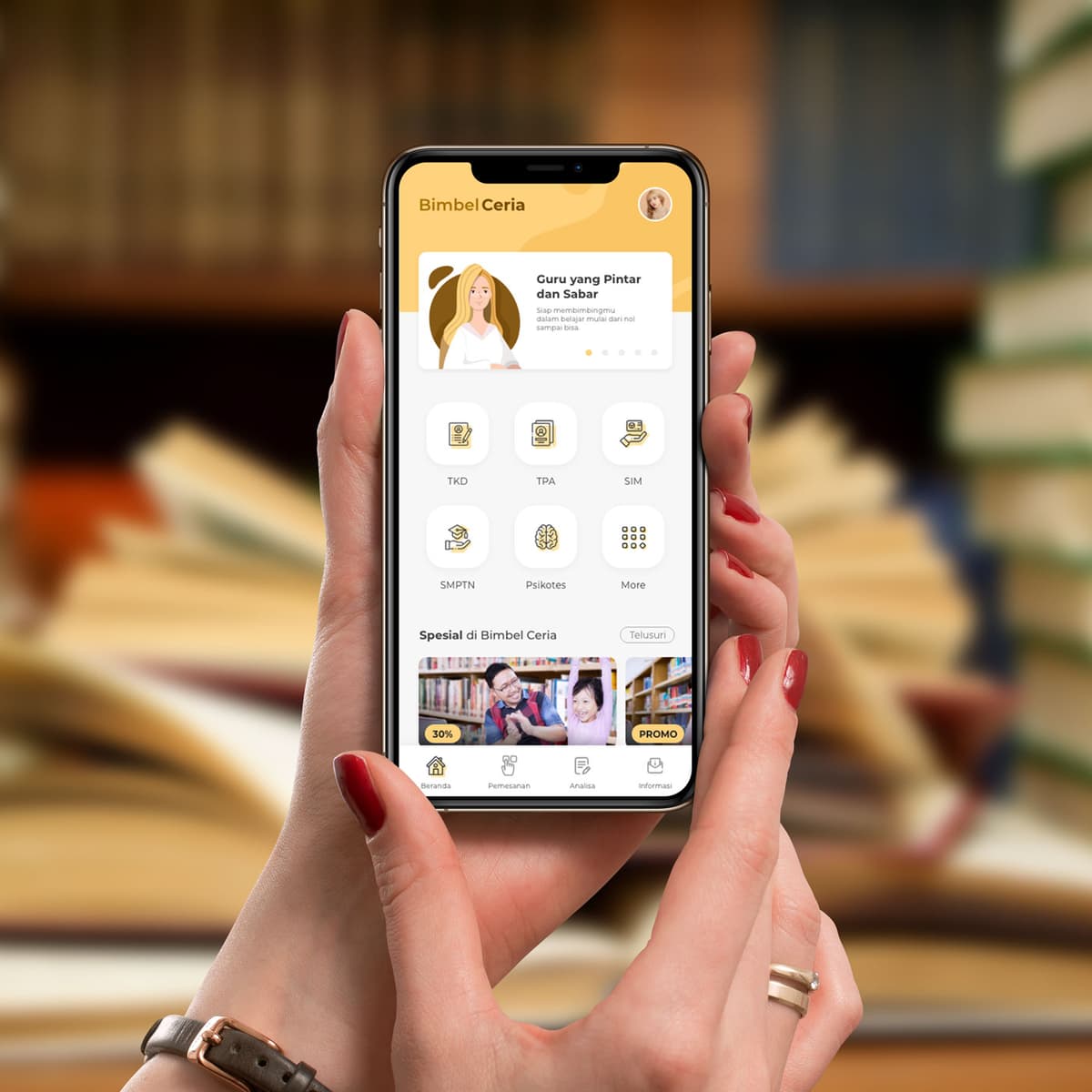
Bimbel Ceria
{"type":"doc","content":[{"type":"paragraph","attrs":{"textAlign":null},"content":[{"type":"text","text":"Bimbel Ceria wraps Indonesia's most demanding exams in a warm, joyful identity that makes studying feel less like a burden and more like a beginning."}]},{"type":"image","attrs":{"src":"https://farooq-agent.web.app/assets/images/works/details/216-bimbel-ceria/bimbel-ceria.jpg","alt":null,"title":null,"width":null,"height":null}},{"type":"paragraph","attrs":{"textAlign":null},"content":[{"type":"text","marks":[{"type":"bold"}],"text":"App UI Design — Bimbel Ceria"}]},{"type":"paragraph","attrs":{"textAlign":null},"content":[{"type":"text","marks":[{"type":"italic"}],"text":"Mobile App · Tutoring & Exam Preparation · Indonesia"}]},{"type":"paragraph","attrs":{"textAlign":null},"content":[{"type":"text","text":"A warm, cheerfully branded app UI for Bimbel Ceria — an Indonesian tutoring platform whose name (\"Ceria\" = cheerful/joyful) is a deliberate positioning statement: this is a bimbel that approaches learning with warmth, not anxiety."}]},{"type":"paragraph","attrs":{"textAlign":null},"content":[{"type":"text","text":"The home screen opens with a soft golden illustrated banner — an animated female teacher character with a gentle smile: \"Guru yang Pintar dan Sabar — Siap membimbingmu dalam belajar mulai dari nol sampai bisa\" (Smart and Patient Teachers — Ready to guide you from zero to capable). The warm amber-gold palette throughout communicates the exact emotional register the brand name promises."}]},{"type":"paragraph","attrs":{"textAlign":null},"content":[{"type":"text","text":"The subject category grid covers the key Indonesian exam types in five icons: TKD, TPA, SIM, SBMPTN, Psikotes, and More — covering government civil service tests, university entrance, driving license, and psychological assessments. The golden icon line style is consistent with the warm brand palette, making even exam category selection feel approachable."}]},{"type":"paragraph","attrs":{"textAlign":null},"content":[{"type":"text","text":"\"Spesial di Bimbel Ceria\" (Special at Bimbel Ceria) surfaces promoted courses with 30% discount and PROMO badges — converting the home screen into both a study hub and a marketing platform."}]},{"type":"paragraph","attrs":{"textAlign":null},"content":[{"type":"text","text":"The bottom navigation mirrors Bimbel BTW — Beranda, Pemesanan, Analisa, Informasi — confirming a shared platform architecture between both bimbel apps, differentiated entirely through visual identity and brand tone."}]},{"type":"paragraph","attrs":{"textAlign":null},"content":[{"type":"text","text":"Photographed held in two female hands against a blurred bookshelf background — the context of a student or parent browsing course options — a purposeful mockup choice that grounds the app in its real-world audience."}]},{"type":"paragraph","attrs":{"textAlign":null},"content":[{"type":"text","text":"Two bimbel apps, same mission, different personalities — one blue and institutional, one golden and joyful."}]}]}
Adhitrans Company Profile - Printed
{"type":"doc","content":[{"type":"paragraph","attrs":{"textAlign":null},"content":[{"type":"text","text":"Every shipment has a story — Adhitrans tells theirs through a company profile that moves as fluidly as the cargo it delivers across seas and borders."}]},{"type":"image","attrs":{"src":"https://farooq-agent.web.app/assets/images/works/large/Q5H7Jcbq_work_image.jpg","alt":null,"title":null,"width":null,"height":null}},{"type":"paragraph","attrs":{"textAlign":null},"content":[{"type":"text","marks":[{"type":"bold"}],"text":"Print Design — Adhitrans Company Profile"}]},{"type":"paragraph","attrs":{"textAlign":null},"content":[{"type":"text","marks":[{"type":"italic"}],"text":"Printed Corporate Document · Cargo, Export-Import & Freight Forwarding"}]},{"type":"paragraph","attrs":{"textAlign":null},"content":[{"type":"text","text":"A graceful, movement-driven company profile design for Adhitrans — a professional logistics solutions company operating across cargo transport, export-import, and freight forwarding. The document cover is a study in fluid elegance: a design that captures the ceaseless motion of global trade in a single, sophisticated visual composition."}]},{"type":"paragraph","attrs":{"textAlign":null},"content":[{"type":"text","text":"The cover design is built around sweeping wave forms in a layered teal and ocean blue palette — broad, flowing curves that cascade across the right side of the cover in overlapping bands of varying depth and opacity. The movement is unmistakably nautical — suggesting open water, shipping lanes, and the constant flow of goods across international borders. A thin lime-green accent line threads through the composition, adding a subtle vitality that prevents the cool blue palette from becoming static."}]},{"type":"paragraph","attrs":{"textAlign":null},"content":[{"type":"text","text":"The Adhitrans logomark — a clean sailboat icon above the wordmark \"Adhitrans\" — anchors the upper left with quiet authority. The sailing vessel is a timeless symbol of maritime trade, exploration, and reliable navigation across distance. The tagline \"Professional Logistics Solutions\" sits beneath in a clean, light sans-serif, communicating the company's market positioning without embellishment."}]},{"type":"paragraph","attrs":{"textAlign":null},"content":[{"type":"text","text":"The label \"Company Profile\" sits in the lower right in a restrained italic — understated, confident, and in perfect typographic proportion to the dynamic visual composition above it."}]},{"type":"paragraph","attrs":{"textAlign":null},"content":[{"type":"text","text":"Presented as a thick, perfect-bound book mockup on a clean white surface, the document carries the weight and credibility of a company that has been delivering on its promises long enough to fill a book with evidence."}]},{"type":"paragraph","attrs":{"textAlign":null},"content":[{"type":"text","text":"A company profile cover that moves like the business it represents — always forward, always on course."}]}]}
Creator
{"type":"doc","content":[{"type":"paragraph","attrs":{"textAlign":null},"content":[{"type":"text","text":"Content flying, finger pointing, smile wide — this is the creator in her element, surrounded by the digital ecosystem she built with her own two hands."}]},{"type":"image","attrs":{"src":"https://farooq-agent.web.app/assets/images/works/details/239-creco/ilus-2.jpg","alt":null,"title":null,"width":null,"height":null}},{"type":"paragraph","attrs":{"textAlign":null},"content":[{"type":"text","marks":[{"type":"bold"}],"text":"Illustration — Creator"}]},{"type":"paragraph","attrs":{"textAlign":null},"content":[{"type":"text","marks":[{"type":"italic"}],"text":"Character Illustration · Process Sheet · Creco Platform · Content Creator"}]},{"type":"paragraph","attrs":{"textAlign":null},"content":[{"type":"text","text":"A vibrant, kinetic illustration of a female content creator in full flow — depicted mid-stride through her digital world, surrounded by the signals of an active creative life. Presented as a four-stage process sheet, the piece reveals the complete illustration journey from gestural sketch to polished final render."}]},{"type":"paragraph","attrs":{"textAlign":null},"content":[{"type":"text","text":"The character — a young woman with voluminous dark hair, blue shirt, and dark jeans — floats dynamically with one finger raised in a gesture of insight or direction, leg kicked back in mid-motion. She is not sitting at a desk; she is moving through her work, inhabiting the digital space she creates for. Orbiting her: yellow chat bubbles, envelope message icons, a floating laptop, and a large translucent content grid structure behind her — representing the content management, communication, and creation tools that define the modern creator's workflow."}]},{"type":"paragraph","attrs":{"textAlign":null},"content":[{"type":"text","text":"The content grid — a 3D isometric panel arrangement in cool sky blue — is the illustration's structural anchor, communicating the platform context: Creco as the organized framework through which the creator operates. The yellow accent elements — speech bubbles, laptops, message icons — bring warmth and communication energy against the cool blues, creating a palette that feels both digital and human."}]},{"type":"paragraph","attrs":{"textAlign":null},"content":[{"type":"text","text":"The four-panel process sheet traces the work: pencil sketch (top-left), refined pink linework (top-right), flat color blocking (bottom-left), and the final shaded render (bottom-right) — each stage showing deliberate evolution of form, light, and detail, from loose idea to finished, deployable illustration."}]},{"type":"paragraph","attrs":{"textAlign":null},"content":[{"type":"text","text":"A character illustration that captures the creator economy's essential truth: the work is never just content — it is a person, in motion, building something worth following."}]}]}
Tomonet
{"type":"doc","content":[{"type":"paragraph","attrs":{"textAlign":null},"content":[{"type":"text","text":"Potenza for ultimate handling, Turanza for smooth and quiet — Tomonet is the tire marketplace app that knows what you need before you've finished searching."}]},{"type":"image","attrs":{"src":"https://farooq-agent.web.app/assets/images/works/large/tomonet.jpg","alt":null,"title":null,"width":null,"height":null}},{"type":"paragraph","attrs":{"textAlign":null},"content":[{"type":"text","marks":[{"type":"bold"}],"text":"App UI Design — Tomonet"}]},{"type":"paragraph","attrs":{"textAlign":null},"content":[{"type":"text","marks":[{"type":"italic"}],"text":"Mobile App · Tire Marketplace · Bridgestone · Indonesia"}]},{"type":"paragraph","attrs":{"textAlign":null},"content":[{"type":"text","text":"A clean, well-structured mobile app UI for Tomonet — a tire sales platform connecting buyers with tire products and nearby stores, built around the Bridgestone product ecosystem."}]},{"type":"paragraph","attrs":{"textAlign":null},"content":[{"type":"text","text":"The home screen is organized into four clear value layers that together cover the complete tire-buying journey:"}]},{"type":"paragraph","attrs":{"textAlign":null},"content":[{"type":"text","marks":[{"type":"bold"}],"text":"TOMO Point (235 points):"},{"type":"text","text":" A loyalty dashboard header with four quick actions — TOMO (store), Promo, Voucher, Help — gamifying repeat purchase behavior with a points system that rewards loyal customers."}]},{"type":"paragraph","attrs":{"textAlign":null},"content":[{"type":"text","marks":[{"type":"bold"}],"text":"Tipe Ban (Tire Types):"},{"type":"text","text":" A horizontal product carousel featuring Bridgestone's flagship lines — Potenza (\"Ultimate handling & response\") and Turanza (\"Smooth, quiet and comfortable\") — each with product photography that communicates the tire's character before a spec is read. The brief taglines are smart copywriting: they communicate performance positioning in four words."}]},{"type":"paragraph","attrs":{"textAlign":null},"content":[{"type":"text","marks":[{"type":"bold"}],"text":"Search by Size:"},{"type":"text","text":" \"Cari ukuran ban ex: 265/65 R17\" — a search bar with placeholder that educates new users on the correct format, reducing input errors and friction for a category where incorrect sizing is a real purchase risk."}]},{"type":"paragraph","attrs":{"textAlign":null},"content":[{"type":"text","marks":[{"type":"bold"}],"text":"5 Toko Terdekat (5 Nearest Stores):"},{"type":"text","text":" A proximity-based store discovery strip showing the closest Bridgestone/tire retailers from the user's current location — closing the loop between digital discovery and physical purchase."}]},{"type":"paragraph","attrs":{"textAlign":null},"content":[{"type":"text","text":"The red-and-white brand palette is clean and energetic. The bottom tab bar — Home, Product, Store, Account — maps a complete e-commerce architecture in four taps."}]},{"type":"paragraph","attrs":{"textAlign":null},"content":[{"type":"text","text":"An app that makes buying tires feel as simple as buying anything else online — which, for most people, it never has been."}]}]}
Elang Persada Logo
{"type":"doc","content":[{"type":"paragraph","attrs":{"textAlign":null},"content":[{"type":"text","text":"The eagle doesn't ask permission to own the sky — and neither does PT. Elang Persada."}]},{"type":"image","attrs":{"src":"https://farooq-agent.web.app/assets/images/works/large/z9UILGv9_work_image.png","alt":null,"title":null,"width":null,"height":null}},{"type":"paragraph","attrs":{"textAlign":null},"content":[{"type":"text","marks":[{"type":"bold"}],"text":"Brand Identity — PT. Elang Persada"}]},{"type":"paragraph","attrs":{"textAlign":null},"content":[{"type":"text","marks":[{"type":"italic"}],"text":"Logo Design · Holding Company / Business Group · Corporate Identity"}]},{"type":"paragraph","attrs":{"textAlign":null},"content":[{"type":"text","text":"A fierce, commanding brand identity for PT. Elang Persada — a holding company whose name translates directly to \"Eagle of the Realm\" — an identity that carries the full weight of that name in every line of its mark. This is corporate branding with teeth."}]},{"type":"paragraph","attrs":{"textAlign":null},"content":[{"type":"text","text":"The logomark is a bold, highly detailed eagle head rendered in a street-art illustration style — sharp feather strokes, an aggressive forward-facing beak, and piercing linework that conveys predatory focus and uncompromising vision. The eagle is not a soft, decorative motif; it is drawn with the intensity of an apex predator at the height of its power, communicating exactly what a holding company needs to signal to its subsidiaries, partners, and competitors alike: dominance, strategic clarity, and the will to lead."}]},{"type":"paragraph","attrs":{"textAlign":null},"content":[{"type":"text","text":"The illustration technique — bold strokes with dramatic negative space cuts — gives the mark exceptional scalability and versatility, performing equally well embossed on corporate collateral, stamped on vehicle livery, or applied to signage across group subsidiaries."}]},{"type":"paragraph","attrs":{"textAlign":null},"content":[{"type":"text","text":"The wordmark \"PT. ELANG PERSADA\" is set in a bold, italicized condensed sans-serif with a forward lean that reinforces momentum and authority. The electric cobalt blue chosen for the entire identity is a deliberate and powerful departure from the conventional navy-and-gold of most holding companies — it signals a group that is modern, dynamic, and forward-facing while retaining the gravitas that a corporate group demands."}]},{"type":"paragraph","attrs":{"textAlign":null},"content":[{"type":"text","text":"Presented on a deep charcoal textured card, the blue-on-black rendering gives the identity a premium, high-contrast presence that commands attention at any scale."}]},{"type":"paragraph","attrs":{"textAlign":null},"content":[{"type":"text","text":"A holding company identity built like the bird it is named after — to soar above everything else in its field."}]}]}

Types of People Related to COVID19
{"type":"doc","content":[{"type":"paragraph","attrs":{"textAlign":null},"content":[{"type":"text","text":"Four people, four stories, one pandemic — this illustrated infographic makes COVID-19 classification instantly human, turning clinical categories into faces you recognize."}]},{"type":"image","attrs":{"src":"https://cdn.dribbble.com/users/5057025/screenshots/11031430/media/1e9979f2cb3ac9d0b42fb279d81c66b9.jpg?compress=1&resize=1200x900&vertical=top","alt":null,"title":null,"width":null,"height":null}},{"type":"paragraph","attrs":{"textAlign":null},"content":[{"type":"text","marks":[{"type":"bold"}],"text":"Infographic Illustration — Types of People Related to COVID-19"}]},{"type":"paragraph","attrs":{"textAlign":null},"content":[{"type":"text","marks":[{"type":"italic"}],"text":"Public Health Illustration · COVID-19 Education · Character Infographic"}]},{"type":"paragraph","attrs":{"textAlign":null},"content":[{"type":"text","text":"A clear, compassionate infographic illustration depicting the four distinct classifications of people in relation to COVID-19 — designed to communicate complex epidemiological categories to a general public audience through the most universally understood medium: human faces and plain language."}]},{"type":"paragraph","attrs":{"textAlign":null},"content":[{"type":"text","text":"The layout organizes four character portraits within circular frames across a deep navy blue background, each paired with a category label and concise clinical description. The dark backdrop is a deliberate editorial choice — serious, authoritative, and focused — communicating public health information with the gravity it deserves while the warm, humanized character illustrations prevent the content from feeling cold or clinical."}]},{"type":"paragraph","attrs":{"textAlign":null},"content":[{"type":"text","marks":[{"type":"bold"}],"text":"Healthy People"},{"type":"text","text":" — A cheerful young woman in a teal top, no mask, relaxed posture — the visual embodiment of someone with no COVID-19 exposure or symptoms. Her open expression and absence of protective equipment is itself the information."}]},{"type":"paragraph","attrs":{"textAlign":null},"content":[{"type":"text","marks":[{"type":"bold"}],"text":"People in Supervision"},{"type":"text","text":" — A woman in an orange jacket and surgical mask, wide alert eyes — someone who has visited a red zone or interacted with a positive case but shows no symptoms. The mask and cautious expression communicate the monitored status without alarm."}]},{"type":"paragraph","attrs":{"textAlign":null},"content":[{"type":"text","marks":[{"type":"bold"}],"text":"Patients in Supervision"},{"type":"text","text":" — A figure wrapped in a scarf, arms crossed, surgical mask on, eyes closed in fatigue — someone presenting symptoms with a history of exposure. The body language says everything the label confirms."}]},{"type":"paragraph","attrs":{"textAlign":null},"content":[{"type":"text","marks":[{"type":"bold"}],"text":"Positive Patients COVID-19"},{"type":"text","text":" — A figure in full medical teal gear, surgical cap, IV drip visible, arms crossed — under clinical care, confirmed positive. The most serious portrait in the set, rendered with quiet dignity rather than distress."}]},{"type":"paragraph","attrs":{"textAlign":null},"content":[{"type":"text","text":"The four characters together form a complete visual spectrum of pandemic status — from the completely unaffected to the clinically confirmed — each rendered with enough individuality to feel like a real person rather than an archetype."}]},{"type":"paragraph","attrs":{"textAlign":null},"content":[{"type":"text","text":"A public health illustration that treats every person in the spectrum with equal dignity — because in a pandemic, everyone deserves to understand where they stand."}]}]}
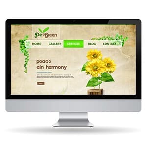
De Green - Website Design
{"type":"doc","content":[{"type":"paragraph","attrs":{"textAlign":null},"content":[{"type":"text","text":"Peace and harmony, sunflowers in bloom, ivy climbing the frame — De Green's website makes every plant lover feel like they've already walked into the garden."}]},{"type":"image","attrs":{"src":"https://farooq-agent.web.app/assets/images/works/details/54-de-green-website-design/di.jpg","alt":null,"title":null,"width":null,"height":null}},{"type":"paragraph","attrs":{"textAlign":null},"content":[{"type":"text","marks":[{"type":"bold"}],"text":"Web Design — De Green"}]},{"type":"paragraph","attrs":{"textAlign":null},"content":[{"type":"text","marks":[{"type":"italic"}],"text":"Website Design Exploration · Flower & Ornamental Plant Trader · Botanical"}]},{"type":"paragraph","attrs":{"textAlign":null},"content":[{"type":"text","text":"A warmly organic website design exploration for De Green — a platform for traders and lovers of flowers and ornamental plants — built with a visual language that feels less like a digital storefront and more like a botanical garden you've just stepped into. Presented in an iMac desktop mockup that grounds the design in its natural viewing context."}]},{"type":"paragraph","attrs":{"textAlign":null},"content":[{"type":"text","text":"The overall aesthetic is defined by its background: a warm parchment-cream textured field that evokes aged paper, pressed flowers, and the tactile warmth of a well-loved plant journal. This is not a white-space minimal website — it is an atmospheric one, where the surface itself communicates heritage, nature, and the earthy sensibility of someone who genuinely loves plants."}]},{"type":"paragraph","attrs":{"textAlign":null},"content":[{"type":"text","text":"The De Green logo anchors the header with a warm hand-lettered wordmark and a small twin-leaf icon in fresh green — personal, botanically precise, and entirely in harmony with the brand's identity. Cascading from the left edge of the header, a decorative ivy vine trails downward in natural, illustrative detail — not a clipart decoration but a considered compositional element that frames the page with organic life."}]},{"type":"paragraph","attrs":{"textAlign":null},"content":[{"type":"text","text":"The hero section delivers its message with quiet, poetic confidence: \"peace and harmony\" set in a warm earthy display typeface against the parchment background, accompanied by a vibrant painted sunflower arrangement in the right frame — cheerful, sun-drenched, and unmistakably the work of a brand that loves what it sells. The sunflower illustration style — painterly, warm, and botanically detailed — elevates the design beyond a simple plant marketplace into something closer to a lifestyle journal for the green-thumbed."}]},{"type":"paragraph","attrs":{"textAlign":null},"content":[{"type":"text","text":"The navigation — Home, Gallery, Services, Blog, Contact — is organized in a clean horizontal bar with a bright green \"Services\" active state tab, communicating the brand's personality through even its most functional element."}]},{"type":"paragraph","attrs":{"textAlign":null},"content":[{"type":"text","text":"A website design that doesn't just sell plants — it makes you want to grow them."}]}]}
Kolektibles - Mobile App
{"type":"doc","content":[{"type":"paragraph","attrs":{"textAlign":null},"content":[{"type":"text","text":"Bakugo Katsuki at buying price $125, market price $175 — Kolektibles is the collector's app that turns your toy shelf into a portfolio worth tracking."}]},{"type":"image","attrs":{"src":"https://mir-s3-cdn-cf.behance.net/project_modules/fs/d02264146771155.62b5fc400e5b5.png","alt":null,"title":null,"width":null,"height":null}},{"type":"paragraph","attrs":{"textAlign":null},"content":[{"type":"text","marks":[{"type":"bold"}],"text":"App UI Design — Kolektibles"}]},{"type":"paragraph","attrs":{"textAlign":null},"content":[{"type":"text","marks":[{"type":"italic"}],"text":"Mobile App · Collectibles Tracking & Community · Toys, Figures, Cards & More"}]},{"type":"paragraph","attrs":{"textAlign":null},"content":[{"type":"text","text":"A dark, feature-rich mobile app UI for Kolektibles — a platform for collectors of action figures, Nendoroids, Gundam, trading cards, vinyl, stamps, coins, sneakers, and every category of collectible — combining a social feed, a category marketplace, and a personal portfolio tracker in a single cohesive product."}]},{"type":"paragraph","attrs":{"textAlign":null},"content":[{"type":"text","marks":[{"type":"bold"}],"text":"Activity Feed:"},{"type":"text","text":" A social content stream where collectors share their acquisitions — Bakugo Katsuki Boku No Hero Academia Nendoroids, a Zoro One Piece statue, an Iron Man Hulkbuster figure — each post with likes (1,204), comments, and a \"Details\" CTA. The collector community layer gives Kolektibles social stickiness beyond the transactional."}]},{"type":"paragraph","attrs":{"textAlign":null},"content":[{"type":"text","marks":[{"type":"bold"}],"text":"Collections Directory:"},{"type":"text","text":" A grid of 12 collectible categories — Statue, Gundam, Action Figure, Vehicle Model, Dolls & Toys, Video Games, Book & Manga, Trading Cards, Vinyl & Analogs, Painting, Antique, Stamps, Coins & Currency, Watches, Sneakers, Luxury Leathers — the broadest possible definition of \"collectible,\" confirming Kolektibles serves serious collectors across every category."}]},{"type":"paragraph","attrs":{"textAlign":null},"content":[{"type":"text","marks":[{"type":"bold"}],"text":"Portfolio Tracker (My Assets):"},{"type":"text","text":" Gilbert Tanuwiyaya's collection — Status, Action Figure, Vehicle Model, Cards. A line chart tracks collection value over time ($75.50 → $154.60), with a detailed list below showing each Bakugo Katsuki figure: buying price $125, market price $175 — with green arrows indicating appreciation. The investment-grade tracking feature is the app's most sophisticated UX layer: treating collectibles as assets, not just possessions."}]},{"type":"paragraph","attrs":{"textAlign":null},"content":[{"type":"text","marks":[{"type":"bold"}],"text":"Collection Grid:"},{"type":"text","text":" A visual gallery of Gilbert's figures — 12 My Hero Academia characters displayed in a dark card grid, beautiful and immediately browsable."}]},{"type":"paragraph","attrs":{"textAlign":null},"content":[{"type":"text","text":"An app that understands collectors don't just want to own things — they want to know what they're worth, and share them with people who care."},{"type":"hardBreak"}]},{"type":"paragraph","attrs":{"textAlign":"center"},"content":[{"type":"text","marks":[{"type":"bold"}],"text":"2021-11-15 19:26:22"}]}]}

Falling Ill Girl
{"type":"doc","content":[{"type":"paragraph","attrs":{"textAlign":null},"content":[{"type":"text","text":"Mask on, arms wrapped around herself, eyes closed — Falling Ill Girl captures the universal experience of feeling unwell with a tenderness that makes you want to feel better for her."}]},{"type":"image","attrs":{"src":"https://cdn.dribbble.com/users/5057025/screenshots/10997145/media/d66c51149b58aa47299e5f37c23369c6.jpg?compress=1&resize=1200x900&vertical=top","alt":null,"title":null,"width":null,"height":null}},{"type":"paragraph","attrs":{"textAlign":null},"content":[{"type":"text","marks":[{"type":"bold"}],"text":"Vector Illustration — Falling Ill Girl"}]},{"type":"paragraph","attrs":{"textAlign":null},"content":[{"type":"text","marks":[{"type":"italic"}],"text":"Health Illustration · COVID-19 · Flat Vector · Emotional Character Design"}]},{"type":"paragraph","attrs":{"textAlign":null},"content":[{"type":"text","text":"A quietly emotional flat vector illustration depicting a young woman in the early, vulnerable stages of falling ill — rendered with warmth, empathy, and the kind of visual sensitivity that separates a good health illustration from a genuinely human one."}]},{"type":"paragraph","attrs":{"textAlign":null},"content":[{"type":"text","text":"The figure is curled inward — knees drawn up, arms hugging herself tightly, body language communicating the instinctive self-holding that comes with fever chills, fatigue, or the first wave of illness. She wears a pink oversized sweater layered over a warm orange turtleneck, a soft surgical mask covering her nose and mouth — practical protection merged seamlessly into a character moment of genuine vulnerability. Her deep violet-purple hair flows freely behind her, the one element of the composition that moves, floats, drifts — a contrast to the stillness and inwardness of the body beneath it."}]},{"type":"paragraph","attrs":{"textAlign":null},"content":[{"type":"text","text":"Her eyes are gently closed, expression not distressed but simply tired — the face of someone who has acknowledged that today, they are not well, and the only honest response is to rest. The delicate pink-blush abstract blob surrounding her functions as a soft aura of warmth and fragility — not clinical, not alarming, simply present."}]},{"type":"paragraph","attrs":{"textAlign":null},"content":[{"type":"text","text":"The palette — hot pink, warm orange, deep violet, and blush pink — is unexpectedly vibrant for a sick-day illustration, and that is precisely its strength. This is not a grey, desaturated depiction of illness; it is a colorful, compassionate one — communicating that being unwell is a human experience worth depicting with the same visual care as any other."}]},{"type":"paragraph","attrs":{"textAlign":null},"content":[{"type":"text","text":"An illustration that makes the viewer feel seen — because at some point, everyone has been exactly this person."}]}]}

Tamawal Brand Identity
{"type":"doc","content":[{"type":"image","attrs":{"src":"https://lh7-rt.googleusercontent.com/formsz/AN7BsVBVX78ZC0nM-emU-9LzHfdxS9eYGZ4yP_dOJ6WKihH4LSOKPHoa1JhDKZHxDfrpB6v0kyG67KAHayZG5xIFuQoXotMSHia6b2HebxDhxDr068FCP1X2IeVg4ISXITz3DSdjLgykEVzIoc7S72CrpTeiIvzSkwpJ_J7R?key=bCVIHGonXZbDUZriKVed7A","alt":null,"title":null,"width":null,"height":null}},{"type":"paragraph","attrs":{"textAlign":null},"content":[{"type":"text","marks":[{"type":"bold"}],"text":"Brand Identity — Tamawal®"},{"type":"text","text":" "},{"type":"hardBreak"},{"type":"text","marks":[{"type":"italic"}],"text":"تمـــوّل · Digital Financing Marketplace · SAMA-Regulated · Saudi Arabia"}]},{"type":"paragraph","attrs":{"textAlign":null},"content":[{"type":"text","text":"A bold, purposeful brand identity for Tamawal® — Saudi Arabia's premier Sharia-compliant digital financing marketplace — built on a visual language that communicates trust, accessibility, and financial empowerment with unmistakable confidence."}]},{"type":"paragraph","attrs":{"textAlign":null},"content":[{"type":"text","marks":[{"type":"bold"}],"text":"The Logo"},{"type":"text","text":" The Tamawal logomark is a geometric, square-bracket icon rendered as a stylized \"T\" — clean, modern, and architecturally precise. It reads as both a structural frame and a financial gateway: an opening that leads somewhere. Paired with the bilingual wordmark — \"tamawal\" in Latin script alongside the Arabic \"تمـــوّل\" — the logo is fully bicultural, speaking with equal authority to Saudi nationals and international audiences. The ® registration mark signals institutional seriousness and market legitimacy."}]},{"type":"paragraph","attrs":{"textAlign":null},"content":[{"type":"text","marks":[{"type":"bold"}],"text":"Color System"},{"type":"text","text":" The brand's palette is unapologetically vivid: electric royal blue, bold golden yellow, and crisp white — a tricolor system of remarkable energy and clarity. Blue anchors the brand in trust, reliability, and digital professionalism. Yellow injects optimism, opportunity, and the warmth of financial aspiration achieved. Together they create a marketplace brand that feels simultaneously approachable and authoritative — a fintech that means business without intimidating its users."}]},{"type":"paragraph","attrs":{"textAlign":null},"content":[{"type":"text","marks":[{"type":"bold"}],"text":"Visual Language"},{"type":"text","text":" The brand board reveals a cohesive visual system across app UI, marketing collateral, photography, and illustration — all unified by the blue-yellow palette and a consistent isometric illustration style for product features. Human photography grounds the brand in real Saudi life, while data visualizations and loan figures (\"150,000 SAR,\" \"72,210.05\") communicate the platform's tangible financial impact."}]},{"type":"paragraph","attrs":{"textAlign":null},"content":[{"type":"text","marks":[{"type":"bold"}],"text":"Positioning"},{"type":"text","text":" The tagline \"Your trusted marketplace for instant loans\" — rendered across app screens and campaign visuals — delivers the brand promise with directness and cultural precision. Every touchpoint, from App Store badges to partner logos (Riyad Bank, Alinma, Al Raedah), reinforces Tamawal's position as a credible, regulated, and comprehensive financial ecosystem."}]},{"type":"paragraph","attrs":{"textAlign":null},"content":[{"type":"text","text":"A market-ready fintech identity that confidently occupies the intersection of Saudi cultural identity, Islamic finance principles, and modern digital product design."},{"type":"hardBreak"}]},{"type":"image","attrs":{"src":"https://mir-s3-cdn-cf.behance.net/project_modules/disp/f94bde154041303.63e52b32f3781.png","alt":null,"title":null,"width":null,"height":null}},{"type":"paragraph","attrs":{"textAlign":null}}]}
Brother - Website Design 2.0
{"type":"doc","content":[{"type":"paragraph","attrs":{"textAlign":null},"content":[{"type":"text","text":"Assured Safety — Brother's website design puts the product front and center with the dark, authoritative confidence of a brand that takes office security seriously."}]},{"type":"image","attrs":{"src":"https://farooq-agent.web.app/assets/images/works/large/5Z7LV9E4_work_image.jpg","alt":null,"title":null,"width":null,"height":null}},{"type":"paragraph","attrs":{"textAlign":null},"content":[{"type":"text","marks":[{"type":"bold"}],"text":"Web Design — Brother Office Equipment"}]},{"type":"paragraph","attrs":{"textAlign":null},"content":[{"type":"text","marks":[{"type":"italic"}],"text":"Product Website · Lemari Arsip & Office Furniture · Surabaya"}]},{"type":"paragraph","attrs":{"textAlign":null},"content":[{"type":"text","text":"A bold, dark-themed website design for Brother Office Equipment — a Surabaya-based distributor of filing cabinets, lockers, and office furniture. The design leans into the product's industrial character: a near-black background with gold/yellow accent creates a premium, serious atmosphere that positions Brother's cabinets as reliable, high-security assets rather than commodity office supplies."}]},{"type":"paragraph","attrs":{"textAlign":null},"content":[{"type":"text","text":"The hero leads with \"Assured Safety\" alongside a 3D-rendered steel locker cabinet — the product as hero, lit and staged like hardware worth trusting. The gold accent on both the wordmark and CTA creates visual continuity, while the icon-tab navigation strip below surfaces product categories (lockers, safes, accessories) at a single glance without requiring scroll."}]},{"type":"paragraph","attrs":{"textAlign":null},"content":[{"type":"text","text":"The contrast between the design's dark authority and the actual brand site's lighter e-commerce approach shows the range of design direction explored — this version targeting credibility and premium positioning over immediate transactional conversion."}]}]}
DIMINDO Business Card
{"type":"doc","content":[{"type":"paragraph","attrs":{"textAlign":null},"content":[{"type":"text","text":"A business card that doesn't ask to be taken seriously — it demands it, from the moment it lands in your hand."}]},{"type":"image","attrs":{"src":"https://farooq-agent.web.app/assets/images/works/small/xyVob9JL_work_image.jpg","alt":null,"title":null,"width":null,"height":null}},{"type":"paragraph","attrs":{"textAlign":null},"content":[{"type":"text","marks":[{"type":"bold"}],"text":"Stationery Design — DIMINDO"}]},{"type":"paragraph","attrs":{"textAlign":null},"content":[{"type":"text","marks":[{"type":"italic"}],"text":"Business Card Design · Consultant Business · Premium Brand Identity"}]},{"type":"paragraph","attrs":{"textAlign":null},"content":[{"type":"text","text":"A boldly premium business card design for DIMINDO — a consultancy brand that communicates its positioning through material, texture, and graphic sophistication before a single word of copy has been read. This is stationery design operating at its highest register."}]},{"type":"paragraph","attrs":{"textAlign":null},"content":[{"type":"text","text":"The front face is an all-black card dominated by a dense, all-over geometric pattern — repeating triangular chevron motifs rendered in a tone-on-tone dark grey, creating a rich textile-like surface that feels tactile even in print. The pattern is not decorative for decoration's sake; it is a brand surface, establishing DIMINDO as a firm with depth, structure, and a designed approach to every detail. A deliberate gradient fade — from full pattern density on the right to a soft dissolve on the left — creates visual movement and draws the eye naturally toward the logo zone."}]},{"type":"paragraph","attrs":{"textAlign":null},"content":[{"type":"text","text":"The logomark is a bold geometric \"M\" constructed from two sharp triangular forms — precise, angular, and authoritative — set in silver against the black field. The wordmark \"DIMINDO\" tracks beside it in clean, widely-spaced uppercase letters, completing a mark that reads instantly as premium, structured, and internationally confident."}]},{"type":"paragraph","attrs":{"textAlign":null},"content":[{"type":"text","text":"The card stack mockup, photographed on a natural burlap surface with white reverse-side cards visible beneath, creates a high-contrast material tension — raw texture vs. refined black card — that reinforces the brand's dual character: grounded yet polished, approachable yet uncompromising."}]},{"type":"paragraph","attrs":{"textAlign":null},"content":[{"type":"text","text":"A business card that functions as a brand statement — left behind in every meeting as evidence that DIMINDO sweats every detail."}]}]}

Strong Antibodies Against Viruses
{"type":"doc","content":[{"type":"paragraph","attrs":{"textAlign":null},"content":[{"type":"text","text":"Sword raised, shield bearing the medical cross — this illustration turns the body's immune response into the battle it literally is, and reminds us that our best weapon was always inside us."}]},{"type":"image","attrs":{"src":"https://cdn.dribbble.com/users/5057025/screenshots/11019134/media/4cf540b07e7af0edfe73259e0bfd98a0.jpg?compress=1&resize=1200x900&vertical=top","alt":null,"title":null,"width":null,"height":null}},{"type":"paragraph","attrs":{"textAlign":null},"content":[{"type":"text","marks":[{"type":"bold"}],"text":"Vector Illustration — Strong Antibodies Against Viruses"}]},{"type":"paragraph","attrs":{"textAlign":null},"content":[{"type":"text","marks":[{"type":"italic"}],"text":"Public Health Illustration · Immune System · COVID-19 Awareness"}]},{"type":"paragraph","attrs":{"textAlign":null},"content":[{"type":"text","text":"A bold, immediately legible health illustration depicting a person fighting back against viruses using the power of a strong immune system — rendered as a full-on fantasy battle that makes a complex clinical concept viscerally, joyfully understandable."}]},{"type":"paragraph","attrs":{"textAlign":null},"content":[{"type":"text","text":"The central figure — a confident young man in a pink sweater, dark jeans, and red sneakers — stands in a wide, planted battle stance, sword raised and a golden shield held forward. The shield bears a medical cross in the center, transforming the classic heraldic defense symbol into a direct metaphor for immunity: the body's natural defense system, visualized as armor. His expression is fierce and determined — a fighter who has done this before and knows he can win again."}]},{"type":"paragraph","attrs":{"textAlign":null},"content":[{"type":"text","text":"Facing him, five purple virus particles — each with a menacing face and crown-like spikes in the characteristic form of coronavirus — float in varying sizes on the right side of the composition. The largest carries an expression of genuine malice; the smaller ones scatter around it like a viral army encountering resistance for the first time. The visual narrative is clear and complete: the immune system, represented as a warrior, is more than a match for what it faces."}]},{"type":"paragraph","attrs":{"textAlign":null},"content":[{"type":"text","text":"The soft blue organic background shape grounds both combatants within the same battlefield space without adding environmental complexity — keeping the illustration's focus on the confrontation itself."}]},{"type":"paragraph","attrs":{"textAlign":null},"content":[{"type":"text","text":"A public health illustration that communicates its medical message through the oldest storytelling language there is: a hero, a threat, and a battle that the hero was always going to win — as long as they kept their shield up."}]}]}
Gatot Kaca Character
{"type":"doc","content":[{"type":"paragraph","attrs":{"textAlign":null},"content":[{"type":"text","text":"Indonesia's mightiest warrior reimagined as a chibi hero — this Gatot Kaca sketch proves that the greatest legends fit on any page, at any size."}]},{"type":"image","attrs":{"src":"https://farooq-agent.web.app/assets/images/works/small/Bna1SbPv_work_image.png","alt":null,"title":null,"width":null,"height":null}},{"type":"paragraph","attrs":{"textAlign":null},"content":[{"type":"text","marks":[{"type":"bold"}],"text":"Sketch Illustration — Gatot Kaca"}]},{"type":"paragraph","attrs":{"textAlign":null},"content":[{"type":"text","marks":[{"type":"italic"}],"text":"Hand-Drawn Pencil Sketch · Javanese Mythology · Character Design"}]},{"type":"paragraph","attrs":{"textAlign":null},"content":[{"type":"text","text":"A hand-drawn pencil sketch reimagining Gatot Kaca — the legendary warrior of the Mahabharata epic, revered across Javanese culture as the mighty son of Bima, gifted with superhuman strength and the power of flight — reinterpreted here through the lens of chibi character design with genuine affection for the source mythology."}]},{"type":"paragraph","attrs":{"textAlign":null},"content":[{"type":"text","text":"The character is rendered in a compact, powerful chibi form: an oversized head adorned with the distinctive Javanese warrior crown — ornate horn-like projections and decorative headgear that immediately signal Gatot Kaca's heroic identity — sitting above a stocky, muscle-packed body with fists raised in a battle-ready pose. A bold star emblem marks the chest, bridging the ancient warrior's identity with the visual language of a modern superhero. The traditional Javanese warrior skirt wrapping the lower body, bare feet planted in a leaping stance, and the dramatic curling flame-like protrusions from the back complete the character's mythological grounding."}]},{"type":"paragraph","attrs":{"textAlign":null},"content":[{"type":"text","text":"The sketch technique is confident and exploratory — loose gestural lines building volume and mass, with heavier strokes reinforcing the character's armor details and facial mask. The result is a character caught between worlds: ancient enough to carry the weight of the legend, contemporary enough to wear a star on its chest and feel at home in a modern character lineup."}]},{"type":"paragraph","attrs":{"textAlign":null},"content":[{"type":"text","text":"Presented on paper with pencil and eraser beside it — the tools of a drawing session where mythology and creativity met without formality."}]},{"type":"paragraph","attrs":{"textAlign":null},"content":[{"type":"text","text":"A sketch that honors Javanese heritage through the most honest creative act there is: a pencil, a page, and a legend worth drawing."}]}]}
HeyHeySaladin
{"type":"doc","content":[{"type":"paragraph","attrs":{"textAlign":null},"content":[{"type":"text","text":"I'm Designing Solutions for Human — HeyHeySaladin is Adin's personal portfolio website, where the designer behind the work finally steps into the frame wearing a spacesuit and waving hello."}]},{"type":"image","attrs":{"src":"https://farooq-agent.web.app/assets/images/works/large/heyheysaladin.jpg","alt":null,"title":null,"width":null,"height":null}},{"type":"paragraph","attrs":{"textAlign":null},"content":[{"type":"text","marks":[{"type":"bold"}],"text":"Web Design — HeyHeySaladin"}]},{"type":"paragraph","attrs":{"textAlign":null},"content":[{"type":"text","marks":[{"type":"italic"}],"text":"Personal Portfolio Website · UX/UI Designer & Frontend Developer · "},{"type":"text","marks":[{"type":"link","attrs":{"href":"http://heyheysaladin.web.app","target":"_blank","rel":"noopener noreferrer nofollow","class":null,"title":null}},{"type":"italic"}],"text":"heyheysaladin.web.app"}]},{"type":"paragraph","attrs":{"textAlign":null},"content":[{"type":"text","text":"A dark, personality-forward personal portfolio website for Adin (Mohammed Salahuddin) — a UI/UX designer and frontend developer — built around a hero that communicates both professional capability and unmistakable personal identity."}]},{"type":"paragraph","attrs":{"textAlign":null},"content":[{"type":"text","text":"The hero opens with \"Hey, I am Saladin...\" — casual, direct, human — followed by the professional declaration in bold display type: \"I'M DESIGNING SOLUTIONS FOR HUMAN.\" The subtext grounds the claim: \"I create solutions with user experience research, user interface design and frontend development skills.\" Three disciplines, one sentence, no padding. A purple \"Let's Talk\" CTA converts attention into conversation."}]},{"type":"paragraph","attrs":{"textAlign":null},"content":[{"type":"text","text":"The star of the hero is the Adinstronaut — Adin's illustrated self-portrait as an astronaut in a purple spacesuit, pink helmet, waving with a laptop in hand, floating in a deep purple cosmos scattered with geometric fragments. The character communicates personality, creativity, and the lightness of someone who takes their work seriously but takes themselves lightly. It's a mascot, a signature, and a brand identity all in one illustration — the visual equivalent of a designer who knows exactly who they are."}]},{"type":"paragraph","attrs":{"textAlign":null},"content":[{"type":"text","text":"The dark mode toggle in the upper right corner confirms the site supports both dark and light viewing modes — a technical detail that also communicates the designer's craft: someone who built the switch, not just toggled it."}]},{"type":"paragraph","attrs":{"textAlign":null},"content":[{"type":"text","text":"The \"HeySaladin\" script wordmark in warm gold anchors the top left — the same signature energy as the astronaut, in typographic form."}]},{"type":"paragraph","attrs":{"textAlign":null},"content":[{"type":"text","text":"A portfolio that introduces its designer with the confidence, warmth, and visual clarity that every piece of work in it was built to deliver."}]}]}
Karmagroup - Home Redesign
{"type":"doc","content":[{"type":"paragraph","attrs":{"textAlign":null},"content":[{"type":"text","text":"Welcome to Karma Group — this home redesign presents one of Asia's most celebrated luxury hospitality brands in a clean, light, fully responsive system that finally matches the world-class properties it represents."}]},{"type":"image","attrs":{"src":"https://farooq-agent.web.app/assets/images/works/large/karmagroup-home-redesign.jpg","alt":null,"title":null,"width":null,"height":null}},{"type":"paragraph","attrs":{"textAlign":null},"content":[{"type":"text","marks":[{"type":"bold"}],"text":"Web Design — Karma Group Home Redesign"}]},{"type":"paragraph","attrs":{"textAlign":null},"content":[{"type":"text","marks":[{"type":"italic"}],"text":"Luxury Hospitality · Responsive Web Design · Desktop + Mobile"}]},{"type":"paragraph","attrs":{"textAlign":null},"content":[{"type":"text","text":"A full responsive redesign of the Karma Group homepage — presented in a dual-screen layout showing desktop and mobile simultaneously, confirming a cohesive design system that works beautifully across every viewport."}]},{"type":"paragraph","attrs":{"textAlign":null},"content":[{"type":"text","text":"The desktop hero leads with a sweeping panoramic photograph of Karma Kandara Ungasan Bali at twilight — the iconic infinity pool lit warm against deep blue ocean and sky — with a booking widget anchored to the lower hero: Destination selector, Date range (Tue Aug 27 — Wed Aug 28), and a gold \"Book Now\" CTA. The navigation is clean and complete: Destinations, Inspiration, Exclusive Offers, Spa & Wellbeing, Karma Beach, News & Events, Contact Us, Membership — a full-service hospitality portal with a prominent \"Book Online\" button."}]},{"type":"paragraph","attrs":{"textAlign":null},"content":[{"type":"text","text":"Below the hero, \"Welcome to Karma Group — Find Luxury Hotels and Resorts for your Next Vacation\" introduces the brand with editorial copy: \"Karma Group is an award-winning international travel and lifestyle brand offering extraordinary experiences... created for five-star travellers who understand that reaching their destination is only the start of their journey.\" An \"About Karma\" CTA and \"Find Karma Around the World\" button extend the exploration."}]},{"type":"paragraph","attrs":{"textAlign":null},"content":[{"type":"text","text":"The \"Find Destination\" section surfaces Karma Kandara, Ungasan Bali as a featured property card — \"Discover the essence of Karma at Karma Kandara on Bali's Bukit Peninsula, known globally as 'Billionaires Row'\" — with a stunning aerial beach resort photograph."}]},{"type":"paragraph","attrs":{"textAlign":null},"content":[{"type":"text","text":"The mobile layout mirrors the full desktop experience in a compact, thumb-friendly format — hero photo, booking widget, destination cards, and \"More Experiences at Karma\" (Luxury Restaurant) all maintained in a single-column layout."}]},{"type":"paragraph","attrs":{"textAlign":null},"content":[{"type":"text","text":"A redesign that elevates Karma Group's digital presence to match the standard of its physical properties."}]}]}
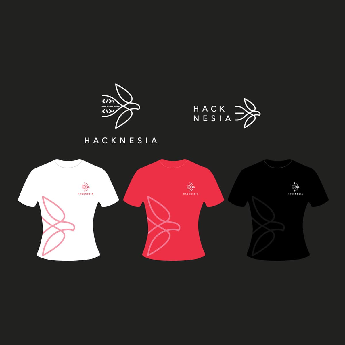
Hacknesia
{"type":"doc","content":[{"type":"paragraph","attrs":{"textAlign":null},"content":[{"type":"text","text":"Indonesia's finest coders don't just write software — they wear their mission, and Hacknesia gives them something worthy of their craft."}]},{"type":"image","attrs":{"src":"https://farooq-agent.web.app/assets/images/works/details/220-hacknesia/hacknesia.jpg","alt":null,"title":null,"width":null,"height":null}},{"type":"paragraph","attrs":{"textAlign":null},"content":[{"type":"text","marks":[{"type":"bold"}],"text":"Brand Identity & Apparel Design — Hacknesia"}]},{"type":"paragraph","attrs":{"textAlign":null},"content":[{"type":"text","marks":[{"type":"italic"}],"text":"Logo & T-Shirt Design · Programmer Community · Indonesia"}]},{"type":"paragraph","attrs":{"textAlign":null},"content":[{"type":"text","text":"A refined, unexpected brand identity for Hacknesia — an exclusive club of Indonesian programmers united by a singular mission: to solve Indonesia's problems through the power of software and collective technical skill. The name itself is a declaration — \"Hack\" meets \"Nesia,\" code meets nation — and the identity lives up to that ambition with striking elegance."}]},{"type":"paragraph","attrs":{"textAlign":null},"content":[{"type":"text","text":"The logomark defies every expectation of what a \"hacker\" brand should look like. Rather than circuit boards, terminals, or angular tech iconography, the mark is a beautifully minimal bird in flight — constructed entirely from code bracket symbols (</>). Wings composed of angle brackets, a body assembled from dashes and slashes — the programmer's syntax transformed into organic form. It is a logo that speaks two languages simultaneously: the visual poetry of nature and the structural grammar of code. A bird in flight communicates freedom, vision, and the upward trajectory of a community that believes technology can lift a nation."}]},{"type":"paragraph","attrs":{"textAlign":null},"content":[{"type":"text","text":"The wordmark \"HACKNESIA\" is set in a clean, widely-spaced uppercase geometric sans-serif — technical yet approachable, disciplined yet open. Two lockup variations are presented: a stacked vertical version and a compact horizontal format, demonstrating systematic thinking and real-world versatility."}]},{"type":"paragraph","attrs":{"textAlign":null},"content":[{"type":"text","text":"The apparel suite brings the identity into physical community territory — three T-shirt colorways (white, red, and black) each carry the logo small at the chest and the abstract bird motif large across the front body, rendered in a tone-on-tone line treatment that gives each garment a premium, considered quality. Red signals urgency and national pride; white communicates clarity and openness; black anchors the collection in technical gravitas."}]},{"type":"paragraph","attrs":{"textAlign":null},"content":[{"type":"text","text":"A brand identity as intelligent as the community it represents — where every line of the logo is, quite literally, written in code."}]}]}

Learning Together
{"type":"doc","content":[{"type":"paragraph","attrs":{"textAlign":null},"content":[{"type":"text","text":"Laptops open, ideas flowing, screens shared — Learning Together captures the energy of collaborative study in three scenes that feel genuinely alive."}]},{"type":"image","attrs":{"src":"https://cdn.dribbble.com/users/5057025/screenshots/10880409/media/062d87b348c3161c7a9d602072b693ba.jpg?compress=1&resize=800x600&vertical=top","alt":null,"title":null,"width":null,"height":null}},{"type":"paragraph","attrs":{"textAlign":null},"content":[{"type":"text","marks":[{"type":"bold"}],"text":"Illustration Set — Learning Together"}]},{"type":"paragraph","attrs":{"textAlign":null},"content":[{"type":"text","marks":[{"type":"italic"}],"text":"Character Illustration · Education · Collaborative Learning · Flat Vector"}]},{"type":"paragraph","attrs":{"textAlign":null},"content":[{"type":"text","text":"A vibrant three-scene illustration set depicting the many faces of collaborative learning — from casual group study to individual mentorship to interactive presentation — rendered in a bright, energetic flat-illustration style that makes education feel like something to look forward to."}]},{"type":"paragraph","attrs":{"textAlign":null},"content":[{"type":"text","text":"The first scene — a group of three students huddled together on a bean bag — is the set's warmest composition. A girl in purple, a boy in teal, and another in orange-red lean in together over an open laptop and a book, the physical proximity communicating the kind of trust and shared focus that only genuine learning partnerships produce. The teal bean bag grounds them in a casual, comfortable setting — this is studying as it should feel: effortless and connected."}]},{"type":"paragraph","attrs":{"textAlign":null},"content":[{"type":"text","text":"The second scene presents a girl with fiery auburn hair gesturing confidently toward a large UI wireframe or content grid — a presenter, a teacher, or a designer walking someone through a structured interface. Her posture is open and enthusiastic, tablet in hand, pointing at the structure with the energy of someone who genuinely understands what she's explaining. The lavender-blue grid behind her reads as a web layout, a kanban board, or a visual framework — versatile enough to speak to design, tech, or education contexts equally."}]},{"type":"paragraph","attrs":{"textAlign":null},"content":[{"type":"text","text":"The third scene is an intimate two-person learning moment: a boy cross-legged with a laptop, a girl leaning in over his shoulder pointing at the screen — the classic pose of peer-to-peer mentorship, the moment where \"I'll show you how\" becomes \"now I understand.\""}]},{"type":"paragraph","attrs":{"textAlign":null},"content":[{"type":"text","text":"The palette — vibrant teal, coral orange, purple, and vivid red — is youthful, inclusive, and joyful, communicating a learning environment where energy is high and curiosity is celebrated."}]},{"type":"paragraph","attrs":{"textAlign":null},"content":[{"type":"text","text":"An illustration set that makes learning look exactly like what it feels like at its best: shared, alive, and worth showing up for."}]}]}
TECHINNOVATION
{"type":"doc","content":[{"type":"paragraph","attrs":{"textAlign":null},"content":[{"type":"text","text":"Discover, Connect & Collaborate — TECHINNOVATION 2017's website captures the energy of Singapore's premier technology commercialization event in a single dark, immersive frame."}]},{"type":"image","attrs":{"src":"https://farooq-agent.web.app/assets/images/works/large/cwE8r2Tk_work_image.jpg","alt":null,"title":null,"width":null,"height":null}},{"type":"paragraph","attrs":{"textAlign":null},"content":[{"type":"text","marks":[{"type":"bold"}],"text":"Web Design — TECHINNOVATION"}]},{"type":"paragraph","attrs":{"textAlign":null},"content":[{"type":"text","marks":[{"type":"italic"}],"text":"Event Website · Technology Innovation Conference · Singapore 2017"}]},{"type":"paragraph","attrs":{"textAlign":null},"content":[{"type":"text","text":"A cinematic, dark-themed event website for TECHINNOVATION 2017 — Singapore's flagship technology commercialization event connecting technology providers with industry adopters from across the globe."}]},{"type":"paragraph","attrs":{"textAlign":null},"content":[{"type":"text","text":"The hero is a spotlight portrait of a keynote speaker on stage — dramatic stage lighting, microphone in hand, circular geometric overlay adding a tech-conference visual motif that bridges human presence with digital precision. The headline \"Discover, Connect & Collaborate at TECHINNOVATION 2017\" communicates the event's three core value propositions in a single line."}]},{"type":"paragraph","attrs":{"textAlign":null},"content":[{"type":"text","text":"The near-black background with white typography and subtle geometric grid elements gives the site the look of a serious, premium conference — the kind where deals get made and technology gets licensed. A \"More Speakers\" CTA drives deeper engagement for the primary audience: technology seekers evaluating whether this event is worth attending."}]},{"type":"paragraph","attrs":{"textAlign":null},"content":[{"type":"text","text":"The overall design language is consistent with Singapore's high-quality government and institutional event branding — authoritative, internationally positioned, and built to attract global participants."}]}]}
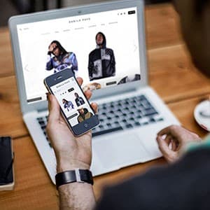
Danilo Pavo - Website Design and Frontend Development
{"type":"doc","content":[{"type":"paragraph","attrs":{"textAlign":null},"content":[{"type":"text","text":"Unique prints, real attitude — Danilo Pavo's e-commerce site puts streetwear culture front and center with a clean, editorial shopping experience built to convert."}]},{"type":"image","attrs":{"src":"https://farooq-agent.web.app/assets/images/works/large/3HUCoTrm_work_image.jpg","alt":null,"title":null,"width":null,"height":null}},{"type":"paragraph","attrs":{"textAlign":null},"content":[{"type":"text","marks":[{"type":"bold"}],"text":"Web Design & Frontend Development — Danilo Pavo"}]},{"type":"paragraph","attrs":{"textAlign":null},"content":[{"type":"text","marks":[{"type":"italic"}],"text":"E-Commerce · Unique Printed T-Shirt & Streetwear · Responsive"}]},{"type":"paragraph","attrs":{"textAlign":null},"content":[{"type":"text","text":"A full-stack design and frontend development project for Danilo Pavo — a streetwear brand specializing in unique printed t-shirts and apparel. The mockup shows the site live across both desktop and mobile simultaneously, confirming responsive implementation across breakpoints."}]},{"type":"paragraph","attrs":{"textAlign":null},"content":[{"type":"text","text":"The desktop hero is an editorial fashion slider — two models in distinctive printed hoodies and layered outfits, photographed with street culture authenticity. The product photography drives the entire visual experience: no lifestyle padding, no filler copy, just the clothes doing the talking. The minimal white layout with clean sans-serif navigation keeps focus entirely on the product."}]},{"type":"paragraph","attrs":{"textAlign":null},"content":[{"type":"text","text":"The mobile view mirrors the same editorial product grid in a compact single-column format — thumbnail-first, immediately shoppable. The consistency between desktop and mobile confirms thoughtful responsive design: same brand, same energy, different form factor, zero compromise."}]},{"type":"paragraph","attrs":{"textAlign":null},"content":[{"type":"text","text":"A project that spans both sides of the design-development boundary — designed and built, not just wireframed and handed off."}]}]}
Money Transfer
{"type":"doc","content":[{"type":"paragraph","attrs":{"textAlign":null},"content":[{"type":"text","text":"A fresh UI concept for Flip — Indonesia's popular zero-fee transfer app — reimagined with a warmer, more personal feel without losing its functional simplicity."}]},{"type":"image","attrs":{"src":"https://farooq-agent.web.app/assets/images/works/details/236-money-transfer/money-transfer.jpg","alt":null,"title":null,"width":null,"height":null}},{"type":"paragraph","attrs":{"textAlign":null},"content":[{"type":"text","marks":[{"type":"bold"}],"text":"UI/UX Design — Money Transfer (Flip)"}]},{"type":"paragraph","attrs":{"textAlign":null},"content":[{"type":"text","marks":[{"type":"italic"}],"text":"Mobile App · Fintech · Money Transfer · Indonesia"}]},{"type":"paragraph","attrs":{"textAlign":null},"content":[{"type":"text","text":"A UI redesign concept for Flip, Indonesia's widely-used inter-bank transfer app. The home screen greets users personally (\"Hello Kak Ginanjar!\") with a savings milestone message — reinforcing Flip's core value proposition of fee-free transfers directly in the header. The warm orange-to-pink gradient hero creates an energetic, friendly atmosphere that sets this apart from the cold blues typical of fintech apps."}]},{"type":"paragraph","attrs":{"textAlign":null},"content":[{"type":"text","text":"Four quick-action icons — Kirim Uang, Isi Paket Data, Buat Refund, and Beli Pulsa — are cleanly arranged in a 2×2 grid on a white card, keeping core functions one tap away. Below, the Riwayat Transaksi feed shows recent transfers with bank routing (BCA → BTPN, BCA → Mandiri), status badges (Konfirmasi, Berhasil), and timestamps — giving users an instant read on pending and completed transactions."}]},{"type":"paragraph","attrs":{"textAlign":null},"content":[{"type":"text","text":"The lifestyle photography mockup — a smiling woman holding the phone — reinforces the human, approachable brand direction this redesign aims to establish."}]}]}
SoftHug
{"type":"doc","content":[{"type":"paragraph","attrs":{"textAlign":null},"content":[{"type":"text","text":"Because every child deserves to be held safe — SoftHug is the brand that wraps protection in warmth, and turns advocacy into identity."}]},{"type":"image","attrs":{"src":"https://farooq-agent.web.app/assets/images/works/large/pd/SoftHug/SoftHug-02.png","alt":null,"title":null,"width":null,"height":null}},{"type":"paragraph","attrs":{"textAlign":null},"content":[{"type":"text","marks":[{"type":"bold"}],"text":"Brand Identity — SoftHug"}]},{"type":"paragraph","attrs":{"textAlign":null},"content":[{"type":"text","marks":[{"type":"italic"}],"text":"Logo Design · Child Protection Organization · Social & Advocacy"}]},{"type":"paragraph","attrs":{"textAlign":null},"content":[{"type":"text","text":"A deeply human brand identity for SoftHug — a child protection organization whose name alone communicates its entire mission: the gentleness of care wrapped around the firmness of safety. The logo translates this mission into a single, emotionally resonant mark that speaks universally across age, culture, and language."}]},{"type":"paragraph","attrs":{"textAlign":null},"content":[{"type":"text","text":"The logomark depicts three abstract human figures arranged in a circular embrace — two adult figures on the outer edges, arms extended inward to cradle a smaller child figure at the center, rendered as a glowing white form protected within the arc of the surrounding arms. The composition is unmistakable: this is a hug, formalized into a symbol. The protective circle formed by the adult figures creates both a physical shelter and a visual boundary — the child held safely within, never exposed to what lies outside."}]},{"type":"paragraph","attrs":{"textAlign":null},"content":[{"type":"text","text":"The gradient treatment — deep cobalt blue flowing into a brighter, hopeful blue — gives the mark a sense of depth, warmth, and institutional trust. Blue is a deliberate choice for a child protection brand: calm, stable, and universally associated with safety, authority, and care. The gradient adds dimension without softness, ensuring the mark feels both approachable and credible."}]},{"type":"paragraph","attrs":{"textAlign":null},"content":[{"type":"text","text":"The wordmark \"SoftHug\" is set in a rounded, semi-bold sans-serif with mixed case — the capitalization of both \"Soft\" and \"Hug\" giving the name equal weight, neither diminishing the gentleness of \"soft\" nor the strength of \"hug.\" The tagline \"CHILD PROTECTION\" is set in spaced, uppercase light-weight type beneath, grounding the brand in its serious purpose without abandoning its warmth."}]},{"type":"paragraph","attrs":{"textAlign":null},"content":[{"type":"text","text":"A logo that communicates protection, love, and safety in a single glance — exactly what a child protection brand must do."}]}]}
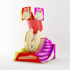
Energen POI Redesign 3D
{"type":"doc","content":[{"type":"paragraph","attrs":{"textAlign":null},"content":[{"type":"text","text":"From shelf to statement — this Energen POI redesign transforms a retail display stand into a sculptural brand experience that stops shoppers before they've even read the label."}]},{"type":"image","attrs":{"src":"https://farooq-agent.web.app/assets/images/works/large/xBRShVvY_work_image.png","alt":null,"title":null,"width":null,"height":null}},{"type":"paragraph","attrs":{"textAlign":null},"content":[{"type":"text","marks":[{"type":"bold"}],"text":"3D Design — Energen POI Redesign"}]},{"type":"paragraph","attrs":{"textAlign":null},"content":[{"type":"text","marks":[{"type":"italic"}],"text":"Point of Interest Display · Retail Merchandising · 3D Visualization · FMCG"}]},{"type":"paragraph","attrs":{"textAlign":null},"content":[{"type":"text","text":"A striking 3D retail display redesign for Energen — the well-known Indonesian cereal and nutritional drink brand — reimagining the point-of-interest (POI) stand as a bold, sculptural retail presence that commands attention at the point of purchase."}]},{"type":"paragraph","attrs":{"textAlign":null},"content":[{"type":"text","text":"The display structure is built around a dramatic central visual element: a coiled rope or wheat braid rising from a stepped tiered base, referencing the brand's grain and cereal heritage while creating vertical architectural height that draws the eye upward in a retail environment crowded with competing stimuli. Two Energen product packs are elevated at the apex — one in the signature red packaging, one in the purple variant — displayed like trophies at the crown of the structure, ensuring product visibility from across the aisle."}]},{"type":"paragraph","attrs":{"textAlign":null},"content":[{"type":"text","text":"The tiered display base is organized in a stepped, staircase format with slots for Energen sachet products — maximizing product holding capacity while maintaining clean visual organization. The red and purple color blocking across the display mirrors Energen's product line variants, creating an internally coherent brand system that communicates product range at a glance."}]},{"type":"paragraph","attrs":{"textAlign":null},"content":[{"type":"text","text":"The Energen wordmark is prominently featured on the base fascia in gold lettering on red — warm, trusted, and immediately recognizable to the brand's loyal customer base."}]},{"type":"paragraph","attrs":{"textAlign":null},"content":[{"type":"text","text":"The 3D render is presented on a clean white studio background with soft neutral lighting — a production-ready visualization that communicates structural form, branding application, and spatial presence with clarity sufficient for both client presentation and manufacturer briefing."}]},{"type":"paragraph","attrs":{"textAlign":null},"content":[{"type":"text","text":"A POI design that turns a standing display into a brand landmark on the retail floor."}]}]}

Cleaning Service
{"type":"doc","content":[{"type":"paragraph","attrs":{"textAlign":null},"content":[{"type":"text","text":"A vector illustration package for a cleaning service brand — featuring a hardworking male cleaner in a ready-to-serve pose, cleaning chemical products, and a work checklist illustration."}]},{"type":"image","attrs":{"src":"https://cdn.dribbble.com/users/5057025/screenshots/10951430/media/ef5061e588466921aea8f49930b6e8d1.jpg?compress=1&resize=1200x900&vertical=top","alt":null,"title":null,"width":null,"height":null}},{"type":"paragraph","attrs":{"textAlign":null},"content":[{"type":"text","text":"Yellow and purple, broom in hand, sparkle in the eye — this cleaning service illustration set is so well-branded, it makes scrubbing floors look like a career worth celebrating."}]},{"type":"horizontalRule"},{"type":"paragraph","attrs":{"textAlign":null},"content":[{"type":"text","marks":[{"type":"bold"}],"text":"Illustration Package — Cleaning Service"}]},{"type":"paragraph","attrs":{"textAlign":null},"content":[{"type":"text","marks":[{"type":"italic"}],"text":"Vector Illustration Set · Cleaning Service Brand · 4-Asset Package"}]},{"type":"paragraph","attrs":{"textAlign":null},"content":[{"type":"text","text":"A vibrant, cohesive four-piece illustration package designed for a cleaning service brand — delivering a complete visual system that covers the service's character identity, ready-to-serve attitude, product line, and operational workflow in a single, harmonious asset set."}]},{"type":"paragraph","attrs":{"textAlign":null},"content":[{"type":"text","text":"The brand color palette — bold sunshine yellow and deep violet-purple — runs consistently across all four illustrations, creating immediate brand recognition and a visual energy that communicates efficiency, cleanliness, and professional pride. The palette is cheerful without being childish, confident without being corporate."}]},{"type":"paragraph","attrs":{"textAlign":null},"content":[{"type":"text","text":"The first illustration presents the cleaner in full action mode: yellow polo and purple dungarees, broom raised high in one hand, metal bucket in the other, mid-stride with the energy of someone who takes their work seriously and enjoys it. The second shifts to a portrait pose — the cleaner mop in hand, eyes softened, a confident thumb-to-chest gesture that says \"leave it to me,\" with sparkle accents communicating the spotless results that follow. Together these two character poses give the brand both a dynamic action identity and an approachable human face."}]},{"type":"paragraph","attrs":{"textAlign":null},"content":[{"type":"text","text":"The third illustration shifts to product — three yellow cleaning fluid bottles grouped with a rolled purple cloth, rendered in warm flat-vector style that makes the products feel premium rather than utilitarian. The fourth closes the brand story with a hand holding a yellow clipboard checklist, pen poised mid-tick — communicating the professional, systematic approach that sets a quality cleaning service apart from a casual one."}]},{"type":"paragraph","attrs":{"textAlign":null},"content":[{"type":"text","text":"Four illustrations. One brand. A complete visual story told from the first broom swing to the final sign-off."}]}]}

Arab Finance Illustrations
{"type":"doc","content":[{"type":"paragraph","attrs":{"textAlign":null},"content":[{"type":"text","text":"From managing options to celebrating earnings — this Arab finance illustration suite puts a Saudi face at the center of every digital financial interaction, with warmth, clarity, and cultural precision."}]},{"type":"image","attrs":{"src":"https://cdn.dribbble.com/users/5057025/screenshots/11632184/media/96c1331230a7220e59d33a67808615ef.jpg?compress=1&resize=1200x900&vertical=top","alt":null,"title":null,"width":null,"height":null}},{"type":"image","attrs":{"src":"https://cdn.dribbble.com/users/5057025/screenshots/11632157/media/1b5aa8253206d1084b8d69b70a1405c0.jpg?compress=1&resize=1200x900&vertical=top","alt":null,"title":null,"width":null,"height":null}},{"type":"paragraph","attrs":{"textAlign":null},"content":[{"type":"text","marks":[{"type":"bold"}],"text":"Illustration Suite — Arab Finance"}]},{"type":"paragraph","attrs":{"textAlign":null},"content":[{"type":"text","marks":[{"type":"italic"}],"text":"UI Illustration · Financial Platform · Saudi Arabia · Arabic Market"}]},{"type":"paragraph","attrs":{"textAlign":null},"content":[{"type":"text","text":"A cohesive suite of flat vector illustrations designed for an Arab-facing financial platform — depicting Saudi men in traditional thobe and ghutrah engaging with digital financial services across a range of key product moments. The series communicates accessibility, trust, and cultural familiarity through character-driven illustration that speaks directly to its intended audience."}]},{"type":"paragraph","attrs":{"textAlign":null},"content":[{"type":"text","text":"The first set presents three distinct interaction states across a clean white layout: a man gesturing confidently toward a grid of blue UI tiles — communicating product selection or a dashboard overview; a man presenting two options (A and B) with open hands — the visual language of comparison and choice, central to any loan or investment platform; and a third figure clutching a SAR-labelled money bag with a fist pump, banknotes and coins flying freely around him — the unmistakable illustration of a successful financial outcome, rendered with infectious joy."}]},{"type":"paragraph","attrs":{"textAlign":null},"content":[{"type":"text","text":"The second illustration zooms into a single, cinematic moment: a Saudi man seated at a sleek blue desk, smiling as he points at a large screen displaying a structured content interface — a document, a report, or a loan summary — phone resting on the desk beside him. The composition communicates digital confidence and ease of use, presenting the platform as something that makes the user feel in control rather than overwhelmed."}]},{"type":"paragraph","attrs":{"textAlign":null},"content":[{"type":"text","text":"The illustration style across both pieces is consistent and deliberate: soft pink-toned ghutrah, clean white thobe, rounded flat-vector forms, and a blue-dominant palette that aligns with the visual language of fintech trust and reliability. The characters are facially expressive and culturally specific without being caricature — dignified, modern representations of the platform's actual user."}]},{"type":"paragraph","attrs":{"textAlign":null},"content":[{"type":"text","text":"An illustration system that earns the trust of its audience by looking like it was made for them — because it was."}]}]}
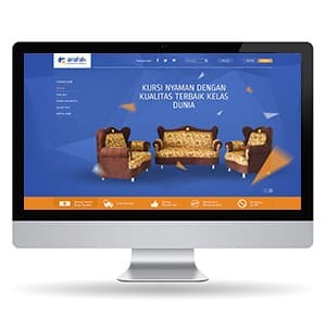
Arafah - Website Design
{"type":"doc","content":[{"type":"paragraph","attrs":{"textAlign":null},"content":[{"type":"text","text":"Kursi nyaman, kualitas terbaik kelas dunia — Arafah brings premium Indonesian furniture within reach of migrant workers dreaming of a better home, wherever they are."}]},{"type":"image","attrs":{"src":"https://farooq-agent.web.app/assets/images/works/large/NZuNvDxP_work_image.jpg","alt":null,"title":null,"width":null,"height":null}},{"type":"paragraph","attrs":{"textAlign":null},"content":[{"type":"text","marks":[{"type":"bold"}],"text":"Web Design — Arafah"}]},{"type":"paragraph","attrs":{"textAlign":null},"content":[{"type":"text","marks":[{"type":"italic"}],"text":"Furniture E-Commerce · Migrant Worker Market · Middle East & Hong Kong"}]},{"type":"paragraph","attrs":{"textAlign":null},"content":[{"type":"text","text":"A bold, conversion-focused e-commerce website for Arafah — a furniture retailer whose primary market is Indonesian migrant workers (TKW/TKI) based in the Middle East, Hong Kong, and beyond. The platform enables overseas workers to purchase quality furniture for their families back home — a specific and deeply human use case that the design addresses head-on."}]},{"type":"paragraph","attrs":{"textAlign":null},"content":[{"type":"text","text":"The hero leads with a full set of classic batik-upholstered sofas against a vibrant royal blue backdrop, with the headline \"Kursi Nyaman Dengan Kualitas Terbaik Kelas Dunia\" — aspirational copy that speaks directly to buyers who want the best for family they're separated from. The orange-and-blue color system communicates trust and warmth simultaneously."}]},{"type":"paragraph","attrs":{"textAlign":null},"content":[{"type":"text","text":"A benefit strip anchors the lower hero: delivery service, free delivery thresholds, quality guarantee, and remittance-friendly payment options — each addressing the real concerns of a buyer shopping from thousands of kilometers away."}]},{"type":"paragraph","attrs":{"textAlign":null},"content":[{"type":"text","text":"The left sidebar navigation and catalog structure confirm a full product catalog experience built for discovery and purchase, not just browsing."}]}]}
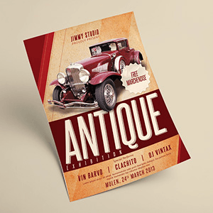
Antique Flyer
{"type":"doc","content":[{"type":"paragraph","attrs":{"textAlign":null},"content":[{"type":"text","text":"Explore flyer designs for antique car shows."}]},{"type":"paragraph","attrs":{"textAlign":null},"content":[{"type":"text","text":"Distressed textures, bold type, and a classic car that stops you cold — this antique exhibition flyer is print design that turns heads before it's even read."}]},{"type":"image","attrs":{"src":"https://farooq-agent.web.app/assets/images/works/large/wcFYd6rE_work_image.png","alt":null,"title":null,"width":null,"height":null}},{"type":"paragraph","attrs":{"textAlign":null},"content":[{"type":"text","marks":[{"type":"bold"}],"text":"Print Design — Antique Exhibition Flyer"}]},{"type":"paragraph","attrs":{"textAlign":null},"content":[{"type":"text","marks":[{"type":"italic"}],"text":"Event Flyer · Jimmy Studio · Vintage & Classic Car Exhibition · 2013"}]},{"type":"paragraph","attrs":{"textAlign":null},"content":[{"type":"text","text":"A richly atmospheric event flyer designed for an antique car exhibition — a piece of print design that draws as much inspiration from the era it celebrates as from the event it announces. The result is a composition that feels genuinely vintage without resorting to cliché."}]},{"type":"paragraph","attrs":{"textAlign":null},"content":[{"type":"text","text":"The hero is a stunning deep crimson classic automobile — a 1930s-era luxury roadster with chrome wire-spoke wheels, long sculpted hood, and commanding presence — rendered in full photographic detail against a warm, aged parchment background. The car commands the upper two-thirds of the flyer with the authority of the era it came from, making every other element secondary to its drama."}]},{"type":"paragraph","attrs":{"textAlign":null},"content":[{"type":"text","text":"The typography system is a masterclass in vintage hierarchy. The event name \"ANTIQUE\" is set in a massive, distressed display serif — bold, textured, and occupying the full width of the composition — anchored against a deep maroon band that grounds the lower section of the layout. Below, \"EXHIBITION\" tracks out in spaced caps, followed by the special performers lineup — Vin Barvo, Clachito, DJ Vintax — set in a clean condensed sans that provides typographic contrast to the expressive display type above."}]},{"type":"paragraph","attrs":{"textAlign":null},"content":[{"type":"text","text":"The red diagonal geometric accent in the upper left corner adds structural energy to an otherwise warm, horizontal composition — a compositional device that subtly modernizes the vintage aesthetic without breaking its period spell. A \"Free Merchandise\" badge stamp in the upper right completes the promotional messaging with period-appropriate graphic flair."}]},{"type":"paragraph","attrs":{"textAlign":null},"content":[{"type":"text","text":"Event details — Mulen, 24th March 2013 — are set at the base in clean light type, ensuring practical information reaches the reader without interrupting the visual experience above."}]},{"type":"paragraph","attrs":{"textAlign":null},"content":[{"type":"text","text":"A flyer that earns its place on any wall it's pinned to."}]}]}
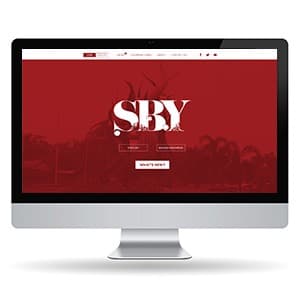
SBY - Website Design
{"type":"doc","content":[{"type":"paragraph","attrs":{"textAlign":null},"content":[{"type":"text","text":"Deep red, bold type, the city name as a headline — SBY's magazine website makes Surabaya feel like the most important city in the world, because for its readers, it is."}]},{"type":"image","attrs":{"src":"https://farooq-agent.web.app/assets/images/works/small/fkiFKacN_work_image.jpg","alt":null,"title":null,"width":null,"height":null}},{"type":"paragraph","attrs":{"textAlign":null},"content":[{"type":"text","marks":[{"type":"bold"}],"text":"Web Design — SBY"}]},{"type":"paragraph","attrs":{"textAlign":null},"content":[{"type":"text","marks":[{"type":"italic"}],"text":"Magazine Media Website · Surabaya · Digital Publication"}]},{"type":"paragraph","attrs":{"textAlign":null},"content":[{"type":"text","text":"A dramatically atmospheric website design for SBY — a magazine media brand dedicated to Surabaya, Indonesia's second-largest city — built around a visual identity as confident and distinct as the city it covers. Presented in an iMac desktop mockup that frames the design's full editorial impact."}]},{"type":"paragraph","attrs":{"textAlign":null},"content":[{"type":"text","text":"The hero section is the design's centerpiece and its most powerful statement: a full-width deep crimson red field — rich, saturated, unmistakably bold — layered over a dimmed editorial photograph of figures or a cityscape, the imagery visible as texture beneath the color wash. Rising from this field, the \"SBY\" masthead is set in an enormous, dramatically weighted display typeface — white letterforms that blend editorial elegance with the visual aggression of a magazine that knows its market and refuses to whisper."}]},{"type":"paragraph","attrs":{"textAlign":null},"content":[{"type":"text","text":"The typographic treatment of \"SBY\" is the design's defining craft moment: the letterforms carry stylistic ink-trap details and contrasting thick-thin strokes that speak to editorial tradition — a publication that takes its city seriously and its design even more so. The masthead feels simultaneously like a newspaper nameplate and a rock poster, communicating a brand with cultural authority and genuine attitude."}]},{"type":"paragraph","attrs":{"textAlign":null},"content":[{"type":"text","text":"Two language toggle buttons — English and Bahasa Indonesia — sit beneath the masthead, confirming the publication's bilingual ambitions and its awareness of both local and international readership. A \"What's New?\" CTA button invites immediate content discovery, keeping the hero section conversion-aware without sacrificing its editorial drama."}]},{"type":"paragraph","attrs":{"textAlign":null},"content":[{"type":"text","text":"The navigation bar is clean and minimal in white against the header band — publication categories, About, and social links anchored right — keeping the information architecture accessible without competing with the hero's visual authority."}]},{"type":"paragraph","attrs":{"textAlign":null},"content":[{"type":"text","text":"A magazine website that makes its city feel unmissable — because that's exactly what a great city publication should do."}]}]}
Dancing Zombie - Character Design
{"type":"doc","content":[{"type":"paragraph","attrs":{"textAlign":null},"content":[{"type":"text","text":"Undead, overdressed, and absolutely loving it — Dancing Zombie is the character that proves even zombies deserve their moment in the spotlight."}]},{"type":"image","attrs":{"src":"https://farooq-agent.web.app/assets/images/works/large/iijD4Iqa_work_image.png","alt":null,"title":null,"width":null,"height":null}},{"type":"paragraph","attrs":{"textAlign":null},"content":[{"type":"text","marks":[{"type":"bold"}],"text":"Character Design — Dancing Zombie"}]},{"type":"paragraph","attrs":{"textAlign":null},"content":[{"type":"text","marks":[{"type":"italic"}],"text":"Chibi Character Illustration · Horror Comedy · Original IP"}]},{"type":"paragraph","attrs":{"textAlign":null},"content":[{"type":"text","text":"A joyfully absurd chibi character illustration presenting the Dancing Zombie — a lovably grotesque undead figure who has chosen, against all biological odds, to put on his best outfit and have a good time. The character is a full-color vector realization of the Zombrema universe, delivered with maximum charm and zero apology."}]},{"type":"paragraph","attrs":{"textAlign":null},"content":[{"type":"text","text":"The Dancing Zombie stands in a mid-shimmy pose — arms swinging, feet shuffling, the whole body committed to a dance that rigor mortis simply cannot stop. He wears a powder blue blazer over a white shirt with a red tie, mismatched accessories dangling from the lapels, and dark brown trousers above clunky black shoes — the outfit of a zombie who raided a vintage wardrobe and somehow made it work. A purple beret sits at a jaunty angle on his lime green head, adding a bohemian flair to the undead ensemble."}]},{"type":"paragraph","attrs":{"textAlign":null},"content":[{"type":"text","text":"The face is the design's most expressive element: giant hollow black eyes with tiny white pupils, a wide exposed tooth grin stitched together from whatever was available post-apocalypse, and green skin rendered with the confident flatness of a vintage cartoon character who knows he's the star. Decorative scattered elements — a watermelon slice, colorful orbs, and other whimsical debris — orbit the character in the tradition of chibi illustration, adding visual energy and compositional playfulness."}]},{"type":"paragraph","attrs":{"textAlign":null},"content":[{"type":"text","text":"The \"Dancing Zombie\" logotype at the base is set in a bouncy, hand-lettered horror display typeface — purple and green — sealing the character in its own branded universe."}]},{"type":"paragraph","attrs":{"textAlign":null},"content":[{"type":"text","text":"A character that finds pure joy in being exactly what it is — and dances like no one is watching, because technically everyone who was watching is now also a zombie."}]}]}
Creator Group
{"type":"doc","content":[{"type":"paragraph","attrs":{"textAlign":null},"content":[{"type":"text","text":"Every creator, every type of content, one platform — this hero illustration captures an entire creative economy in motion, and makes you want to be part of it immediately."}]},{"type":"image","attrs":{"src":"https://farooq-agent.web.app/assets/images/works/details/239-creco/ilus-1.jpg","alt":null,"title":null,"width":null,"height":null}},{"type":"paragraph","attrs":{"textAlign":null},"content":[{"type":"text","marks":[{"type":"bold"}],"text":"Hero Illustration — Creator Group"}]},{"type":"paragraph","attrs":{"textAlign":null},"content":[{"type":"text","marks":[{"type":"italic"}],"text":"Website Hero Section · Creco Platform · Digital Creator Economy · Patreon-style Platform"}]},{"type":"paragraph","attrs":{"textAlign":null},"content":[{"type":"text","text":"The flagship hero illustration for Creco — a digital creator platform where creators share exclusive content and earn money from their audience — presented as a four-stage process sheet that reveals the complete illustration workflow from first gestural sketch to final gradient-rich render."}]},{"type":"paragraph","attrs":{"textAlign":null},"content":[{"type":"text","text":"The composition is a full creative ecosystem in motion: six distinct creator figures orbit a central content dashboard — the platform's core product — each representing a different creator archetype. A musician with headphones, a visual artist with a palette, a writer at a laptop, a video creator mid-gesture, a streamer, a content strategist — together they form a living, breathing map of the creator economy Creco serves. No single creator dominates; the platform belongs to all of them."}]},{"type":"paragraph","attrs":{"textAlign":null},"content":[{"type":"text","text":"The central dashboard element anchors the composition with platform intelligence: a content panel with charts, text blocks, a video play button, and engagement metrics — communicating at a glance that Creco is not just a place to post content, but a place to grow, measure, and monetize it. Yellow accent elements — chat bubbles, gold rings, geometric shapes — add warmth and engagement energy against the deep blue platform palette."}]},{"type":"paragraph","attrs":{"textAlign":null},"content":[{"type":"text","text":"The color progression across the four panels is the process sheet's most visually compelling story: from raw pencil sketch (top-left) through refined pink structural linework (top-right) to a vibrant royal blue flat render (bottom-left) and the final blue-to-purple gradient version (bottom-right) — the illustration evolving from idea to hero-worthy asset with each stage."}]},{"type":"paragraph","attrs":{"textAlign":null},"content":[{"type":"text","text":"The organic fluid background shape — a flowing blue-violet form — gives the hero illustration the kind of dynamic, non-rectangular energy that makes a website section stop the scroll and hold attention."}]},{"type":"paragraph","attrs":{"textAlign":null},"content":[{"type":"text","text":"A hero illustration that communicates the platform's promise before a single headline is read: this is where creators come to do what they love — and get paid for it."}]}]}
Leman
{"type":"doc","content":[{"type":"paragraph","attrs":{"textAlign":null},"content":[{"type":"text","text":"Tusks of gold, bamboo spear in grip, gaze unmovable — Team Leman's emblem carries the full authority of Indonesian traffic law enforcement wrapped in a symbol of regional power and pride."}]},{"type":"image","attrs":{"src":"https://farooq-agent.web.app/assets/images/works/large/pd/leman/tim-leman-02.jpg","alt":null,"title":null,"width":null,"height":null}},{"type":"paragraph","attrs":{"textAlign":null},"content":[{"type":"text","marks":[{"type":"bold"}],"text":"Emblem Design — Team Leman"}]},{"type":"paragraph","attrs":{"textAlign":null},"content":[{"type":"text","marks":[{"type":"italic"}],"text":"Police Unit Logo · Satlantas Polres Ngawi · Traffic Division · East Java"}]},{"type":"paragraph","attrs":{"textAlign":null},"content":[{"type":"text","text":"A commanding unit emblem designed for Team Leman — the traffic law enforcement team (Satlantas) of Polres Ngawi, East Java — built around a mascot that communicates strength, authority, and deep regional identity in a single powerful mark."}]},{"type":"paragraph","attrs":{"textAlign":null},"content":[{"type":"text","text":"The central figure is an elephant head rendered in a bold, high-contrast illustration style — grey skin with dramatic ink linework that gives the animal mass and gravitas, positioned within a shield-like crest that signals institutional authority. The elephant is an animal of intelligence, memory, and immovable resolve — qualities that map directly onto the values of a disciplined law enforcement unit. For a traffic division that must maintain order, enforce standards, and command public respect, the elephant is an instinctive and powerful choice."}]},{"type":"paragraph","attrs":{"textAlign":null},"content":[{"type":"text","text":"The golden curved tusk sweeping forward from the left adds a warm, luminous accent that contrasts beautifully against the cool grey of the elephant's hide — communicating both the strength of the unit and the warmth of its public service mission. The bamboo spear clenched diagonally in the elephant's grip is a distinctly Javanese cultural element — the bamboo runcing, a symbol of Indonesian resistance and resolve, here recontextualized as a tool of order and protection rather than conflict."}]},{"type":"paragraph","attrs":{"textAlign":null},"content":[{"type":"text","text":"The \"TEAM LEMAN\" wordmark is set in bold, yellow condensed type against a black arc banner — high-contrast, highly legible, and authoritative at patch, vehicle, and signage scale. \"SATLANTAS POLRES NGAWI\" grounds the unit's institutional identity below in clean white type."}]},{"type":"paragraph","attrs":{"textAlign":null},"content":[{"type":"text","text":"A police unit emblem that earns its authority through the weight of its symbolism — local, powerful, and unmistakably East Javanese."}]}]}

Esenja
{"type":"doc","content":[{"type":"image","attrs":{"src":"https://farooq-agent.web.app/assets/images/works/large/esenja.jpg","alt":null,"title":null,"width":null,"height":null}},{"type":"paragraph","attrs":{"textAlign":null},"content":[{"type":"text","text":"Sweet name, sweeter drinks — Esenja is the cute Indonesian beverage brand that makes every cup feel like a reward, and every sip feel like an event."}]},{"type":"image","attrs":{"src":"https://cdn.dribbble.com/users/5057025/screenshots/14280090/media/e08a68afd38258c4053f61f9b97e8485.jpg?compress=1&resize=1200x900&vertical=top","alt":null,"title":null,"width":null,"height":null}},{"type":"paragraph","attrs":{"textAlign":null},"content":[{"type":"text","marks":[{"type":"bold"}],"text":"Brand Identity & Mascot Design — Esenja"}]},{"type":"paragraph","attrs":{"textAlign":null},"content":[{"type":"text","marks":[{"type":"italic"}],"text":"Logo & Mascot Design · Drinking Product · F&B · Indonesia"}]},{"type":"paragraph","attrs":{"textAlign":null},"content":[{"type":"text","text":"A thoroughly delightful brand identity for Esenja — a cute Indonesian drinking brand whose name itself is playful and inviting — built around a mascot character and a logo system that radiates sweetness, approachability, and the kind of visual energy that stops you at a drink stall before you've even decided you're thirsty."}]},{"type":"paragraph","attrs":{"textAlign":null},"content":[{"type":"text","text":"The Esenja mascot is a chibi girl in a pink cap adorned with a white flower, wide smile, eyes closed in happy contentment, one hand holding a cup of shaved ice with boba pearls on top. The character is rendered in a warm pink monochrome palette with bold outlines — a sticker-style illustration that combines the cheerful visual language of Japanese food mascots with the local charm of an Indonesian street drink vendor. The cow-print pattern in the background circle is a subtle nod to the dairy or milk-based drinks in the product lineup."}]},{"type":"paragraph","attrs":{"textAlign":null},"content":[{"type":"text","text":"The \"ESENJA\" wordmark is set in a bold, rounded bubble typeface in vivid yellow with a pink outline — loud, fun, and instantly legible on a drink cup from across the room. The ribbon banner integrates seamlessly with the circular mascot composition, giving the logo a badge-like quality that scales beautifully from sticker to cup sleeve to signage."}]},{"type":"paragraph","attrs":{"textAlign":null},"content":[{"type":"text","text":"The product photography application reveals the full brand system in action across three cup variants — strawberry pink (foreground), matcha green, and taro beige — each carrying the Esenja mascot in its matching color variant, surrounded by fresh blueberries, strawberries, and mint on a clean white surface. The mascot adapts tonally across each variant, maintaining brand consistency while celebrating each flavor's identity."}]},{"type":"paragraph","attrs":{"textAlign":null},"content":[{"type":"text","text":"A brand design as refreshing as the drinks it adorns — cute without being cloying, sweet without being overwhelming."}]}]}
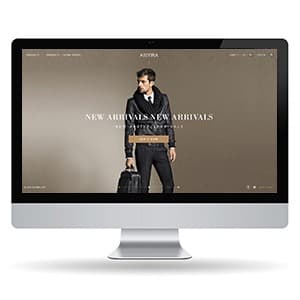
Aisyira - Website Design
{"type":"doc","content":[{"type":"paragraph","attrs":{"textAlign":null},"content":[{"type":"text","text":"Aisyira's luxury fashion website is a dark, editorial statement that positions the brand firmly in the world of premium men's and women's fashion."}]},{"type":"image","attrs":{"src":"https://farooq-agent.web.app/assets/images/works/small/k5UeVzyZ_work_image.jpg","alt":null,"title":null,"width":null,"height":null}},{"type":"paragraph","attrs":{"textAlign":null},"content":[{"type":"text","marks":[{"type":"bold"}],"text":"Web Design — Aisyira"}]},{"type":"paragraph","attrs":{"textAlign":null},"content":[{"type":"text","marks":[{"type":"italic"}],"text":"Fashion E-Commerce Website · Luxury · Men's & Women's Fashion"}]},{"type":"paragraph","attrs":{"textAlign":null},"content":[{"type":"text","text":"A dark, editorial luxury fashion website for Aisyira — a fashion brand serving both men and women at the premium end of the market. A stark contrast to the brand's coral-pink mobile app, the desktop website speaks an entirely different visual language: dark, minimal, and aspirational."}]},{"type":"paragraph","attrs":{"textAlign":null},"content":[{"type":"text","text":"The hero is a full-bleed editorial photograph of a male model in a black leather jacket and tailored trousers, briefcase in hand, shot against a warm mocha-brown background. The composition is fashion editorial at its most confident — the model's posture, the controlled color palette, the isolation of the figure against a tonal background — all communicating a brand that operates at luxury price points."}]},{"type":"paragraph","attrs":{"textAlign":null},"content":[{"type":"text","text":"\"NEW ARRIVALS NEW ARRIVALS\" in a scrolling marquee headline creates motion and urgency within the otherwise still composition — a web design technique borrowed from high-fashion digital publications. The \"Buy It Now\" CTA in a warm bronze-gold button is the only color accent in an otherwise neutral composition — a deliberate luxury restraint."}]},{"type":"paragraph","attrs":{"textAlign":null},"content":[{"type":"text","text":"The navigation — Products, Products, Look Book — is minimal and fashion-focused. The AISYIRA wordmark centered in the header communicates brand confidence: the name is enough, no tagline required."}]},{"type":"paragraph","attrs":{"textAlign":null},"content":[{"type":"text","text":"A fashion website that understands luxury is communicated through what you leave out — and makes restraint the most powerful design choice on the page."}]}]}
Amidis - Website Design
{"type":"doc","content":[{"type":"paragraph","attrs":{"textAlign":null},"content":[{"type":"text","text":"Premium Water for Premium Life — Amidis' website is as clean and refined as the water it bottles."}]},{"type":"image","attrs":{"src":"https://farooq-agent.web.app/assets/images/works/large/NNQUZYLj_work_image.jpg","alt":null,"title":null,"width":null,"height":null}},{"type":"paragraph","attrs":{"textAlign":null},"content":[{"type":"text","marks":[{"type":"bold"}],"text":"Web Design — Amidis"}]},{"type":"paragraph","attrs":{"textAlign":null},"content":[{"type":"text","marks":[{"type":"italic"}],"text":"Product Website · Premium Drinking Water"}]},{"type":"paragraph","attrs":{"textAlign":null},"content":[{"type":"text","text":"A crisp, aspirational website for Amidis — an Indonesian premium drinking water brand. The design does exactly what premium FMCG product websites need to do: make the product feel desirable before the specs are read."}]},{"type":"paragraph","attrs":{"textAlign":null},"content":[{"type":"text","text":"The hero is a full-bleed sky-and-cloud background — airy, light, and pure — with the Amidis glass bottle as the sole product hero. The distinctive cut-glass bottle design with its orange cap reads as a premium lifestyle object, not a commodity. The headline \"Premium Water for Premium Life\" in warm orange against the light sky reinforces the aspirational positioning with minimal copy, maximum clarity."}]},{"type":"paragraph","attrs":{"textAlign":null},"content":[{"type":"text","text":"A scroll indicator invites deeper exploration, while the minimal hamburger nav and top-right icons keep the interface clean and uninterrupted. The orange brand color carries through logo, headline, and cap — a tight, cohesive system."}]},{"type":"paragraph","attrs":{"textAlign":null},"content":[{"type":"text","text":"A product website where restraint is the strategy — and it works."}]}]}
Vacapedia
{"type":"doc","content":[{"type":"paragraph","attrs":{"textAlign":null},"content":[{"type":"text","text":"Your next adventure, organized and at your fingertips — Vacapedia is the travel management app that turns destination dreams into a seamlessly curated journey."}]},{"type":"image","attrs":{"src":"https://farooq-agent.web.app/assets/images/works/large/vacapedia.jpg","alt":null,"title":null,"width":null,"height":null}},{"type":"paragraph","attrs":{"textAlign":null},"content":[{"type":"text","marks":[{"type":"bold"}],"text":"Mobile App Design & Development — Vacapedia"}]},{"type":"paragraph","attrs":{"textAlign":null},"content":[{"type":"text","marks":[{"type":"italic"}],"text":"Android App · Travel Management · Java & Android Native"}]},{"type":"paragraph","attrs":{"textAlign":null},"content":[{"type":"text","text":"A clean, visually inviting travel management application built natively for Android using Java — Vacapedia brings the full richness of travel discovery and trip organization into a single, intuitive mobile experience."}]},{"type":"paragraph","attrs":{"textAlign":null},"content":[{"type":"text","text":"The app's home screen leads with a full-width hero image carousel — vibrant travel photography that immediately transports the user, with \"Fun on Beach\" as the featured destination. The carousel pagination dots below invite exploration, setting a browsing cadence that feels natural and unhurried. Below the hero, destinations are organized into curated category sections — \"Back to Nature\" surfaces Nusa Lembongan and Parasailing; \"Amazing Architecture\" leads with Puputan Renon and Makam Sunan Kalijaga — a content taxonomy that speaks to Indonesia's extraordinary depth of travel experiences."}]},{"type":"paragraph","attrs":{"textAlign":null},"content":[{"type":"text","text":"The UI palette is deliberately fresh and airy — sky blue navigation bar, clean white content cards, and rich photography doing the heavy lifting of visual appeal. The card-grid layout strikes the right balance between information density and visual breathing room, allowing users to browse multiple categories without cognitive overload."}]},{"type":"paragraph","attrs":{"textAlign":null},"content":[{"type":"text","text":"The hand-holding phone mockup against a soft-focus travel map background is a smart presentation choice — it grounds the app in the act of travel planning itself, reminding the viewer exactly who this product is for and where they'll be when they use it."}]},{"type":"paragraph","attrs":{"textAlign":null},"content":[{"type":"text","text":"A native Android travel app that proves you don't need cross-platform frameworks to build something that feels genuinely polished and purposeful."}]}]}

Doctor with Korean Love Sign
{"type":"doc","content":[{"type":"paragraph","attrs":{"textAlign":null},"content":[{"type":"text","text":"A flat vector illustration of a male and female doctor making the Korean finger heart gesture — a symbol of the sincere love and dedication of healthcare workers who continue to serve their communities in the midst of a global virus pandemic."}]},{"type":"horizontalRule"},{"type":"paragraph","attrs":{"textAlign":null},"content":[{"type":"text","text":"Masks on, finger hearts raised — these doctors say what words during a pandemic sometimes can't: we are here, we care, and we love what we do for you."}]},{"type":"image","attrs":{"src":"https://cdn.dribbble.com/users/5057025/screenshots/11019160/media/fa8d6bc9cef65e63021eba87c8ddb738.jpg?compress=1&resize=1200x900&vertical=top","alt":null,"title":null,"width":null,"height":null}},{"type":"paragraph","attrs":{"textAlign":null},"content":[{"type":"text","marks":[{"type":"bold"}],"text":"Vector Illustration — Doctor with Korean Love Sign"}]},{"type":"paragraph","attrs":{"textAlign":null},"content":[{"type":"text","marks":[{"type":"italic"}],"text":"Public Health Illustration · Healthcare Heroes · COVID-19 Tribute"}]},{"type":"paragraph","attrs":{"textAlign":null},"content":[{"type":"text","text":"A warm, emotionally resonant flat vector illustration depicting a male and female doctor — both in white coats and surgical masks, clipboards in hand — each making the Korean finger heart gesture: thumb and index finger crossed to form a small, intimate heart. Floating hearts of varying sizes surround them, filling the composition with an atmosphere of genuine care and human warmth that transcends the clinical setting."}]},{"type":"paragraph","attrs":{"textAlign":null},"content":[{"type":"text","text":"The Korean finger heart — popularized through K-pop and Korean culture — has become a universally understood gesture of affection and sincerity, small enough to make with one hand yet powerful enough to communicate a complete feeling. In this context, placed in the hands of healthcare workers at the height of a pandemic, the gesture carries extraordinary weight: these are people who showed up every day, masked and gloved, and still found a way to say \"I love what I do, and I do it for you.\""}]},{"type":"paragraph","attrs":{"textAlign":null},"content":[{"type":"text","text":"The character design is warm and approachable — soft rounded features, expressive eyes above the masks that carry the full emotional burden of a smile the viewer cannot see. The male doctor holds his clipboard at his side while making the gesture at chest level; the female doctor extends hers outward — offering the heart to the viewer directly. The lavender-purple abstract blob background gives the pair a shared space that feels intimate rather than clinical."}]},{"type":"paragraph","attrs":{"textAlign":null},"content":[{"type":"text","text":"The illustration communicates a truth that needed to be said during a pandemic — and still needs to be said now: that behind every mask is a person who chose this profession out of love, and kept that love even when the work was hardest."}]},{"type":"paragraph","attrs":{"textAlign":null},"content":[{"type":"text","text":"A tribute illustration that honors healthcare workers in the language they deserve — sincere, human, and full of heart."}]}]}

Girl Confuse
{"type":"doc","content":[{"type":"paragraph","attrs":{"textAlign":null},"content":[{"type":"text","text":"Both palms up, eyes closed, half a smile — Girl Confuse is the illustration that perfectly captures the moment between not knowing and not really minding."}]},{"type":"image","attrs":{"src":"https://cdn.dribbble.com/users/5057025/screenshots/11632208/media/7ce85bcdb81ddcbe197d091ff4908395.jpg?compress=1&resize=1200x900&vertical=top","alt":null,"title":null,"width":null,"height":null}},{"type":"paragraph","attrs":{"textAlign":null},"content":[{"type":"text","marks":[{"type":"bold"}],"text":"Vector Illustration — Girl Confuse"}]},{"type":"paragraph","attrs":{"textAlign":null},"content":[{"type":"text","marks":[{"type":"italic"}],"text":"Character Illustration · UI Empty State · Flat Vector"}]},{"type":"paragraph","attrs":{"textAlign":null},"content":[{"type":"text","text":"A warm, softly expressive flat vector illustration of a confused girl — the feminine companion to the Confuse Man character series — rendered with the same emotional precision but a distinctly lighter, more ambivalent energy. Where the male figure conveyed earnest bewilderment, Girl Confuse brings something subtly different: a half-smile that suggests she's not entirely troubled by not knowing the answer."}]},{"type":"paragraph","attrs":{"textAlign":null},"content":[{"type":"text","text":"The character wears a soft pink long-sleeve top that blends harmoniously with her warm auburn-brown hair pulled back in a low ponytail — a palette of blush and rose that feels gentle, approachable, and entirely suited to a UI context where the goal is reassurance rather than alarm. Her expression is the illustration's most nuanced element: eyes gently closed, mouth curved in the faintest smile, face tilted ever so slightly — the look of someone who has decided that confusion, at least right now, is perfectly fine."}]},{"type":"paragraph","attrs":{"textAlign":null},"content":[{"type":"text","text":"Both arms are raised at her sides, palms open and upward in the classic double-shrug — a gesture that communicates \"I genuinely don't know\" with an ease that avoids frustration. The symmetry of the pose gives the character a balanced, composed quality: not lost, not panicking — simply waiting for more information."}]},{"type":"paragraph","attrs":{"textAlign":null},"content":[{"type":"text","text":"The soft pink oval background blob grounds the character in a warm, uncluttered space, making the illustration equally deployable across empty states, onboarding moments, FAQ sections, search-no-results screens, and any UI touchpoint where a user needs to feel gently met rather than briskly redirected."}]},{"type":"paragraph","attrs":{"textAlign":null},"content":[{"type":"text","text":"A companion illustration that proves the same emotion can wear many faces — and sometimes confusion comes with a smile."}]}]}
Dr. Antri
{"type":"doc","content":[{"type":"paragraph","attrs":{"textAlign":null},"content":[{"type":"text","text":"\"Now serving number: 28 — Your queue number: 35\" — Dr. Antri turns the most frustrating part of seeing a doctor into a calm, data-informed wait."}]},{"type":"image","attrs":{"src":"https://farooq-agent.web.app/assets/images/works/large/dr-antri.jpg","alt":null,"title":null,"width":null,"height":null}},{"type":"paragraph","attrs":{"textAlign":null},"content":[{"type":"text","marks":[{"type":"bold"}],"text":"App UI Design — Dr. Antri"}]},{"type":"paragraph","attrs":{"textAlign":null},"content":[{"type":"text","marks":[{"type":"italic"}],"text":"Mobile App · Doctor Queue Management System · Healthcare UX"}]},{"type":"paragraph","attrs":{"textAlign":null},"content":[{"type":"text","text":"A thoughtful, data-rich queue management app for Dr. Antri — a doctor's clinic service that lets patients join the queue online, track their position in real time, and know exactly how long they'll wait before stepping into the waiting room."}]},{"type":"paragraph","attrs":{"textAlign":null},"content":[{"type":"text","marks":[{"type":"bold"}],"text":"Screen 1 — Clinic Home:"},{"type":"text","text":" A warm, friendly home screen for what appears to be an OB/GYN or maternal health clinic — a doctor consulting with a pregnant patient in the hero image, followed by service cards: \"Konsultasi Awal Kehamilan\" (Early Pregnancy Consultation) and \"Pelayanan Masa Emas Janin\" (Golden Fetal Care Period). The prominent dark purple \"Ikut Antrian Online\" (Join Online Queue) CTA is the single most important action on the screen, placed prominently at the bottom."}]},{"type":"paragraph","attrs":{"textAlign":null},"content":[{"type":"text","marks":[{"type":"bold"}],"text":"Screen 2 — Live Queue Tracker:"},{"type":"text","text":" A dark purple dashboard screen that is genuinely impressive in its information design. The current queue number being served — \"28\" — is displayed in massive, confident type. Below it, a waveform visualization shows the queue flow pattern across numbers 20–27, giving a visual sense of pace. Three stat cards below communicate everything a waiting patient needs: Rata-rata Durasi Layanan (Average service duration) 7 menit, Antrian yang Masih Ditunggu (Queue remaining) 7 orang, Perkiraan Waktu Tunggu (Estimated wait time) 49 menit. At the bottom, the patient's own queue number — 35 — with Catatan (Notes) and Keluar (Exit) actions."}]},{"type":"paragraph","attrs":{"textAlign":null},"content":[{"type":"text","text":"The waveform visualization is the design's standout detail: it transforms dry queue data into a living, breathing signal — communication as much as information."}]},{"type":"paragraph","attrs":{"textAlign":null},"content":[{"type":"text","text":"An app that makes waiting feel managed — because when you know exactly how long, the wait is already shorter."}]}]}
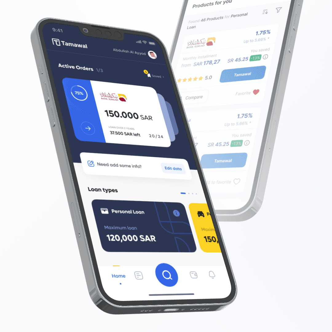
Tamawal
{"type":"doc","content":[{"type":"paragraph","attrs":{"textAlign":null},"content":[{"type":"text","text":"A Sharia-compliant loan marketplace that puts Saudi borrowers in control — compare products, track active loans, and find the best rate, all in one place."}]},{"type":"image","attrs":{"src":"https://mir-s3-cdn-cf.behance.net/project_modules/fs/9a3549149443863.62e7e763c8f26.png","alt":null,"title":null,"width":null,"height":null}},{"type":"paragraph","attrs":{"textAlign":null},"content":[{"type":"text","marks":[{"type":"bold"}],"text":"UI/UX Design — Tamawal"}]},{"type":"paragraph","attrs":{"textAlign":null},"content":[{"type":"text","marks":[{"type":"italic"}],"text":"Mobile App · Fintech · Loan Marketplace · Saudi Arabia"}]},{"type":"paragraph","attrs":{"textAlign":null},"content":[{"type":"text","text":"Tamawal is a SAMA-regulated loan marketplace app designed for the Saudi market. The home screen leads with an Active Orders tracker — a bold blue card displaying the current loan amount (150,000 SAR), repayment progress (20/24 installments), and remaining balance at a glance. Below it, a horizontal Loan Types carousel lets users quickly browse Personal Loan and other categories with their maximum limits surfaced upfront."}]},{"type":"paragraph","attrs":{"textAlign":null},"content":[{"type":"text","text":"The Products listing screen takes a comparison-first approach: each bank offer card shows the interest rate, monthly installment, and \"You saved\" badge in green — making cost differences immediately scannable. A prominent \"Tamawal\" CTA on each card drives conversion directly from the list. The navy and yellow-gold palette grounds the app in a financial context while maintaining enough warmth to feel approachable rather than intimidating."}]},{"type":"paragraph","attrs":{"textAlign":null},"content":[{"type":"text","text":"Clean, functional, and built around the decisions users actually need to make."}]}]}
Kadologi - App UI Design
{"type":"doc","content":[{"type":"paragraph","attrs":{"textAlign":null},"content":[{"type":"text","text":"Giving gifts just got its own app — Kadologi's vibrant onboarding screen sets the tone for a platform built around the joy of giving."}]},{"type":"image","attrs":{"src":"https://farooq-agent.web.app/assets/images/works/large/rRMA8ULL_work_image.png","alt":null,"title":null,"width":null,"height":null}},{"type":"paragraph","attrs":{"textAlign":null},"content":[{"type":"text","marks":[{"type":"bold"}],"text":"App UI Design — Kadologi"}]},{"type":"paragraph","attrs":{"textAlign":null},"content":[{"type":"text","marks":[{"type":"italic"}],"text":"Mobile App · Gift Platform · iOS UI Design"}]},{"type":"paragraph","attrs":{"textAlign":null},"content":[{"type":"text","text":"A bright, welcoming app UI design for Kadologi — a mobile platform that helps users discover, curate, and send gifts. The onboarding screen shown here is a hand-held iPhone mockup that captures the first impression the app makes: colorful, friendly, and immediately inviting."}]},{"type":"paragraph","attrs":{"textAlign":null},"content":[{"type":"text","text":"The login screen uses a full-bleed rainbow gradient background — transitioning from warm pink through orange, yellow, green, to cool blue — communicating the range and variety of the gifting experience within a single opening frame. The Kadologi logomark, a vibrant multi-petaled flower icon, sits center-screen with the app name in clean light typography below."}]},{"type":"paragraph","attrs":{"textAlign":null},"content":[{"type":"text","text":"Three entry points are offered: Log In, Sign Up, and Facebook Log In — a standard but well-structured auth flow that reduces friction for new users while providing the social login shortcut that significantly improves conversion on consumer apps."}]},{"type":"paragraph","attrs":{"textAlign":null},"content":[{"type":"text","text":"A clean, joyful first screen that says: this is an app about celebration."}]}]}
LKCNHM
{"type":"doc","content":[{"type":"paragraph","attrs":{"textAlign":null},"content":[{"type":"text","text":"From flying lizards to ancient fossils — LKCNHM's website design gives Singapore's premier natural history museum a digital presence as rich and layered as its collections."}]},{"type":"image","attrs":{"src":"https://farooq-agent.web.app/assets/images/works/small/BDYKzn6j_work_image.jpg","alt":null,"title":null,"width":null,"height":null}},{"type":"paragraph","attrs":{"textAlign":null},"content":[{"type":"text","marks":[{"type":"bold"}],"text":"Web Design — LKCNHM"}]},{"type":"paragraph","attrs":{"textAlign":null},"content":[{"type":"text","marks":[{"type":"italic"}],"text":"Museum Website · Lee Kong Chian Natural History Museum · Singapore"}]},{"type":"paragraph","attrs":{"textAlign":null},"content":[{"type":"text","text":"A design project for the Lee Kong Chian Natural History Museum — Singapore's leading natural history institution, home to Southeast Asia's most significant biodiversity and paleontological collections, including the famous dinosaur specimens Apollonia, Prince, and T. rex."}]},{"type":"paragraph","attrs":{"textAlign":null},"content":[{"type":"text","text":"The image visible here captures the museum's specimen photography style: a Draco lizard — the gliding lizard native to Southeast Asian forests — photographed with scientific precision against a clean white background, its colorful patagium (wing membrane) fully displayed. The specimen photography is both scientifically accurate and visually striking, designed to translate the physical museum experience into a compelling digital one."}]},{"type":"paragraph","attrs":{"textAlign":null},"content":[{"type":"text","text":"The gold and dark atmospheric framing in the background suggests a website that uses dramatic, cinematic treatments for its hero sections — an approach appropriate for a museum whose collections inspire genuine wonder. Natural history museums sit at the intersection of science and storytelling, and the design direction reflects that: precise and evocative in equal measure."}]},{"type":"paragraph","attrs":{"textAlign":null},"content":[{"type":"text","text":"A museum website where every specimen photograph earns its full frame."}]}]}

Steps for Using Hand Sanitizers
{"type":"doc","content":[{"type":"paragraph","attrs":{"textAlign":null},"content":[{"type":"text","text":"Three steps, three icons, zero confusion — this hand sanitizer guide does exactly what the best public health design always does: makes the right behavior impossible to get wrong."}]},{"type":"image","attrs":{"src":"https://cdn.dribbble.com/users/5057025/screenshots/11019151/media/2c312a3d5ac50d64cb4fc5b9d79802aa.jpg?compress=1&resize=1200x900&vertical=top","alt":null,"title":null,"width":null,"height":null}},{"type":"paragraph","attrs":{"textAlign":null},"content":[{"type":"text","marks":[{"type":"bold"}],"text":"Infographic Illustration — Steps for Using Hand Sanitizers"}]},{"type":"paragraph","attrs":{"textAlign":null},"content":[{"type":"text","marks":[{"type":"italic"}],"text":"Public Health Guide · Vector Illustration · COVID-19 Awareness · Signage Design"}]},{"type":"paragraph","attrs":{"textAlign":null},"content":[{"type":"text","text":"A clean, universally readable instructional illustration designed for deployment in public spaces — airports, supermarkets, office lobbies, clinics, and anywhere hand hygiene guidance needs to reach a broad, multilingual audience in seconds."}]},{"type":"paragraph","attrs":{"textAlign":null},"content":[{"type":"text","text":"The design distills the hand sanitizer protocol into three steps, each represented by a circular dark-teal icon containing a warm flat-vector hand illustration — a deliberate combination of dark background and warm skin tones that ensures maximum visual contrast and legibility at poster or signage scale."}]},{"type":"paragraph","attrs":{"textAlign":null},"content":[{"type":"text","text":"Step one — \"Apply the product on the palm of one hand\" — shows a hand positioned beneath a pump dispenser with a clear downward arrow indicating the dispensing action. Step two — \"Rub hands together\" — depicts two hands in active friction, sanitizer droplets visible between them. Step three — \"Wait all surfaces until hands feel dry (20 sec)\" — presents both open palms raised forward, communicating the held-still waiting posture with the critical time guidance of 20 seconds."}]},{"type":"paragraph","attrs":{"textAlign":null},"content":[{"type":"text","text":"The deep ocean blue background provides a calm, authoritative foundation — clinical without being cold, serious without being alarming. The title \"Steps for Using Hand Sanitizers\" is set in a bold, centered teal display typeface with strong contrast against the background, readable at distance from across a lobby or corridor. The three-column horizontal layout is perfectly balanced — symmetric, scannable left-to-right, and adaptable to landscape signage, digital displays, or printed posters."}]},{"type":"paragraph","attrs":{"textAlign":null},"content":[{"type":"text","text":"A public health illustration that communicates a life-protecting behavior with the clarity and dignity every piece of public signage should aspire to."}]}]}
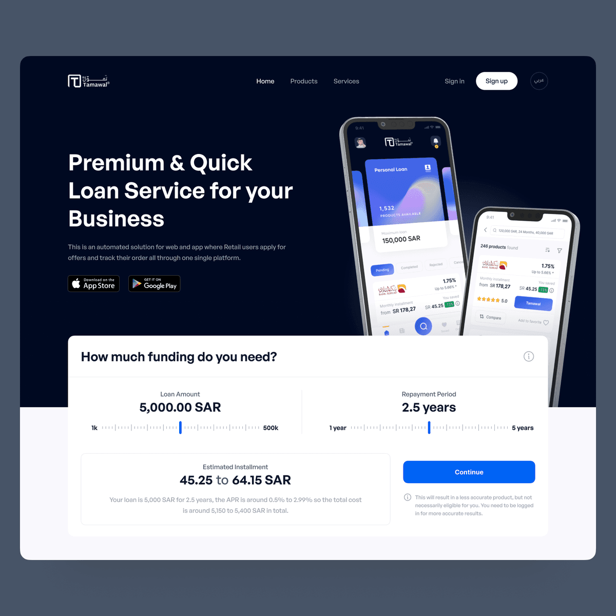
Tamawal Website
{"type":"doc","content":[{"type":"paragraph","attrs":{"textAlign":null},"content":[{"type":"text","text":"5,000 SAR over 2.5 years, estimated installment 45.25 to 64.15 SAR — Tamawal's website puts the loan calculator front and center so every visitor knows their number before they sign up."}]},{"type":"image","attrs":{"src":"https://mir-s3-cdn-cf.behance.net/project_modules/fs/7d3b7c153716401.633497841fe76.png","alt":null,"title":null,"width":null,"height":null}},{"type":"paragraph","attrs":{"textAlign":null},"content":[{"type":"text","marks":[{"type":"bold"}],"text":"Web Design — Tamawal"}]},{"type":"paragraph","attrs":{"textAlign":null},"content":[{"type":"text","marks":[{"type":"italic"}],"text":"Loan Marketplace Website · Saudi Arabia · B2B & Retail Financing"}]},{"type":"paragraph","attrs":{"textAlign":null},"content":[{"type":"text","text":"A clean, conversion-optimized landing page for Tamawal (تمويل) — an automated loan marketplace platform for web and app where retail users apply for offers and track their orders through one single platform."}]},{"type":"paragraph","attrs":{"textAlign":null},"content":[{"type":"text","text":"The hero is direct and product-forward: \"Premium & Quick Loan Service for your Business\" in bold white display type against a deep navy background, with two floating app screens showing the platform's mobile experience — a Personal Loan screen showing 1,532 products available at 150,000 SAR, and a loan comparison screen displaying multiple bank offers with rates from 1.75% APR. App Store and Google Play CTAs confirm the cross-platform product."}]},{"type":"paragraph","attrs":{"textAlign":null},"content":[{"type":"text","text":"The loan calculator widget dominates the bottom section — the page's most important conversion tool. Two interactive sliders let the user configure their loan: Loan Amount (1k–500k SAR, currently set to 5,000 SAR) and Repayment Period (1–5 years, currently 2.5 years). The estimated installment range updates dynamically: 45.25 to 64.15 SAR, with a transparent APR disclosure (0.5% to 2.99%) and total cost estimate (5,150 to 5,400 SAR). A blue \"Continue\" CTA drives application, with a small disclaimer that logged-in users get more accurate results — a smart nudge toward account creation."}]},{"type":"paragraph","attrs":{"textAlign":null},"content":[{"type":"text","text":"The bilingual Arabic/English toggle confirms Tamawal's fluency in its primary market. The navigation — Products, Services, Sign in, Sign up — maps a complete SaaS fintech platform with multiple product lines."}]},{"type":"paragraph","attrs":{"textAlign":null},"content":[{"type":"text","text":"A fintech landing page that earns trust by showing the math before asking for anything in return."}]}]}
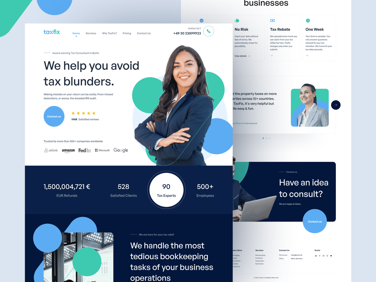
TaxFix - Tax Consulting Service
{"type":"doc","content":[{"type":"paragraph","attrs":{"textAlign":null},"content":[{"type":"text","text":"We help you avoid tax blunders — TaxFix's website redesign gives an award-winning Berlin tax consultancy the clean, confident digital presence its 190K satisfied reviews deserve."}]},{"type":"image","attrs":{"src":"https://cdn.dribbble.com/userupload/4159028/file/original-9b0d5e2e45c559e670d95806b4306b63.png","alt":null,"title":null,"width":null,"height":null}},{"type":"paragraph","attrs":{"textAlign":null},"content":[{"type":"text","marks":[{"type":"bold"}],"text":"Web Design — TaxFix"}]},{"type":"paragraph","attrs":{"textAlign":null},"content":[{"type":"text","marks":[{"type":"italic"}],"text":"Tax Consulting Service Website · Berlin, Germany · B2C & B2B"}]},{"type":"paragraph","attrs":{"textAlign":null},"content":[{"type":"text","text":"A clean, professional multi-section website redesign for TaxFix — an award-winning tax consulting firm in Berlin, trusted by 500+ companies worldwide including Airbnb, Amazon, FedEx, Microsoft, and Google."}]},{"type":"paragraph","attrs":{"textAlign":null},"content":[{"type":"text","marks":[{"type":"bold"}],"text":"Hero:"},{"type":"text","text":" A confident female tax consultant, arms crossed, smiling — the human face of a service that removes fear from tax filing. \"We help you avoid tax blunders\" is the headline: direct, benefit-first, and immediately reassuring for a user whose primary emotion about taxes is anxiety. 190K satisfied reviews in a star rating strip, 24/7 hotline (+49 30 23599923), and a clean \"Contact us\" CTA anchor the trust signals."}]},{"type":"paragraph","attrs":{"textAlign":null},"content":[{"type":"text","marks":[{"type":"bold"}],"text":"Three Value Pillars:"},{"type":"text","text":" No Risk (\"Insert your data without fear of errors\"), Tax Rebate (\"We calculate how much you can claim, TaxFix charges only when you submit\"), One Week (\"Your time is valuable. You only answer questions relevant to your tax situation\") — a tight three-card framework that answers the three objections every tax service prospect has before they commit."}]},{"type":"paragraph","attrs":{"textAlign":null},"content":[{"type":"text","marks":[{"type":"bold"}],"text":"Stats Band:"},{"type":"text","text":" 1,500,004,721 EUR Refunds, 528 Satisfied Clients, 90 Tax Experts, 500+ Employees — impact at scale, communicated with the confidence of a firm that has nothing to hide."}]},{"type":"paragraph","attrs":{"textAlign":null},"content":[{"type":"text","marks":[{"type":"bold"}],"text":"Bookkeeping Section:"},{"type":"text","text":" \"We handle the most tedious bookkeeping tasks of your business operations\" — extending the value proposition from personal tax returns to B2B accounting services."}]},{"type":"paragraph","attrs":{"textAlign":null},"content":[{"type":"text","marks":[{"type":"bold"}],"text":"Contact CTA:"},{"type":"text","text":" \"Have an idea to consult? We are happy to listen.\" — warm, approachable closing that converts the website's anxiety-reduction tone into an invitation to act."}]},{"type":"paragraph","attrs":{"textAlign":null},"content":[{"type":"text","text":"The teal and navy palette communicates financial trustworthiness — clean, professional, and instantly credible for a European B2C financial services brand."}]}]}
Outfit Style
{"type":"doc","content":[{"type":"paragraph","attrs":{"textAlign":null},"content":[{"type":"text","text":"Clean lines, editorial confidence, and a product grid that sells itself — ProGad is a clothing website that looks as good as what it sells."}]},{"type":"image","attrs":{"src":"https://farooq-agent.web.app/assets/images/works/large/progad.jpg","alt":null,"title":null,"width":null,"height":null}},{"type":"paragraph","attrs":{"textAlign":null},"content":[{"type":"text","marks":[{"type":"bold"}],"text":"Web Design & Development — ProGad"}]},{"type":"paragraph","attrs":{"textAlign":null},"content":[{"type":"text","marks":[{"type":"italic"}],"text":"Clothing E-Commerce Website · Fashion Retail · Freestyle Apparel"}]},{"type":"paragraph","attrs":{"textAlign":null},"content":[{"type":"text","text":"A polished fashion e-commerce website for ProGad — a clothing brand positioned around \"Exclusive Products\" and freestyle apparel — presented across a dual-monitor development mockup that reveals both the hero experience and the product catalog in a single composition."}]},{"type":"paragraph","attrs":{"textAlign":null},"content":[{"type":"text","text":"The hero section on the left monitor is confidently editorial: a full-bleed, soft-lit fashion photograph of a young couple in casual, contemporary clothing fills the entire viewport. \"EXCLUSIVE PRODUCTS\" is overlaid in wide-spaced uppercase lettering — restrained and premium — with a minimal \"LEARN MORE\" CTA beneath. The PROGAD wordmark sits in the navigation with quiet authority, and the overall composition communicates a brand that trusts its photography to do the selling."}]},{"type":"paragraph","attrs":{"textAlign":null},"content":[{"type":"text","text":"The right monitor reveals the product catalog — \"LATEST PRODUCTS\" — organized in a clean six-item grid of apparel photography on pure white backgrounds: t-shirts, outerwear, and accessories displayed with the clinical precision of a well-run fashion store. Category labels and pricing sit beneath each item in a readable, minimal typeset. The header navigation (HOME, INFORMATION) is sparse and purposeful."}]},{"type":"paragraph","attrs":{"textAlign":null},"content":[{"type":"text","text":"The warm desk environment — wooden surfaces, a Maneki-neko lucky cat figurine, a notebook and pen — grounds the developer's workspace in creative personality, adding human context to what is otherwise a technically precise web project."}]},{"type":"paragraph","attrs":{"textAlign":null},"content":[{"type":"text","text":"A fashion website that demonstrates both frontend development skill and genuine understanding of how clothing brands need to feel online — aspirational, clean, and shoppable."},{"type":"hardBreak"},{"type":"hardBreak"},{"type":"hardBreak"},{"type":"text","text":"23/05/2019"}]},{"type":"horizontalRule"},{"type":"paragraph","attrs":{"textAlign":null},"content":[{"type":"text","marks":[{"type":"bold"}],"text":"Outfit Style"}]},{"type":"paragraph","attrs":{"textAlign":null}},{"type":"image","attrs":{"src":"https://hyperfantasy.web.app/assets/images/portfolios/984b5efb-cdb7-441f-8e2c-72caecca6da0/outfit_style.png","alt":null,"title":null,"width":null,"height":null}},{"type":"paragraph","attrs":{"textAlign":null}}]}
Tresnan - Landing Page
{"type":"doc","content":[{"type":"paragraph","attrs":{"textAlign":null},"content":[{"type":"text","text":"\"Because Your Life is So Precious\" — Tresnan's landing page turns a 5,000-year-old Balinese matchmaking tradition into a two-minute compatibility check, and 25,647 people have already tried it."}]},{"type":"image","attrs":{"src":"https://farooq-agent.web.app/assets/images/works/details/249-tresnan-landing-page/tresnan-landing-page.jpg","alt":"Tresnan Landing Page","title":null,"width":null,"height":null}},{"type":"paragraph","attrs":{"textAlign":null},"content":[{"type":"text","marks":[{"type":"bold"}],"text":"Web Design — Tresnan Landing Page"}]},{"type":"paragraph","attrs":{"textAlign":null},"content":[{"type":"text","marks":[{"type":"italic"}],"text":"Dating App Landing Page · Balinese Cultural Matchmaking"}]},{"type":"paragraph","attrs":{"textAlign":null},"content":[{"type":"text","text":"A warm, beautifully composed landing page for Tresnan — the Balinese dating app — designed to introduce new users to its core value proposition: compatibility matching based on the Lontar Tri Premana, an ancient Balinese manuscript that calculates romantic compatibility through Pancawara, Saptawara, and Sadwara birth cycles."}]},{"type":"paragraph","attrs":{"textAlign":null},"content":[{"type":"text","marks":[{"type":"bold"}],"text":"Hero:"},{"type":"text","text":" \"Karena Hidup Kamu Begitu Berharga — Pilihlah Jodoh Terbaik Untuk Menjalaninya\" (Because Your Life is So Precious — Choose the Best Partner to Live it With). The copy is warm, meaningful, and culturally grounded. Two app screens float in the hero — Kadek Dessy and Wayan Suryasa, both in traditional Balinese context — confirming the app's target audience and cultural identity at a glance."}]},{"type":"paragraph","attrs":{"textAlign":null},"content":[{"type":"text","marks":[{"type":"bold"}],"text":"Compatibility Checker CTA:"},{"type":"text","text":" \"Cek kecocokan jodoh* anda sekarang!\" — a conversion-first form with four fields: your name, your partner's name, your birth date, and your partner's birth date, plus email. 25,647 orang sudah mengecek (25,647 people have already checked) — social proof displayed as a counter badge that communicates both popularity and urgency. A pink \"Cek Sekarang\" (Check Now) CTA completes the flow."}]},{"type":"paragraph","attrs":{"textAlign":null},"content":[{"type":"text","text":"The footnote explains the cultural grounding: \"Perhitungan kecocokan jodoh ini adalah berdasarkan warisan budaya nusantara (Lontar Tripramana) berdasarkan kombinasi hari kelahiran pasangan (Saptawara, Pancawara, Sadwara).\" A dating app that cites its ancient sources — that's a first."}]},{"type":"paragraph","attrs":{"textAlign":null},"content":[{"type":"text","text":"The pink-to-purple gradient palette and the broken-heart logo are consistent with the app's identity, creating a seamless brand experience from mobile app to landing page."}]},{"type":"paragraph","attrs":{"textAlign":null},"content":[{"type":"text","text":"A dating app landing page that earns trust by being honest about where its algorithm comes from: thousands of years of Balinese wisdom."}]}]}

Arab Man
{"type":"doc","content":[{"type":"paragraph","attrs":{"textAlign":null},"content":[{"type":"text","text":"Mid-leap, phone raised, thobe flowing — this Arab man isn't just using his smartphone, he's celebrating everything it just showed him."}]},{"type":"image","attrs":{"src":"https://cdn.dribbble.com/users/5057025/screenshots/10997093/media/a65c7f54ebef4801be4f371386b060dd.jpg?compress=1&resize=800x600&vertical=top","alt":null,"title":null,"width":null,"height":null}},{"type":"paragraph","attrs":{"textAlign":null},"content":[{"type":"text","marks":[{"type":"bold"}],"text":"Vector Illustration — Arab Man"}]},{"type":"paragraph","attrs":{"textAlign":null},"content":[{"type":"text","marks":[{"type":"italic"}],"text":"Flat-Style Character Illustration · Mobile User · Arabian Market"}]},{"type":"paragraph","attrs":{"textAlign":null},"content":[{"type":"text","text":"A dynamic, flat-style vector illustration of an Arab man fully in motion — thobe billowing, one foot kicked back mid-leap, phone held aloft in a moment of pure digital joy. The character communicates something specific and culturally precise: this is not a static user portrait, but a person actively energized by what's happening on their screen."}]},{"type":"paragraph","attrs":{"textAlign":null},"content":[{"type":"text","text":"The figure wears a flowing periwinkle-blue thobe with a rich gradient wash that gives the flat-vector form a subtle dimensionality — the fabric catching movement and light as the character jumps. The crimson-pink ghutrah flows behind him in a dramatic arc, adding visual motion and cultural identity in equal measure. A classic black agal band crowns the head. The dark slip-on shoes anchor the composition at the base, providing grounding weight to an otherwise airborne figure."}]},{"type":"paragraph","attrs":{"textAlign":null},"content":[{"type":"text","text":"The smartphone is held up at eye level — the character appearing to laugh or react to something on screen, mouth open, expression caught between delight and disbelief. It is the universal pose of \"I can't believe what I just saw on my phone,\" translated into the visual language of Gulf digital culture."}]},{"type":"paragraph","attrs":{"textAlign":null},"content":[{"type":"text","text":"The faceless, suggestion-of-expression approach — a smile indicated by posture rather than detailed facial features — keeps the character universally applicable as a UI illustration asset across digital products, fintech platforms, e-commerce, and social applications serving the Arabian market."}]},{"type":"paragraph","attrs":{"textAlign":null},"content":[{"type":"text","text":"A character illustration that makes mobile engagement feel like an event — because for the right notification, the right offer, the right moment, it genuinely is."}]}]}
Dompet Digital
{"type":"doc","content":[{"type":"paragraph","attrs":{"textAlign":null},"content":[{"type":"text","text":"Top Up, Nasi Bakar Cumi at Kedai Lolo Senggol, Grab Car, Berhasil, Gagal — Dompet Digital's transaction history screen captures the full texture of everyday Indonesian digital wallet life in a single scrollable feed."}]},{"type":"image","attrs":{"src":"https://farooq-agent.web.app/assets/images/works/details/243-dompet-digital/dompet-digital.jpg","alt":null,"title":null,"width":null,"height":null}},{"type":"paragraph","attrs":{"textAlign":null},"content":[{"type":"text","marks":[{"type":"bold"}],"text":"App UI Design — Dompet Digital"}]},{"type":"paragraph","attrs":{"textAlign":null},"content":[{"type":"text","marks":[{"type":"italic"}],"text":"Mobile App · Digital Wallet · OVO Requirement Test · Indonesia"}]},{"type":"paragraph","attrs":{"textAlign":null},"content":[{"type":"text","text":"A clean, color-coded transaction history UI designed as part of an OVO product requirement test — demonstrating a well-considered approach to one of the most important and frequently visited screens in any digital wallet app: the transaction history."}]},{"type":"paragraph","attrs":{"textAlign":null},"content":[{"type":"text","text":"The \"History Semua\" (All History) screen organizes transactions chronologically in two groups — \"Baru Saja\" (Just Now) and \"Minggu Lalu\" (Last Week) — a temporal grouping that gives users immediate context for recent versus past activity without requiring date parsing."}]},{"type":"paragraph","attrs":{"textAlign":null},"content":[{"type":"text","text":"Each transaction row follows a consistent visual pattern: a colored service icon (food, transport, top-up), transaction name and merchant (Nasi Bakar Cumi at Kedai Lolo Senggol, Grab Car at Ngurah Rai - Jl. Pulau Kawe, Top Up), timestamp (24 Feb '20, 19:30), and a colored status badge — Berhasil (Successful, green), Pending (orange), Gagal (Failed, red) — with the transaction amount displayed prominently. The color-coded status system communicates outcome at a glance without requiring the user to read: green = done, orange = waiting, red = problem."}]},{"type":"paragraph","attrs":{"textAlign":null},"content":[{"type":"text","text":"The diagonal isometric phone mockup presentation places both screens in context — the transaction list on the foreground phone, a mascot/onboarding screen visible on the phone behind it, suggesting a complete app design beyond just this single screen."}]},{"type":"paragraph","attrs":{"textAlign":null},"content":[{"type":"text","text":"A transaction history design that respects the user's need to understand their money at a glance — clear, scannable, and honest about what succeeded and what didn't."}]}]}
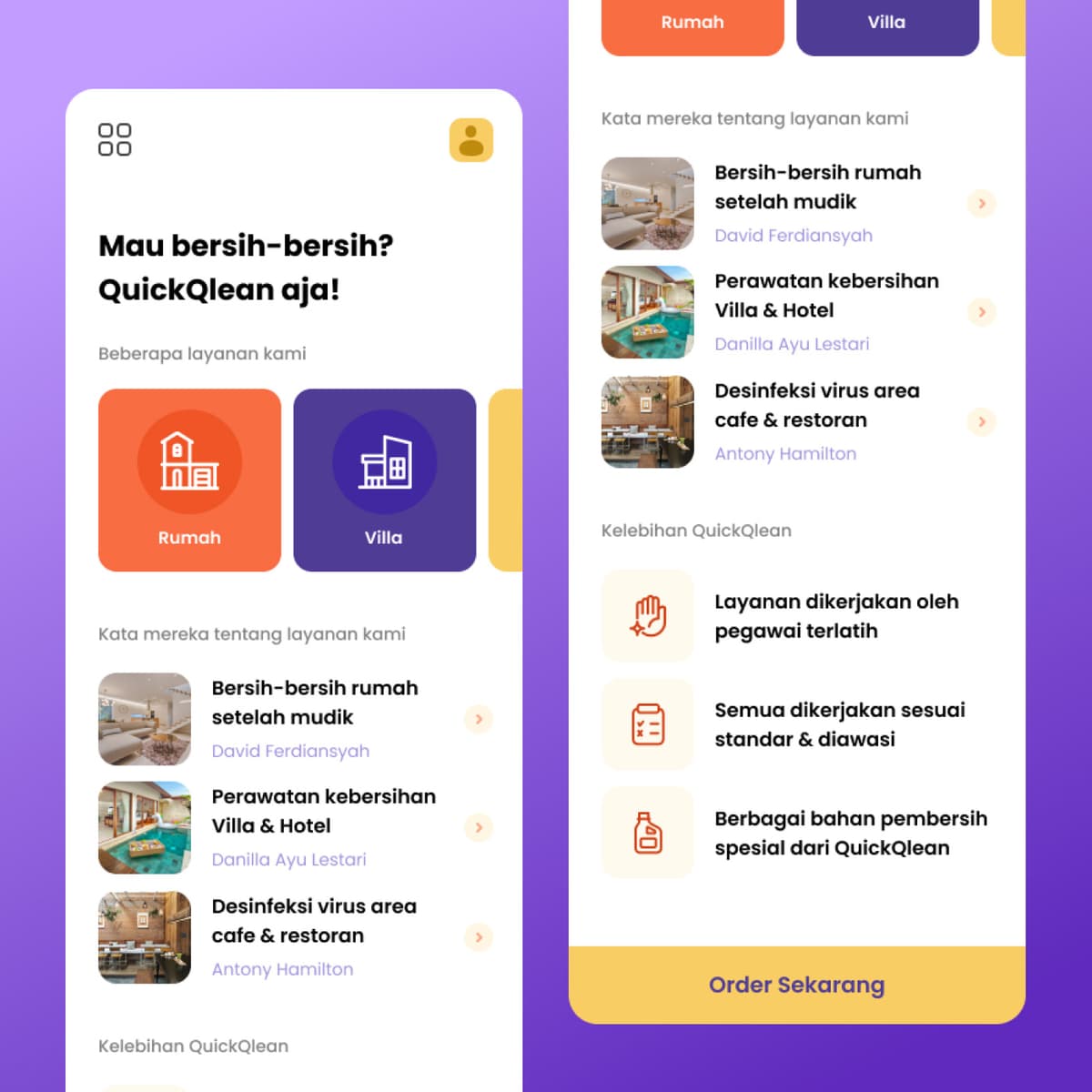
Quick Clean
{"type":"doc","content":[{"type":"paragraph","attrs":{"textAlign":null},"content":[{"type":"text","text":"Mau bersih-bersih? QuickQlean aja! — from post-mudik house cleaning to villa maintenance to cafe disinfection, QuickQlean makes professional cleaning as easy as tapping Order Sekarang."}]},{"type":"image","attrs":{"src":"https://farooq-agent.web.app/assets/images/works/details/231-quick-clean/quick-clean.jpg","alt":null,"title":null,"width":null,"height":null}},{"type":"paragraph","attrs":{"textAlign":null},"content":[{"type":"text","marks":[{"type":"bold"}],"text":"App UI Design — Quick Clean (QuickQlean)"}]},{"type":"paragraph","attrs":{"textAlign":null},"content":[{"type":"text","marks":[{"type":"italic"}],"text":"Mobile App · Cleaning Service · On-Demand & Outsource · Indonesia"}]},{"type":"paragraph","attrs":{"textAlign":null},"content":[{"type":"text","text":"A bold, energetic two-screen app UI for QuickQlean — an on-demand and outsourced cleaning service platform covering residential, villa, hotel, and commercial spaces."}]},{"type":"paragraph","attrs":{"textAlign":null},"content":[{"type":"text","marks":[{"type":"bold"}],"text":"Home Screen:"},{"type":"text","text":" The opening headline is direct and colloquial: \"Mau bersih-bersih? QuickQlean aja!\" (Want to clean up? Just use QuickQlean!) — the tone of a friend recommending a service, not a corporate pitch. Service category cards below — Rumah (House) in orange, Villa in purple, and a third partially visible — use icon-forward card design that lets users jump directly to their service type without navigation overhead."}]},{"type":"paragraph","attrs":{"textAlign":null},"content":[{"type":"text","text":"The testimonial section \"Kata mereka tentang layanan kami\" (What they say about our service) surfaces three real use cases with photo thumbnails: Bersih-bersih rumah setelah mudik (House cleaning after Eid homecoming) by David Ferdiansyah, Perawatan kebersihan Villa & Hotel by Danilla Ayu Lestari, and Desinfeksi virus area cafe & restoran by Antony Hamilton — three distinct customer segments, three distinct service scenarios, communicating QuickQlean's breadth without a feature list."}]},{"type":"paragraph","attrs":{"textAlign":null},"content":[{"type":"text","marks":[{"type":"bold"}],"text":"Service Detail / Order Screen:"},{"type":"text","text":" \"Kelebihan QuickQlean\" (QuickQlean Advantages) lists three brand promises: Layanan dikerjakan oleh pegawai terlatih (Service performed by trained employees), Semua dikerjakan sesuai standar & diawasi (All work done to standard & supervised), Berbagai bahan pembersih spesial dari QuickQlean (Various special cleaning products from QuickQlean). The yellow \"Order Sekarang\" (Order Now) CTA anchors the bottom — warm, high-contrast, and impossible to miss."}]},{"type":"paragraph","attrs":{"textAlign":null},"content":[{"type":"text","text":"The orange-purple-yellow palette is bold and service-forward — communicating energy, reliability, and the satisfaction of a space that's genuinely clean."}]},{"type":"paragraph","attrs":{"textAlign":null},"content":[{"type":"text","text":"A cleaning service app that respects its users' time: clear categories, real testimonials, and one big button at the bottom."}]}]}
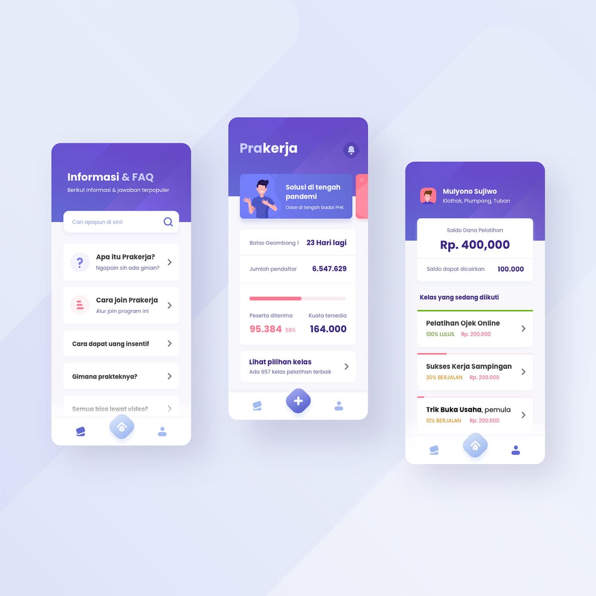
Prakerja
{"type":"doc","content":[{"type":"paragraph","attrs":{"textAlign":null},"content":[{"type":"text","text":"6,547,629 registered, 23 days left for Wave 1, Rp. 400,000 training balance — Prakerja's app redesign brings Indonesia's largest government upskilling program to life with the clarity and warmth its millions of users deserve."}]},{"type":"image","attrs":{"src":"https://farooq-agent.web.app/assets/images/works/details/250-prakerja/prakerja.jpg","alt":null,"title":null,"width":null,"height":null}},{"type":"paragraph","attrs":{"textAlign":null},"content":[{"type":"text","marks":[{"type":"bold"}],"text":"App UI Design — Prakerja"}]},{"type":"paragraph","attrs":{"textAlign":null},"content":[{"type":"text","marks":[{"type":"italic"}],"text":"Mobile App · Government Online Training Program · Indonesia"}]},{"type":"paragraph","attrs":{"textAlign":null},"content":[{"type":"text","text":"A clean, accessible three-screen app UI for Prakerja — Indonesia's national pre-employment card program that provides online training subsidies and financial incentives to workers, job seekers, and those affected by layoffs (PHK). Designed during the pandemic when the program became a critical social safety net for millions of Indonesians."}]},{"type":"paragraph","attrs":{"textAlign":null},"content":[{"type":"text","marks":[{"type":"bold"}],"text":"Home Screen:"},{"type":"text","text":" \"Solusi di tengah pandemi — Dase di tengah badai PHK\" (Solution in the middle of the pandemic — a beacon in the storm of layoffs) frames the program's purpose with empathetic directness. Live program stats show the urgency: Wave 1 closes in 23 days, 6,547,629 registered, 95,384 participants accepted (58%), 164,000 quota available. \"Lihat pilihan kelas — Ada 657 kelas pelatihan terbaik\" (See class options — 657 best training classes available) drives discovery."}]},{"type":"paragraph","attrs":{"textAlign":null},"content":[{"type":"text","marks":[{"type":"bold"}],"text":"FAQ Screen:"},{"type":"text","text":" \"Informasi & FAQ — Apa itu Prakerja? / Cara join Prakerja / Cara dapat uang insentif / Gimana prakteknya? / Semua bisa lewat video?\" — the five most common questions new users have, organized as an expandable FAQ list with a search bar. The colloquial, youth-friendly copy (\"Ngapain sih ada giniya?\") makes a government program feel approachable rather than bureaucratic."}]},{"type":"paragraph","attrs":{"textAlign":null},"content":[{"type":"text","marks":[{"type":"bold"}],"text":"User Dashboard:"},{"type":"text","text":" Mulyono Sujiwo from Klothok, Plumpang, Tuban — a real small-town Indonesian user — with Saldo Dana Pelatihan Rp. 400,000 and three enrolled courses at different progress stages: Pelatihan Ojek Online (100% LULUS, Rp. 200,000), Sukses Kerja Sampingan (30% BERJALAN, Rp. 200,000), Trik Buka Usaha (10% BERJALAN, Rp. 200,000)."}]},{"type":"paragraph","attrs":{"textAlign":null},"content":[{"type":"text","text":"The purple gradient palette communicates both the official government program identity and the digital-forward, accessible tone needed to serve a demographic that ranges from fresh graduates to displaced factory workers across the Indonesian archipelago."}]},{"type":"paragraph","attrs":{"textAlign":null},"content":[{"type":"text","text":"A government app redesign that treats its users — millions of Indonesians navigating economic uncertainty — with the dignity and clarity they deserve."}]}]}
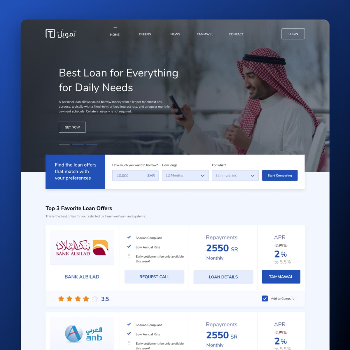
Tammwel Web
{"type":"doc","content":[{"type":"paragraph","attrs":{"textAlign":null},"content":[{"type":"text","text":"Best Loan for Everything for Daily Needs — Tammwel's web platform brings Saudi Arabia's loan marketplace into the browser with the same clarity and consumer-first design as the mobile app."}]},{"type":"image","attrs":{"src":"https://farooq-agent.web.app/assets/images/works/details/244-tammwel-web/tammwel-web.jpg","alt":null,"title":null,"width":null,"height":null}},{"type":"paragraph","attrs":{"textAlign":null},"content":[{"type":"text","marks":[{"type":"bold"}],"text":"Web Design — Tammwel"}]},{"type":"paragraph","attrs":{"textAlign":null},"content":[{"type":"text","marks":[{"type":"italic"}],"text":"Loan Marketplace Website · Saudi Arabia · Sharia-Compliant Finance"}]},{"type":"paragraph","attrs":{"textAlign":null},"content":[{"type":"text","text":"A clean, full-featured desktop web design for Tammwel (تمويل) — the Saudi loan comparison and marketplace platform — extending the mobile app experience into a fully responsive web interface for users who prefer to evaluate loan options on a larger screen."}]},{"type":"paragraph","attrs":{"textAlign":null},"content":[{"type":"text","text":"The hero leads with a Saudi man in thobe and shemagh browsing his phone — a culturally precise hero image that immediately signals the platform's target audience. \"Best Loan for Everything for Daily Needs\" is the headline: broad, benefit-first, and entirely relevant to the platform's core use case."}]},{"type":"paragraph","attrs":{"textAlign":null},"content":[{"type":"text","text":"The loan comparison tool sits directly below the hero — \"Find the loan offers that match with your preferences\" — with three input fields: How much (10,000 SAR), How long (12 Months), and For what (Tammwel Inc), plus a \"Start Comparing\" CTA. The immediacy of the calculator at the fold removes the primary friction point: a Saudi borrower can begin comparing offers without navigating anywhere."}]},{"type":"paragraph","attrs":{"textAlign":null},"content":[{"type":"text","text":"The \"Top 3 Favorite Loan Offers\" section below surfaces the marketplace's core value — Bank AlBilad and ANB visible in the first two rows, each showing Shariah Compliant ✓, Low Annual Rate ✓, Early Settlement Fee note, repayment amount (2,550 SR monthly), and APR (2%, from 2.99% crossed out to show the discount). Four action buttons per offer — Request Call, Loan Details, Tammawal, Add to Compare — map every stage of the decision-to-application journey."}]},{"type":"paragraph","attrs":{"textAlign":null},"content":[{"type":"text","text":"The bilingual Arabic/English wordmark (تمويل / Tammwel) signals a platform built with genuine Saudi market fluency."}]},{"type":"paragraph","attrs":{"textAlign":null},"content":[{"type":"text","text":"A web marketplace that makes comparing loans as straightforward as comparing anything else online."}]}]}

Notebook Digital Ads - CSS3
{"type":"doc","content":[{"type":"paragraph","attrs":{"textAlign":null},"content":[{"type":"text","text":"Animated, direct, and built to convert — this CSS3 web banner for Leaders in Heels makes \"Make Your Mark\" feel like a personal challenge you can't ignore."}]},{"type":"image","attrs":{"src":"https://farooq-agent.web.app/assets/images/works/large/VbNBzdjL_work_image.jpg","alt":null,"title":null,"width":null,"height":null}},{"type":"paragraph","attrs":{"textAlign":null},"content":[{"type":"text","marks":[{"type":"bold"}],"text":"Digital Advertising — Leaders in Heels"}]},{"type":"paragraph","attrs":{"textAlign":null},"content":[{"type":"text","marks":[{"type":"italic"}],"text":"CSS3 Animated Web Banner · Digital Ad · Female Leadership Platform"}]},{"type":"paragraph","attrs":{"textAlign":null},"content":[{"type":"text","text":"An animated CSS3 web advertisement designed for Leaders in Heels — a platform dedicated to creating female leaders — built to perform in the fast-attention economy of digital display advertising."}]},{"type":"paragraph","attrs":{"textAlign":null},"content":[{"type":"text","text":"The banner distills the brand into three high-impact elements: the Leaders in Heels logo (a bold red stiletto paired with the tagline \"creating female leaders\"), a commanding headline \"MAKE YOUR MARK\" in heavy black type, and a crimson CTA button — \"GET IT NOW ›\" — textured with a subtle chevron pattern that adds tactile dimension to a digital surface. The hand reaching up to tap the CTA is a smart compositional device, demonstrating interaction and urgency in a single static frame while the CSS3 animation plays across transitions."}]},{"type":"paragraph","attrs":{"textAlign":null},"content":[{"type":"text","text":"The watercolor splash background adds softness and femininity without diminishing the ad's conversion-first intent. Clean, purposeful, and click-ready."}]}]}
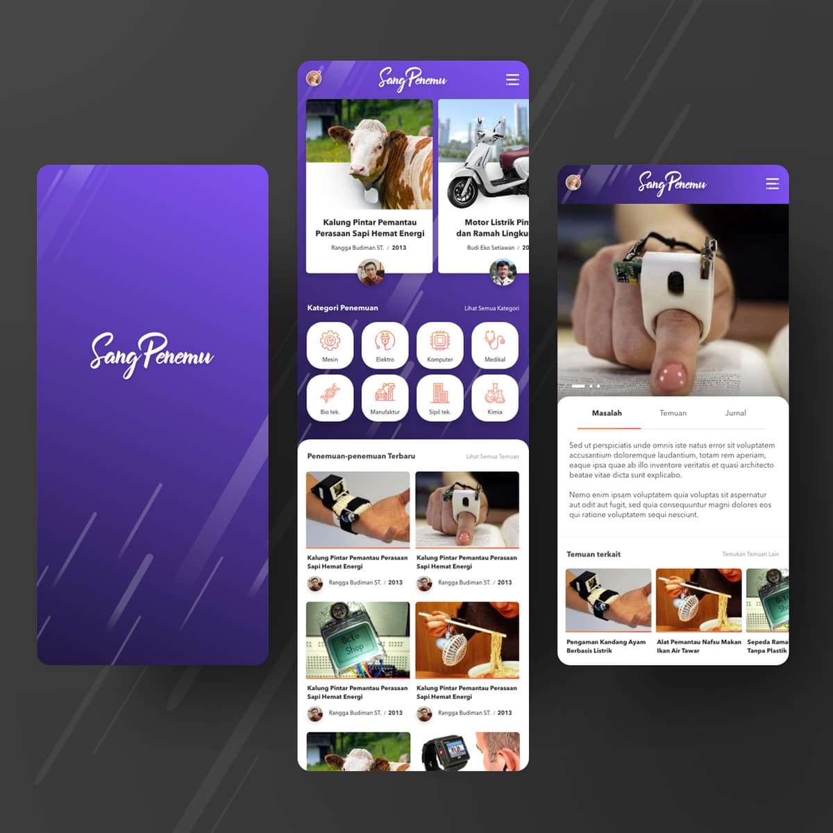
Sang Penemu
{"type":"doc","content":[{"type":"paragraph","attrs":{"textAlign":null},"content":[{"type":"text","text":"\"Smart Collar for Monitoring Cow Mood/Wellbeing, Eco-Friendly Electric Motorcycle, Electric-Based Chicken Coop Security System\" — Sang Penemu is where Indonesian inventors finally have a platform worthy of their ideas."}]},{"type":"image","attrs":{"src":"https://farooq-agent.web.app/assets/images/works/large/sang-penemu.jpg","alt":null,"title":null,"width":null,"height":null}},{"type":"paragraph","attrs":{"textAlign":null},"content":[{"type":"text","marks":[{"type":"bold"}],"text":"App UI Design — Sang Penemu"}]},{"type":"paragraph","attrs":{"textAlign":null},"content":[{"type":"text","marks":[{"type":"italic"}],"text":"Mobile App · Inventor Platform · Innovation Journal · Indonesia"}]},{"type":"paragraph","attrs":{"textAlign":null},"content":[{"type":"text","text":"A bold, purpose-driven app UI for Sang Penemu (The Inventor) — a platform built for Indonesian inventors to document, share, and discover innovations across engineering, electronics, computing, medical, biotechnology, manufacturing, civil engineering, and chemistry."}]},{"type":"paragraph","attrs":{"textAlign":null},"content":[{"type":"text","text":"Three screens map the complete platform experience:"}]},{"type":"paragraph","attrs":{"textAlign":null},"content":[{"type":"text","marks":[{"type":"bold"}],"text":"Splash Screen:"},{"type":"text","text":" A deep purple gradient with diagonal light streak motifs and the Sang Penemu script wordmark — confident, distinctive, and immediately communicating that this is a platform for people who think differently."}]},{"type":"paragraph","attrs":{"textAlign":null},"content":[{"type":"text","marks":[{"type":"bold"}],"text":"Discovery Feed:"},{"type":"text","text":" The home screen opens with a featured invention carousel (Kalung Pintar Pemantau Perasaan Sapi Hemat Energi by Rangga Budiman, 2013; Motor Listrik Pintar dan Ramah Lingkungan by Budi Eko Setiawan) — real, named Indonesian inventors with real work, grounding the platform in authentic content. Below, \"Kategori Penemuan\" organizes the innovation taxonomy: Mesin, Elektro, Komputer, Medikal, Bio tek., Manufaktur, Sipil tek., Kimia — eight categories covering the full engineering spectrum. A \"Penemuan-penemuan Terbaru\" grid follows, with four inventions visible in the first row, each with inventor name and year."}]},{"type":"paragraph","attrs":{"textAlign":null},"content":[{"type":"text","marks":[{"type":"bold"}],"text":"Invention Detail:"},{"type":"text","text":" A wearable ring device photographed in hand anchors the detail screen. Three tabs — Masalah (Problem), Temuan (Finding), Jurnal (Journal) — structure the invention documentation: what problem it solves, what was discovered, and the supporting research. \"Temuan terkait\" (Related Findings) surfaces related inventions — Pengaman Kandang Ayam, Alat Pemantau Nafsu Makan Ikan, Sepeda Ramah Tanpa Plastik."}]},{"type":"paragraph","attrs":{"textAlign":null},"content":[{"type":"text","text":"A platform that treats Indonesian inventors as the innovators they are — and gives their work a home that matches their ambition."}]}]}
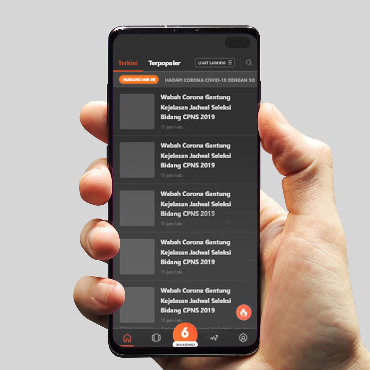
Liputan 6
{"type":"doc","content":[{"type":"paragraph","attrs":{"textAlign":null},"content":[{"type":"text","text":"Latest, Popular, breaking ticker at the top — the Liputan 6 app redesign gives one of Indonesia's most trusted news brands a dark, focused reading experience built for the way Indonesians actually consume news today."}]},{"type":"image","attrs":{"src":"https://farooq-agent.web.app/assets/images/works/details/245-liputan-6/liputan-6.jpg","alt":null,"title":null,"width":null,"height":null}},{"type":"paragraph","attrs":{"textAlign":null},"content":[{"type":"text","marks":[{"type":"bold"}],"text":"App UI Design — Liputan 6"}]},{"type":"paragraph","attrs":{"textAlign":null},"content":[{"type":"text","marks":[{"type":"italic"}],"text":"News App Redesign · Indonesia · Mobile UI"}]},{"type":"paragraph","attrs":{"textAlign":null},"content":[{"type":"text","text":"A dark-mode news app UI design for Liputan 6 — one of Indonesia's most widely read digital news platforms under the EMTEK media group — delivering a cleaner, more focused reading experience that respects the content and the reader's attention."}]},{"type":"paragraph","attrs":{"textAlign":null},"content":[{"type":"text","text":"The news feed screen establishes the redesign's core direction immediately: a dark charcoal background reduces eye strain for users reading through news during commutes, evenings, or late nights — a significant usability improvement over the original lighter interface. The orange Liputan 6 brand color is preserved as the sole accent, appearing on the category tab indicator, the breaking news ticker badge, the trending/fire button, and the bottom navigation logo — a disciplined use of brand color that maintains recognition while letting the content breathe."}]},{"type":"paragraph","attrs":{"textAlign":null},"content":[{"type":"text","text":"The top navigation offers two primary modes: \"Terkini\" (Latest) and \"Terpopuler\" (Most Popular) — the two reading modes that capture the majority of news app usage — with a \"Lihat Lainnya\" (See More) category dropdown and a search icon keeping additional options accessible without cluttering the primary flow."}]},{"type":"paragraph","attrs":{"textAlign":null},"content":[{"type":"text","text":"A scrolling \"Headline Hari Ini\" (Today's Headlines) breaking news ticker runs below the tabs — \"Hadapi Corona Covid-19 Dengan So...\" — the urgent, timely content format that drives habitual daily opens."}]},{"type":"paragraph","attrs":{"textAlign":null},"content":[{"type":"text","text":"The article card list is clean and scannable: thumbnail left, headline right, timestamp below — the optimal mobile news card format with none of the advertising and promotional noise that often clutters news app feeds."}]},{"type":"paragraph","attrs":{"textAlign":null},"content":[{"type":"text","text":"The bottom tab bar — Home, Bookmarks, Liputan 6 central logo, Trending, Account — is minimal and purposeful."}]},{"type":"paragraph","attrs":{"textAlign":null},"content":[{"type":"text","text":"A redesign that puts the news back at the center of a news app."}]}]}
Episode 1 Logo
{"type":"doc","content":[{"type":"paragraph","attrs":{"textAlign":null},"content":[{"type":"text","text":"Every great story starts somewhere — Episode 1 is the production team that makes sure yours begins with impact."}]},{"type":"image","attrs":{"src":"https://farooq-agent.web.app/assets/images/works/large/2V9Jco7T_work_image.png","alt":null,"title":null,"width":null,"height":null}},{"type":"heading","attrs":{"textAlign":null,"level":3},"content":[{"type":"text","text":"Brand Identity — Episode 1"}]},{"type":"paragraph","attrs":{"textAlign":null},"content":[{"type":"text","marks":[{"type":"italic"}],"text":"Logo Design · Video Content Production · Creative Studio"}]},{"type":"paragraph","attrs":{"textAlign":null},"content":[{"type":"text","text":"A clean, conceptually clever brand identity for Episode 1 — a video content production team whose very name celebrates the moment every story begins. The logo is a masterclass in restrained storytelling: a single mark that communicates the brand's entire purpose without a single word beyond the name itself."}]},{"type":"paragraph","attrs":{"textAlign":null},"content":[{"type":"text","text":"The logomark fuses two elements into one unified symbol: a bold numeral \"1\" and a circular play button — the universal icon of video playback — merged into a single geometric form enclosed within a thin orbit-like circle. The \"1\" sits confidently at the center of the circle, its stem doubling as the triangular play indicator, creating a dual-reading mark that is simultaneously a number and a motion trigger. It is a logo that literally plays — and invites the viewer to press it."}]},{"type":"paragraph","attrs":{"textAlign":null},"content":[{"type":"text","text":"The outer orbit circle — thin, open, incomplete at the left — suggests motion, rotation, and the continuous loop of content creation: from concept to production to publishing, and back again. It also creates a visual sense of a lens aperture or a reel in motion, both deeply resonant references for a video production team."}]},{"type":"paragraph","attrs":{"textAlign":null},"content":[{"type":"text","text":"The wordmark \"EPISODE\" is set in a bold, wide-spaced geometric sans-serif in matching cobalt blue — authoritative and direct, with just enough weight to anchor the more dynamic logomark beside it. The deliberate offset composition — wordmark low-left, icon upper-right — creates a visual diagonal tension that feels dynamic and forward-leaning, fitting for a production team always moving toward the next frame."}]},{"type":"paragraph","attrs":{"textAlign":null},"content":[{"type":"text","text":"The single cobalt blue palette applied across the white textured card is a confident, deliberate choice — clear-headed, creative, and professional without being corporate."}]},{"type":"paragraph","attrs":{"textAlign":null},"content":[{"type":"text","text":"A brand identity that captures the excitement of the beginning — because in content, Episode 1 is everything."}]}]}

Learn from Home
{"type":"doc","content":[{"type":"paragraph","attrs":{"textAlign":null},"content":[{"type":"text","text":"Books stacked, coffee steaming, finger pointed at the screen — Learn from Home captures the quiet, self-directed energy of a generation that figured out how to turn any room into a classroom."}]},{"type":"image","attrs":{"src":"https://cdn.dribbble.com/users/5057025/screenshots/10997361/media/0a1e88a7809708a678417d2e0273cb34.jpg?compress=1&resize=1200x900&vertical=top","alt":null,"title":null,"width":null,"height":null}},{"type":"paragraph","attrs":{"textAlign":null},"content":[{"type":"text","marks":[{"type":"bold"}],"text":"Flat Illustration — Learn from Home"}]},{"type":"paragraph","attrs":{"textAlign":null},"content":[{"type":"text","marks":[{"type":"italic"}],"text":"E-Learning · Online Education · Flat Vector · UI Illustration"}]},{"type":"paragraph","attrs":{"textAlign":null},"content":[{"type":"text","text":"A warm, contemporary flat illustration depicting a student in their home learning environment — seated at a desk, facing a large digital interface filled with video lessons, content thumbnails, and an instructor portrait, one finger raised toward the screen in a gesture of engaged interaction. The piece communicates the full experience of online learning with compositional clarity and visual warmth."}]},{"type":"paragraph","attrs":{"textAlign":null},"content":[{"type":"text","text":"The character is viewed from behind — a deliberate perspective choice that places the viewer in the learner's position, creating immediate identification. The red-orange hair adds a vibrant focal point to the back-of-head view, while the orange t-shirt and blue jeans communicate a casual, comfortable home setting rather than a formal classroom. Blue slippers visible beneath the stool confirm the setting: this is home, and this is learning on your own terms."}]},{"type":"paragraph","attrs":{"textAlign":null},"content":[{"type":"text","text":"The learning interface floating in the background is constructed from a purple-violet UI system — a central video player with playlist thumbnails to the right, content cards floating to the left, an instructor portrait in the upper right corner, and text block elements scattered throughout — together forming a recognizable digital learning platform environment without referencing any specific product. The UI elements are arranged in a loose, floating composition that gives the illustration an open, airy quality while communicating content richness."}]},{"type":"paragraph","attrs":{"textAlign":null},"content":[{"type":"text","text":"The desk holds two essential companions: a stack of three colorful textbooks — the physical anchor of knowledge in a digital world — and a steaming yellow coffee cup — the universal symbol of a learner committed to the long session."}]},{"type":"paragraph","attrs":{"textAlign":null},"content":[{"type":"text","text":"A learning illustration that feels true to the experience it depicts — comfortable, focused, and genuinely absorbed in what's on the screen."}]}]}

Electronic Health Records - Physical Medicine and Rehabilitation
{"type":"doc","content":[{"type":"paragraph","attrs":{"textAlign":null},"content":[{"type":"text","text":"Mr. Thomas Johanson, 78 years old, Muscle Spasm — Chronic — this Electronic Health Record redesign turns a patient file into an interactive 3D diagnostic experience that makes clinical data genuinely readable."}]},{"type":"image","attrs":{"src":"https://cdn.dribbble.com/userupload/4028039/file/original-f6b5997dcab99be0383e65e7cd08ecc1.png?compress=1&resize=640x480&vertical=top","alt":null,"title":null,"width":null,"height":null}},{"type":"paragraph","attrs":{"textAlign":null},"content":[{"type":"text","marks":[{"type":"bold"}],"text":"UI/UX Design — Electronic Health Records"}]},{"type":"paragraph","attrs":{"textAlign":null},"content":[{"type":"text","marks":[{"type":"italic"}],"text":"Physical Medicine & Rehabilitation · EHR System · Medical Dashboard"}]},{"type":"paragraph","attrs":{"textAlign":null},"content":[{"type":"text","text":"A visually ambitious Electronic Health Record interface design for a Physical Medicine and Rehabilitation department — combining patient profile data, 3D anatomical visualization, and multi-specialty navigation in a single, tablet-optimized dashboard."}]},{"type":"paragraph","attrs":{"textAlign":null},"content":[{"type":"text","text":"The left panel presents the patient profile: Mr. Thomas Johanson, DOB March 24, 1944 (78 years), Male, Blood Type O (RHO positive). Below the patient card, four quick-access modules — Medical History Check-up, Vital Sign Check-up, Physical Check-up (active, teal), and Supporting Check-up — organize the clinical workflow into task-based navigation that maps how physical medicine practitioners actually move through a patient encounter."}]},{"type":"paragraph","attrs":{"textAlign":null},"content":[{"type":"text","text":"The dominant right panel is the design's defining innovation: a fully rendered 3D muscular anatomy model displayed from the posterior view, with interactive diagnostic pins marking clinical findings on the body. A tooltip callout reads \"Muscle Spasm — The forceful and involuntary contraction of a muscle — CHRONIC\" with a \"More details\" CTA — transforming the anatomical model from a visual aid into a clickable diagnostic interface. The \"Comprehensive health reports & analysis\" header confirms this is a full clinical reporting system, not just a reference tool."}]},{"type":"paragraph","attrs":{"textAlign":null},"content":[{"type":"text","text":"The bottom specialty carousel — Physical Medicine & Rehabilitation (active), Thoracic Cardiac and Vascular, Gastroenterology & Hepatology, Urology & Andrology — with attending physician avatars confirms a multi-disciplinary EHR platform serving coordinated care teams."}]},{"type":"paragraph","attrs":{"textAlign":null},"content":[{"type":"text","text":"An EHR design that makes the body the interface — and puts clinical insight exactly where it belongs: on the patient."}]},{"type":"paragraph","attrs":{"textAlign":null},"content":[{"type":"text","text":" "}]},{"type":"paragraph","attrs":{"textAlign":"center"},"content":[{"type":"text","text":"2022-03-13 00:14:15"}]},{"type":"paragraph","attrs":{"textAlign":null},"content":[{"type":"text","text":" "}]}]}
Donini - Website Design
{"type":"doc","content":[{"type":"paragraph","attrs":{"textAlign":null},"content":[{"type":"text","text":"Dark, editorial, and unapologetically luxurious — Donini's website design carries the weight of Italian fashion craftsmanship in every pixel."}]},{"type":"image","attrs":{"src":"https://farooq-agent.web.app/assets/images/works/small/gdyOBT00_work_image.jpg","alt":null,"title":null,"width":null,"height":null}},{"type":"paragraph","attrs":{"textAlign":null},"content":[{"type":"text","marks":[{"type":"bold"}],"text":"Web Design — Donini"}]},{"type":"paragraph","attrs":{"textAlign":null},"content":[{"type":"text","marks":[{"type":"italic"}],"text":"Website Design · Fashion Brand · Luxury Accessories · Made in Italy"}]},{"type":"paragraph","attrs":{"textAlign":null},"content":[{"type":"text","text":"A richly atmospheric website design for Donini — an Italian fashion accessories brand — presented in an iMac desktop mockup that frames the design with the premium hardware it deserves. The overall aesthetic is unmistakably luxury: deep black backgrounds, warm editorial photography, and a restrained typographic system that lets the product imagery do the talking."}]},{"type":"paragraph","attrs":{"textAlign":null},"content":[{"type":"text","text":"The hero section is built as a mosaic grid of editorial photography — multiple panels of fashion imagery arranged in a magazine-spread format, each frame capturing a different moment in the brand's visual world: a model with a statement bag in deep purple, leather goods in warm caramel and coral tones, lifestyle shots that communicate aspiration through atmosphere rather than product specification. At the center of the grid, the \"DONINI — Made in Italy\" badge anchors the brand's origin story with the quiet authority of a hallmark stamp. Made in Italy: no further explanation required."}]},{"type":"paragraph","attrs":{"textAlign":null},"content":[{"type":"text","text":"The navigation system sits in a minimal dark header — the brand name rendered in a clean, light-weight logotype — with section links that read against the black ground with typographic precision. The overall page rhythm alternates between editorial imagery zones and a news/content band at the lower portion of the viewport, creating a scrollable luxury editorial experience that functions as both a brand story and a product destination."}]},{"type":"paragraph","attrs":{"textAlign":null},"content":[{"type":"text","text":"The dark palette is the design's defining choice — a deliberate move away from the white-space minimalism of most fashion e-commerce toward something more cinematic and immersive, communicating a brand that wants to be experienced, not just browsed."}]},{"type":"paragraph","attrs":{"textAlign":null},"content":[{"type":"text","text":"A website design that treats the digital storefront as an atelier — intimate, curated, and crafted with intent."}]}]}

Hyperfantasy Logo Design
{"type":"doc","content":[{"type":"paragraph","attrs":{"textAlign":null},"content":[{"type":"text","text":"Where product thinking meets interface craft — Hyperfantasy is a design studio that doesn't just imagine better digital experiences, it builds them."}]},{"type":"image","attrs":{"src":"https://cdn.dribbble.com/users/8414462/screenshots/17268568/media/aa348aaa6d3d2ba45d44da369fbd2884.png?compress=1&resize=1600x1200&vertical=top","alt":null,"title":null,"width":null,"height":null}},{"type":"paragraph","attrs":{"textAlign":null},"content":[{"type":"text","marks":[{"type":"bold"}],"text":"Brand Identity — Hyperfantasy"},{"type":"text","text":" "},{"type":"hardBreak"},{"type":"text","marks":[{"type":"italic"}],"text":"Logo & Brand Guidelines · Product Design & UI/UX Studio"}]},{"type":"paragraph","attrs":{"textAlign":null},"content":[{"type":"text","text":"A meticulously crafted brand identity system for Hyperfantasy — a product design and UI/UX studio whose name alone signals a commitment to going beyond the ordinary. The identity is a full-spectrum brand guidelines document, demonstrating not just a logo, but a complete, considered design language built to carry a creative studio's reputation across every surface it inhabits."}]},{"type":"paragraph","attrs":{"textAlign":null},"content":[{"type":"text","marks":[{"type":"bold"}],"text":"The Icon"},{"type":"text","text":" The logomark is a stylized \"F\" — for Fantasy — constructed from two interlocking geometric forms that together create an abstract butterfly or wing-like silhouette. The mark reads simultaneously as a monogram, a motion symbol, and a spatial object — a fitting metaphor for a studio that works at the intersection of form, function, and imagination. The geometry is precise yet organic, technical yet alive, reflecting the dual nature of great product design itself."}]},{"type":"paragraph","attrs":{"textAlign":null},"content":[{"type":"text","marks":[{"type":"bold"}],"text":"The Color System"},{"type":"text","text":" The brand's chromatic identity is its most expressive dimension. A bold, multi-stop gradient system spans from deep indigo ("},{"type":"text","marks":[{"type":"code"}],"text":"#220E72"},{"type":"text","text":") through electric blue ("},{"type":"text","marks":[{"type":"code"}],"text":"#114EF7"},{"type":"text","text":") and violet ("},{"type":"text","marks":[{"type":"code"}],"text":"#A91BFF"},{"type":"text","text":") to vivid orange ("},{"type":"text","marks":[{"type":"code"}],"text":"#FC7541"},{"type":"text","text":") and cool cyan — a spectrum that communicates creative range, technological energy, and the kind of visual ambition that defines studios operating at the frontier of digital craft. The gradient is not decorative; it is the brand's emotional core, applied with discipline across icon, wordmark, and dark-mode applications alike."}]},{"type":"paragraph","attrs":{"textAlign":null},"content":[{"type":"text","marks":[{"type":"bold"}],"text":"The Typography"},{"type":"text","text":" The wordmark \"hyperfantasy\" is set in a rounded, geometric sans-serif in confident lowercase — approachable, modern, and distinctly studio-coded. The type weight system (Black, ExtraBold, Bold, SemiBold, Medium) is documented with care, establishing a typographic hierarchy that scales from display headlines to UI microcopy without losing brand coherence."}]},{"type":"paragraph","attrs":{"textAlign":null},"content":[{"type":"text","marks":[{"type":"bold"}],"text":"The System"},{"type":"text","text":" Grid construction guides, safe area specifications, color combinations, icon variations, and dark/light mode applications are all documented with the rigor of a studio that practices what it preaches. This is a brand that doesn't just design for clients — it designs itself with the same standard of excellence."}]},{"type":"paragraph","attrs":{"textAlign":null},"content":[{"type":"text","text":"A brand identity that is at once portfolio piece, credentials document, and mission statement — proof that Hyperfantasy doesn't just do good design. It "},{"type":"text","marks":[{"type":"italic"}],"text":"is"},{"type":"text","text":" good design."}]}]}

Traffic Police Mobile Application - Korlantas POLRI
{"type":"doc","content":[{"type":"image","attrs":{"src":"https://cdn.dribbble.com/userupload/9828793/file/original-06973186d246ba12b889fef7762b07bf.png?resize=1504x1128&vertical=center","alt":null,"title":null,"width":null,"height":null}},{"type":"paragraph","attrs":{"textAlign":null},"content":[{"type":"text","text":"Hey Friends 👋"}]},{"type":"paragraph","attrs":{"textAlign":null},"content":[{"type":"text","text":"Today I'll share the results of my redesign of the Digital App "},{"type":"text","marks":[{"type":"link","attrs":{"href":"https://www.digitalkorlantas.id/","target":"_blank","rel":"noopener noreferrer nofollow","class":null,"title":null}}],"text":"Korlantas POLRI"},{"type":"text","text":", Press the Love key if you like it. Cheers! ✨"},{"type":"hardBreak"},{"type":"hardBreak"},{"type":"hardBreak"},{"type":"text","marks":[{"type":"bold"}],"text":"What do you think guys? Let me know in the comments section!"}]},{"type":"paragraph","attrs":{"textAlign":null},"content":[{"type":"text","text":"Hope you enjoy it guys. Click “❤️Like” if you like it."}]},{"type":"paragraph","attrs":{"textAlign":null},"content":[{"type":"text","marks":[{"type":"bold"}],"text":"Need design services?"},{"type":"text","text":" Please just focus on building your product, don't bother yourself with crafting branding, marketing design, or even the website."}]},{"type":"paragraph","attrs":{"textAlign":null}},{"type":"image","attrs":{"src":"https://cdn.dribbble.com/userupload/9828803/file/original-212e0a8acbf85f718b7e52c261e195cc.png?resize=1504x1128&vertical=center","alt":null,"title":null,"width":null,"height":null}},{"type":"image","attrs":{"src":"https://cdn.dribbble.com/userupload/9828804/file/original-440207d360850e6f6abc3f4d0415e99c.png?resize=1504x1128&vertical=center","alt":null,"title":null,"width":null,"height":null}},{"type":"image","attrs":{"src":"https://cdn.dribbble.com/userupload/9828805/file/original-bd22363a2d2119e27d607c105b871142.png?resize=1504x1128&vertical=center","alt":null,"title":null,"width":null,"height":null}},{"type":"image","attrs":{"src":"https://cdn.dribbble.com/userupload/9828796/file/original-2d2619135f5a82f15d6b3f108c2cf7da.png?resize=2048x1536&vertical=center","alt":null,"title":null,"width":null,"height":null}},{"type":"image","attrs":{"src":"https://cdn.dribbble.com/userupload/9828795/file/original-3067def41993b0ab038620c2483d2f29.png?resize=2048x1536&vertical=center","alt":null,"title":null,"width":null,"height":null}},{"type":"image","attrs":{"src":"https://cdn.dribbble.com/userupload/9828799/file/original-79061948d3de9ef8ac065facfe2ae3a5.png?resize=2048x1536&vertical=center","alt":null,"title":null,"width":null,"height":null}},{"type":"image","attrs":{"src":"https://cdn.dribbble.com/userupload/9828802/file/original-80de1034da151fc5d7ba935df5c85cf0.png?resize=1504x1128&vertical=center","alt":null,"title":null,"width":null,"height":null}},{"type":"image","attrs":{"src":"https://cdn.dribbble.com/userupload/9828800/file/original-b40451a517c81aba9e9575a87b7de44f.png?resize=1504x1128&vertical=center","alt":null,"title":null,"width":null,"height":null}},{"type":"paragraph","attrs":{"textAlign":null},"content":[{"type":"hardBreak"},{"type":"text","text":"Services we provide:"}]},{"type":"paragraph","attrs":{"textAlign":null},"content":[{"type":"text","text":"🖼️ UI Design | 😄 UX Design | 🎉 Illustration | 🛍 Brand Identity | 📝 Graphic Design | 🌐 Web Development | 📱 Mobile App Development"},{"type":"hardBreak"}]},{"type":"image","attrs":{"src":"https://cdn.dribbble.com/userupload/9828801/file/original-a2e21fbaf36e62274a2fb6b3362b3c17.png?resize=1504x1128&vertical=center","alt":null,"title":null,"width":null,"height":null}},{"type":"paragraph","attrs":{"textAlign":null}}]}
Orange Tech - Website Design
{"type":"doc","content":[{"type":"paragraph","attrs":{"textAlign":null},"content":[{"type":"text","text":"Order Now, Get It Now — OrenjTech's gadget store website cuts straight to the point with the confident directness of a brand that knows its customers came here to buy."}]},{"type":"image","attrs":{"src":"https://farooq-agent.web.app/assets/images/works/details/53-orange-tech-website-design/grintec.jpg","alt":null,"title":null,"width":null,"height":null}},{"type":"paragraph","attrs":{"textAlign":null},"content":[{"type":"text","marks":[{"type":"bold"}],"text":"Web Design — OrenjTech"}]},{"type":"paragraph","attrs":{"textAlign":null},"content":[{"type":"text","marks":[{"type":"italic"}],"text":"Website Design Exploration · Gadget & Technology E-Commerce"}]},{"type":"paragraph","attrs":{"textAlign":null},"content":[{"type":"text","text":"A bold, conversion-focused website design exploration for OrenjTech — a gadget and technology goods retail brand — demonstrating a clean, energetic e-commerce layout that balances product display, brand identity, and purchase intent in a single scroll-stopping hero section."}]},{"type":"paragraph","attrs":{"textAlign":null},"content":[{"type":"text","text":"The brand identity leads with a distinctive hexagonal flower logomark in warm orange — geometric, modular, and immediately recognizable as a technology brand with personality. The \"OrenjTech\" wordmark combines a light-weight \"Orenj\" with a bold \"Tech\" — a typographic pairing that communicates approachability and technical authority in a single compound word."}]},{"type":"paragraph","attrs":{"textAlign":null},"content":[{"type":"text","text":"The hero section is built for one purpose: conversion. The headline \"ORDER NOW, GET IT NOW\" is set in massive, bold orange display type that fills the left column with directional urgency — no brand story, no feature list, just the most compelling possible message for a gadget buyer who already knows what they want. The right side of the hero deploys a multi-device product photography composition — iMac, iPad, and iPhone arranged in the classic Apple-style device stack — communicating the breadth of the product range and the aspirational quality tier the brand aligns with."}]},{"type":"paragraph","attrs":{"textAlign":null},"content":[{"type":"text","text":"The orange accent band across the full width of the lower hero section provides a warm, energetic visual separator that reinforces the brand color system while creating a secondary content zone for promotional messaging."}]},{"type":"paragraph","attrs":{"textAlign":null},"content":[{"type":"text","text":"The navigation — About Us, Our Works, Services, Solutions, E-Commerce, Gallery, Contact — maps a technology company with multiple service dimensions beyond retail, confirming the website serves both consumer and business audiences."}]},{"type":"paragraph","attrs":{"textAlign":null},"content":[{"type":"text","text":"A gadget e-commerce design that understands the first rule of online retail: make the path to purchase as short and clear as possible."}]}]}
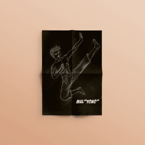
Mulyono Illustration
{"type":"doc","content":[{"type":"paragraph","attrs":{"textAlign":null},"content":[{"type":"text","text":"By day he trains Pencak Silat, by night he tries to save the world — Mulyono is the handmade comic that proves the most original superheroes come straight from the kampung."}]},{"type":"image","attrs":{"src":"https://farooq-agent.web.app/assets/images/works/small/1ifBoIWt_work_image.png","alt":null,"title":null,"width":null,"height":null}},{"type":"paragraph","attrs":{"textAlign":null},"content":[{"type":"text","marks":[{"type":"bold"}],"text":"Comic Illustration — Mulyono"}]},{"type":"paragraph","attrs":{"textAlign":null},"content":[{"type":"text","marks":[{"type":"italic"}],"text":"Hand-Drawn Comic · Action Comedy · Original Character · Pencak Silat"}]},{"type":"paragraph","attrs":{"textAlign":null},"content":[{"type":"text","text":"A handmade comic illustration for Mulyono — an original action-comedy character whose story follows a dedicated Pencak Silat practitioner with grand ambitions of becoming a superhero. The premise is delightfully local and deeply human: not a billionaire in a suit, not an alien with a cape — just Mul \"Yono,\" a silat fighter from the neighbourhood who decides the world needs saving and figures he might as well try."}]},{"type":"paragraph","attrs":{"textAlign":null},"content":[{"type":"text","text":"The cover illustration is drawn entirely by hand — white chalk or pencil on jet black paper, the most stripped-back medium possible — and yet the execution is electric. Mul \"Yono\" is captured mid-kick in a dynamic flying side kick pose — leg extended, arms braced, body coiled in the explosive energy of a silat practitioner at full force. The white-on-black contrast gives the figure a luminous, almost glowing quality, as if the character is materializing out of darkness — a fitting visual metaphor for a hero still figuring out his own powers."}]},{"type":"paragraph","attrs":{"textAlign":null},"content":[{"type":"text","text":"The crinkled, folded paper surface on which the drawing is photographed adds a rawness and authenticity that no digital illustration could replicate — this was made with hands, with intent, and with a genuine love for the craft of sequential storytelling."}]},{"type":"paragraph","attrs":{"textAlign":null},"content":[{"type":"text","text":"The character name \"MUL 'YONO'\" is lettered in bold, italicized type at the lower right — the alias of a man too earnest to be an anti-hero, too funny to be a tragedy, and too Javanese to ever give up."}]},{"type":"paragraph","attrs":{"textAlign":null},"content":[{"type":"text","text":"A comic that could only come from Indonesia — and a character the world absolutely needs."}]}]}
Obituary
{"type":"doc","content":[{"type":"paragraph","attrs":{"textAlign":null},"content":[{"type":"text","text":"\"Everyone will surely die — no one knows when\" — Obituary is the community app built for the uncomfortable truth that someone you know may die far from home, and someone needs to be ready."}]},{"type":"image","attrs":{"src":"https://farooq-agent.web.app/assets/images/works/large/obituary.jpg","alt":null,"title":null,"width":null,"height":null}},{"type":"paragraph","attrs":{"textAlign":null},"content":[{"type":"text","marks":[{"type":"bold"}],"text":"App UI Design — Obituary"}]},{"type":"paragraph","attrs":{"textAlign":null},"content":[{"type":"text","marks":[{"type":"italic"}],"text":"Mobile App · Community Death Management · Indonesia"}]},{"type":"paragraph","attrs":{"textAlign":null},"content":[{"type":"text","text":"A sober, purposeful app UI for Obituary — a community platform designed to manage the situation when a member dies alone or in a place far from their family, ensuring the deceased is handled properly by professionals and that the right people are notified in time."}]},{"type":"paragraph","attrs":{"textAlign":null},"content":[{"type":"text","text":"The app addresses one of the most practically neglected areas of Indonesian community life: what happens when someone dies unexpectedly, away from family, with no one to coordinate the proper handling of their jenazah (body)? Obituary exists to answer that question — through community, preparation, and access to professional funeral services."}]},{"type":"paragraph","attrs":{"textAlign":null},"content":[{"type":"text","text":"Two content cards dominate the home screen: \"Kapan, Tak Seorangpun yang Tahu...\" (When — no one knows...) — a reflection on mortality's unpredictability — and \"Pastikan Jenazah Anda ditangani Ahlinya\" (Make sure your body is handled by experts) — a direct, practical call to preparedness. The photographs are unflinching but respectful: a tagged body at the morgue, emergency responders in action."}]},{"type":"paragraph","attrs":{"textAlign":null},"content":[{"type":"text","text":"Three quick-access functions sit below: Riwayat (History), Testimonial, and Pencarian (Search) — confirming a platform with both personal records and community discovery features."}]},{"type":"paragraph","attrs":{"textAlign":null},"content":[{"type":"text","text":"The Berita Terbaru (Latest News) section surfaces relevant news: \"Hitungan menit Korban Kecelakaan Teridentifikasi\" (Traffic accident victim identified within minutes) — showing the real-world urgency the app addresses."}]},{"type":"paragraph","attrs":{"textAlign":null},"content":[{"type":"text","text":"The dark near-black UI is the only appropriate design choice for this subject matter: respectful, serious, and entirely focused on the gravity of what the platform exists to do."}]},{"type":"paragraph","attrs":{"textAlign":null},"content":[{"type":"text","text":"A design that confronts an uncomfortable reality with the care and directness it deserves."}]}]}
Deteksi - Website Design
{"type":"doc","content":[{"type":"paragraph","attrs":{"textAlign":null},"content":[{"type":"text","text":"Stuck on the Street — DetEksi's website hits the right note for Gen-Z media: bold, illustrated, and instantly recognizable as something made for young people, not at them."}]},{"type":"image","attrs":{"src":"https://farooq-agent.web.app/assets/images/works/large/FqKF6i7Z_work_image.jpg","alt":null,"title":null,"width":null,"height":null}},{"type":"paragraph","attrs":{"textAlign":null},"content":[{"type":"text","marks":[{"type":"bold"}],"text":"Web Design — DetEksi"}]},{"type":"paragraph","attrs":{"textAlign":null},"content":[{"type":"text","marks":[{"type":"italic"}],"text":"Newsletter / Youth Media Website · Jawa Pos Group · Gen-Z"}]},{"type":"paragraph","attrs":{"textAlign":null},"content":[{"type":"text","text":"A vibrant, illustration-driven website design for DetEksi — the youth-focused rubric of Jawa Pos Group, serving school and campus communities across Indonesia with news, lifestyle, and creative content."}]},{"type":"paragraph","attrs":{"textAlign":null},"content":[{"type":"text","text":"The hero is immediately youth-coded: a hand-drawn editorial illustration of a girl in traffic chaos — motorbikes, exclamation marks, urban debris — paired with the feature headline \"Stuck on the Street\" in a bold, mixed-color display typeface. The illustration style is expressive and comic-adjacent, speaking directly to a Gen-Z audience that consumes content through visual language first."}]},{"type":"paragraph","attrs":{"textAlign":null},"content":[{"type":"text","text":"The sky-blue header and cloud-border motif at the bottom of the hero create a dreamy, playful environment that separates DetEksi visually from the parent Jawa Pos brand — maintaining youth identity without severing the institutional connection. The clean white body and bright accent colors keep the reading experience light and energetic."}]},{"type":"paragraph","attrs":{"textAlign":null},"content":[{"type":"text","text":"A media website that understands its audience enough to look like them."}]}]}
Top Five to Remember - Illustration
{"type":"doc","content":[{"type":"paragraph","attrs":{"textAlign":null},"content":[{"type":"text","text":"Five students, five faces, one instructor who cared enough to draw them all — Top Five to Remember is the most personal piece in the portfolio, and perhaps the most meaningful."}]},{"type":"image","attrs":{"src":"https://farooq-agent.web.app/assets/images/works/large/yCtQleer_work_image.jpg","alt":null,"title":null,"width":null,"height":null}},{"type":"paragraph","attrs":{"textAlign":null},"content":[{"type":"text","marks":[{"type":"bold"}],"text":"Illustration — Top Five to Remember"}]},{"type":"paragraph","attrs":{"textAlign":null},"content":[{"type":"text","marks":[{"type":"italic"}],"text":"Personal Artwork · Graphic Design Course · Instructor Tribute Illustration"}]},{"type":"paragraph","attrs":{"textAlign":null},"content":[{"type":"text","text":"A deeply personal illustration created as a farewell gift to five mentees at the end of a graphic design course — five students who came to learn design, and left with a portrait of themselves drawn by the instructor who taught them. The piece is a reminder that the best teachers don't just transfer skills; they see the people in front of them."}]},{"type":"paragraph","attrs":{"textAlign":null},"content":[{"type":"text","text":"The five faces are arranged in a circular formation around a bold \"5\" at the center — each rendered in a clean, minimal caricature style: black linework on a deep indigo-blue starfield background, the cosmos serving as a backdrop that gives each portrait both intimacy and magnitude. Every face captures a distinct personality through the most economical means: a pair of glasses here, a particular hairstyle there, an expression that says \"yes, that's them.\" The hairstyles and facial features are individualized enough to be recognizable to anyone who knows the subjects, while the unified monochromatic treatment gives the group a sense of belonging together."}]},{"type":"paragraph","attrs":{"textAlign":null},"content":[{"type":"text","text":"The subline — \"from sparks to artworks, from me to you\" — is set in a soft light typeface beneath the title, and it carries everything: the arc of a learning journey, the direction of a gift, and the warmth of a teacher who meant every class session. The \"course mag\" attribution at the lower right situates the piece within the graphic design course context, closing the story with quiet completeness."}]},{"type":"paragraph","attrs":{"textAlign":null},"content":[{"type":"text","text":"A poster hung on the wall of a classroom, or tucked into a portfolio, or kept long after the course ends — because some things are worth remembering, and some people are worth drawing."}]}]}
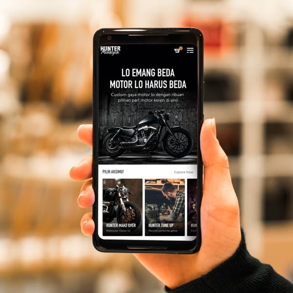
Hunter Motorcycle
{"type":"doc","content":[{"type":"paragraph","attrs":{"textAlign":null},"content":[{"type":"text","text":"\"Lo Emang Beda, Motor Lo Harus Beda\" ("},{"type":"text","marks":[{"type":"bold"}],"text":"You're Different, Your Motorcycle Should Be Different"},{"type":"text","text":") — Hunter Motorcycle's mobile web speaks directly to every rider who refuses to look like everyone else on the road."}]},{"type":"image","attrs":{"src":"https://farooq-agent.web.app/assets/images/works/large/hunter.jpg","alt":null,"title":null,"width":null,"height":null}},{"type":"paragraph","attrs":{"textAlign":null},"content":[{"type":"text","marks":[{"type":"bold"}],"text":"Mobile Web Design — Hunter Motorcycle"}]},{"type":"paragraph","attrs":{"textAlign":null},"content":[{"type":"text","marks":[{"type":"italic"}],"text":"Custom Motorcycle & Parts Marketplace · Mobile Web · Indonesia"}]},{"type":"paragraph","attrs":{"textAlign":null},"content":[{"type":"text","text":"A dark, attitude-forward mobile web design for Hunter Motorcycle — a custom motorcycle and aftermarket parts business sourcing modification components from the global market."}]},{"type":"paragraph","attrs":{"textAlign":null},"content":[{"type":"text","text":"The hero is all energy: \"LO EMANG BEDA, MOTOR LO HARUS BEDA\" (You're Different, Your Motorcycle Should Be Different) in bold all-caps white type against a near-black background, with a custom Harley-Davidson-style chopper staged in dramatic low-key lighting. The copy is direct, colloquial, and exactly right for the target audience — Indonesian motorcycle enthusiasts who see their bike as an identity statement, not just a vehicle."}]},{"type":"paragraph","attrs":{"textAlign":null},"content":[{"type":"text","text":"The subheading confirms the platform's value proposition: \"Custom gaya motor lo dengan ribuan pilihan part motor keren di sini!\" (Customize your bike with thousands of cool motorcycle parts here!) — community-coded, streetwear-adjacent, and entirely on-brand."}]},{"type":"paragraph","attrs":{"textAlign":null},"content":[{"type":"text","text":"Below the hero, \"Pilih Aksimu!\" (Choose Your Action!) surfaces three service categories as visual cards: Hunter Make Over (full motorcycle makeover), Hunter Tune Up (performance tuning), and a third card partially visible — each with a dark editorial photo of custom bikes and riders, reinforcing the aspirational lifestyle positioning."}]},{"type":"paragraph","attrs":{"textAlign":null},"content":[{"type":"text","text":"The Hunter Motorcycle wordmark in the header — bold, compact, and authoritative — anchors the brand before anything else is read."}]},{"type":"paragraph","attrs":{"textAlign":null},"content":[{"type":"text","text":"A mobile web design that matches its audience's energy: loud, specific, and built for people who already know exactly what they want."}]}]}
SIEW
{"type":"doc","content":[{"type":"paragraph","attrs":{"textAlign":null},"content":[{"type":"text","text":"Celebrate, Connect, Co-Create — SIEW's website frames Singapore's premier energy event with the authority of a conference that shapes global energy policy."}]},{"type":"image","attrs":{"src":"https://farooq-agent.web.app/assets/images/works/small/cFgTnTZ1_work_image.jpg","alt":null,"title":null,"width":null,"height":null}},{"type":"paragraph","attrs":{"textAlign":null},"content":[{"type":"text","marks":[{"type":"bold"}],"text":"Web Design — SIEW"}]},{"type":"paragraph","attrs":{"textAlign":null},"content":[{"type":"text","marks":[{"type":"italic"}],"text":"Event Website · Singapore International Energy Week · Marina Bay Sands"}]},{"type":"paragraph","attrs":{"textAlign":null},"content":[{"type":"text","text":"A bold, conference-grade event website for SIEW — the Singapore International Energy Week, a flagship platform for energy professionals, policymakers, and industry leaders gathering at Marina Bay Sands."}]},{"type":"paragraph","attrs":{"textAlign":null},"content":[{"type":"text","text":"The hero opens with a darkened auditorium photograph — a speaker on stage facing a packed conference hall — immediately communicating scale and importance. The headline \"Celebrate, Connect, Co-Create — 10th Singapore International Energy Week\" establishes both the milestone (10th edition) and the event's three-part purpose, supported by a brief mission statement below."}]},{"type":"paragraph","attrs":{"textAlign":null},"content":[{"type":"text","text":"A four-icon event stats strip anchors the bottom of the hero: Location (Marina Bay Sands), Time (24–28 October), Speakers (50+ speakers, from 30+ companies), and Seats — the standard event site conversion architecture that answers the key questions of any prospective attendee in a single glance."}]},{"type":"paragraph","attrs":{"textAlign":null},"content":[{"type":"text","text":"The dark cinematic palette — near-black with amber/orange accents — communicates the gravitas of a high-stakes industry event, while the orange \"Register\" CTA button creates clear conversion priority. The SIEW wordmark in its distinctive typographic treatment carries the brand identity of an event that has earned its position in Singapore's energy policy calendar."}]}]}
Ronggolawe Group Logo
{"type":"doc","content":[{"type":"paragraph","attrs":{"textAlign":null},"content":[{"type":"text","text":"Built on the legacy of a warrior and the strength of a stallion — Ronggolawe Group is a property brand that stands as tall as its history, and as bold as its ambition."}]},{"type":"image","attrs":{"src":"https://farooq-agent.web.app/assets/images/works/large/2dtwtLAE_work_image.png","alt":null,"title":null,"width":null,"height":null}},{"type":"paragraph","attrs":{"textAlign":null},"content":[{"type":"text","marks":[{"type":"bold"}],"text":"Brand Identity — Ronggolawe Group"},{"type":"text","text":" "},{"type":"hardBreak"},{"type":"text","marks":[{"type":"italic"}],"text":"Logo Design · Property & Real Estate · East Java Heritage Brand"}]},{"type":"paragraph","attrs":{"textAlign":null},"content":[{"type":"text","text":"A commanding, heritage-rooted brand identity for Ronggolawe Group — a property company whose name draws from one of East Java's most celebrated warrior legends, Ronggolawe of Tuban, the loyal knight renowned for his courage, strength, and unyielding spirit. The identity translates this historical gravitas into a modern corporate mark with rare elegance and symbolic depth."}]},{"type":"paragraph","attrs":{"textAlign":null},"content":[{"type":"text","text":"The logomark is a bold silhouette of a rearing stallion — dynamic, powerful, and unmistakably noble. The horse, long the companion and symbol of Ronggolawe in Javanese historical narrative, is rendered as a solid, confident form with fluid movement frozen at its peak of energy — front hooves lifted, mane flowing, body coiled with latent power. In the property context, this communicates momentum, ambition, and the strength to build things that endure."}]},{"type":"paragraph","attrs":{"textAlign":null},"content":[{"type":"text","text":"Embedded within the horse's body is a secondary negative space element — a smaller bird or wing-like form — creating a dual-reading mark that rewards close inspection. This layered visual technique adds conceptual richness to an already strong silhouette, suggesting a brand identity with depth beyond its surface."}]},{"type":"paragraph","attrs":{"textAlign":null},"content":[{"type":"text","text":"The entire mark is executed in a single, deeply saturated terracotta red — the color of East Javanese earth, of brick and clay, of buildings raised from the ground up. It is a color of groundedness, warmth, and permanence, all essential qualities for a property brand asking clients to trust them with their most significant investments."}]},{"type":"paragraph","attrs":{"textAlign":null},"content":[{"type":"text","text":"The wordmark \"RONGGOLAWE\" is set in a clean, wide-spaced serif capitals, with \"GROUP\" spaced generously beneath in a smaller weight — a typographic hierarchy that communicates both brand name and corporate scale without excess. The combination of the historic serif with the bold figurative mark creates a brand that feels rooted in legacy yet entirely contemporary in execution."}]},{"type":"paragraph","attrs":{"textAlign":null},"content":[{"type":"text","text":"Presented on a textured white paper card mockup, the single-color treatment demonstrates the mark's strength and versatility — a logo confident enough to need nothing but itself."}]},{"type":"paragraph","attrs":{"textAlign":null},"content":[{"type":"text","text":"A property brand identity with the soul of a warrior and the bearing of a company built to last generations."}]}]}

COVID19 Symptoms
{"type":"doc","content":[{"type":"paragraph","attrs":{"textAlign":null},"content":[{"type":"text","text":"Three symptoms, three faces, one clear message — this COVID-19 infographic makes the body's warning signs impossible to miss and impossible to misunderstand."}]},{"type":"image","attrs":{"src":"https://cdn.dribbble.com/users/5057025/screenshots/11013370/media/5c723b0ac7acc2cf92e7b7326e8ee575.jpg?compress=1&resize=1200x900&vertical=top","alt":null,"title":null,"width":null,"height":null}},{"type":"paragraph","attrs":{"textAlign":null},"content":[{"type":"text","marks":[{"type":"bold"}],"text":"Infographic Illustration — COVID-19 Symptoms"}]},{"type":"paragraph","attrs":{"textAlign":null},"content":[{"type":"text","marks":[{"type":"italic"}],"text":"Public Health Illustration · COVID-19 Awareness · Flat Vector"}]},{"type":"paragraph","attrs":{"textAlign":null},"content":[{"type":"text","text":"A clean, empathetic flat vector infographic depicting the three primary symptoms of COVID-19 infection — designed for maximum clarity and accessibility across public health contexts, from social media posts to clinic waiting rooms to printed flyers."}]},{"type":"paragraph","attrs":{"textAlign":null},"content":[{"type":"text","text":"The layout is organized as a balanced three-column composition against a clean white background, each symptom represented by a circular dark-toned portrait of a character experiencing that specific physical state — a visual empathy device that makes abstract medical information immediate and human."}]},{"type":"paragraph","attrs":{"textAlign":null},"content":[{"type":"text","text":"The first figure — head wrapped in a cold compress, thermometer in mouth, expression heavy with discomfort — communicates High Fever with the wordless accuracy of someone who has lived it. The forehead compress and closed eyes are the universal, culturally transcendent visual shorthand for \"I have a fever and I feel terrible.\""}]},{"type":"paragraph","attrs":{"textAlign":null},"content":[{"type":"text","text":"The center figure is caught mid-cough — hand raised to mouth, face furrowed, the involuntary reflex of a dry, irritating cough perfectly frozen in illustration. The \"(no phlegm)\" qualifier beneath the label \"Cough\" is a clinically important distinction, included without overwhelming the visual — communicating symptom specificity with typographic restraint."}]},{"type":"paragraph","attrs":{"textAlign":null},"content":[{"type":"text","text":"The third figure clutches their chest with both hands, neck strained, expression conveying the distress of labored breathing — Out of Breath rendered with the sensitivity a symptom of that severity deserves."}]},{"type":"paragraph","attrs":{"textAlign":null},"content":[{"type":"text","text":"The teal-green color palette — used consistently across the title, label text, and character clothing — creates a cohesive, medically-appropriate visual language: calm, clinical, and credible without being cold. The dark circular backgrounds give each portrait a focused, contained quality that prevents the composition from feeling scattered."}]},{"type":"paragraph","attrs":{"textAlign":null},"content":[{"type":"text","text":"A public health illustration that communicates urgency through clarity — three symptoms, three portraits, one message that could save a life."}]}]}

Work from Home
{"type":"doc","content":[{"type":"paragraph","attrs":{"textAlign":null},"content":[{"type":"text","text":"Barefoot, bean bag, sleeping cat beside him — this Work from Home illustration captures the pandemic office in all its accidental perfection."}]},{"type":"image","attrs":{"src":"https://cdn.dribbble.com/users/5057025/screenshots/10997292/media/134bb3346c211abb442f870cb4f38e5a.jpg?compress=1&resize=1200x900&vertical=top","alt":null,"title":null,"width":null,"height":null}},{"type":"paragraph","attrs":{"textAlign":null},"content":[{"type":"text","marks":[{"type":"bold"}],"text":"Flat Illustration — Work from Home"}]},{"type":"paragraph","attrs":{"textAlign":null},"content":[{"type":"text","marks":[{"type":"italic"}],"text":"WFH Life · Flat Vector · Remote Work · Editorial Illustration"}]},{"type":"paragraph","attrs":{"textAlign":null},"content":[{"type":"text","text":"A warm, quietly delightful flat vector illustration of a man working from home — the scene so specific in its domestic detail that anyone who lived through the pandemic will recognize it immediately as their own living room story."}]},{"type":"paragraph","attrs":{"textAlign":null},"content":[{"type":"text","text":"The character sits comfortably cross-legged in a plush purple accent chair, laptop balanced on his knee, expression relaxed and content — the posture of someone who has fully committed to the home office life and discovered that the commute to the bean bag is, in fact, superior. He wears a casual teal t-shirt and orange shorts, barefoot on the lavender rug — the unofficial WFH uniform the world adopted simultaneously and without coordination."}]},{"type":"paragraph","attrs":{"textAlign":null},"content":[{"type":"text","text":"The scene is assembled from the icons of a well-lived home workspace: a window with soft curtains behind him lets in the suggestion of daylight; a terracotta pot with a tall leafy plant stands to the left — the pandemic houseplant, now a design cliché because it was everywhere, in every apartment, in every WFH photo; and most perfectly, an orange tabby cat curled in a tight sleep circle on the rug beside his feet — the most honest detail of all, because the cats were always there, and they never pretended to work."}]},{"type":"paragraph","attrs":{"textAlign":null},"content":[{"type":"text","text":"The palette — lavender, teal, warm orange, and soft coral — is gentle and domestic, communicating comfort and ease rather than productivity pressure. The composition is open and airy, the background minimal, keeping focus on the human moment at the center: a person, at home, doing their best, with a cat."}]},{"type":"paragraph","attrs":{"textAlign":null},"content":[{"type":"text","text":"An illustration that made the whole world say: same."}]}]}
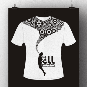
Uneg-Uneg T-shirt
{"type":"doc","content":[{"type":"paragraph","attrs":{"textAlign":null},"content":[{"type":"text","text":"One figure, a flood of bubbles, and the quiet relief of letting it all go — Uneg-Uneg is the t-shirt design that turns unexpressed feelings into a visual exhale."}]},{"type":"image","attrs":{"src":"https://farooq-agent.web.app/assets/images/works/large/CWAXzAAp_work_image.png","alt":null,"title":null,"width":null,"height":null}},{"type":"paragraph","attrs":{"textAlign":null},"content":[{"type":"text","marks":[{"type":"bold"}],"text":"T-Shirt Design — Uneg-Uneg"}]},{"type":"paragraph","attrs":{"textAlign":null},"content":[{"type":"text","marks":[{"type":"italic"}],"text":"Apparel Design · Conceptual Illustration · Personal Expression"}]},{"type":"paragraph","attrs":{"textAlign":null},"content":[{"type":"text","text":"A deeply conceptual t-shirt design built around one of the most distinctly Indonesian emotional concepts: \"uneg-uneg\" — the feeling of having something unspoken, unsaid, or pent-up inside that needs to be released. The word has no direct English equivalent, which makes this illustration's task all the more impressive: to translate a nuanced emotional state into pure visual form, on a shirt, in black and white."}]},{"type":"paragraph","attrs":{"textAlign":null},"content":[{"type":"text","text":"The composition is stark and powerful. A small silhouetted human figure stands in the lower center of the tee, one arm raised — and from that raised hand, a torrent of concentric circles erupts upward and outward across the chest and shoulders of the shirt. The circles vary in size from tiny dots to large target-like rings, densest at the mass and dispersing as they spread — a visual representation of something held inside finally finding its way out, expanding as it goes, filling the space it was always meant to occupy."}]},{"type":"paragraph","attrs":{"textAlign":null},"content":[{"type":"text","text":"The imagery draws from the visual language of sound waves, thought bubbles, and release — all appropriate metaphors for uneg-uneg. The black-on-white execution strips the concept to its essence: no color distraction, no decorative noise, just the idea itself made visible. The typographic element at the figure's base — \"put all your uneg-uneg\" — anchors the concept in text, but the illustration would communicate its meaning even without a single word."}]},{"type":"paragraph","attrs":{"textAlign":null},"content":[{"type":"text","text":"Presented as a hanging poster mockup against a black background, the white tee glows — making the design's stark contrast even more dramatic."}]},{"type":"paragraph","attrs":{"textAlign":null},"content":[{"type":"text","text":"A wearable philosophy — for everyone who has ever had something to say and needed a shirt to say it first."}]}]}
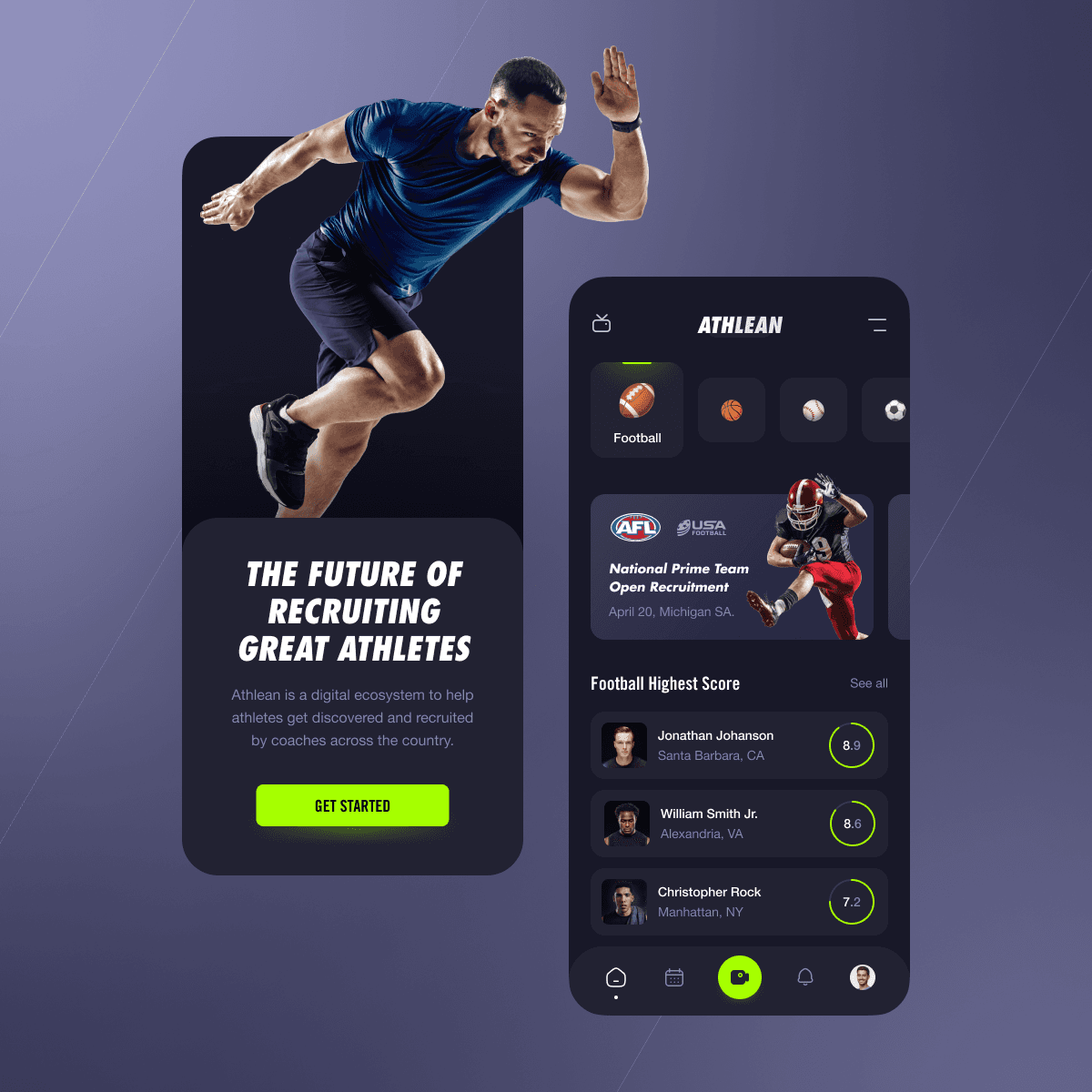
Athlete Recruiting Platform
{"type":"doc","content":[{"type":"paragraph","attrs":{"textAlign":null},"content":[{"type":"text","text":"Hey Sporty People 🔥"}]},{"type":"paragraph","attrs":{"textAlign":null}},{"type":"paragraph","attrs":{"textAlign":null},"content":[{"type":"text","text":"This is my Exploration for ..."}]},{"type":"paragraph","attrs":{"textAlign":null},"content":[{"type":"text","text":"\"Athlean - Athlete Recruiting Platform\""}]},{"type":"paragraph","attrs":{"textAlign":null},"content":[{"type":"text","text":"A platform for Student Athlete Recruitment for vary of sport like American Football, Basketball, Soccer, Base ball, Soft ball etc."}]},{"type":"image","attrs":{"src":"https://mir-s3-cdn-cf.behance.net/project_modules/max_1200/00a936141309407.625146a74266e.png","alt":null,"title":null,"width":null,"height":null}},{"type":"paragraph","attrs":{"textAlign":null},"content":[{"type":"text","text":"What do you think guys? Let me know in the comments section!"}]},{"type":"paragraph","attrs":{"textAlign":null},"content":[{"type":"text","text":"Hope you enjoy it guys. Click “❤️Like” if you like it."}]},{"type":"paragraph","attrs":{"textAlign":null}},{"type":"paragraph","attrs":{"textAlign":null},"content":[{"type":"text","marks":[{"type":"bold"}],"text":"Have a great project idea?"},{"type":"text","text":" Let us know ✅"}]},{"type":"paragraph","attrs":{"textAlign":null}},{"type":"paragraph","attrs":{"textAlign":null},"content":[{"type":"text","text":"Services we provide:"}]},{"type":"paragraph","attrs":{"textAlign":null},"content":[{"type":"text","text":"🖼️ UI Design | 😄 UX Design | 🎉 Illustration | 🛍 Brand Identity | 📝 Graphic Design | 🌐 Web Development | 📱 Mobile App Development"}]},{"type":"paragraph","attrs":{"textAlign":null}},{"type":"paragraph","attrs":{"textAlign":null},"content":[{"type":"text","text":"Thanks!"}]}]}
Univ. Kader Bangsa - Website Design
{"type":"doc","content":[{"type":"paragraph","attrs":{"textAlign":null},"content":[{"type":"text","text":"Sarana & Prasarana Lengkap — UKB's website leads with the promise every prospective health student needs to hear: this university is ready for you."}]},{"type":"image","attrs":{"src":"https://farooq-agent.web.app/assets/images/works/large/MK9khiqO_work_image.jpg","alt":null,"title":null,"width":null,"height":null}},{"type":"paragraph","attrs":{"textAlign":null},"content":[{"type":"text","marks":[{"type":"bold"}],"text":"Web Design — Universitas Kader Bangsa (UKB)"}]},{"type":"paragraph","attrs":{"textAlign":null},"content":[{"type":"text","marks":[{"type":"italic"}],"text":"University Website · Health Sciences · Palembang"}]},{"type":"paragraph","attrs":{"textAlign":null},"content":[{"type":"text","text":"A confident, institutional website design for Universitas Kader Bangsa — a private university in Palembang specializing in health sciences and professional education across 17 study programs, operating under the Yayasan Kader Bangsa since 2000."}]},{"type":"paragraph","attrs":{"textAlign":null},"content":[{"type":"text","text":"The hero communicates academic credibility through its imagery: a nursing student in full white uniform smiles with quiet confidence in a library environment — books stacked behind her, the atmosphere of a working health education facility. The headline \"Sarana & Prasarana Lengkap\" (Complete Facilities & Infrastructure) addresses directly what prospective students and parents evaluate first when choosing a health university."}]},{"type":"paragraph","attrs":{"textAlign":null},"content":[{"type":"text","text":"The deep crimson header with the UKB institutional crest mark establishes the university's formal identity. The navigation — News, Faculties, Info Sivitas, New Student, Contact — maps the full stakeholder journey from discovery to enrollment, structured for both prospective students and current academic community members."}]},{"type":"paragraph","attrs":{"textAlign":null},"content":[{"type":"text","text":"The desaturated background photography with a single full-color student figure is a strong visual device: it isolates the human element — the student — as the university's primary value proposition. The institution exists to serve her."}]}]}
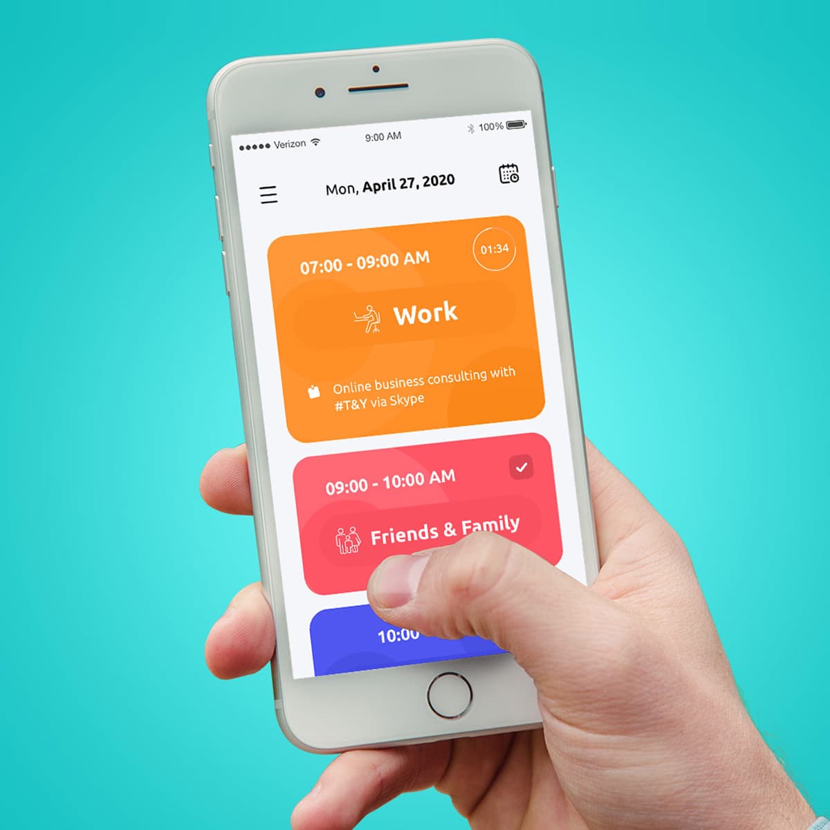
JiYu
{"type":"doc","content":[{"type":"image","attrs":{"src":"https://farooq-agent.web.app/assets/images/works/details/251-jiyu/jiyu.jpg","alt":null,"title":null,"width":null,"height":null}},{"type":"heading","attrs":{"textAlign":null,"level":3},"content":[{"type":"text","marks":[{"type":"bold"}],"text":"UI/UX Design — Jiyu"},{"type":"text","text":" "},{"type":"hardBreak"},{"type":"text","marks":[{"type":"italic"}],"text":"Mobile App Design · Daily Scheduler & Life Productivity · iOS"}]},{"type":"paragraph","attrs":{"textAlign":null},"content":[{"type":"text","text":"A vibrant, category-first daily scheduling app designed to bring color-coded clarity to how people organize their lives. Jiyu's UI philosophy is immediately legible: each life domain — Work, Friends & Family, and beyond — is assigned a bold, distinct color block that fills the screen with purposeful warmth and visual energy."}]},{"type":"paragraph","attrs":{"textAlign":null},"content":[{"type":"text","text":"The interface centers on a daily timeline view, where time-blocked activities are presented as large, rounded cards in a vertically scrollable stack. The generous card size ensures each activity gets the visual real estate it deserves — no more squinting at cramped calendar grids. A live countdown timer badge in the top-right corner of the active card (\"01:34\") adds a subtle productivity pulse, keeping the user anchored in the present moment without intrusion."}]},{"type":"paragraph","attrs":{"textAlign":null},"content":[{"type":"text","text":"The color system does the heavy cognitive lifting: warm amber for Work, coral-pink for Friends & Family, and a teasing glimpse of indigo blue for the next block below the fold — together creating an at-a-glance emotional map of the day. The completed task in the \"Friends & Family\" block is indicated with a clean white checkmark, providing instant satisfaction feedback."}]},{"type":"paragraph","attrs":{"textAlign":null},"content":[{"type":"text","text":"Typography is confident and friendly — bold category names paired with lighter activity descriptions strike a balance between structure and approachability. The minimal navigation (hamburger menu + calendar icon) keeps the chrome unobtrusive, letting the schedule itself breathe."}]},{"type":"paragraph","attrs":{"textAlign":null},"content":[{"type":"text","text":"Presented in a hand-holding mockup against a fresh teal background, the image communicates the app's core promise: that organizing your day should feel as natural — and as human — as holding your phone."}]},{"type":"paragraph","attrs":{"textAlign":null},"content":[{"type":"text","text":"A polished, emotionally intelligent productivity app UI that understands that time management is ultimately about life management."}]}]}
KIOO KIOO Social Media Campaign
{"type":"doc","content":[{"type":"paragraph","attrs":{"textAlign":null},"content":[{"type":"text","text":"Ketupat in hand, smile wide, clouds below — KiooKioo's Lebaran campaign brings the warmth of Eid celebration into a single joyful visual that feels like home."}]},{"type":"image","attrs":{"src":"https://farooq-agent.web.app/assets/images/works/small/dbKem6ga_work_image.jpg","alt":null,"title":null,"width":null,"height":null}},{"type":"paragraph","attrs":{"textAlign":null},"content":[{"type":"text","marks":[{"type":"bold"}],"text":"Social Media Campaign — KiooKioo"}]},{"type":"paragraph","attrs":{"textAlign":null},"content":[{"type":"text","marks":[{"type":"italic"}],"text":"Lebaran Campaign · Social Media Design · F&B / Brand · Eid Al-Fitr"}]},{"type":"paragraph","attrs":{"textAlign":null},"content":[{"type":"text","text":"A festive, warmly celebratory social media campaign design for KiooKioo — created for the Lebaran (Eid Al-Fitr) season — delivering the full spirit of Indonesian Eid celebration through a single, instantly recognizable visual composition."}]},{"type":"paragraph","attrs":{"textAlign":null},"content":[{"type":"text","text":"The KiooKioo mascot — a cheerful, round character with the brand's signature red-and-white circular face design — sits at the center of the composition, arms outstretched to embrace two ketupat (woven diamond rice cake packages), the most iconic symbol of Indonesian Lebaran tradition. The wide smile and rosy cheeks communicate genuine festivity, making the brand feel like a participant in the celebration rather than a sponsor of it."}]},{"type":"paragraph","attrs":{"textAlign":null},"content":[{"type":"text","text":"The mascot is framed within a warm golden circular backdrop embellished with green leaf garlands — natural, organic decorative elements that evoke the traditional Eid aesthetic of freshly woven coconut leaves and festive household decoration. The composition sits above a layer of soft white clouds, giving the character an elevated, celebratory quality — as if floating on the joy of the holiday itself."}]},{"type":"paragraph","attrs":{"textAlign":null},"content":[{"type":"text","text":"The \"Lebaran Bersama KiooKioo\" title treatment is set in a bold, playful display typeface — green outlined letters on white for \"Lebaran Bersama,\" dropping into a larger, warm red \"KiooKioo\" logotype below — creating a clear visual hierarchy that places the brand name as the anchor of the celebration message. The hand-lettered, slightly bubbly quality of the type reinforces the campaign's festive, family-friendly tone."}]},{"type":"paragraph","attrs":{"textAlign":null},"content":[{"type":"text","text":"The overall color palette — red, green, cream, and white — mirrors the traditional Lebaran color language of Indonesian celebration, making the campaign immediately recognizable as seasonal content while remaining distinctly on-brand."}]},{"type":"paragraph","attrs":{"textAlign":null},"content":[{"type":"text","text":"A Lebaran campaign that celebrates the holiday the right way — by making the brand feel like it belongs at the table."}]}]}
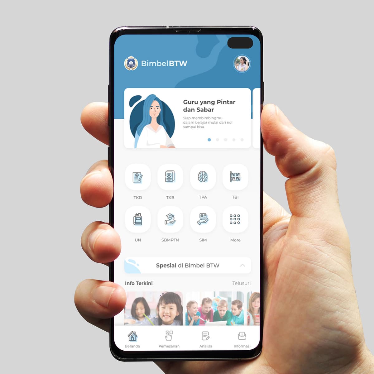
Bimbel BTW
{"type":"doc","content":[{"type":"paragraph","attrs":{"textAlign":null},"content":[{"type":"text","text":"Bimbel BTW is the tutoring app that makes Indonesia's most challenging entrance exams feel approachable, one subject at a time."}]},{"type":"image","attrs":{"src":"https://farooq-agent.web.app/assets/images/works/large/bimbel-btw.jpg","alt":null,"title":null,"width":null,"height":null}},{"type":"paragraph","attrs":{"textAlign":null},"content":[{"type":"text","marks":[{"type":"bold"}],"text":"App UI Design — Bimbel BTW"}]},{"type":"paragraph","attrs":{"textAlign":null},"content":[{"type":"text","marks":[{"type":"italic"}],"text":"Mobile App · Tutoring & Exam Preparation · Indonesia"}]},{"type":"paragraph","attrs":{"textAlign":null},"content":[{"type":"text","text":"A clean, friendly app UI for Bimbel BTW — an Indonesian tutoring (bimbingan belajar) platform covering the full spectrum of national exam preparation for students at every level."}]},{"type":"paragraph","attrs":{"textAlign":null},"content":[{"type":"text","text":"The home screen opens with a warm illustrated banner: \"Guru yang Pintar dan Sabar — Siap membimbingmu dalam belajar mulai dari nol sampai bisa\" (Smart and Patient Teachers — Ready to guide you in learning from zero to capable). The illustration of a female teacher with a calm, welcoming expression communicates the emotional promise of good tutoring: not intimidation, but patient guidance."}]},{"type":"paragraph","attrs":{"textAlign":null},"content":[{"type":"text","text":"The subject category grid covers Indonesia's most critical exam types in a clean eight-icon layout: TKD (Tes Kemampuan Dasar), TKB (Tes Kemampuan Bidang), TPA (Tes Potensi Akademik), TBI (Tes Bahasa Inggris), UN (Ujian Nasional), SBMPTN (university entrance exam), SIM (driving license test), and More — a comprehensive catalog spanning school, university, and civil service exam preparation in one platform."}]},{"type":"paragraph","attrs":{"textAlign":null},"content":[{"type":"text","text":"\"Spesial di Bimbel BTW\" and \"Info Terkini\" sections below signal curated featured content and latest educational news, adding a content layer that keeps students engaged between study sessions."}]},{"type":"paragraph","attrs":{"textAlign":null},"content":[{"type":"text","text":"The bottom navigation — Beranda, Pemesanan (Booking), Analisa (Analysis), Informasi — confirms a complete learning platform: students can discover courses, book sessions, track their performance analytics, and access information all from one app."}]},{"type":"paragraph","attrs":{"textAlign":null},"content":[{"type":"text","text":"The sky blue and white palette communicates calm focus and academic credibility — exactly the tone an exam prep platform needs to inspire confidence rather than anxiety."}]},{"type":"paragraph","attrs":{"textAlign":null},"content":[{"type":"text","text":"An app that meets Indonesian students where the pressure is highest — and tells them they can do it."}]}]}

Balinese Millennial Girl
{"type":"doc","content":[{"type":"paragraph","attrs":{"textAlign":null},"content":[{"type":"text","text":"Flower in her hair, phone raised, peace sign ready — the Balinese Millennial Girl is tradition and modernity sharing the same stunning silhouette."}]},{"type":"image","attrs":{"src":"https://cdn.dribbble.com/users/1863357/screenshots/7416115/media/37bf1a615a22c89ff767938b337096e8.jpg?compress=1&resize=800x600&vertical=top","alt":null,"title":null,"width":null,"height":null}},{"type":"paragraph","attrs":{"textAlign":null},"content":[{"type":"text","marks":[{"type":"bold"}],"text":"Character Illustration — Balinese Millennial Girl"}]},{"type":"paragraph","attrs":{"textAlign":null},"content":[{"type":"text","marks":[{"type":"italic"}],"text":"Flat Vector Illustration · Cultural Character · Millennial Style"}]},{"type":"paragraph","attrs":{"textAlign":null},"content":[{"type":"text","text":"A flowing, luminous character illustration of a young Balinese woman living at the intersection of cultural heritage and contemporary millennial life — captured mid-selfie, mid-step, mid-joy, in a composition that radiates warmth and forward motion."}]},{"type":"paragraph","attrs":{"textAlign":null},"content":[{"type":"text","text":"The character is rendered in a warm flat-vector style with expressive, painterly gradient fills that give the illustration a soft, handcrafted quality. Her voluminous auburn-orange hair flows dramatically behind her — wild, free, and unmistakably colored in the millennial palette — while a small yellow frangipani flower tucked above her ear grounds her identity in Balinese tradition without anchoring her to it. The flower is the illustration's most quietly powerful detail: one small symbol that carries the full weight of cultural belonging."}]},{"type":"paragraph","attrs":{"textAlign":null},"content":[{"type":"text","text":"Her outfit layers the contemporary and the traditional with effortless ease — a bright yellow off-shoulder top over a flowing earth-tone batik-style wrap skirt, a yellow fabric sash trailing mid-movement. The colors are warm and sun-drenched, pulled directly from the Balinese landscape: the gold of temple offerings, the amber of sunset over rice fields."}]},{"type":"paragraph","attrs":{"textAlign":null},"content":[{"type":"text","text":"In her right hand, raised at selfie height, she holds a smartphone — the gadget that defines her generation — while her left hand forms a peace sign, the universal pose of a millennial who knows how to be present in the moment while also documenting it for everyone else. Her expression is open and delighted, mid-smile, entirely at ease in her own story."}]},{"type":"paragraph","attrs":{"textAlign":null},"content":[{"type":"text","text":"The floating pose — feet barely grazing the ground — gives the character a quality of effortless elevation, as if the island itself is carrying her forward."}]},{"type":"paragraph","attrs":{"textAlign":null},"content":[{"type":"text","text":"A character illustration that celebrates the Balinese millennial exactly as she is: traditional and contemporary, grounded and floating, connected and free."}]}]}
Geonk Radio Logo
{"type":"doc","content":[{"type":"paragraph","attrs":{"textAlign":null},"content":[{"type":"text","text":"Turn up the frequency — Geonk Radio's identity hits like a drop on the airwaves, raw, electric, and impossible to tune out."}]},{"type":"image","attrs":{"src":"https://farooq-agent.web.app/assets/images/works/large/C5hLTFMh_work_image.png","alt":null,"title":null,"width":null,"height":null}},{"type":"paragraph","attrs":{"textAlign":null},"content":[{"type":"text","marks":[{"type":"bold"}],"text":"Brand Identity — Geonk Radio"},{"type":"text","text":" "},{"type":"hardBreak"},{"type":"text","marks":[{"type":"italic"}],"text":"Logo Design · Independent Radio Station · Music & Broadcasting"}]},{"type":"paragraph","attrs":{"textAlign":null},"content":[{"type":"text","text":"A high-voltage, street-culture-inspired brand identity for Geonk Radio — an independent radio station that wears its sonic personality on its sleeve. The logo is a bold fusion of music, attitude, and visual energy, assembled with the confident hand of a designer who understands that a radio brand must sound as good as it looks."}]},{"type":"paragraph","attrs":{"textAlign":null},"content":[{"type":"text","text":"The logomark centers on a stylized human head wearing oversized headphones — the universal symbol of immersive listening — rendered as a stark, graphic silhouette in acid yellow-green against deep charcoal black. The head is not a smooth, corporate avatar; it is angular and abstracted, with a sharp triangular face built from bold geometric planes, communicating the edgy, independent character of a station that plays by its own rules."}]},{"type":"paragraph","attrs":{"textAlign":null},"content":[{"type":"text","text":"The standout detail is the halftone stripe treatment — a series of bold vertical lines that fill the triangular face, referencing both the visual noise of a radio signal and the graphic language of underground print culture, zines, and street posters. The \"GR\" monogram is embedded within this striped form, functioning as both a lettermark and a visual texture that rewards close inspection."}]},{"type":"paragraph","attrs":{"textAlign":null},"content":[{"type":"text","text":"The headphone arc that crowns the head is rendered in the same electric yellow-green, with circular ear cups that pop with graphic weight — clean circles against the dark background that give the mark its iconic, badge-like silhouette. Below, the wordmark \"Geonk Radio\" is hand-lettered in a flowing script — loose, expressive, and entirely at odds with the geometric rigidity of the icon above — creating a deliberate tension between structure and freedom that perfectly mirrors the spirit of independent radio."}]},{"type":"paragraph","attrs":{"textAlign":null},"content":[{"type":"text","text":"The two-color palette — electric acid green on near-black — is a neon-in-the-dark choice: maximum contrast, maximum presence, zero compromise."}]},{"type":"paragraph","attrs":{"textAlign":null},"content":[{"type":"text","text":"A logo that doesn't ask for your attention — it takes it, tunes you in, and never lets go."}]}]}
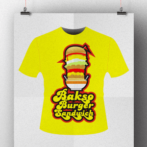
Bakso Burger Sandwich T-Shirt
{"type":"doc","content":[{"type":"paragraph","attrs":{"textAlign":null},"content":[{"type":"text","text":"Bakso meets burger meets sandwich — this t-shirt design is the delicious collision of Indonesian street food and global fast food, served bold on a yellow tee."}]},{"type":"image","attrs":{"src":"https://farooq-agent.web.app/assets/images/works/large/jDIWQR6Z_work_image.png","alt":null,"title":null,"width":null,"height":null}},{"type":"paragraph","attrs":{"textAlign":null},"content":[{"type":"text","marks":[{"type":"bold"}],"text":"T-Shirt Design — Bakso Burger Sandwich"}]},{"type":"paragraph","attrs":{"textAlign":null},"content":[{"type":"text","marks":[{"type":"italic"}],"text":"Apparel Design · Indonesian Food Culture · Street Food · Graphic Tee"}]},{"type":"paragraph","attrs":{"textAlign":null},"content":[{"type":"text","text":"A visually explosive t-shirt design that celebrates the ultimate Indonesian food fusion fantasy: a towering burger-bakso-sandwich hybrid stack — all-caps flavor, no apologies. The design lives on a vibrant, screen-print-ready yellow ground that announces itself across a room before the details are even legible."}]},{"type":"paragraph","attrs":{"textAlign":null},"content":[{"type":"text","text":"The central illustration is a gloriously impractical food tower: a classic burger bun on top, layered patty and fresh vegetables cascading downward into a full bakso bowl — the traditional Indonesian meatball soup vessel sitting at the base, complete with its distinctive ceramic bowl and broth — each layer rendered in a detailed, appetite-first illustration style. The entire stack is held together by the sheer force of design confidence. A red lightning bolt slash cuts through the upper right of the composition, adding kinetic energy and the visual shorthand of something so good it strikes like electricity."}]},{"type":"paragraph","attrs":{"textAlign":null},"content":[{"type":"text","text":"The \"Bakso Burger Sandwich\" logotype below is set in a warm, retro-groovy script — yellow letters with deep red and black outlines, the typography of a 1970s food stall that accidentally became iconic. The thick outlined lettering has the street-food menu energy of something hand-painted on a warung wall, but designed with the craft of a brand that knows exactly what it's doing."}]},{"type":"paragraph","attrs":{"textAlign":null},"content":[{"type":"text","text":"On yellow, with black and red outlines throughout, the design achieves maximum visual impact — bold, graphic, and screen-printable in three colors or fewer."}]},{"type":"paragraph","attrs":{"textAlign":null},"content":[{"type":"text","text":"A t-shirt that celebrates the best of Indonesian street food culture with the confidence of something that was always destined to be worn."}]}]}
The Pixel - Website Design
{"type":"doc","content":[{"type":"paragraph","attrs":{"textAlign":null},"content":[{"type":"text","text":"Built on Magento, built for growth — The Pixel's website design positions the agency as the expert partner for businesses ready to take their e-commerce seriously."}]},{"type":"image","attrs":{"src":"https://farooq-agent.web.app/assets/images/works/large/0qUmt8MF_work_image.png","alt":null,"title":null,"width":null,"height":null}},{"type":"paragraph","attrs":{"textAlign":null},"content":[{"type":"text","marks":[{"type":"bold"}],"text":"Web Design — The Pixel"}]},{"type":"paragraph","attrs":{"textAlign":null},"content":[{"type":"text","marks":[{"type":"italic"}],"text":"Website Design · Magento E-Commerce Agency · Web Development Services"}]},{"type":"paragraph","attrs":{"textAlign":null},"content":[{"type":"text","text":"A clean, technology-forward website design for The Pixel — a web agency specializing in Magento e-commerce solutions — whose homepage communicates platform expertise and technical credibility from the first scroll, designed for the specific audience of business owners evaluating e-commerce partners."}]},{"type":"paragraph","attrs":{"textAlign":null},"content":[{"type":"text","text":"The hero section is built around a bold product endorsement: the Magento logomark and wordmark dominate the left half of the hero field — \"Magento® eCommerce Platform for Growth\" — a direct declaration of partnership and specialization that tells the visitor exactly what platform the agency builds on before a single service description has been read. The right side of the hero is a dramatic 3D render of the Magento \"M\" icon in warm orange-gold, oversized and dimensional, floating against a deep sky-blue and polygon-network background that communicates technical sophistication and digital infrastructure depth."}]},{"type":"paragraph","attrs":{"textAlign":null},"content":[{"type":"text","text":"The Magento mark's characteristic interlocking loop form — rendered here in both flat orange and full 3D gold — is treated as the hero's centrepiece visual, demonstrating The Pixel's comfort with and ownership of the platform identity. An agency that dedicates its entire homepage hero to a platform endorsement is an agency that has made a clear market bet — and communicates that confidence explicitly."}]},{"type":"paragraph","attrs":{"textAlign":null},"content":[{"type":"text","text":"The \"thepixel\" logo anchors the upper left in a clean sans-serif with a distinctive lowercase \"p\" letterform mark — simple, memorable, and technical. The navigation — Home, E-Commerce, Hosting, Support, Blog — maps the agency's full service stack, confirming The Pixel offers the complete lifecycle of Magento services from build to hosting to ongoing support."}]},{"type":"paragraph","attrs":{"textAlign":null},"content":[{"type":"text","text":"A web design that positions the agency as a specialist rather than a generalist — and in e-commerce, specialization is the strongest possible signal of competence."}]}]}
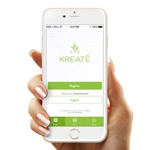
KREATE - App UI Design
{"type":"doc","content":[{"type":"paragraph","attrs":{"textAlign":null},"content":[{"type":"text","text":"Overnight Oats, Savory Oats, Gourmet Salad — Kreaté's app UI makes healthy eating feel like a lifestyle choice you actually want to make."}]},{"type":"image","attrs":{"src":"https://farooq-agent.web.app/assets/images/works/large/syWPFwQv_work_image.jpg","alt":null,"title":null,"width":null,"height":null}},{"type":"paragraph","attrs":{"textAlign":null},"content":[{"type":"text","marks":[{"type":"bold"}],"text":"App UI Design — KREATÉ"}]},{"type":"paragraph","attrs":{"textAlign":null},"content":[{"type":"text","marks":[{"type":"italic"}],"text":"Mobile App · Healthy Food Ordering"}]},{"type":"paragraph","attrs":{"textAlign":null},"content":[{"type":"text","text":"A clean, minimal app UI design for Kreaté — a healthy food brand serving Overnight Oats, Savory Oats, and Gourmet Salads with a \"Rejuvenating your Lifestyle\" philosophy. The onboarding screen is held in hand — an intentional presentation choice that connects the digital product to its real-world context."}]},{"type":"paragraph","attrs":{"textAlign":null},"content":[{"type":"text","text":"The app leads with the Kreaté wordmark in a light sans-serif paired with a minimal botanical leaf icon — fresh, contemporary, and entirely aligned with the brand's health-forward identity. The white background with fresh green as the sole accent color communicates cleanliness and natural goodness without visual noise."}]},{"type":"paragraph","attrs":{"textAlign":null},"content":[{"type":"text","text":"The auth flow is frictionless: a prominent green \"Register\" CTA, a quiet \"Log In\" link below, and terms copy that doesn't intimidate. A bottom tab bar with three icons (Order, Menu, More) is already visible — confirming the app's core structure is simple and task-focused from the very first screen."}]},{"type":"paragraph","attrs":{"textAlign":null},"content":[{"type":"text","text":"A healthy food app UI that looks as clean as what it serves."}]}]}
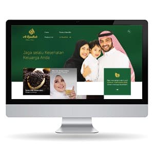
Arroudhah - Website
{"type":"doc","content":[{"type":"paragraph","attrs":{"textAlign":null},"content":[{"type":"text","text":"\"Jaga selalu Kesehatan Keluarga Anda\" — Ar Raudhah's website brings the warmth of Thibbun Nabawi tradition into a clean, family-focused digital storefront."}]},{"type":"image","attrs":{"src":"https://farooq-agent.web.app/assets/images/works/small/LqsoQHxf_work_image.jpg","alt":null,"title":null,"width":null,"height":null}},{"type":"paragraph","attrs":{"textAlign":null},"content":[{"type":"text","marks":[{"type":"bold"}],"text":"Web Design — Ar Raudhah (Arroudhah)"}]},{"type":"paragraph","attrs":{"textAlign":null},"content":[{"type":"text","marks":[{"type":"italic"}],"text":"Herbal Health Product Website · Habbatussauda, Madu & Thibbun Nabawi · Indonesia"}]},{"type":"paragraph","attrs":{"textAlign":null},"content":[{"type":"text","text":"A warm, trust-centered website for Ar Raudhah — an Indonesian herbal health brand selling habbatussauda (black seed), madu (honey), and a range of Thibbun Nabawi (Prophetic medicine) products."}]},{"type":"paragraph","attrs":{"textAlign":null},"content":[{"type":"text","text":"The hero centers on a happy Saudi-styled family — a father in thobe, mother in hijab, child — communicating the brand's core promise: \"Jaga selalu Kesehatan Keluarga Anda\" (Always Protect Your Family's Health). The family imagery is a deliberate trust signal for a Muslim-market brand: health products framed as an act of care for those you love, rooted in Islamic tradition."}]},{"type":"paragraph","attrs":{"textAlign":null},"content":[{"type":"text","text":"The deep forest green and gold palette carries the brand's Islamic heritage identity — green as the color of the deen, gold as a signal of quality. Product card thumbnails below the hero showcase habbatussauda seeds and honey — natural, high-quality imagery that reinforces the \"alami dan berkualitas\" positioning expected by health-conscious Muslim consumers."}]},{"type":"paragraph","attrs":{"textAlign":null},"content":[{"type":"text","text":"A herbal product website that sells the belief system as much as the product — and for its audience, that's exactly the right approach."}]}]}
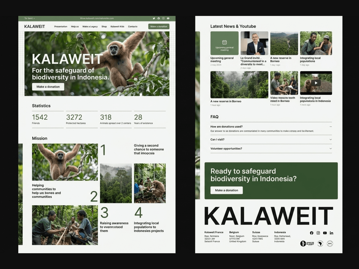
Kalaweit
{"type":"doc","content":[{"type":"paragraph","attrs":{"textAlign":null},"content":[{"type":"text","text":"For the safeguard of biodiversity in Indonesia — Kalaweit's app splash screen gives one of Borneo's most important wild animal rescue organizations a digital identity worthy of the work they do."}]},{"type":"image","attrs":{"src":"https://farooq-agent.web.app/assets/images/works/details/254-kalaweit/kalaweit.jpg","alt":null,"title":null,"width":null,"height":null}},{"type":"paragraph","attrs":{"textAlign":null},"content":[{"type":"text","marks":[{"type":"bold"}],"text":"App UI Design — Kalaweit"}]},{"type":"paragraph","attrs":{"textAlign":null},"content":[{"type":"text","marks":[{"type":"italic"}],"text":"Mobile App · Wild Animal Rescue NGO · Borneo, Indonesia · "},{"type":"text","marks":[{"type":"link","attrs":{"href":"http://kalaweit.org","target":"_blank","rel":"noopener noreferrer nofollow","class":null,"title":null}},{"type":"italic"}],"text":"kalaweit.org"}]},{"type":"paragraph","attrs":{"textAlign":null},"content":[{"type":"text","text":"A clean, purposeful splash screen design for the Kalaweit mobile app — representing one of Indonesia's most established wildlife conservation organizations, founded 28 years ago and dedicated to the rescue, rehabilitation, and protection of gibbons and other wild animals across Borneo and Sumatra."}]},{"type":"paragraph","attrs":{"textAlign":null},"content":[{"type":"text","text":"The splash screen is a single, confident statement: a deep forest green background — the color of the jungle Kalaweit works to protect — bearing the organization's logo centered on screen. The logomark is a shield containing a stylized gibbon face rendered in white, arms raised in the characteristic gibbon posture — simultaneously a primate portrait and a symbol of protection. Below it, \"KALAWEIT\" in bold white type and \"Wild Animal Rescue\" as a clean subtitle."}]},{"type":"paragraph","attrs":{"textAlign":null},"content":[{"type":"text","text":"The design achieves what every NGO mobile identity needs to achieve in its opening moment: instant recognition, clear mission, and emotional resonance. You know what this organization does before you have read a word. The green communicates conservation; the shield communicates protection; the gibbon face communicates exactly whose story this is."}]},{"type":"paragraph","attrs":{"textAlign":null},"content":[{"type":"text","text":"Kalaweit's mission by the numbers is extraordinary — 1,554 friends/supporters, 3,179 protected hectares, 318 animals across 2 centers — and this app splash screen is the first digital touchpoint connecting that mission to the people who want to support it."}]},{"type":"paragraph","attrs":{"textAlign":null},"content":[{"type":"text","text":"A mobile identity that honors the animals it represents — and the 28 years of work behind it."}]},{"type":"paragraph","attrs":{"textAlign":null}},{"type":"image","attrs":{"src":"https://hyperfantasy.web.app/assets/images/portfolios/36bc89b6-0979-48ba-8ef9-747d59b8b424/kalaweit.png","alt":null,"title":null,"width":null,"height":null}},{"type":"paragraph","attrs":{"textAlign":null}}]}
Geonk Retro - Profile Flash App
{"type":"doc","content":[{"type":"paragraph","attrs":{"textAlign":null},"content":[{"type":"text","text":"Every designer has a \"first\" — and this is mine: a retro Flash profile app built in 2011 that sparked everything that came after."}]},{"type":"image","attrs":{"src":"https://farooq-agent.web.app/assets/images/works/large/ATExggLP_work_image.png","alt":null,"title":null,"width":null,"height":null}},{"type":"paragraph","attrs":{"textAlign":null},"content":[{"type":"text","marks":[{"type":"bold"}],"text":"Digital Design — Geret · Geonk Retro"}]},{"type":"paragraph","attrs":{"textAlign":null},"content":[{"type":"text","marks":[{"type":"italic"}],"text":"Personal Profile Flash App · 2011 · Where It All Began"}]},{"type":"paragraph","attrs":{"textAlign":null},"content":[{"type":"text","text":"A deeply personal artifact in this portfolio — Geret is the Flash-based interactive profile application built in 2011, the very project that marked the beginning of a design journey now spanning well over a decade. It is included here not despite its age, but because of it: as honest evidence of where the craft began, and how far it has traveled since."}]},{"type":"paragraph","attrs":{"textAlign":null},"content":[{"type":"text","text":"The visual is a carefully composited digital scene — a figure seated on a vintage sofa against a warm exposed brick wall, framed photographs hanging behind, a retro boombox on a side table. The aesthetic is deliberate and cohesive: moody, cinematic, and unmistakably retro. Even at this earliest stage, there is instinct at work — an understanding that a profile is not just information, it is atmosphere. That the best way to introduce yourself is not with a list of facts, but with a world the viewer steps into."}]},{"type":"paragraph","attrs":{"textAlign":null},"content":[{"type":"text","text":"The \"GERET — GEONK RETRO\" title card, set in a worn serif on a torn paper texture, sits as a handmade banner in the upper left — a typography choice that was already reaching for character and tone rather than defaulting to the generic."}]},{"type":"paragraph","attrs":{"textAlign":null},"content":[{"type":"text","text":"Built entirely in Adobe Flash at a time when Flash was the frontier of interactive web design, this piece represents the first collision of storytelling instinct and digital craft — the origin point of a designer who has never stopped pushing both."}]},{"type":"paragraph","attrs":{"textAlign":null},"content":[{"type":"text","text":"A reminder that every expert was once a beginner — and that the best beginnings are the ones made with genuine curiosity and zero shortcuts."}]}]}

Arabian Loan Service Landing Page - Fun Version
{"type":"doc","content":[{"type":"paragraph","attrs":{"textAlign":null},"content":[{"type":"text","text":"Bold, bilingual-ready, and built for a Saudi audience — this Arabian loan service landing page makes financing feel less like a transaction and more like a solution designed just for you."}]},{"type":"image","attrs":{"src":"https://cdn.dribbble.com/users/1863357/screenshots/11646573/media/3942bfae29ff1b981ab3fb50f83c1f20.png?compress=1&resize=1600x1200&vertical=top","alt":null,"title":null,"width":null,"height":null}},{"type":"paragraph","attrs":{"textAlign":null},"content":[{"type":"text","marks":[{"type":"bold"}],"text":"UI/UX Design — Arabian Loan Service Landing Page"}]},{"type":"paragraph","attrs":{"textAlign":null},"content":[{"type":"text","marks":[{"type":"italic"}],"text":"Web & Mobile Design · Tammwel · Loan Marketplace · Saudi Arabia · Fun Version"}]},{"type":"paragraph","attrs":{"textAlign":null},"content":[{"type":"text","text":"A vibrant, full-responsive landing page design for Tammwel — an Arabian loan marketplace application — presented in both desktop and mobile layouts that demonstrate a cohesive, conversion-optimized UI system built for the Saudi digital finance market."}]},{"type":"paragraph","attrs":{"textAlign":null},"content":[{"type":"text","text":"The hero section leads with maximum confidence: a bold, left-aligned headline \"The Best Loan Just for You\" — direct, personal, and consumer-first — paired with a dynamic illustrated hero of a Saudi man in thobe mid-stride on a golden platform, exuding the energy of someone who just solved a financial problem. The dual CTA buttons — PlayStore and AppStore — position the platform as mobile-first without abandoning the web experience. The hero illustration's blue-and-yellow color geometry gives the section visual drama without sacrificing readability."}]},{"type":"paragraph","attrs":{"textAlign":null},"content":[{"type":"text","text":"The \"Fun Version\" design direction is immediately apparent in the palette choices: the deep indigo-to-violet gradient background frames the white card layout, while yellow accent shapes, pink curves, and purple icon circles inject playful energy into what is typically a conservative category. The result is a fintech landing page that feels accessible and approachable — designed for everyday Saudis discovering digital financing for the first time, not just tech-savvy early adopters."}]},{"type":"paragraph","attrs":{"textAlign":null},"content":[{"type":"text","text":"The product categories — Personal Loan, Riding Loan, and Property Loan — are organized as a clean three-column icon grid, each with a purple circular icon and a concise benefit description. Below, an interactive loan calculator prompt (\"Find the loan offers that match with your preferences\") with amount input, sector dropdown, and a prominent yellow \"Find It Now\" CTA completes the discovery-to-action flow in a single scroll."}]},{"type":"paragraph","attrs":{"textAlign":null},"content":[{"type":"text","text":"The mobile layout mirrors every section in a perfectly adapted single-column format — responsive thinking applied at every breakpoint, not as an afterthought."}]},{"type":"paragraph","attrs":{"textAlign":null},"content":[{"type":"text","text":"A loan marketplace design that proves financial services can be warm, bold, and genuinely enjoyable to navigate."}]}]}

Illustration Bali.js - Hero Section Website
{"type":"doc","content":[{"type":"paragraph","attrs":{"textAlign":null},"content":[{"type":"text","text":"Where Balinese culture meets JavaScript — this hero illustration captures a developer community as vibrant, warm, and alive as the island it's named after."}]},{"type":"image","attrs":{"src":"https://farooq-agent.web.app/assets/images/works/large/illustration-balijs-website.jpg","alt":null,"title":null,"width":null,"height":null}},{"type":"paragraph","attrs":{"textAlign":null},"content":[{"type":"text","marks":[{"type":"bold"}],"text":"Hero Illustration — Bali.js"}]},{"type":"paragraph","attrs":{"textAlign":null},"content":[{"type":"text","marks":[{"type":"italic"}],"text":"Website Hero Section · JavaScript Community · Bali, Indonesia"}]},{"type":"paragraph","attrs":{"textAlign":null},"content":[{"type":"text","text":"A richly atmospheric hero illustration for Bali.js — the JavaScript developer community rooted in Bali, Indonesia — that achieves something rare in tech community branding: it makes code feel like culture, and culture feel like code."}]},{"type":"paragraph","attrs":{"textAlign":null},"content":[{"type":"text","text":"The composition places two characters at the center of a lush, golden-purple landscape that is unmistakably Balinese in spirit — tropical foliage rendered in deep plum and aubergine, warm amber-gold backgrounds, and the soft haze of a Balinese sunset bathing the entire scene in a palette that could only belong to this island. Yet floating through this landscape are the unmistakable icons of the JavaScript ecosystem: the JS logo, the React atom, the Node.js hexagon, the Angular shield — technology badges orbiting the scene like spirits, bridging the digital and the natural with effortless elegance."}]},{"type":"paragraph","attrs":{"textAlign":null},"content":[{"type":"text","text":"The female character — flowing auburn hair, yellow Balinese-style outfit, flower in her hair — holds a smartphone with a peace sign, connecting the traditional Balinese aesthetic with contemporary digital life. The male character — JS t-shirt, Balinese udeng headband, flip-flops — runs forward with a laptop outstretched, the physical embodiment of a developer community that builds things with urgency and joy. The laptop itself glows between them — the shared object, the meeting point of culture and craft."}]},{"type":"paragraph","attrs":{"textAlign":null},"content":[{"type":"text","text":"The illustration style is warm painterly flat-vector — layered organic shapes, gradient fills, and expressive character design that feels handcrafted rather than generated. The overall composition reads as a poster for a community you'd want to join not just for the code, but for everything around it."}]},{"type":"paragraph","attrs":{"textAlign":null},"content":[{"type":"text","text":"A hero illustration that says: we are developers, we are Balinese, and where we build is as important as what we build."}]}]}
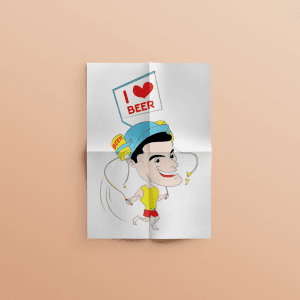
Beer Lover - Character Design
{"type":"doc","content":[{"type":"paragraph","attrs":{"textAlign":null},"content":[{"type":"text","text":"Beer can on his head, \"I ❤️ BEER\" sign raised high, grin absolutely unrepentant — Beer Lover is the character design that knows exactly what it is and commits completely."}]},{"type":"image","attrs":{"src":"https://farooq-agent.web.app/assets/images/works/large/Xo4TxRrJ_work_image.png","alt":null,"title":null,"width":null,"height":null}},{"type":"paragraph","attrs":{"textAlign":null},"content":[{"type":"text","marks":[{"type":"bold"}],"text":"Character Design — Beer Lover"}]},{"type":"paragraph","attrs":{"textAlign":null},"content":[{"type":"text","marks":[{"type":"italic"}],"text":"Chibi Character Illustration · Personal Expression · Humor"}]},{"type":"paragraph","attrs":{"textAlign":null},"content":[{"type":"text","text":"A cheerfully shameless chibi character illustration of the archetypal beer enthusiast — rendered with warm humor, clean vector linework, and the kind of unashamed commitment to a single personality trait that makes character design genuinely joyful to look at."}]},{"type":"paragraph","attrs":{"textAlign":null},"content":[{"type":"text","text":"The character is a compact, oversized-head chibi figure with a wide, ear-to-ear grin — the face of someone who has decided that life is short, beer is good, and there is no reason to pretend otherwise. A blue cap sits on his head, and perched on top of the cap — with the casual permanence of someone who has simply always had a beer can on their head — sits a branded beer can, label visible, perfectly balanced. The yellow t-shirt and red shorts complete the look: casual, cheerful, and entirely comfortable."}]},{"type":"paragraph","attrs":{"textAlign":null},"content":[{"type":"text","text":"In one raised hand he holds a small placard: \"I ❤️ BEER\" — the red heart emoji rendered in actual illustrated form, the message delivered with the earnest directness of someone making a public announcement they have never felt the need to keep private. The sign's proportions are just large enough to be the first thing you read in the composition, ensuring the character's position on the matter is established before you've taken in the rest of the details."}]},{"type":"paragraph","attrs":{"textAlign":null},"content":[{"type":"text","text":"The minimal linework treatment on the body — sketchy, semi-finished — gives the lower half a spontaneous, doodle-like quality that contrasts playfully with the more polished face and upper body, as if the character materialized from a quick sketch that took on a life of its own."}]},{"type":"paragraph","attrs":{"textAlign":null},"content":[{"type":"text","text":"Presented on folded paper on a warm salmon surface — a medium that suits the character's casual, personal energy perfectly."}]},{"type":"paragraph","attrs":{"textAlign":null},"content":[{"type":"text","text":"A character that celebrates one specific love with total, unembarrassed sincerity. We respect it."}]}]}
Karmagroup Modern
{"type":"doc","content":[{"type":"paragraph","attrs":{"textAlign":null},"content":[{"type":"text","text":"Karma Kandara, Ungasan Bali — the most refined iteration of Karma Group's mobile presence yet, clean and editorial with the brand's luxury credentials front and center."}]},{"type":"image","attrs":{"src":"https://farooq-agent.web.app/assets/images/works/large/karmagroup-modern.jpg","alt":null,"title":null,"width":null,"height":null}},{"type":"paragraph","attrs":{"textAlign":null},"content":[{"type":"text","marks":[{"type":"bold"}],"text":"Web Design — Karma Group Modern"}]},{"type":"paragraph","attrs":{"textAlign":null},"content":[{"type":"text","marks":[{"type":"italic"}],"text":"Mobile Web · Luxury Hospitality · Redesign Concept"}]},{"type":"paragraph","attrs":{"textAlign":null},"content":[{"type":"text","text":"The most refined of Karma Group's mobile web design iterations — a clean, light, editorial approach that lets the property photography do the talking while the interface stays completely out of the way."}]},{"type":"paragraph","attrs":{"textAlign":null},"content":[{"type":"text","text":"The hero is Karma Kandara, Ungasan Bali — the same clifftop infinity pool in its signature twilight palette, now rendered as a full-bleed card with the property name and location overlaid in elegant gold script directly on the image. The carousel navigation arrows are the only UI elements visible within the hero frame, communicating that this is an explorable, immersive content surface — not a static banner."}]},{"type":"paragraph","attrs":{"textAlign":null},"content":[{"type":"text","text":"The Karma Group wordmark in gold script anchors the top center — centered, confident, and immediately communicating premium brand positioning. A hamburger menu left and search icon right are the only navigation elements, creating a UI that trusts the content hierarchy to guide the user rather than relying on visible structure."}]},{"type":"paragraph","attrs":{"textAlign":null},"content":[{"type":"text","text":"\"Exclusive Offers\" surfaces below the hero in a horizontal scroll strip — Save 35% Book Direct at Karma Resorts, Spring Spa Escape at Karma Rottnest, Fish at Karma... — real promotional offers with warm lifestyle photography that converts discovery into booking intent."}]},{"type":"paragraph","attrs":{"textAlign":null},"content":[{"type":"text","text":"The bottom navigation — Home, Messages, Reservations, Call, Chat — maps every guest touchpoint in five icons, prioritizing communication channels alongside booking functionality."}]},{"type":"paragraph","attrs":{"textAlign":null},"content":[{"type":"text","text":"A mobile hospitality design that achieves what the most sophisticated luxury brands demand: total visual clarity, zero clutter, and a product experience that feels as premium as the properties it presents."}]}]}
Kolektibles - Dashboard
{"type":"doc","content":[{"type":"paragraph","attrs":{"textAlign":null},"content":[{"type":"text","text":"A sleek admin dashboard that gives collectibles platform managers full visibility — from total collection value to real-time community activity, all in one dark interface."}]},{"type":"image","attrs":{"src":"https://mir-s3-cdn-cf.behance.net/project_modules/fs/385dc2146771155.62b5f6fca9c5d.png","alt":null,"title":null,"width":null,"height":null}},{"type":"paragraph","attrs":{"textAlign":null},"content":[{"type":"text","marks":[{"type":"bold"}],"text":"UI/UX Design — Kolektibles Dashboard"}]},{"type":"paragraph","attrs":{"textAlign":null},"content":[{"type":"text","marks":[{"type":"italic"}],"text":"Web App · Backoffice · Admin Dashboard · Collector Community"}]},{"type":"paragraph","attrs":{"textAlign":null},"content":[{"type":"text","text":"The Kolektibles backoffice dashboard gives platform admins a comprehensive overview of community health and platform activity. Key metrics are front and center: 24,568 collection items and 1,568 collectors, each with a growth delta indicator and a sparkline trend chart. Below, a dual-line area chart tracks the growth trajectory of both Collections and Collectors over time — giving admins an at-a-glance read on platform momentum."}]},{"type":"paragraph","attrs":{"textAlign":null},"content":[{"type":"text","text":"The right column surfaces operational priorities: an active event banner (Helloctofest Auction), a queue of 6 pending events, 3 contact messages, and 12 listed categories. A live activity log tracks user interactions in real time — likes, comments, and engagement on specific collection items — keeping admins connected to the community pulse without leaving the dashboard."}]},{"type":"paragraph","attrs":{"textAlign":null},"content":[{"type":"text","text":"The total value card anchors the bottom with a bold $5,406,896 figure, reinforcing the platform's marketplace weight. The dark navy palette, teal-green chart accents, and sidebar navigation (Category Setting, Home Setting, Events, Contacts) keep the backoffice functional and visually consistent with the front-facing product."}]},{"type":"paragraph","attrs":{"textAlign":null},"content":[{"type":"hardBreak"},{"type":"text","marks":[{"type":"bold"}],"text":"2021-11-15 19:26:22"}]}]}

Djava
{"type":"doc","content":[{"type":"paragraph","attrs":{"textAlign":null},"content":[{"type":"text","text":"Watch a video about Tahu Pong Semarang — then buy it directly from the same screen. Djava is where Javanese cultural content and commerce finally share the same stage."}]},{"type":"image","attrs":{"src":"https://farooq-agent.web.app/assets/images/works/large/djava.jpg","alt":null,"title":null,"width":null,"height":null}},{"type":"paragraph","attrs":{"textAlign":null},"content":[{"type":"text","marks":[{"type":"bold"}],"text":"App UI Design — Djava"}]},{"type":"paragraph","attrs":{"textAlign":null},"content":[{"type":"text","marks":[{"type":"italic"}],"text":"Mobile App · Social Video Sharing + Embedded E-Commerce · Javanese Culture"}]},{"type":"paragraph","attrs":{"textAlign":null},"content":[{"type":"text","text":"A culturally rich, concept-forward mobile app UI for Djava — a platform combining social video sharing with embedded e-commerce, built specifically around Javanese cultural content: culinary, craft, and heritage."}]},{"type":"paragraph","attrs":{"textAlign":null},"content":[{"type":"text","text":"The app logo — a stylized wayang head merged with a play button icon in warm gold — communicates the platform's dual identity instantly: Javanese cultural content, delivered digitally."}]},{"type":"paragraph","attrs":{"textAlign":null},"content":[{"type":"text","marks":[{"type":"bold"}],"text":"Screen 1 — Video Detail with Commerce:"},{"type":"text","text":" A food video plays — \"Seharian Menjajal Enaknya Kuliner Unik Tahu Pong Semarang\" — with 2,457 views, 1,023 likes, and 32 dislikes. Below the video metrics sits the app's defining feature: a prominent gold \"Beli Tahu Pong Ini\" (Buy This Tahu Pong) CTA — an embedded commerce button that lets viewers purchase the product featured in the video without leaving the content experience. The related video list below surfaces more Javanese content: Sate Klatak, Mengenal Keris Pamor Rojo."}]},{"type":"paragraph","attrs":{"textAlign":null},"content":[{"type":"text","marks":[{"type":"bold"}],"text":"Screen 2 — Discovery Feed:"},{"type":"text","text":" Popular videos curated by category — \"Perbedaan Antara Blangkon Jogja dan Blangkon Solo\" (15:25), traditional crafts, keris — alongside a search bar with category filter. The bottom tab bar — Videos, Store, Events, News — confirms a complete cultural platform ecosystem, not just a video feed."}]},{"type":"paragraph","attrs":{"textAlign":null},"content":[{"type":"text","text":"The warm dark UI with gold accents communicates the premium, culturally respectful positioning of a platform that treats Javanese heritage as something worth preserving — and worth buying into."}]},{"type":"paragraph","attrs":{"textAlign":null},"content":[{"type":"text","text":"A platform where watching becomes knowing, and knowing becomes owning."}]}]}
Maleeka Logo
{"type":"doc","content":[{"type":"paragraph","attrs":{"textAlign":null},"content":[{"type":"text","text":"Graceful, confident, and unapologetically feminine — Maleeka dresses the modern Muslimah not just in fabric, but in identity."}]},{"type":"image","attrs":{"src":"https://farooq-agent.web.app/assets/images/works/large/bPYeDwer_work_image.png","alt":null,"title":null,"width":null,"height":null}},{"type":"heading","attrs":{"textAlign":null,"level":3},"content":[{"type":"text","marks":[{"type":"bold"}],"text":"Brand Identity — Maleeka"},{"type":"text","text":" "}]},{"type":"paragraph","attrs":{"textAlign":null},"content":[{"type":"text","marks":[{"type":"italic"}],"text":"Logo Design · Muslimah Fashion Brand · Modest Women's Clothing"}]},{"type":"paragraph","attrs":{"textAlign":null},"content":[{"type":"text","text":"A vibrant, personality-driven wordmark logo for Maleeka — a Muslimah women's clothing brand whose very name speaks its positioning: "},{"type":"text","marks":[{"type":"italic"}],"text":"Maleeka"},{"type":"text","text":" (ملیکة), meaning \"queen\" in Arabic — a declaration of dignity, elegance, and feminine power embedded directly into the brand's identity."}]},{"type":"paragraph","attrs":{"textAlign":null},"content":[{"type":"text","text":"The wordmark is rendered in a flowing, hand-lettered script with confident strokes that move with natural energy from left to right — the kind of typographic character that feels personal, warm, and alive. The letterforms carry an expressive rhythm, with playful ascenders and deliberate ink variation that gives the mark a boutique, handcrafted sensibility perfectly suited to a fashion brand built on individual style and modest self-expression."}]},{"type":"paragraph","attrs":{"textAlign":null},"content":[{"type":"text","text":"The crown icon — perched delicately above the letter \"k\" — is the logo's crowning detail in every sense. Small in scale but significant in meaning, it reinforces the royal etymology of the name with a light touch, avoiding ostentation while planting the brand's queenly aspiration firmly in the mark. It is a detail that rewards attention — the kind of logo element that customers notice, remember, and identify with."}]},{"type":"paragraph","attrs":{"textAlign":null},"content":[{"type":"text","text":"The color is a bold, confident magenta-pink — vibrant and unapologetic, yet deeply feminine. In the modest fashion space, where brand identities can sometimes default to muted, safe palettes, Maleeka's vivid pink is a deliberate statement: that modesty and joy, coverage and color, faith and fashion are not in conflict — they belong together."}]},{"type":"paragraph","attrs":{"textAlign":null},"content":[{"type":"text","text":"Presented on a clean white textured paper mockup, the logo demonstrates strong print performance and natural elegance — at home on garment labels, shopping bags, social media, and storefront signage alike."}]},{"type":"paragraph","attrs":{"textAlign":null},"content":[{"type":"text","text":"A brand identity that tells every Muslimah customer: "},{"type":"text","marks":[{"type":"italic"}],"text":"you are a queen — and your wardrobe should know it."}]}]}
Ale-Ale Product Photo
{"type":"doc","content":[{"type":"paragraph","attrs":{"textAlign":null},"content":[{"type":"text","text":"Pure citrus energy, captured in a single frame — this Ale-Ale product photo makes you thirsty before you've even read the label."}]},{"type":"image","attrs":{"src":"https://farooq-agent.web.app/assets/images/works/large/WzfGbZEC_work_image.png","alt":null,"title":null,"width":null,"height":null}},{"type":"paragraph","attrs":{"textAlign":null},"content":[{"type":"text","marks":[{"type":"bold"}],"text":"Product Photography — Ale-Ale"}]},{"type":"paragraph","attrs":{"textAlign":null},"content":[{"type":"text","marks":[{"type":"italic"}],"text":"Commercial Product Photo · Orange Drink · F&B · Indonesia"}]},{"type":"paragraph","attrs":{"textAlign":null},"content":[{"type":"text","text":"A vibrant commercial product photograph for Ale-Ale — one of Indonesia's most beloved fruity drink brands — executed with the visual language of appetite-first FMCG photography. The composition centers on the iconic Ale-Ale orange cup, flanked by a halved orange and a whole orange fruit, all erupting within a dramatic liquid splash of golden orange juice frozen mid-air."}]},{"type":"paragraph","attrs":{"textAlign":null},"content":[{"type":"text","text":"The splash element is the hero of the shot — dynamic, energetic, and deeply effective at communicating the product's core promise of fresh, real fruit flavor. The white background keeps the composition clean and commercially versatile, ready for use across print, digital, and packaging applications without distraction."}]},{"type":"paragraph","attrs":{"textAlign":null},"content":[{"type":"text","text":"A product photo that does exactly one job — and does it perfectly: make you want to drink it, right now."}]}]}
Gus Baha - Fans Club
{"type":"doc","content":[{"type":"paragraph","attrs":{"textAlign":null},"content":[{"type":"text","text":"That unmistakable grin, that green peci, that warmth you feel before he's even spoken — the Gus Baha fans club logo captures the ulama in a single joyful face."}]},{"type":"image","attrs":{"src":"https://farooq-agent.web.app/assets/images/works/large/gus-baha-fansclub.jpg","alt":null,"title":null,"width":null,"height":null}},{"type":"paragraph","attrs":{"textAlign":null},"content":[{"type":"text","marks":[{"type":"bold"}],"text":"Logo Design — Gus Bahá Fans Club"}]},{"type":"paragraph","attrs":{"textAlign":null},"content":[{"type":"text","marks":[{"type":"italic"}],"text":"Fan Community Identity · Santri Online Seduluran · Islamic Scholar Tribute"}]},{"type":"paragraph","attrs":{"textAlign":null},"content":[{"type":"text","text":"A warmly affectionate community logo designed for the Gus Bahá fans club — a digital community of santri and Islamic knowledge seekers who gather online in the spirit of "},{"type":"text","marks":[{"type":"italic"}],"text":"seduluran"},{"type":"text","text":" (brotherhood and kinship) around the teachings of KH. Ahmad Bahauddin Nursalim, one of Indonesia's most beloved and widely followed ulama."}]},{"type":"paragraph","attrs":{"textAlign":null},"content":[{"type":"text","text":"The logo centers on a caricature portrait of Gus Bahá himself — a cherubic, cartoon-style face rendered with genuine affection: wide grin, rosy cheeks, eyes closed in the expression of someone mid-laugh or mid-wisdom, wearing the iconic green peci that has become one of his most recognizable visual signatures. The caricature style is not satirical but celebratory — it captures the warmth, humor, and approachability that has made Gus Bahá's lectures viral across YouTube, WhatsApp groups, and Indonesian social media."}]},{"type":"paragraph","attrs":{"textAlign":null},"content":[{"type":"text","text":"The circular badge format frames the portrait within a layered green medallion — the color of Islam, of pesantren tradition, and of the peci atop his head — with \"SANTRI ONLINE\" arcing above and \"SEDULURAN\" arcing below, completing the community's identity statement: we are online santri, and we are family."}]},{"type":"paragraph","attrs":{"textAlign":null},"content":[{"type":"text","text":"The \"GusBahá\" script wordmark at the base is rendered in a warm, hand-lettered style — flowing and organic, like a signature passed between friends — in a yellow-green tone that lifts off the darker green background with gentle warmth."}]},{"type":"paragraph","attrs":{"textAlign":null},"content":[{"type":"text","text":"The sticker card mockup on a dark teal surface gives the logo its physical, collectible quality — a badge worn with pride by anyone who finds joy, peace, and wisdom in the ulama's legendary laughter."}]},{"type":"paragraph","attrs":{"textAlign":null},"content":[{"type":"text","text":"A logo built not from a brand brief, but from genuine love for a teacher."}]}]}

Vaccine Creation
{"type":"doc","content":[{"type":"paragraph","attrs":{"textAlign":null},"content":[{"type":"text","text":"A flat vector illustration of a research doctor conducting experiments in a lab to find a vaccine against a virus."}]},{"type":"horizontalRule"},{"type":"paragraph","attrs":{"textAlign":null},"content":[{"type":"text","text":"One drop at a time, one experiment closer — this research doctor illustration captures the quiet, meticulous heroism of vaccine creation in its most human moment."}]},{"type":"image","attrs":{"src":"https://cdn.dribbble.com/users/5057025/screenshots/10997184/media/9762ed7cdcc04a8b7f74eb1e8ee7e15b.jpg?compress=1&resize=1200x900&vertical=top","alt":null,"title":null,"width":null,"height":null}},{"type":"paragraph","attrs":{"textAlign":null},"content":[{"type":"text","marks":[{"type":"bold"}],"text":"Flat Vector Illustration — Vaccine Creation"}]},{"type":"paragraph","attrs":{"textAlign":null},"content":[{"type":"text","marks":[{"type":"italic"}],"text":"Medical Research · Virology · Public Health · Flat Vector"}]},{"type":"paragraph","attrs":{"textAlign":null},"content":[{"type":"text","text":"A focused, intimately composed flat vector illustration of a research doctor in full protective gear — face shield, N95 respirator, glasses, white hazmat suit, and bright yellow rubber gloves — carefully dispensing a single drop from a pipette into a blue-liquid Erlenmeyer flask. The moment captured is small and precise: one drop, held in suspension above the flask, representing the entire concentrated effort of a scientific mind working toward something the world desperately needed."}]},{"type":"paragraph","attrs":{"textAlign":null},"content":[{"type":"text","text":"The character's expression is wide-eyed and intent — mouth slightly open behind the mask, eyes focused on the drop with the absorbed concentration of someone who understands the weight of what they are doing. This is not a generic lab scene; it is a portrait of purpose. The yellow rubber gloves provide a warm chromatic accent against the cool white suit and soft lavender-purple background blob, directing visual attention naturally to the hands — the instruments of the work."}]},{"type":"paragraph","attrs":{"textAlign":null},"content":[{"type":"text","text":"The composition is a tight bust portrait, framing the researcher from mid-torso up within an organic lavender shape that provides focus without distraction. Two small abstract circles float above — molecules? Bubbles? Ideas? — adding a gentle sense of scientific activity beyond the immediate frame."}]},{"type":"paragraph","attrs":{"textAlign":null},"content":[{"type":"text","text":"The illustration is versatile and deployable across public health campaigns, science education content, vaccine awareness materials, and editorial contexts — a single image that communicates the complexity of the research process through the simplicity of one decisive gesture."}]},{"type":"paragraph","attrs":{"textAlign":null},"content":[{"type":"text","text":"A flat vector illustration that makes the laboratory feel as important as the frontline — because it always was."}]}]}
Dian Istana Logo Design Improvement
{"type":"doc","content":[{"type":"paragraph","attrs":{"textAlign":null},"content":[{"type":"text","text":"A brand that already had presence — refined into one that commands it."}]},{"type":"image","attrs":{"src":"https://farooq-agent.web.app/assets/images/works/large/31CRDdij_work_image.png","alt":null,"title":null,"width":null,"height":null}},{"type":"paragraph","attrs":{"textAlign":null},"content":[{"type":"text","marks":[{"type":"bold"}],"text":"Brand Identity Proposal — Dian Istana"}]},{"type":"paragraph","attrs":{"textAlign":null},"content":[{"type":"text","marks":[{"type":"italic"}],"text":"Logo Redesign · Property Company · Brand Improvement"}]},{"type":"paragraph","attrs":{"textAlign":null},"content":[{"type":"text","text":"A logo improvement project for Dian Istana, presented as a comprehensive proposal sheet exploring multiple color directions — gold on black, gold on white, and deep crimson — each variant offering a distinct positioning while maintaining the same refined core mark."}]},{"type":"paragraph","attrs":{"textAlign":null},"content":[{"type":"text","text":"The logomark is a fluid, flame-like \"D\" — elegant and upward-reaching, communicating growth, warmth, and architectural aspiration in a single continuous stroke. The form carries a natural luxury quality, befitting a property brand whose name translates to \"Light of the Palace.\""}]},{"type":"paragraph","attrs":{"textAlign":null},"content":[{"type":"text","text":"The multi-variant proposal demonstrates strategic thinking beyond aesthetics: giving the client real choices between premium-dark, clean-light, and bold-heritage directions — all grounded in the same cohesive identity foundation."}]}]}

Taxfix - Website Design
{"type":"doc","content":[{"type":"paragraph","attrs":{"textAlign":null},"content":[{"type":"text","text":"£300,000,000 goes unclaimed in overpaid taxes every year — Taxfix's website design makes that number impossible to ignore, and the solution impossible to refuse."}]},{"type":"image","attrs":{"src":"https://farooq-agent.web.app/assets/images/works/large/qdrAsJob_work_image.jpg","alt":null,"title":null,"width":null,"height":null}},{"type":"paragraph","attrs":{"textAlign":null},"content":[{"type":"text","marks":[{"type":"bold"}],"text":"Web Design — Taxfix"}]},{"type":"paragraph","attrs":{"textAlign":null},"content":[{"type":"text","marks":[{"type":"italic"}],"text":"Website Design · Tax Rebate Service · UK Market"}]},{"type":"paragraph","attrs":{"textAlign":null},"content":[{"type":"text","text":"A clean, conversion-focused website design for Taxfix — a UK-based tax rebate service — built around a single, startling statistic that functions as the most powerful possible hero headline: \"Each Year Over £300.000.000 Goes Unclaimed in Overpaid Taxes.\" The design's entire job is to make that number land, and then make the path to a refund feel effortless."}]},{"type":"paragraph","attrs":{"textAlign":null},"content":[{"type":"text","text":"The hero section splits between a professional female consultant figure — confident, arms crossed, business-appropriate — and the bold blue stat typography that dominates the right frame. The combination communicates the dual promise of every good financial service website: human expertise and real money. The consultant's presence says \"there are people here who know what they're doing\"; the £300 million figure says \"and here's why you should care.\""}]},{"type":"paragraph","attrs":{"textAlign":null},"content":[{"type":"text","text":"The color system — sky blue, fresh green, and clean white — is the established palette of trustworthy financial and health services: approachable, credible, and nothing that raises alarm. The green navigation bar with \"Services\" highlighted in white provides the primary conversion pathway without aggression."}]},{"type":"paragraph","attrs":{"textAlign":null},"content":[{"type":"text","text":"The three-panel benefit strip anchoring the lower hero is the design's sharpest structural decision: Tax Rebate, One Week, No Risk — three green and blue icon panels that compress the entire service value proposition into a single scannable row. For a service where the customer's primary objections are \"is it real?\", \"how long does it take?\", and \"what do I risk?\" — this strip answers all three simultaneously, before the user has scrolled an inch."}]},{"type":"paragraph","attrs":{"textAlign":null},"content":[{"type":"text","text":"A tax service website that earns trust, communicates urgency, and removes every obstacle between the visitor and the claim form."}]}]}
Swabina - Frontend Development
{"type":"doc","content":[{"type":"paragraph","attrs":{"textAlign":null},"content":[{"type":"text","text":"Mudah & Cepat, Terpercaya, Pilihan Tiket Terlengkap — Swabina delivers online travel ticketing with the calm efficiency of a brand that knows its users just want to get moving."}]},{"type":"image","attrs":{"src":"https://farooq-agent.web.app/assets/images/works/large/azKaxl36_work_image.jpg","alt":null,"title":null,"width":null,"height":null}},{"type":"paragraph","attrs":{"textAlign":null},"content":[{"type":"text","marks":[{"type":"bold"}],"text":"Frontend Development — Swabina Garira Travel"}]},{"type":"paragraph","attrs":{"textAlign":null},"content":[{"type":"text","marks":[{"type":"italic"}],"text":"Ticketing Web App · Online Travel & Transportation · Surabaya"}]},{"type":"paragraph","attrs":{"textAlign":null},"content":[{"type":"text","text":"A clean, trust-focused frontend for Swabina Garira — a Surabaya-based travel and ticketing service offering bus, train, and transportation tickets online."}]},{"type":"paragraph","attrs":{"textAlign":null},"content":[{"type":"text","text":"The page structure hits the key trust signals any ticketing platform needs: a three-column value prop at the top (Mudah & Cepat / Terpercaya / Pilihan Tiket Terlengkap), a company about section establishing credibility, and a footer band with a prominent customer service number (0804-1500-308), physical address, Google Maps link, and payment method logos — BCA, Mastercard, and a third gateway."}]},{"type":"paragraph","attrs":{"textAlign":null},"content":[{"type":"text","text":"The blue-dominant palette communicates reliability and ease — the color language of travel and logistics services that want to feel both approachable and professional. The customer service agent illustration adds a human touch to what could otherwise be a purely transactional interface."}]},{"type":"paragraph","attrs":{"textAlign":null},"content":[{"type":"text","text":"A solid, functional travel ticketing frontend built to convert browsers into booked passengers."}]}]}
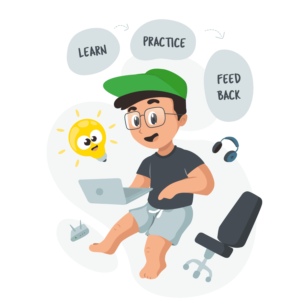
Learn Practice Feedback
{"type":"doc","content":[{"type":"paragraph","attrs":{"textAlign":null},"content":[{"type":"image","attrs":{"src":"https://farooq-agent.web.app/assets/images/works/large/pd/1/lgf-square.png","alt":null,"title":null,"width":1140,"height":1140}}]},{"type":"image","attrs":{"src":"https://farooq-agent.web.app/assets/images/works/large/pd/1/adin_adin.png","alt":null,"title":null,"width":null,"height":null}},{"type":"paragraph","attrs":{"textAlign":null},"content":[{"type":"hardBreak"},{"type":"text","text":"Barefoot, shorts on, laptop in hand — this is what maximizing a once-in-a-career opportunity looks like during a pandemic, and it's more honest than any professional headshot."}]},{"type":"horizontalRule"},{"type":"paragraph","attrs":{"textAlign":null},"content":[{"type":"text","marks":[{"type":"bold"}],"text":"Illustration Design — Learn · Practice · Feedback"}]},{"type":"paragraph","attrs":{"textAlign":null},"content":[{"type":"text","marks":[{"type":"italic"}],"text":"Personal Illustration · Tokopedia Trainee Program · WFH 2021"}]},{"type":"paragraph","attrs":{"textAlign":null},"content":[{"type":"text","text":"A candid, self-portrait illustration capturing the spirit of the Tokopedia Trainee Program experience — distilled into three words floating above the character's head: Learn, Practice, Feedback. The illustration is personal, specific, and entirely true to the moment it documents."}]},{"type":"paragraph","attrs":{"textAlign":null},"content":[{"type":"text","text":"The character — glasses on, green Tokopedia cap, dark grey t-shirt, light shorts, and completely barefoot — sits mid-air with a laptop balanced in their hands, fully in the flow of work. The barefoot detail is the illustration's most honest touch: 2021, full pandemic, fully WFH, and the office was wherever the WiFi router reached. The router sits in the lower left corner as a quiet supporting character — the infrastructure of an entire year of professional growth, rendered in cartoon form."}]},{"type":"paragraph","attrs":{"textAlign":null},"content":[{"type":"text","text":"A glowing lightbulb character floats to the left, eyes wide with the electricity of a new idea — the visual embodiment of what happens when Learn and Practice converge. Wireless headphones orbit to the right, a nod to the deep focus sessions and virtual calls that defined the trainee experience. An empty office chair in the lower right completes the WFH tableau — technically the workspace, practically the whole world that year."}]},{"type":"paragraph","attrs":{"textAlign":null},"content":[{"type":"text","text":"The three speech bubble labels — LEARN, PRACTICE, FEEDBACK — connected by dotted arrows in a cycle, communicate the deliberate mindset brought into the program: not just showing up, but actively extracting every layer of value from every opportunity, every mentor, every critique."}]},{"type":"paragraph","attrs":{"textAlign":null},"content":[{"type":"text","text":"An illustration that turns a pandemic work-from-home moment into a creative statement of intent — and proves that the best learning environments don't always have shoes."}]}]}
Zombie Bassist - Character Design
{"type":"doc","content":[{"type":"paragraph","attrs":{"textAlign":null},"content":[{"type":"text","text":"Blue-skinned, hollow-eyed, bass guitar in hand — the Zombie Bassist is the undead musician who never stopped playing, even after everything else stopped."}]},{"type":"image","attrs":{"src":"https://farooq-agent.web.app/assets/images/works/large/rYhfgWJw_work_image.png","alt":null,"title":null,"width":null,"height":null}},{"type":"paragraph","attrs":{"textAlign":null},"content":[{"type":"text","marks":[{"type":"bold"}],"text":"Character Design — Zombie Bassist"}]},{"type":"paragraph","attrs":{"textAlign":null},"content":[{"type":"text","marks":[{"type":"italic"}],"text":"Chibi Character Illustration · Horror Rock · Original Character"}]},{"type":"paragraph","attrs":{"textAlign":null},"content":[{"type":"text","text":"A boldly expressive chibi character illustration of a zombie bass player — executed in a vivid, high-contrast flat-vector style that combines the exaggerated cuteness of chibi proportions with the visual vocabulary of punk horror, producing a character that is simultaneously grotesque and completely irresistible."}]},{"type":"paragraph","attrs":{"textAlign":null},"content":[{"type":"text","text":"The Zombie Bassist stands in a compact, mid-strum pose — knees slightly bent, body leaning forward with the muscle memory of someone who has been playing bass for longer than they've been alive (and continues to do so after). The bass guitar is rendered in a warm pink and gold tone, held with the casual confidence of an undead musician who has long since stopped caring about technique and simply plays because that's what the body knows how to do."}]},{"type":"paragraph","attrs":{"textAlign":null},"content":[{"type":"text","text":"The character's most arresting features: a blue-grey zombie complexion rendered with flat vector precision; hollow, oversized dark eye sockets that dominate the face; a jagged, stitched grin that conveys both menace and the stubborn joy of someone who refuses to let death interrupt their set; and a crown of spiky yellow hair — bright, almost comedic — that clashes perfectly with the skull face below. The pink drip on the torso adds a horror-gore detail that is more cartoon than disturbing, leaning fully into the character's horror-comedy register."}]},{"type":"paragraph","attrs":{"textAlign":null},"content":[{"type":"text","text":"The tattered clothing — a shredded pink jacket, worn brown pants, red shoes that have seen better days — confirms the character's commitment to the look: this zombie dressed for the gig before the apocalypse, and kept the outfit."}]},{"type":"paragraph","attrs":{"textAlign":null},"content":[{"type":"text","text":"Presented on a folded paper mockup — the same format as the Bassist Sketch and Zombrema — completing a trilogy of music-and-horror character work that shares a visual universe and a creative voice."}]},{"type":"paragraph","attrs":{"textAlign":null},"content":[{"type":"text","text":"A character that proves: some musicians are too into it to ever stop."}]}]}
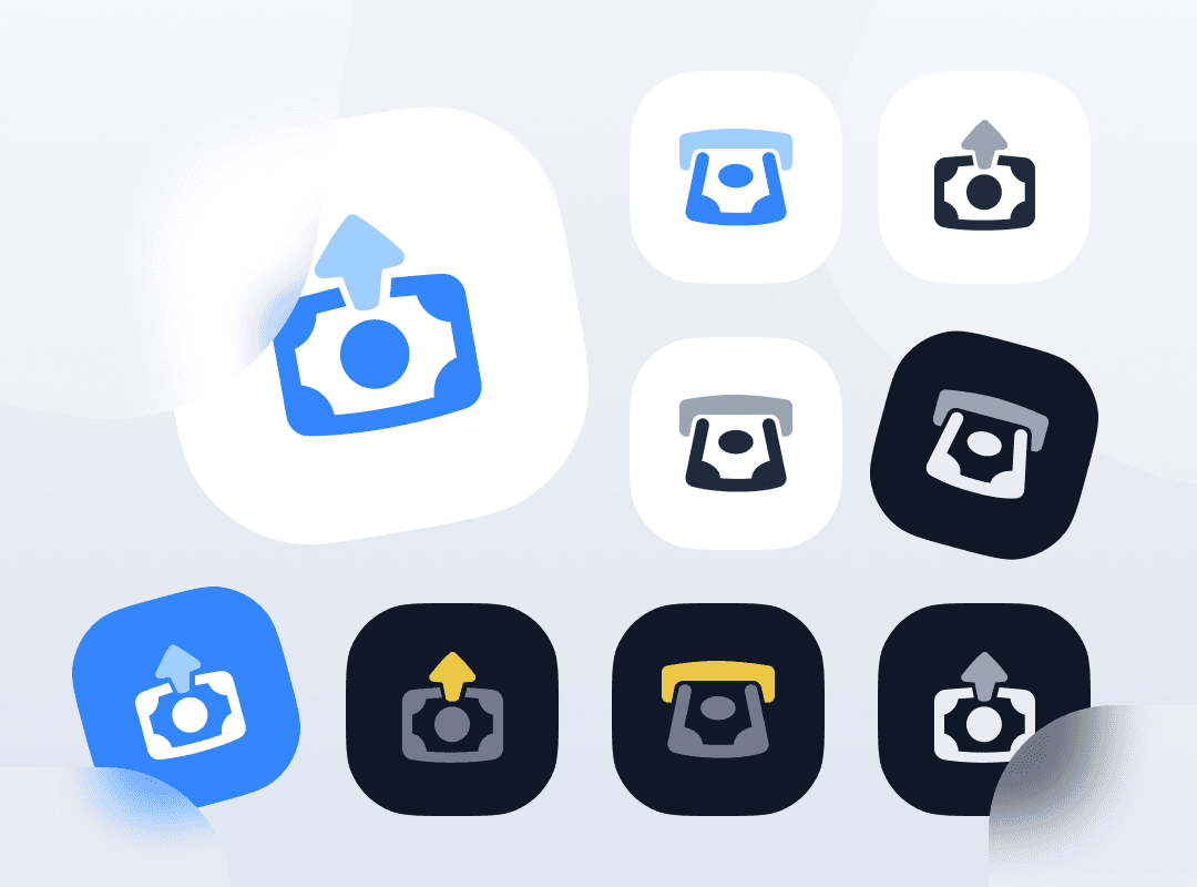
Icon Deposit & Withdraw
{"type":"doc","content":[{"type":"paragraph","attrs":{"textAlign":null},"content":[{"type":"text","text":"One concept, nine expressions — this deposit and withdraw icon exploration demonstrates how a single fintech action can be designed with depth, versatility, and visual system thinking."}]},{"type":"image","attrs":{"src":"https://mir-s3-cdn-cf.behance.net/project_modules/max_1200/d7e6aa145783977.62a46dab6ad3f.png","alt":null,"title":null,"width":null,"height":null}},{"type":"paragraph","attrs":{"textAlign":null},"content":[{"type":"text","marks":[{"type":"bold"}],"text":"Icon Design Exploration — Deposit & Withdraw"}]},{"type":"paragraph","attrs":{"textAlign":null},"content":[{"type":"text","marks":[{"type":"italic"}],"text":"UI Icon Set · Fintech · App Icon Design"}]},{"type":"paragraph","attrs":{"textAlign":null},"content":[{"type":"text","text":"A thorough icon design exploration for deposit and withdraw actions — two of the most fundamental interactions in any fintech or digital wallet application. The project presents a single core concept iterated across nine distinct visual treatments, demonstrating a mature, system-aware approach to icon design that goes far beyond a single deliverable."}]},{"type":"paragraph","attrs":{"textAlign":null},"content":[{"type":"text","text":"The icon's core metaphor is elegant and immediately legible: a coin or token dropping into or emerging from a tray-like container, with a directional arrow indicating the flow of funds. This abstraction is precise enough to convey financial transaction, yet simple enough to read at 24px — the true test of any UI icon."}]},{"type":"paragraph","attrs":{"textAlign":null},"content":[{"type":"text","text":"The nine variants explore the full design system spectrum systematically: light mode on white, light mode on blue, monochrome on white, monochrome on dark, full-color on dark with yellow accent, glassmorphism with frosted white background, sticker-style with shadow peel, and solid app icon formats in both light and dark themes. Each treatment answers a different UI context question — what does this icon look like in dark mode? In a colored CTA button? As an app icon on a home screen?"}]},{"type":"paragraph","attrs":{"textAlign":null},"content":[{"type":"text","text":"The hero variant — a large glassmorphism treatment in blue with a frosted white card — is the most refined, demonstrating current design trend literacy while maintaining functional clarity. The yellow-accent dark variant signals a secondary action state, while the monochrome versions confirm the icon's structural integrity when color is removed entirely."}]},{"type":"paragraph","attrs":{"textAlign":null},"content":[{"type":"text","text":"An icon exploration that doesn't just design one icon — it designs an entire icon system."}]}]}
HeySaladin Website
{"type":"doc","content":[{"type":"paragraph","attrs":{"textAlign":null},"content":[{"type":"text","text":"I'm Designing Solutions for Human — HeySaladin's 2019 portfolio website is where the designer's mascot first stepped into the frame, waving hello to the world with a yellow \"Let's Go!\" button."}]},{"type":"image","attrs":{"src":"https://farooq-agent.web.app/assets/images/works/large/heysaladin.jpg","alt":null,"title":null,"width":null,"height":null}},{"type":"paragraph","attrs":{"textAlign":null},"content":[{"type":"text","marks":[{"type":"bold"}],"text":"Web Design — HeySaladin"}]},{"type":"paragraph","attrs":{"textAlign":null},"content":[{"type":"text","marks":[{"type":"italic"}],"text":"Personal Portfolio Website · UI/UX Designer & Frontend Developer · 2019"}]},{"type":"paragraph","attrs":{"textAlign":null},"content":[{"type":"text","text":"The original iteration of Adin's personal portfolio website — HeySaladin — photographed live on a MacBook in a real workspace, hands on the keyboard, the designer visibly present in his own presentation."}]},{"type":"paragraph","attrs":{"textAlign":null},"content":[{"type":"text","text":"The hero delivers the same professional declaration as its successor: \"I'M DESIGNING SOLUTIONS FOR HUMAN\" in bold, heavy display type — the same mission statement, the same three-discipline subtext (user experience research, user interface design, frontend development), the same direct confidence. What differs is the visual language and the era."}]},{"type":"paragraph","attrs":{"textAlign":null},"content":[{"type":"text","text":"Where the later HeyHeySaladin features the Adinstronaut in a purple cosmos, this version introduces an earlier mascot iteration — a chibi-style character in a black cap and dark outfit, waving with casual energy, floating in the same dark background scattered with geometric shapes. The character is more grounded, more street-level, less cosmic — a designer who has arrived and is ready to work, rather than one exploring the universe."}]},{"type":"paragraph","attrs":{"textAlign":null},"content":[{"type":"text","text":"The yellow \"Let's Go!\" CTA — warm, energetic, and distinctly different from the purple \"Let's Talk\" of the later version — communicates the momentum of a designer in his earlier career: eager, direct, moving."}]},{"type":"paragraph","attrs":{"textAlign":null},"content":[{"type":"text","text":"The dark/light mode toggle on the left edge confirms the technical craft that goes beyond visual design. The HeySaladin gold script wordmark centered at top is consistent across both iterations — the signature that has remained even as the character around it evolved."}]},{"type":"paragraph","attrs":{"textAlign":null},"content":[{"type":"text","text":"Copyright HeySaladin 2019 — the timestamp of a designer who was already building his identity before the industry caught up."}]},{"type":"paragraph","attrs":{"textAlign":null},"content":[{"type":"text","text":"An earlier self-portrait from a designer who has always known exactly what he wanted to say — and kept saying it better with every iteration."}]}]}
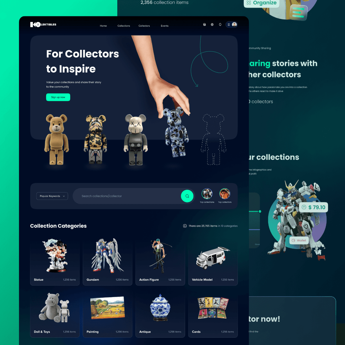
Kolektibles - Web App
{"type":"doc","content":[{"type":"paragraph","attrs":{"textAlign":null},"content":[{"type":"text","text":"A dark, immersive web platform built for serious toy collectors — discover rare pieces, share your collection, and connect with a community that gets the obsession."}]},{"type":"image","attrs":{"src":"https://mir-s3-cdn-cf.behance.net/project_modules/fs/6afb60146771155.62b5f6fcaa37a.png","alt":null,"title":null,"width":null,"height":null}},{"type":"paragraph","attrs":{"textAlign":null},"content":[{"type":"text","marks":[{"type":"bold"}],"text":"UI/UX Design — Kolektibles"}]},{"type":"paragraph","attrs":{"textAlign":null},"content":[{"type":"text","marks":[{"type":"italic"}],"text":"Web App · Collector Community · Toys & Collectibles"}]},{"type":"paragraph","attrs":{"textAlign":null},"content":[{"type":"text","text":"Kolektibles is a community platform for toy and collectibles enthusiasts, spanning categories from Bearbrick and Gundam to Action Figures, Antiques, Paintings, and Trading Cards. The hero section leads with \"For Collectors to Inspire\" — a positioning that frames the platform as much about community storytelling as it is about cataloging items."}]},{"type":"paragraph","attrs":{"textAlign":null},"content":[{"type":"text","text":"The deep teal-green dark interface sets a premium, gallery-like atmosphere that lets the collectibles themselves take center stage. A search bar with Popular Keywords filter and Top Collectors spotlight sit directly below the hero, encouraging discovery and social connection from the first scroll. The Collection Categories grid — 25,765 items across 10 categories — gives immediate scale to the platform's depth."}]},{"type":"paragraph","attrs":{"textAlign":null},"content":[{"type":"text","text":"Secondary screens reveal a community sharing angle (sharing stories with other collectors) and a monetization layer, with wallet integration and item pricing (e.g. $79.10 on a Gundam figure), hinting at a marketplace beneath the community surface."}]},{"type":"paragraph","attrs":{"textAlign":null}},{"type":"paragraph","attrs":{"textAlign":null},"content":[{"type":"text","marks":[{"type":"bold"}],"text":"2021-11-15 19:26:22"}]}]}
Food Icons
{"type":"doc","content":[{"type":"paragraph","attrs":{"textAlign":null},"content":[{"type":"text","text":"From satay to seafood — this Indonesian food icon set brings the richness of the archipelago's culinary identity into a clean, scalable UI system built for Tokopedia's marketplace."}]},{"type":"image","attrs":{"src":"https://mir-s3-cdn-cf.behance.net/project_modules/fs/4e0ea8147011375.62badd30434ef.png","alt":null,"title":null,"width":null,"height":null}},{"type":"paragraph","attrs":{"textAlign":null},"content":[{"type":"text","marks":[{"type":"bold"}],"text":"Icon Design — Indonesian Food Icons"}]},{"type":"paragraph","attrs":{"textAlign":null},"content":[{"type":"text","marks":[{"type":"italic"}],"text":"UI Icon Set · Food Category Icons · Tokopedia · E-Commerce"}]},{"type":"paragraph","attrs":{"textAlign":null},"content":[{"type":"text","text":"A thoughtfully crafted food icon set designed for Tokopedia's Indonesian food marketplace — built to represent the diverse culinary categories of Indonesian cuisine in a consistent, scalable, and visually cohesive system."}]},{"type":"paragraph","attrs":{"textAlign":null},"content":[{"type":"text","text":"The icon set is organized around a three-color variant system: active green, accent orange, and neutral grey — a deliberate design decision that gives the system maximum UI flexibility. The green variant signals selection or primary state; the orange variant communicates action, promotion, or secondary highlight; the grey variant serves inactive or disabled states. All three maintain identical form and weight, ensuring seamless state transitions in any UI context."}]},{"type":"paragraph","attrs":{"textAlign":null},"content":[{"type":"text","text":"The icons visible in this panel represent three essential Indonesian food categories: a crossed fork-and-spoon for the general dining category — the universal restaurant marker given a local, approachable stroke weight; a prawn/shrimp icon for seafood — rendered with enough anatomical accuracy to be instantly recognizable yet simple enough to read at 24px; a grilled meat or fish steak for the protein category, with characteristic grill lines that communicate texture and cooking method in four strokes; and a satay skewer cluster — two bamboo skewers with three rounds each — the most distinctly Indonesian icon in the set, immediately grounding the icon system in local culinary culture."}]},{"type":"paragraph","attrs":{"textAlign":null},"content":[{"type":"text","text":"Each icon shares a consistent stroke weight, rounded terminals, and a 2:3 aspect ratio that scales from mobile nav bars to desktop category headers without loss of clarity. The outlined style with selective fill creates visual warmth while maintaining the technical precision a product icon system demands."}]},{"type":"paragraph","attrs":{"textAlign":null},"content":[{"type":"text","text":"An icon set that speaks the visual language of Indonesian food culture — precise, familiar, and built to perform at every size."}]}]}
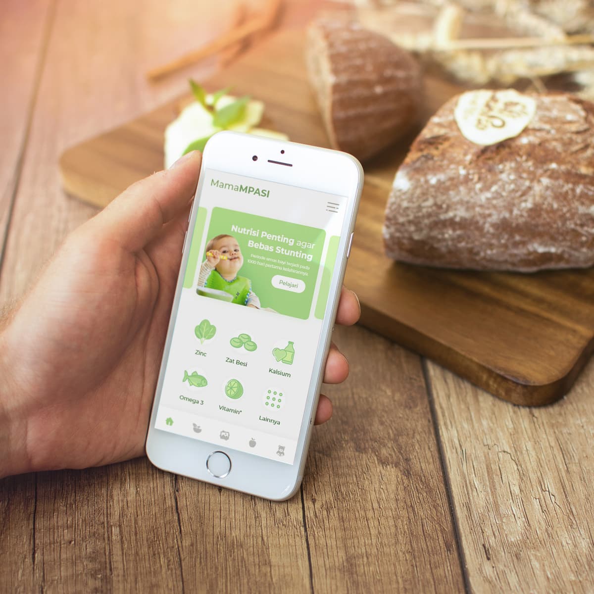
MamaMPASI
{"type":"doc","content":[{"type":"paragraph","attrs":{"textAlign":null},"content":[{"type":"text","text":"MamaMPASI is the app that helps Indonesian mothers navigate the most critical 1,000 days of their child's nutrition with confidence and clarity."}]},{"type":"image","attrs":{"src":"https://farooq-agent.web.app/assets/images/works/large/mamampasi.jpg","alt":null,"title":null,"width":null,"height":null}},{"type":"paragraph","attrs":{"textAlign":null},"content":[{"type":"text","marks":[{"type":"bold"}],"text":"App UI Design — MamaMPASI"}]},{"type":"paragraph","attrs":{"textAlign":null},"content":[{"type":"text","marks":[{"type":"italic"}],"text":"Mobile App · Baby Nutrition & MPASI Guide · Indonesia · Anti-Stunting"}]},{"type":"paragraph","attrs":{"textAlign":null},"content":[{"type":"text","text":"A clean, nurturing app UI for MamaMPASI — a baby nutrition platform focused on MPASI (Makanan Pendamping ASI, complementary feeding) and stunting prevention in Indonesia, where childhood stunting remains one of the country's most critical public health priorities."}]},{"type":"paragraph","attrs":{"textAlign":null},"content":[{"type":"text","text":"The hero banner delivers the app's mission without softening it: \"Nutrisi Penting agar Bebas Stunting — Penuhi asupan vital terbaik bagi bayi pada 1000 hari pertama kehidupan\" (Important Nutrition to be Free from Stunting — Fulfill the best vital intake for babies in the first 1000 days of life). A cheerful baby in a green bib eating from a spoon anchors the banner with warmth — this is a platform about childhood flourishing, not just clinical nutrition compliance."}]},{"type":"paragraph","attrs":{"textAlign":null},"content":[{"type":"text","text":"The nutrient category grid below organizes MPASI guidance by key nutritional pillars: Zinc, Zat Besi (Iron), Kalsium (Calcium), Omega 3, Vitamin, and Lainnya (More) — each with a clean illustrated icon in the app's fresh green palette. The categories map precisely to the nutrients most commonly deficient in Indonesian infants, making the app a practical daily reference for mothers planning meals."}]},{"type":"paragraph","attrs":{"textAlign":null},"content":[{"type":"text","text":"The bottom navigation confirms a complete platform — recipe browsing, meal tracking, gallery, and profile — everything a young Indonesian mother needs to plan and track her baby's nutritional intake through the MPASI journey."}]},{"type":"paragraph","attrs":{"textAlign":null},"content":[{"type":"text","text":"The fresh green palette communicates health, growth, and natural ingredients — photographed in hand against a warm wooden table with artisan bread, the mockup placing the app exactly where Indonesian mothers use it: in the kitchen, while cooking."}]},{"type":"paragraph","attrs":{"textAlign":null},"content":[{"type":"text","text":"An app built around one of the most important design briefs possible — helping Indonesia's next generation grow up strong."}]}]}
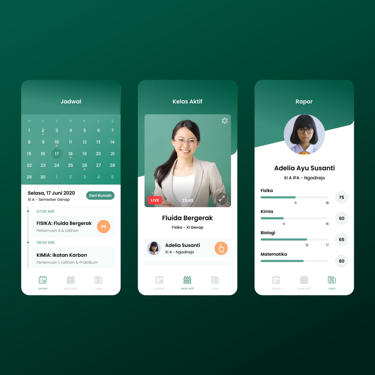
Sapa Sekolah
{"type":"doc","content":[{"type":"paragraph","attrs":{"textAlign":null},"content":[{"type":"text","marks":[{"type":"bold"}],"text":"“Learning Is No Longer Confined by Space.”"},{"type":"text","text":" — Sapa Sekolah reimagines home learning as a structured, human-centered digital experience where students stay connected, guided, and in control."}]},{"type":"image","attrs":{"src":"https://farooq-agent.web.app/assets/images/works/details/241-sapa-sekolah/sapa-sekolah.jpg","alt":null,"title":null,"width":null,"height":null}},{"type":"paragraph","attrs":{"textAlign":null},"content":[{"type":"text","marks":[{"type":"bold"}],"text":"Mobile App Design — Sapa Sekolah"}]},{"type":"paragraph","attrs":{"textAlign":null},"content":[{"type":"text","marks":[{"type":"italic"}],"text":"EdTech · Learn from Home · Student Experience · UI/UX Design"}]},{"type":"paragraph","attrs":{"textAlign":null},"content":[{"type":"text","text":"A mobile learning application designed to support structured, accessible, and engaging education from home — Sapa Sekolah positions itself as a bridge between formal schooling and the realities of remote learning."}]},{"type":"paragraph","attrs":{"textAlign":null},"content":[{"type":"text","text":"The design emphasizes clarity and approachability. Clean layouts, friendly visual language, and intuitive navigation reduce cognitive load, allowing students to focus on what matters most: learning. The interface likely prioritizes core actions — accessing lessons, tracking progress, and staying connected with teachers — without overwhelming the user."}]},{"type":"paragraph","attrs":{"textAlign":null},"content":[{"type":"text","text":"At its core, Sapa Sekolah is not just a digital classroom, but a learning companion. It transforms the home into an extension of the school environment, maintaining rhythm, accountability, and interaction even at a distance."}]},{"type":"paragraph","attrs":{"textAlign":null},"content":[{"type":"text","text":"The “learn from home” positioning reflects a broader shift in education — where flexibility is no longer optional, and digital platforms must balance structure with empathy. This project embraces that challenge by crafting an experience that feels guided, supportive, and human, rather than mechanical."}]},{"type":"paragraph","attrs":{"textAlign":null},"content":[{"type":"text","text":"A thoughtful exploration of how education can remain consistent and meaningful, even when the classroom is no longer a physical space."}]}]}
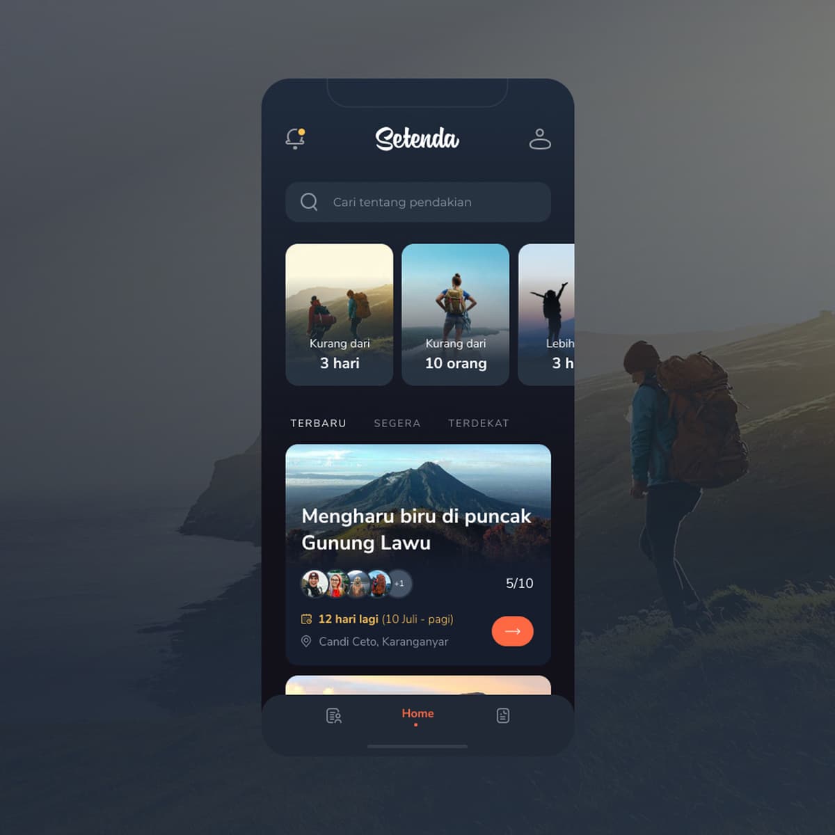
Setenda
{"type":"doc","content":[{"type":"paragraph","attrs":{"textAlign":null},"content":[{"type":"text","text":"\"Deeply moved at the summit of Mount Lawu\", 12 hari lagi, 5/10 slots filled — Setenda is the open trip platform that turns the dream of hiking Indonesia's mountains into a group adventure you can join today."}]},{"type":"image","attrs":{"src":"https://farooq-agent.web.app/assets/images/works/details/188-sejalan/setenda.jpg","alt":null,"title":null,"width":null,"height":null}},{"type":"paragraph","attrs":{"textAlign":null},"content":[{"type":"text","marks":[{"type":"bold"}],"text":"App UI Design — Setenda"}]},{"type":"paragraph","attrs":{"textAlign":null},"content":[{"type":"text","marks":[{"type":"italic"}],"text":"Mobile App · Open Trip Outdoor Hiking Platform · Indonesia"}]},{"type":"paragraph","attrs":{"textAlign":null},"content":[{"type":"text","text":"A dark, atmospheric app UI for Setenda — an open trip platform connecting hikers with organized mountain climbing trips across Indonesia. The design is set against a real mountain backdrop, a hiker with full pack visible in the right frame — grounding the app in the physical experience it enables."}]},{"type":"paragraph","attrs":{"textAlign":null},"content":[{"type":"text","text":"The home screen is organized around three discovery filters at the top: Kurang dari 3 hari (Less than 3 days), Kurang dari 10 orang (Less than 10 people), and a third filter — quick-filter chips that let hikers find trips matching their schedule and group preference before scrolling a single result."}]},{"type":"paragraph","attrs":{"textAlign":null},"content":[{"type":"text","text":"The search bar — \"Cari tentang pendakian\" (Search about hiking) — sits above the filters, confirming the platform serves both casual browsers and users with a specific destination in mind."}]},{"type":"paragraph","attrs":{"textAlign":null},"content":[{"type":"text","text":"The trip feed is tabbed: Terbaru (Latest), Segera (Soon), Terdekat (Nearest) — three sorting modes that serve different user intents. The featured trip card shows \"Mengharu biru di puncak Gunung Lawu\" (Deeply moving at the summit of Mount Lawu) — participant avatars (5/10 slots filled), departure countdown (12 hari lagi / 12 days left, 10 Juli pagi), and meeting point (Candi Ceto, Karanganyar). The availability indicator and countdown create natural urgency without manufactured pressure."}]},{"type":"paragraph","attrs":{"textAlign":null},"content":[{"type":"text","text":"The dark navy palette with orange accent CTAs communicates the outdoors at night — the pre-dawn departure, the summit before sunrise, the atmosphere every serious hiker knows and loves."}]},{"type":"paragraph","attrs":{"textAlign":null},"content":[{"type":"text","text":"An app that makes finding your next mountain feel as easy as finding your next movie."}]}]}

Desert Project - Mascot Design
{"type":"doc","content":[{"type":"image","attrs":{"src":"https://farooq-agent.web.app/assets/images/works/details/247-tammwel-design/tammwel-design.jpg","alt":null,"title":null,"width":null,"height":null}},{"type":"paragraph","attrs":{"textAlign":null},"content":[{"type":"text","text":"Sun-golden, bow-tied, and holding a bag of riyals — this Dhab mascot turns the Arabian desert's most recognizable lizard into a fintech character with unmistakable local charm."}]},{"type":"image","attrs":{"src":"https://cdn.dribbble.com/users/5057025/screenshots/14280115/media/746f2e091fb8f44d15aa88dfbc3eaec6.jpg?compress=1&resize=1200x900&vertical=top","alt":null,"title":null,"width":null,"height":null}},{"type":"paragraph","attrs":{"textAlign":null},"content":[{"type":"text","marks":[{"type":"bold"}],"text":"Mascot Design — Desert Project"}]},{"type":"paragraph","attrs":{"textAlign":null},"content":[{"type":"text","marks":[{"type":"italic"}],"text":"Character Design · Uromastyx aegyptia (Dhab) · Loan Marketplace Fintech · Arabian Market"}]},{"type":"paragraph","attrs":{"textAlign":null},"content":[{"type":"text","text":"A richly detailed mascot illustration inspired by the Uromastyx aegyptia — the Dhab, a ground-dwelling lizard native to the arid deserts of the Arabian Peninsula — reimagined here as the charming brand ambassador for a desert-rooted loan marketplace fintech. The result is a character that is unmistakably local, instantly trustworthy, and commercially purposeful."}]},{"type":"paragraph","attrs":{"textAlign":null},"content":[{"type":"text","text":"The Dhab mascot stands upright in a confident, welcoming pose — left hand open in a presenting gesture, right hand raised holding a light blue money bag inscribed with the Arabic \"ريال\" (Riyal) — a direct, culturally grounded visual cue to the platform's financial services context. The character wears a sky blue top hat bearing a golden square emblem and a matching blue bow tie, elevating the desert reptile from wildlife to distinguished brand representative in a single costume choice."}]},{"type":"paragraph","attrs":{"textAlign":null},"content":[{"type":"text","text":"The choice of the Dhab as mascot is deeply intentional. Uromastyx aegyptia is a beloved, familiar creature across Gulf and Arabian cultures — known to locals, rooted in the land, and carrying none of the negative connotations of other reptiles. For a fintech operating in this market, it is a mascot that signals regional pride and cultural intelligence, building immediate trust with a local audience."}]},{"type":"paragraph","attrs":{"textAlign":null},"content":[{"type":"text","text":"The illustration is executed in a warm golden-amber palette that mirrors the Dhab's natural coloration and the sun-baked tones of the Arabian desert — making the character feel native rather than imported. The scaly armored tail, the cream belly, and the wide expressive eyes are rendered with confident cartoon accuracy, while the blue accessory system provides the brand color contrast needed for a versatile, scalable identity."}]},{"type":"paragraph","attrs":{"textAlign":null},"content":[{"type":"text","text":"A mascot that turns local wildlife into global brand equity — and makes every loan feel like it's being offered by a friend of the desert."}]}]}
Last Memory Logo Design
{"type":"doc","content":[{"type":"paragraph","attrs":{"textAlign":null},"content":[{"type":"text","text":"Because every life deserves to be remembered with dignity — Last Memory is the digital space where love, loss, and legacy are preserved forever."}]},{"type":"image","attrs":{"src":"https://farooq-agent.web.app/assets/images/works/large/qh4hvY2u_work_image.jpg","alt":null,"title":null,"width":null,"height":null}},{"type":"heading","attrs":{"textAlign":null,"level":3},"content":[{"type":"text","marks":[{"type":"bold"}],"text":"Brand Identity — Last Memory"},{"type":"text","text":" "},{"type":"hardBreak"},{"type":"text","marks":[{"type":"italic"}],"text":"Logo Design · Online Obituary Platform · Memorial & Remembrance Services"}]},{"type":"paragraph","attrs":{"textAlign":null},"content":[{"type":"text","text":"A deeply considered brand identity for Last Memory — an online obituary and memorial platform dedicated to preserving the stories, legacies, and lives of those who have passed. In a category where trust, sensitivity, and timeless dignity are non-negotiable, every element of this identity has been crafted with quiet intentionality."}]},{"type":"paragraph","attrs":{"textAlign":null},"content":[{"type":"text","text":"The logomark is a circular funeral wreath — rendered in fine, intricate detail from dark botanical elements — forming a complete, unbroken ring that speaks to the cycle of life, the continuity of memory, and the act of honoring those we have lost. The wreath is one of humanity's oldest symbols of remembrance and tribute, carrying cultural resonance across traditions, faiths, and generations. Its circular form is both a crown of honor and a frame — a space that holds memory complete and intact."}]},{"type":"paragraph","attrs":{"textAlign":null},"content":[{"type":"text","text":"The wordmark \"Last Memory\" is set in a refined, classical serif typeface with generous letter-spacing — unhurried, composed, and respectful. The choice of serif over sans-serif is deliberate: it carries the weight of permanence, of printed words in a book of remembrance rather than a digital notification. The two-word stacking \"Last / Memory\" creates a natural pause — a breath — that mirrors the solemnity of the service itself."}]},{"type":"paragraph","attrs":{"textAlign":null},"content":[{"type":"text","text":"The logo is presented on an elegant oval hanging signage mounted beneath ornate wrought-iron scrollwork — a presentation choice of exceptional contextual intelligence. The Victorian ironwork bracket frames the brand in a tradition of enduring craftsmanship and dignified permanence, while the white oval sign provides clean contrast for the mark to breathe."}]},{"type":"paragraph","attrs":{"textAlign":null},"content":[{"type":"text","text":"The monochromatic palette — near-black botanical wreath, dark green oval border, classic black wordmark on white — removes all color distraction, leaving only form, memory, and meaning."}]},{"type":"paragraph","attrs":{"textAlign":null},"content":[{"type":"text","text":"A brand identity that carries grief gently, honors life completely, and reminds us that remembrance is one of the most human acts we share."}]}]}
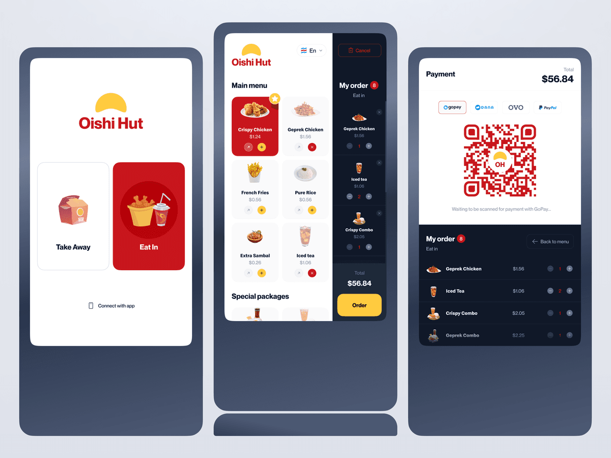
Oishi Hut - Kiosk Display Design
{"type":"doc","content":[{"type":"paragraph","attrs":{"textAlign":null},"content":[{"type":"text","text":"Crispy Chicken, Geprek Chicken, French Fries, Iced Tea — $56.84 total, scan to pay with GoPay — Oishi Hut's kiosk display design brings the full restaurant ordering experience to a self-service screen without losing a single ounce of appetite appeal."}]},{"type":"image","attrs":{"src":"https://cdn.dribbble.com/userupload/2794935/file/original-11be58166680d21f304c481d4df054b1.png","alt":null,"title":null,"width":null,"height":null}},{"type":"paragraph","attrs":{"textAlign":null},"content":[{"type":"text","marks":[{"type":"bold"}],"text":"UI Design Exploration — Oishi Hut Kiosk Display"}]},{"type":"paragraph","attrs":{"textAlign":null},"content":[{"type":"text","marks":[{"type":"italic"}],"text":"Self-Service Kiosk · Restaurant Order Terminal · GoPay / OVO / Dana / PayPal"}]},{"type":"paragraph","attrs":{"textAlign":null},"content":[{"type":"text","text":"A three-screen kiosk display UI exploration for Oishi Hut — extending the restaurant's mobile app design into the physical self-service terminal format, covering the complete in-store ordering journey from arrival to payment."}]},{"type":"paragraph","attrs":{"textAlign":null},"content":[{"type":"text","marks":[{"type":"bold"}],"text":"Screen 1 — Welcome / Dine Mode Selection:"},{"type":"text","text":" The kiosk splash screen greets arriving customers with the Oishi Hut branding — the warm yellow sun logo — and a clear two-mode selection: Take Away (illustrated with a takeout bag) and Eat In (illustrated with a tray and drink, highlighted in red as the default). A \"Connect with app\" option at the bottom offers a hybrid physical-digital experience for returning customers. Clean, immediate, zero friction."}]},{"type":"paragraph","attrs":{"textAlign":null},"content":[{"type":"text","marks":[{"type":"bold"}],"text":"Screen 2 — Menu & Order:"},{"type":"text","text":" The core ordering screen splits into a menu catalog (left) and a live order summary (right). The catalog shows: Crispy Chicken ($1.24), Geprek Chicken ($1.56), French Fries ($0.56), Pure Rice ($0.56), Extra Sambal ($0.26), Iced Tea ($1.06) — each with product photography, quantity controls (add/remove), and a Special Packages section below. The live order panel tracks 8 items — Geprek Chicken ×1, Iced Tea ×2, Crispy Combo ×1 — with a running total of $56.84 and a prominent yellow \"Order\" CTA. The bilingual toggle (EN) confirms international market positioning."}]},{"type":"paragraph","attrs":{"textAlign":null},"content":[{"type":"text","marks":[{"type":"bold"}],"text":"Screen 3 — Payment:"},{"type":"text","text":" Total $56.84, four payment methods — GoPay, Dana, OVO, PayPal — with a large branded QR code center screen. \"Waiting to be scanned for payment with GoPay...\" confirms real-time payment state. The order summary below (Geprek Chicken, Iced Tea, Crispy Combo, Geprek Combo) with a \"Back to menu\" option gives the customer full visibility and control before committing."}]},{"type":"paragraph","attrs":{"textAlign":null},"content":[{"type":"text","text":"A kiosk UI that respects the customer's time — fast to navigate, clear to read, and honest about every item in the order before the payment screen appears."}]},{"type":"paragraph","attrs":{"textAlign":null}},{"type":"paragraph","attrs":{"textAlign":null},"content":[{"type":"text","marks":[{"type":"bold"}],"text":"Have a great project idea?"},{"type":"text","text":" Let us know ✅"}]},{"type":"paragraph","attrs":{"textAlign":null}},{"type":"paragraph","attrs":{"textAlign":null},"content":[{"type":"text","text":"Services we provide:"}]},{"type":"paragraph","attrs":{"textAlign":null},"content":[{"type":"text","text":"🖼️ UI Design | 😄 UX Design | 🎉 Illustration | 🛍 Brand Identity | 📝 Graphic Design | 🌐 Web Development | 📱 Mobile App Development"}]}]}
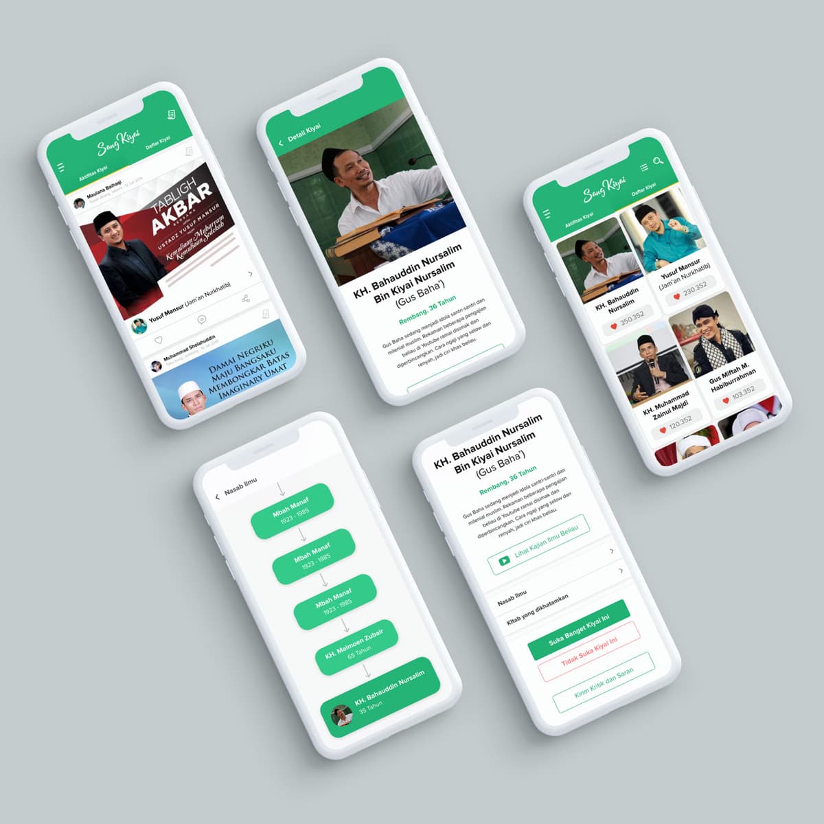
Sang Kiyai
{"type":"doc","content":[{"type":"paragraph","attrs":{"textAlign":null},"content":[{"type":"text","text":"KH. Bahauddin Nursalim, KH. Maimoen Zubair, Yusuf Mansur, Gus Mitah — Sang Kiyai is the platform that brings Indonesia's most beloved Islamic scholars into a single, beautifully organized app."}]},{"type":"image","attrs":{"src":"https://farooq-agent.web.app/assets/images/works/large/sang-kiyai.jpg","alt":null,"title":null,"width":null,"height":null}},{"type":"paragraph","attrs":{"textAlign":null},"content":[{"type":"text","marks":[{"type":"bold"}],"text":"App UI Design — Sang Kiyai"}]},{"type":"paragraph","attrs":{"textAlign":null},"content":[{"type":"text","marks":[{"type":"italic"}],"text":"Mobile App · Islamic Religious Figure Platform · Indonesia"}]},{"type":"paragraph","attrs":{"textAlign":null},"content":[{"type":"text","text":"A clean, respectful five-screen app UI for Sang Kiyai — a platform dedicated to Indonesia's kiyai (Islamic religious scholars), presenting their profiles, scholarly lineage, lectures, and content in one organized digital home."}]},{"type":"paragraph","attrs":{"textAlign":null},"content":[{"type":"text","marks":[{"type":"bold"}],"text":"Activity Feed:"},{"type":"text","text":" A social content stream featuring lecture posters and content from prominent figures — Ustadz Yusuf Mansur's Tabligh Akbar announcement, Muhammad Sholihudin's post \"Damai Negriku, Maju Bangsaku, Membongkar Bayas Imaginary Umat\" — the platform functioning as a content hub for the Islamic scholarly community."}]},{"type":"paragraph","attrs":{"textAlign":null},"content":[{"type":"text","marks":[{"type":"bold"}],"text":"Kiyai Directory:"},{"type":"text","text":" A photo grid of Indonesia's most recognized scholars — KH. Bahauddin Nursalim / Gus Baha (559,352 likes), Yusuf Mansur (230,852), KH. Muhammad Zainul Majdi (120,352), Gus Mitah M. Hababurrahman (103,852) — ranked by follower appreciation, giving the platform a discovery layer for users exploring beyond their familiar scholars."}]},{"type":"paragraph","attrs":{"textAlign":null},"content":[{"type":"text","marks":[{"type":"bold"}],"text":"Scholar Profile — Gus Baha:"},{"type":"text","text":" KH. Bahauddin Nursalim Bin Kiyai Nursalim (Gus Baha'), Rembang, 36 Tahun — a full profile with photo, biographical description, and action CTAs: Lihat Kajian Ilmu Beliau (View His Lectures), Nasab Ilmu (Scholarly Lineage), Kitab yang dibutuhkan (Recommended Books), Suka Banget Kiyai Ini / Tidak Suka Kiyai Ini / Kirim Kritik dan Saran — a feedback system that treats scholarly appreciation and critique with equal dignity."}]},{"type":"paragraph","attrs":{"textAlign":null},"content":[{"type":"text","marks":[{"type":"bold"}],"text":"Nasab Ilmu (Scholarly Lineage):"},{"type":"text","text":" A vertical flowchart tracing Gus Baha's chain of Islamic knowledge transmission — Mbah Manuf → Mbah Manuf → KH. Maimoen Zubair → KH. Bahauddin Nursalim — the sanad (chain of transmission) that connects contemporary scholars back through generations of Islamic learning. This feature is unique to Islamic scholarly culture and demonstrates deep understanding of the tradition the app serves."}]},{"type":"paragraph","attrs":{"textAlign":null},"content":[{"type":"text","text":"The fresh green palette — the color of Islam — communicates reverence and accessibility simultaneously. A platform that honors its subjects while making them discoverable to a new generation of Indonesian Muslims."}]}]}

Multinas - Website Design
{"type":"doc","content":[{"type":"paragraph","attrs":{"textAlign":null},"content":[{"type":"text","text":"Growing with Commitment — Multinas Indonesia's website carries the weight of an engineering company that means exactly what it says."}]},{"type":"image","attrs":{"src":"https://farooq-agent.web.app/assets/images/works/small/sVdiiT71_work_image.png","alt":null,"title":null,"width":null,"height":null}},{"type":"paragraph","attrs":{"textAlign":null},"content":[{"type":"text","marks":[{"type":"bold"}],"text":"Web Design — PT. Multinas Indonesia"}]},{"type":"paragraph","attrs":{"textAlign":null},"content":[{"type":"text","marks":[{"type":"italic"}],"text":"Corporate Website · Engineering Company · Surabaya · \"Global Technologies Go Local\""}]},{"type":"paragraph","attrs":{"textAlign":null},"content":[{"type":"text","text":"A bold, industrial corporate website for PT. Multinas Indonesia — an engineering company operating under the concept \"Global Technologies Go Local,\" bringing international-grade technical solutions to the Indonesian market."}]},{"type":"paragraph","attrs":{"textAlign":null},"content":[{"type":"text","text":"The hero is dark and authoritative: a deep navy industrial backdrop with an engineer in full PPE — hard hat, safety glasses, blue coverall, radio in hand — communicating a company that works in real environments with real stakes. The headline \"Growing with Commitment\" paired with the company's brief positioning statement sets the tone: this is a company with a track record, not a startup pitch."}]},{"type":"paragraph","attrs":{"textAlign":null},"content":[{"type":"text","text":"The deep navy and red accent color system communicates industrial precision and institutional trust — a palette that reads as credible to the B2B clients, contractors, and government partners Multinas serves. The English-language navigation with a language toggle confirms the company's international positioning despite its Surabaya roots."}]},{"type":"paragraph","attrs":{"textAlign":null},"content":[{"type":"text","text":"A corporate engineering website that looks as solid as the infrastructure it builds."}]}]}
David Jack - Website Design
{"type":"doc","content":[{"type":"paragraph","attrs":{"textAlign":null},"content":[{"type":"text","text":"Dark, bold, and built to impress — David Jack's construction company website makes \"Powerful Design\" feel like a promise the building in the hero image has already kept."}]},{"type":"image","attrs":{"src":"https://farooq-agent.web.app/assets/images/works/small/RragmKzj_work_image.jpg","alt":null,"title":null,"width":null,"height":null}},{"type":"paragraph","attrs":{"textAlign":null},"content":[{"type":"text","marks":[{"type":"bold"}],"text":"Web Design — David Jack"}]},{"type":"paragraph","attrs":{"textAlign":null},"content":[{"type":"text","marks":[{"type":"italic"}],"text":"Website Design · Construction Company · Corporate Web"}]},{"type":"paragraph","attrs":{"textAlign":null},"content":[{"type":"text","text":"A striking, high-contrast website design for David Jack — a construction company whose digital presence communicates the same qualities as its physical work: strength, precision, and visual authority. Presented in an iMac desktop mockup that grounds the design in its natural viewing context."}]},{"type":"paragraph","attrs":{"textAlign":null},"content":[{"type":"text","text":"The hero section is built on a dramatic black-dominant palette — a full-width background mosaic of architectural project photography, desaturated to near-black, creating a rich textural depth that positions the company as an organization with a substantial portfolio behind every claim it makes. The visual effect is that of a construction legacy made tangible: every building they've touched, present on the page at once."}]},{"type":"paragraph","attrs":{"textAlign":null},"content":[{"type":"text","text":"Center stage: a sharp, modern high-rise tower rendered in grey-silver architectural photography, its angular profile piercing upward with the kind of vertical ambition that only confident structural engineering produces. Beside it, the hero headline \"POWERFUL DESIGN\" is set in a bold, condensed white display typeface — maximum weight, maximum confidence. A bilingual subtext in Chinese characters beneath the English headline confirms the brand's international market orientation, communicating fluency across two of the world's most significant construction economies."}]},{"type":"paragraph","attrs":{"textAlign":null},"content":[{"type":"text","text":"A gold CTA button — the site's single accent color — anchors the action call at the base of the hero text block, providing the warmth and premium signal that black-and-white corporate sites need to feel inviting rather than merely authoritative. The gold carries through into a horizontal accent bar at the footer section, tying the brand color system with quiet consistency."}]},{"type":"paragraph","attrs":{"textAlign":null},"content":[{"type":"text","text":"A web design that looks as structural as the buildings it represents — and performs just as reliably."}]}]}

Balinese Boy Technology
{"type":"doc","content":[{"type":"paragraph","attrs":{"textAlign":null},"content":[{"type":"text","text":"A flat illustration that bridges two worlds — a young Balinese woman in traditional dress, laptop open, proving that cultural roots and digital futures are not opposites."}]},{"type":"image","attrs":{"src":"https://cdn.dribbble.com/users/5057025/screenshots/10862676/media/52854d80f2d4fa4e479690f58a2130b4.jpg?compress=1&resize=800x600&vertical=top","alt":null,"title":null,"width":null,"height":null}},{"type":"paragraph","attrs":{"textAlign":null},"content":[{"type":"text","marks":[{"type":"bold"}],"text":"Illustration — Balinese Youth & Technology"}]},{"type":"paragraph","attrs":{"textAlign":null},"content":[{"type":"text","marks":[{"type":"italic"}],"text":"Flat Illustration · Editorial · Culture · Technology · Bali"}]},{"type":"paragraph","attrs":{"textAlign":null},"content":[{"type":"text","text":"A flat-style vector illustration depicting a young Balinese woman in traditional attire working on a laptop — a single image that communicates a layered message about identity, progress, and coexistence. The character design intentionally blends cultural markers (traditional Balinese dress, natural surroundings) with modern tools (laptop, digital interface), creating a visual narrative about a generation that does not have to choose between heritage and innovation."}]},{"type":"paragraph","attrs":{"textAlign":null},"content":[{"type":"text","text":"The flat illustration style keeps the tone warm and accessible — appropriate for educational materials, social campaigns, or editorial use that celebrates the spirit of young Indonesians who carry their culture forward while embracing the possibilities of the digital age. Nature elements in the composition reinforce Bali's deep relationship with the environment, grounding the technology angle in a context of preservation rather than disruption."}]},{"type":"paragraph","attrs":{"textAlign":null},"content":[{"type":"text","text":"A quiet but powerful statement: tradition and technology, growing side by side."}]}]}

Water Tiger Illustration
{"type":"doc","content":[{"type":"paragraph","attrs":{"textAlign":null},"content":[{"type":"image","attrs":{"src":"https://farooq-agent.web.app/assets/images/works/large/pd/watig-illustration/watig-sketch.png","alt":null,"title":null,"width":1140,"height":1140}}]},{"type":"paragraph","attrs":{"textAlign":null},"content":[{"type":"image","attrs":{"src":"https://farooq-agent.web.app/assets/images/works/large/pd/watig-illustration/watig-tiger.png","alt":null,"title":null,"width":1140,"height":1140}}]},{"type":"paragraph","attrs":{"textAlign":null},"content":[{"type":"image","attrs":{"src":"https://farooq-agent.web.app/assets/images/works/large/pd/watig-illustration/watig-color.png","alt":null,"title":null,"width":1140,"height":1140}}]},{"type":"paragraph","attrs":{"textAlign":null},"content":[{"type":"image","attrs":{"src":"https://farooq-agent.web.app/assets/images/works/large/pd/watig-illustration/tiger-fullcolor.png","alt":null,"title":null,"width":1140,"height":1140}}]},{"type":"image","attrs":{"src":"https://farooq-agent.web.app/assets/images/works/large/pd/watig-illustration/tiger-water-vector.png","alt":null,"title":null,"width":null,"height":null}},{"type":"paragraph","attrs":{"textAlign":null},"content":[{"type":"text","text":"Fierce yet fluid — this Water Tiger illustration captures the rare power of a zodiac that commands both land and sea, rendered in a style as vibrant as the year it celebrates."}]},{"type":"horizontalRule"},{"type":"paragraph","attrs":{"textAlign":null},"content":[{"type":"text","marks":[{"type":"bold"}],"text":"Vector Illustration — Water Tiger"}]},{"type":"paragraph","attrs":{"textAlign":null},"content":[{"type":"text","marks":[{"type":"italic"}],"text":"Chinese New Year Illustration · Shio Tiger · Year of the Water Tiger"}]},{"type":"paragraph","attrs":{"textAlign":null},"content":[{"type":"text","text":"A beautifully composed vector illustration celebrating the Year of the Water Tiger — the rare zodiac combination that unites the Tiger's fierce, courageous nature with the fluid adaptability of the Water element. The result is an illustration of extraordinary visual balance: raw power softened by flow, strength made graceful."}]},{"type":"paragraph","attrs":{"textAlign":null},"content":[{"type":"text","text":"The tiger is rendered in a rich amber-orange palette with deep brown stripe detailing — voluminous, rounded body forms that draw from both classical Chinese zodiac iconography and contemporary flat illustration technique. The fur texture is achieved through fine directional linework layered over bold color fills, giving the figure tactile warmth without photographic complexity. The tiger's expression — confident, composed, one paw raised mid-stride — communicates the Water Tiger's defining quality: strength that doesn't need to shout."}]},{"type":"paragraph","attrs":{"textAlign":null},"content":[{"type":"text","text":"Surrounding the figure, stylized water scroll elements in cooling cerulean blue float across the composition — intricate wave spirals rendered in a traditional Chinese seigaiha (fish-scale) pattern that visually anchors the \"Water\" in the zodiac combination. These elements frame the tiger without constraining it, creating a sense of the animal moving through its element rather than being contained by it."}]},{"type":"paragraph","attrs":{"textAlign":null},"content":[{"type":"text","text":"The circular seigaiha background field grounds the composition with a soft, patterned disc — a classic East Asian visual device that gives the illustration a medallion-like, celebratory quality perfect for New Year greetings, red packets, editorial use, or cultural merchandise."}]},{"type":"paragraph","attrs":{"textAlign":null},"content":[{"type":"text","text":"An illustration that honors both the zodiac's energy and the craft of East Asian visual tradition — powerful, balanced, and entirely at peace with itself."}]},{"type":"paragraph","attrs":{"textAlign":null}}]}
Pinjam Web Development
{"type":"doc","content":[{"type":"paragraph","attrs":{"textAlign":null},"content":[{"type":"text","text":"Fast money when you need it most — "},{"type":"text","marks":[{"type":"link","attrs":{"href":"http://Pinjam.co.id","target":"_blank","rel":"noopener noreferrer nofollow","class":null,"title":null}}],"text":"Pinjam.co.id"},{"type":"text","text":" is a regulated Indonesian fintech platform built with React.js to make personal and business lending as simple as a tap."}]},{"type":"image","attrs":{"src":"https://farooq-agent.web.app/assets/images/works/large/pinjam.jpg","alt":null,"title":null,"width":null,"height":null}},{"type":"paragraph","attrs":{"textAlign":null},"content":[{"type":"text","marks":[{"type":"bold"}],"text":"Web Development — "},{"type":"text","marks":[{"type":"link","attrs":{"href":"http://Pinjam.co.id","target":"_blank","rel":"noopener noreferrer nofollow","class":null,"title":null}},{"type":"bold"}],"text":"Pinjam.co.id"}]},{"type":"paragraph","attrs":{"textAlign":null},"content":[{"type":"text","marks":[{"type":"italic"}],"text":"Frontend Development · Fintech Lending Platform · React.js & JavaScript"}]},{"type":"paragraph","attrs":{"textAlign":null},"content":[{"type":"text","text":"A polished, responsive web development project for "},{"type":"text","marks":[{"type":"link","attrs":{"href":"http://Pinjam.co.id","target":"_blank","rel":"noopener noreferrer nofollow","class":null,"title":null}}],"text":"Pinjam.co.id"},{"type":"text","text":" — an OJK-regulated Indonesian fintech platform offering online lending and gadai (collateral) services in partnership with Kantor Pos across 18 locations in Jakarta. Built with React.js and JavaScript, the platform demonstrates the power of component-based frontend architecture to deliver a fast, trust-inspiring financial product experience."}]},{"type":"paragraph","attrs":{"textAlign":null},"content":[{"type":"text","text":"The desktop and mobile mockup side-by-side confirms the project's primary achievement: a fully responsive layout that performs seamlessly across screen sizes — from wide desktop browsers to compact mobile viewports — without sacrificing visual fidelity or UX clarity. The hero section leads with confident financial copywriting — \"Butuh dana cepat untuk keperluan pribadi atau usaha?\" — paired with aspirational lifestyle photography and a clear red CTA button, creating an immediate conversion-focused landing experience."}]},{"type":"paragraph","attrs":{"textAlign":null},"content":[{"type":"text","text":"Below the hero, two service cards — \"Gadai Online\" and \"Pinjaman\" — organize the platform's core offerings with clean iconography and short action-oriented descriptions, guiding users toward their relevant product path in seconds. The OJK and BK regulatory badges in the header are strategically positioned trust signals, communicating compliance and legitimacy to a financial audience where trust is the primary conversion factor."}]},{"type":"paragraph","attrs":{"textAlign":null},"content":[{"type":"text","text":"The clean white UI, navy hero section, and coral-red accent palette work together to project a brand that is simultaneously professional, approachable, and urgently helpful — exactly the tone a lending platform needs to strike."}]},{"type":"paragraph","attrs":{"textAlign":null},"content":[{"type":"text","text":"A production-grade fintech frontend built with React.js — responsive, regulated, and ready to convert."}]}]}

Balinese Boy Warrior
{"type":"doc","content":[{"type":"paragraph","attrs":{"textAlign":null},"content":[{"type":"text","text":"Small but unstoppable — the Balinese Boy Warrior charges into battle with a golden shield, a crystal sword, and the kind of fearless energy that only a child warrior can carry."}]},{"type":"image","attrs":{"src":"https://cdn.dribbble.com/users/5057025/screenshots/10880374/media/f50c563fd3c4c84235d9f745aceb8529.jpg?compress=1&resize=800x600&vertical=top","alt":null,"title":null,"width":null,"height":null}},{"type":"paragraph","attrs":{"textAlign":null},"content":[{"type":"text","marks":[{"type":"bold"}],"text":"Character Design — Balinese Boy Warrior"}]},{"type":"paragraph","attrs":{"textAlign":null},"content":[{"type":"text","marks":[{"type":"italic"}],"text":"Mascot Illustration · Chibi Character · Cultural Hero"}]},{"type":"paragraph","attrs":{"textAlign":null},"content":[{"type":"text","text":"A spirited chibi character illustration depicting a young Balinese warrior boy — fully armored, fully committed, and absolutely ready for whatever comes next. The character fuses Balinese ceremonial warrior aesthetics with the rounded, exaggerated proportions of chibi character design, producing a figure that is simultaneously heroic and utterly endearing."}]},{"type":"paragraph","attrs":{"textAlign":null},"content":[{"type":"text","text":"The character stands in a dynamic semi-battle stance — mouth open mid-battle cry, sword lowered at his side, golden shield raised forward — the posture of a fighter who has already decided the outcome in his favor. Every armor element speaks to the Balinese warrior tradition: a golden headband adorned with a feather, pale blue armor with gold button studs across the pauldrons and greaves, a flowing red cape that adds movement and drama to the otherwise compact chibi silhouette."}]},{"type":"paragraph","attrs":{"textAlign":null},"content":[{"type":"text","text":"The color palette is deliberately vibrant and celebratory — sky blue armor, gold accessories, crimson cape, and a crystal-blue sword that catches imaginary light — communicating the richness of Balinese ceremonial costume translated into a game-ready, sticker-ready, brand-ready character format."}]},{"type":"paragraph","attrs":{"textAlign":null},"content":[{"type":"text","text":"The expression — wide eyes, open mouth, rosy cheeks — perfectly balances the warrior seriousness of the pose with the irresistible charm of a child playing the hero role with complete conviction. This is not a character who doubts himself for a single frame."}]},{"type":"paragraph","attrs":{"textAlign":null},"content":[{"type":"text","text":"A character design that carries cultural pride, visual energy, and pure charm in equal measure — the kind of mascot that works equally well on a game screen, a children's book cover, or a regional tourism campaign."}]}]}
Alien Octopus - Character Design
{"type":"doc","content":[{"type":"paragraph","attrs":{"textAlign":null},"content":[{"type":"text","text":"Six eyes, ten tentacles, zero personal space — the Alien Octopus is the character design that makes you wonder what planet it came from and immediately want to visit."}]},{"type":"image","attrs":{"src":"https://farooq-agent.web.app/assets/images/works/large/hn4HxM8R_work_image.png","alt":null,"title":null,"width":null,"height":null}},{"type":"paragraph","attrs":{"textAlign":null},"content":[{"type":"text","marks":[{"type":"bold"}],"text":"Character Design — Alien Octopus"}]},{"type":"paragraph","attrs":{"textAlign":null},"content":[{"type":"text","marks":[{"type":"italic"}],"text":"Original Character · Sci-Fi · Horror Comedy · Illustration"}]},{"type":"paragraph","attrs":{"textAlign":null},"content":[{"type":"text","text":"A delightfully unsettling character illustration introducing the Alien Octopus — an extraterrestrial cephalopod rendered in a bold, graphic flat-illustration style that lands squarely at the intersection of cute and deeply weird, exactly where the best character designs live."}]},{"type":"paragraph","attrs":{"textAlign":null},"content":[{"type":"text","text":"The character is built on a rounded, bulbous blue body — the soft, inflated form of a cartoon creature that looks harmless until you notice the details. Six eyes of varying sizes are distributed across the upper face in an irregular, asymmetric arrangement that is the illustration's most immediately arresting feature: not two, not even four — six, placed with the casual disregard of something that evolved somewhere the rules of bilateral symmetry simply did not apply. Each eye has a classic cartoon white sclera and dark iris, giving the creature an expression that oscillates between bewilderment and knowing too much."}]},{"type":"paragraph","attrs":{"textAlign":null},"content":[{"type":"text","text":"The mouth is wide, prominent, and full of irregular teeth — open, expressive, and impossible to read as either threatening or friendly, which is precisely the point. A tongue visible between the teeth adds a final touch of comic grotesquerie. Below the face, a mass of curling, intertwining blue tentacles spreads outward and downward — each one rendered with fluid movement that suggests the character is perpetually in gentle, thoughtless motion."}]},{"type":"paragraph","attrs":{"textAlign":null},"content":[{"type":"text","text":"Small accent details — toy-like objects tucked into some of the tentacles, a star and small candy-like shapes orbiting the body — give the character the chaotic energy of a creature that picks up objects simply because it has enough limbs to carry them all."}]},{"type":"paragraph","attrs":{"textAlign":null},"content":[{"type":"text","text":"A character that is impossible to categorize — and entirely impossible to forget."}]}]}
Gloria Cell - Frontend Development
{"type":"doc","content":[{"type":"paragraph","attrs":{"textAlign":null},"content":[{"type":"text","text":"Semua Pembayaran dalam Tiga Langkah mudah — Gloria Cell puts pulsa top-up and transaction history exactly where you need them, nothing more."}]},{"type":"image","attrs":{"src":"https://farooq-agent.web.app/assets/images/works/large/R4icUt4o_work_image.jpg","alt":null,"title":null,"width":null,"height":null}},{"type":"paragraph","attrs":{"textAlign":null},"content":[{"type":"text","marks":[{"type":"bold"}],"text":"Frontend Development — Gloria Cell"}]},{"type":"paragraph","attrs":{"textAlign":null},"content":[{"type":"text","marks":[{"type":"italic"}],"text":"Mobile App UI · Pulsa Top-Up Service · Indonesia"}]},{"type":"paragraph","attrs":{"textAlign":null},"content":[{"type":"text","text":"A clean, focused mobile frontend for Gloria Cell — a pulsa (mobile credit) buy and sell service. The UI is held in hand in a real-world context, confirming this is a built, deployed product — not a mockup."}]},{"type":"paragraph","attrs":{"textAlign":null},"content":[{"type":"text","text":"The home screen is ruthlessly simple: two large circular red action buttons — \"Isi Pulsa\" (Top Up) and \"Cek Transaksi\" (Check Transaction) — centered on a white background with a circuit-pattern texture. Two actions, zero friction. The Gloria Cell logo sits above in bold orange-red, and the tagline below — \"Semua Pembayaran dalam Tiga Langkah mudah\" — confirms the product's core UX promise."}]},{"type":"paragraph","attrs":{"textAlign":null},"content":[{"type":"text","text":"The dark bottom panel with the tagline creates a receipt-style tear effect — a visual metaphor that communicates the transactional nature of the service with personality rather than convention."}]},{"type":"paragraph","attrs":{"textAlign":null},"content":[{"type":"text","text":"A utility app that gets out of the user's way and delivers exactly what they came for."}]}]}
IDN Times - Web Design
{"type":"doc","content":[{"type":"paragraph","attrs":{"textAlign":null},"content":[{"type":"text","text":"What's Hot, Trending, News, Hype, Life, Girls, Community — IDN Times' web design brings Indonesia's millennial-first media platform to life with a clean editorial layout that keeps the content moving and the audience coming back."}]},{"type":"image","attrs":{"src":"https://farooq-agent.web.app/assets/images/works/small/h3slJWTU_work_image.jpg","alt":null,"title":null,"width":null,"height":null}},{"type":"paragraph","attrs":{"textAlign":null},"content":[{"type":"text","marks":[{"type":"bold"}],"text":"Web Design — IDN Times"}]},{"type":"paragraph","attrs":{"textAlign":null},"content":[{"type":"text","marks":[{"type":"italic"}],"text":"Online Media Website · News & Lifestyle · Indonesia"}]},{"type":"paragraph","attrs":{"textAlign":null},"content":[{"type":"text","text":"A clean, editorial web design for IDN Times — one of Indonesia's largest millennial-focused digital media platforms, covering news, pop culture, lifestyle, entertainment, and community content."}]},{"type":"paragraph","attrs":{"textAlign":null},"content":[{"type":"text","text":"The homepage opens with a \"What's Hot\" editorial banner — a scrolling ticker that surfaces the most urgent headlines before the user has even registered the navigation. It's an effective media UX device: acknowledge that readers are always mid-news-cycle, and meet them there."}]},{"type":"paragraph","attrs":{"textAlign":null},"content":[{"type":"text","text":"The hero grid is a classic editorial mosaic: a large primary story card (a musician on stage under stage lights) anchors the left two-thirds, with four secondary story cards filling the right column — each with a thumbnail, headline, and timestamp. The image-first, text-second layout communicates IDN Times' audience-first philosophy: show the story visually before asking for a click."}]},{"type":"paragraph","attrs":{"textAlign":null},"content":[{"type":"text","text":"The navigation — News, Hype, Life, Girls, Community — maps the publication's editorial verticals, each representing a distinct reader segment and content tone. The red IDN Times wordmark with its characteristic stylized \"I\" letterform is instantly recognizable across the Indonesian digital media landscape."}]},{"type":"paragraph","attrs":{"textAlign":null},"content":[{"type":"text","text":"A \"Trending\" section begins below the hero, surfacing the content that's driving the most engagement in real time — the algorithmic layer of a modern news platform built into the page architecture rather than bolted on."}]},{"type":"paragraph","attrs":{"textAlign":null},"content":[{"type":"text","text":"A news website that understands its audience reads quickly, shares freely, and always wants to know what's happening right now."}]}]}
Proteksi
{"type":"doc","content":[{"type":"paragraph","attrs":{"textAlign":null},"content":[{"type":"text","text":"Rp. 367.050.653 collected, 367.050 members — Proteksi turns collective community contributions into a financial safety net that grows stronger with every new member who joins."}]},{"type":"image","attrs":{"src":"https://farooq-agent.web.app/assets/images/works/details/235-proteksi/proteksi.jpg","alt":null,"title":null,"width":null,"height":null}},{"type":"paragraph","attrs":{"textAlign":null},"content":[{"type":"text","marks":[{"type":"bold"}],"text":"App UI Design — Proteksi"}]},{"type":"paragraph","attrs":{"textAlign":null},"content":[{"type":"text","marks":[{"type":"italic"}],"text":"Mobile App · Crowdfunding / Community Protection Fund · Indonesia"}]},{"type":"paragraph","attrs":{"textAlign":null},"content":[{"type":"text","text":"A clean, trust-forward app UI for Proteksi — a community crowdfunding and mutual protection platform where members pool funds to provide financial safety nets for one another."}]},{"type":"paragraph","attrs":{"textAlign":null},"content":[{"type":"text","text":"The home screen communicates the platform's two most important trust signals immediately and at scale: Dana PROTEKSI Terkumpul (Total Funds Collected) — Rp. 367.050.653 — displayed in large, bold numerals that communicate both the platform's legitimacy and the weight of collective contribution. Below it, 367.050 Anggota telah bergabung (Members who have joined) — a community size figure that reinforces the \"strength in numbers\" proposition at the heart of any mutual protection platform."}]},{"type":"paragraph","attrs":{"textAlign":null},"content":[{"type":"text","text":"Budi Adhi Setiawan, 27 th, Pegawai Swasta (Private Employee) — the platform's target user persona, confirmed as \"Anggota Resmi PROTEKSI\" with a badge. The avatar illustration style is warm and accessible, communicating that this platform is designed for everyday Indonesians, not financial experts."}]},{"type":"paragraph","attrs":{"textAlign":null},"content":[{"type":"text","text":"The \"Tambah Dana\" (Add Funds) CTA sits cleanly below the collected amount — actionable and unambiguous. The community illustration below — a diverse group of Indonesians in everyday attire including hijab — visualizes the mutual protection community itself: different people, same shared purpose."}]},{"type":"paragraph","attrs":{"textAlign":null},"content":[{"type":"text","text":"\"Kabar PROTEKSI Terbaru\" (Latest PROTEKSI News) begins below, confirming a content and community layer beyond the financial mechanics."}]},{"type":"paragraph","attrs":{"textAlign":null},"content":[{"type":"text","text":"The sky blue palette communicates calm, trust, and openness — the emotional register a mutual protection platform needs to earn the confidence of members who are entrusting it with their financial safety."}]},{"type":"paragraph","attrs":{"textAlign":null},"content":[{"type":"text","text":"An app that makes community-based financial protection feel as natural and accessible as joining a neighborhood group."}]}]}

Bubumbu - Interactive Education Media
{"type":"doc","content":[{"type":"paragraph","attrs":{"textAlign":null},"content":[{"type":"text","text":"Chili, garlic, ginger, and galangal — Bubumbu brings Indonesian spices to life with faces, feelings, and a little girl who makes learning to cook the most fun thing in the room."}]},{"type":"image","attrs":{"src":"https://farooq-agent.web.app/assets/images/works/large/cMLsQat3_work_image.jpg","alt":null,"title":null,"width":null,"height":null}},{"type":"paragraph","attrs":{"textAlign":null},"content":[{"type":"text","marks":[{"type":"bold"}],"text":"Interactive Media Design — Bubumbu"}]},{"type":"paragraph","attrs":{"textAlign":null},"content":[{"type":"text","marks":[{"type":"italic"}],"text":"Interactive Education Media · Indonesian Culinary Learning · Character Design · App Icon"}]},{"type":"paragraph","attrs":{"textAlign":null},"content":[{"type":"text","text":"A delightfully charming interactive education media identity for Bubumbu — a digital learning platform designed to introduce Indonesian culinary culture, spices, and cooking knowledge to young learners through playful, character-driven interaction."}]},{"type":"paragraph","attrs":{"textAlign":null},"content":[{"type":"text","text":"The icon composition is a celebration of the Indonesian dapur (kitchen) reimagined as an animated world: a warm brown mortar and pestle at the center holds a gathering of personified spices — garlic with a shy smile, tiny peppercorns huddled together, and other bumbu characters rendered in the round, expressive chibi style of children's educational media. Flying and floating above them: a red chili with spirited eyes, a shallot (bawang merah) in playful pink, a kaffir lime in cheerful green, and galangal rendered as a friendly root creature — each one a distinct character with its own personality, embodying the ingredient it represents."}]},{"type":"paragraph","attrs":{"textAlign":null},"content":[{"type":"text","text":"The central figure is a young Javanese girl — dark hair in a braid, yellow frangipani flower tucked behind her ear, warm brown skin — smiling with the open delight of someone who loves everything happening in her kitchen. Her presence grounds the spice characters in human warmth and cultural identity: this is Indonesian cooking, through Indonesian eyes, for Indonesian children."}]},{"type":"paragraph","attrs":{"textAlign":null},"content":[{"type":"text","text":"The \"BUBUMBU\" wordmark is set in a chunky, rounded display typeface on a warm wooden brown panel — earthy, tactile, and reminiscent of a carved wooden kitchen sign. The sky-blue background gives the composition airiness and warmth — a kitchen that feels like play rather than work."}]},{"type":"paragraph","attrs":{"textAlign":null},"content":[{"type":"text","text":"An educational media identity that makes Indonesian culinary heritage feel like an adventure — one spice character at a time."}]}]}
Corporate Business Brochure
{"type":"doc","content":[{"type":"paragraph","attrs":{"textAlign":null},"content":[{"type":"text","text":"A printed tri-fold brochure layout exploration in a formal business style."}]},{"type":"horizontalRule"},{"type":"paragraph","attrs":{"textAlign":null},"content":[{"type":"text","text":"Structured, professional, and built to inform — this corporate brochure layout demonstrates how good print design turns business services into a conversation worth having."}]},{"type":"image","attrs":{"src":"https://farooq-agent.web.app/assets/images/works/small/s2Sev9hP_work_image.jpg","alt":null,"title":null,"width":null,"height":null}},{"type":"paragraph","attrs":{"textAlign":null},"content":[{"type":"text","marks":[{"type":"bold"}],"text":"Print Design — Corporate Business Brochure"}]},{"type":"paragraph","attrs":{"textAlign":null},"content":[{"type":"text","marks":[{"type":"italic"}],"text":"Tri-Fold Brochure · General Business Services · Print Layout Exploration"}]},{"type":"paragraph","attrs":{"textAlign":null},"content":[{"type":"text","text":"A printed tri-fold brochure layout exploration in a formal business style — demonstrating confident command of corporate print design across a three-panel folded format. The piece is presented in a dynamic angled mockup that reveals both the cover panel and the full interior spread simultaneously, showcasing the complete design system in a single view."}]},{"type":"paragraph","attrs":{"textAlign":null},"content":[{"type":"text","text":"The color palette is a sophisticated pairing of amber-gold and deep charcoal — warm and authoritative in equal measure, communicating a business brand that is approachable but serious. The amber operates as the accent system: section headers, CTA bands, icon backgrounds, and Venn diagram elements all carry the same warm tone, creating visual cohesion across a content-dense layout without visual chaos."}]},{"type":"paragraph","attrs":{"textAlign":null},"content":[{"type":"text","text":"The cover panel leads with a professional team photography — suited business figures presented with editorial confidence — anchored by a bold headline and supported by a dark lower panel carrying contact details and the \"#1 International Business Services\" brand claim. The interior columns are organized with clear typographic hierarchy: section titles in amber, body copy in light grey, supporting icons for service categories, and a Preparation vs. Opportunity Venn diagram that adds a consultative, analytical dimension to the layout."}]},{"type":"paragraph","attrs":{"textAlign":null},"content":[{"type":"text","text":"White panels and dark panels alternate across the three-column interior, creating rhythm and preventing monotony across what is a content-heavy format. Every panel has a clear purpose — cover, services overview, team credentials, contact — and the layout ensures the reader moves through them in natural sequence."}]},{"type":"paragraph","attrs":{"textAlign":null},"content":[{"type":"text","text":"A corporate brochure layout that earns its place in a business folder — and gets read rather than filed."}]}]}

Man & Woman Doctors Pose
{"type":"doc","content":[{"type":"paragraph","attrs":{"textAlign":null},"content":[{"type":"text","text":"Two doctors, two open gestures, one empty space between them — this multipurpose illustration is the perfect frame for any health message that needs a trusted voice to deliver it."}]},{"type":"image","attrs":{"src":"https://cdn.dribbble.com/users/5057025/screenshots/11031359/media/bc95ae2a14b29daa9a6f4b78b10cf48f.jpg?compress=1&resize=1200x900&vertical=top","alt":null,"title":null,"width":null,"height":null}},{"type":"paragraph","attrs":{"textAlign":null},"content":[{"type":"text","marks":[{"type":"bold"}],"text":"Vector Illustration — Multipurpose Doctor Poses"}]},{"type":"paragraph","attrs":{"textAlign":null},"content":[{"type":"text","marks":[{"type":"italic"}],"text":"UI Illustration · Healthcare · Male & Female Doctor · Presentation Asset · Flat Vector"}]},{"type":"paragraph","attrs":{"textAlign":null},"content":[{"type":"text","text":"A clean, versatile flat vector illustration featuring a male and female doctor in mirrored presentation poses — each gesturing with open palms toward the center of the composition, framing a generous lavender-purple oval space designed to hold any content the context demands: a headline, a statistic, a product, a CTA, or simply a message."}]},{"type":"paragraph","attrs":{"textAlign":null},"content":[{"type":"text","text":"The design is a masterclass in deliberate emptiness. The two doctors face each other across a central void — not a gap, but an invitation. Their synchronized open-hand gestures are the universal visual language of \"here, look at this\" — a presentation pose that communicates authority, warmth, and trustworthiness without a single word. Used in clinic signage, they say: pay attention to what's between us. Used in app onboarding, they say: here's what you need to know. Used in health campaigns, they say: this matters, and we're the ones telling you."}]},{"type":"paragraph","attrs":{"textAlign":null},"content":[{"type":"text","text":"Both figures wear matching white medical coats with teal-blue scrub collars — a consistent, gender-neutral uniform that signals professional medical authority. The male doctor carries the casual confidence of an experienced practitioner; the female doctor's long dark hair and relaxed posture communicate approachability and calm. Neither figure is masked, giving both characters full facial expressiveness — warm, slightly smiling, and entirely trustworthy."}]},{"type":"paragraph","attrs":{"textAlign":null},"content":[{"type":"text","text":"The lavender-purple abstract background blob unites the two figures in a shared visual space without crowding them, providing just enough environmental context to ground the illustration while leaving the center entirely open for customization."}]},{"type":"paragraph","attrs":{"textAlign":null},"content":[{"type":"text","text":"A UI illustration asset that does its one job perfectly: make whatever it frames feel like it's worth listening to."}]}]}
BACOK Logo Design
{"type":"doc","content":[{"type":"paragraph","attrs":{"textAlign":null},"content":[{"type":"text","text":"Straight from the concrete courts of Surabaya — BACOK plays with the raw hunger of a crocodile, a street basketball club that bites as hard as it hoops."}]},{"type":"image","attrs":{"src":"https://farooq-agent.web.app/assets/images/works/large/PfmH0XO0_work_image.png","alt":null,"title":null,"width":null,"height":null}},{"type":"paragraph","attrs":{"textAlign":null},"content":[{"type":"hardBreak"},{"type":"text","marks":[{"type":"bold"}],"text":"Brand Identity — BACOK"},{"type":"text","text":" "},{"type":"hardBreak"},{"type":"text","marks":[{"type":"italic"}],"text":"Logo Design · Street Basketball Club · Surabaya, East Java"},{"type":"text","text":" "},{"type":"text","marks":[{"type":"italic"}],"text":"\"Spirit Anti Misuh\""}]},{"type":"paragraph","attrs":{"textAlign":null},"content":[{"type":"text","text":"A fiercely characterful sports identity for BACOK — a street basketball club born from the concrete courts of Surabaya — that channels the raw, unfiltered energy of street ball culture into a mascot logo dripping with attitude, local pride, and visual muscle."}]},{"type":"paragraph","attrs":{"textAlign":null},"content":[{"type":"text","text":"The centerpiece of the identity is an illustrated crocodile — the apex predator of the waterways — wrapping its powerful body around a full-sized basketball in a stranglehold grip. Jaws wide open, claws locked in, the croc dominates the ball with the same intensity a street baller brings to every possession. The mascot is rendered in a bold, retro-sports illustration style: thick outlines, flat color fills in reptilian green and burnt orange, with expressive detail in the teeth and scales that rewards a close look without losing clarity at a distance."}]},{"type":"paragraph","attrs":{"textAlign":null},"content":[{"type":"text","text":"The choice of the crocodile as mascot is deeply rooted in Surabaya's cultural identity — the city's iconic symbol is the legendary battle between a "},{"type":"text","marks":[{"type":"italic"}],"text":"suro"},{"type":"text","text":" (shark) and a "},{"type":"text","marks":[{"type":"italic"}],"text":"boyo"},{"type":"text","text":" (crocodile), making this mascot not just fierce but unmistakably local. BACOK — Surabaya's own, through and through."}]},{"type":"paragraph","attrs":{"textAlign":null},"content":[{"type":"text","text":"The club name \"BACOK\" is set on a bold sky-blue ribbon banner that bisects the composition, rendered in a heavy collegiate typeface with strong ink-trap character — the typographic equivalent of a hard screen. The tagline "},{"type":"text","marks":[{"type":"italic"}],"text":"\"Spirit Anti Misuh\""},{"type":"text","text":" arcs beneath in a smaller weight, a defiant, self-aware rallying cry that captures the club's community spirit and no-nonsense court etiquette."}]},{"type":"paragraph","attrs":{"textAlign":null},"content":[{"type":"text","text":"The circular badge format — a wreath of illustrated foliage framing the composition — gives the mark the authority of a traditional sports crest while keeping its feet firmly planted on the street."}]},{"type":"paragraph","attrs":{"textAlign":null},"content":[{"type":"text","text":"A mascot logo that plays as hard as the team it represents — loud, local, and impossible to ignore."}]}]}
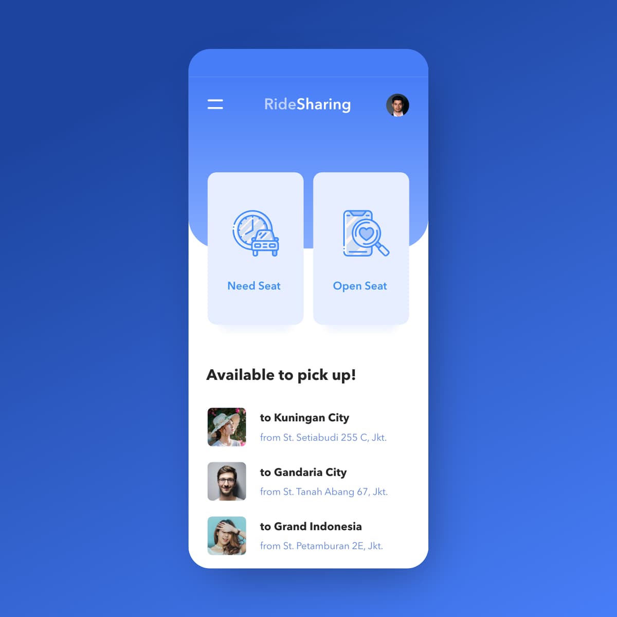
Ride Sharing
{"type":"doc","content":[{"type":"paragraph","attrs":{"textAlign":null},"content":[{"type":"text","text":"Need Seat or Open Seat — RideSharing's two-button home screen makes the entire carpooling proposition clear before a single scroll."}]},{"type":"image","attrs":{"src":"https://farooq-agent.web.app/assets/images/works/large/ride-sharing.jpg","alt":null,"title":null,"width":null,"height":null}},{"type":"paragraph","attrs":{"textAlign":null},"content":[{"type":"text","marks":[{"type":"bold"}],"text":"App UI Design — RideSharing"}]},{"type":"paragraph","attrs":{"textAlign":null},"content":[{"type":"text","marks":[{"type":"italic"}],"text":"Mobile App Concept · Ride Sharing / Carpooling · Jakarta"}]},{"type":"paragraph","attrs":{"textAlign":null},"content":[{"type":"text","text":"A clean, single-screen app concept for RideSharing — a peer-to-peer carpooling platform where commuters either offer seats in their vehicle or look for a ride heading the same direction."}]},{"type":"paragraph","attrs":{"textAlign":null},"content":[{"type":"text","text":"The home screen is built around a binary user intent split: two large, equal-weight action cards — \"Need Seat\" (I need a ride) and \"Open Seat\" (I'm offering a ride) — positioned side by side as the primary navigation. The icon design reinforces each mode: a scheduled car icon for Need Seat, a phone with a heart/search for Open Seat. It's a rare two-option home screen that works precisely because the product has exactly two user modes and no ambiguity between them."}]},{"type":"paragraph","attrs":{"textAlign":null},"content":[{"type":"text","text":"Below the action cards, \"Available to pick up!\" surfaces three live ride offers — all Jakarta routes: to Kuningan City from St. Setiabudi 255 C, to Gandaria City from St. Tanah Abang 67, to Grand Indonesia from St. Petamburan 2E. Each listing shows the driver/rider profile photo, destination, and departure point — the minimum viable information for a commuter deciding in seconds whether a route matches theirs."}]},{"type":"paragraph","attrs":{"textAlign":null},"content":[{"type":"text","text":"The all-blue palette — deep cobalt background, lighter blue card surfaces, blue icon line work — creates a cohesive, trust-forward visual identity appropriate for a service built on sharing a car with a stranger. The card float on the blue background gives the UI a clean, modern depth."}]},{"type":"paragraph","attrs":{"textAlign":null},"content":[{"type":"text","text":"A carpooling app concept that solves the UX challenge of serving two distinct user types — passenger and driver — with a single home screen that handles both without confusion."}]}]}

Examining Infected Lungs
{"type":"doc","content":[{"type":"paragraph","attrs":{"textAlign":null},"content":[{"type":"text","text":"Three researchers, one infected lung, and the urgent energy of science racing against a virus — this illustration captures medical research at its most human and its most heroic."}]},{"type":"image","attrs":{"src":"https://cdn.dribbble.com/users/5057025/screenshots/11019165/media/d71b3e257e881397746c6d5ca07ca42d.jpg?compress=1&resize=1200x900&vertical=top","alt":null,"title":null,"width":null,"height":null}},{"type":"paragraph","attrs":{"textAlign":null},"content":[{"type":"text","marks":[{"type":"bold"}],"text":"Vector Illustration — Examining Infected Lungs"}]},{"type":"paragraph","attrs":{"textAlign":null},"content":[{"type":"text","marks":[{"type":"italic"}],"text":"Medical Research Illustration · COVID-19 · Virology · Flat Vector"}]},{"type":"paragraph","attrs":{"textAlign":null},"content":[{"type":"text","text":"A compositionally striking flat vector illustration depicting three virus researchers in dynamic motion around a giant, laboratory-encased lung specimen — the central visual metaphor of a science community in urgent, coordinated pursuit of understanding."}]},{"type":"paragraph","attrs":{"textAlign":null},"content":[{"type":"text","text":"The giant lung dominates the center of the composition — displayed in a transparent cylindrical specimen container, illuminated from within in deep violet-purple, its surface visibly colonized by bright yellow-orange virus particles with characteristic spike-crown forms. The scale relationship between the tiny researchers and the enormous specimen creates an immediate sense of the microscopic made tangible — a device that communicates scientific examination without a single technical word."}]},{"type":"paragraph","attrs":{"textAlign":null},"content":[{"type":"text","text":"The three researchers orbit the specimen with the kinetic energy of people who know time matters: a left figure in white coat with green-tipped hair runs forward with a magnifying glass raised — the classic symbol of investigation and close analysis; an upper-right figure dashes with a clipboard tucked under one arm, data in hand, ready to record; a lower-right figure moves urgently with a tablet — digital tools of modern diagnostics in motion."}]},{"type":"paragraph","attrs":{"textAlign":null},"content":[{"type":"text","text":"All three are rendered in the same flat-vector white coat uniform that signals scientific authority, with colorful accent details — pink shoes, orange trainers, teal footwear — that humanize the figures and prevent the illustration from feeling sterile. Their floating, running poses give the composition a weightless, urgent quality — researchers moving through knowledge as much as through space."}]},{"type":"paragraph","attrs":{"textAlign":null},"content":[{"type":"text","text":"The lavender-purple background and the soft circular spotlight around the specimen create a theatrical framing — the lung as exhibit, the researchers as audience and investigators simultaneously."}]},{"type":"paragraph","attrs":{"textAlign":null},"content":[{"type":"text","text":"A medical research illustration that communicates urgency, collaboration, and the quiet drama of science doing its work."}]}]}

Kebun Anggrek Clai
{"type":"doc","content":[{"type":"paragraph","attrs":{"textAlign":null},"content":[{"type":"text","text":"A hidden garden where rare orchids bloom and visitors fall in love — Kebun Anggrek Clai is where the beauty of nature becomes a brand worth remembering."}]},{"type":"image","attrs":{"src":"https://cdn.dribbble.com/users/5057025/screenshots/10851459/media/6a2004d2c7624ab504291e101a1fb2c7.jpg?compress=1&resize=800x600&vertical=top","alt":null,"title":null,"width":null,"height":null}},{"type":"paragraph","attrs":{"textAlign":null},"content":[{"type":"image","attrs":{"src":"https://farooq-agent.web.app/assets/images/works/large/kebun-anggrek-clai.jpg","alt":null,"title":null,"width":1140,"height":1140}}]},{"type":"heading","attrs":{"textAlign":null,"level":3},"content":[{"type":"text","marks":[{"type":"bold"}],"text":"Brand Identity — Kebun Anggrek Clai"},{"type":"text","text":" "},{"type":"hardBreak"},{"type":"text","marks":[{"type":"italic"}],"text":"Logo Design · Orchid Garden · Retail & Agrotourism · Indonesia"}]},{"type":"paragraph","attrs":{"textAlign":null},"content":[{"type":"text","text":"A delicate yet characterful brand identity for Kebun Anggrek Clai — a small Indonesian orchid garden that offers both a curated plant retail experience and a living recreational destination for flower enthusiasts and nature seekers alike. The identity centers on what the brand is at its very heart: the orchid itself, rendered with botanical accuracy and artistic warmth."}]},{"type":"paragraph","attrs":{"textAlign":null},"content":[{"type":"text","text":"The logomark is a front-facing phalaenopsis orchid illustration — the most iconic and beloved of the orchid family — captured in full bloom with its distinctive symmetrical petals spreading wide and the characteristic labellum at its center rendered in rich plum purple. The petals are illustrated in a warm yellow-green gradient, giving the mark a luminous, almost glowing quality that speaks to the living, breathing nature of the garden. Fine linework traces the natural veining of each petal, adding botanical credibility and illustrative craftsmanship that elevates the mark beyond a generic floral icon."}]},{"type":"paragraph","attrs":{"textAlign":null},"content":[{"type":"text","text":"The deep royal purple background — the color most universally associated with orchids, elegance, and rare beauty — creates an immediate emotional anchor. Against it, the wordmark \"ORCHID\" sits in clean, widely-spaced uppercase letters in crisp white, exuding quiet sophistication without overshadowing the illustrated centerpiece above."}]},{"type":"paragraph","attrs":{"textAlign":null},"content":[{"type":"text","text":"For Kebun Anggrek Clai, this visual language translates perfectly: it communicates a space that is simultaneously intimate and extraordinary — a neighborhood garden with the soul of a botanical sanctuary. The identity works equally well on signage at the garden entrance, plant tags, packaging for sold specimens, social media content, and printed merchandise for recreational visitors."}]},{"type":"paragraph","attrs":{"textAlign":null},"content":[{"type":"text","text":"A brand identity that blooms as beautifully as the flowers it represents."}]}]}

Love Illustrations
{"type":"doc","content":[{"type":"paragraph","attrs":{"textAlign":null},"content":[{"type":"text","text":"Swipe, verify, say hello — this dating app illustration set captures the full emotional arc of modern digital romance in three warm, human moments."}]},{"type":"image","attrs":{"src":"https://cdn.dribbble.com/users/5057025/screenshots/11632226/media/e8989d704c97cf08c0103d5bcd1ce601.jpg?compress=1&resize=1200x900&vertical=top","alt":null,"title":null,"width":null,"height":null}},{"type":"paragraph","attrs":{"textAlign":null},"content":[{"type":"text","marks":[{"type":"bold"}],"text":"Illustration Set — Love Illustrations"}]},{"type":"paragraph","attrs":{"textAlign":null},"content":[{"type":"text","marks":[{"type":"italic"}],"text":"UI Illustration · Dating App · Love & Connection Platform · Flat Vector"}]},{"type":"paragraph","attrs":{"textAlign":null},"content":[{"type":"text","text":"A charming, warmly composed set of three flat vector illustrations designed for a love and dating application — each capturing a distinct moment in the modern digital dating journey, rendered in a cohesive blush-pink and violet palette that feels intimate, optimistic, and entirely inviting."}]},{"type":"paragraph","attrs":{"textAlign":null},"content":[{"type":"text","text":"The first illustration depicts the browsing moment: a smiling woman in a purple top scrolls through a grid of user profile silhouettes surrounding her — the selection process personified. Her confident expression and peace-sign gesture communicate a user in control of her choices, comfortable with the platform, and genuinely excited by the possibilities in front of her. The circular blob background frames the scene as a portal — the digital world made warm and personal."}]},{"type":"paragraph","attrs":{"textAlign":null},"content":[{"type":"text","text":"The second illustration captures profile verification: a dark-haired woman seen from behind holds up an ID card while a large \"VERIFIED\" badge with a checkmark glows on the screen before her. The moment is simple but communicates something essential — trust, safety, and the platform's commitment to authentic connections. For a dating app, this scene is quietly powerful: showing users that who they see is who they get."}]},{"type":"paragraph","attrs":{"textAlign":null},"content":[{"type":"text","text":"The third illustration is the first spark — a young man in purple, hands open in a welcoming gesture, flanked by two pink speech bubbles: one carrying a hand-lettered \"Hello\" in his direction, another showing a female silhouette responding. The composition captures the hopeful, slightly nervous energy of a first message sent — the moment before everything begins."}]},{"type":"paragraph","attrs":{"textAlign":null},"content":[{"type":"text","text":"Together the three scenes tell a complete story: discover, trust, connect. A dating app UI illustration set that makes the platform feel safe, joyful, and genuinely worth opening."}]}]}

Chubby Boy
{"type":"doc","content":[{"type":"paragraph","attrs":{"textAlign":null},"content":[{"type":"text","text":"Round, rosy, and ready for work — Chubby Boy is the character design that proves the most endearing mascots are the ones that look exactly like someone you know."}]},{"type":"image","attrs":{"src":"https://cdn.dribbble.com/users/5057025/screenshots/10880398/media/65825b8e68d7cda81039fc8e6a866e59.jpg?compress=1&resize=800x600&vertical=top","alt":null,"title":null,"width":null,"height":null}},{"type":"paragraph","attrs":{"textAlign":null},"content":[{"type":"text","marks":[{"type":"bold"}],"text":"Character Design — Chubby Boy"}]},{"type":"paragraph","attrs":{"textAlign":null},"content":[{"type":"text","marks":[{"type":"italic"}],"text":"Mascot Illustration · General Purpose Character · Flat Vector"}]},{"type":"paragraph","attrs":{"textAlign":null},"content":[{"type":"text","text":"A delightfully round, instantly lovable character illustration — Chubby Boy stands quietly confident in a purple turtleneck sweater, terracotta trousers, and matching purple slip-on shoes, a yellow lanyard holding a blank ID badge against his chest. The ID badge is a deliberate open canvas: a character designed to represent anyone — an office worker, an event attendee, a student, a team member — whoever the context calls for."}]},{"type":"paragraph","attrs":{"textAlign":null},"content":[{"type":"text","text":"The character design is built on maximum roundness: a perfectly spherical head with rosy cheeks and a small, content smile; a body wider than it is tall; arms that barely clear the torso; and feet so compact they function more as anchors than appendages. This geometric simplicity is the illustration's greatest strength — instantly readable at any size, infinitely scalable across UI, marketing, and animation contexts."}]},{"type":"paragraph","attrs":{"textAlign":null},"content":[{"type":"text","text":"The warm, muted palette — violet purple, burnt orange, deep auburn hair — creates a character that feels approachable and contemporary without being garish. The slight smile and relaxed posture communicate a character at ease in any situation: the kind of mascot that shows up in onboarding flows, empty state illustrations, loading screens, and event materials with equal charm."}]},{"type":"paragraph","attrs":{"textAlign":null},"content":[{"type":"text","text":"The blank ID badge is a subtle but smart design choice — it leaves room for customization, naming, or branding, making Chubby Boy a genuinely versatile character asset rather than a one-context illustration."}]},{"type":"paragraph","attrs":{"textAlign":null},"content":[{"type":"text","text":"A character that wears its personality in its proportions — because sometimes the most memorable designs are simply the ones that make you smile without knowing why."}]},{"type":"paragraph","attrs":{"textAlign":null}}]}
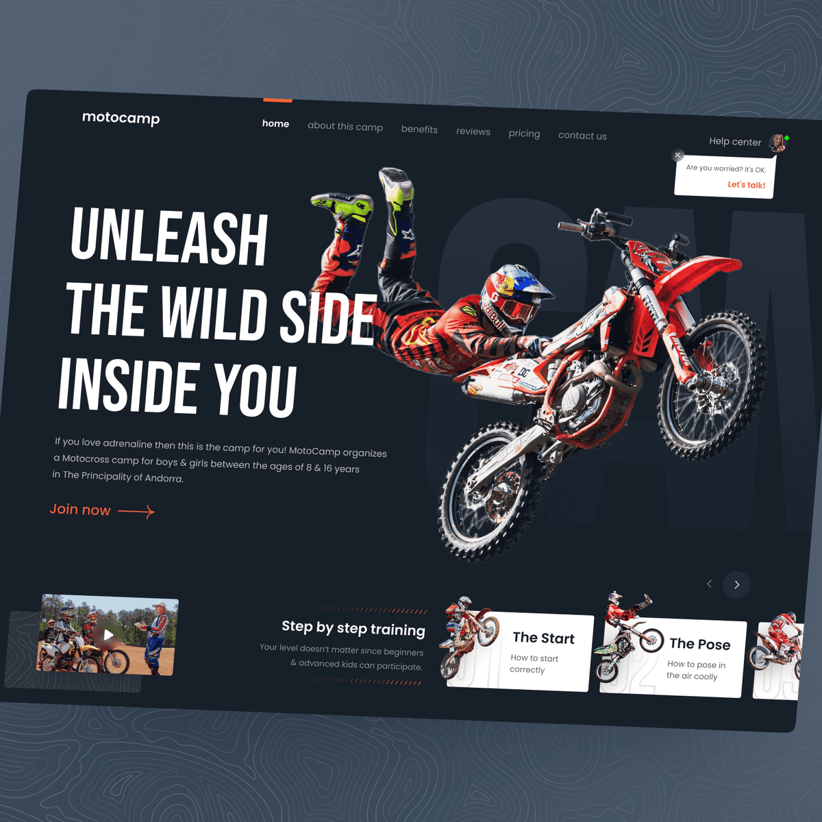
MotoCamp Motocross Training Camp Website
{"type":"doc","content":[{"type":"paragraph","attrs":{"textAlign":null},"content":[{"type":"text","text":"Hey extreme lovers 👋"}]},{"type":"paragraph","attrs":{"textAlign":null}},{"type":"paragraph","attrs":{"textAlign":null},"content":[{"type":"text","text":"This is my Exploration for ..."}]},{"type":"paragraph","attrs":{"textAlign":null},"content":[{"type":"text","text":"\"MotoCamp - Motocross Training Camp Website\""}]},{"type":"paragraph","attrs":{"textAlign":null},"content":[{"type":"text","text":"A website about motocross training camps."}]},{"type":"image","attrs":{"src":"https://mir-s3-cdn-cf.behance.net/project_modules/fs/b00c1e142316759.6264a79d96960.png","alt":null,"title":null,"width":null,"height":null}},{"type":"paragraph","attrs":{"textAlign":null},"content":[{"type":"text","text":"What do you think guys? Let me know in the comments section!"}]},{"type":"paragraph","attrs":{"textAlign":null},"content":[{"type":"text","text":"Hope you enjoy it guys. Click “❤️Like” if you like it."}]},{"type":"paragraph","attrs":{"textAlign":null}},{"type":"paragraph","attrs":{"textAlign":null},"content":[{"type":"text","marks":[{"type":"bold"}],"text":"Have a great project idea?"},{"type":"text","text":" Let us know ✅"}]},{"type":"paragraph","attrs":{"textAlign":null}},{"type":"paragraph","attrs":{"textAlign":null},"content":[{"type":"text","text":"Services we provide:"}]},{"type":"paragraph","attrs":{"textAlign":null},"content":[{"type":"text","text":"🖼️ UI Design | 😄 UX Design | 🎉 Illustration | 🛍 Brand Identity | 📝 Graphic Design | 🌐 Web Development | 📱 Mobile App Development"}]},{"type":"paragraph","attrs":{"textAlign":null}},{"type":"paragraph","attrs":{"textAlign":null},"content":[{"type":"text","text":"Thanks!"}]}]}
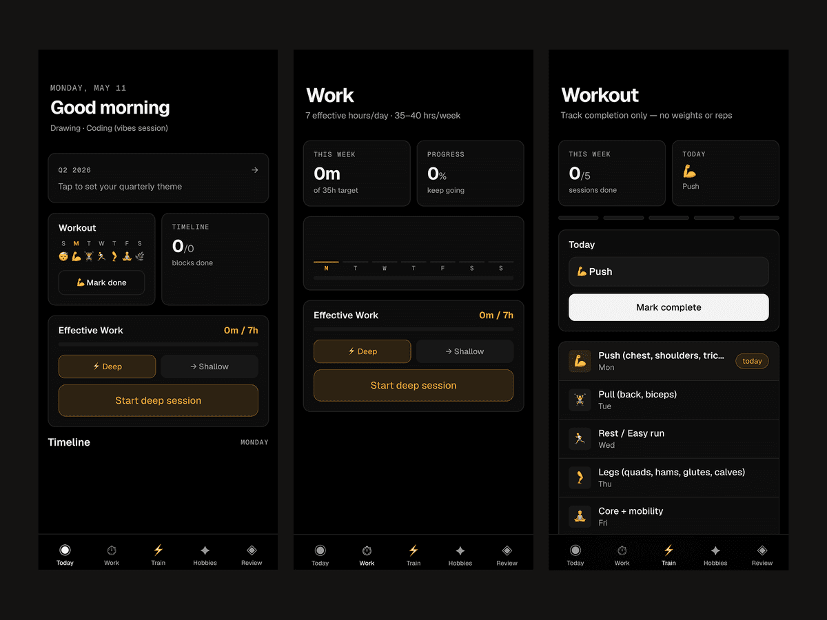
DIPUJA
{"type":"doc","content":[{"type":"paragraph","attrs":{"textAlign":null},"content":[{"type":"text","text":"Learn, Share, and Grow — Stockwise turns stock market education into an interactive, community-driven experience for learners at every level."}]},{"type":"image","attrs":{"src":"https://mir-s3-cdn-cf.behance.net/project_modules/max_1200/184ddd164614065.63f99abd76873.png","alt":null,"title":null,"width":null,"height":null}},{"type":"paragraph","attrs":{"textAlign":null},"content":[{"type":"text","marks":[{"type":"bold"}],"text":"Mobile App Design — Stockwise"}]},{"type":"paragraph","attrs":{"textAlign":null},"content":[{"type":"text","marks":[{"type":"italic"}],"text":"Stock Market Education · Learning Platform · Community Sharing · UI/UX Design"}]},{"type":"paragraph","attrs":{"textAlign":null},"content":[{"type":"text","text":"A mobile application designed to teach and empower users about the stock market — Stockwise combines interactive learning with community engagement to make investing accessible and understandable."}]},{"type":"paragraph","attrs":{"textAlign":null},"content":[{"type":"text","text":"The final version focuses on clarity, engagement, and collaboration. Users can access structured lessons, track their progress, and share insights with peers, creating a social learning ecosystem that encourages participation and discussion."}]},{"type":"paragraph","attrs":{"textAlign":null},"content":[{"type":"text","text":"The interface likely balances content richness with usability. Charts, tutorials, and real-time examples are presented in a digestible way, making complex financial concepts approachable even for beginners. Community features enable users to ask questions, exchange strategies, and celebrate learning milestones together."}]},{"type":"paragraph","attrs":{"textAlign":null},"content":[{"type":"text","text":"Stockwise positions itself as more than an educational tool — it is a platform for continuous growth. By connecting learners, providing structured knowledge, and promoting discussion, it fosters both confidence and competence in navigating the stock market."}]},{"type":"paragraph","attrs":{"textAlign":null},"content":[{"type":"text","text":"Visually, the design likely emphasizes clarity, hierarchy, and motivational cues. Key metrics, progress tracking, and interactive elements guide users without overwhelming them, creating an engaging and supportive learning experience."}]},{"type":"paragraph","attrs":{"textAlign":null},"content":[{"type":"text","text":"This project reflects a broader trend toward democratizing finance education — blending technology, social learning, and actionable knowledge to make investing approachable for everyone."}]},{"type":"paragraph","attrs":{"textAlign":null},"content":[{"type":"text","text":"A polished exploration of how digital platforms can teach, connect, and inspire — where learning about stocks becomes an interactive, social, and empowering journey."}]},{"type":"paragraph","attrs":{"textAlign":null}},{"type":"horizontalRule"},{"type":"paragraph","attrs":{"textAlign":null},"content":[{"type":"text","text":"DIPUJA"}]},{"type":"paragraph","attrs":{"textAlign":null}},{"type":"image","attrs":{"src":"https://hyperfantasy.web.app/assets/images/portfolios/dc0924ec-746d-4636-8e01-23217ffc83cc/dipuja.png","alt":null,"title":null,"width":null,"height":null}},{"type":"paragraph","attrs":{"textAlign":null}}]}
Astary
{"type":"doc","content":[{"type":"paragraph","attrs":{"textAlign":null},"content":[{"type":"text","text":"When the human hand becomes the brand — Astary transforms artisan craft into a luxury identity that hotels and villas reach for without hesitation."}]},{"type":"image","attrs":{"src":"https://farooq-agent.web.app/assets/images/works/large/astary.jpg","alt":null,"title":null,"width":null,"height":null}},{"type":"heading","attrs":{"textAlign":null,"level":3},"content":[{"type":"text","marks":[{"type":"bold"}],"text":"Brand Identity — Astary"},{"type":"text","text":" "},{"type":"hardBreak"},{"type":"text","marks":[{"type":"italic"}],"text":"Logo & Brand Identity · Artisan Craft Supplier · Hospitality & Luxury Interiors"}]},{"type":"paragraph","attrs":{"textAlign":null},"content":[{"type":"text","text":"A luminous, handcrafted brand identity for Astary — a premium craft supplier serving the hotel and villa hospitality sector with bespoke resin creations, from soap containers and decorative bottles to curated interior accessories. The name itself carries the mark of its origin: "},{"type":"text","marks":[{"type":"italic"}],"text":"Asta"},{"type":"text","text":", meaning hand in Sanskrit — and the identity honors that etymology with extraordinary visual precision."}]},{"type":"paragraph","attrs":{"textAlign":null},"content":[{"type":"text","text":"The logomark is an abstracted open hand rendered in upward-reaching geometric flame-like forms, rising with quiet elegance from a single base point. The five finger-like elements taper and flow naturally, simultaneously evoking an open palm, a blooming flower, and a flame — three archetypes of creation, warmth, and living craftsmanship. The form is unmistakably human yet refined beyond the literal, occupying the rare space where symbolic and figurative design converge seamlessly."}]},{"type":"paragraph","attrs":{"textAlign":null},"content":[{"type":"text","text":"The gold gradient treatment applied to the icon is where the identity truly ascends. A rich, warm gradient transitions from deep amber at the base to brilliant champagne gold at the tips — mimicking the way light catches the surface of polished resin, the very material Astary works with. This is not decorative gold; it is material gold — a direct reference to the product's essence embedded in the brand's visual DNA."}]},{"type":"paragraph","attrs":{"textAlign":null},"content":[{"type":"text","text":"The wordmark \"ASTARY\" is set in a clean, widely-spaced uppercase serif against the deep charcoal card — cool white letterforms that provide stark, elegant contrast to the warmth of the icon above. The all-caps treatment adds formality and scale, positioning the brand as a premium supplier worthy of five-star hospitality procurement lists."}]},{"type":"paragraph","attrs":{"textAlign":null},"content":[{"type":"text","text":"Currently rooted in Bali — Indonesia's global capital of luxury hospitality and artisan craft — Astary is building its reputation among the island's world-class hotels and villas, with a clear vision to expand its handcrafted offerings to the international hospitality market."}]},{"type":"paragraph","attrs":{"textAlign":null},"content":[{"type":"text","text":"Presented across a multi-card stationery mockup in dramatic dark-surface flat-lay, the identity demonstrates flawless consistency at every size — from full business card to reduced secondary mark — a hallmark of a mature, considered brand system."}]},{"type":"paragraph","attrs":{"textAlign":null},"content":[{"type":"text","text":"A brand identity as refined as the objects it represents — where every element is placed by hand, with purpose."}]}]}
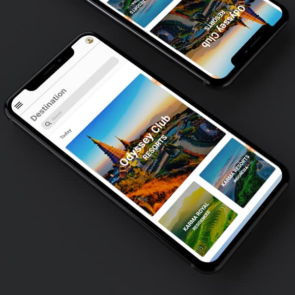
Karma Group React Native App Development
{"type":"doc","content":[{"type":"paragraph","attrs":{"textAlign":null},"content":[{"type":"text","text":"Where luxury hospitality meets mobile elegance — the Karma Group app brings world-class resort destinations to your fingertips, built with the precision of React Native."}]},{"type":"image","attrs":{"src":"https://farooq-agent.web.app/assets/images/works/large/odyssey.jpg","alt":null,"title":null,"width":null,"height":null}},{"type":"paragraph","attrs":{"textAlign":null},"content":[{"type":"text","marks":[{"type":"bold"}],"text":"Mobile App Development — Karma Group · Odyssey Club"}]},{"type":"paragraph","attrs":{"textAlign":null},"content":[{"type":"text","marks":[{"type":"italic"}],"text":"React Native · Cross-Platform Mobile App · Luxury Hospitality & Resort Group"}]},{"type":"paragraph","attrs":{"textAlign":null},"content":[{"type":"text","text":"A premium mobile application built with React Native for Karma Group — one of Asia-Pacific's leading luxury hospitality and resort brands — delivering a curated destination discovery experience across the group's prestigious portfolio of properties, including Odyssey Club Resorts, Karma Resorts Indonesia, and Karma Royal Residences."}]},{"type":"paragraph","attrs":{"textAlign":null},"content":[{"type":"text","text":"The app's home screen opens on a \"Destination\" view with a clean search bar and a \"Today\" feed — a content-first approach that immediately surfaces the most relevant resort experiences to the user. The hero card features Odyssey Club Resorts with a sweeping aerial landscape photograph of a Southeast Asian temple district bathed in golden hour light — the kind of image that makes booking feel inevitable. Below, additional property cards for Karma Resorts Indonesia and Karma Royal Residences complete a destination grid that communicates the group's geographic breadth and property diversity."}]},{"type":"paragraph","attrs":{"textAlign":null},"content":[{"type":"text","text":"The dual-phone mockup — one upright in focus, one tilted and partially visible above — creates a dynamic, layered composition that adds visual depth to the portfolio presentation, suggesting an app that works beautifully at any angle, on any device."}]},{"type":"paragraph","attrs":{"textAlign":null},"content":[{"type":"text","text":"The UI palette is deliberately restrained: white content cards, clean typography, and photography that does the heavy lifting — a design philosophy perfectly calibrated for a luxury brand whose visual assets speak louder than any UI decoration. React Native ensures the experience is natively fluid across both iOS and Android, matching the seamless standard a premium resort brand demands."}]},{"type":"paragraph","attrs":{"textAlign":null},"content":[{"type":"text","text":"An app as effortless to use as checking into one of its properties."}]}]}

Hazmat Suit in Super Heros Pose
{"type":"doc","content":[{"type":"paragraph","attrs":{"textAlign":null},"content":[{"type":"text","text":"Cape optional, hazmat suit mandatory — this health worker flies through a viral battlefield with a raised fist and a disinfectant sprayer, the superhero the pandemic actually needed."}]},{"type":"image","attrs":{"src":"https://cdn.dribbble.com/users/5057025/screenshots/11031408/media/7eecb6a8e7154de6581c170263406160.jpg?compress=1&resize=1200x900&vertical=top","alt":null,"title":null,"width":null,"height":null}},{"type":"paragraph","attrs":{"textAlign":null},"content":[{"type":"text","marks":[{"type":"bold"}],"text":"Illustration — Hazmat Suit in Super Hero's Pose"}]},{"type":"paragraph","attrs":{"textAlign":null},"content":[{"type":"text","marks":[{"type":"italic"}],"text":"Public Health Illustration · Healthcare Hero · COVID-19 · Flat Vector"}]},{"type":"paragraph","attrs":{"textAlign":null},"content":[{"type":"text","text":"A bold, cinematic flat vector illustration that does what the best public health communication always does — it makes the extraordinary work of ordinary people feel legendary. A health worker in full yellow PPE — hazmat suit, respirator mask, protective goggles, rubber boots — soars through a dark void, fist raised in the classic superhero flying pose, disinfectant spray gun in the other hand, surrounded by a scattered constellation of pink virus particles that haven't yet met their match."}]},{"type":"paragraph","attrs":{"textAlign":null},"content":[{"type":"text","text":"The yellow hazmat suit is the illustration's most deliberate visual choice: a color of caution transformed into a color of courage. Against the near-black background, the figure glows — radiant, warm, impossible to miss — the same way the real health workers who wore these suits were impossible to forget for anyone who witnessed the pandemic up close. The suit's seams and goggle reflections are rendered with enough detail to be recognizable, while the flat-vector style keeps the illustration accessible and deployable across poster, digital, and campaign contexts."}]},{"type":"paragraph","attrs":{"textAlign":null},"content":[{"type":"text","text":"The pose is pure superhero vocabulary: horizontal flight, one fist forward, one arm back holding the tool of their trade — the disinfectant sprayer replacing the magic wand, the web-shooter, the repulsor blast. It is a deliberate, joyful act of framing: the health worker IS the superhero, the PPE IS the costume, and the sprayer IS the superpower."}]},{"type":"paragraph","attrs":{"textAlign":null},"content":[{"type":"text","text":"The pink virus particles drifting through the dark background — some large, some small, all with that distinctive crown-spike form — complete the narrative: this is a battlefield, and the hero is already in it."}]},{"type":"paragraph","attrs":{"textAlign":null},"content":[{"type":"text","text":"An illustration that gives health workers the visual mythology they earned every single day of the pandemic."}]}]}

PotFol - Website Design
{"type":"doc","content":[{"type":"paragraph","attrs":{"textAlign":null},"content":[{"type":"text","text":"Dark, image-first, and unapologetically bold — PotFol's photography portfolio website puts the work exactly where it belongs: front, center, and impossible to look away from."}]},{"type":"image","attrs":{"src":"https://farooq-agent.web.app/assets/images/works/details/51-potfol-website-design/pofol.jpg","alt":null,"title":null,"width":null,"height":null}},{"type":"paragraph","attrs":{"textAlign":null},"content":[{"type":"text","marks":[{"type":"bold"}],"text":"Web Design — PotFol"}]},{"type":"paragraph","attrs":{"textAlign":null},"content":[{"type":"text","marks":[{"type":"italic"}],"text":"Photography Portfolio Website · Personal Portfolio Design Exploration"}]},{"type":"paragraph","attrs":{"textAlign":null},"content":[{"type":"text","text":"A sleek, image-forward photography portfolio website design exploration for PotFol — a personal photography portfolio platform — built around the fundamental principle of all great portfolio design: get out of the way and let the work speak."}]},{"type":"paragraph","attrs":{"textAlign":null},"content":[{"type":"text","text":"The layout is a confident two-column split: a dark charcoal left sidebar carries the navigation and branding, while the right three-quarters of the viewport is given entirely to a masonry-style photo grid — a collection of portrait and fashion photography in high-contrast black and white, punctuated by a single bold colour accent at the center that draws the eye with the precision of a carefully placed spotlight."}]},{"type":"paragraph","attrs":{"textAlign":null},"content":[{"type":"text","text":"The left sidebar is a masterclass in minimal navigation design: the \"POTFOL\" wordmark anchors the top in a mixed-weight typeface — bold \"POT\" against lighter \"FOL\" — with a hot pink \"Photography Portfolio\" sub-label that introduces the brand's accent color with quiet authority. The navigation links — About Me (active, highlighted in magenta pink), Gallery, Awards, Services, Contact — are clean, light-weight, and organized in a vertical stack that keeps the interface completely scannable. Social media icons anchor the footer of the sidebar, completing the professional photographer's digital identity without clutter."}]},{"type":"paragraph","attrs":{"textAlign":null},"content":[{"type":"text","text":"The photo grid dominates with deliberate variety: portrait close-ups, full-body fashion shots, couples, movement studies — a range that demonstrates breadth of subject matter and technical versatility. The monochromatic treatment unifies the disparate subjects into a single cohesive visual language, making the portfolio feel curated rather than simply collected."}]},{"type":"paragraph","attrs":{"textAlign":null},"content":[{"type":"text","text":"A photography portfolio design that respects the photographer's most important asset — the photographs — by giving them the space they deserve."}]}]}
Geonk Design - Illustration 3D
{"type":"doc","content":[{"type":"paragraph","attrs":{"textAlign":null},"content":[{"type":"text","text":"When your design studio has its own 3D robot mascot that leaps off the render floor with its own brand on its chest — you know the designer is having fun."}]},{"type":"image","attrs":{"src":"https://farooq-agent.web.app/assets/images/works/large/W8qF7pzj_work_image.png","alt":null,"title":null,"width":null,"height":null}},{"type":"paragraph","attrs":{"textAlign":null},"content":[{"type":"text","marks":[{"type":"bold"}],"text":"3D Illustration — Geonk Design"}]},{"type":"paragraph","attrs":{"textAlign":null},"content":[{"type":"text","marks":[{"type":"italic"}],"text":"Brand Illustration · 3D Character · Personal Studio Identity"}]},{"type":"paragraph","attrs":{"textAlign":null},"content":[{"type":"text","text":"A clean, energetic 3D illustration for Geonk Design — a personal design studio identity brought to life through a compact, expressive robot mascot captured mid-leap in a studio-white render environment. The piece is equal parts brand statement and creative self-expression — a designer saying: this is what I do, and this is how I feel about it."}]},{"type":"paragraph","attrs":{"textAlign":null},"content":[{"type":"text","text":"The robot mascot is a small, rounded white mech — squat proportions, visor-style head unit, articulated arms and legs spread wide in a joyful jumping pose — frozen at the apex of its energy, as if permanently in the state of enthusiastic motion. The word \"GEONK\" is printed directly on the robot's chest panel, claiming the mascot as the studio's official representative with a confidence that only a self-designed brand character can carry."}]},{"type":"paragraph","attrs":{"textAlign":null},"content":[{"type":"text","text":"The 3D text \"GEONK DESIGN\" casts alongside the character in a matching near-white tone, with subtle reflections and shadows grounding both elements on a soft, seamless white surface. The monochromatic render — white robot, white text, warm white environment — communicates a studio that understands restraint: when your concept is strong, color is optional."}]},{"type":"paragraph","attrs":{"textAlign":null},"content":[{"type":"text","text":"The character's jumping pose is the emotional core of the piece: this is not a robot standing at attention waiting for a brief. It is a robot mid-celebration, mid-idea, mid-flight — the physical embodiment of creative momentum."}]},{"type":"paragraph","attrs":{"textAlign":null},"content":[{"type":"text","text":"A 3D brand illustration that doubles as a personality statement — Geonk Design, in motion, always."}]}]}

Special Ambulance Virus
{"type":"doc","content":[{"type":"paragraph","attrs":{"textAlign":null},"content":[{"type":"text","text":"Sirens on, hazmat suit buckled, anti-virus symbol blazing on the side — the Special Ambulance Virus illustration is the pandemic response vehicle that means business from every angle."}]},{"type":"image","attrs":{"src":"https://cdn.dribbble.com/users/5057025/screenshots/11058366/media/052a24f6c0d165444721ff011ebdcccd.jpg?compress=1&resize=1200x900&vertical=top","alt":null,"title":null,"width":null,"height":null}},{"type":"paragraph","attrs":{"textAlign":null},"content":[{"type":"text","marks":[{"type":"bold"}],"text":"Vector Illustration — Special Ambulance Virus"}]},{"type":"paragraph","attrs":{"textAlign":null},"content":[{"type":"text","marks":[{"type":"italic"}],"text":"Public Health Illustration · COVID-19 · Emergency Response · Flat Vector"}]},{"type":"paragraph","attrs":{"textAlign":null},"content":[{"type":"text","text":"A bold, immediately legible flat vector illustration depicting a specially equipped pandemic ambulance — a vehicle purpose-built for the COVID-19 era, driven by a health worker in full PPE and branded with the universal visual language of viral combat."}]},{"type":"paragraph","attrs":{"textAlign":null},"content":[{"type":"text","text":"The ambulance is rendered in a clean white body with the characteristic \"AMBULANCE\" mirror text printed across the roof in red — a detail of functional realism that gives the illustration documentary accuracy alongside its illustrative style. The red and blue emergency lights atop the cab flash with rendered urgency, communicating active deployment rather than standby status."}]},{"type":"paragraph","attrs":{"textAlign":null},"content":[{"type":"text","text":"Behind the wheel sits a health worker in full protective gear — white hazmat suit, goggles, respirator mask — the dedicated face of a system that showed up every day during the pandemic, masked and suited and driving. The figure is calm, purposeful, entirely present — a visual tribute rendered with the simplicity and directness the subject deserves."}]},{"type":"paragraph","attrs":{"textAlign":null},"content":[{"type":"text","text":"The vehicle's rear panel carries the illustration's most striking graphic element: a large anti-virus symbol — a purple COVID-19 particle within a red circle crossed by a diagonal red slash, accompanied by a red medical cross. The combination reads instantly across cultures and languages as a single, unambiguous message: this vehicle fights the virus. The symbol is bold enough to read from across an editorial layout at any size, making the illustration equally deployable across health campaigns, infographics, editorial articles, and public awareness posters."}]},{"type":"paragraph","attrs":{"textAlign":null},"content":[{"type":"text","text":"The teal-blue background provides a clean, clinical backdrop that keeps the white ambulance sharply defined while giving the overall composition the calm urgency of a public health communication piece."}]},{"type":"paragraph","attrs":{"textAlign":null},"content":[{"type":"text","text":"An illustration of a vehicle that represents the human infrastructure of pandemic response — unglamorous, essential, and perpetually on the way."}]}]}

No Mask No Entry
{"type":"doc","content":[{"type":"paragraph","attrs":{"textAlign":null},"content":[{"type":"text","text":"Stop — but here's a mask. The security officer in this illustration enforces the rule and offers the solution in the same breath."}]},{"type":"image","attrs":{"src":"https://cdn.dribbble.com/users/5057025/screenshots/11013386/media/77b52fe7755d9c2766e52e6d32dc1d65.jpg?compress=1&resize=1200x900&vertical=top","alt":null,"title":null,"width":null,"height":null}},{"type":"paragraph","attrs":{"textAlign":null},"content":[{"type":"text","marks":[{"type":"bold"}],"text":"Vector Illustration — No Mask, No Entry!"}]},{"type":"paragraph","attrs":{"textAlign":null},"content":[{"type":"text","marks":[{"type":"italic"}],"text":"Public Health Illustration · COVID-19 Compliance · Security Officer · Flat Vector"}]},{"type":"paragraph","attrs":{"textAlign":null},"content":[{"type":"text","text":"A sharply composed flat vector illustration of a security officer enforcing one of the pandemic era's most universal rules — No Mask, No Entry — with a combination of firm authority and practical hospitality that perfectly captures how the policy worked at its best."}]},{"type":"paragraph","attrs":{"textAlign":null},"content":[{"type":"text","text":"The character is unmistakably a security professional: black suit, crisp white shirt, red tie, dark aviator sunglasses with a reflective star glint — the visual vocabulary of someone whose job it is to decide who gets in and who doesn't. He wears a surgical mask himself, modeling the very compliance he enforces. His left hand extends forward in a clear, flat-palmed stop gesture — the universal signal for \"not yet, not like that.\" His right hand, raised to shoulder height, holds a spare surgical mask between two fingers — dangling it as an offering rather than a weapon, his expression (above the mask) suggesting calm, non-confrontational authority."}]},{"type":"paragraph","attrs":{"textAlign":null},"content":[{"type":"text","text":"The double gesture is the illustration's conceptual strength: one hand says stop, the other says here's what you need. It is the enforcement and the solution in a single composition — communicating a policy that was firm but fair, a rule that came with a remedy."}]},{"type":"paragraph","attrs":{"textAlign":null},"content":[{"type":"text","text":"The abstract grey blob background keeps the focus entirely on the figure and his two-handed message, with no environmental distraction from the clarity of the pose."}]},{"type":"paragraph","attrs":{"textAlign":null},"content":[{"type":"text","text":"A public health illustration that captures the exact tone pandemic compliance communication needed: direct, non-threatening, and practical. No mask? Here's one. No entry? That's the rule."}]}]}

StarBuss - Website Design
{"type":"doc","content":[{"type":"paragraph","attrs":{"textAlign":null},"content":[{"type":"text","text":"Professional, direct, and built for business — StarBuss's corporate website puts the right faces and the right navigation in front of every visitor from the very first scroll."}]},{"type":"image","attrs":{"src":"https://farooq-agent.web.app/assets/images/works/details/55-starbuss-website-design/corporate.jpg","alt":null,"title":null,"width":null,"height":null}},{"type":"paragraph","attrs":{"textAlign":null},"content":[{"type":"text","marks":[{"type":"bold"}],"text":"Web Design — StarBuss"}]},{"type":"paragraph","attrs":{"textAlign":null},"content":[{"type":"text","marks":[{"type":"italic"}],"text":"Corporate Website Exploration · Business Services"}]},{"type":"paragraph","attrs":{"textAlign":null},"content":[{"type":"text","text":"A clean, professional corporate website design exploration for StarBuss — a business services company whose digital presence communicates institutional credibility, approachability, and the organized confidence of a firm that knows its clients and what they need."}]},{"type":"paragraph","attrs":{"textAlign":null},"content":[{"type":"text","text":"The hero section leads with a full-width black and white editorial photograph of a business team in active collaboration — a senior executive with glasses engaged in conversation with three professional colleagues — a deliberate visual choice that communicates people-first business values. The desaturated treatment gives the image a timeless, editorial quality while keeping the focus entirely on human interaction rather than environment, signaling that StarBuss's primary value is its people and their expertise."}]},{"type":"paragraph","attrs":{"textAlign":null},"content":[{"type":"text","text":"The StarBuss logo anchors the header with a clean star icon mark — a five-pointed star with a dimensional cut, rendered in blue-grey — beside the \"STARBUSS\" wordmark in a bold, condensed typeface. The logo communicates aspiration and precision in equal measure. A phone number sits aligned right in the header, immediately surfacing the most direct path to human contact for visitors who arrived ready to talk."}]},{"type":"paragraph","attrs":{"textAlign":null},"content":[{"type":"text","text":"The navigation bar — Home (active, blue), Services, Solutions, Compare, News, Contact — is structured with the logic of a B2B buyer's journey: understand the brand, explore services, evaluate solutions, compare options, read credibility signals, then contact. The blue active state on \"Home\" establishes the brand's accent color with economy."}]},{"type":"paragraph","attrs":{"textAlign":null},"content":[{"type":"text","text":"The Sign In and Register buttons in the upper right confirm a platform dimension to the business — client portals, account-based access, or membership services — adding functional depth to what reads as a clean, trustworthy corporate front door."}]},{"type":"paragraph","attrs":{"textAlign":null},"content":[{"type":"text","text":"A corporate website that does its job without decoration — because in B2B, clarity is the most sophisticated design choice of all."}]}]}
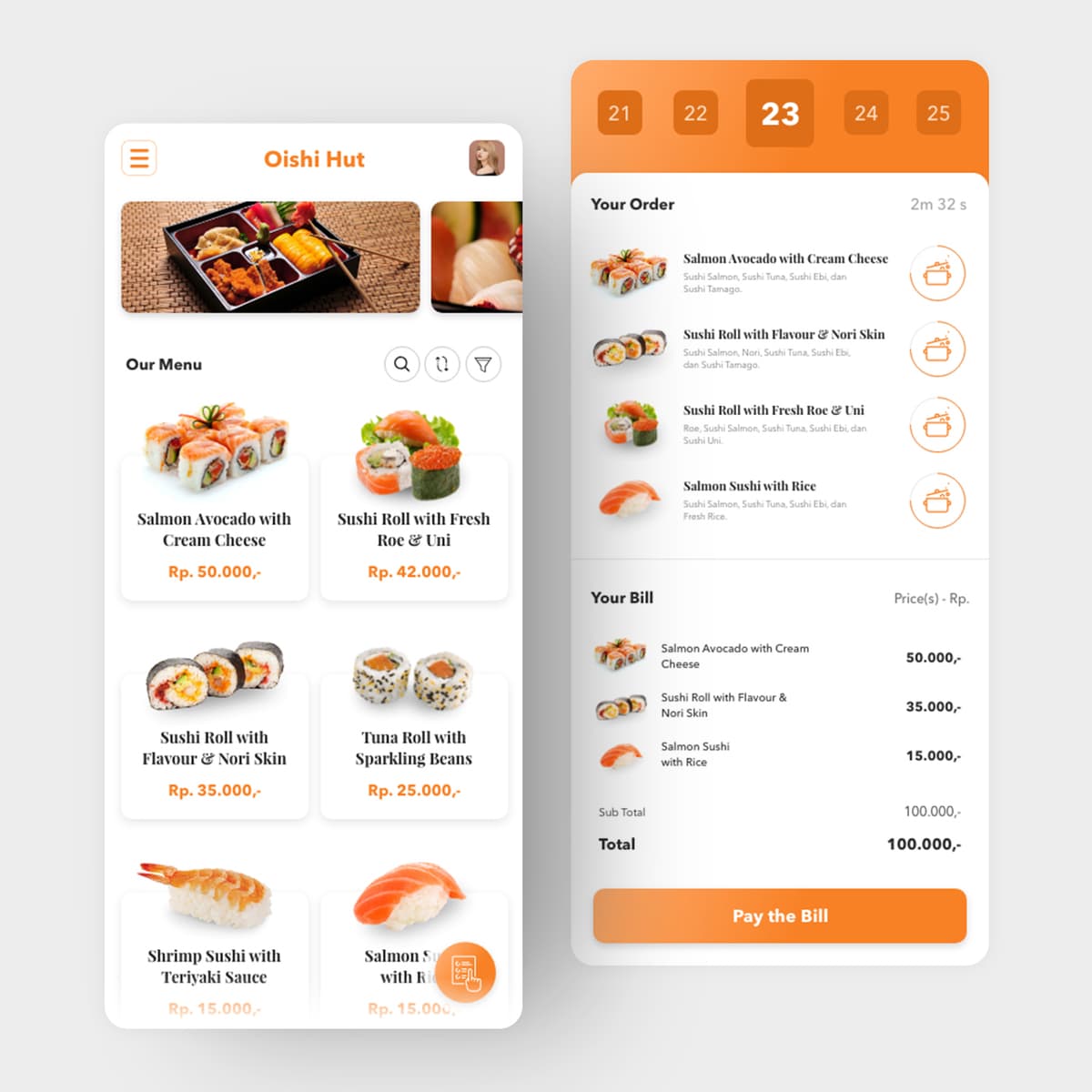
Oishi Hut
{"type":"doc","content":[{"type":"paragraph","attrs":{"textAlign":null},"content":[{"type":"text","text":"Table 23, Your Order, 2m 32s — Oishi Hut puts the sushi menu, cooking progress, and bill in one seamless flow that makes dining in feel as smooth as ordering online."}]},{"type":"image","attrs":{"src":"https://farooq-agent.web.app/assets/images/works/large/oishi-hut.jpg","alt":null,"title":null,"width":null,"height":null}},{"type":"paragraph","attrs":{"textAlign":null},"content":[{"type":"text","marks":[{"type":"bold"}],"text":"App UI Design — Oishi Hut"}]},{"type":"paragraph","attrs":{"textAlign":null},"content":[{"type":"text","marks":[{"type":"italic"}],"text":"Restaurant App · In-Dining Order & Kitchen Tracking · Japanese Cuisine"}]},{"type":"paragraph","attrs":{"textAlign":null},"content":[{"type":"text","text":"A polished, full-featured restaurant app UI for Oishi Hut — a Japanese sushi and roll restaurant — covering the complete in-dining experience from menu browsing to kitchen progress tracking to bill payment."}]},{"type":"paragraph","attrs":{"textAlign":null},"content":[{"type":"text","marks":[{"type":"bold"}],"text":"Screen 1 — Menu:"},{"type":"text","text":" A clean white product grid with high-quality sushi photography, product names, and prices in orange (Salmon Avocado with Cream Cheese Rp. 50.000, Sushi Roll with Fresh Roe & Uni Rp. 42.000, Tuna Roll with Sparkling Beans Rp. 25.000). The orange accent color is the app's single most important design decision — warm, appetite-stimulating, and consistent across every touchpoint. Search, sort, and filter icons sit above the grid for power-user navigation."}]},{"type":"paragraph","attrs":{"textAlign":null},"content":[{"type":"text","marks":[{"type":"bold"}],"text":"Screen 2 — Order Tracking & Bill:"},{"type":"text","text":" The right screen is the app's most interesting UX layer. A table selector at the top (21–25) confirms the diner's table number — Table 23 is active. Below it, the order list doubles as a live kitchen tracker: each item has a cooking pot icon indicating its current preparation state, and a countdown timer (2m 32s) shows how long until the order is ready. The bill section below itemizes each dish with prices, sub-total (Rp. 100.000), total (Rp. 100.000), and a prominent orange \"Pay the Bill\" CTA."}]},{"type":"paragraph","attrs":{"textAlign":null},"content":[{"type":"text","text":"The kitchen progress tracking feature — real-time cooking status visible to the diner — is the app's standout UX innovation. It eliminates the \"where is my food?\" friction that defines most restaurant experiences without requiring staff interaction."}]},{"type":"paragraph","attrs":{"textAlign":null},"content":[{"type":"text","text":"A restaurant app that gives diners control, transparency, and hunger — in that order."}]}]}

Tamawal Illustration
{"type":"doc","content":[{"type":"paragraph","attrs":{"textAlign":null},"content":[{"type":"image","attrs":{"src":"https://mir-s3-cdn-cf.behance.net/project_modules/max_1200/6865ed153716735.6334989a9a1e4.png","alt":null,"title":null,"width":1140,"height":1140}}]},{"type":"paragraph","attrs":{"textAlign":null},"content":[{"type":"text","text":"Two users, one platform, one mission — Tamawal's illustration suite puts real Saudi faces at the center of a fintech experience built to serve every kind of borrower."}]},{"type":"image","attrs":{"src":"https://mir-s3-cdn-cf.behance.net/project_modules/fs/3fc4ca153716735.6334989a9a7dc.png","alt":null,"title":null,"width":null,"height":null}},{"type":"paragraph","attrs":{"textAlign":null},"content":[{"type":"text","marks":[{"type":"bold"}],"text":"Illustration Design — Tamawal"}]},{"type":"paragraph","attrs":{"textAlign":null},"content":[{"type":"text","marks":[{"type":"italic"}],"text":"Character Illustration · Digital Financing Platform · SAMA-Regulated · Saudi Arabia"}]},{"type":"paragraph","attrs":{"textAlign":null},"content":[{"type":"text","text":"A suite of custom character illustrations created for Tamawal® — Saudi Arabia's premier Sharia-compliant digital financing marketplace — designed to humanize the platform's user experience across onboarding flows, marketing campaigns, and customer support touchpoints."}]},{"type":"paragraph","attrs":{"textAlign":null},"content":[{"type":"text","text":"The user illustration pair presents two Saudi individuals in their natural digital context: a man in traditional white thobe and red-checked ghutrah, smiling as he interacts with his phone — embodying the everyday borrower discovering financing options with ease; and a woman in modest black abaya, bracelet on her wrist, phone in hand with a focused, considered expression — representing the modern Saudi woman engaging with financial services on her own terms. Both figures are rendered in a contemporary flat-illustration style with warm, realistic skin tones and culturally precise attire — neither caricature nor stereotype, but genuine, dignified representation."}]},{"type":"paragraph","attrs":{"textAlign":null},"content":[{"type":"text","text":"The customer support illustration offers a closer portrait: a Saudi man in the Tamawal thobe — white with the brand's blue \"T\" logomark embroidered on the chest — wearing a headset and raising one finger in the universal gesture of \"let me explain.\" His expression is open, warm, and knowledgeable — the face of a platform that wants its users to feel supported, not processed. The soft blue halo behind him grounds the character in Tamawal's brand color language."}]},{"type":"paragraph","attrs":{"textAlign":null},"content":[{"type":"text","text":"Together these illustrations form a visual language that does something rare in Gulf fintech design: they show Saudi people using Saudi financial tools, in their own clothes, in their own context — communicating that Tamawal was built for them, not adapted from somewhere else."}]},{"type":"paragraph","attrs":{"textAlign":null},"content":[{"type":"text","text":"An illustration system that puts the human at the center of every screen it appears on."}]}]}
FUFA Frontend Web Development
{"type":"doc","content":[{"type":"paragraph","attrs":{"textAlign":null},"content":[{"type":"text","text":"Heavy industry deserves a web presence as strong as its machinery — FUFA's frontend build delivers exactly that, forged in clean HTML and CSS."}]},{"type":"image","attrs":{"src":"https://farooq-agent.web.app/assets/images/works/small/WfV9r5Wm_work_image.jpg","alt":null,"title":null,"width":null,"height":null}},{"type":"paragraph","attrs":{"textAlign":null},"content":[{"type":"text","marks":[{"type":"bold"}],"text":"Frontend Development — FUFA"}]},{"type":"paragraph","attrs":{"textAlign":null},"content":[{"type":"text","marks":[{"type":"italic"}],"text":"Web Development · Industrial Sector · WELT, Steel, Construction & Metallurgy · HTML & CSS"}]},{"type":"paragraph","attrs":{"textAlign":null},"content":[{"type":"text","text":"A robust, atmosphere-driven frontend web development project for FUFA — an industrial company operating across the WELT framework, steel manufacturing, construction, and metallurgy sectors. The website is built with handcrafted HTML and CSS, demonstrating that frontend discipline and strong art direction can produce a digital presence as commanding as the industry it represents."}]},{"type":"paragraph","attrs":{"textAlign":null},"content":[{"type":"text","text":"The desktop UI reveals a dark, editorial-toned homepage — deep maroon and charcoal backdrops frame full-bleed industrial photography: heavy machinery, factory workers, towering industrial structures shot with the gravitas they deserve. The visual language is intentionally raw and powerful, communicating a company that works with real materials, real heat, and real force. A large Chinese numeral \"25年\" visible on the hero panel signals a proud heritage — 25 years of industrial experience carried into the digital space."}]},{"type":"paragraph","attrs":{"textAlign":null},"content":[{"type":"text","text":"A photo grid at the bottom of the layout organizes additional industrial imagery into a structured mosaic — construction sites, steel infrastructure, architectural spans — giving the visitor a rapid-fire visual portfolio of the company's capabilities and scale."}]},{"type":"paragraph","attrs":{"textAlign":null},"content":[{"type":"text","text":"The open code editor on the adjacent monitor confirms the project's handcrafted nature — syntax-highlighted HTML markup written line by line, without shortcuts or drag-and-drop builders. The dual-monitor presentation is a deliberate portfolio statement: the polished result on one screen, the craft behind it on the other."}]},{"type":"paragraph","attrs":{"textAlign":null},"content":[{"type":"text","text":"A frontend build that carries the weight of its industry — dark, disciplined, and built to last."}]}]}
Superstrait Logo Design
{"type":"doc","content":[{"type":"paragraph","attrs":{"textAlign":null},"content":[{"type":"text","text":"Where East meets West through the world's most strategic waterway — a brand identity built to move cargo, command trust, and own the Malacca Strait."}]},{"type":"image","attrs":{"src":"https://farooq-agent.web.app/assets/images/works/large/kd31xZy1_work_image.png","alt":null,"title":null,"width":null,"height":null}},{"type":"heading","attrs":{"textAlign":null,"level":3},"content":[{"type":"text","marks":[{"type":"bold"}],"text":"Brand Identity — Superstraits"},{"type":"text","text":" "},{"type":"hardBreak"},{"type":"text","marks":[{"type":"italic"}],"text":"Logo Design · Import-Export & Freight Forwarding · Malacca Strait"}]},{"type":"paragraph","attrs":{"textAlign":null},"content":[{"type":"text","text":"A sharp, globally-minded brand identity for Superstraits — a freight forwarding and import-export company operating along one of the world's most vital maritime trade corridors: the Malacca Strait. The logo is a study in elegant duality, where every design decision carries both visual and strategic meaning."}]},{"type":"paragraph","attrs":{"textAlign":null},"content":[{"type":"text","text":"The logomark is a fluid, circular \"S\" form composed of two interlocking wave-like shapes — a direct visual reference to the Strait itself, where opposing currents of global trade converge and flow. The dark navy fill gives the mark weight, stability, and international authority, while the circular enclosure suggests a complete, reliable trade loop — cargo in, cargo out, seamlessly managed."}]},{"type":"paragraph","attrs":{"textAlign":null},"content":[{"type":"text","text":"The wordmark \"SUPER"},{"type":"text","marks":[{"type":"bold"}],"text":"STRAITS"},{"type":"text","text":"\" employs a deliberate typographic split: \"SUPER\" in deep navy, \"STRAITS\" in vibrant lime green — a two-color system that communicates both the brand's confidence (navy) and its agility (green). The clean, geometric sans-serif chosen for the wordmark speaks the universal language of logistics and global commerce: precise, modern, borderless."}]},{"type":"paragraph","attrs":{"textAlign":null},"content":[{"type":"text","text":"Presented on a textured paper card mockup, the identity demonstrates clean print performance and professional restraint — a brand that would sit equally at home on a shipping container manifest, a corporate presentation, or a digital freight platform."}]},{"type":"paragraph","attrs":{"textAlign":null},"content":[{"type":"text","text":"A focused, geographically rooted brand identity that turns a strategic location into a brand asset — and signals to partners across Asia and beyond that Superstraits knows exactly where it stands in the global supply chain."},{"type":"hardBreak"},{"type":"hardBreak"}]}]}
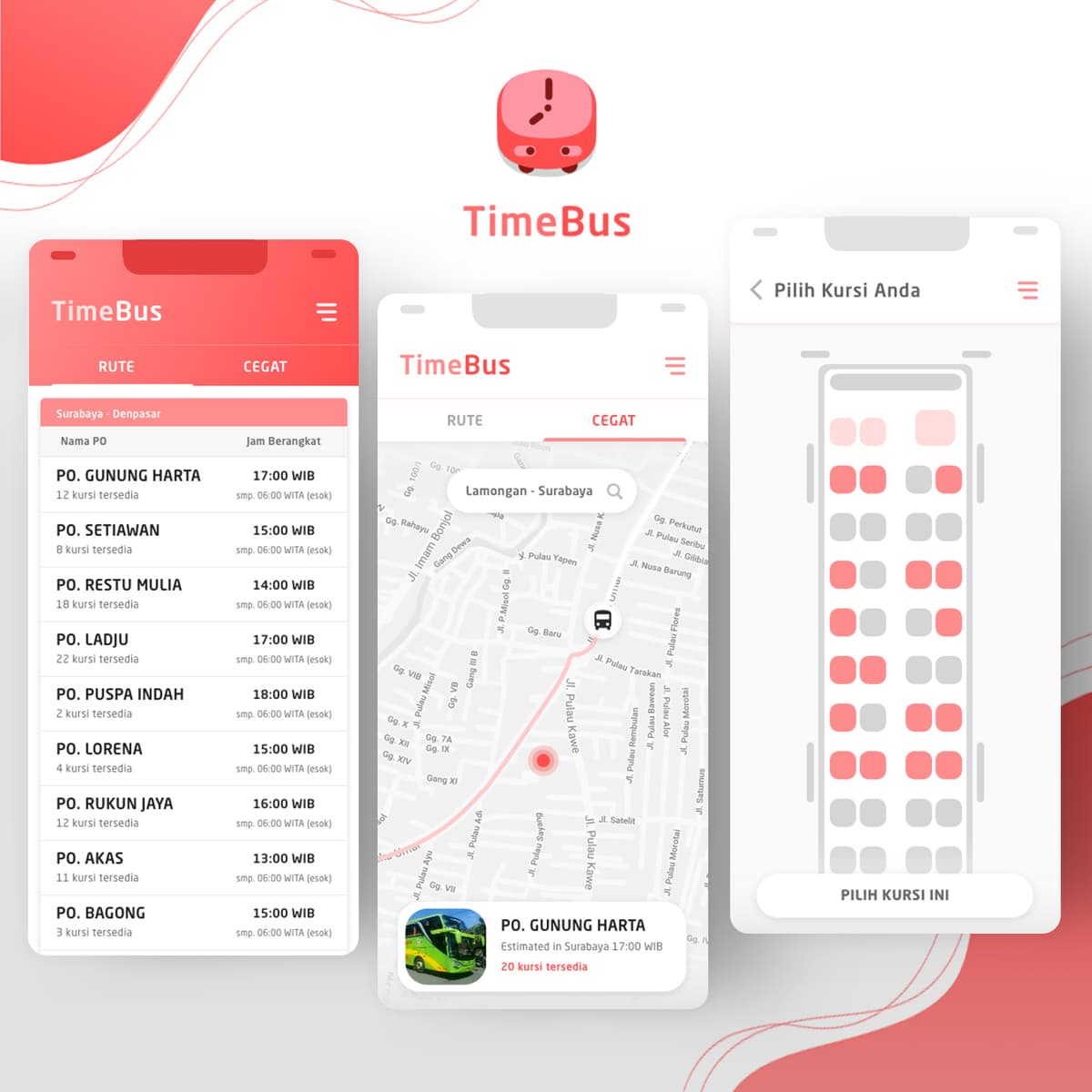
Time Bus
{"type":"doc","content":[{"type":"paragraph","attrs":{"textAlign":null},"content":[{"type":"text","text":"\"PO. Gunung Harta 17:00 WIB, 12 kursi tersedia\" — TimeBus brings the intercity bus terminal experience into your pocket, from route browsing to seat selection in three screens."}]},{"type":"image","attrs":{"src":"https://farooq-agent.web.app/assets/images/works/large/time-bus.jpg","alt":null,"title":null,"width":null,"height":null}},{"type":"paragraph","attrs":{"textAlign":null},"content":[{"type":"text","marks":[{"type":"bold"}],"text":"App UI Design — TimeBus"}]},{"type":"paragraph","attrs":{"textAlign":null},"content":[{"type":"text","marks":[{"type":"italic"}],"text":"Mobile App · Intercity Bus Booking & Management · Indonesia"}]},{"type":"paragraph","attrs":{"textAlign":null},"content":[{"type":"text","text":"A clean, well-structured mobile app UI for TimeBus — an intercity bus booking platform for the Indonesian market, where dozens of bus operators (PO) serve the same routes and passengers need to compare departures, seat availability, and arrival times at a glance."}]},{"type":"paragraph","attrs":{"textAlign":null},"content":[{"type":"text","text":"The app icon — a round, friendly bus face in coral red — sets the tone: functional but approachable, serious about schedules without being intimidating."}]},{"type":"paragraph","attrs":{"textAlign":null},"content":[{"type":"text","marks":[{"type":"bold"}],"text":"Screen 1 — Route (Rute):"},{"type":"text","text":" A list view of all operators serving Surabaya–Denpasar, each row showing PO name, departure time (WIB), and seats available. PO. Gunung Harta at 17:00 (12 kursi), PO. Setiawan at 15:00 (8 kursi), PO. Restu Mulia at 14:00 (18 kursi) — exactly the comparison a traveler needs before committing to a booking. The \"Cegat\" tab suggests an additional mode for flagging down buses at intermediate stops."}]},{"type":"paragraph","attrs":{"textAlign":null},"content":[{"type":"text","marks":[{"type":"bold"}],"text":"Screen 2 — Cegat (Map View):"},{"type":"text","text":" A map-based screen showing the bus route Lamongan–Surabaya with a live bus position and a bottom sheet revealing PO. Gunung Harta's estimated arrival at Surabaya 17:00 WIB with 20 seats available. Real-time tracking communication in a familiar map interface."}]},{"type":"paragraph","attrs":{"textAlign":null},"content":[{"type":"text","marks":[{"type":"bold"}],"text":"Screen 3 — Pilih Kursi (Seat Selection):"},{"type":"text","text":" A visual bus seat map — red seats taken, grey seats available — with a \"Pilih Kursi Ini\" (Choose This Seat) CTA. The seat picker is intuitive, complete, and exactly what converts intent into a confirmed booking."}]},{"type":"paragraph","attrs":{"textAlign":null},"content":[{"type":"text","text":"Three screens, one complete booking journey — designed specifically for the PO bus culture of Java and Bali."}]}]}
Sumpah Pamungkas Poster Design
{"type":"doc","content":[{"type":"paragraph","attrs":{"textAlign":null},"content":[{"type":"text","text":"Part mythology, part cinema — the Sumpah Pamungkas poster is a visual world unto itself, where Javanese spirit meets Hollywood poster craft."}]},{"type":"image","attrs":{"src":"https://farooq-agent.web.app/assets/images/works/large/90bcF2tw_work_image.png","alt":null,"title":null,"width":null,"height":null}},{"type":"paragraph","attrs":{"textAlign":null},"content":[{"type":"text","marks":[{"type":"bold"}],"text":"Poster Design — Sumpah Pamungkas"}]},{"type":"paragraph","attrs":{"textAlign":null},"content":[{"type":"text","marks":[{"type":"italic"}],"text":"Film / Theater Poster · Javanese Cultural Production · 2012"}]},{"type":"paragraph","attrs":{"textAlign":null},"content":[{"type":"text","text":"A dramatically cinematic poster for Sumpah Pamungkas — a Javanese cultural theater or film production — that channels the visual language of international movie posters while remaining deeply rooted in Indonesian mythological aesthetics."}]},{"type":"paragraph","attrs":{"textAlign":null},"content":[{"type":"text","text":"The central figure stands bare-chested with exposed rib-bone body paint, flanked by sweeping giant butterfly wings in black and gold batik patterns — a surreal, otherworldly composition that positions the protagonist between the human and the supernatural. The stormy, backlit sky amplifies the epic, mythological scale of the narrative."}]},{"type":"paragraph","attrs":{"textAlign":null},"content":[{"type":"text","text":"The title \"SUMPAH PAMUNGKAS\" is set in bold red type against the dark atmospheric backdrop — urgent, declarative, and impossible to miss. Cast names arc across the top in classic film poster style, lending the piece a cinematic authority that elevates the production's prestige. A release date (March 24, 2013) grounds the drama in real-world anticipation."}]},{"type":"paragraph","attrs":{"textAlign":null},"content":[{"type":"text","text":"A poster that doesn't describe the story — it becomes it."}]}]}

Learning Design - Works
{"type": "doc", "content": [{"type": "paragraph", "content": [{"type": "text", "text": "These are some of the works (which I still found) that I made when I started studying design specifically in a professional program in the city of Malang, East Java around 2011."}]}, {"type": "paragraph", "content": [{"type": "image", "attrs": {"src": "https://farooq-agent.web.app/assets/images/works/details/211-saladin-college-works/i14.png", "width": 1140, "height": 1138}}]}]}

Privateers - Website Design
{"type":"doc","content":[{"type":"paragraph","attrs":{"textAlign":null},"content":[{"type":"text","text":"First and foremost, risk managers — Privateer Capital Company's website says exactly what it does and to whom, with the clean authority of a firm that has never needed to shout."}]},{"type":"image","attrs":{"src":"https://farooq-agent.web.app/assets/images/works/large/0eeUkYkH_work_image.jpg","alt":null,"title":null,"width":null,"height":null}},{"type":"paragraph","attrs":{"textAlign":null},"content":[{"type":"text","marks":[{"type":"bold"}],"text":"Web Design — Privateer"}]},{"type":"paragraph","attrs":{"textAlign":null},"content":[{"type":"text","marks":[{"type":"italic"}],"text":"Business Website Exploration · Capital Company · Financial Services"}]},{"type":"paragraph","attrs":{"textAlign":null},"content":[{"type":"text","text":"A clean, authoritative website design exploration for Privateer Capital Company — a financial services firm whose digital presence communicates institutional confidence, professional credibility, and the understated gravitas of a company that manages serious capital for serious clients."}]},{"type":"paragraph","attrs":{"textAlign":null},"content":[{"type":"text","text":"The hero section opens with the brand's positioning statement as its headline: \"FIRST AND FOREMOST, WE ARE RISK MANAGERS.\" — set in a bold, mixed-weight display typeface that creates deliberate emphasis through typographic contrast. \"AND\" and \"RISK\" are highlighted in electric blue — the accent color that carries the firm's entire personality: precise, technical, and alert. The statement is both a value proposition and a philosophy, delivered with the directness of someone who has been asked what they do one too many times and decided to just put it on the homepage."}]},{"type":"paragraph","attrs":{"textAlign":null},"content":[{"type":"text","text":"Sharing the hero frame is a professional male figure in a dark business suit — confident posture, arms relaxed, expression open and composed — the visual embodiment of the firm's human capital: experienced, trustworthy, and entirely comfortable with the weight of client responsibility."}]},{"type":"paragraph","attrs":{"textAlign":null},"content":[{"type":"text","text":"The Privateer logo — a shield-like crest mark beside an elegant script wordmark — sits in the upper left, communicating heritage and institutional pedigree. \"Capital Company\" beneath the name confirms the firm's positioning within the investment and asset management space."}]},{"type":"paragraph","attrs":{"textAlign":null},"content":[{"type":"text","text":"The navigation, anchored by a bold sky-blue horizontal band, maps the firm's service architecture: About Us, Private Equity, Hedge Fund, Our Team, Employment, Contact Us — a structure that confirms Privateer operates across multiple investment vehicles with a team worth meeting and a pipeline worth joining."}]},{"type":"paragraph","attrs":{"textAlign":null},"content":[{"type":"text","text":"A business website that earns trust before the scroll — because the headline already told you everything you needed to know."}]}]}
Pelindo III - Website Design
{"type":"doc","content":[{"type":"paragraph","attrs":{"textAlign":null},"content":[{"type":"text","text":"Integrity — Pelindo III's website redesign puts Indonesia's state-owned port operator on a digital stage that matches its scale and national importance."}]},{"type":"image","attrs":{"src":"https://farooq-agent.web.app/assets/images/works/large/5Qrdew31_work_image.jpg","alt":null,"title":null,"width":null,"height":null}},{"type":"paragraph","attrs":{"textAlign":null},"content":[{"type":"text","marks":[{"type":"bold"}],"text":"Web Design — Pelindo III"}]},{"type":"paragraph","attrs":{"textAlign":null},"content":[{"type":"text","marks":[{"type":"italic"}],"text":"Corporate Website · State-Owned Port Operator · BUMN · Indonesia"}]},{"type":"paragraph","attrs":{"textAlign":null},"content":[{"type":"text","text":"A clean, authoritative website design for Pelindo III — PT Pelabuhan Indonesia III, the state-owned enterprise managing ports across Central and Eastern Indonesia, one of the nation's most critical logistics infrastructure assets."}]},{"type":"paragraph","attrs":{"textAlign":null},"content":[{"type":"text","text":"The branding splash — Pelindo III's distinctive double-arrow logomark on a teal dot-pattern background — establishes the institutional identity with the confidence of a BUMN that doesn't need to oversell its position. The logomark's layered diagonal forms communicate movement, shipping, and interconnected logistics networks in a single abstract mark."}]},{"type":"paragraph","attrs":{"textAlign":null},"content":[{"type":"text","text":"The website hero rotates through core values: \"Integrity\" is visible here, with a port worker in full PPE — hard hat, safety vest — standing against container cranes and a cargo ship. The pairing of abstract corporate value with real operational imagery is a strong design choice: Pelindo III's integrity isn't a boardroom aspiration, it's demonstrated on the dock every day."}]},{"type":"paragraph","attrs":{"textAlign":null},"content":[{"type":"text","text":"The navigation — \"Profil Perusahaan, Media, Layanan, Masyarakat & Lingkungan, Tata Kelola, Info Investor, Login\" — maps a full corporate stakeholder platform: public users, investors, business partners, and community audiences all served from a single, well-structured site."}]}]}

Marvell City - Website
{"type":"doc","content":[{"type":"paragraph","attrs":{"textAlign":null},"content":[{"type":"text","text":"3 Harmony of Life, 10 in 1 Concept, 5 Marvellous Value — Marvell City's website frames Surabaya's most ambitious mixed-use development as the city's next landmark."}]},{"type":"image","attrs":{"src":"https://farooq-agent.web.app/assets/images/works/small/gq4daFI6_work_image.jpg","alt":null,"title":null,"width":null,"height":null}},{"type":"paragraph","attrs":{"textAlign":null},"content":[{"type":"text","marks":[{"type":"bold"}],"text":"Web Design — Marvell City"}]},{"type":"paragraph","attrs":{"textAlign":null},"content":[{"type":"text","marks":[{"type":"italic"}],"text":"Property Website · Mixed-Use Development · Surabaya"}]},{"type":"paragraph","attrs":{"textAlign":null},"content":[{"type":"text","text":"A clean, aspirational website design for Marvell City — a large-scale integrated property development in Surabaya combining residential, commercial, and lifestyle zones."}]},{"type":"paragraph","attrs":{"textAlign":null},"content":[{"type":"text","text":"The hero is a triptych of architectural renders — retail streetscape, tower podium, and glass residential tower — arranged in a sharp angled-panel layout that communicates scale and variety simultaneously. The tagline \"Marvellous Values & Concepts\" anchors above, setting the tone: this isn't just a property, it's a lifestyle proposition."}]},{"type":"paragraph","attrs":{"textAlign":null},"content":[{"type":"text","text":"The three value pillars below — 3 Harmony of Life, 10 in 1 Concept, 5 Marvellous Value — compress the development's complex offering into a scannable, memorable framework. For a property of this ambition, it's the right UX choice: give visitors the concept first, the detail second."}]},{"type":"paragraph","attrs":{"textAlign":null},"content":[{"type":"text","text":"The white space-dominant layout with editorial typography communicates premium positioning without resorting to gold-and-marble clichés — a property that sells itself through vision, not decoration."}]}]}
Defiskom Lion Character Design
{"type": "doc", "content": [{"type": "paragraph", "content": [{"type": "text", "text": "This is a design that I made when I was in high school, using a computer in the student council room at school."}]}, {"type": "paragraph", "content": [{"type": "text", "text": "This is the logo of a one-year professional program institution and a picture of a lion, which is a representation of Malang, the city where the professional program is located."}]}, {"type": "paragraph", "content": [{"type": "text", "text": "I created this work because I realized it was rather difficult to continue education until college at that time and chose to work alone, but took the course first. majoring in graphic design and computer."}]}, {"type": "paragraph", "content": [{"type": "image", "attrs": {"src": "https://farooq-agent.web.app/assets/images/works/details/47-defiskom-lion-character-design/i20.png", "width": 376, "height": 480}}]}]}
Mamikos
{"type":"doc","content":[{"type":"paragraph","attrs":{"textAlign":null},"content":[{"type":"text","text":"Finding your next kos kosan just got smarter — Mamikos puts thousands of boarding house options in your pocket, with filters, pricing, and facilities all at your fingertips."}]},{"type":"image","attrs":{"src":"https://farooq-agent.web.app/assets/images/works/large/mamikos.jpg","alt":null,"title":null,"width":null,"height":null}},{"type":"paragraph","attrs":{"textAlign":null},"content":[{"type":"text","marks":[{"type":"bold"}],"text":"Mobile App Design — Mamikos"}]},{"type":"paragraph","attrs":{"textAlign":null},"content":[{"type":"text","marks":[{"type":"italic"}],"text":"UI/UX Design · Kos Kosan Finder App · Property Tech · Indonesia"}]},{"type":"paragraph","attrs":{"textAlign":null},"content":[{"type":"text","text":"A clean, conversion-focused mobile app design for Mamikos — Indonesia's leading platform for finding and booking kos kosan (boarding house rooms) — demonstrated here across two key screens that capture the full user discovery journey."}]},{"type":"paragraph","attrs":{"textAlign":null},"content":[{"type":"text","text":"The home screen leads with a full-bleed property photography hero — a bright, airy kos interior — overlaid with the platform's core call-to-action: \"Cari Kos Kosan?\" The search bar sits immediately below, primed for location input, with a category shortcut row beneath offering quick access to Promo & Event, Promo dari Kost, and Kost Terbaru. A bold green \"Kost Terfavorit\" CTA button anchors the mid-section, driving users directly to the most-saved listings. The bottom navigation — Cari Kost, Filter, Urutkan — keeps the core functions permanently accessible, critical for a search-heavy use case."}]},{"type":"paragraph","attrs":{"textAlign":null},"content":[{"type":"text","text":"The search results screen reveals the platform's filtering intelligence: a location input pre-filled with \"Denpasar,\" a dual-handle price range slider spanning 300,000 to 2,000,000 IDR, and a facility type dropdown — giving the user meaningful control over their search without overwhelming the interface. The prominent green \"Cari Kost\" CTA is impossible to miss, driving the next action with clarity."}]},{"type":"paragraph","attrs":{"textAlign":null},"content":[{"type":"text","text":"The dual Samsung Galaxy mockup presentation — one home, one search — communicates a complete, coherent user flow across two screens, demonstrating strong information architecture instincts and a UI that prioritizes speed-to-result above all else."}]},{"type":"paragraph","attrs":{"textAlign":null},"content":[{"type":"text","text":"A property tech app design that understands its user: a student or worker who needs the right room, in the right place, at the right price — and needs to find it fast."}]}]}
Maxfit
{"type":"doc","content":[{"type":"paragraph","attrs":{"textAlign":null},"content":[{"type":"text","text":"Your gym, your schedule, your goals — Maxfit puts a complete fitness coaching system in the palm of your hands, built with React Native from the ground up."}]},{"type":"image","attrs":{"src":"https://farooq-agent.web.app/assets/images/works/large/maxfit.jpg","alt":null,"title":null,"width":null,"height":null}},{"type":"paragraph","attrs":{"textAlign":null},"content":[{"type":"text","marks":[{"type":"bold"}],"text":"Mobile App Design & Development — Maxfit"}]},{"type":"paragraph","attrs":{"textAlign":null},"content":[{"type":"text","marks":[{"type":"italic"}],"text":"Fitness & Workout App · React Native · JavaScript"}]},{"type":"paragraph","attrs":{"textAlign":null},"content":[{"type":"text","text":"A clean, focused fitness workout application built with React Native — Maxfit delivers a cross-platform mobile experience that organizes the full spectrum of physical training into a single, intuitive interface. The app demonstrates the power of React Native to produce a genuinely native-feeling fitness product from a unified JavaScript codebase."}]},{"type":"paragraph","attrs":{"textAlign":null},"content":[{"type":"text","text":"The home screen leads with a full-width workout photography hero — a dynamic weightlifting image that sets the motivational tone from the first tap. Below, the app's core navigation is organized into a clear 2×2 category grid: Lifting, Gymnastic, Cardiovascular, and Calisthenics — four workout disciplines covering the complete range of modern fitness training. Each category is represented by a clean pictogram icon on a white card, creating a UI that is immediately scannable and gesture-friendly for users mid-session with sweaty hands."}]},{"type":"paragraph","attrs":{"textAlign":null},"content":[{"type":"text","text":"The bottom navigation bar provides quick access to home, workout log, progress tracking, and statistics — a considered information architecture that anticipates the real user journey: plan, train, track, improve. The Android-native navigation bar beneath confirms the app's platform commitment, while the React Native foundation ensures the same experience translates seamlessly to iOS."}]},{"type":"paragraph","attrs":{"textAlign":null},"content":[{"type":"text","text":"The two-handed phone holding mockup against a clean neutral background is a strong presentation choice — it communicates a product built for real, active use, held the way a person actually holds their phone during a workout."}]},{"type":"paragraph","attrs":{"textAlign":null},"content":[{"type":"text","text":"A fitness app that keeps its UI as disciplined as the training it supports — clean, purposeful, and built to perform."}]}]}
Heffen - Website
{"type":"doc","content":[{"type":"paragraph","attrs":{"textAlign":null},"content":[{"type":"text","text":"The Little & The Horns — Heffen Merch's website lives in the same dark, aggressive visual universe as the clothing it sells."}]},{"type":"image","attrs":{"src":"https://farooq-agent.web.app/assets/images/works/small/ML8e4lPf_work_image.jpg","alt":null,"title":null,"width":null,"height":null}},{"type":"paragraph","attrs":{"textAlign":null},"content":[{"type":"text","marks":[{"type":"bold"}],"text":"Web Design — Heffen Merch"}]},{"type":"paragraph","attrs":{"textAlign":null},"content":[{"type":"text","marks":[{"type":"italic"}],"text":"Clothing & Merchandise Website · Metal / Dark Streetwear"}]},{"type":"paragraph","attrs":{"textAlign":null},"content":[{"type":"text","text":"A full-commitment dark merchandise website for Heffen Merch — a clothing brand rooted in metal and underground culture. The design doesn't try to appeal to everyone, and that's exactly the point."}]},{"type":"paragraph","attrs":{"textAlign":null},"content":[{"type":"text","text":"The hero leads with \"The Little & The Horns — Terror of this April\" against a distressed black background with an intricate skull illustration — raw, hand-drawn, and unmistakably metal. The red \"Get This\" CTA is the only burst of color in an otherwise monochromatic composition, and it works precisely because of that contrast."}]},{"type":"paragraph","attrs":{"textAlign":null},"content":[{"type":"text","text":"The \"Heffenmerch\" logotype in a custom display typeface communicates brand identity with the same energy as a band logo — designed to be recognizable on a shirt from across a mosh pit. Navigation — Products, Custom Order, Lookbook, Review, Imprint, FAQ — confirms a fully operational merch store with custom ordering capabilities."}]},{"type":"paragraph","attrs":{"textAlign":null},"content":[{"type":"text","text":"A website that earns its credibility by looking exactly like its customer base — zero compromise, full attitude."}]}]}
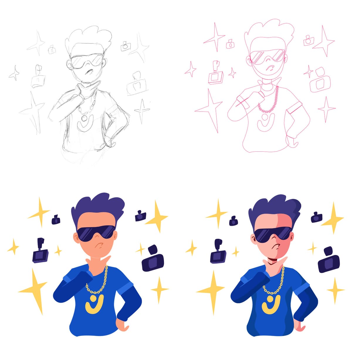
Creator Pose
{"type":"doc","content":[{"type":"paragraph","attrs":{"textAlign":null},"content":[{"type":"text","text":"Sunglasses on, gold chain gleaming, content icons orbiting like satellites — this is the Creator Pose, and it communicates in a single image what it feels like to be at the top of your creative game."}]},{"type":"image","attrs":{"src":"https://farooq-agent.web.app/assets/images/works/details/239-creco/ilus-3.jpg","alt":null,"title":null,"width":null,"height":null}},{"type":"paragraph","attrs":{"textAlign":null},"content":[{"type":"text","marks":[{"type":"bold"}],"text":"Illustration — Creator Pose"}]},{"type":"paragraph","attrs":{"textAlign":null},"content":[{"type":"text","marks":[{"type":"italic"}],"text":"Character Illustration · Process Sheet · Creco Platform · Content Creator"}]},{"type":"paragraph","attrs":{"textAlign":null},"content":[{"type":"text","text":"A confident, personality-packed character illustration for the Creco platform — presenting a male creator in his element: cool, self-assured, and unmistakably in his era. Presented as a four-stage process sheet that reveals the complete illustration journey from gestural sketch to polished final render."}]},{"type":"paragraph","attrs":{"textAlign":null},"content":[{"type":"text","text":"The character is a young man in a deep blue Creco-branded hoodie — the platform's logo badge displayed on the chest — dark sunglasses resting on his face with the casual authority of someone who chose them, not wore them. A thick gold chain sits at his collar, hand raised to his chin in a thinking-or-posing gesture that reads as both: this is someone who creates deliberately, who curates himself as much as his content. The expression is considered, slightly mysterious — a creator who lets the work do the talking but knows how to enter a room."}]},{"type":"paragraph","attrs":{"textAlign":null},"content":[{"type":"text","text":"Orbiting the figure: dark navy icon shapes — user profile silhouettes, content badges — and golden four-pointed sparkle stars that explode outward in a celebration of creative energy. The icon elements communicate the platform ecosystem; the sparkles communicate what it feels like when the platform works for you — when content lands, when the audience shows up, when the algorithm becomes a collaborator."}]},{"type":"paragraph","attrs":{"textAlign":null},"content":[{"type":"text","text":"The four-panel process grid traces the work from loose pencil sketch (top-left) through refined pink linework (top-right) into flat blue color blocking (bottom-left) and the final shaded, lit render (bottom-right) — the full craft visible, the deliberateness unmistakable."}]},{"type":"paragraph","attrs":{"textAlign":null},"content":[{"type":"text","text":"A character illustration that captures the creator economy's aspiration in a single confident pose — because the best creators don't just make content, they embody it."}]}]}
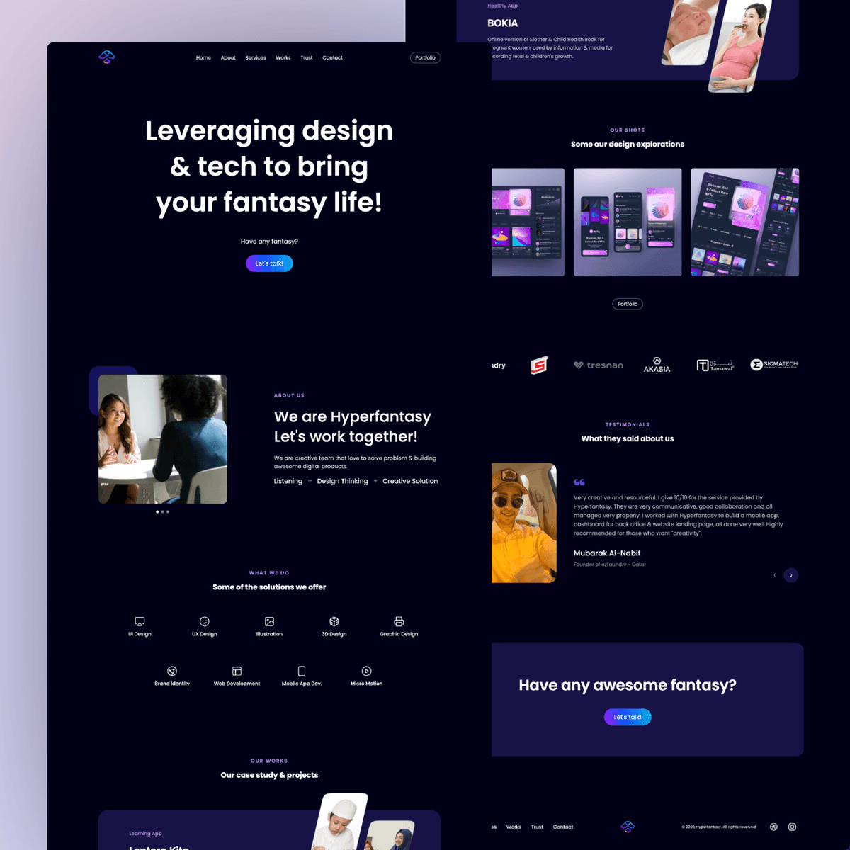
Hyperfantasy Web Design
{"type":"doc","content":[{"type":"image","attrs":{"src":"https://hyperfantasy.web.app/assets/images/portfolios/fd5a2635-158f-4e05-9a1c-0c720732e9a3/display_web_hyperfantasy.png","alt":null,"title":null,"width":null,"height":null}},{"type":"image","attrs":{"src":"https://hyperfantasy.web.app/assets/images/portfolios/fd5a2635-158f-4e05-9a1c-0c720732e9a3/web_home_hyperfantasy.png","alt":null,"title":null,"width":null,"height":null}},{"type":"image","attrs":{"src":"https://farooq-agent.web.app/assets/images/works/large/pd/hyperfantasy_square.png","alt":null,"title":null,"width":null,"height":null}},{"type":"paragraph","attrs":{"textAlign":null}},{"type":"heading","attrs":{"textAlign":null,"level":1},"content":[{"type":"text","text":"Hyperfantasy Web Design"},{"type":"hardBreak"}]},{"type":"image","attrs":{"src":"https://cdn.dribbble.com/users/8414462/avatars/normal/440c89cb507f4f9d2aa912e569bf1b47.png?1629696498","alt":null,"title":null,"width":1140,"height":1140}},{"type":"paragraph","attrs":{"textAlign":null}},{"type":"paragraph","attrs":{"textAlign":"center"},"content":[{"type":"text","text":"January 14, 2022"}]}]}
Juanita Logo
{"type":"doc","content":[{"type":"paragraph","attrs":{"textAlign":null},"content":[{"type":"text","text":"Where beauty meets boutique — Juanita is the salon brand that makes every woman feel like she walked into her own fairytale."}]},{"type":"image","attrs":{"src":"https://farooq-agent.web.app/assets/images/works/large/iUU75IOT_work_image.png","alt":null,"title":null,"width":null,"height":null}},{"type":"paragraph","attrs":{"textAlign":null},"content":[{"type":"text","marks":[{"type":"bold"}],"text":"Brand Identity — Juanita"}]},{"type":"paragraph","attrs":{"textAlign":null},"content":[{"type":"text","marks":[{"type":"italic"}],"text":"Logo Design · Boutique & Salon · Beauty & Lifestyle"}]},{"type":"paragraph","attrs":{"textAlign":null},"content":[{"type":"text","text":"A romantically feminine brand identity for Juanita Boutique & Salon — a beauty destination that combines the indulgence of a salon with the charm of a boutique, all wrapped in one graceful visual mark. The logo is a composition of layered elegance: expressive, floral, and unapologetically feminine."}]},{"type":"paragraph","attrs":{"textAlign":null},"content":[{"type":"text","text":"The icon is a stylized silhouette of a woman's figure — tall, slender, and poised — rendered as a flowing abstract form that simultaneously reads as the letter \"J,\" the initial of the brand name. The double reading is seamless and satisfying: a monogram that is also a person, a letter that is also a pose. At the crown of the figure, a four-leaf clover motif adds a note of luck and charm, while delicate sakura-like blossoms scatter at the base — grounding the mark in natural beauty and feminine grace."}]},{"type":"paragraph","attrs":{"textAlign":null},"content":[{"type":"text","text":"The wordmark \"Juanita\" is set in an expressive, flowing calligraphic script with heart accents dotting the letter \"j\" — a small but telling detail that injects warmth and personality into the typography. The tagline \"Boutique & Salon\" sits beneath in a lighter script, clearly communicating the dual nature of the business without competing with the main wordmark."}]},{"type":"paragraph","attrs":{"textAlign":null},"content":[{"type":"text","text":"The single fuchsia-pink palette — warm, vivid, and distinctly feminine — is the perfect color choice for a beauty brand targeting women who want to feel celebrated. Applied consistently across the icon and wordmark on a clean white textured paper mockup, the identity radiates the kind of warmth that makes a client feel welcome before she's even walked through the door."}]},{"type":"paragraph","attrs":{"textAlign":null},"content":[{"type":"text","text":"A salon brand identity that is as beautiful as the transformations it promises."}]}]}

Sharing Session Organizer
{"type":"doc","content":[{"type":"paragraph","attrs":{"textAlign":null},"content":[{"type":"text","text":"Behind every great sharing session is a team that makes it happen — this illustration captures the organizers who kept the Tokopedia trainee program running with energy, coordination, and a megaphone full of enthusiasm."}]},{"type":"image","attrs":{"src":"https://farooq-agent.web.app/assets/images/works/large/pd/3/pdx-7.png","alt":null,"title":null,"width":null,"height":null}},{"type":"paragraph","attrs":{"textAlign":null},"content":[{"type":"text","marks":[{"type":"bold"}],"text":"Illustration Design — Sharing Session Organizer"}]},{"type":"paragraph","attrs":{"textAlign":null},"content":[{"type":"text","marks":[{"type":"italic"}],"text":"Event Illustration · Tokopedia Trainee Program · Internal Communication"}]},{"type":"paragraph","attrs":{"textAlign":null},"content":[{"type":"text","text":"A dynamic, role-driven character illustration created during the Tokopedia Trainee Program — celebrating the organizing team behind the program's sharing sessions: the unsung crew who plan, coordinate, and hype every knowledge-sharing event from behind the scenes and at the front of the room."}]},{"type":"paragraph","attrs":{"textAlign":null},"content":[{"type":"text","text":"The three characters are rendered in a sticker-style flat illustration with confident, energetic poses that communicate a team in motion — not sitting still, not waiting — actively making things happen. Each figure carries a prop that defines their role with visual clarity: the left character holds a clipboard and wears a signature green Tokopedia cap — the planner, the detail person, the one who knows exactly what needs to happen next; the center character holds a microphone with both hands, headset on, mid-speech — the host, the connector, the voice of the session; the right character raises a megaphone with a thumbs-up energy — the amplifier, the promoter, the one making sure everyone in the building knows something great is happening."}]},{"type":"paragraph","attrs":{"textAlign":null},"content":[{"type":"text","text":"All three wear matching dark grey shirts and black pants — a uniform that signals unity and team identity while keeping the character design clean and scalable across digital and print contexts. The sticker-style white outline frames the group as a portable badge — usable across program decks, event posters, internal Notion pages, and digital invitations."}]},{"type":"paragraph","attrs":{"textAlign":null},"content":[{"type":"text","text":"An illustration that turns an event organizing team into characters worth remembering — because good programs don't run themselves."}]}]}

Police Against Hoax About Virus
{"type":"doc","content":[{"type":"paragraph","attrs":{"textAlign":null},"content":[{"type":"text","text":"A bold editorial illustration that puts law enforcement at the frontline of the infodemic — stopping the spread of virus hoaxes before they cause more harm than the virus itself."}]},{"type":"image","attrs":{"src":"https://cdn.dribbble.com/users/5057025/screenshots/11013375/media/7243fc056e0ce48e9ede3e2dae33f158.jpg?compress=1&resize=1200x900&vertical=top","alt":null,"title":null,"width":1000,"height":750}},{"type":"paragraph","attrs":{"textAlign":null},"content":[{"type":"text","marks":[{"type":"bold"}],"text":"Illustration — Police Against Hoax About Virus"}]},{"type":"paragraph","attrs":{"textAlign":null},"content":[{"type":"text","marks":[{"type":"italic"}],"text":"Vector Illustration · Editorial · Public Health · Social Commentary"}]},{"type":"paragraph","attrs":{"textAlign":null},"content":[{"type":"text","text":"A conceptual vector illustration depicting a police officer taking a firm stance against the spread of virus-related misinformation across online and social media platforms. The composition frames law enforcement not as a physical protector, but as a guardian of public information — blocking the chain of hoax content that proliferates during a global health crisis."}]},{"type":"paragraph","attrs":{"textAlign":null},"content":[{"type":"text","text":"The illustration uses clear visual metaphors to communicate its message: authority, prohibition, and digital media collide in a single scene that speaks to the real-world consequences of unchecked misinformation during a pandemic. The character design and flat vector style keep the tone authoritative yet accessible — serious enough to carry the message, clean enough to work across editorial, campaign, and educational contexts."}]},{"type":"paragraph","attrs":{"textAlign":null},"content":[{"type":"text","text":"A timely piece that captures one of the defining social challenges of the pandemic era: not just fighting the virus, but fighting the lies about it."}]}]}

Hazmat Suit Researching Virus
{"type":"doc","content":[{"type":"paragraph","attrs":{"textAlign":null},"content":[{"type":"text","text":"Vector illustration that represents health workers and researchers who are researching a virus."}]},{"type":"paragraph","attrs":{"textAlign":null},"content":[{"type":"image","attrs":{"src":"https://cdn.dribbble.com/users/5057025/screenshots/11031453/media/111875ae19f248eaf81d51edf5c00641.jpg?compress=1&resize=1200x900&vertical=top","alt":null,"title":null,"width":1000,"height":750}}]}]}
Wind Lion
{"type":"doc","content":[{"type":"paragraph","attrs":{"textAlign":null},"content":[{"type":"text","text":"Bold as a lion, smooth as the wind — Windlion Coffeeshop is the brand that commands your morning before the first sip."}]},{"type":"image","attrs":{"src":"https://farooq-agent.web.app/assets/images/works/large/windlion.jpg","alt":null,"title":null,"width":null,"height":null}},{"type":"paragraph","attrs":{"textAlign":null},"content":[{"type":"text","marks":[{"type":"bold"}],"text":"Brand Identity — Windlion Coffeeshop"}]},{"type":"paragraph","attrs":{"textAlign":null},"content":[{"type":"text","marks":[{"type":"italic"}],"text":"Logo & Packaging Design · Coffee Shop · F&B Retail"}]},{"type":"paragraph","attrs":{"textAlign":null},"content":[{"type":"text","text":"A commanding, character-driven brand identity for Windlion Coffeeshop — a coffee brand that wears its personality with the same quiet confidence as the animal at its center. The identity is built around a single, powerful image: a lion, rendered in fine engraving-style illustration, set within a structured crest frame that signals heritage, quality, and craft."}]},{"type":"paragraph","attrs":{"textAlign":null},"content":[{"type":"text","text":"The logomark is a detailed, hand-etched lion portrait — mane flowing with wild elegance, gaze fixed with calm authority. The illustration style draws from vintage apothecary labels and artisan food packaging, communicating a brand that takes its craft seriously and respects the traditions of great coffee. Enclosed within a shield-like crest, the mark has the weight and legitimacy of a brand that has been around long enough to earn its reputation."}]},{"type":"paragraph","attrs":{"textAlign":null},"content":[{"type":"text","text":"The wordmark \"WINDLION\" is set in a bold, condensed uppercase serif directly beneath the crest — strong, grounded, and legible at cup-sleeve scale. The tagline \"Coffeeshop\" sits in a lighter serif below, flanked by three coffee bean icons that add a subtle product reference without interrupting the mark's authority."}]},{"type":"paragraph","attrs":{"textAlign":null},"content":[{"type":"text","text":"The entire identity is executed in a strict monochromatic black-and-white system — a deliberate choice that ensures maximum versatility across cup sleeves, packaging, signage, and merchandise, while projecting a sense of premium restraint. On the takeaway cup mockup, surrounded by scattered coffee beans, the logo performs exactly as a great coffeeshop brand should: instantly recognizable, quietly confident, and deeply craveable."}]},{"type":"paragraph","attrs":{"textAlign":null},"content":[{"type":"text","text":"A coffeeshop identity with the soul of a classic and the presence of a predator."}]}]}
Hippo Team
{"type":"doc","content":[{"type":"paragraph","attrs":{"textAlign":null},"content":[{"type":"text","text":"Every great mentoring group has a story — and the Hippo Team's starts with a mentor who loves hippos so much, one ended up in the illustration."}]},{"type":"image","attrs":{"src":"https://farooq-agent.web.app/assets/images/works/large/pd/2/hippo-bg-clean-square.png","alt":null,"title":null,"width":null,"height":null}},{"type":"paragraph","attrs":{"textAlign":null},"content":[{"type":"text","marks":[{"type":"bold"}],"text":"Illustration Design — Hippo Team"}]},{"type":"paragraph","attrs":{"textAlign":null},"content":[{"type":"text","marks":[{"type":"italic"}],"text":"Mentoring Group Mascot · Tokopedia Trainee Program"}]},{"type":"paragraph","attrs":{"textAlign":null},"content":[{"type":"text","text":"A warmly personal group illustration created during the Tokopedia Trainee Program — capturing the Hippo Team mentoring group in full character, complete with the detail that makes this piece genuinely one-of-a-kind: a tiny purple hippo perched on the mentor's shoulder, waving cheerfully at the viewer."}]},{"type":"paragraph","attrs":{"textAlign":null},"content":[{"type":"text","text":"The story behind the hippo is the heart of the illustration — the mentor's well-known love of hippos became the group's identity, the source of its name, and ultimately its mascot. The result is a piece of design that isn't just a team badge; it's a memory, a private joke made permanent, a shared reference that will make every member of the group smile for years after the program ends."}]},{"type":"paragraph","attrs":{"textAlign":null},"content":[{"type":"text","text":"The mentor is rendered at the top center — long dark hair, a charming straw hat, peace sign raised — the figure of warmth and guidance around whom the group orbits. The three mentees cluster below: a green-cap-wearing trainee with a notebook and pen (the documenter), a wide-eyed mentee with a fork and spoon (the foodie of the group, perhaps), and a third holding a bicycle wheel (the cyclist). Each prop is a character detail — a nod to the real personalities in the group, encoded into the illustration with affection."}]},{"type":"paragraph","attrs":{"textAlign":null},"content":[{"type":"text","text":"The \"HIPPO TEAM — Mentoring Group\" banner at the base is set in a bold, friendly display typeface on a forest green ribbon, framed by leaf elements that give the badge a natural, club-crest quality."}]},{"type":"paragraph","attrs":{"textAlign":null},"content":[{"type":"text","text":"An illustration that captures something rare in professional design work — a genuine relationship, rendered with craft and care."}]}]}
NEA
{"type":"doc","content":[{"type":"paragraph","attrs":{"textAlign":null},"content":[{"type":"text","text":"Caring for the Environment Together in a Clean & Green Singapore — NEA's website design reflects the quiet, organized precision of a government agency that actually delivers on its mandate."}]},{"type":"image","attrs":{"src":"https://farooq-agent.web.app/assets/images/works/large/upucuDho_work_image.jpg","alt":null,"title":null,"width":null,"height":null}},{"type":"paragraph","attrs":{"textAlign":null},"content":[{"type":"text","marks":[{"type":"bold"}],"text":"Web Design — NEA (National Environment Agency)"}]},{"type":"paragraph","attrs":{"textAlign":null},"content":[{"type":"text","marks":[{"type":"italic"}],"text":"Government Portal · Singapore Environment Agency · Public Services"}]},{"type":"paragraph","attrs":{"textAlign":null},"content":[{"type":"text","text":"A clean, information-dense government portal design for Singapore's National Environment Agency — responsible for weather, air quality, public health, and waste management across the island."}]},{"type":"paragraph","attrs":{"textAlign":null},"content":[{"type":"text","text":"The hero is a full-bleed photograph of lush tropical tree canopy — green, dense, unmistakably Singapore — overlaid with the mission statement \"Caring for the Environment Together in a Clean & Green Singapore.\" No embellishment needed: the image is the message."}]},{"type":"paragraph","attrs":{"textAlign":null},"content":[{"type":"text","text":"A live weather widget in the lower right corner — 24–33°C forecast — delivers immediate real-world value on the homepage without competing with the broader content hierarchy. The NEA logo with its characteristic leaf-wave mark anchors the header alongside a Singapore Government red masthead badge."}]},{"type":"paragraph","attrs":{"textAlign":null},"content":[{"type":"text","text":"The mega navigation — Weather & Climate, Public Health, Air Pollution & Radiation Protection, Grants & Programmes, Energy & Waste, Events & Awards, Training & Education, News & Forms — maps a genuinely wide-scope agency without overwhelming the homepage."}]},{"type":"paragraph","attrs":{"textAlign":null},"content":[{"type":"text","text":"Government design at its best: informative, accessible, and completely in service of its citizens."}]}]}
Logo Design 2021 - 2021
{"type":"doc","content":[{"type":"paragraph","attrs":{"textAlign":null},"content":[{"type":"text","text":"One mark, two reads — a duck and a musical note fused so perfectly you'll wonder how no one thought of it sooner."}]},{"type":"image","attrs":{"src":"https://farooq-agent.web.app/assets/images/works/large/pd/logo-2021/lokajaya-design-3.jpg","alt":null,"title":null,"width":null,"height":null}},{"type":"paragraph","attrs":{"textAlign":null},"content":[{"type":"text","marks":[{"type":"bold"}],"text":"Logo Design — Ducknote Musics"}]},{"type":"paragraph","attrs":{"textAlign":null},"content":[{"type":"text","marks":[{"type":"italic"}],"text":"Logo Design · 2021 Compilation · Music Brand"}]},{"type":"paragraph","attrs":{"textAlign":null},"content":[{"type":"text","text":"A standout logo from the 2021 design compilation — and one of the most conceptually satisfying dual-meaning marks in the portfolio. The logomark is simultaneously a musical eighth note and a duck in profile: the note's head becomes the duck's body, the stem its elegant neck, the flag its beak raised mid-quack. The negative space between form and counter-form seals the illusion perfectly."}]},{"type":"paragraph","attrs":{"textAlign":null},"content":[{"type":"text","text":"Executed in pure black on white — no color, no decoration, no distraction — the mark proves that the strongest ideas need nothing added to them. Bold, witty, and instantly memorable."}]}]}
The Bassist
{"type":"doc","content":[{"type":"paragraph","attrs":{"textAlign":null},"content":[{"type":"text","text":"Before the screen, before the stylus — just a pencil, a sheet of paper, and a bassist who looks like he's been playing since before he had skin."}]},{"type":"image","attrs":{"src":"https://farooq-agent.web.app/assets/images/works/small/akaiWYLr_work_image.png","alt":null,"title":null,"width":null,"height":null}},{"type":"paragraph","attrs":{"textAlign":null},"content":[{"type":"text","marks":[{"type":"bold"}],"text":"Sketch Illustration — The Bassist"}]},{"type":"paragraph","attrs":{"textAlign":null},"content":[{"type":"text","marks":[{"type":"italic"}],"text":"Hand-Drawn Pencil Sketch · Personal Artwork · Music & Character Art"}]},{"type":"paragraph","attrs":{"textAlign":null},"content":[{"type":"text","text":"A raw, energetic pencil sketch capturing a heavy metal bassist in full character — wild dreadlocks flying, skull face grinning, bass guitar raised defiantly in one tattooed hand. The piece is presented exactly as it was made: clipped to a binder clip on a wooden surface, pencil and eraser resting beside it — the tools of a drawing session preserved without filter or apology."}]},{"type":"paragraph","attrs":{"textAlign":null},"content":[{"type":"text","text":"The character design is pure metal iconography: a skeletal figure with long, chaotic hair that merges with the overall composition's frantic linework, wearing a button-up shirt with visible tattoos creeping up the arms, sneakers planted on the ground, and a bass guitar held like a weapon or a trophy — with the same intensity either way. The Geonk tag is hand-lettered in a thrash metal logotype style in the upper left, asserting authorship in the language of the subject."}]},{"type":"paragraph","attrs":{"textAlign":null},"content":[{"type":"text","text":"The sketch technique is confident and loose — lines stack and repeat, shadows build through hatching, and the anatomy bends toward expressiveness rather than accuracy. This is character art that understands its genre: metal doesn't clean up for anyone, and neither does this drawing."}]},{"type":"paragraph","attrs":{"textAlign":null},"content":[{"type":"text","text":"A piece that belongs to the part of the portfolio that predates software, clients, and deliverables — where drawing was just drawing, and the only brief was whatever was loud in the headphones that afternoon."}]}]}
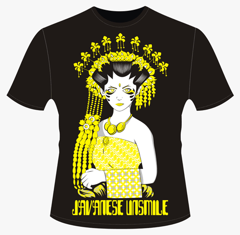
Javanese Unsmile
{"type":"doc","content":[{"type":"paragraph","attrs":{"textAlign":null},"content":[{"type":"text","text":"She wears the crown of Javanese tradition and the gaze of something ancient — Javanese Unsmile is a t-shirt illustration that turns cultural identity into haunting, wearable art."}]},{"type":"image","attrs":{"src":"https://farooq-agent.web.app/assets/images/works/large/javanese-unsmile.png","alt":null,"title":null,"width":null,"height":null}},{"type":"paragraph","attrs":{"textAlign":null},"content":[{"type":"text","marks":[{"type":"bold"}],"text":"T-Shirt Illustration — Javanese Unsmile"}]},{"type":"paragraph","attrs":{"textAlign":null},"content":[{"type":"text","marks":[{"type":"italic"}],"text":"Apparel Design · Cultural Illustration · Original Artwork"}]},{"type":"paragraph","attrs":{"textAlign":null},"content":[{"type":"text","text":"A striking, deeply atmospheric t-shirt illustration that reimagines Javanese feminine identity through a lens of quiet, unsettling beauty. \"Javanese Unsmile\" presents a traditional Javanese woman adorned in full ceremonial headdress — elaborate golden ornaments cascading in layers of flowers, pendants, and decorative chains — rendered in vivid yellow against a deep black tee, creating a composition of maximum visual contrast and cultural weight."}]},{"type":"paragraph","attrs":{"textAlign":null},"content":[{"type":"text","text":"The figure's expression is the work's defining tension: hollow, shadowed eyes that carry no warmth, no invitation, no performed happiness — just a steady, unflinching gaze that refuses the expectation of the smile. It is a deliberate subversion. Javanese feminine beauty is often associated with grace, softness, and serene expression; \"Unsmile\" disrupts that expectation with a figure who wears every ornament of her tradition while offering none of its deference."}]},{"type":"paragraph","attrs":{"textAlign":null},"content":[{"type":"text","text":"The illustration style draws from both wayang and Art Nouveau traditions — highly decorative, symmetrical, and detail-rich, with a flat two-color execution in yellow and white on black that gives the design its graphic power and screen-print readiness. The batik-patterned drape across the figure's body reinforces the cultural grounding, while the gloved hands add an anachronistic, theatrical dimension."}]},{"type":"paragraph","attrs":{"textAlign":null},"content":[{"type":"text","text":"The \"JAVANESE UNSMILE\" title is lettered in a custom display typeface at the base — bold, slightly eroded, the typography of a brand that knows exactly what it's saying and is comfortable making you feel it."}]},{"type":"paragraph","attrs":{"textAlign":null},"content":[{"type":"text","text":"A wearable artwork that carries cultural pride, quiet resistance, and genuine artistic intent in every thread."}]}]}
Karmagroup Dark
{"type":"doc","content":[{"type":"paragraph","attrs":{"textAlign":null},"content":[{"type":"text","text":"Discover the World With Karma — this desktop web design puts Karma Kandara's clifftop infinity pool front and center, and makes booking your next luxury escape feel like the easiest decision you'll make today."}]},{"type":"image","attrs":{"src":"https://farooq-agent.web.app/assets/images/works/large/karmagroup-dark.jpg","alt":null,"title":null,"width":null,"height":null}},{"type":"paragraph","attrs":{"textAlign":null},"content":[{"type":"text","marks":[{"type":"bold"}],"text":"Web Design — Karma Group Dark"}]},{"type":"paragraph","attrs":{"textAlign":null},"content":[{"type":"text","marks":[{"type":"italic"}],"text":"Luxury Hospitality Website · Desktop · Full-Width Booking Interface"}]},{"type":"paragraph","attrs":{"textAlign":null},"content":[{"type":"text","text":"A cinematic, full-bleed desktop website design for Karma Group — presenting the brand's flagship visual identity: \"Discover the World With Karma. We Create Experience.\" The dark MacBook mockup presentation gives the design a premium, editorial quality that mirrors the hospitality brand it houses."}]},{"type":"paragraph","attrs":{"textAlign":null},"content":[{"type":"text","text":"The hero is Karma Kandara, Jimbaran Bali — a sweeping golden-hour photograph of the resort's iconic clifftop pool pavilion, warm amber stone architecture glowing against a deep blue twilight sky, the Indian Ocean visible beyond. The property label \"Karma Kandara Jimbaran Bali\" confirms the location while the photography communicates everything words cannot about what this resort feels like."}]},{"type":"paragraph","attrs":{"textAlign":null},"content":[{"type":"text","text":"\"Find Luxury Hotels and Resorts for your Next Vacation\" leads the hero copy — broad enough to serve the full multi-property portfolio, specific enough to speak to the traveler's aspiration. \"Discover the World With Karma\" in bold display type and \"We Create Experience...\" in gold italic script deliver the brand's positioning with restraint and elegance."}]},{"type":"paragraph","attrs":{"textAlign":null},"content":[{"type":"text","text":"The booking widget anchored to the lower hero is direct and functional: Destination selector, Date range picker (Tue Aug 27 — Wed Aug 28), and a gold \"Book Now\" CTA — the conversion flow embedded in the hero without interrupting its visual authority."}]},{"type":"paragraph","attrs":{"textAlign":null},"content":[{"type":"text","text":"The full navigation reveals the complete brand ecosystem: Destinations, Inspiration, Exclusive Offers, Spa & Wellbeing, Karma Beach, News & Events, Contact Us — with Karma Moments, Membership, Chat, Email, and Member Login in the utility header. The \"Book Online\" button in blue provides a contrasting conversion anchor at the top right."}]},{"type":"paragraph","attrs":{"textAlign":null},"content":[{"type":"text","text":"A luxury hospitality desktop web that earns its premium positioning in every pixel — from the property photography to the gold booking CTA."}]}]}
Mekar
{"type":"doc","content":[{"type":"paragraph","attrs":{"textAlign":null},"content":[{"type":"text","text":"Describe your business, watch your web app bloom — Mekar turns ideas into fully functional React + Spring Boot applications without writing a single line of code."}]},{"type":"image","attrs":{"src":"https://farooq-agent.web.app/assets/images/works/large/mekar.jpg","alt":null,"title":null,"width":null,"height":null}},{"type":"paragraph","attrs":{"textAlign":null},"content":[{"type":"text","marks":[{"type":"bold"}],"text":"Smart Generator — Mekar"}]},{"type":"paragraph","attrs":{"textAlign":null},"content":[{"type":"text","marks":[{"type":"italic"}],"text":"Web App Design · Automatic Web App Generator · React & Spring Boot Platform"}]},{"type":"paragraph","attrs":{"textAlign":null},"content":[{"type":"text","text":"A clean, optimistic product design for Mekar — a no-code web application generator platform that does something genuinely revolutionary: you describe your business model in plain language, and Mekar automatically generates a fully functional web application powered by React on the frontend and Spring Boot on the backend."}]},{"type":"paragraph","attrs":{"textAlign":null},"content":[{"type":"text","text":"The name \"Mekar\" — Indonesian for \"to bloom\" — is the perfect metaphor: you plant a seed of an idea, and a complete digital product flowers from it. The visual identity carries this metaphor through a soft green-to-teal gradient hero section, accented with subtle floral pattern elements that echo the brand name and its organic, generative spirit."}]},{"type":"paragraph","attrs":{"textAlign":null},"content":[{"type":"text","text":"The hero headline \"Pretty Web App Generator\" is positioned above a three-feature icon row — Quick, Simple, and Scalable — communicating the platform's core value proposition in the most direct terms possible. The UI is deliberately light, airy, and approachable, signaling that this is a tool built for founders and business owners, not developers. The navigation (\"Home,\" \"About Mekar,\" \"Login,\" \"Data\") is minimal and purposeful — keeping the focus on the product's singular promise."}]},{"type":"paragraph","attrs":{"textAlign":null},"content":[{"type":"text","text":"Presented in a premium desktop monitor mockup, the design demonstrates how a technically complex platform can wear a calm, inviting face — reducing the intimidation of app development to something that feels as natural as describing your own business."}]},{"type":"paragraph","attrs":{"textAlign":null},"content":[{"type":"text","text":"A product that makes the complex feel effortless — and a design that makes that promise believable at first glance."}]}]}
Zombrema Sketch
{"type":"doc","content":[{"type":"paragraph","attrs":{"textAlign":null},"content":[{"type":"text","text":"Undead, undeniably cute, and completely unhinged — Zombrema is the sketch that proves horror and charm are just two pencil strokes apart."}]},{"type":"image","attrs":{"src":"https://farooq-agent.web.app/assets/images/works/small/TTwEbvoY_work_image.png","alt":null,"title":null,"width":null,"height":null}},{"type":"paragraph","attrs":{"textAlign":null},"content":[{"type":"text","marks":[{"type":"bold"}],"text":"Sketch Illustration — Zombrema"}]},{"type":"paragraph","attrs":{"textAlign":null},"content":[{"type":"text","marks":[{"type":"italic"}],"text":"Hand-Drawn Pencil Sketch · Original Character · Horror Comedy"}]},{"type":"paragraph","attrs":{"textAlign":null},"content":[{"type":"text","text":"A raw pencil sketch introducing Zombrema — an original character that sits at the delightful intersection of chibi cute and zombie grotesque. The design leans into the contradiction fully: a round, wide-eyed head with wild spiky hair and Frankenstein bolt details, paired with an exposed rib cage, decaying clawed hands, and a toothy grin that's equal parts adorable and unsettling."}]},{"type":"paragraph","attrs":{"textAlign":null},"content":[{"type":"text","text":"The character is emerging from the ground — the classic zombie rising pose — surrounded by jagged earth and debris rendered in loose, energetic linework that spills into the lower half of the page. The hands reach forward with exaggerated clawed fingers, yet the oversized chibi eyes and chubby proportions keep the character endearing rather than genuinely threatening. This is a zombie you'd put on a sticker."}]},{"type":"paragraph","attrs":{"textAlign":null},"content":[{"type":"text","text":"The \"Zombrema\" tag is hand-lettered in a loose graffiti-metal style at the base — the name as much a visual element as a label, scrawled with the same expressive energy as the character above it."}]},{"type":"paragraph","attrs":{"textAlign":null},"content":[{"type":"text","text":"Presented on paper, pencil and eraser resting beside it on a warm wooden surface, the sketch is captured as a work-in-progress artifact — honest, unfinished, and entirely itself. The kind of character that starts with a doodle in the margin of a notebook and ends up with its own universe."}]},{"type":"paragraph","attrs":{"textAlign":null},"content":[{"type":"text","text":"A sketch that makes you smile at something that probably shouldn't be smiled at — and that's exactly the point."}]}]}

Podcast Platform - Landing Page Hero
{"type":"doc","content":[{"type":"image","attrs":{"src":"https://cdn.dribbble.com/userupload/11487733/file/3fdb2fe1543646d2f5bc231a1e5dd079.png?resize=752x&vertical=center","alt":null,"title":null,"width":null,"height":null}},{"type":"paragraph","attrs":{"textAlign":null},"content":[{"type":"text","text":"Hey Friends 👋"}]},{"type":"paragraph","attrs":{"textAlign":null},"content":[{"type":"text","text":"Today I'll share the results of my design of Podcast Platform - Landing Page Hero Section Design (RPM)."}]},{"type":"paragraph","attrs":{"textAlign":null},"content":[{"type":"text","text":"Press the heart icon if you like it. Cheers! ✨"}]},{"type":"paragraph","attrs":{"textAlign":null},"content":[{"type":"text","marks":[{"type":"bold"}],"text":"Have a great project idea?"},{"type":"text","text":" Let us know ✅"},{"type":"hardBreak"}]},{"type":"paragraph","attrs":{"textAlign":null},"content":[{"type":"text","text":"Services we provide:"}]},{"type":"paragraph","attrs":{"textAlign":null},"content":[{"type":"text","text":"🖼️ UI Design | 😄 UX Design | 🎉 Illustration | 🛍 Brand Identity | 📝 Graphic Design | 🌐 Web Development | 📱 Mobile App Development"},{"type":"hardBreak"}]},{"type":"paragraph","attrs":{"textAlign":null},"content":[{"type":"text","text":"Thanks!"}]}]}

Vulnerable People Group
{"type": "doc", "content": [{"type": "heading", "attrs": {"level": 1}, "content": [{"type": "text", "text": "Vulnerable People Group"}]}, {"type": "paragraph", "content": [{"type": "text", "text": "Vector illustration of 3 groups of people that could be infected with the COVID-19 virus"}]}, {"type": "paragraph", "content": [{"type": "image", "attrs": {"src": "https://cdn.dribbble.com/users/5057025/screenshots/11031477/media/1beb13687d13c5ff38bddfb0a31f7243.jpg?compress=1&resize=1200x900&vertical=top", "width": 1000, "height": 750}}]}]}
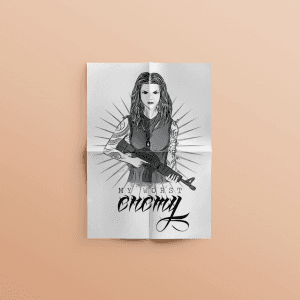
Kill My Worst Enemy Illustration
{"type":"doc","content":[{"type":"paragraph","attrs":{"textAlign":null},"content":[{"type":"text","text":"Cold, tattooed, and armed — \"My Worst Enemy\" is an illustration that doesn't flinch, delivering raw visual power in pure black and white."}]},{"type":"image","attrs":{"src":"https://farooq-agent.web.app/assets/images/works/small/1LiJiu8t_work_image.png","alt":null,"title":null,"width":null,"height":null}},{"type":"paragraph","attrs":{"textAlign":null},"content":[{"type":"text","marks":[{"type":"bold"}],"text":"Illustration — Kill My Worst Enemy"}]},{"type":"paragraph","attrs":{"textAlign":null},"content":[{"type":"text","marks":[{"type":"italic"}],"text":"Personal Artwork · Graphic Illustration · Dark Editorial Style"}]},{"type":"paragraph","attrs":{"textAlign":null},"content":[{"type":"text","text":"A bold, uncompromising illustration rendered entirely in monochrome — a tattooed woman stands front-facing, rifle in hand, long wavy hair framing an expression of quiet, unflinching resolve. The composition radiates literally: sunburst lines emanate from the figure's center, giving her a dark-saint quality — simultaneously threatening and iconic."}]},{"type":"paragraph","attrs":{"textAlign":null},"content":[{"type":"text","text":"The tattoo sleeves on both arms are rendered with deliberate linework detail, communicating a character who has lived, chosen, and committed to every mark on her skin. The rifle is held with casual confidence rather than dramatic aggression — this is not a threat, it is a statement of readiness."}]},{"type":"paragraph","attrs":{"textAlign":null},"content":[{"type":"text","text":"The typography grounds the piece with equal attitude: \"MY WORST ENEMY\" is set in tight, spaced caps above a bold, flowing calligraphic script — the contrast between rigid uppercase and fluid hand-lettering mirroring the character's own duality of control and expression."}]},{"type":"paragraph","attrs":{"textAlign":null},"content":[{"type":"text","text":"Presented on folded paper on a warm neutral surface, the illustration carries the intimacy of something personal — an image made not for a client brief but for the freedom of making something dark and true. No color needed. The black and white is the point."}]},{"type":"paragraph","attrs":{"textAlign":null},"content":[{"type":"text","text":"A piece that speaks the visual language of tattoo art, metal culture, and graphic storytelling — all at once."}]}]}

Pok Pok
{"type":"doc","content":[{"type":"paragraph","attrs":{"textAlign":null},"content":[{"type":"text","text":"Loud, proud, and wielding a spatula — Pok Pok's rooster mascot announces its Taiwanese spicy snack booth with the same energy it brings to every serving."}]},{"type":"image","attrs":{"src":"https://cdn.dribbble.com/users/5057025/screenshots/10940966/media/ea69abc16f89746b97e9373f38c88030.jpg?compress=1&resize=800x600&vertical=top","alt":null,"title":null,"width":null,"height":null}},{"type":"paragraph","attrs":{"textAlign":null},"content":[{"type":"text","marks":[{"type":"bold"}],"text":"Mascot Illustration — Pok Pok"}]},{"type":"paragraph","attrs":{"textAlign":null},"content":[{"type":"text","marks":[{"type":"italic"}],"text":"Booth Brand Illustration · Taiwanese Spicy Snack Seller · F&B"}]},{"type":"paragraph","attrs":{"textAlign":null},"content":[{"type":"text","text":"A bold, character-driven mascot illustration for Pok Pok — a Taiwanese spicy snack booth brand whose identity is built entirely around one supremely confident rooster chef. The name itself is onomatopoeic — the sound a chicken makes, echoed twice for double the attitude — and the illustration delivers on that energy with gleeful commitment."}]},{"type":"paragraph","attrs":{"textAlign":null},"content":[{"type":"text","text":"The mascot is a white rooster in a chef's toque, spatula raised high in one wing, red comb standing proud, eyes wide with the unmistakable look of someone who absolutely knows their food is good. The speech bubble \"POK POK\" erupts from the character in bold red lettering — the brand name literally spoken by the mascot, closing the loop between character and identity in the most direct, playful way possible."}]},{"type":"paragraph","attrs":{"textAlign":null},"content":[{"type":"text","text":"The composition is contained within a warm yellow circle — a sun-like backdrop that radiates appetite-stimulating warmth and gives the mark its badge-like, booth-ready quality. The rooster's white feathers fan out expressively beyond the circle's boundary, breaking the frame with the kind of dynamic energy that makes a street food booth mascot impossible to walk past without noticing."}]},{"type":"paragraph","attrs":{"textAlign":null},"content":[{"type":"text","text":"The illustration style is confident flat-vector with expressive linework — clean enough for signage and menus, characterful enough to anchor the brand's entire personality. A rooster who cooks. A name that sounds like what it is. A booth brand that doesn't need a tagline."}]},{"type":"paragraph","attrs":{"textAlign":null},"content":[{"type":"text","text":"A mascot illustration that makes you hungry before you've even smelled the food."}]}]}
4kampus Frontend Development
{"type":"doc","content":[{"type":"paragraph","attrs":{"textAlign":null},"content":[{"type":"text","text":"Clean code, real events, zero frameworks wasted — 4kampus is a campus event hub built the right way, with Bootstrap 4 and pure frontend craft."}]},{"type":"image","attrs":{"src":"https://farooq-agent.web.app/assets/images/works/large/0X7wYcC3_work_image.jpg","alt":null,"title":null,"width":null,"height":null}},{"type":"paragraph","attrs":{"textAlign":null},"content":[{"type":"text","marks":[{"type":"bold"}],"text":"Frontend Development — 4kampus"}]},{"type":"paragraph","attrs":{"textAlign":null},"content":[{"type":"text","marks":[{"type":"italic"}],"text":"Web Development · Campus Event Hub · HTML, CSS, JavaScript & Bootstrap 4"}]},{"type":"paragraph","attrs":{"textAlign":null},"content":[{"type":"text","text":"A focused frontend development project for 4kampus — a campus event discovery and management platform designed to connect students with everything happening on and around their campus. Built with clean, handcrafted code using Bootstrap 4, HTML, CSS, and JavaScript, the project demonstrates strong command of responsive frontend architecture without relying on heavy JavaScript frameworks."}]},{"type":"paragraph","attrs":{"textAlign":null},"content":[{"type":"text","text":"The desktop UI reveals a well-structured event platform homepage — a vibrant hero section featuring crowd photography that instantly communicates the energy of campus life, followed by a \"Popular Events\" section in a clean card-grid layout. The interface is light, approachable, and purposefully optimized for a young, mobile-first student audience."}]},{"type":"paragraph","attrs":{"textAlign":null},"content":[{"type":"text","text":"The dual-screen mockup — live UI on the desktop monitor alongside raw HTML code in the editor — communicates the full picture of the development process: a polished front-end experience handwritten from the ground up. The Bootstrap 4 badge grounds the project's technical identity, signaling a developer who understands the value of building on reliable, responsive foundations."}]},{"type":"paragraph","attrs":{"textAlign":null},"content":[{"type":"text","text":"The terracotta \"4\" corner badge is a sharp design touch — adding brand personality to the technical presentation and making the project thumbnail instantly distinctive in a portfolio grid."}]},{"type":"paragraph","attrs":{"textAlign":null},"content":[{"type":"text","text":"A clean, purposeful frontend build that proves great campus experiences start with great code."}]}]}

COVID19 Behavior Prevention
{"type": "doc", "content": [{"type": "heading", "attrs": {"level": 1}, "content": [{"type": "text", "text": "COVID-19 Behavior Prevention"}]}, {"type": "paragraph", "content": [{"type": "text", "text": "Illustration of preventive ethics that can be done by the community to prevent transmission of COVID-19."}]}, {"type": "paragraph", "content": [{"type": "image", "attrs": {"src": "https://cdn.dribbble.com/users/5057025/screenshots/11019126/media/b3b507a66f77e563bdbf6e38300b5a7b.jpg?compress=1&resize=1200x900&vertical=top", "width": 1000, "height": 750}}]}]}
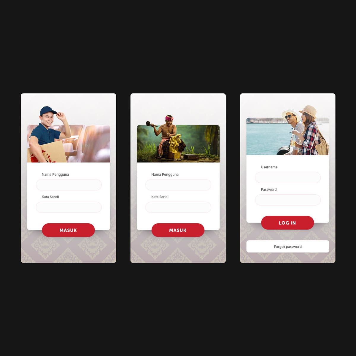
Klik LPD
{"type":"doc","content":[{"type":"paragraph","attrs":{"textAlign":null},"content":[{"type":"text","text":"Klik LPD brings Bali's village credit institution into the digital age — without losing the cultural identity that makes LPD worth trusting in the first place."}]},{"type":"image","attrs":{"src":"https://farooq-agent.web.app/assets/images/works/details/221-klik-lpd/klik-lpd.jpg","alt":null,"title":null,"width":null,"height":null}},{"type":"paragraph","attrs":{"textAlign":null},"content":[{"type":"text","marks":[{"type":"bold"}],"text":"App UI Design — Klik LPD"}]},{"type":"paragraph","attrs":{"textAlign":null},"content":[{"type":"text","marks":[{"type":"italic"}],"text":"Mobile Banking App · Lembaga Perkreditan Desa (LPD) · Bali · Fintech"}]},{"type":"paragraph","attrs":{"textAlign":null},"content":[{"type":"text","text":"A mobile app UI design for Klik LPD — a digital modernization initiative for Bali's LPD (Lembaga Perkreditan Desa), the traditional village-based credit institution that has been the financial backbone of Balinese communities for decades. The challenge: bring LPD into the smartphone era while honoring the cultural context it serves."}]},{"type":"paragraph","attrs":{"textAlign":null},"content":[{"type":"text","text":"The login screen is presented in three contextual variants — each featuring a different user persona against the same UI structure: a delivery worker, a Balinese farmer in traditional attire mid-harvest, and two tourists on a scooter. The variant approach is a deliberate UX research decision, exploring how the same financial platform communicates differently across the diverse user segments that interact with Bali's village economy — local workers, traditional community members, and the tourism sector that flows through LPD-connected businesses."}]},{"type":"paragraph","attrs":{"textAlign":null},"content":[{"type":"text","text":"Each card shares the same structural DNA: a photo header that contextualizes the user, \"Nama Pengguna\" and \"Kata Sandi\" fields, and a bold red \"MASUK / LOG IN\" CTA — but the persona photography shifts the emotional register entirely. The batik pattern at the card base is the design's most culturally specific detail: a textile reference that grounds the app in Balinese identity without being decorative for its own sake."}]},{"type":"paragraph","attrs":{"textAlign":null},"content":[{"type":"text","text":"A fintech UI that respects where the money comes from — and who it serves."}]}]}
Star Blue - Business Card Design
{"type":"doc","content":[{"type":"paragraph","attrs":{"textAlign":null},"content":[{"type":"text","text":"Sharp angles, electric blue, and a star that spins — Star Blue's business card design is the kind that stays on the desk instead of the bin."}]},{"type":"horizontalRule"},{"type":"paragraph","attrs":{"textAlign":null},"content":[{"type":"text","text":"This is an exploration of logo and business card designs from a pivotal period in my creative journey. At the time, I was studying design while working as a graphic designer and print operator at a printing press in Malang, East Java."}]},{"type":"paragraph","attrs":{"textAlign":null},"content":[{"type":"text","text":"It was an immersive, hands-on education — learning print design from the inside out: understanding color profiles for print, mastering bleed areas, and respecting the safe margins before the paper hits the cutter. Exciting times."}]},{"type":"image","attrs":{"src":"https://farooq-agent.web.app/assets/images/works/details/69-star-blue-business-card/bin1.png","alt":null,"title":null,"width":null,"height":null}},{"type":"paragraph","attrs":{"textAlign":null},"content":[{"type":"text","marks":[{"type":"bold"}],"text":"Business Card Design — Star Blue"}]},{"type":"paragraph","attrs":{"textAlign":null},"content":[{"type":"text","marks":[{"type":"italic"}],"text":"Stationery Design · Brand Identity · Creative Studio"}]},{"type":"paragraph","attrs":{"textAlign":null},"content":[{"type":"text","text":"A clean, geometry-driven business card for Star Blue — a brand whose identity is built around a striking angular star logomark, constructed from sharp, overlapping triangular facets in electric blue. The mark has a dynamic, pinwheel-like quality — as if caught mid-rotation — communicating energy, creativity, and precision in equal measure."}]},{"type":"paragraph","attrs":{"textAlign":null},"content":[{"type":"text","text":"The card system presents two complementary sides: the front face centers the logo on a solid charcoal grey background with the wordmark \"STAR**BLUE**\" in mixed-weight type — confident and minimal. The reverse splits into a white logo zone and a matching charcoal contact panel, organizing details for Creative Director Jhon Liu with clean icon-led typography."}]},{"type":"paragraph","attrs":{"textAlign":null},"content":[{"type":"text","text":"Two-color, two-sided, and entirely self-assured — a business card that reflects exactly the kind of design thinking that gets noticed."}]}]}

Stop Underestimating Viruses
{"type":"doc","content":[{"type":"paragraph","attrs":{"textAlign":null},"content":[{"type":"text","text":"A flat vector illustration of a female healthcare worker in a stop pose, urging people not to underestimate COVID-19 — visually conveying the importance of wearing a mask and using hand sanitizer."}]},{"type":"horizontalRule"},{"type":"paragraph","attrs":{"textAlign":null},"content":[{"type":"text","text":"Hand raised, mask on, sanitizer ready — this illustration delivers a public health message with the directness it deserves, because some warnings can't wait to be pretty."}]},{"type":"image","attrs":{"src":"https://cdn.dribbble.com/users/5057025/screenshots/11013379/media/4ddf77f0eb3465e60d40112fdb28238f.jpg?compress=1&resize=1200x900&vertical=top","alt":null,"title":null,"width":null,"height":null}},{"type":"paragraph","attrs":{"textAlign":null},"content":[{"type":"text","marks":[{"type":"bold"}],"text":"Illustration — Stop Underestimating Viruses"}]},{"type":"paragraph","attrs":{"textAlign":null},"content":[{"type":"text","marks":[{"type":"italic"}],"text":"Public Health Illustration · Pandemic Awareness · Editorial"}]},{"type":"paragraph","attrs":{"textAlign":null},"content":[{"type":"text","text":"A clear, purposeful public health illustration created at the height of the pandemic era — delivering its message with the visual economy of a stop sign and the warmth of a concerned professional. The piece is a personal response to a global moment, rendered in a flat illustration style that balances accessibility with emotional weight."}]},{"type":"paragraph","attrs":{"textAlign":null},"content":[{"type":"text","text":"The central figure is a healthcare professional — white coat, surgical mask, auburn hair in a high ponytail — presented in a three-quarter bust composition that brings her directly into the viewer's space. Her right hand is extended forward in a firm stop gesture, breaking the picture plane and addressing the viewer personally. The left hand holds upward, palm open, with a hand sanitizer bottle floating above it — a visual cue to the most basic, most critical protective act of the pandemic period."}]},{"type":"paragraph","attrs":{"textAlign":null},"content":[{"type":"text","text":"The expression, visible above the mask, communicates quiet seriousness rather than alarm — the face of someone who has seen what happens when people underestimate the threat, and is choosing education over panic. The eyes are calm but direct. This is a message delivered with care."}]},{"type":"paragraph","attrs":{"textAlign":null},"content":[{"type":"text","text":"The abstract purple blob background anchors the figure in a soft, non-clinical space — approachable enough for public communication campaigns, social media health content, or awareness posters — while the white coat ensures the authority of the messenger is never in question."}]},{"type":"paragraph","attrs":{"textAlign":null},"content":[{"type":"text","text":"An illustration that communicates a public health imperative in the visual language most likely to be heard: clear, human, and impossible to dismiss."}]}]}
Breast Cancer Care - Character Design
{"type":"doc","content":[{"type":"paragraph","attrs":{"textAlign":null},"content":[{"type":"text","text":"Arms crossed, eyes closed, standing still in her strength — this character design speaks the language of breast cancer awareness without a single word."}]},{"type":"image","attrs":{"src":"https://farooq-agent.web.app/assets/images/works/large/gNY4xqga_work_image.png","alt":null,"title":null,"width":null,"height":null}},{"type":"paragraph","attrs":{"textAlign":null},"content":[{"type":"text","marks":[{"type":"bold"}],"text":"Character Design — Breast Cancer Care"}]},{"type":"paragraph","attrs":{"textAlign":null},"content":[{"type":"text","marks":[{"type":"italic"}],"text":"Awareness Illustration · Women's Health · Flat Vector"}]},{"type":"paragraph","attrs":{"textAlign":null},"content":[{"type":"text","text":"A quietly powerful character illustration created for breast cancer awareness — a woman rendered in a minimal, line-art style with deliberate emotional restraint, presented on a folded paper mockup that adds a tactile, intimate quality to a deeply personal subject."}]},{"type":"paragraph","attrs":{"textAlign":null},"content":[{"type":"text","text":"The figure stands in a composed, self-holding pose — arms crossed protectively across her chest, hands gently clasping her own shoulders — a body language that communicates both self-care and quiet resilience. Her eyes are closed, expression serene, head slightly tilted in a moment of inward calm. This is not a pose of fear or defeat; it is the posture of a woman who has chosen to be present with herself, to listen to her body, to take care."}]},{"type":"paragraph","attrs":{"textAlign":null},"content":[{"type":"text","text":"The illustration style is deliberately gentle: fine linework, a warm blonde hair rendered in soft yellow-gold tones, and a textured amber-patterned top that provides warmth without weight. The overall palette is drawn from the peach and gold tones associated with warmth, femininity, and healing — a considered departure from the clinical pinks of mainstream breast cancer branding."}]},{"type":"paragraph","attrs":{"textAlign":null},"content":[{"type":"text","text":"The folded paper presentation grounds the illustration in the physical world — a reminder that awareness campaigns live in print, in waiting rooms, in flyers passed between hands — and that the most important conversations about health often happen quietly, privately, on a folded piece of paper."}]},{"type":"paragraph","attrs":{"textAlign":null},"content":[{"type":"text","text":"A character illustration that holds space for the experience it represents — with care, with dignity, and with the understanding that sometimes the most powerful thing design can do is simply listen."}]}]}
Illustration Djava App
{"type":"doc","content":[{"type":"paragraph","attrs":{"textAlign":null},"content":[{"type":"text","text":"Where Javanese warmth meets video commerce — Djava App brings the soul of the pasar and the energy of live streaming into a single platform, illustrated with characters that feel genuinely local."}]},{"type":"image","attrs":{"src":"https://farooq-agent.web.app/assets/images/works/large/illustration-djava-app.jpg","alt":null,"title":null,"width":null,"height":null}},{"type":"paragraph","attrs":{"textAlign":null},"content":[{"type":"text","marks":[{"type":"bold"}],"text":"UI Illustration & App Design — Djava App"}]},{"type":"paragraph","attrs":{"textAlign":null},"content":[{"type":"text","marks":[{"type":"italic"}],"text":"Illustration Design · Video Shared Commerce · Javanese Society · Mobile App"}]},{"type":"paragraph","attrs":{"textAlign":null},"content":[{"type":"text","text":"A warmly illustrated UI design for Djava App — a video-shared commerce platform built for and rooted in Javanese society, where traditional market culture meets the modern live-streaming commerce experience. The project's illustration work is its defining creative contribution: custom character illustrations that give the app a soul no stock asset library could provide."}]},{"type":"paragraph","attrs":{"textAlign":null},"content":[{"type":"text","text":"The two onboarding screen illustrations depict a young Javanese woman in traditional brown attire — cap worn casually, batik-adjacent clothing grounding her in Javanese cultural identity — presented across two key states: the first screen shows her walking and waving, carrying a package, communicating the delivery and commerce dimension of the platform; the second shows her seated cross-legged with a market basket overflowing with colorful goods, hands open in a welcoming gesture — the pasar vendor reimagined as a content creator."}]},{"type":"paragraph","attrs":{"textAlign":null},"content":[{"type":"text","text":"The illustration style is warm flat-vector with soft, earthy tones — golden browns, warm tans, and muted reds — a deliberate palette that evokes the warmth of Javanese craftsmanship and wayang visual heritage without resorting to literal cultural cliché. The characters are friendly, modern, and aspirational — a Javanese woman entrepreneur thriving in digital commerce."}]},{"type":"paragraph","attrs":{"textAlign":null},"content":[{"type":"text","text":"The TV Streaming home screen on the right reveals the platform's channel ecosystem: Madyang, AKKINDO, Inspirasi Budaya, and other video content providers organized in a clean card grid with bottom navigation tabs — Videos, Store, Events, News — showing a full-featured commerce and content platform beneath the illustrated warmth."}]},{"type":"paragraph","attrs":{"textAlign":null},"content":[{"type":"text","text":"An app design that earns trust from its audience by speaking their visual language — because the best products feel like they were made by someone who understands exactly who they're for."}]}]}
gokreator
{"type":"doc","content":[{"type":"paragraph","attrs":{"textAlign":null},"content":[{"type":"text","text":"Nulis di gokreator bikin nagih — gokreator is the Indonesian creator membership platform that turns fans into active supporters and content into a sustainable income."}]},{"type":"image","attrs":{"src":"https://farooq-agent.web.app/assets/images/works/details/239-creco/gokreator.jpg","alt":null,"title":null,"width":null,"height":null}},{"type":"paragraph","attrs":{"textAlign":null},"content":[{"type":"text","marks":[{"type":"bold"}],"text":"Web Design — gokreator"}]},{"type":"paragraph","attrs":{"textAlign":null},"content":[{"type":"text","marks":[{"type":"italic"}],"text":"Creator Membership Platform · Landing Page · Indonesia · Patreon-style"}]},{"type":"paragraph","attrs":{"textAlign":null},"content":[{"type":"text","text":"A clean, warm landing page for gokreator — an Indonesian creator membership platform where creators offer exclusive content, community access, and creative insights to paying supporters through monthly memberships."}]},{"type":"paragraph","attrs":{"textAlign":null},"content":[{"type":"text","marks":[{"type":"bold"}],"text":"Hero / Testimonial Section:"},{"type":"text","text":" Rizky Ariestiyansyah, Penulis / Podcaster, shares his experience: \"Nulis di gokreator bikin nagih! Setelah saya mencoba upload beberapa tulisan saya, seneng banget rasanya ketika dapat pembaca-pembaca baru yang jadi pengikut. Fitur-fitur di gokreator gampang buat explore, tinggal kitanya yang mau berkarya atau nggak.\" His profile link (gokreator.com/ariestiyansyah) confirms this is a real creator on the platform. A Podcaster card below shows 27 Pendukung (supporters) — the platform's key conversion metric made visible."}]},{"type":"paragraph","attrs":{"textAlign":null},"content":[{"type":"text","marks":[{"type":"bold"}],"text":"\"Apa itu gokreator?\" Section:"},{"type":"text","text":" \"Di gokreator, Anda dapat membuat penggemar menjadi peserta aktif dalam pekerjaan yang mereka sukai dengan menawarkan keanggotaan bulanan kepada mereka. Anda memberi mereka akses ke konten eksklusif, komunitas, dan wawasan tentang proses kreatif Anda.\" The platform manifesto follows: \"Kami percaya bahwa setiap orang adalah kreator dengan karya dan kemampuan yang unik, sekarang lebih mudah mendapatkan dukungan atau apresiasi atas karyamu dengan gokreator.\""}]},{"type":"paragraph","attrs":{"textAlign":null},"content":[{"type":"text","marks":[{"type":"bold"}],"text":"Features Section:"},{"type":"text","text":" \"Fitur-fitur gokreator\" previews the platform's capability set — three feature icons visible at the bottom."}]},{"type":"paragraph","attrs":{"textAlign":null},"content":[{"type":"text","text":"The blue gradient palette, clean white card layout, and the creator-first illustration style communicate a platform that is warm, accessible, and built to celebrate Indonesian creative talent of every kind."}]},{"type":"paragraph","attrs":{"textAlign":null},"content":[{"type":"text","text":"A Patreon for Indonesia — with the language, cultural context, and creator personas that make it feel genuinely local."}]}]}
Farooqa Creative
{"type":"doc","content":[{"type":"paragraph","attrs":{"textAlign":null},"content":[{"type":"text","text":"Just Create Something New — Farooqa Creative's portfolio website is a designer's self-portrait: dark, confident, responsive, and built with the same craft it promises to deliver."}]},{"type":"image","attrs":{"src":"https://farooq-agent.web.app/assets/images/works/large/farooqa-creative.jpg","alt":null,"title":null,"width":null,"height":null}},{"type":"paragraph","attrs":{"textAlign":null},"content":[{"type":"text","marks":[{"type":"bold"}],"text":"Web Design — Farooqa Creative"}]},{"type":"paragraph","attrs":{"textAlign":null},"content":[{"type":"text","marks":[{"type":"italic"}],"text":"Personal Portfolio Website · Design Studio · Responsive"}]},{"type":"paragraph","attrs":{"textAlign":null},"content":[{"type":"text","text":"A clean, dark-themed portfolio website for Farooqa Creative — Adin's personal design studio — presented across desktop, tablet, and mobile simultaneously to demonstrate full responsive implementation."}]},{"type":"paragraph","attrs":{"textAlign":null},"content":[{"type":"text","text":"The hero is a single bold statement: \"JUST CREATE SOMETHING NEW\" in heavy white display type against a dark grey ground, paired with the Farooqa mascot character — a hooded figure in olive green, rendered in an illustrated flat style that doubles as the studio's brand identity. The combination is direct and entirely on-brand: no decoration, no filler — just a clear creative mandate and the visual identity to back it."}]},{"type":"paragraph","attrs":{"textAlign":null},"content":[{"type":"text","text":"The responsive three-device mockup confirms the site works across every screen — the same hero, the same energy, scaling from 27-inch desktop to smartphone without losing hierarchy or impact. The navigation — Home, Services, Works, For Client, Action — maps a full freelance studio website that serves both portfolio visitors and prospective clients."}]},{"type":"paragraph","attrs":{"textAlign":null},"content":[{"type":"text","text":"A portfolio that practices what it preaches: designed well, built clean, and impossible to misread."}]},{"type":"paragraph","attrs":{"textAlign":null}},{"type":"image","attrs":{"src":"https://hyperfantasy.web.app/assets/images/portfolios/65101564-ae98-45f8-bb68-6e1198314b9b/farooqa_creative.png","alt":null,"title":null,"width":null,"height":null}},{"type":"paragraph","attrs":{"textAlign":null}}]}
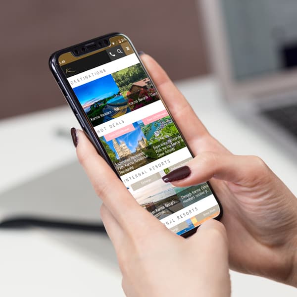
Karma Group Android App Maintenance
{"type":"doc","content":[{"type":"paragraph","attrs":{"textAlign":null},"content":[{"type":"text","text":"Keeping a luxury app running as smoothly as the resorts it represents — this is the ongoing Android maintenance work behind Karma Group's member-facing mobile experience."}]},{"type":"image","attrs":{"src":"https://farooq-agent.web.app/assets/images/works/large/karma-mobile-app.jpg","alt":null,"title":null,"width":null,"height":null}},{"type":"paragraph","attrs":{"textAlign":null},"content":[{"type":"text","marks":[{"type":"bold"}],"text":"Mobile App Maintenance — Karma Group"}]},{"type":"paragraph","attrs":{"textAlign":null},"content":[{"type":"text","marks":[{"type":"italic"}],"text":"Android App Maintenance · React Native · Luxury Hospitality Platform"}]},{"type":"paragraph","attrs":{"textAlign":null},"content":[{"type":"text","text":"An ongoing Android app maintenance engagement for Karma Group — one of Asia-Pacific's premier luxury resort and hospitality brands — ensuring the member-facing mobile application remains performant, stable, and continuously updated with fresh content and features across its growing portfolio."}]},{"type":"paragraph","attrs":{"textAlign":null},"content":[{"type":"text","text":"This maintenance view reveals the app in fuller operational depth than a first-launch build: the content ecosystem is live and active across multiple distinct sections — Destinations, Hot Deals, Internal Resorts, and National Resorts — each populated with real property photography and member-relevant editorial content. Karma Kandara Bali and Karma Saleh are visible in the Destinations carousel; a Hot Deals section surfaces time-sensitive offers with bold pink CTAs; Internal and National Resorts sections extend the app's reach across the group's international property network including Karma Manor in Normandy, France."}]},{"type":"paragraph","attrs":{"textAlign":null},"content":[{"type":"text","text":"The gold-tinted status bar and navigation chrome — subtle but deliberate — reinforce the brand's premium color language at the OS level, a detail that speaks to the depth of platform integration achieved during maintenance phases."}]},{"type":"paragraph","attrs":{"textAlign":null},"content":[{"type":"text","text":"The in-hand mockup — fingers actively scrolling — communicates an app that is used, trusted, and actively maintained. In luxury hospitality, reliability is as important as design; an app that breaks is a guest experience that breaks."}]},{"type":"paragraph","attrs":{"textAlign":null},"content":[{"type":"text","text":"Maintenance work of this caliber requires understanding both the codebase architecture and the brand standards — and delivering both without compromise, update after update."}]}]}
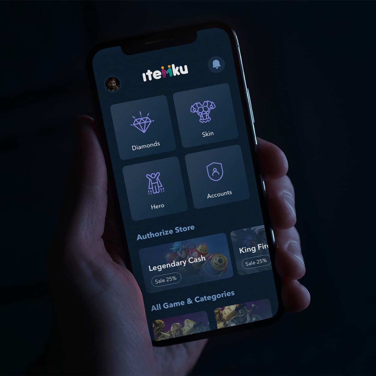
MyItem
{"type":"doc","content":[{"type":"paragraph","attrs":{"textAlign":null},"content":[{"type":"text","text":"Diamonds, Skins, Heroes, Accounts — MyItem (Itemku) is the dark, gamer-first marketplace that makes buying in-game items feel as natural as buying anything else."}]},{"type":"image","attrs":{"src":"https://farooq-agent.web.app/assets/images/works/details/234-myitem/myitem.jpg","alt":null,"title":null,"width":null,"height":null}},{"type":"paragraph","attrs":{"textAlign":null},"content":[{"type":"text","marks":[{"type":"bold"}],"text":"App UI Design — MyItem (Itemku)"}]},{"type":"paragraph","attrs":{"textAlign":null},"content":[{"type":"text","marks":[{"type":"italic"}],"text":"Mobile App · In-Game Item Marketplace · Gaming · Indonesia"}]},{"type":"paragraph","attrs":{"textAlign":null},"content":[{"type":"text","text":"A dark, immersive app UI for MyItem — presented as Itemku, Indonesia's leading in-game item marketplace — designed for gamers who buy and sell diamonds, skins, heroes, and accounts across mobile games, primarily Mobile Legends and similar titles."}]},{"type":"paragraph","attrs":{"textAlign":null},"content":[{"type":"text","text":"The home screen is organized around four primary item category cards in a 2×2 grid — Diamonds, Skin, Hero, Accounts — each with a distinctive purple line-art icon against a dark slate card background. The category system maps the four most traded asset types in Indonesian mobile gaming: currency (Diamonds), cosmetics (Skin), playable characters (Hero), and full account transfers (Accounts). The dark navy-charcoal palette with purple accents is the language of gaming — dark mode, always."}]},{"type":"paragraph","attrs":{"textAlign":null},"content":[{"type":"text","text":"The \"Authorize Store\" section below surfaces verified seller storefronts — Legendary Cash (Sale 25%) and King Fir... (Sale 25% visible) — marketplace sellers with authenticated status, communicating that this is a trusted platform with vetted merchants, not a grey-market exchange. The sale badges in orange create warm contrast against the cool dark UI, drawing the eye to deals without disrupting the overall gaming aesthetic."}]},{"type":"paragraph","attrs":{"textAlign":null},"content":[{"type":"text","text":"\"All Game & Categories\" begins below, hinting at a broader catalog extending beyond Mobile Legends — the full multi-game marketplace visible on scroll."}]},{"type":"paragraph","attrs":{"textAlign":null},"content":[{"type":"text","text":"The Itemku wordmark in multicolor display type — each letter a different accent color — communicates playfulness and variety within the dark gaming aesthetic, a brand identity that is unmistakably digital-native."}]},{"type":"paragraph","attrs":{"textAlign":null},"content":[{"type":"text","text":"A marketplace app that speaks the language of the gamer — dark, fast, and built for people who know exactly what they want to buy."}]}]}
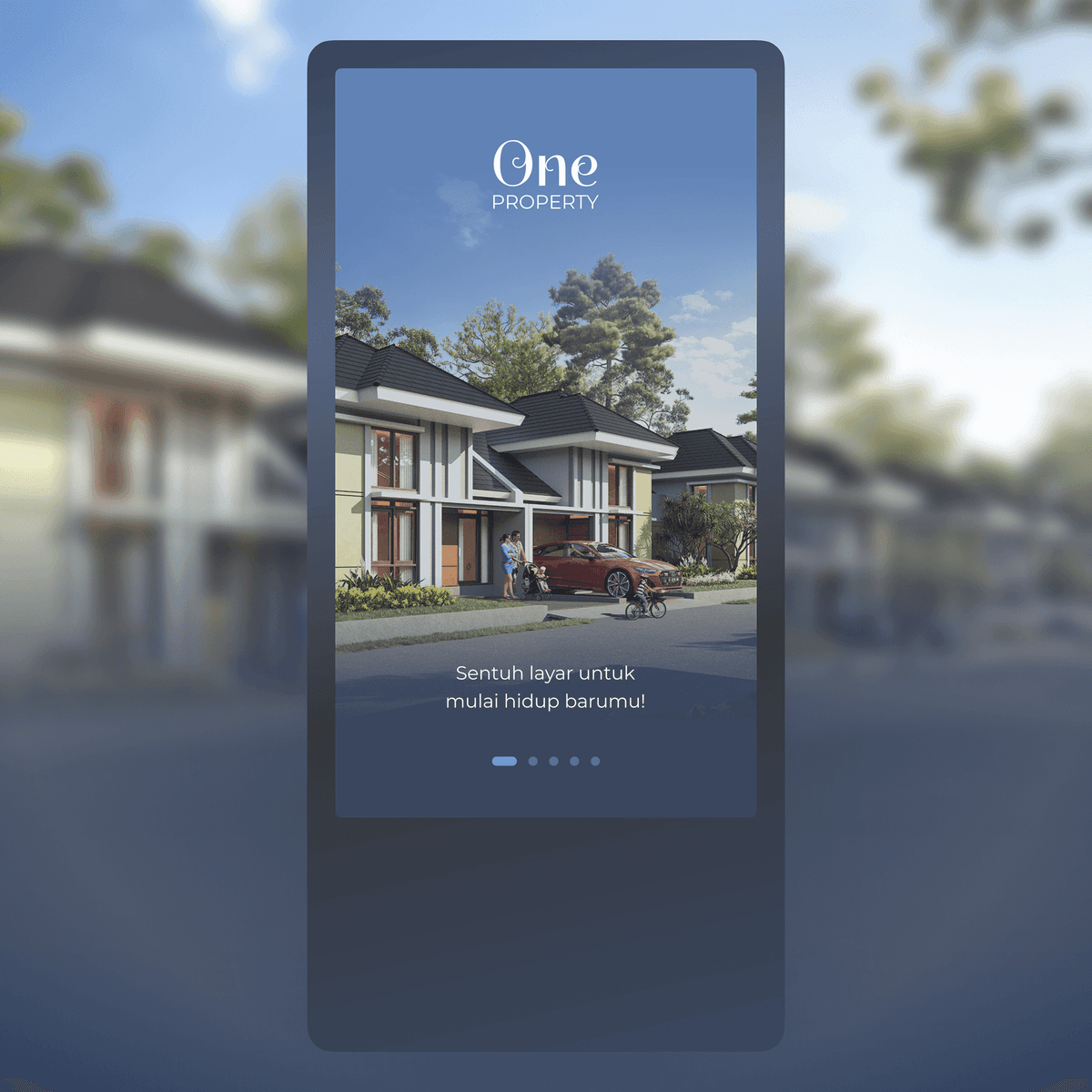
OneProperty - Kiosk
{"type":"doc","content":[{"type":"paragraph","attrs":{"textAlign":null},"content":[{"type":"text","text":"A property kiosk experience that welcomes visitors with a single cinematic image and one simple prompt — touch to start a new life."}]},{"type":"image","attrs":{"src":"https://mir-s3-cdn-cf.behance.net/project_modules/fs/8b05cf144094017.6286218c7258e.png","alt":null,"title":null,"width":null,"height":null}},{"type":"paragraph","attrs":{"textAlign":null},"content":[{"type":"text","marks":[{"type":"bold"}],"text":"UI/UX Design — OneProperty Kiosk"}]},{"type":"paragraph","attrs":{"textAlign":null},"content":[{"type":"text","marks":[{"type":"italic"}],"text":"Kiosk UI · Real Estate · Touch Screen · Property"}]},{"type":"paragraph","attrs":{"textAlign":null},"content":[{"type":"text","text":"OneProperty Kiosk opens with a full-bleed architectural render of a modern two-story residential property — lush greenery, red car in the driveway, a family in the distance — immediately selling the lifestyle before any product information appears. The elegant serif wordmark \"One Property\" sits at the top in white against the sky, striking the right balance between luxury and approachability."}]},{"type":"paragraph","attrs":{"textAlign":null},"content":[{"type":"text","text":"The single interaction prompt — \"Sentuh layar untuk mulai hidup barumu!\" (Touch the screen to start your new life!) — keeps the splash screen completely friction-free. Five pagination dots hint at an onboarding carousel ahead, guiding first-time visitors through the property offering before diving into the full kiosk experience. The portrait orientation and touch-first interaction pattern are purpose-built for a standing display unit in a property showroom or exhibition environment."}]}]}
Arafah Newspaper Advertisement
{"type":"doc","content":[{"type":"paragraph","attrs":{"textAlign":null},"content":[{"type":"text","text":"Bold, warm, and impossible to scroll past — Arafah's newspaper job ad turns a recruitment notice into a brand moment."}]},{"type":"image","attrs":{"src":"https://farooq-agent.web.app/assets/images/works/large/FfZJcslm_work_image.png","alt":null,"title":null,"width":null,"height":null}},{"type":"paragraph","attrs":{"textAlign":null},"content":[{"type":"text","marks":[{"type":"bold"}],"text":"Print Design — Arafah Newspaper Advertisement"}]},{"type":"paragraph","attrs":{"textAlign":null},"content":[{"type":"text","marks":[{"type":"italic"}],"text":"Recruitment Ad · Lowongan Pekerjaan · Newspaper Print Design"}]},{"type":"paragraph","attrs":{"textAlign":null},"content":[{"type":"text","text":"A high-visibility newspaper advertisement designed for Arafah — a recruitment ad (\"Lowongan Pekerjaan\") that refuses to blend into the grey columns around it. The layout commands attention through a warm amber-golden background, bold blue typography, and a structured information hierarchy that guides the reader from headline to application details without friction."}]},{"type":"paragraph","attrs":{"textAlign":null},"content":[{"type":"text","text":"The Arafah logo anchors the top right with clear brand ownership, while oversized blue letterforms and graphic elements create visual weight that punches well above the standard classified format. A clean card-style layout organizes job requirements and contact information into digestible sections — making the ad as functional as it is visually distinctive."}]},{"type":"paragraph","attrs":{"textAlign":null},"content":[{"type":"text","text":"A print advertisement that works as hard as the people it's looking to hire."}]}]}
Bidadari Photo Manipulation
{"type":"doc","content":[{"type":"paragraph","attrs":{"textAlign":null},"content":[{"type":"text","text":"Where the forest becomes sacred and the bride becomes divine — Bidadari is photo manipulation at its most quietly magical."}]},{"type":"image","attrs":{"src":"https://farooq-agent.web.app/assets/images/works/large/UtTHAul0_work_image.jpg","alt":null,"title":null,"width":null,"height":null}},{"type":"paragraph","attrs":{"textAlign":null},"content":[{"type":"text","marks":[{"type":"bold"}],"text":"Photo Manipulation — Bidadari"}]},{"type":"paragraph","attrs":{"textAlign":null},"content":[{"type":"text","marks":[{"type":"italic"}],"text":"Photography Edit · Digital Compositing · Creative Retouching"}]},{"type":"paragraph","attrs":{"textAlign":null},"content":[{"type":"text","text":"A dreamlike photo manipulation presenting a bride transformed into a bidadari — an angel or heavenly nymph in Javanese and Malay mythology. The composition places the figure in a lush, towering forest bathed in soft filtered light, white angel wings spread wide behind her, bouquet in hand, expression serene."}]},{"type":"paragraph","attrs":{"textAlign":null},"content":[{"type":"text","text":"The manipulation is executed with atmospheric sensitivity: the forest background, the light source, and the wing compositing all share the same cool, ethereal tone — creating a seamless world rather than a forced collage. The white wedding gown flows naturally into the forest floor, and the wings emerge from the figure's silhouette as if they always belonged there."}]},{"type":"paragraph","attrs":{"textAlign":null},"content":[{"type":"text","text":"Signed by Geonk in the lower right — a personal creative work that demonstrates early mastery of digital compositing, light matching, and the ability to build a visual narrative from multiple photographic elements."}]}]}
Zombrema
{"type":"doc","content":[{"type":"paragraph","attrs":{"textAlign":null},"content":[{"type":"text","text":"From pencil sketch to wearable nightmare — Zombrema graduates from paper to t-shirt and arrives exactly as promised: undead, unflinching, and impossible to look away from."}]},{"type":"image","attrs":{"src":"https://farooq-agent.web.app/assets/images/works/large/fFZNF0mp_work_image.png","alt":null,"title":null,"width":null,"height":null}},{"type":"paragraph","attrs":{"textAlign":null},"content":[{"type":"text","marks":[{"type":"bold"}],"text":"T-Shirt Design — Zombrema"}]},{"type":"paragraph","attrs":{"textAlign":null},"content":[{"type":"text","marks":[{"type":"italic"}],"text":"Apparel Design · Zombie Character · Horror Illustration · Original IP"}]},{"type":"paragraph","attrs":{"textAlign":null},"content":[{"type":"text","text":"Zombrema — the chibi zombie character born from a pencil sketch on folded paper — makes its full evolution into a finished, wearable vector illustration on a white t-shirt, and the upgrade is everything the sketch promised it would be."}]},{"type":"paragraph","attrs":{"textAlign":null},"content":[{"type":"text","text":"The character design is now fully realized in bold flat vector: a blue-grey undead face with wild black hair, hollow red glowing eyes, and a jagged open mouth exposing rotten teeth in a grin that lands somewhere between terrifying and delightfully absurd. The rotting hands reach forward from the lower body — clawed, expressive, and dripping with the same horror-comedy energy that defined Zombrema from its first pencil line."}]},{"type":"paragraph","attrs":{"textAlign":null},"content":[{"type":"text","text":"The \"ZOMBREMA\" logotype splashes beneath the character in a dramatic blood-red splatter typeface — the letters dissolving at the edges into jagged ink drops and gore details that frame the composition with theatrical excess. The typography is genre-perfect: metal band logo meets horror movie poster, set in motion rather than standing still."}]},{"type":"paragraph","attrs":{"textAlign":null},"content":[{"type":"text","text":"The white t-shirt ground makes every color pop with maximum contrast — the icy blue skin, the blazing red eyes, the crimson splatter typography — creating a print-ready design that would look equally at home in a streetwear drop, a fan merch booth, or a Halloween pop-up shop."}]},{"type":"paragraph","attrs":{"textAlign":null},"content":[{"type":"text","text":"A character that started as a doodle and arrived as a statement — Zombrema was always going to end up on a shirt. It was just a matter of time."}]}]}
Theater Poster
{"type":"doc","content":[{"type":"image","attrs":{"src":"https://farooq-agent.web.app/assets/images/works/details/210-saladin-before-learn-design/paem-theater-poster.jpg","alt":null,"title":null,"width":null,"height":null}},{"type":"paragraph","attrs":{"textAlign":null},"content":[{"type":"text","marks":[{"type":"bold"}],"text":"Theater Poster — \"Matahari Di Sebuah Jalan Kecil\""},{"type":"text","text":" "},{"type":"hardBreak"},{"type":"text","marks":[{"type":"italic"}],"text":"PA'EM Theater Production · 2011"},{"type":"hardBreak"},{"type":"hardBreak"},{"type":"text","text":"A bold event poster designed for a student theater production, demonstrating early command of visual hierarchy and dramatic composition. The piece layers a warm, sun-drenched landscape — rendered in deep amber and burnt orange — against a stark black lower half, creating a natural stage-like division between atmosphere and information."}]},{"type":"paragraph","attrs":{"textAlign":null},"content":[{"type":"text","text":"The silhouetted figure standing at the horizon draws the eye immediately, evoking themes of journey and solitude that mirror the play's narrative. Custom hand-styled typography in high-contrast yellow commands attention, while the deliberate mix of display fonts adds an expressive, street-art energy fitting for a theatrical context."}]},{"type":"paragraph","attrs":{"textAlign":null},"content":[{"type":"text","text":"Directional signpost elements are used as functional design devices — guiding the reader through event details while maintaining thematic cohesion. The PA'EM heraldic badge, rendered in purple and gold, grounds the piece with institutional identity."}]},{"type":"paragraph","attrs":{"textAlign":null},"content":[{"type":"text","text":"A work that reflects strong instincts for storytelling through design — even at an early stage of the creative journey."}]}]}
Arafah Catalog
{"type":"doc","content":[{"type":"paragraph","attrs":{"textAlign":null},"content":[{"type":"text","text":"Hot deals, warm spirit — Arafah's Ramadan catalog delivers seasonal promotions in a format as inviting as the month itself."}]},{"type":"image","attrs":{"src":"https://farooq-agent.web.app/assets/images/works/large/RXmjtsRZ_work_image.png","alt":null,"title":null,"width":null,"height":null}},{"type":"paragraph","attrs":{"textAlign":null},"content":[{"type":"text","marks":[{"type":"bold"}],"text":"Print Design — Arafah Product Catalog"}]},{"type":"paragraph","attrs":{"textAlign":null},"content":[{"type":"text","marks":[{"type":"italic"}],"text":"Ramadan Promo Catalog · Electronics & Furniture · Printed Collateral"}]},{"type":"paragraph","attrs":{"textAlign":null},"content":[{"type":"text","text":"A seasonal product catalog designed for Arafah Electronics & Furniture — produced for their Ramadan promotional campaign (\"Bulan Berkah Ramadhan · Hot Promo\"). The printed catalog cover leads with a vibrant royal blue background anchored by the Arafah logo in a clean white cartouche, immediately establishing brand ownership. The Ramadan campaign identity — rendered in bold, festive yellow-green script with a mosque-and-crescent motif — delivers the seasonal message with cultural warmth and commercial directness."}]},{"type":"paragraph","attrs":{"textAlign":null},"content":[{"type":"text","text":"A practical, high-impact print piece that bridges brand identity and seasonal retail in a single folded format — designed to be picked up, flipped through, and acted upon."}]}]}
Geohorse - Character Design
{"type":"doc","content":[{"type":"paragraph","attrs":{"textAlign":null},"content":[{"type":"text","text":"Part sunflower, part street kid, all attitude — Geohorse is the graffiti artist mascot that blooms on walls and owns every surface it touches."}]},{"type":"image","attrs":{"src":"https://farooq-agent.web.app/assets/images/works/large/S7LWLcEB_work_image.png","alt":null,"title":null,"width":null,"height":null}},{"type":"paragraph","attrs":{"textAlign":null},"content":[{"type":"text","marks":[{"type":"bold"}],"text":"Mascot Design — Geohorse"}]},{"type":"paragraph","attrs":{"textAlign":null},"content":[{"type":"text","marks":[{"type":"italic"}],"text":"Character Design · Street Graffiti Artist Mascot · Urban Culture"}]},{"type":"paragraph","attrs":{"textAlign":null},"content":[{"type":"text","text":"A compact, striking mascot illustration for Geohorse — a street graffiti artist identity — built around a character concept that fuses organic nature with urban edge in one unexpectedly perfect combination. The result is a mascot as original as the walls it's designed to tag."}]},{"type":"paragraph","attrs":{"textAlign":null},"content":[{"type":"text","text":"The Geohorse character is a small, bold figure with a sunflower crown — radiating yellow petals forming a dramatic halo around a deep terracotta-brown face with a single oversized cartoon eye. The mono-eye design is immediately iconic: mysterious, expressive, and distinct from every other mascot on the block. The rounded brown body tapers into yellow accent limbs — arms and legs rendered in chunky, graphic simplicity, mid-stride in a casual walking pose that communicates the unhurried confidence of a street artist who owns their territory."}]},{"type":"paragraph","attrs":{"textAlign":null},"content":[{"type":"text","text":"The color palette — burnt terracotta, yellow-gold, and bold black outlines — draws from both the warmth of street murals and the high-contrast aesthetics of graffiti culture. The sunflower crown is the character's most subversive detail: a flower on a street artist, nature claiming space in the urban environment, beauty pushing through concrete. It communicates a creative vision that finds life and color in unexpected places — which is, at its core, exactly what graffiti art does."}]},{"type":"paragraph","attrs":{"textAlign":null},"content":[{"type":"text","text":"Presented on a folded paper mockup, the character feels like a sticker pulled from a back pocket or a throw-up tag that's appeared overnight on a clean wall — intimate, spontaneous, and entirely its own thing."}]},{"type":"paragraph","attrs":{"textAlign":null},"content":[{"type":"text","text":"A mascot that belongs to the street and brings the garden with it."}]}]}
PAEM Logo Design (Class Identity)
{"type":"doc","content":[{"type":"paragraph","attrs":{"textAlign":null},"content":[{"type":"text","marks":[{"type":"bold"}],"text":"Logo Design — PA'EM Class Identity"},{"type":"text","text":" "},{"type":"hardBreak"},{"type":"text","marks":[{"type":"italic"}],"text":"Emblem / Crest Design · Student Organization · 2009"},{"type":"hardBreak"},{"type":"hardBreak"},{"type":"text","text":"A heraldic crest logo designed for PA'EM, a student class organization, demonstrating early exploration of emblem-based identity design. The composition is structured around a traditional shield divided into four quadrants — each housing a distinct symbol: a mosque dome, a trophy, a microscope, and a heart — collectively representing the pillars of the organization's values: faith, achievement, knowledge, and community."}]},{"type":"paragraph","attrs":{"textAlign":null},"content":[{"type":"text","text":"A regal crown sits at the apex, flanked by symmetrical baroque-style floral flourishes that add decorative character while reinforcing the crest's authoritative framing. The wordmark \"pa'em\" is set on a ribbon banner that bisects the shield horizontally, rendered in a rounded, approachable typeface that balances the formality of the crest with a sense of youthful identity."}]},{"type":"paragraph","attrs":{"textAlign":null},"content":[{"type":"text","text":"The entire composition is executed in a monochromatic purple palette — ranging from deep violet to soft lavender — creating a cohesive, print-ready mark with strong scalability. A ribbon footer anchors the piece with the founding year, 2009."}]},{"type":"paragraph","attrs":{"textAlign":null},"content":[{"type":"text","text":"A confident early exercise in heraldic composition, symbol hierarchy, and identity systems — showing instinctive understanding of how visual elements communicate organizational character."},{"type":"hardBreak"}]},{"type":"image","attrs":{"src":"https://farooq-agent.web.app/assets/images/works/details/210-saladin-before-learn-design/paem-class-logo.jpg","alt":null,"title":null,"width":null,"height":null}},{"type":"paragraph","attrs":{"textAlign":null}}]}
Graha Natura - Website Design
{"type":"doc","content":[{"type":"paragraph","attrs":{"textAlign":null},"content":[{"type":"text","text":"Comfortable Home for a Comfortable Life — Graha Natura's website sells the feeling of home long before the floor plan is opened."}]},{"type":"image","attrs":{"src":"https://farooq-agent.web.app/assets/images/works/large/okllJEFy_work_image.jpg","alt":null,"title":null,"width":null,"height":null}},{"type":"paragraph","attrs":{"textAlign":null},"content":[{"type":"text","marks":[{"type":"bold"}],"text":"Web Design — Graha Natura"}]},{"type":"paragraph","attrs":{"textAlign":null},"content":[{"type":"text","marks":[{"type":"italic"}],"text":"Property Website · Residential Development · Surabaya"}]},{"type":"paragraph","attrs":{"textAlign":null},"content":[{"type":"text","text":"A warm, lifestyle-driven website for Graha Natura — a residential property development in Surabaya that leads with emotion, not specs."}]},{"type":"paragraph","attrs":{"textAlign":null},"content":[{"type":"text","text":"The hero is a split-screen composition: a mother and daughter reading together on a bed in a softly lit bedroom occupies the left two-thirds — intimate, warm, and aspirational. The right panel reveals an aerial view of the development itself — greenery, streets, low-density residential clusters. The pairing communicates both the interior life and the neighborhood context in a single frame, answering the two questions every property buyer asks: what will home feel like, and what's around it?"}]},{"type":"paragraph","attrs":{"textAlign":null},"content":[{"type":"text","text":"\"Comfortable Home for a Comfortable Life\" is the hero headline — plain, sincere, and precisely targeted at the Surabaya middle-class family buyer. The teal CTA button provides the only accent color in an otherwise warm, earthy palette of browns, creams, and dark greens."}]},{"type":"paragraph","attrs":{"textAlign":null},"content":[{"type":"text","text":"The dark semi-transparent navigation with a tree logomark positions Graha Natura as a nature-conscious development — reinforcing the \"alam\" in the brand name before a single feature is listed."}]}]}

Pak Topo Sticker
{"type":"doc","content":[{"type":"paragraph","attrs":{"textAlign":null},"content":[{"type":"text","text":"Sunglasses on, revolvers crossed, roses at the base — Pak Topo Club is the sticker design that turns a character into a legend before you've even asked who he is."}]},{"type":"image","attrs":{"src":"https://farooq-agent.web.app/assets/images/works/small/QZcfAJHH_work_image.jpg","alt":null,"title":null,"width":null,"height":null}},{"type":"paragraph","attrs":{"textAlign":null},"content":[{"type":"text","marks":[{"type":"bold"}],"text":"Sticker Design — Pak Topo Club"}]},{"type":"paragraph","attrs":{"textAlign":null},"content":[{"type":"text","marks":[{"type":"italic"}],"text":"Character Sticker · Community Identity · Outlaw Aesthetic"}]},{"type":"paragraph","attrs":{"textAlign":null},"content":[{"type":"text","text":"A boldly characterful sticker illustration for Pak Topo Club — a community or group identity built around a single, immediately iconic character: a grinning, bearded figure in dark sunglasses and a white bandana, flanked by two crossed revolvers in the classic outlaw heraldry formation."}]},{"type":"paragraph","attrs":{"textAlign":null},"content":[{"type":"text","text":"The character design is all confidence and charisma — a wide, toothy grin beneath dark wraparound shades, brown hair peeking from beneath the headband, white beard suggesting a man of experience and authority. The revolvers crossed behind the head elevate the composition into something between a coat of arms and a gang patch — the visual language of loyalty, brotherhood, and a group that takes its identity seriously while not taking itself too seriously."}]},{"type":"paragraph","attrs":{"textAlign":null},"content":[{"type":"text","text":"The \"PAK TOPO\" wordmark is set in a chunky, distressed serif with a brown-on-cream color treatment that evokes aged leather and weathered wood — the aesthetic of something that has been around long enough to earn its reputation. \"CLUB\" anchors below in a bold condensed face, flanked by two illustrated red roses — the classic outlaw romanticism symbol that softens the edge of the revolvers above without undermining the mark's toughness."}]},{"type":"paragraph","attrs":{"textAlign":null},"content":[{"type":"text","text":"The entire composition is presented with a crisp white sticker outline — die-cut ready, wall-ready, laptop-ready, jacket-patch-ready. The warm cardboard-textured background in the mockup grounds the sticker in the physical world, communicating a design built for real surfaces and real communities."}]},{"type":"paragraph","attrs":{"textAlign":null},"content":[{"type":"text","text":"A sticker that communicates group identity, personal legend, and just enough attitude to make you want to be in the club."}]}]}

Paramex - Outdoor Advertising
{"type":"doc","content":[{"type":"paragraph","attrs":{"textAlign":null},"content":[{"type":"text","text":"When a headache hits, there's no time for subtlety — Paramex's billboard puts the pain front and center, and the solution right beside it."}]},{"type":"image","attrs":{"src":"https://farooq-agent.web.app/assets/images/works/large/TmUwGIPX_work_image.png","alt":null,"title":null,"width":null,"height":null}},{"type":"paragraph","attrs":{"textAlign":null},"content":[{"type":"text","marks":[{"type":"bold"}],"text":"Outdoor Advertising — Paramex"}]},{"type":"paragraph","attrs":{"textAlign":null},"content":[{"type":"text","marks":[{"type":"italic"}],"text":"Billboard Design · OTC Headache Medicine · Out-of-Home Campaign"}]},{"type":"paragraph","attrs":{"textAlign":null},"content":[{"type":"text","text":"A bold out-of-home advertisement for Paramex — one of Indonesia's most recognized over-the-counter headache medicines. The billboard design speaks directly to its audience through pure visual empathy: a young man in uniform pressing his temple, expression tight with the unmistakable look of a headache in full force."}]},{"type":"paragraph","attrs":{"textAlign":null},"content":[{"type":"text","text":"The radial ripple graphic emanating from his head is a classic but effective device — visualizing pain as a physical wave, making the symptom immediately relatable to any passerby stuck in traffic or walking under the board. Multiple ghosted figures in the background extend the narrative, suggesting this is not one person's problem — it is everyone's."}]},{"type":"paragraph","attrs":{"textAlign":null},"content":[{"type":"text","text":"The Paramex logo commands the upper left in bold blue, and a product pack appears bottom-center — placing the solution in clear view the moment the problem has been felt. Clean, high-contrast, and emotionally direct — exactly what a roadside medicine ad demands."}]}]}
Academica Platform Manage School Assignments
{"type":"doc","content":[{"type":"paragraph","attrs":{"textAlign":null},"content":[{"type":"text","text":"A school assignment management platform that keeps students, teachers, and deadlines all in the same place — organized, trackable, and stress-free."}]},{"type":"image","attrs":{"src":"https://cdn.dribbble.com/userupload/4447133/file/original-e7f4af0af2257e20980e9f6f8e9633e4.png","alt":null,"title":null,"width":null,"height":null}},{"type":"paragraph","attrs":{"textAlign":null},"content":[{"type":"text","marks":[{"type":"bold"}],"text":"UI/UX Design — Academica"}]},{"type":"paragraph","attrs":{"textAlign":null},"content":[{"type":"text","marks":[{"type":"italic"}],"text":"Web App · Education · Assignment Management · School Platform"}]},{"type":"paragraph","attrs":{"textAlign":null},"content":[{"type":"text","text":"Academica is a digital platform designed to streamline the way schools manage assignments — bringing together students, teachers, and academic workflows into a single organized interface. The platform addresses a common friction point in education: the scattered, hard-to-track nature of assignments across subjects, classes, and deadlines."}]},{"type":"paragraph","attrs":{"textAlign":null},"content":[{"type":"text","text":"The UI centers on clarity and hierarchy — surfacing upcoming due dates, subject categories, submission statuses, and teacher feedback in a dashboard that works equally well for a student managing their workload and a teacher monitoring class progress. Assignment cards, progress indicators, and notification systems replace the chaos of paper handouts and fragmented messaging apps."}]},{"type":"paragraph","attrs":{"textAlign":null},"content":[{"type":"text","text":"Designed with the school environment in mind, Academica balances a clean academic aesthetic with enough structure to handle the complexity of multi-subject, multi-class assignment management at scale."}]}]}
Giring Kambing
{"type":"doc","content":[{"type":"paragraph","attrs":{"textAlign":null},"content":[{"type":"text","text":"One grinning farmer, one very unimpressed goat — Giring Kambing's app icon tells the whole game story before a single tap."}]},{"type":"image","attrs":{"src":"https://farooq-agent.web.app/assets/images/works/large/YGLfq7No_work_image.jpg","alt":null,"title":null,"width":null,"height":null}},{"type":"paragraph","attrs":{"textAlign":null},"content":[{"type":"text","marks":[{"type":"bold"}],"text":"App Icon Design — Giring Kambing"}]},{"type":"paragraph","attrs":{"textAlign":null},"content":[{"type":"text","marks":[{"type":"italic"}],"text":"Mobile Game Icon · Casual Game · Indonesian · Goat Herding"}]},{"type":"paragraph","attrs":{"textAlign":null},"content":[{"type":"text","text":"A richly characterful app icon for Giring Kambing — a casual mobile game centered on the thoroughly Indonesian activity of goat herding — delivering its entire game premise in a single, energetic square composition that would stop any finger mid-scroll through an app store."}]},{"type":"paragraph","attrs":{"textAlign":null},"content":[{"type":"text","text":"The icon centers on two characters whose dynamic immediately establishes the game's comic tension: a stout, cheerful farmer in a patched straw hat and round glasses, whip in hand, laughing with the complete confidence of a man who believes he is in charge — and beside him, a tired, droopy-eyed goat who has clearly been herded one too many times today, expressing the resigned dignity of an animal with opinions it cannot voice. The farmer's joy and the goat's weariness are the entire joke and the entire game, communicated in two faces."}]},{"type":"paragraph","attrs":{"textAlign":null},"content":[{"type":"text","text":"The composition is set against a vibrant forest green rounded-square icon frame — the standard app icon format — with a radial sunburst of lighter green rays emanating from the center, creating depth and visual energy that draws the eye even at small sizes on a phone screen. Grass and leaf details at the base ground the characters in their rural environment without cluttering the composition."}]},{"type":"paragraph","attrs":{"textAlign":null},"content":[{"type":"text","text":"The \"Giring Kambing\" logotype is set in a warm brown display typeface with a slightly bubbly, wood-carved quality — earthy, playful, and perfectly sized to be legible at app icon scale. The typeface carries the warmth of Indonesian kampung life without any pretension."}]},{"type":"paragraph","attrs":{"textAlign":null},"content":[{"type":"text","text":"An app icon that makes you smile, makes you curious, and makes you tap — which is exactly what an app icon should do."}]}]}
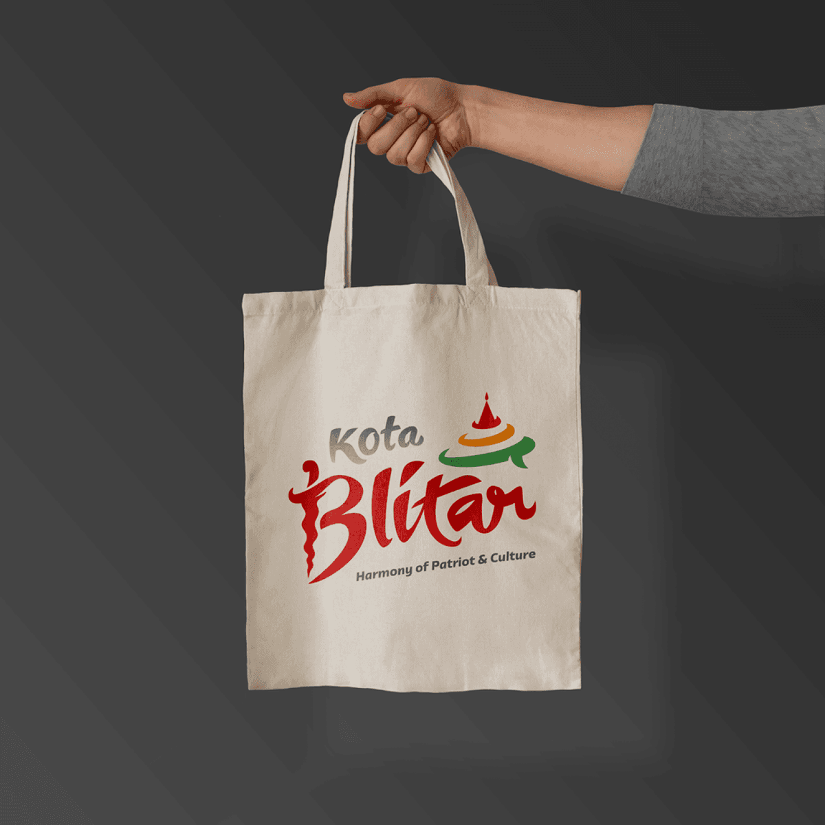
City Branding Kota Blitar
{"type":"doc","content":[{"type":"paragraph","attrs":{"textAlign":null},"content":[{"type":"image","attrs":{"src":"https://mir-s3-cdn-cf.behance.net/project_modules/max_1200/c2b480149523067.62e9296cb5a02.png","alt":null,"title":null,"width":1140,"height":1140}}]},{"type":"paragraph","attrs":{"textAlign":null},"content":[{"type":"text","text":" \"Harmony of Patriot & Culture\""},{"type":"hardBreak"},{"type":"hardBreak"},{"type":"text","marks":[{"type":"bold"}],"text":"City Branding — Kota Blitar"},{"type":"hardBreak"},{"type":"text","marks":[{"type":"italic"}],"text":"City Identity Design · East Java, Indonesia"}]},{"type":"paragraph","attrs":{"textAlign":null},"content":[{"type":"text","text":"A bold and culturally rich city branding mark designed for Kota Blitar — the historic East Javanese city known as the resting place of Indonesia's founding father, Soekarno. The identity is anchored by a dominant script wordmark \"Blitar\" rendered in deep crimson red, with an expressive, hand-lettered quality that conveys civic pride and cultural energy. The fluid strokes carry a sense of motion and character — far removed from sterile municipal design."}]},{"type":"paragraph","attrs":{"textAlign":null},"content":[{"type":"text","text":"Above the wordmark, a stylized architectural icon depicting the spire of a traditional Javanese temple or monument is set within sweeping arcs of green and orange — a subtle nod to both the city's heritage architecture and the natural landscape of East Java. The color palette is deliberate and meaningful: red for patriotism and courage, green for prosperity and nature, orange for warmth and optimism."}]},{"type":"paragraph","attrs":{"textAlign":null},"content":[{"type":"text","text":"The supporting wordmark \"Kota\" is set in a lighter grey script, creating a comfortable visual hierarchy that lets \"Blitar\" command full attention. The tagline \"Harmony of Patriot & Culture\" grounds the identity in the city's dual narrative — its deep patriotic legacy and its rich Javanese cultural heritage."}]},{"type":"paragraph","attrs":{"textAlign":null},"content":[{"type":"text","text":"A confident, place-specific identity that successfully translates local pride and historical significance into a cohesive, memorable civic brand."}]},{"type":"paragraph","attrs":{"textAlign":null},"content":[{"type":"image","attrs":{"src":"https://mir-s3-cdn-cf.behance.net/project_modules/1400_opt_1/f81bcb149523067.62e92a479bb67.png","alt":null,"title":null,"width":1140,"height":1140}}]}]}
Ladys Park Sticker
{"type":"doc","content":[{"type":"paragraph","attrs":{"textAlign":null},"content":[{"type":"text","text":"Retro, cheeky, and impossible to ignore — Lady's Park sticker design turns a brand into something people actually want to stick everywhere."}]},{"type":"image","attrs":{"src":"https://farooq-agent.web.app/assets/images/works/large/mK5TjtfG_work_image.png","alt":null,"title":null,"width":null,"height":null}},{"type":"paragraph","attrs":{"textAlign":null},"content":[{"type":"text","marks":[{"type":"bold"}],"text":"Sticker Design — Lady's Park"}]},{"type":"paragraph","attrs":{"textAlign":null},"content":[{"type":"text","marks":[{"type":"italic"}],"text":"Brand Sticker · Retro Style · Die-Cut"}]},{"type":"paragraph","attrs":{"textAlign":null},"content":[{"type":"text","text":"A bold, retro-flavored sticker design for Lady's Park — a brand identity expressed through two distinct die-cut sticker variants: a wordmark sticker and an icon sticker, scattered in a repeating pattern that immediately communicates collectability and street-culture energy."}]},{"type":"paragraph","attrs":{"textAlign":null},"content":[{"type":"text","text":"The wordmark \"Lady's Park\" is set in a thick, groovy script with strong black outlines and vibrant yellow fill — a typographic style that pulls directly from 1970s Americana: funky, confident, and dripping with personality. The icon sticker transforms a classic road warning sign into a playful brand symbol — a yellow diamond featuring a silhouette of elegant legs, a winking visual pun that captures the brand's feminine, slightly irreverent character."}]},{"type":"paragraph","attrs":{"textAlign":null},"content":[{"type":"text","text":"The white border cut around each sticker is crisp and clean, ready for real-world application on laptops, helmets, bottles, or storefronts. A sticker design that makes you reach for it before you've even thought about it."}]}]}
3D Portfolio
{"type":"doc","content":[{"type":"paragraph","attrs":{"textAlign":null},"content":[{"type":"text","text":"Red, blocky, bass guitar in hand — the Geonk 3D character shreds into the portfolio with the confidence of a designer who refuses to be boring, even in three dimensions."}]},{"type":"image","attrs":{"src":"https://farooq-agent.web.app/assets/images/works/large/JwkCZcPt_work_image.png","alt":null,"title":null,"width":null,"height":null}},{"type":"paragraph","attrs":{"textAlign":null},"content":[{"type":"text","marks":[{"type":"bold"}],"text":"3D Design — Geonk 3D Portfolio Character"}]},{"type":"paragraph","attrs":{"textAlign":null},"content":[{"type":"text","marks":[{"type":"italic"}],"text":"3D Illustration · Personal Brand · Portfolio Identity"}]},{"type":"paragraph","attrs":{"textAlign":null},"content":[{"type":"text","text":"A striking 3D character render that takes the Geonk brand identity into a full third dimension — a blocky, action-figure-style robot rendered in vivid hot red with holographic chrome accents, posed mid-shred with a bass guitar, the \"GEONK\" wordmark stamped boldly across its square head."}]},{"type":"paragraph","attrs":{"textAlign":null},"content":[{"type":"text","text":"The character design draws from the visual language of vinyl collectible toys and designer figures — the squared-off body segments, the articulated joints, the oversized feet planted in a wide rock-star stance. Every surface catches light differently: the red body has a warm plastic sheen, the joints and feet shift into holographic iridescent chrome, and the bass guitar itself is rendered with the meticulous detail of something worth playing. The pink-to-lavender gradient studio environment wraps the character in a soft, dreamy glow that contrasts perfectly with the character's hard-edged, no-nonsense silhouette."}]},{"type":"paragraph","attrs":{"textAlign":null},"content":[{"type":"text","text":"The \"GEONK\" stamp on the head unit is the brand's signature move — claiming the figure as portfolio property in the most direct way possible, turning the character itself into a logo application. It is a designer's figure, made by a designer, wearing the designer's name."}]},{"type":"paragraph","attrs":{"textAlign":null},"content":[{"type":"text","text":"The bass guitar is the character detail that elevates this from brand exercise to personal statement: this is not just a portfolio mascot, it is a self-portrait of someone who designs with the same energy and commitment they bring to playing music — full body, both hands, all in."}]},{"type":"paragraph","attrs":{"textAlign":null},"content":[{"type":"text","text":"A 3D render that proves: when Geonk shows up, it shows up completely."}]}]}
Snapnotes
{"type":"doc","content":[{"type":"paragraph","attrs":{"textAlign":null},"content":[{"type":"text","text":"A note app that actually matches the chaos of daily life — grocery lists, WiFi passwords, tax reminders, and medication checklists all in one colorful, no-fuss space."}]},{"type":"image","attrs":{"src":"https://mir-s3-cdn-cf.behance.net/project_modules/max_1200/7c736e164614065.64060fa954a65.png","alt":null,"title":null,"width":null,"height":null}},{"type":"paragraph","attrs":{"textAlign":null},"content":[{"type":"text","marks":[{"type":"bold"}],"text":"UI/UX Design — Snapnotes"}]},{"type":"paragraph","attrs":{"textAlign":null},"content":[{"type":"text","marks":[{"type":"italic"}],"text":"Mobile App · Productivity · Note Taking"}]},{"type":"paragraph","attrs":{"textAlign":null},"content":[{"type":"text","text":"Snapnotes is a feature-rich note-taking app designed around real, everyday use cases. The home screen presents notes in a Pinterest-style masonry grid, with each card color-coded by priority or mood — a recipe grocery list in white, a honey purchase reminder in orange, a tax payment alert in yellow, a WiFi password note in neutral, a medicine restock in green. Filter tabs (All, High-Prio, Favorite, Cook) let users cut through the noise fast."}]},{"type":"paragraph","attrs":{"textAlign":null},"content":[{"type":"text","text":"The note editor screen goes beyond plain text — supporting rich formatting (bold, italic, underline, highlight), inline images, and numbered lists, as seen in a detailed asset declaration note with an embedded Jeep Rubicon Wrangler image. A bottom toolbar provides quick access to color themes, background wallpapers, image insertion, and collaboration tools, giving each note a distinct visual identity. Voice input and camera shortcuts in the home screen's bottom bar make capturing new notes frictionless, whether typing, speaking, or snapping a photo."}]}]}
NOCTURE Branding
{"type":"doc","content":[{"type":"image","attrs":{"src":"https://farooq-agent.web.app/assets/images/works/small/nLXidNgf_work_image.jpg","alt":null,"title":null,"width":null,"height":null}},{"type":"paragraph","attrs":{"textAlign":null},"content":[{"type":"text","marks":[{"type":"bold"}],"text":"Brand Identity — NOCTUR"},{"type":"text","text":" "},{"type":"hardBreak"},{"type":"text","marks":[{"type":"italic"}],"text":"Logo & Stationery Design · Security / Surveillance Services"}]},{"type":"paragraph","attrs":{"textAlign":null},"content":[{"type":"text","text":"A sleek, understated brand identity for NOCTUR, presented through a premium stationery mockup that immediately communicates the brand's tone — vigilant, precise, and deeply professional. The identity is rendered entirely in deep navy blue with a tone-on-tone treatment, where the logo surfaces through a subtle contrast rather than a contrasting color — a sophisticated choice that rewards close attention."}]},{"type":"paragraph","attrs":{"textAlign":null},"content":[{"type":"text","text":"The icon is a stylized eye with geometric interior detailing, referencing surveillance, awareness, and watchful precision — a natural symbol for a security-oriented service brand. The linework is clean and technical, balancing a sense of engineered control with restrained elegance. Paired beneath it, the wordmark \"NOCTUR\" is set in a spaced, uppercase sans-serif that reinforces the brand's authoritative, no-nonsense character."}]},{"type":"paragraph","attrs":{"textAlign":null},"content":[{"type":"text","text":"The stationery suite — folder, letterhead, and business card — is presented in a flat-lay mockup on a neutral grey surface, demonstrating how the identity translates across physical touchpoints. The monochromatic deep blue across all pieces creates a unified, cohesive system that would perform equally well in digital and print environments."}]},{"type":"paragraph","attrs":{"textAlign":null},"content":[{"type":"text","text":"A confident brand identity that channels the visual language of precision and trust — exactly what a security service needs to establish credibility at first glance."}]}]}
LestariDiskon App
{"type":"doc","content":[{"type":"paragraph","attrs":{"textAlign":null},"content":[{"type":"text","text":"Shop smarter, save more — LestariDiskon brings Bali's best merchant deals directly to your Android, built natively in Java with a marketplace experience that feels effortlessly local."}]},{"type":"image","attrs":{"src":"https://farooq-agent.web.app/assets/images/works/large/lestari.jpg","alt":null,"title":null,"width":null,"height":null}},{"type":"paragraph","attrs":{"textAlign":null},"content":[{"type":"text","marks":[{"type":"bold"}],"text":"Mobile App Development — LestariDiskon"}]},{"type":"paragraph","attrs":{"textAlign":null},"content":[{"type":"text","marks":[{"type":"italic"}],"text":"Android App · Java · Merchant Discount Marketplace · Bali"}]},{"type":"paragraph","attrs":{"textAlign":null},"content":[{"type":"text","text":"A native Android application built in Java for LestariDiskon — a merchant-driven discount platform connecting consumers in Bali with curated deals and offers from local businesses across food, beverage, and retail categories. The app demonstrates confident Android development skills, from UI architecture to merchant data management, all delivered in a clean, consumer-friendly interface."}]},{"type":"paragraph","attrs":{"textAlign":null},"content":[{"type":"text","text":"The Browse screen is the app's beating heart — a discovery-first layout organized around \"Merchant of the Month,\" Terbaru (Newest), and Terdekat (Nearest) tabs, giving users multiple intuitive browsing paths depending on their intent. The Merchant of the Month section surfaces three prominently discounted businesses — Bebek Trambel, Bali Coffee Cafe, and Wanaku — each displaying a bold 40.0% discount badge that immediately communicates real value. Star ratings beneath each merchant card provide social proof at a glance."}]},{"type":"paragraph","attrs":{"textAlign":null},"content":[{"type":"text","text":"Below the merchant carousel, a community-style feed section shows user-generated food content — a full-bleed photo of Bebek Timbungan attributed to local user Ni Luh Putu Sri Sutariani — adding a social discovery layer that makes the app feel alive and locally rooted rather than a generic deals aggregator."}]},{"type":"paragraph","attrs":{"textAlign":null},"content":[{"type":"text","text":"The warm yellow background behind the hand-holding mockup is a smart art direction choice — energetic, optimistic, and appetite-stimulating, perfectly aligned with a discount app targeting Bali's vibrant food and lifestyle scene."}]},{"type":"paragraph","attrs":{"textAlign":null},"content":[{"type":"text","text":"A locally intelligent Android app that turns everyday savings into a genuinely enjoyable discovery experience."}]}]}
Petado: Rescue and Adopt Domestic Stray Animals
{"type":"doc","content":[{"type":"paragraph","attrs":{"textAlign":null},"content":[{"type":"text","text":"They exist, suffering and waiting our help — Petado's mockup places two stray dogs front and center, because the app's entire purpose is the animals behind the screen."}]},{"type":"image","attrs":{"src":"https://farooq-agent.web.app/assets/images/works/large/petado.jpg","alt":null,"title":null,"width":null,"height":null}},{"type":"paragraph","attrs":{"textAlign":null},"content":[{"type":"text","marks":[{"type":"bold"}],"text":"Petado: Rescue and Adopt Domestic Stray Animals"}]},{"type":"paragraph","attrs":{"textAlign":null},"content":[{"type":"text","marks":[{"type":"italic"}],"text":"Mobile App · Pet Rescue & Adoption · Indonesia"}]},{"type":"paragraph","attrs":{"textAlign":null},"content":[{"type":"text","text":"An application for saving and adopting abandoned domestic animals. also part of educating the public about caring for abandoned animals."}]},{"type":"blockquote","content":[{"type":"paragraph","attrs":{"textAlign":null},"content":[{"type":"text","text":"One stop service for rescue, adopt and loving homeless, neglected, mistreated and abused animals, especially house-pet in Indonesia. "},{"type":"text","marks":[{"type":"italic"}],"text":"Rescue . Adopt . Love"}]}]},{"type":"heading","attrs":{"textAlign":null,"level":2},"content":[{"type":"text","text":"Problems"}]},{"type":"paragraph","attrs":{"textAlign":null},"content":[{"type":"text","text":"Lots of pets in Indonesia are abandoned, treated harshly, neglected, neglected. There needs to be real action to help them get a better life, home and affection."}]},{"type":"paragraph","attrs":{"textAlign":null},"content":[{"type":"text","text":"Data obtained:"}]},{"type":"bulletList","content":[{"type":"listItem","content":[{"type":"paragraph","attrs":{"textAlign":null},"content":[{"type":"text","text":"In DKI Jakarta at the end of 2018 there were more than 30 thousand cats, not including dogs. This caused the beginning of 2019 the DKI Jakarta government to conduct raids on cats roaming throughout DKI Jakarta"}]}]},{"type":"listItem","content":[{"type":"paragraph","attrs":{"textAlign":null},"content":[{"type":"text","text":"In Jakarta there were also 19,753 cats that had been given rabies vaccine throughout 2018. This means that there are still many cats in Jakarta that have not been given the vaccine and have the potential to spread rabies to humans. Not to mention other animals besides cats, for example dogs and monkeys (monkeys) which can also transmit rabies"}]}]}]},{"type":"paragraph","attrs":{"textAlign":null},"content":[{"type":"text","text":"Some problems found:"}]},{"type":"bulletList","content":[{"type":"listItem","content":[{"type":"paragraph","attrs":{"textAlign":null},"content":[{"type":"text","text":"Abandoned animals have the potential to transmit disease in the community"}]}]},{"type":"listItem","content":[{"type":"paragraph","attrs":{"textAlign":null},"content":[{"type":"text","text":"Shelter shelter for abandoned animals overcapacity"}]}]},{"type":"listItem","content":[{"type":"paragraph","attrs":{"textAlign":null},"content":[{"type":"text","text":"People are less well informed about pet adoption"}]}]},{"type":"listItem","content":[{"type":"paragraph","attrs":{"textAlign":null},"content":[{"type":"text","text":"People have difficulty getting to know the pet to be adopted"}]}]},{"type":"listItem","content":[{"type":"paragraph","attrs":{"textAlign":null},"content":[{"type":"text","text":"People who care for abandoned pets who want to adopt it to others do not know what to do"}]}]},{"type":"listItem","content":[{"type":"paragraph","attrs":{"textAlign":null},"content":[{"type":"text","text":"People who see abandoned pets can not do much to save the pet"}]}]}]},{"type":"heading","attrs":{"textAlign":null,"level":2},"content":[{"type":"text","text":"How Might We"}]},{"type":"bulletList","content":[{"type":"listItem","content":[{"type":"paragraph","attrs":{"textAlign":null},"content":[{"type":"text","text":"How Might WeHelps people to more easily adopt pets"}]}]},{"type":"listItem","content":[{"type":"paragraph","attrs":{"textAlign":null},"content":[{"type":"text","text":"How Might We help the public get to know the profile of the pet he is about to adopt"}]}]},{"type":"listItem","content":[{"type":"paragraph","attrs":{"textAlign":null},"content":[{"type":"text","text":"How Might We Help people find their adopted pet expectations"}]}]},{"type":"listItem","content":[{"type":"paragraph","attrs":{"textAlign":null},"content":[{"type":"text","text":"How Might We Helps the public report that there is an abandoned pet"}]}]},{"type":"listItem","content":[{"type":"paragraph","attrs":{"textAlign":null},"content":[{"type":"text","text":"How Might We Help people find pet that can be adopted around them"}]}]},{"type":"listItem","content":[{"type":"paragraph","attrs":{"textAlign":null},"content":[{"type":"text","text":"How Might We Helps the community provide complete data about pets that can be adopted by other users"}]}]},{"type":"listItem","content":[{"type":"paragraph","attrs":{"textAlign":null},"content":[{"type":"text","text":"How Might We Helps people make donations for pet care"}]}]}]},{"type":"heading","attrs":{"textAlign":null,"level":2},"content":[{"type":"text","text":"The Matrics"}]},{"type":"bulletList","content":[{"type":"listItem","content":[{"type":"paragraph","attrs":{"textAlign":null},"content":[{"type":"text","text":"Easy reporting process for abandoned or abused animal to the animal lover"}]}]},{"type":"listItem","content":[{"type":"paragraph","attrs":{"textAlign":null},"content":[{"type":"text","text":"The animal lover can do the animal resque effectively"}]}]},{"type":"listItem","content":[{"type":"paragraph","attrs":{"textAlign":null},"content":[{"type":"text","text":"Animal adoption process more easy"}]}]}]},{"type":"heading","attrs":{"textAlign":null,"level":2},"content":[{"type":"text","text":"User Roles"}]},{"type":"bulletList","content":[{"type":"listItem","content":[{"type":"paragraph","attrs":{"textAlign":null},"content":[{"type":"text","text":"The Rescuer: people who care for abandoned pets"}]}]},{"type":"listItem","content":[{"type":"paragraph","attrs":{"textAlign":null},"content":[{"type":"text","text":"The Adopter: people who adopts a pet"}]}]},{"type":"listItem","content":[{"type":"paragraph","attrs":{"textAlign":null},"content":[{"type":"text","text":"The Reporter: people who reports that there is a pet that needs help"}]}]},{"type":"listItem","content":[{"type":"paragraph","attrs":{"textAlign":null},"content":[{"type":"text","text":"++ the animal lover: people who help donations, share to social media and participate in animal love campaigns and refuse animal abuse"}]}]}]},{"type":"heading","attrs":{"textAlign":null,"level":2},"content":[{"type":"text","text":"Map"}]},{"type":"paragraph","attrs":{"textAlign":null}},{"type":"image","attrs":{"src":"https://farooq-agent.web.app/assets/images/works/details/186-petado/petado-user-behavior-map.jpg","alt":"User behavior map","title":null,"width":null,"height":null}},{"type":"paragraph","attrs":{"textAlign":"center"},"content":[{"type":"text","text":"User behavior map"}]},{"type":"paragraph","attrs":{"textAlign":null}},{"type":"image","attrs":{"src":"https://farooq-agent.web.app/assets/images/works/details/186-petado/petado-structure.jpg","alt":"Petado App Structure","title":null,"width":null,"height":null}},{"type":"paragraph","attrs":{"textAlign":"center"},"content":[{"type":"text","text":"Petado App Structure"}]},{"type":"heading","attrs":{"textAlign":null,"level":2},"content":[{"type":"text","text":"Sketch"}]},{"type":"paragraph","attrs":{"textAlign":null}},{"type":"image","attrs":{"src":"https://farooq-agent.web.app/assets/images/works/details/186-petado/app-name.jpg","alt":"Petado - App Logo Sketch","title":null,"width":null,"height":null}},{"type":"paragraph","attrs":{"textAlign":"center"},"content":[{"type":"text","text":"Petado - App Logo Sketch"}]},{"type":"paragraph","attrs":{"textAlign":null}},{"type":"image","attrs":{"src":"https://farooq-agent.web.app/assets/images/works/details/186-petado/brainstorming.jpg","alt":"Initial Brainstorming","title":null,"width":null,"height":null}},{"type":"paragraph","attrs":{"textAlign":"center"},"content":[{"type":"text","text":"Initial Brainstorming"}]},{"type":"paragraph","attrs":{"textAlign":null}},{"type":"image","attrs":{"src":"https://farooq-agent.web.app/assets/images/works/details/186-petado/petado-sketch.jpg","alt":"Petado App Sketch","title":null,"width":null,"height":null}},{"type":"paragraph","attrs":{"textAlign":"center"},"content":[{"type":"text","text":"Petado App Sketch"}]},{"type":"paragraph","attrs":{"textAlign":null}},{"type":"image","attrs":{"src":"https://farooq-agent.web.app/assets/images/works/details/186-petado/crazy-8-list-of-pets-with-timer.jpg","alt":"Crazy 8s: List of Pets","title":null,"width":null,"height":null}},{"type":"paragraph","attrs":{"textAlign":"center"},"content":[{"type":"text","text":"Crazy 8s: List of Pets"}]},{"type":"heading","attrs":{"textAlign":null,"level":2},"content":[{"type":"text","text":"Wireframe"}]},{"type":"paragraph","attrs":{"textAlign":null}},{"type":"image","attrs":{"src":"https://farooq-agent.web.app/assets/images/works/details/186-petado/petado-wireframe.jpg","alt":"Petado Wireframe","title":null,"width":null,"height":null}},{"type":"heading","attrs":{"textAlign":null,"level":2},"content":[{"type":"text","text":"Branding"}]},{"type":"paragraph","attrs":{"textAlign":null}},{"type":"image","attrs":{"src":"https://farooq-agent.web.app/assets/images/works/details/186-petado/petado-branding.jpg","alt":"Petado Branding","title":null,"width":null,"height":null}},{"type":"heading","attrs":{"textAlign":null,"level":2},"content":[{"type":"text","text":"UI Design"}]},{"type":"paragraph","attrs":{"textAlign":null}},{"type":"image","attrs":{"src":"https://farooq-agent.web.app/assets/images/works/details/186-petado/web-preview-opening.png","alt":"Petado: Spash Screen, Register, Login","title":null,"width":null,"height":null}},{"type":"paragraph","attrs":{"textAlign":"center"},"content":[{"type":"text","text":"Petado: Spash Screen, Register, Login"}]},{"type":"heading","attrs":{"textAlign":null,"level":3},"content":[{"type":"text","text":"Home"}]},{"type":"paragraph","attrs":{"textAlign":null},"content":[{"type":"text","text":"Opening page that focuses on animal info recommended for immediate adoption, current information about saving abandoned and tortured animals, as well as information on happy stories about families who are happy by adopting abandoned animals to become members of their new family."}]},{"type":"paragraph","attrs":{"textAlign":null}},{"type":"image","attrs":{"src":"https://farooq-agent.web.app/assets/images/works/details/186-petado/web-preview-home.png","alt":"Home","title":null,"width":null,"height":null}},{"type":"paragraph","attrs":{"textAlign":"center"},"content":[{"type":"text","text":"Home"}]},{"type":"heading","attrs":{"textAlign":null,"level":3},"content":[{"type":"text","text":"List of Pets"}]},{"type":"paragraph","attrs":{"textAlign":null},"content":[{"type":"text","text":"The page contains a list of pets that can be adopted. There is also their name to recognize them more closely. And there is brief information about where he currently lives and what age they are now."}]},{"type":"paragraph","attrs":{"textAlign":null},"content":[{"type":"text","text":"This page also features search, sorting, filtering and even features to find out around users if there are pets that are ready to be adopted or are in danger."}]},{"type":"paragraph","attrs":{"textAlign":null}},{"type":"image","attrs":{"src":"https://farooq-agent.web.app/assets/images/works/details/186-petado/web-preview-list-pets.png","alt":"List of Pets","title":null,"width":null,"height":null}},{"type":"paragraph","attrs":{"textAlign":"center"},"content":[{"type":"text","text":"List of Pets"}]},{"type":"heading","attrs":{"textAlign":null,"level":3},"content":[{"type":"text","text":"Pet Details"}]},{"type":"paragraph","attrs":{"textAlign":null},"content":[{"type":"text","text":"This is the most important page of this application, because here the user can see photos of the animal, its name, age, life story and where it is at the moment."}]},{"type":"paragraph","attrs":{"textAlign":null},"content":[{"type":"text","text":"On this page the user will also be able to access the main features of this application which is to adopt selected pets. If you are not interested in adopting it, you can also donate for treatment."}]},{"type":"paragraph","attrs":{"textAlign":null},"content":[{"type":"text","text":"There are also recommendations for seeing other animals."}]},{"type":"paragraph","attrs":{"textAlign":null}},{"type":"image","attrs":{"src":"https://farooq-agent.web.app/assets/images/works/details/186-petado/web-preview-pet-details.png","alt":"Pet Details","title":null,"width":null,"height":null}},{"type":"paragraph","attrs":{"textAlign":"center"},"content":[{"type":"text","text":"Pet Details"}]},{"type":"heading","attrs":{"textAlign":null,"level":3},"content":[{"type":"text","text":"Moments"}]},{"type":"paragraph","attrs":{"textAlign":null},"content":[{"type":"text","text":"The page lists stories of happy moments and information on saving animals and even information about the development of animals that have not yet been adopted that are currently in shelters."}]},{"type":"paragraph","attrs":{"textAlign":null}},{"type":"image","attrs":{"src":"https://farooq-agent.web.app/assets/images/works/details/186-petado/web-preview-moments.png","alt":"Moments","title":null,"width":null,"height":null}},{"type":"paragraph","attrs":{"textAlign":"center"},"content":[{"type":"text","text":"Moments"}]},{"type":"heading","attrs":{"textAlign":null,"level":2},"content":[{"type":"text","text":"Account, Sliding Menu, Notification"}]},{"type":"paragraph","attrs":{"textAlign":null}},{"type":"image","attrs":{"src":"https://farooq-agent.web.app/assets/images/works/details/186-petado/web-preview-standard-app.png","alt":"Account, Sliding Menu, Notification","title":null,"width":null,"height":null}},{"type":"paragraph","attrs":{"textAlign":"center"},"content":[{"type":"text","text":"Account, Sliding Menu, Notification"}]},{"type":"heading","attrs":{"textAlign":null,"level":3},"content":[{"type":"text","text":"The Petado's Family"}]},{"type":"paragraph","attrs":{"textAlign":null},"content":[{"type":"text","text":"This page is an interesting page. Which contains a list of shelters for abandoned and abused animals, where other users can adopt these animals."}]},{"type":"paragraph","attrs":{"textAlign":null},"content":[{"type":"text","text":"Actually not only shelter, this page also contains a list of petshops and veterinarians affiliated with Petado, who have the same passion to help abandoned and abused animals."}]},{"type":"paragraph","attrs":{"textAlign":null}},{"type":"image","attrs":{"src":"https://farooq-agent.web.app/assets/images/works/details/186-petado/web-preview-family.png","alt":"The Petado's Family","title":null,"width":null,"height":null}},{"type":"paragraph","attrs":{"textAlign":"center"},"content":[{"type":"text","text":"The Petado's Family"}]},{"type":"heading","attrs":{"textAlign":null,"level":3},"content":[{"type":"text","text":"Pet Report"}]},{"type":"paragraph","attrs":{"textAlign":null},"content":[{"type":"text","text":"This page is a form that can be accessed to report abandoned and abused animals encountered by the user. With complete data, it will help animal rescuers to take rescue actions as soon as possible."}]},{"type":"paragraph","attrs":{"textAlign":null},"content":[{"type":"text","text":"On this page after the user enters location information, at the bottom a recommendation will appear to the nearest shaelter, veterinarian or pet shop. Petado doesn't want reporters to just report and run away. Petado wants the reporter to also take rescue action as soon as possible by contacting the nearest shaelter, veterinarian or pet shop."}]},{"type":"paragraph","attrs":{"textAlign":null}},{"type":"image","attrs":{"src":"https://farooq-agent.web.app/assets/images/works/details/186-petado/web-preview-pet-report.png","alt":"Pet Report","title":null,"width":null,"height":null}},{"type":"paragraph","attrs":{"textAlign":"center"},"content":[{"type":"text","text":"Pet Report"}]},{"type":"heading","attrs":{"textAlign":null,"level":3},"content":[{"type":"text","text":"Dream Buddy"}]},{"type":"paragraph","attrs":{"textAlign":null},"content":[{"type":"text","text":"This is the most unique page on this Petado application. Where if the current animal can be chosen for adoption, the user can make the pet's expectations criteria. Users can specify the size, coat color (body color), type (workers, family, contests etc.) as well as special notes about their dream pet."}]},{"type":"paragraph","attrs":{"textAlign":null},"content":[{"type":"text","text":"This feature makes the user get special notifications if there is new information about animals that might be close to the animal's expected criteria. It is hoped that in this way it will increase the interest of the community to adopt."}]},{"type":"paragraph","attrs":{"textAlign":null},"content":[{"type":"text","text":"Indeed, the best is adoption without being picky, but most people are still picky if they want to adopt abandoned and neglected animals."}]},{"type":"paragraph","attrs":{"textAlign":null}},{"type":"image","attrs":{"src":"https://farooq-agent.web.app/assets/images/works/details/186-petado/web-preview-dream-buddy.png","alt":"Dream Buddy","title":null,"width":null,"height":null}},{"type":"paragraph","attrs":{"textAlign":"center"},"content":[{"type":"text","text":"Dream Buddy"}]},{"type":"heading","attrs":{"textAlign":null,"level":3},"content":[{"type":"text","text":"Donation"}]},{"type":"paragraph","attrs":{"textAlign":null},"content":[{"type":"text","text":"Adopting animals is not a joke, it takes a strong commitment, because the animals adopted will live for years and even decades with adopters."}]},{"type":"paragraph","attrs":{"textAlign":null},"content":[{"type":"text","text":"Therefore, users who do not want to adopt can also contribute by donating for the care of abandoned and abused animals."}]},{"type":"paragraph","attrs":{"textAlign":null}},{"type":"image","attrs":{"src":"https://farooq-agent.web.app/assets/images/works/details/186-petado/web-preview-donation.png","alt":"Donation","title":null,"width":null,"height":null}},{"type":"paragraph","attrs":{"textAlign":"center"},"content":[{"type":"text","text":"Donation"}]},{"type":"heading","attrs":{"textAlign":null,"level":2},"content":[{"type":"text","text":"Adoption"}]},{"type":"paragraph","attrs":{"textAlign":null},"content":[{"type":"text","marks":[{"type":"bold"}],"text":"Adoption Proposal"}]},{"type":"orderedList","attrs":{"start":1,"type":null},"content":[{"type":"listItem","content":[{"type":"paragraph","attrs":{"textAlign":null},"content":[{"type":"text","text":"Completeness of Adoption Submission"}]}]},{"type":"listItem","content":[{"type":"paragraph","attrs":{"textAlign":null},"content":[{"type":"text","text":"Confirmation that submission was successfully sent"}]}]}]},{"type":"paragraph","attrs":{"textAlign":null},"content":[{"type":"text","text":"Next, Users can survey directly to the shelter where the animals to be adopted are located."}]},{"type":"paragraph","attrs":{"textAlign":null},"content":[{"type":"text","text":"And then, the Petado Officer will survey the residence of the user who submitted the adoption."}]},{"type":"paragraph","attrs":{"textAlign":null}},{"type":"image","attrs":{"src":"https://farooq-agent.web.app/assets/images/works/details/186-petado/web-preview-adoption-proposal.png","alt":"Adoption Proposal","title":null,"width":null,"height":null}},{"type":"paragraph","attrs":{"textAlign":"center"},"content":[{"type":"text","text":"Adoption Proposal"}]},{"type":"paragraph","attrs":{"textAlign":null},"content":[{"type":"text","marks":[{"type":"bold"}],"text":"Adoption Approved"}]},{"type":"orderedList","attrs":{"start":1,"type":null},"content":[{"type":"listItem","content":[{"type":"paragraph","attrs":{"textAlign":null},"content":[{"type":"text","text":"Notification that the application for adoption is approved by Petado"}]}]},{"type":"listItem","content":[{"type":"paragraph","attrs":{"textAlign":null},"content":[{"type":"text","text":"Additional data in the account menu, if new adoption needs to be completed"}]}]}]},{"type":"paragraph","attrs":{"textAlign":null}},{"type":"image","attrs":{"src":"https://farooq-agent.web.app/assets/images/works/details/186-petado/web-preview-adoption-approved.png","alt":"Adoption Approved","title":null,"width":null,"height":null}},{"type":"paragraph","attrs":{"textAlign":"center"},"content":[{"type":"text","text":"Adoption Approved"}]},{"type":"paragraph","attrs":{"textAlign":null},"content":[{"type":"text","marks":[{"type":"bold"}],"text":"Adoption Completed"}]},{"type":"orderedList","attrs":{"start":1,"type":null},"content":[{"type":"listItem","content":[{"type":"paragraph","attrs":{"textAlign":null},"content":[{"type":"text","text":"Complete adoption data form"}]}]},{"type":"listItem","content":[{"type":"paragraph","attrs":{"textAlign":null},"content":[{"type":"text","text":"Congratulations that the entire adoption process has been successful"}]}]}]},{"type":"paragraph","attrs":{"textAlign":null}},{"type":"image","attrs":{"src":"https://farooq-agent.web.app/assets/images/works/details/186-petado/web-preview-adoption-completed.png","alt":"Adoption Completed","title":null,"width":null,"height":null}},{"type":"paragraph","attrs":{"textAlign":"center"},"content":[{"type":"text","text":"Adoption Completed"}]},{"type":"heading","attrs":{"textAlign":null,"level":2},"content":[{"type":"text","text":"Prototype"}]},{"type":"paragraph","attrs":{"textAlign":null},"content":[{"type":"text","text":"Link prototype "},{"type":"text","marks":[{"type":"link","attrs":{"href":"https://marvelapp.com/c992944/screen/60051427","target":"_blank","rel":"noopener noreferrer nofollow","class":null,"title":null}}],"text":"here"}]},{"type":"paragraph","attrs":{"textAlign":null}},{"type":"image","attrs":{"src":"https://farooq-agent.web.app/assets/images/works/details/186-petado/web-petado-1.jpg","alt":"Petado Preview","title":null,"width":null,"height":null}},{"type":"paragraph","attrs":{"textAlign":"center"},"content":[{"type":"text","text":"Petado Preview"}]},{"type":"heading","attrs":{"textAlign":null,"level":3},"content":[{"type":"text","text":"Expected Impacts"}]},{"type":"bulletList","content":[{"type":"listItem","content":[{"type":"paragraph","attrs":{"textAlign":null},"content":[{"type":"text","text":"User can reporting the abandoned or abused animal faster and easily"}]}]},{"type":"listItem","content":[{"type":"paragraph","attrs":{"textAlign":null},"content":[{"type":"text","text":"User can do the animal resque effectively"}]}]},{"type":"listItem","content":[{"type":"paragraph","attrs":{"textAlign":null},"content":[{"type":"text","text":"User can adopt the animal easily"}]}]}]},{"type":"heading","attrs":{"textAlign":null,"level":1},"content":[{"type":"text","text":"Thank You"}]},{"type":"paragraph","attrs":{"textAlign":null}}]}
Codotto - Web App
{"type":"doc","content":[{"type":"paragraph","attrs":{"textAlign":null},"content":[{"type":"text","text":"A dark-mode community hub built for developers, hackers, and tech enthusiasts — where meetups get organized and groups find their people."}]},{"type":"image","attrs":{"src":"https://mir-s3-cdn-cf.behance.net/project_modules/1400_opt_1/9b7c9f164613463.64061341a0f2b.png","alt":null,"title":null,"width":null,"height":null}},{"type":"paragraph","attrs":{"textAlign":null},"content":[{"type":"text","marks":[{"type":"bold"}],"text":"UI/UX Design — Codotto"}]},{"type":"paragraph","attrs":{"textAlign":null},"content":[{"type":"text","marks":[{"type":"italic"}],"text":"Web App · Developer Community · Event Platform"}]},{"type":"paragraph","attrs":{"textAlign":null},"content":[{"type":"text","text":"Codotto is a web platform that brings the developer community together through meetups and interest-based groups. The dashboard opens with four key stats — groups managed, total members, meetups organized, and total attendees — giving organizers an instant pulse on their community's activity."}]},{"type":"paragraph","attrs":{"textAlign":null},"content":[{"type":"text","text":"The Meetup section uses a card grid with event covers, attendee count chips, countdown timers, and venue/time details all surfaced at a glance. Tabs cleanly separate Upcoming from Previous events. Below, the Group section organizes communities by tech stack — Frontend, Backend, DevOps, Q.A. — each represented by a branded card with member count and avatar stack."}]},{"type":"paragraph","attrs":{"textAlign":null},"content":[{"type":"text","text":"The dark UI with cyan accent CTAs (\"Create New Meetup\", \"Create New Group\") keeps the interface energetic but focused. A well-structured organizer dashboard that scales from a single group to thousands of members without losing clarity."}]}]}
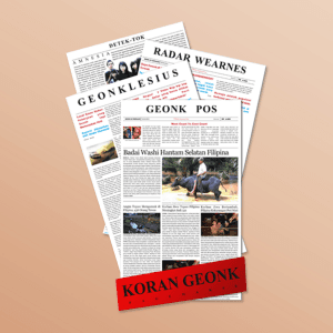
Geonk Newspaper
{"type":"doc","content":[{"type":"paragraph","attrs":{"textAlign":null},"content":[{"type":"text","text":"Before Figma, before Photoshop — there was PageMaker, and Koran Geonk is the proof that great editorial instincts don't wait for the right tools."}]},{"type":"image","attrs":{"src":"https://farooq-agent.web.app/assets/images/works/large/AvEFMZJm_work_image.png","alt":null,"title":null,"width":null,"height":null}},{"type":"paragraph","attrs":{"textAlign":null},"content":[{"type":"text","marks":[{"type":"bold"}],"text":"Editorial Design — Koran Geonk"}]},{"type":"paragraph","attrs":{"textAlign":null},"content":[{"type":"text","marks":[{"type":"italic"}],"text":"Newspaper Layout · Adobe PageMaker · Early Design Work"}]},{"type":"paragraph","attrs":{"textAlign":null},"content":[{"type":"text","text":"A collection of student newspaper layouts produced using Adobe PageMaker — one of the earliest desktop publishing applications — representing a formative milestone in the design journey. Three distinct newspaper editions are presented in a fanned stack: Radar Wearnes, Geonklesius, and Geonk Pos, each anchored by the bold red \"Koran Geonk\" masthead at the base."}]},{"type":"paragraph","attrs":{"textAlign":null},"content":[{"type":"text","text":"The layouts demonstrate a confident early grasp of editorial design fundamentals: multi-column grid systems, headline hierarchy, photo placement, and the typographic rhythm of a printed broadsheet. News articles, photographs, and section headers are organized with the structured discipline that newspaper design demands — where clarity and speed of reading are everything."}]},{"type":"paragraph","attrs":{"textAlign":null},"content":[{"type":"text","text":"A piece of design history from the PageMaker era — raw, earnest, and entirely self-taught. The beginning of a designer who never stopped building."}]}]}
Semanggine Branding
{"type":"doc","content":[{"type":"image","attrs":{"src":"https://farooq-agent.web.app/assets/images/works/small/YpXEsVUX_work_image.jpg","alt":null,"title":null,"width":null,"height":null}},{"type":"heading","attrs":{"textAlign":null,"level":3},"content":[{"type":"hardBreak"},{"type":"text","marks":[{"type":"bold"}],"text":"Logo Design — Semanggine"},{"type":"text","text":" "},{"type":"hardBreak"},{"type":"text","marks":[{"type":"italic"}],"text":"Brand Identity · Cultural / Food & Beverage · Javanese Heritage"}]},{"type":"paragraph","attrs":{"textAlign":null},"content":[{"type":"text","text":"A graceful, character-driven logo for Semanggine — a brand name derived from "},{"type":"text","marks":[{"type":"italic"}],"text":"semanggi"},{"type":"text","text":", the beloved Javanese street herb dish — brought to life through an illustrated mascot that is both culturally rooted and quietly charming. The central figure depicts a traditional Javanese woman in a deep green kebaya, hands pressed together in a respectful greeting gesture ("},{"type":"text","marks":[{"type":"italic"}],"text":"sembah"},{"type":"text","text":"), her head framed by a warm golden halo-like headpiece adorned with a green accent — evoking the iconic appearance of a semanggi street vendor from Surabaya."}]},{"type":"paragraph","attrs":{"textAlign":null},"content":[{"type":"text","text":"The illustration style is deliberately delicate and hand-drawn in character, with soft linework and a restrained color palette anchored in forest green and warm gold — colors that simultaneously reference fresh herbs, nature, and cultural warmth. The figure radiates approachability and authenticity, communicating a brand deeply connected to its origins."}]},{"type":"paragraph","attrs":{"textAlign":null},"content":[{"type":"text","text":"Below, the wordmark \"SEMANGGINE\" is set in a clean, widely-spaced uppercase sans-serif in matching deep green, with a small clover-like botanical mark dotting the letter \"i\" — a refined typographic detail that ties the wordmark back to the brand's herbal identity."}]},{"type":"paragraph","attrs":{"textAlign":null},"content":[{"type":"text","text":"Presented on a textured paper mockup, the logo feels at home on premium packaging, café menus, or artisan food branding — a confident translation of Javanese street food culture into a contemporary, market-ready identity."}]},{"type":"paragraph","attrs":{"textAlign":null},"content":[{"type":"text","text":" "}]}]}
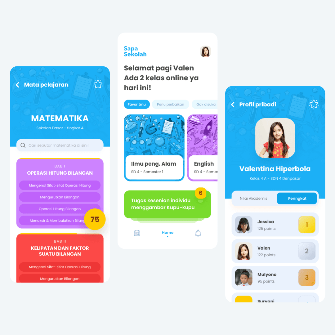
SapaSekolah
{"type":"doc","content":[{"type":"paragraph","attrs":{"textAlign":null},"content":[{"type":"text","text":"SapaSekolah greets every student by name and makes learning from home feel as structured and social as being in the classroom."}]},{"type":"image","attrs":{"src":"https://farooq-agent.web.app/assets/images/works/large/pd/sapasekolah-new/sapasekolah-preview-s.png","alt":null,"title":null,"width":null,"height":null}},{"type":"paragraph","attrs":{"textAlign":null},"content":[{"type":"text","marks":[{"type":"bold"}],"text":"App UI Design — SapaSekolah"}]},{"type":"paragraph","attrs":{"textAlign":null},"content":[{"type":"text","marks":[{"type":"italic"}],"text":"Mobile App · Learn from Home · Elementary School · Indonesia"}]},{"type":"paragraph","attrs":{"textAlign":null},"content":[{"type":"text","text":"A bright, child-friendly three-screen app UI for SapaSekolah — a learn-from-home platform designed for Indonesian elementary school students, built during the era when remote learning became a national necessity."}]},{"type":"paragraph","attrs":{"textAlign":null},"content":[{"type":"text","marks":[{"type":"bold"}],"text":"Home Screen:"},{"type":"text","text":" \"Selamat pagi Valen — Ada 2 kelas online ya hari ini!\" (Good morning Valen — You have 2 online classes today!) — a personalized daily greeting that immediately makes the app feel warm and human. Subject cards below (Ilmu peng. Alam SD 4 Semester 1, English SD 4) are tagged Favoritmu / Perlu perbaikan / Gak disuka — a three-category filter that lets students navigate by enthusiasm, need, or preference. An active task card in green: \"Tugas kesenian individu menggambar Kupu-kupu\" (Individual art assignment: draw a butterfly) with 6 notifications — the school day arriving on a phone screen."}]},{"type":"paragraph","attrs":{"textAlign":null},"content":[{"type":"text","marks":[{"type":"bold"}],"text":"Mata Pelajaran — Matematika:"},{"type":"text","text":" The subject detail for Mathematics, Sekolah Dasar Tingkat 4 — with a chapter structure: BAB I Operasi Hitung Bilangan (purple, score 75), BAB II Kelipatan dan Faktor Suatu Bilangan (red) — each chapter expanding into sub-topics with a search bar for finding specific material. The score badge (75) and color-coded chapter cards gamify curriculum progress for young learners."}]},{"type":"paragraph","attrs":{"textAlign":null},"content":[{"type":"text","marks":[{"type":"bold"}],"text":"Profil Pribadi — Valentina Hiperbola:"},{"type":"text","text":" Kelas 4A, SDN 4 Denpasar. Academic scores and a Peringkat (Ranking) leaderboard: Jessica (125 points, 1st), Valen (122 points, 2nd), Mulyono (95 points, 3rd) — the social, competitive learning layer that keeps students engaged beyond the content itself."}]},{"type":"paragraph","attrs":{"textAlign":null},"content":[{"type":"text","text":"The bright blue, purple, and green palette is energetic, age-appropriate, and entirely designed for the 8–12 year old learner. SapaSekolah doesn't just deliver lessons — it makes school feel like it's still there, even when it isn't."}]}]}
Tamawal Social Media Contents
{"type": "doc", "content": [{"type": "heading", "attrs": {"level": 1}, "content": [{"type": "text", "text": "Tamawal Founding Day", "marks": [{"type": "bold"}]}]}, {"type": "paragraph", "content": [{"type": "image", "attrs": {"src": "https://mir-s3-cdn-cf.behance.net/project_modules/2800_opt_1/f91c28154041303.63e5250699c60.png", "width": 1140, "height": 684}}]}, {"type": "paragraph", "content": [{"type": "text", "text": " "}]}, {"type": "heading", "attrs": {"level": 1}, "content": [{"type": "text", "text": "Tamawal National Day", "marks": [{"type": "bold"}]}]}, {"type": "paragraph", "content": [{"type": "image", "attrs": {"src": "https://mir-s3-cdn-cf.behance.net/project_modules/2800_opt_1/3bf4a7154041303.633b13c6dd04f.png", "width": 1140, "height": 684}}]}, {"type": "paragraph", "content": [{"type": "image", "attrs": {"src": "https://mir-s3-cdn-cf.behance.net/project_modules/1400/ca1aae154041303.633b13c6deae2.png", "width": 1140, "height": 1140}}]}, {"type": "paragraph", "content": [{"type": "text", "text": " "}]}, {"type": "heading", "attrs": {"level": 1}, "content": [{"type": "text", "text": "Tamawal Eid Al Adha", "marks": [{"type": "bold"}]}]}, {"type": "paragraph", "content": [{"type": "image", "attrs": {"src": "https://mir-s3-cdn-cf.behance.net/project_modules/1400/ed55c8154041303.633b1b0c1b51a.png", "width": 1140, "height": 684}}]}, {"type": "paragraph", "content": [{"type": "text", "text": " "}]}, {"type": "paragraph", "content": [{"type": "image", "attrs": {"src": "https://mir-s3-cdn-cf.behance.net/project_modules/1400/e2fb7e154041303.633b13c6e2fb6.png", "width": 1140}}]}, {"type": "paragraph", "content": [{"type": "text", "text": " "}]}, {"type": "paragraph", "content": [{"type": "image", "attrs": {"src": "https://mir-s3-cdn-cf.behance.net/project_modules/1400/2db016154041303.633b13c6d82fa.png", "width": 1140}}]}, {"type": "paragraph", "content": [{"type": "text", "text": " "}]}, {"type": "paragraph", "content": [{"type": "image", "attrs": {"src": "https://mir-s3-cdn-cf.behance.net/project_modules/1400/f59ad5154041303.633b13c6e3e52.png", "width": 1140, "height": 684}}]}, {"type": "paragraph", "content": [{"type": "text", "text": " "}]}, {"type": "paragraph", "content": [{"type": "image", "attrs": {"src": "https://mir-s3-cdn-cf.behance.net/project_modules/1400/e5a6fd154041303.633b13c6e6ffd.png", "width": 1140, "height": 684}}]}, {"type": "paragraph", "content": [{"type": "text", "text": " "}]}, {"type": "paragraph", "content": [{"type": "image", "attrs": {"src": "https://mir-s3-cdn-cf.behance.net/project_modules/1400/fa4139154041303.633b13c6e606d.png", "width": 1140, "height": 684}}]}, {"type": "paragraph", "content": [{"type": "text", "text": " "}]}, {"type": "paragraph", "content": [{"type": "image", "attrs": {"src": "https://mir-s3-cdn-cf.behance.net/project_modules/1400_opt_1/348ba8154041303.633b13c6df88f.png", "width": 1140, "height": 1140}}]}, {"type": "paragraph", "content": [{"type": "text", "text": " "}]}, {"type": "paragraph", "content": [{"type": "image", "attrs": {"src": "https://mir-s3-cdn-cf.behance.net/project_modules/1400/442d75154041303.633c634bd084b.png", "width": 1140, "height": 1140}}]}, {"type": "paragraph", "content": [{"type": "text", "text": " "}]}, {"type": "paragraph", "content": [{"type": "image", "attrs": {"src": "https://mir-s3-cdn-cf.behance.net/project_modules/1400/da533f154041303.633c634bcbafa.png", "width": 1140, "height": 1140}}]}, {"type": "paragraph", "content": [{"type": "text", "text": " "}]}, {"type": "paragraph", "content": [{"type": "image", "attrs": {"src": "https://mir-s3-cdn-cf.behance.net/project_modules/1400/d7f872154041303.633c634bd2180.png", "width": 1140, "height": 1140}}]}, {"type": "paragraph", "content": [{"type": "text", "text": " "}]}, {"type": "paragraph", "content": [{"type": "image", "attrs": {"src": "https://mir-s3-cdn-cf.behance.net/project_modules/1400_opt_1/dcdc10154041303.633c634bce567.png", "width": 1140, "height": 1140}}]}, {"type": "paragraph", "content": [{"type": "image", "attrs": {"src": "https://mir-s3-cdn-cf.behance.net/project_modules/1400/57dd68154041303.633c634bd387b.png", "width": 1140, "height": 1140}}]}, {"type": "paragraph", "content": [{"type": "text", "text": " "}]}, {"type": "heading", "attrs": {"level": 1}, "content": [{"type": "text", "text": "Promotion Video"}]}, {"type": "paragraph", "content": [{"type": "image", "attrs": {"src": "https://mir-s3-cdn-cf.behance.net/project_modules/max_1200/f5047d154041303.633b13c6e4ee2.png", "width": 1140, "height": 1140}}]}, {"type": "paragraph", "content": [{"type": "text", "text": " "}]}]}
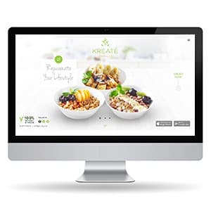
KREATE - Website Design
{"type":"doc","content":[{"type":"paragraph","attrs":{"textAlign":null},"content":[{"type":"text","text":"Rejuvenate Your Lifestyle — Kreaté's website makes healthy food look so good you'd order before you've finished reading."}]},{"type":"image","attrs":{"src":"https://farooq-agent.web.app/assets/images/works/large/QgMuf4vT_work_image.jpg","alt":null,"title":null,"width":null,"height":null}},{"type":"paragraph","attrs":{"textAlign":null},"content":[{"type":"text","marks":[{"type":"bold"}],"text":"Web Design — KREATÉ"}]},{"type":"paragraph","attrs":{"textAlign":null},"content":[{"type":"text","marks":[{"type":"italic"}],"text":"Product Website · Healthy Food · Overnight Oats & Gourmet Salad"}]},{"type":"paragraph","attrs":{"textAlign":null},"content":[{"type":"text","text":"A clean, appetite-first website for Kreaté — a healthy food brand built around the philosophy of \"Rejuvenating your Lifestyle\" through Overnight Oats, Savory Oats, and Gourmet Salads."}]},{"type":"paragraph","attrs":{"textAlign":null},"content":[{"type":"text","text":"The hero is all product: three white ceramic bowls loaded with colorful, fresh ingredients fill the center frame — the visual equivalent of a menu that sells itself. The light, airy white background and soft kitchen blur create a premium food-photography atmosphere without a single word of copy beyond the tagline \"Rejuvenate Your Lifestyle\" in an elegant script."}]},{"type":"paragraph","attrs":{"textAlign":null},"content":[{"type":"text","text":"The Kreaté botanical leaf logomark anchors the top center, consistent with the app UI's green-on-white identity system. A \"100% Natural & Fresh\" badge bottom-left, social media icons, and App Store / Play Store buttons confirm this is both a brand statement and an ordering platform — the website and app operating as a unified customer journey."}]},{"type":"paragraph","attrs":{"textAlign":null},"content":[{"type":"text","text":"Minimal, fresh, and completely focused on the one thing that converts: making the food look irresistible."}]}]}
Java Paradigm Branding
{"type":"doc","content":[{"type":"paragraph","attrs":{"textAlign":null},"content":[{"type":"text","text":"Java Paradigm Branding"}]},{"type":"paragraph","attrs":{"textAlign":null}},{"type":"image","attrs":{"src":"https://farooq-agent.web.app/assets/images/works/large/FwXD6UcP_work_image.png","alt":null,"title":null,"width":300,"height":300}},{"type":"paragraph","attrs":{"textAlign":null},"content":[{"type":"text","marks":[{"type":"bold"}],"text":"Brand Identity — Java Paradigm"},{"type":"hardBreak"},{"type":"text","marks":[{"type":"italic"}],"text":"Logo & Visual Identity · Media / Creative Agency · East Java"},{"type":"hardBreak"}]},{"type":"paragraph","attrs":{"textAlign":null},"content":[{"type":"text","text":"A striking media brand identity for Java Paradigm, presented here in a bold editorial context that immediately signals creative ambition. The logo is overlaid on a high-fashion editorial photograph — a deliberate compositional choice that positions the brand squarely within the world of culture, creativity, and contemporary media."}]},{"type":"paragraph","attrs":{"textAlign":null},"content":[{"type":"text","text":"The icon is a fluid, abstract mark formed from two dynamic swooping shapes — one larger, one smaller — evoking a sense of motion, orbit, and forward momentum. The form carries a dual reading: it can be interpreted as a figure in motion or as an abstract representation of ideas in circulation, both fitting metaphors for a media brand rooted in the creative pulse of Java."}]},{"type":"paragraph","attrs":{"textAlign":null},"content":[{"type":"text","text":"The wordmark \"JAVA PARADIGM\" is set in a bold, slightly condensed serif with a distinctive character — the letters carry elegance without stiffness, suggesting a brand that is authoritative yet culturally alive. The all-white rendering against the vibrant electric-blue editorial backdrop creates maximum contrast and visual presence."}]},{"type":"paragraph","attrs":{"textAlign":null},"content":[{"type":"text","text":"The choice of photography — avant-garde fashion, bold blue tones, high concept styling — speaks to a media brand that positions itself at the intersection of culture, art, and ideas. Java Paradigm is not a generic brand; it is a statement of creative identity rooted in the cultural landscape of Java."}]},{"type":"paragraph","attrs":{"textAlign":null},"content":[{"type":"text","text":"A sophisticated, editorially confident brand identity that stands out in any context it inhabits."}]}]}
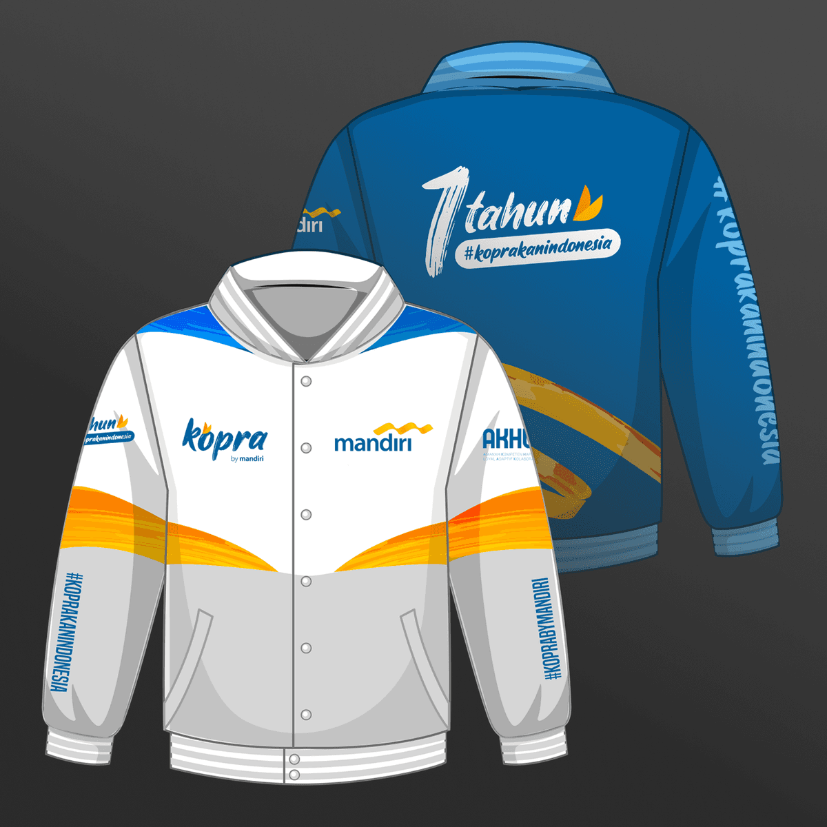
Kopra Jacket Design
{"type":"doc","content":[{"type":"paragraph","attrs":{"textAlign":null},"content":[{"type":"text","text":"A jacket that doesn't just wear a brand — it celebrates a milestone, wraps a community, and makes Bank Mandiri's first anniversary of Kopra impossible to miss."}]},{"type":"image","attrs":{"src":"https://mir-s3-cdn-cf.behance.net/project_modules/1400/8e759a154045193.633b2063cfb2a.png","alt":null,"title":null,"width":null,"height":null}},{"type":"paragraph","attrs":{"textAlign":null},"content":[{"type":"text","marks":[{"type":"bold"}],"text":"Apparel Design — Kopra by Mandiri"}]},{"type":"paragraph","attrs":{"textAlign":null},"content":[{"type":"text","marks":[{"type":"italic"}],"text":"Jacket Design · Bank Mandiri · Anniversary Merchandise · #KoprakanIndonesia"}]},{"type":"paragraph","attrs":{"textAlign":null},"content":[{"type":"text","text":"A bold commemorative jacket design for Kopra by Mandiri — Bank Mandiri's digital banking platform — produced to mark the milestone of \"1 Tahun #KoprakanIndonesia.\" The design is presented in a full front-and-back technical mockup, demonstrating complete apparel design execution across both faces of the garment."}]},{"type":"paragraph","attrs":{"textAlign":null},"content":[{"type":"text","text":"The front jacket leads with a clean white and silver base, bisected by a sweeping arc of warm orange-to-gold — the energy stripe of Mandiri's brand palette — cutting diagonally across the body with dynamic momentum. The Kopra by Mandiri and Bank Mandiri logos are placed on opposing chest panels, establishing dual brand presence. The hashtags #KoprakanIndonesia and #KoprabyMandiri run vertically down both sleeves, turning the wearer into a walking campaign."}]},{"type":"paragraph","attrs":{"textAlign":null},"content":[{"type":"text","text":"The back is a confident inversion — deep teal replacing white, the \"1 tahun #koprakanindonesia\" anniversary mark rendered in bold hand-lettered style at center back, with the Mandiri flame symbol completing the celebratory composition. The sleeve carries the campaign hashtag in large format vertical type — visible from any angle in a crowd."}]},{"type":"paragraph","attrs":{"textAlign":null},"content":[{"type":"text","text":"A merchandise design that works as hard as the platform it celebrates."}]}]}

Social Commerce - Live Shopping
{"type":"doc","content":[{"type":"image","attrs":{"src":"https://cdn.dribbble.com/userupload/10798495/file/original-6ff221efe976cd9d9c3f96e3330e0851.png?resize=2048x1536&vertical=center","alt":null,"title":null,"width":null,"height":null}},{"type":"paragraph","attrs":{"textAlign":null},"content":[{"type":"text","text":"🛍️ This app is intended for social commerce mobile app. Here users can buy some products directly, communicate with friends, and monitor their shopping."}]},{"type":"paragraph","attrs":{"textAlign":null}},{"type":"paragraph","attrs":{"textAlign":null},"content":[{"type":"text","text":"What do you think guys? Let me know in the comments section!"}]},{"type":"paragraph","attrs":{"textAlign":null},"content":[{"type":"text","text":"Hope you enjoy it guys. Click “❤️Like” if you like it."},{"type":"hardBreak"},{"type":"hardBreak"}]},{"type":"image","attrs":{"src":"https://cdn.dribbble.com/userupload/10798684/file/original-61ed2662254aee036d20c1ca279df7e5.png?resize=2048x1536&vertical=center","alt":null,"title":null,"width":null,"height":null}},{"type":"image","attrs":{"src":"https://cdn.dribbble.com/userupload/10798685/file/original-a2ecb6f01d56e002d173171d72548a3e.png?resize=2048x1536&vertical=center","alt":null,"title":null,"width":null,"height":null}},{"type":"image","attrs":{"src":"https://cdn.dribbble.com/userupload/10798686/file/original-8b7b11290bf39a04f154547f6bd5f318.png?resize=2048x1536&vertical=center","alt":null,"title":null,"width":null,"height":null}},{"type":"paragraph","attrs":{"textAlign":null},"content":[{"type":"hardBreak"},{"type":"hardBreak"},{"type":"text","text":"🛒"}]},{"type":"paragraph","attrs":{"textAlign":null}},{"type":"paragraph","attrs":{"textAlign":null},"content":[{"type":"text","marks":[{"type":"bold"}],"text":"Have a great project idea?"},{"type":"text","text":" Let us know ✅"}]},{"type":"paragraph","attrs":{"textAlign":null}},{"type":"paragraph","attrs":{"textAlign":null},"content":[{"type":"text","text":"Services we provide:"}]},{"type":"paragraph","attrs":{"textAlign":null},"content":[{"type":"text","text":"🖼️ UI Design | 😄 UX Design | 🎉 Illustration | 🛍 Brand Identity | 📝 Graphic Design | 🌐 Web Development | 📱 Mobile App Development"}]},{"type":"paragraph","attrs":{"textAlign":null}},{"type":"paragraph","attrs":{"textAlign":null},"content":[{"type":"text","text":"Thanks!"}]}]}

Healthy Brochure
{"type":"doc","content":[{"type":"paragraph","attrs":{"textAlign":null},"content":[{"type":"text","text":"A printed brochure design exploration for a health service brand."}]},{"type":"horizontalRule"},{"type":"paragraph","attrs":{"textAlign":null},"content":[{"type":"text","text":"Clean, approachable, and reassuring — this health service brochure proves that good medical design doesn't have to feel cold or clinical."}]},{"type":"image","attrs":{"src":"https://farooq-agent.web.app/assets/images/works/small/gK0XkMXS_work_image.jpg","alt":null,"title":null,"width":null,"height":null}},{"type":"paragraph","attrs":{"textAlign":null},"content":[{"type":"text","marks":[{"type":"bold"}],"text":"Print Design — Healthy Brochure"}]},{"type":"paragraph","attrs":{"textAlign":null},"content":[{"type":"text","marks":[{"type":"italic"}],"text":"Tri-Fold Brochure · Health Service · HealthyCare · Print Exploration"}]},{"type":"paragraph","attrs":{"textAlign":null},"content":[{"type":"text","text":"An exploration of tri-fold brochure design for a health service brand — HealthyCare — demonstrating confident command of editorial layout across a folded print format. The piece is presented as both a closed cover and an open spread, showcasing the design system in full context."}]},{"type":"paragraph","attrs":{"textAlign":null},"content":[{"type":"text","text":"The cover leads with a smiling doctor in professional whites flanked by circular photography insets of patients and families — imagery that immediately communicates warmth, trust, and human care. The HealthyCare logo anchors the top with a clean green leaf mark, while the headline \"Healthho dolores dollo ithas\" provides placeholder copy in a layout-first design approach."}]},{"type":"paragraph","attrs":{"textAlign":null},"content":[{"type":"text","text":"The interior spread opens into a three-column layout organized with alternating white and green panels — a classic health brochure structure that separates content zones clearly while maintaining visual flow. Data visualizations, service summaries, circular portrait insets, and body copy are organized with confident grid discipline throughout."}]},{"type":"paragraph","attrs":{"textAlign":null},"content":[{"type":"text","text":"The fresh green palette — universally associated with health, nature, and vitality — runs consistently from cover to interior, creating a coherent brand experience across every fold. A practical, well-structured brochure design that would translate directly to any real health service with minimal copy substitution."}]}]}
Interior Design
{"type":"doc","content":[{"type":"paragraph","attrs":{"textAlign":null},"content":[{"type":"text","text":"Bold, moody, and unapologetically personal — this 3D interior render proves that a bedroom can be as much a statement of identity as any design portfolio piece."}]},{"type":"image","attrs":{"src":"https://farooq-agent.web.app/assets/images/works/large/TnJWPk5J_work_image.png","alt":null,"title":null,"width":null,"height":null}},{"type":"paragraph","attrs":{"textAlign":null},"content":[{"type":"text","marks":[{"type":"bold"}],"text":"3D Design — Interior Design Render"}]},{"type":"paragraph","attrs":{"textAlign":null},"content":[{"type":"text","marks":[{"type":"italic"}],"text":"3D Visualization · Bedroom Interior · Personal Project"}]},{"type":"paragraph","attrs":{"textAlign":null},"content":[{"type":"text","text":"A dramatic 3D interior render exploring a deeply personalized bedroom concept — built around a bold red and charcoal color palette that refuses to blend into the background. This is not a neutral show-home bedroom; it is a space designed with conviction, for someone who knows exactly who they are."}]},{"type":"paragraph","attrs":{"textAlign":null},"content":[{"type":"text","text":"The dominant deep crimson walls create an atmosphere of intensity and warmth — a theatrical backdrop that anchors every other element in the room. A full-height dark damask-patterned wardrobe panel adds texture and architectural weight to the left wall, its intricate repeat pattern providing visual complexity against the flat red surfaces flanking it. A circular wall-mounted shelf in the same tonal palette carries books and personal objects, reinforcing the room's lived-in, curated character."}]},{"type":"paragraph","attrs":{"textAlign":null},"content":[{"type":"text","text":"The guitar mounted on the wall between a yellow-shaded wall lamp and a wall-hung circular mirror is the room's most revealing detail — this is a musician's bedroom, or at minimum, a dreamer's. The cherry blossom triptych on the right wall introduces the only organic element in an otherwise geometric space: a hint of Japanese aesthetic sensibility softening the room's hard edges with botanical delicacy."}]},{"type":"paragraph","attrs":{"textAlign":null},"content":[{"type":"text","text":"The bed — low-profile, dressed in deep red linen — sits on a patterned rug with gold circular motifs that echo similar details on the ceiling, creating a subtle top-to-bottom rhythm across the vertical space. Recessed geometric ceiling light elements in gold add a final layer of architectural ambition."}]},{"type":"paragraph","attrs":{"textAlign":null},"content":[{"type":"text","text":"A 3D render that demonstrates spatial thinking, lighting control, and the ability to translate a personality into a room."}]}]}
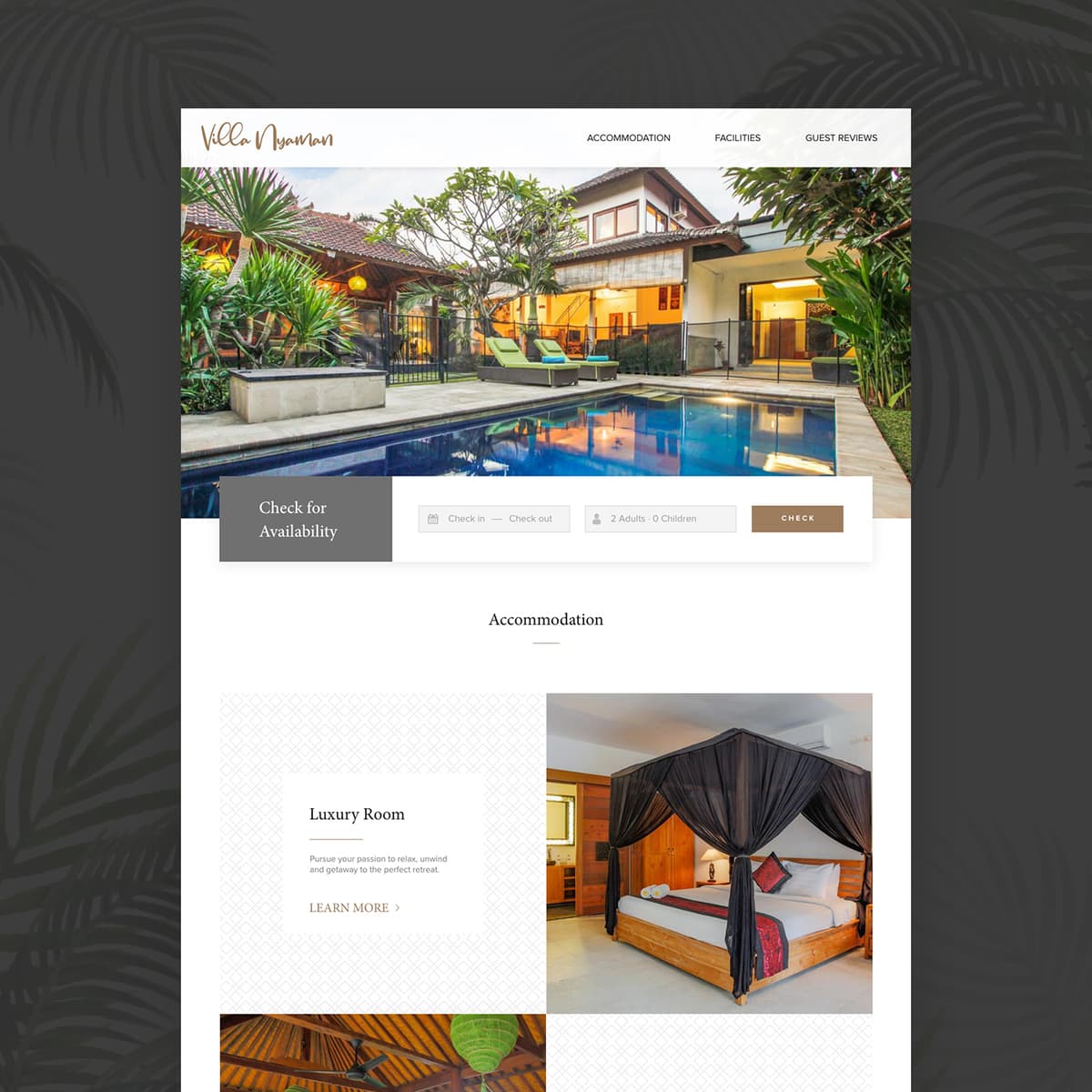
Villa Nyaman
{"type":"doc","content":[{"type":"paragraph","attrs":{"textAlign":null},"content":[{"type":"text","text":"Pursue your passion to relax, unwind and getaway to the perfect retreat — Villa Nyaman's website is as warm and inviting as the Balinese villa it presents."}]},{"type":"image","attrs":{"src":"https://farooq-agent.web.app/assets/images/works/large/villa-nyaman.jpg","alt":null,"title":null,"width":null,"height":null}},{"type":"paragraph","attrs":{"textAlign":null},"content":[{"type":"text","marks":[{"type":"bold"}],"text":"Web Design — Villa Nyaman"}]},{"type":"paragraph","attrs":{"textAlign":null},"content":[{"type":"text","marks":[{"type":"italic"}],"text":"Villa Website · Balinese Accommodation · Hospitality"}]},{"type":"paragraph","attrs":{"textAlign":null},"content":[{"type":"text","text":"A warm, elegant website design for Villa Nyaman — a Balinese private villa offering a tropical retreat experience. The design communicates the villa's core promise — comfort, nature, and escape — from the very first scroll."}]},{"type":"paragraph","attrs":{"textAlign":null},"content":[{"type":"text","text":"The hero is a lush, sun-warmed photograph of the villa's private pool and tropical garden, the Balinese architecture glowing amber against the surrounding greenery in late afternoon light. The image does the selling before a word is read: this is somewhere you want to be right now. The \"Check for Availability\" widget anchors directly to the hero — Check in / Check out date picker, guest count (2 Adults, 0 Children), and a gold \"Check\" CTA — converting browsing intent into booking action at the earliest possible moment."}]},{"type":"paragraph","attrs":{"textAlign":null},"content":[{"type":"text","text":"The Villa Nyaman logotype in a warm script sits in the top left — organic, handcrafted, and entirely aligned with the intimate character of a private villa experience. Navigation is minimal: Accommodation, Facilities, Guest Reviews — the three pillars of any villa booking decision."}]},{"type":"paragraph","attrs":{"textAlign":null},"content":[{"type":"text","text":"The Accommodation section below opens with the Luxury Room — a four-poster canopied bed in dark carved wood, Balinese batik accents — with the tagline \"Pursue your passion to relax, unwind and getaway to the perfect retreat.\" A \"Learn More\" CTA invites deeper exploration."}]},{"type":"paragraph","attrs":{"textAlign":null},"content":[{"type":"text","text":"The tropical palm leaf motif in the dark background of the outer frame reinforces the Balinese setting — a subtle environmental detail that frames the entire design in the island's natural character."}]},{"type":"paragraph","attrs":{"textAlign":null},"content":[{"type":"text","text":"A villa website that makes its guests feel they've already arrived."}]}]}
Crossfit Eclipse T-Shirt
{"type":"doc","content":[{"type":"paragraph","attrs":{"textAlign":null},"content":[{"type":"text","text":"Wings spread, barbell raised — CrossFit Eclipse's t-shirt design turns a gym membership into a badge of honor you actually want to wear."}]},{"type":"image","attrs":{"src":"https://farooq-agent.web.app/assets/images/works/large/zrADdy0b_work_image.png","alt":null,"title":null,"width":null,"height":null}},{"type":"paragraph","attrs":{"textAlign":null},"content":[{"type":"text","marks":[{"type":"bold"}],"text":"Apparel Design — CrossFit Eclipse"}]},{"type":"paragraph","attrs":{"textAlign":null},"content":[{"type":"text","marks":[{"type":"italic"}],"text":"T-Shirt Design · Gym Brand · Fitness Apparel"}]},{"type":"paragraph","attrs":{"textAlign":null},"content":[{"type":"text","text":"A high-energy apparel design for CrossFit Eclipse Gym — a fitness brand identity expressed through a bold, screen-print-ready t-shirt graphic that captures the intensity and pride of the CrossFit community in a single wearable mark."}]},{"type":"paragraph","attrs":{"textAlign":null},"content":[{"type":"text","text":"The central graphic is built around a symmetrical pair of white feathered wings spreading wide across the chest — the universal symbol of achievement, elevation, and freedom — flanking the CrossFit Eclipse logotype set in a strong, angled display typeface. The wordmark uses a deliberate two-color split: \"CrossFit\" in crisp white, \"Eclipse\" in electric sky blue — the contrast creating visual hierarchy while reinforcing the brand's identity within the larger CrossFit ecosystem."}]},{"type":"paragraph","attrs":{"textAlign":null},"content":[{"type":"text","text":"At the heart of the composition, a barbell sits horizontally across the logo — the most direct symbol of the sport, grounding the aspirational wing motif in the physical reality of the gym floor. A starburst spark at the top center adds a cinematic energy hit, as if the barbell has just been dropped from a max lift. Supporting kettlebell and weight imagery completes the lower composition, building a dense, detailed graphic that rewards close inspection."}]},{"type":"paragraph","attrs":{"textAlign":null},"content":[{"type":"text","text":"The full design is set against a distressed, textured dark backdrop visible in the logo artwork — giving the piece a worn, battle-tested character that speaks to athletes who earn their results. On the black performance tee, the white and blue graphic achieves maximum contrast and print clarity."}]},{"type":"paragraph","attrs":{"textAlign":null},"content":[{"type":"text","text":"A gym apparel design that earns its place on the floor, the podium, and the street."}]}]}
Ferrous Brand Value and Guidelines
{"type":"doc","content":[{"type":"image","attrs":{"src":"https://farooq-agent.web.app/assets/images/works/small/pjx2gGpV_work_image.jpg","alt":null,"title":null,"width":null,"height":null}},{"type":"heading","attrs":{"textAlign":null,"level":3},"content":[{"type":"text","marks":[{"type":"bold"}],"text":"Brand Identity — Ferrous"},{"type":"text","text":" "},{"type":"hardBreak"},{"type":"text","marks":[{"type":"italic"}],"text":"Logo & Brand Guidelines · Construction Steel Factory · Industrial Sector"}]},{"type":"paragraph","attrs":{"textAlign":null},"content":[{"type":"text","text":"An uncompromisingly industrial brand identity for Ferrous — a construction steel manufacturer — where every design decision is an extension of the material itself. The wordmark \"FERR\" is rendered directly onto a raw, weathered steel surface, with a deliberately mirror-reversed final letterform that functions as both a typographic device and a symbolic gesture: a nod to the rolling and pressing processes central to steel fabrication."}]},{"type":"paragraph","attrs":{"textAlign":null},"content":[{"type":"text","text":"The letterforms are custom-engineered — angular, wide-set, and constructed from sharp geometric strokes with beveled edges that catch light like machined metal. The typography does not merely describe the industry; it "},{"type":"text","marks":[{"type":"italic"}],"text":"is"},{"type":"text","text":" the industry. Each letter carries structural weight and precision, communicating a brand built on material integrity and manufacturing strength."}]},{"type":"paragraph","attrs":{"textAlign":null},"content":[{"type":"text","text":"The embossed, tone-on-tone treatment — steel grey on steel texture — creates a sense of depth without color, relying entirely on form, light, and surface to establish presence. This restraint is itself a statement: a brand confident enough to need nothing but its own material identity."}]},{"type":"paragraph","attrs":{"textAlign":null},"content":[{"type":"text","text":"The reversed \"R\" doubles as a subtle logomark — a signature detail that rewards attention and creates instant brand recognizability across applications from signage to stamped steel plates."}]},{"type":"paragraph","attrs":{"textAlign":null},"content":[{"type":"text","text":"A masterful exercise in material-driven branding — raw, authoritative, and built to last. "}]}]}
Ciputra Water Park Trifold Brochure Layout
{"type":"doc","content":[{"type":"paragraph","attrs":{"textAlign":null},"content":[{"type":"text","text":"Layout is the invisible craft that makes content feel effortless — this Ciputra Waterpark brochure puts that craft front and center, organizing a full theme park experience into a clean, navigable tri-fold format."}]},{"type":"image","attrs":{"src":"https://farooq-agent.web.app/assets/images/works/large/O2XC7OM0_work_image.jpg","alt":null,"title":null,"width":null,"height":null}},{"type":"paragraph","attrs":{"textAlign":null},"content":[{"type":"text","marks":[{"type":"bold"}],"text":"Print Layout Design — Ciputra Waterpark Sinbad Adventures"}]},{"type":"paragraph","attrs":{"textAlign":null},"content":[{"type":"text","marks":[{"type":"italic"}],"text":"Tri-Fold Brochure · Content Layout · Theme Park · Surabaya"}]},{"type":"paragraph","attrs":{"textAlign":null},"content":[{"type":"text","text":"A tri-fold brochure layout project for Ciputra Waterpark — Sinbad Adventures — where the primary contribution is content organization and print layout, not illustration. The artwork and character illustrations were provided assets from the college context; the design work here was the disciplined task of making all of it fit, flow, and communicate clearly across three folded panels."}]},{"type":"paragraph","attrs":{"textAlign":null},"content":[{"type":"text","text":"The cover panel leads with the Ciputra Waterpark Sinbad Adventures logo — a vibrant illustrated mascot group emerging from a wave splash — set against a sky blue background that immediately communicates the brand's aquatic, family-fun positioning. The light, airy background and logo placement demonstrate confident spatial judgment: knowing what to feature, how large, and where to breathe."}]},{"type":"paragraph","attrs":{"textAlign":null},"content":[{"type":"text","text":"The real discipline of this piece lives inside the fold — organizing attraction information, maps, ticketing details, and promotional content into a logical reading sequence that guides the visitor from discovery to decision. Grid management, column width, type size hierarchy, image-to-text ratio, and bleed awareness are the skills on display here: the invisible infrastructure that makes a brochure actually usable in the hands of a first-time park visitor."}]},{"type":"paragraph","attrs":{"textAlign":null},"content":[{"type":"text","text":"A print layout project that proves great design isn't always about making the illustration — sometimes it's about knowing exactly where to put it."}]}]}

Financial Management Mobile App
{"type":"doc","content":[{"type":"image","attrs":{"src":"https://cdn.dribbble.com/userupload/8252376/file/original-7fad6f20f735c1dae368c9edae879870.png?resize=1504x1128&vertical=center","alt":null,"title":null,"width":null,"height":null}},{"type":"heading","attrs":{"textAlign":"center","level":2},"content":[{"type":"text","marks":[{"type":"bold"}],"text":"Hi Guys!✋🏻"}]},{"type":"paragraph","attrs":{"textAlign":"center"},"content":[{"type":"text","text":"This is another exploration about Financial Management Mobile App called Moman (Money Manager)."}]},{"type":"paragraph","attrs":{"textAlign":"center"},"content":[{"type":"text","marks":[{"type":"bold"}],"text":"More preview? enjoy scrolling 🙌"}]},{"type":"image","attrs":{"src":"https://cdn.dribbble.com/userupload/8252379/file/original-5658cba12416c90da237aa8cedaf0396.png?resize=752x&vertical=center","alt":"Financial Management Mobile App - Mockup Light","title":null,"width":null,"height":null}},{"type":"image","attrs":{"src":"https://cdn.dribbble.com/userupload/8252378/file/original-fb17f2ad938bd464c369273b73dd9455.png?resize=752x&vertical=center","alt":"Financial Management Mobile App - HOME","title":null,"width":null,"height":null}},{"type":"image","attrs":{"src":"https://cdn.dribbble.com/userupload/8252377/file/original-f737e4999750ce8eb2141e2fe227780a.png?resize=752x&vertical=center","alt":"Financial Management Mobile App - REPORT","title":null,"width":null,"height":null}},{"type":"image","attrs":{"src":"https://cdn.dribbble.com/userupload/8252380/file/original-da3be3718ff7050b4191b66d3c1289c1.png?resize=752x&vertical=center","alt":"Financial Management Mobile App - DETAILED REPORT","title":null,"width":null,"height":null}},{"type":"paragraph","attrs":{"textAlign":null},"content":[{"type":"text","text":"With Moman, users will be able to do the following:"}]},{"type":"paragraph","attrs":{"textAlign":null},"content":[{"type":"text","text":"• Users can easily see the balance they have"}]},{"type":"paragraph","attrs":{"textAlign":null},"content":[{"type":"text","text":"• Users can make transfers between accounts or friends easily"}]},{"type":"paragraph","attrs":{"textAlign":null},"content":[{"type":"text","text":"• Users can view activities carried out within a certain time"}]},{"type":"image","attrs":{"src":"https://cdn.dribbble.com/userupload/8252383/file/original-8f87e468090c30f790a8321cc46aab0b.png?resize=752x&vertical=center","alt":"Financial Management Mobile App - Showcase 1","title":null,"width":null,"height":null}},{"type":"image","attrs":{"src":"https://cdn.dribbble.com/userupload/8252382/file/original-f7fd1d32face0f764739401ca983f449.png?resize=752x&vertical=center","alt":"Financial Management Mobile App - Showcase 2","title":null,"width":null,"height":null}},{"type":"image","attrs":{"src":"https://cdn.dribbble.com/userupload/8252384/file/original-7216ef27ae1699d39dda5f97e382102d.png?resize=752x&vertical=center","alt":"Financial Management Mobile App - Showcase 3","title":null,"width":null,"height":null}},{"type":"image","attrs":{"src":"https://cdn.dribbble.com/userupload/8252381/file/original-1ba2d1985a6784f84ea5d7a8e51e9015.png?resize=752x&vertical=center","alt":"Financial Management Mobile App - Mockup Dark","title":null,"width":null,"height":null}},{"type":"heading","attrs":{"textAlign":null,"level":1},"content":[{"type":"text","marks":[{"type":"bold"}],"text":"Thank You!"}]},{"type":"paragraph","attrs":{"textAlign":null},"content":[{"type":"text","text":"Hope you like it! 😊"}]}]}
Shake Club House - Social Media Management
{"type":"doc","content":[{"type":"paragraph","attrs":{"textAlign":null},"content":[{"type":"text","text":"Where white coffee meets chocolate indulgence — Shake Club House's social media presence is as rich and layered as the drinks it serves across Surabaya, Malang, Jakarta, and Bali."}]},{"type":"image","attrs":{"src":"https://farooq-agent.web.app/assets/images/works/small/S81swfwM_work_image.jpg","alt":null,"title":null,"width":null,"height":null}},{"type":"paragraph","attrs":{"textAlign":null},"content":[{"type":"text","marks":[{"type":"bold"}],"text":"Social Media Management — Shake Club House"}]},{"type":"paragraph","attrs":{"textAlign":null},"content":[{"type":"text","marks":[{"type":"italic"}],"text":"Social Media Content Design · White Coffee & Chocolate Drink Brand · Multi-City Indonesia"}]},{"type":"paragraph","attrs":{"textAlign":null},"content":[{"type":"text","text":"A social media content design project for Shake Club House — a premium white coffee and chocolate drink brand operating across four Indonesian cities: Surabaya, Malang, Jakarta, and Bali. The visual identity crafted for their social channels is atmospheric, indulgent, and deeply consistent in its brand storytelling."}]},{"type":"paragraph","attrs":{"textAlign":null},"content":[{"type":"text","text":"The hero social post centers on a dark, editorial composition — the Shake Club House logo displayed on a warm wooden surface, flanked by broken chocolate blocks and set against a deep chalkboard green background. The scene is a deliberate mood: warm, artisan, and café-intimate. The props are the brand's ingredients made tactile — chocolate as texture, wood as warmth, green as the earthy origin of the coffee."}]},{"type":"paragraph","attrs":{"textAlign":null},"content":[{"type":"text","text":"The logomark itself is a classic heraldic shield bearing a figure in traditional warrior attire — a bold, heritage-coded identity that positions Shake Club House as something older and more storied than a modern bubble tea chain. The wordmark \"SHAKE CLUB HOUSE\" is set in a heavy slab-serif display type, confident and masculine — a brand that takes its drinks as seriously as its identity."}]},{"type":"paragraph","attrs":{"textAlign":null},"content":[{"type":"text","text":"The framed white border around the composition gives the post the quality of a framed artwork — elevating a social media square from content to creative. This is social media design that refuses to look disposable."}]},{"type":"paragraph","attrs":{"textAlign":null},"content":[{"type":"text","text":"A content visual that makes the scroll stop — and the hands reach for a cup."}]},{"type":"paragraph","attrs":{"textAlign":null},"content":[{"type":"text","text":" "}]}]}
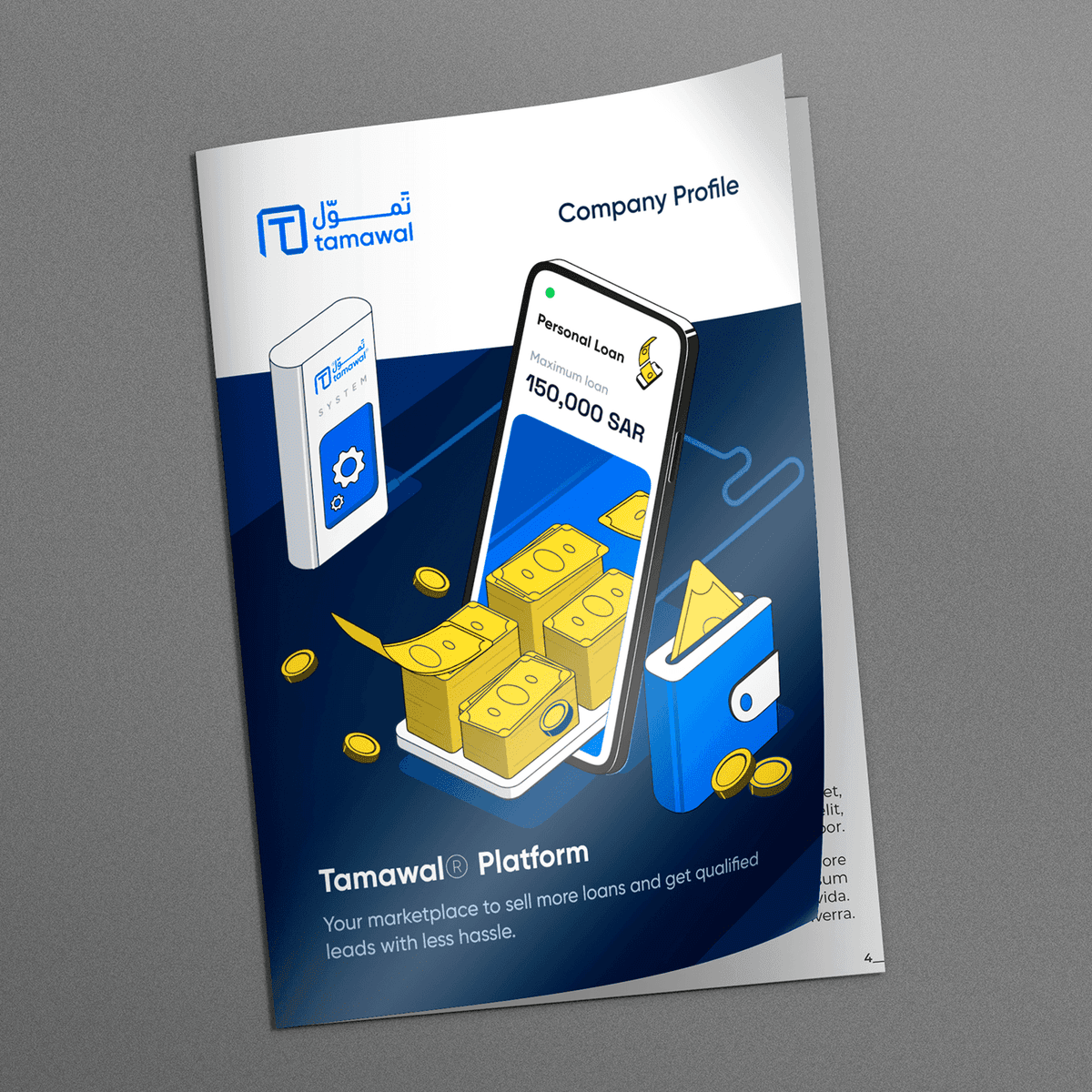
Tamawal Business Documents
{"type":"doc","content":[{"type":"paragraph","attrs":{"textAlign":null},"content":[{"type":"text","text":"When your platform needs to walk into a boardroom and close the deal — Tamawal's Company Profile document does exactly that, with the confidence of a brand that knows its numbers."}]},{"type":"image","attrs":{"src":"https://mir-s3-cdn-cf.behance.net/project_modules/1400/1578f4154041303.63e528eb03419.png","alt":null,"title":null,"width":null,"height":null}},{"type":"paragraph","attrs":{"textAlign":null},"content":[{"type":"text","marks":[{"type":"bold"}],"text":"Business Document Design — Tamawal®"},{"type":"text","text":" "},{"type":"hardBreak"},{"type":"text","marks":[{"type":"italic"}],"text":"Company Profile · Corporate Print & Digital Document · Saudi Arabia Fintech"}]},{"type":"image","attrs":{"src":"https://mir-s3-cdn-cf.behance.net/project_modules/1400/34fd47154041303.633b1b8890af0.png","alt":null,"title":null,"width":null,"height":null}},{"type":"paragraph","attrs":{"textAlign":null},"content":[{"type":"text","text":"A polished, investor-grade company profile document designed for Tamawal® — Saudi Arabia's SAMA-regulated digital financing marketplace — crafted to represent the brand at its highest professional register in boardrooms, partner meetings, and institutional presentations."}]},{"type":"paragraph","attrs":{"textAlign":null},"content":[{"type":"text","text":"The cover page immediately establishes authority: the Tamawal bilingual logo anchors the upper left against a clean white header, while the lower two-thirds transitions into a deep navy blue backdrop — the brand's signature color of trust, credibility, and financial gravitas. Center stage is a dynamic 3D isometric illustration composition: a smartphone displaying the Personal Loan interface (Maximum Loan: 150,000 SAR) surrounded by stacked banknotes, gold coins, and a branded wallet — a visual language that communicates the platform's core promise in a single image."}]},{"type":"paragraph","attrs":{"textAlign":null},"content":[{"type":"text","text":"The Tamawal System card in the background adds product depth, suggesting an ecosystem beyond the consumer app — a platform with infrastructure, APIs, and institutional integrations beneath its polished surface."}]},{"type":"paragraph","attrs":{"textAlign":null},"content":[{"type":"text","text":"The tagline \"Your marketplace to sell more loans and get qualified leads with less hassle\" speaks directly to the document's B2B audience — financial institutions, lending partners, and potential investors — in the practical, results-oriented language they respond to."}]},{"type":"paragraph","attrs":{"textAlign":null},"content":[{"type":"text","text":"The document mockup, presented as a printed A4 profile on a neutral grey surface, grounds the digital brand in physical credibility — a brand confident enough to exist equally on screen and on paper."}]},{"type":"paragraph","attrs":{"textAlign":null},"content":[{"type":"text","text":"A corporate document that sells the platform before the first page is turned. "}]}]}
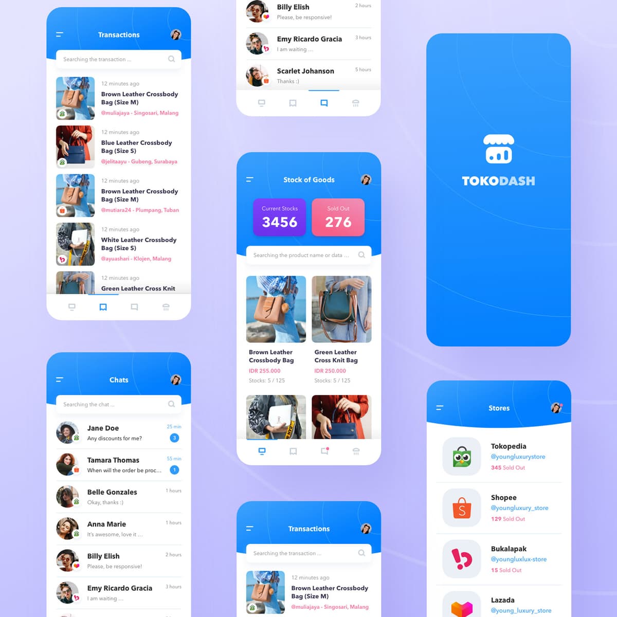
TokoDash
{"type":"doc","content":[{"type":"paragraph","attrs":{"textAlign":null},"content":[{"type":"text","text":"3,456 current stocks, 276 sold out, across Tokopedia, Shopee, Bukalapak, and Lazada — TokoDash is the seller's command center for managing an Indonesian multi-marketplace store from a single mobile app."}]},{"type":"image","attrs":{"src":"https://farooq-agent.web.app/assets/images/works/details/237-tokodash/tokodash.jpg","alt":null,"title":null,"width":null,"height":null}},{"type":"paragraph","attrs":{"textAlign":null},"content":[{"type":"text","marks":[{"type":"bold"}],"text":"App UI Design — TokoDash"}]},{"type":"paragraph","attrs":{"textAlign":null},"content":[{"type":"text","marks":[{"type":"italic"}],"text":"Mobile App · Store Management · Multi-Marketplace · Indonesia"}]},{"type":"paragraph","attrs":{"textAlign":null},"content":[{"type":"text","text":"A clean, blue-forward five-screen app UI for TokoDash — a store management dashboard for Indonesian online sellers who operate simultaneously across multiple marketplaces: Tokopedia, Shopee, Bukalapak, and Lazada."}]},{"type":"paragraph","attrs":{"textAlign":null},"content":[{"type":"text","marks":[{"type":"bold"}],"text":"Splash Screen:"},{"type":"text","text":" The TokoDash logo — a storefront icon with a bar chart — centers on a vivid blue gradient. Clean, confident, instantly communicating a tool built for commerce."}]},{"type":"paragraph","attrs":{"textAlign":null},"content":[{"type":"text","marks":[{"type":"bold"}],"text":"Stock of Goods:"},{"type":"text","text":" The inventory management screen — Current Stocks: 3,456 / Sold Out: 276 — displayed in bold, color-coded cards (blue for available, pink for sold out). A product search bar and a two-column catalog grid below show Brown Leather Crossbody Bag (IDR 255,000, Stocks: 5/125) and Green Leather Cross Knit Bag (IDR 250,000, Stocks: 5/125) — real leather bag products with real stock counts and pricing."}]},{"type":"paragraph","attrs":{"textAlign":null},"content":[{"type":"text","marks":[{"type":"bold"}],"text":"Transactions:"},{"type":"text","text":" A chronological transaction feed showing customer orders with product thumbnails, sizes, and buyer locations — @muliajaya from Singosari Malang, @jelitaayu from Gubeng Surabaya, @mutiara24 from Plumpang Tuban, @ayuashari from Klojen Malang — a geography of Indonesian online commerce captured in a single scroll."}]},{"type":"paragraph","attrs":{"textAlign":null},"content":[{"type":"text","marks":[{"type":"bold"}],"text":"Chats:"},{"type":"text","text":" A buyer message inbox — Jane Doe \"Any discounts for me?\", Tamara Thomas \"When will the order be proc...\", Belle Gonzales \"Okay, thanks :)\", Anna Marie \"It's awesome, love it...\" — the daily reality of managing buyer inquiries across a busy store, organized in a clean timeline."}]},{"type":"paragraph","attrs":{"textAlign":null},"content":[{"type":"text","marks":[{"type":"bold"}],"text":"Stores:"},{"type":"text","text":" A marketplace directory showing the seller's connected stores — Tokopedia (@youngluxurystore, 345 Sold Out), Shopee (@youngluxury_store, 129 Sold Out), Bukalapak (@youngluxlux-store, 15 Sold Out), Lazada (@young_luxury_store) — each with the marketplace logo and individual sold-out counts, giving the seller a cross-platform performance view at a glance."}]},{"type":"paragraph","attrs":{"textAlign":null},"content":[{"type":"text","text":"A seller app that treats the complexity of multi-marketplace commerce with the clarity it deserves — one dashboard, all your stores, no switching tabs."}]}]}
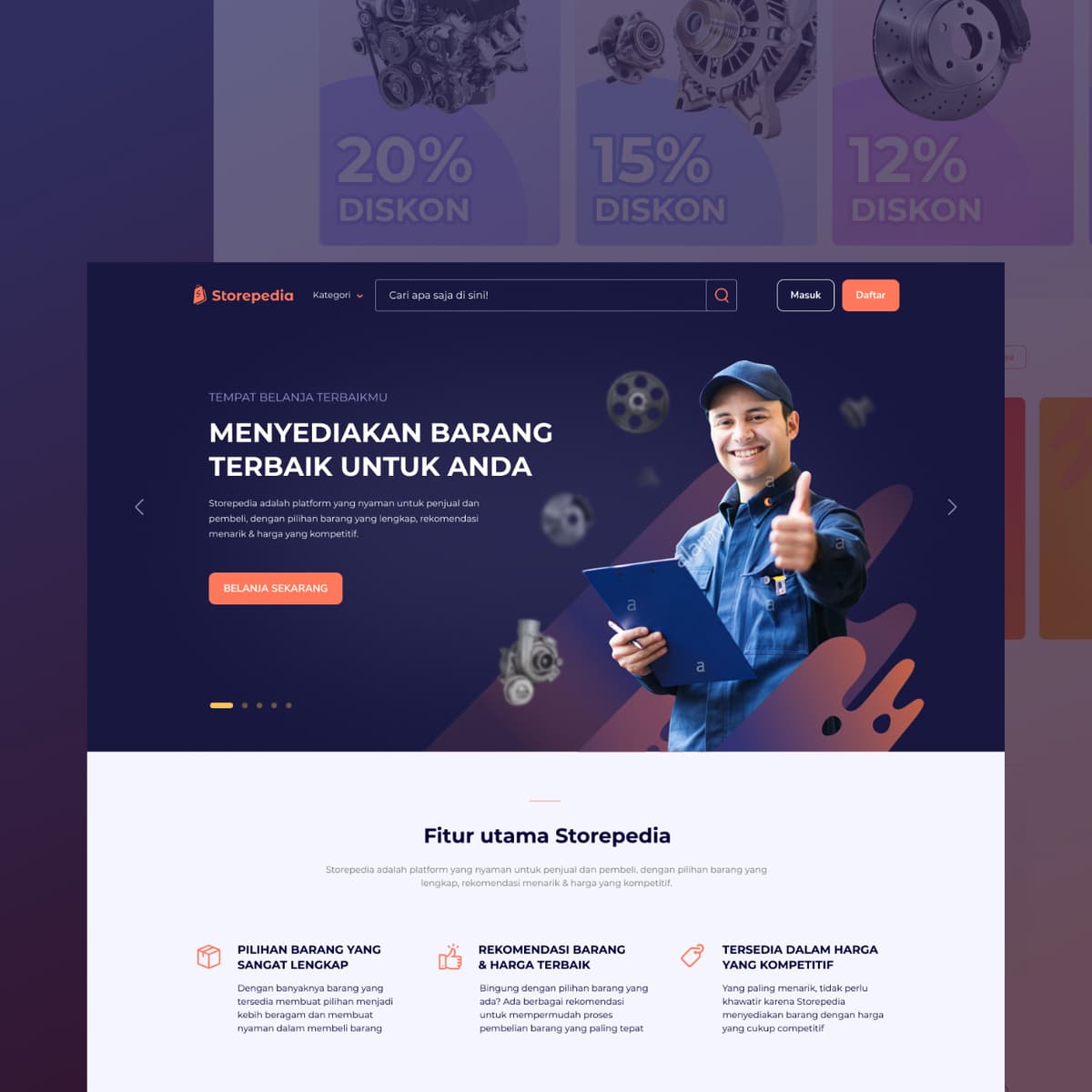
Storepedia
{"type":"doc","content":[{"type":"paragraph","attrs":{"textAlign":null},"content":[{"type":"text","text":"Storepedia is the industrial spare parts marketplace that brings factory and heavy machinery components into a clean, consumer-grade shopping experience."}]},{"type":"image","attrs":{"src":"https://farooq-agent.web.app/assets/images/works/details/252-autocom/autocom.jpg","alt":null,"title":null,"width":null,"height":null}},{"type":"paragraph","attrs":{"textAlign":null},"content":[{"type":"text","marks":[{"type":"bold"}],"text":"Web Design — Storepedia"}]},{"type":"paragraph","attrs":{"textAlign":null},"content":[{"type":"text","marks":[{"type":"italic"}],"text":"E-Commerce Marketplace Website · Industrial Spare Parts & Heavy Machinery · Indonesia"}]},{"type":"paragraph","attrs":{"textAlign":null},"content":[{"type":"text","text":"A full desktop e-commerce marketplace design for Storepedia — a parts and industrial goods platform serving buyers and sellers of factory spare parts, heavy machinery components, and automotive parts in Indonesia."}]},{"type":"paragraph","attrs":{"textAlign":null},"content":[{"type":"text","text":"The hero leads with a confident mechanic in uniform giving a thumbs up — approachable, professional, and immediately human — alongside floating machinery components (engine parts, gears, brake discs). The headline: \"Tempat Belanja Terbaik Mu — Menyediakan Barang Terbaik Untuk Anda\" (Your Best Shopping Destination — Providing the Best Products for You). A prominent \"Belanja Sekarang\" (Shop Now) CTA drives action. The top banner above the main site surfaces live discount promotions: 20%, 15%, and 12% diskon across three product categories — a classic marketplace conversion tactic that creates urgency at first scroll."}]},{"type":"paragraph","attrs":{"textAlign":null},"content":[{"type":"text","text":"The \"Fitur Utama Storepedia\" section below distills the platform's value in three pillars: Pilihan Barang yang Sangat Lengkap (Most Complete Product Selection), Rekomendasi Barang & Harga Terbaik (Best Product Recommendations & Prices), and Tersedia dalam Harga yang Kompetitif (Available at Competitive Prices) — a trust-building trifecta for B2B buyers evaluating a new parts supplier."}]},{"type":"paragraph","attrs":{"textAlign":null},"content":[{"type":"text","text":"The Storepedia logo — a stylized shopping bag icon in orange — anchors the dark navy header alongside \"Kategori\" dropdown, full-width search bar (\"Cari apa saja di sini!\"), and Masuk/Daftar (Login/Register) buttons — the complete marketplace header architecture."}]},{"type":"paragraph","attrs":{"textAlign":null},"content":[{"type":"text","text":"A spare parts marketplace that makes industrial procurement feel as intuitive as everyday online shopping."}]}]}
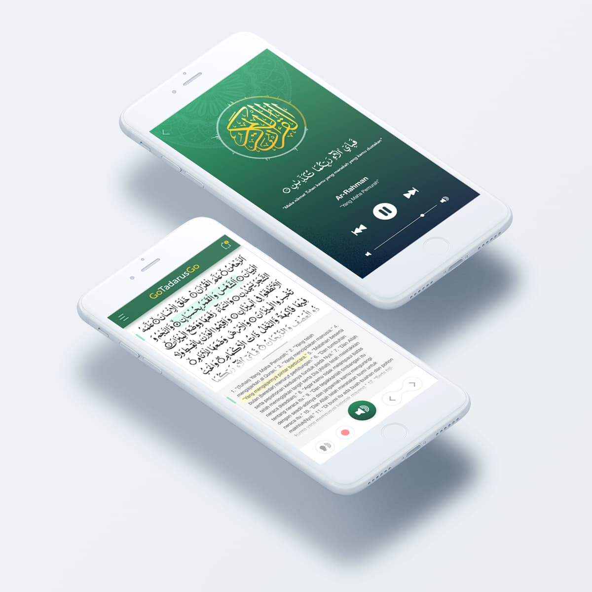
Go Tadarus Go
{"type":"doc","content":[{"type":"paragraph","attrs":{"textAlign":null},"content":[{"type":"text","text":"Ar-Rahman playing, ayat highlighted, translation synced — Go Tadarus Go makes Quran recitation and understanding a single, seamless mobile experience."}]},{"type":"image","attrs":{"src":"https://farooq-agent.web.app/assets/images/works/large/go-tadarus-go.jpg","alt":null,"title":null,"width":null,"height":null}},{"type":"paragraph","attrs":{"textAlign":null},"content":[{"type":"text","marks":[{"type":"bold"}],"text":"App UI Design — Go Tadarus Go"}]},{"type":"paragraph","attrs":{"textAlign":null},"content":[{"type":"text","marks":[{"type":"italic"}],"text":"Mobile App · Quran Reading & Audio · Islamic Digital Tool"}]},{"type":"paragraph","attrs":{"textAlign":null},"content":[{"type":"text","text":"A focused, elegantly designed mobile app for Go Tadarus Go — a Quran reading and translation listening app that brings together Arabic text, audio recitation, and Indonesian translation in one synchronized interface."}]},{"type":"paragraph","attrs":{"textAlign":null},"content":[{"type":"text","text":"The audio player screen (background) presents Surah Ar-Rahman with a full-screen green gradient backdrop, the Al-Quran medallion icon centered in gold, the Arabic ayat displayed in the header, and a clean music-player-style control bar — play/pause, skip, previous, and a progress slider. The design language borrows from music streaming apps deliberately: familiar interaction patterns applied to sacred content, lowering the barrier to daily tadarus."}]},{"type":"paragraph","attrs":{"textAlign":null},"content":[{"type":"text","text":"The reading screen (foreground) is the app's functional core: Arabic text on the left column, Indonesian translation on the right, with an active ayat highlighted in yellow — the app's key feature that shows exactly which verse the audio is currently reciting. A floating audio control button sits bottom-right for seamless audio-while-reading. The GoTadarusGo wordmark in the green header ties both screens to the same brand identity."}]},{"type":"paragraph","attrs":{"textAlign":null},"content":[{"type":"text","text":"The isometric two-phone presentation is a strong portfolio choice — showing both key screens simultaneously in a single, composition-forward image."}]},{"type":"paragraph","attrs":{"textAlign":null},"content":[{"type":"text","text":"An app that turns daily Quran reading into a habit by making it effortless to follow along with eyes and ears at once."}]}]}
Van Holland Branding
{"type":"doc","content":[{"type":"image","attrs":{"src":"https://farooq-agent.web.app/assets/images/works/small/Gfa29C2h_work_image.jpg","alt":null,"title":null,"width":null,"height":null}},{"type":"paragraph","attrs":{"textAlign":null},"content":[{"type":"text","text":" "},{"type":"text","marks":[{"type":"bold"}],"text":"Web Design — Stroopwafel Food Brand"},{"type":"text","text":" "},{"type":"hardBreak"},{"type":"text","marks":[{"type":"italic"}],"text":"Website Design · Dutch Artisan Food · F&B Sector"}]},{"type":"paragraph","attrs":{"textAlign":null},"content":[{"type":"text","text":"A warmly crafted web presence for a stroopwafel brand rooted in authentic Dutch heritage, presented here in a desktop monitor mockup that showcases the full homepage experience. The design masterfully balances appetite appeal with cultural storytelling — a combination essential for any artisan food brand with a geographic identity to defend."}]},{"type":"paragraph","attrs":{"textAlign":null},"content":[{"type":"text","text":"The hero section leads with a warm, overhead food photography composition on a natural wood surface — stroopwafels and accompanying condiments bathed in warm light — immediately triggering sensory engagement. The textured zigzag border that transitions the hero into the dark body section is a clever typographic nod to the waffle's signature grid pattern, seamlessly connecting visual language to product identity."}]},{"type":"paragraph","attrs":{"textAlign":null},"content":[{"type":"text","text":"The lower body adopts a deep charcoal backdrop that creates a dramatic, premium contrast against the warmth above. A ribbon banner headline — "},{"type":"text","marks":[{"type":"italic"}],"text":"\"Tasty stroopwafels with authentic Holland recipe\""},{"type":"text","text":" — is centered with classical confidence, while a silhouette of a Dutch windmill and the Netherlands flag ground the brand firmly in its geographic origin story."}]},{"type":"paragraph","attrs":{"textAlign":null},"content":[{"type":"text","text":"The \"Our Brand\" section introduces a chef in traditional whites alongside a map of the Netherlands, reinforcing authenticity and craft. The overall layout communicates a brand that is simultaneously inviting and authoritative — proud of its origins, confident in its craft."}]},{"type":"paragraph","attrs":{"textAlign":null},"content":[{"type":"text","text":"A well-composed food brand web design that uses cultural identity as its primary differentiator."}]}]}
Camp Logo Design
{"type":"doc","content":[{"type":"image","attrs":{"src":"https://farooq-agent.web.app/assets/images/works/details/210-saladin-before-learn-design/i9.png","alt":null,"title":null,"width":null,"height":null}},{"type":"paragraph","attrs":{"textAlign":null},"content":[{"type":"text","marks":[{"type":"bold"}],"text":"Logo Design — KEMBAR IV Camp Identity"},{"type":"hardBreak"},{"type":"text","marks":[{"type":"italic"}],"text":"Event Logo · Youth Camp · Jenu, June 2012"}]},{"type":"paragraph","attrs":{"textAlign":null},"content":[{"type":"text","text":"A dynamic event logo designed for KEMBAR IV, a youth camp held in Jenu, June 13–15, 2012. The mark centers on a triadic swirl composition — three interlocking figures rendered in primary colors (blue, red, and yellow) — evoking unity, movement, and the energy of collective participation."}]},{"type":"paragraph","attrs":{"textAlign":null},"content":[{"type":"text","text":"The three abstract forms are stylized human silhouettes in motion, arranged in a continuous rotational flow reminiscent of the classic triskelion symbol. This circular rhythm communicates the spirit of collaboration and togetherness central to a camp experience. The primary color palette — bold, unblended, and confident — signals accessibility and youthful vitality without relying on gradients or decorative treatment."}]},{"type":"paragraph","attrs":{"textAlign":null},"content":[{"type":"text","text":"A clean circular border frames the emblem, lending structure and badge-like authority to the mark. The wordmark \"KEMBAR IV\" arcs above in a strong red serif, while the event date and location curve below in a matching script, completing the medallion format."}]},{"type":"paragraph","attrs":{"textAlign":null},"content":[{"type":"text","text":"An early demonstration of strong compositional instincts — the ability to encode meaning (unity of three) directly into form — executed with clarity and visual balance."}]}]}
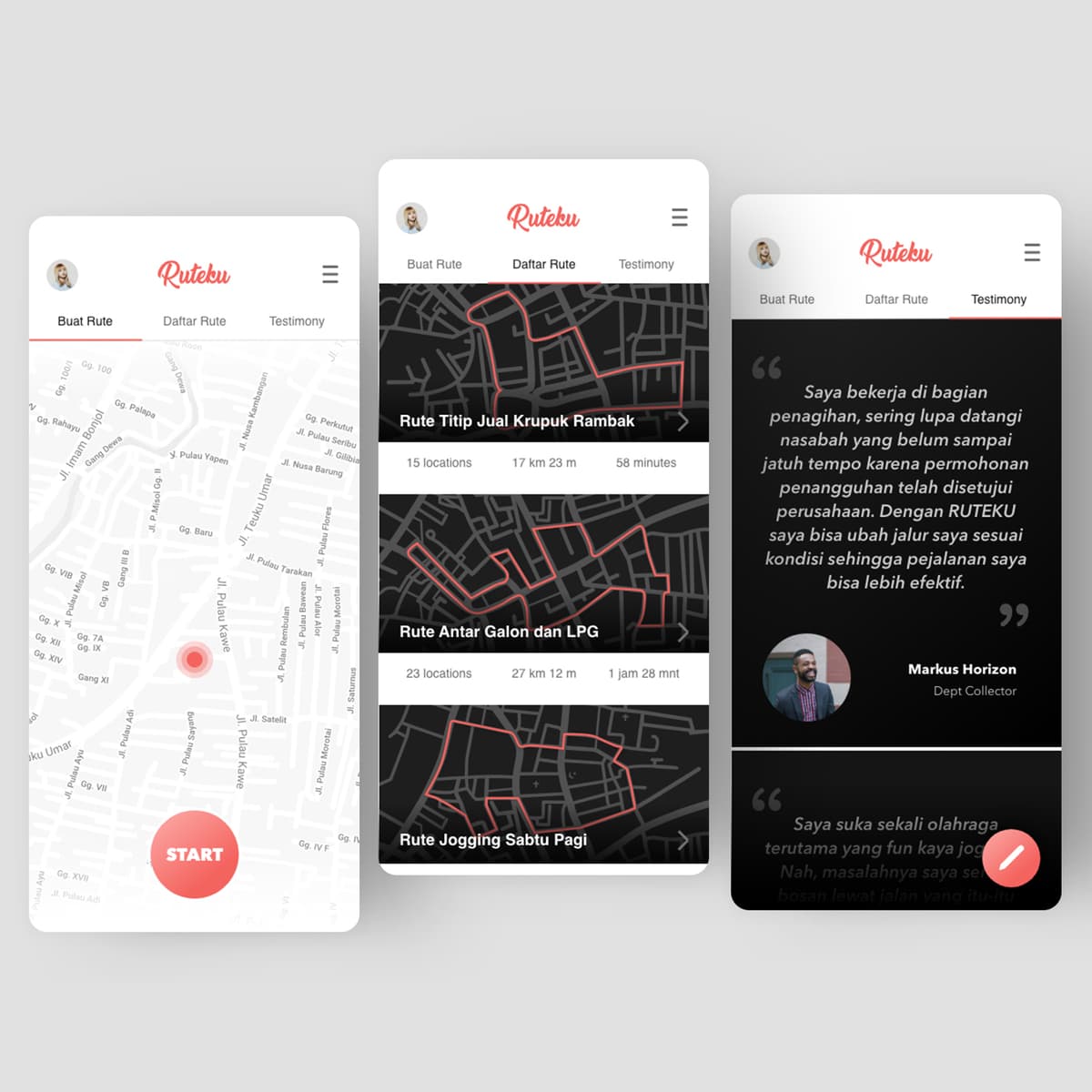
Ruteku
{"type":"doc","content":[{"type":"paragraph","attrs":{"textAlign":null},"content":[{"type":"text","text":"\"Rute Titip Jual Krupuk Rambak, Rute Antar Galon dan LPG, Rute Jogging Sabtu Pagi\" — Ruteku is the route planning app that works for whoever needs it, whatever the route is for."}]},{"type":"image","attrs":{"src":"https://farooq-agent.web.app/assets/images/works/large/ruteku.jpg","alt":null,"title":null,"width":null,"height":null}},{"type":"paragraph","attrs":{"textAlign":null},"content":[{"type":"text","marks":[{"type":"bold"}],"text":"App UI Design — Ruteku"}]},{"type":"paragraph","attrs":{"textAlign":null},"content":[{"type":"text","marks":[{"type":"italic"}],"text":"Mobile App · Route Planning & Management · Indonesia"}]},{"type":"paragraph","attrs":{"textAlign":null},"content":[{"type":"text","text":"A clean, practical app UI for Ruteku — a route creation, planning, and reuse tool built for anyone who travels the same paths regularly: field sales reps, delivery drivers, debt collectors, joggers, and beyond."}]},{"type":"paragraph","attrs":{"textAlign":null},"content":[{"type":"text","text":"The three-screen layout maps the complete user journey across three distinct tabs — Buat Rute, Daftar Rute, Testimony."}]},{"type":"paragraph","attrs":{"textAlign":null},"content":[{"type":"text","marks":[{"type":"bold"}],"text":"Buat Rute (Create Route):"},{"type":"text","text":" A full-screen map with a pulsing red location pin and a prominent red \"START\" button — minimal, immediate, zero friction to begin recording or planning a route."}]},{"type":"paragraph","attrs":{"textAlign":null},"content":[{"type":"text","marks":[{"type":"bold"}],"text":"Daftar Rute (Route Library):"},{"type":"text","text":" A dark-themed list of saved routes with route preview maps, names, location counts, distances, and estimated times. Three routes are visible: \"Rute Titip Jual Krupuk Rambak\" (15 locations, 17km, 58 minutes), \"Rute Antar Galon dan LPG\" (23 locations, 27km, 1h 28m), and \"Rute Jogging Sabtu Pagi\" — use cases so specific and Indonesian they immediately communicate that this app was designed from real user research, not assumptions."}]},{"type":"paragraph","attrs":{"textAlign":null},"content":[{"type":"text","marks":[{"type":"bold"}],"text":"Testimony:"},{"type":"text","text":" A dark testimonial screen with a quote from Markus Horizon, a Dept Collector: \"Dengan RUTEKU saya bisa ubah jalur saya sesuai kondisi sehingga perjalanan saya bisa lebih efektif.\" — the app's value proposition confirmed by a user whose livelihood depends on efficient routes."}]},{"type":"paragraph","attrs":{"textAlign":null},"content":[{"type":"text","text":"The red-on-white brand palette is clean and action-oriented throughout. The naming convention \"Ruteku\" (My Route) is personal and possessive — this app belongs to its user's daily life, not just their phone."}]}]}
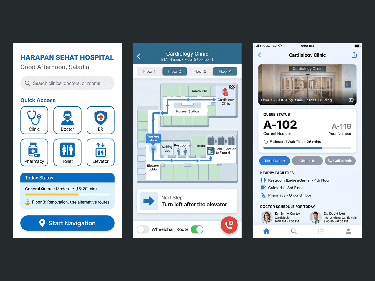
Apotekita
{"type":"doc","content":[{"type":"paragraph","attrs":{"textAlign":null},"content":[{"type":"text","text":"Streamline Health, Simplify Management — Apotekita transforms pharmacy operations into an organized, efficient, and reliable digital workflow."}]},{"type":"image","attrs":{"src":"https://farooq-agent.web.app/assets/images/works/details/229-apotekita/apotekita.jpg","alt":null,"title":null,"width":null,"height":null}},{"type":"paragraph","attrs":{"textAlign":null},"content":[{"type":"text","marks":[{"type":"bold"}],"text":"Mobile App Design — Apotekita (Medicine)"}]},{"type":"paragraph","attrs":{"textAlign":null},"content":[{"type":"text","marks":[{"type":"italic"}],"text":"Pharmacy Management · Inventory & Commerce · Healthcare Operations · UI/UX Design"}]},{"type":"paragraph","attrs":{"textAlign":null},"content":[{"type":"text","text":"A mobile application designed to optimize the management of medicine stores — Apotekita focuses on inventory tracking, sales management, and operational efficiency for pharmacies of all sizes."}]},{"type":"paragraph","attrs":{"textAlign":null},"content":[{"type":"text","text":"The experience centers on organization and clarity. Users can monitor stock levels, track expirations, manage sales, and generate reports — all within a streamlined, intuitive interface. By centralizing critical data, the app reduces errors and administrative burden."}]},{"type":"paragraph","attrs":{"textAlign":null},"content":[{"type":"text","text":"The interface likely emphasizes readability and speed. Key actions such as adding inventory, checking availability, and processing transactions are easily accessible, minimizing clicks and preventing mistakes in fast-paced pharmacy environments."}]},{"type":"paragraph","attrs":{"textAlign":null},"content":[{"type":"text","text":"Apotekita positions itself as more than a management tool. It ensures compliance, maintains supply chain awareness, and improves service quality for both store owners and customers, creating trust and reliability in healthcare delivery."}]},{"type":"paragraph","attrs":{"textAlign":null},"content":[{"type":"text","text":"The design balances operational depth with user-friendliness. Complex processes are presented in digestible ways, allowing users to focus on accuracy and efficiency without being overwhelmed by technical details."}]},{"type":"paragraph","attrs":{"textAlign":null},"content":[{"type":"text","text":"This project reflects a growing need for digital solutions in healthcare retail — where precision, reliability, and speed are essential."}]},{"type":"paragraph","attrs":{"textAlign":null},"content":[{"type":"text","text":"A practical and thoughtful exploration of pharmacy operations, where technology simplifies management, strengthens service, and ensures medicines reach the people who need them efficiently."}]},{"type":"paragraph","attrs":{"textAlign":null}},{"type":"image","attrs":{"src":"https://hyperfantasy.web.app/assets/images/portfolios/f15065a3-593c-4da6-9f81-3f4aab19e2c1/rs_flow.png","alt":null,"title":null,"width":null,"height":null}},{"type":"paragraph","attrs":{"textAlign":null}}]}
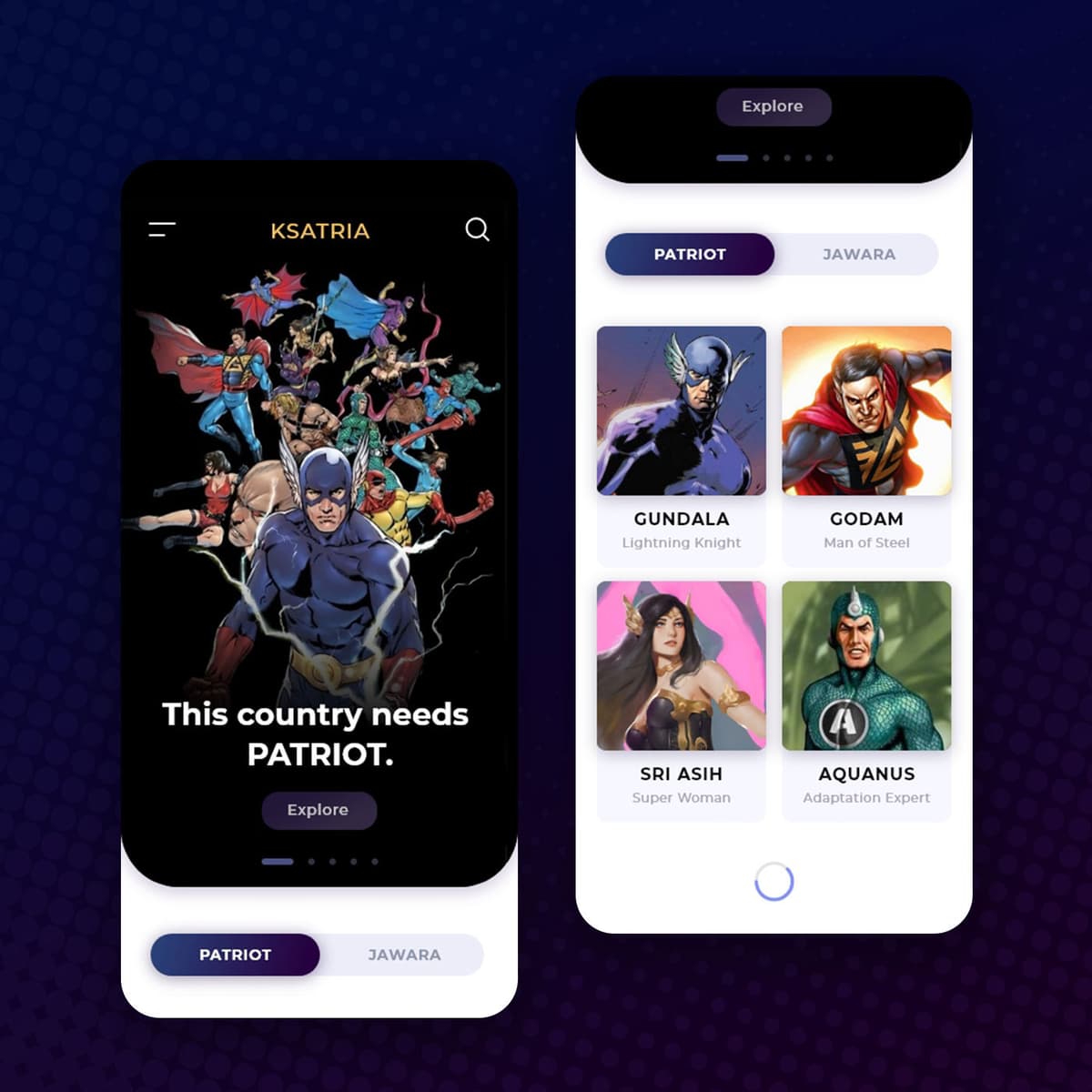
KSATRIA
{"type":"doc","content":[{"type":"paragraph","attrs":{"textAlign":null},"content":[{"type":"text","text":"This country needs PATRIOT — Ksatria is the Indonesian superhero universe app that finally gives Gundala, Godam, Sri Asih, and Aquanus the digital stage they deserve."}]},{"type":"image","attrs":{"src":"https://farooq-agent.web.app/assets/images/works/large/ksatria.jpg","alt":null,"title":null,"width":null,"height":null}},{"type":"paragraph","attrs":{"textAlign":null},"content":[{"type":"text","marks":[{"type":"bold"}],"text":"App UI Design — Ksatria"}]},{"type":"paragraph","attrs":{"textAlign":null},"content":[{"type":"text","marks":[{"type":"italic"}],"text":"Mobile App · Indonesian Superhero Universe · Comic & Character Platform"}]},{"type":"paragraph","attrs":{"textAlign":null},"content":[{"type":"text","text":"A bold, cinematic two-screen app UI for Ksatria — a platform dedicated to Indonesia's own superhero universe, bringing together the country's most iconic comic book characters in one dark, dramatic digital home."}]},{"type":"paragraph","attrs":{"textAlign":null},"content":[{"type":"text","marks":[{"type":"bold"}],"text":"Hero Screen:"},{"type":"text","text":" A full-bleed ensemble artwork of Indonesian superheroes — a group shot reminiscent of the Justice League or Avengers lineup, featuring costumed heroes in dynamic poses — anchored by the declaration \"This country needs PATRIOT.\" in bold white display type. The copy is a direct address: a call to heroism that connects the fictional universe to Indonesian national identity. An \"Explore\" CTA and two category tabs — Patriot and Jawara — organize the universe's character taxonomy."}]},{"type":"paragraph","attrs":{"textAlign":null},"content":[{"type":"text","marks":[{"type":"bold"}],"text":"Character Directory:"},{"type":"text","text":" The Explore screen surfaces the hero roster in a clean two-column card grid with character portrait art and names: Gundala (Lightning Knight), Godam (Man of Steel), Sri Asih (Super Woman), and Aquanus (Adaptation Expert) — four of Indonesia's most recognized superheroes, each with a distinct visual identity and archetypal power descriptor. The Patriot/Jawara tab system suggests a moral or factional divide within the universe — heroes vs. a rival class, or two schools of heroism — adding narrative depth to the navigation."}]},{"type":"paragraph","attrs":{"textAlign":null},"content":[{"type":"text","text":"The deep purple-to-blue gradient background communicates the cosmic, otherworldly atmosphere of a superhero universe, while the gold \"KSATRIA\" wordmark marks the platform as something worth the name — Ksatria means knight, warrior, hero in Indonesian."}]},{"type":"paragraph","attrs":{"textAlign":null},"content":[{"type":"text","text":"An app that tells Indonesian kids — and adults — that their country has always had its own heroes."}]}]}
Lakoni Branding
{"type":"doc","content":[{"type":"image","attrs":{"src":"https://farooq-agent.web.app/assets/images/works/details/155-lakonono-branding/lakoni.jpg","alt":null,"title":null,"width":null,"height":null}},{"type":"paragraph","attrs":{"textAlign":null},"content":[{"type":"text","marks":[{"type":"bold"}],"text":"Brand Identity — Lakoni"},{"type":"text","text":" "},{"type":"hardBreak"},{"type":"text","marks":[{"type":"italic"}],"text":"Logo Design · Illustration Studio · Small Creative Team"}]},{"type":"paragraph","attrs":{"textAlign":null},"content":[{"type":"text","text":"A joyfully bold wordmark logo for Lakoni — an illustration studio or small creative team — that wears its personality on its sleeve from the very first glance. The mark is built entirely from a custom bubble-letter typographic treatment: round, inflated letterforms with generous white fill and a thick black outline that gives the wordmark an almost tactile, sticker-like quality. The final lowercase \"i\" introduces a deliberate break in the capitalization rhythm — a small typographic wink that signals a team comfortable with personality and play."}]},{"type":"paragraph","attrs":{"textAlign":null},"content":[{"type":"text","text":"The wordmark floats against a vibrant sky blue background, centered within a soft radial circle that creates a subtle halo effect — adding depth and drawing focus without adding visual clutter. The entire composition has the cheerful immediacy of character art and street stickers, speaking directly to a creative audience that values craft, warmth, and a healthy disregard for corporate formality."}]},{"type":"paragraph","attrs":{"textAlign":null},"content":[{"type":"text","text":"The color palette — pure sky blue, crisp white, and bold black — is deceptively simple. It achieves maximum visual impact with minimal elements, demonstrating strong typographic confidence: when your letterforms are this characterful, you need nothing else."}]},{"type":"paragraph","attrs":{"textAlign":null},"content":[{"type":"text","text":"A logo that communicates exactly what an illustration studio should — approachable, creative, and unmistakably human. The kind of brand identity that makes people smile before they've read a single line of copy."}]}]}
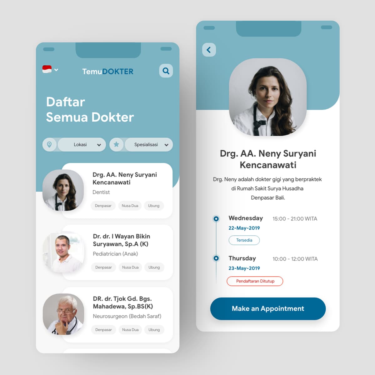
Temu Dokter
{"type":"doc","content":[{"type":"paragraph","attrs":{"textAlign":null},"content":[{"type":"text","text":"Browse All Doctors, filter by location and specialty, book in two taps — Temu Dokter makes finding the right doctor in Bali feel as simple as it should be."}]},{"type":"image","attrs":{"src":"https://farooq-agent.web.app/assets/images/works/large/temu-dokter.jpg","alt":null,"title":null,"width":null,"height":null}},{"type":"paragraph","attrs":{"textAlign":null},"content":[{"type":"text","marks":[{"type":"bold"}],"text":"App UI Design — Temu Dokter"}]},{"type":"paragraph","attrs":{"textAlign":null},"content":[{"type":"text","marks":[{"type":"italic"}],"text":"Mobile App · Doctor Appointment · Indonesian Healthcare"}]},{"type":"paragraph","attrs":{"textAlign":null},"content":[{"type":"text","text":"A clean, well-considered doctor appointment app UI for Temu Dokter — a platform connecting patients with doctors across Bali, filterable by lokasi (location) and spesialisasi (specialization)."}]},{"type":"paragraph","attrs":{"textAlign":null},"content":[{"type":"text","marks":[{"type":"bold"}],"text":"Screen 1 — Doctor Directory:"},{"type":"text","text":" The listing screen opens with \"Daftar Semua Dokter\" and two filter chips — Lokasi (Denpasar, Nusa Dua, Ubung) and Spesialisasi — giving patients immediate control over search relevance. Three doctors are visible: Drg. AA. Neny Suryani Kencanawati (Dentist), Dr. dr. I Wayan Bikin Suryawan Sp.A K (Pediatrician), and DR. dr. Tjok Gd. Bgs. Mahadewa "},{"type":"text","marks":[{"type":"link","attrs":{"href":"http://Sp.BS","target":"_blank","rel":"noopener noreferrer nofollow","class":null,"title":null}}],"text":"Sp.BS"},{"type":"text","text":"(K) (Neurosurgeon). Each card shows real photo, full medical title, specialty, and practice locations — the level of detail a patient actually needs to choose."}]},{"type":"paragraph","attrs":{"textAlign":null},"content":[{"type":"text","marks":[{"type":"bold"}],"text":"Screen 2 — Doctor Profile & Availability:"},{"type":"text","text":" Drg. Neny's profile screen shows her photo, full name, practice location (RS Surya Husadha Denpasar Bali), and a chronological availability schedule: Wednesday 22-May 15:00–21:00 WITA (Tersedia) and Thursday 23-May 10:00–12:00 WITA (Pendaftaran Ditutup). The closed/open status distinction is a critical UX detail — patients see exactly which slots are bookable, not just when the doctor works. A prominent \"Make an Appointment\" CTA closes the conversion flow."}]},{"type":"paragraph","attrs":{"textAlign":null},"content":[{"type":"text","text":"The teal-and-white palette communicates medical clarity without clinical coldness — a calm, trustworthy app for decisions that actually matter."}]}]}
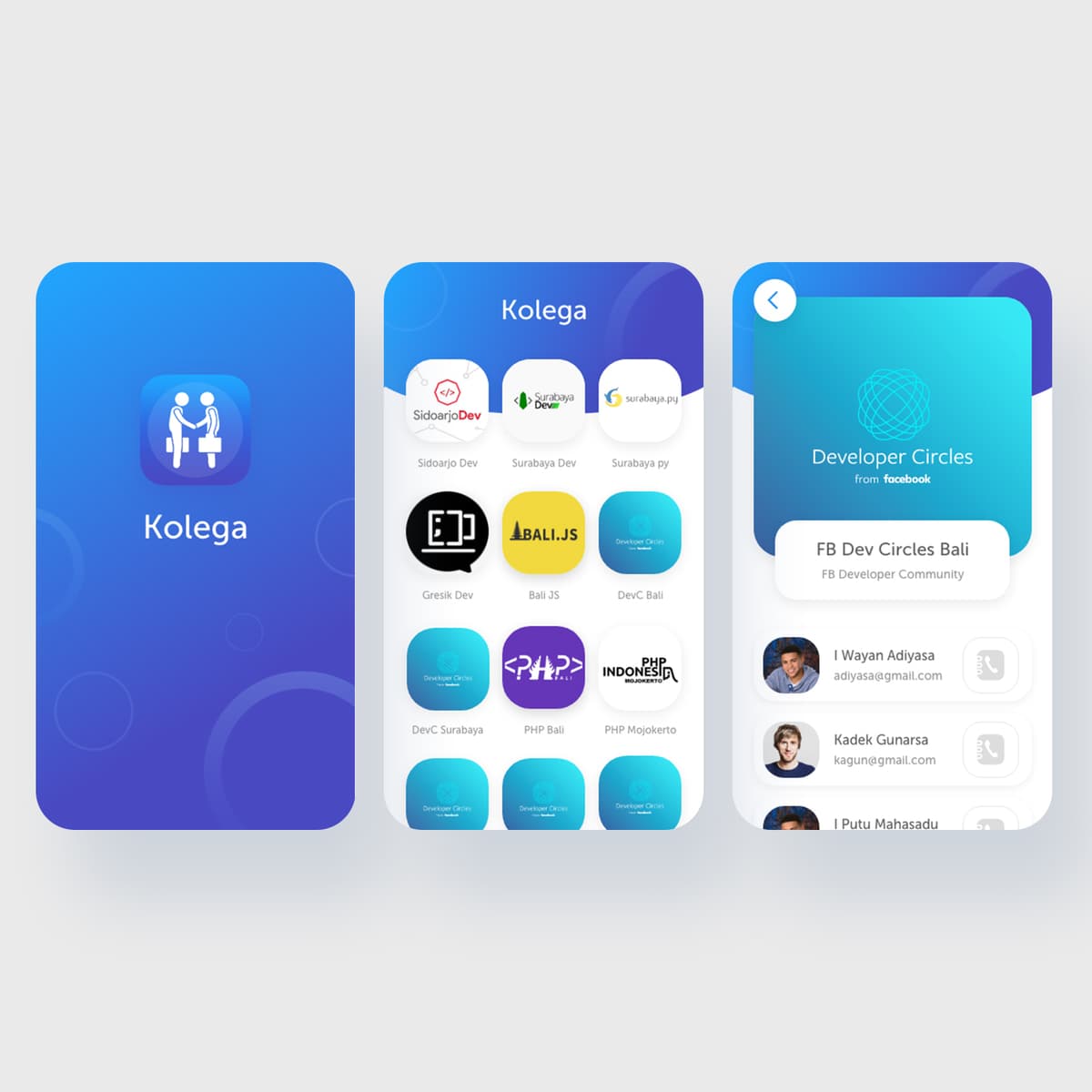
Kolega
{"type":"doc","content":[{"type":"paragraph","attrs":{"textAlign":null},"content":[{"type":"text","text":"Sidoarjo Dev, Surabaya Dev, Bali JS, DevC, PHP Indonesia — Kolega is the app that maps Indonesia's developer community into one place, one contact at a time."}]},{"type":"image","attrs":{"src":"https://farooq-agent.web.app/assets/images/works/large/kolega.jpg","alt":null,"title":null,"width":null,"height":null}},{"type":"paragraph","attrs":{"textAlign":null},"content":[{"type":"text","marks":[{"type":"bold"}],"text":"App UI Design — Kolega"}]},{"type":"paragraph","attrs":{"textAlign":null},"content":[{"type":"text","marks":[{"type":"italic"}],"text":"Mobile App · Developer Community Directory · Indonesia Tech Scene"}]},{"type":"paragraph","attrs":{"textAlign":null},"content":[{"type":"text","text":"A clean, vibrant app UI for Kolega — a developer community contact and networking platform connecting members across Indonesia's growing tech communities. Three screens tell the complete user story from onboarding to discovery to connection."}]},{"type":"paragraph","attrs":{"textAlign":null},"content":[{"type":"text","text":"The splash screen is confident and simple: the Kolega logomark — two figures shaking hands — on a rich blue gradient, the brand name centered below. No tagline needed; the icon says it all."}]},{"type":"paragraph","attrs":{"textAlign":null},"content":[{"type":"text","text":"The community directory screen is the app's core value proposition: a scrollable grid of Indonesian developer community logos — Sidoarjo Dev, Surabaya Dev, "},{"type":"text","marks":[{"type":"link","attrs":{"href":"http://Surabaya.py","target":"_blank","rel":"noopener noreferrer nofollow","class":null,"title":null}}],"text":"Surabaya.py"},{"type":"text","text":", Gresik Dev, Bali JS, DevC Bali, DevC Surabaya, PHP Bali, PHP Mojokerto, and more — each in a rounded card format that makes the community ecosystem feel organized, accessible, and genuinely navigable. For a developer in East Java discovering that Gresik Dev exists 30 minutes from their home, this screen alone delivers immediate value."}]},{"type":"paragraph","attrs":{"textAlign":null},"content":[{"type":"text","text":"The community detail screen shows the FB Developer Circles member list for Bali — real names, profile photos, email addresses, and a direct call button beside each member. The teal gradient header with the Developer Circles from Facebook branding confirms the app's integration with existing community infrastructure."}]},{"type":"paragraph","attrs":{"textAlign":null},"content":[{"type":"text","text":"A networking app that treats Indonesia's distributed developer community as the asset it genuinely is."}]}]}

HelloDoc Doctor Consultation - Mobile App
{"type":"doc","content":[{"type":"paragraph","attrs":{"textAlign":null},"content":[{"type":"text","text":"A telemedicine app that puts a verified doctor two taps away — browse schedules, pick your consultation type, and go live in minutes."}]},{"type":"image","attrs":{"src":"https://cdn.dribbble.com/userupload/4027980/file/original-b0608547b2daa74bbb18d6cd0760ccb3.png?compress=1&resize=640x480&vertical=top","alt":null,"title":null,"width":null,"height":null}},{"type":"paragraph","attrs":{"textAlign":null},"content":[{"type":"text","marks":[{"type":"bold"}],"text":"UI/UX Design — HelloDoc Doctor Consultation"}]},{"type":"paragraph","attrs":{"textAlign":null},"content":[{"type":"text","marks":[{"type":"italic"}],"text":"Mobile App · Telemedicine · Healthcare"}]},{"type":"paragraph","attrs":{"textAlign":null},"content":[{"type":"text","text":"HelloDoc streamlines the end-to-end doctor consultation experience across two core screens. The Doctor Details page profiles Dr. Joseph Shamalan — an Otorhinolaryngologist with 5,000+ patients and 4 years of experience — alongside a weekly availability grid that shows real-time slot status (available, limited, fully booked) per day and time. Three consultation tiers are presented clearly: Short (10 min), In-depth (30 min), and Action Consultation (requires recommendation) — each with distinct visual treatments that guide users toward the right booking decision. A full-width \"Book Now\" CTA closes the screen with zero friction."}]},{"type":"paragraph","attrs":{"textAlign":null},"content":[{"type":"text","text":"The live video call screen shows an active in-depth consultation in progress — full-screen doctor feed, patient thumbnail in the corner, a 2:58 timer, and a \"Recording\" indicator. Standard call controls (camera, mic, pause, chat, grid) sit neatly at the bottom, keeping the interface minimal so the conversation stays the focus."}]},{"type":"paragraph","attrs":{"textAlign":null},"content":[{"type":"text","text":"The soft blue gradient header and clean white card layout give the app a calm, clinical trustworthiness without feeling cold."}]},{"type":"paragraph","attrs":{"textAlign":null},"content":[{"type":"text","text":" "}]},{"type":"paragraph","attrs":{"textAlign":null},"content":[{"type":"text","text":"2022-03-13 01:12:15"}]}]}
Lift UI
{"type":"doc","content":[{"type":"paragraph","attrs":{"textAlign":null},"content":[{"type":"text","text":"What if a lift had 1000 floors? Lift UI reimagines the elevator control panel for a building where the floor number alone needs four digits to say where you're going."}]},{"type":"image","attrs":{"src":"https://farooq-agent.web.app/assets/images/works/large/lift.jpg","alt":null,"title":null,"width":null,"height":null}},{"type":"paragraph","attrs":{"textAlign":null},"content":[{"type":"text","marks":[{"type":"bold"}],"text":"UI Design Concept — Lift UI"}]},{"type":"paragraph","attrs":{"textAlign":null},"content":[{"type":"text","marks":[{"type":"italic"}],"text":"Elevator Interface · Interaction Design · \"What If\" Concept"}]},{"type":"paragraph","attrs":{"textAlign":null},"content":[{"type":"text","text":"A speculative interaction design exploration answering a deceptively interesting question: what if an elevator had 1000 floors? The standard lift panel — a grid of numbered buttons — completely breaks down at that scale. This concept rethinks it from scratch."}]},{"type":"paragraph","attrs":{"textAlign":null},"content":[{"type":"text","text":"The result is a dark, industrial-styled control panel with a numeric keypad entry system — the only sensible UX solution when destination floors number in the hundreds or thousands. The current floor display reads \"0563\" in a bold LCD-style typeface at the top, flanked by down (↓) and up (↑) chevrons in amber and gold. The \"Up Next\" queue on the left shows a live list of queued destinations — 0590, 0634, 0669, 0730, 0986 going up (amber arrows) and 0198, 0094, 0022 going down (green arrows) — communicating the elevator's current travel state at a glance."}]},{"type":"paragraph","attrs":{"textAlign":null},"content":[{"type":"text","text":"The floor entry panel on the right is a clean 0–9 numpad with CLEAR and ENTER — the most efficient input method for a 4-digit floor system, borrowed from ATM and security pad interaction patterns. Door controls (open/close) sit at the bottom."}]},{"type":"paragraph","attrs":{"textAlign":null},"content":[{"type":"text","text":"The panel is presented beside a blurred, atmospheric elevator corridor photograph — contextualizing the UI in its physical environment and grounding the speculative concept in a real spatial experience."}]},{"type":"paragraph","attrs":{"textAlign":null},"content":[{"type":"text","text":"A concept that starts with \"what if\" and ends with a fully considered answer."}]}]}

Smart and Advanced Messaging App
{"type":"doc","content":[{"type":"image","attrs":{"src":"https://cdn.dribbble.com/userupload/8429188/file/original-4f8e613ea2c5924e2970df8326f25f34.png?resize=1504x1128&vertical=center","alt":null,"title":null,"width":null,"height":null}},{"type":"heading","attrs":{"textAlign":"center","level":2},"content":[{"type":"text","marks":[{"type":"bold"}],"text":"Hi Guys!✋🏻"}]},{"type":"paragraph","attrs":{"textAlign":"center"},"content":[{"type":"text","text":"This is another exploration about Messaging App Mobile called Pesan."}]},{"type":"paragraph","attrs":{"textAlign":"center"},"content":[{"type":"text","marks":[{"type":"bold"}],"text":"More preview? enjoy scrolling 🙌"},{"type":"hardBreak"},{"type":"hardBreak"}]},{"type":"image","attrs":{"src":"https://cdn.dribbble.com/userupload/8429189/file/original-3c91df81e94f63b01cf44ebf896552c7.png?resize=752x&vertical=center","alt":null,"title":null,"width":null,"height":null}},{"type":"image","attrs":{"src":"https://cdn.dribbble.com/userupload/8429190/file/original-6efd776721c38892ff8210bfaf6aa495.png?resize=752x&vertical=center","alt":null,"title":null,"width":null,"height":null}},{"type":"image","attrs":{"src":"https://cdn.dribbble.com/userupload/8429191/file/original-0d0326d26515175a7e99b714f3f2b2db.png?resize=752x&vertical=center","alt":null,"title":null,"width":null,"height":null}},{"type":"image","attrs":{"src":"https://cdn.dribbble.com/userupload/8429192/file/original-bb581b198b89920a0a7d54e926a9ac6a.png?resize=752x&vertical=center","alt":null,"title":null,"width":null,"height":null}},{"type":"image","attrs":{"src":"https://cdn.dribbble.com/userupload/8429193/file/original-e91d5116b04a3982909b941004eca8c9.png?resize=752x&vertical=center","alt":null,"title":null,"width":null,"height":null}},{"type":"paragraph","attrs":{"textAlign":null}}]}
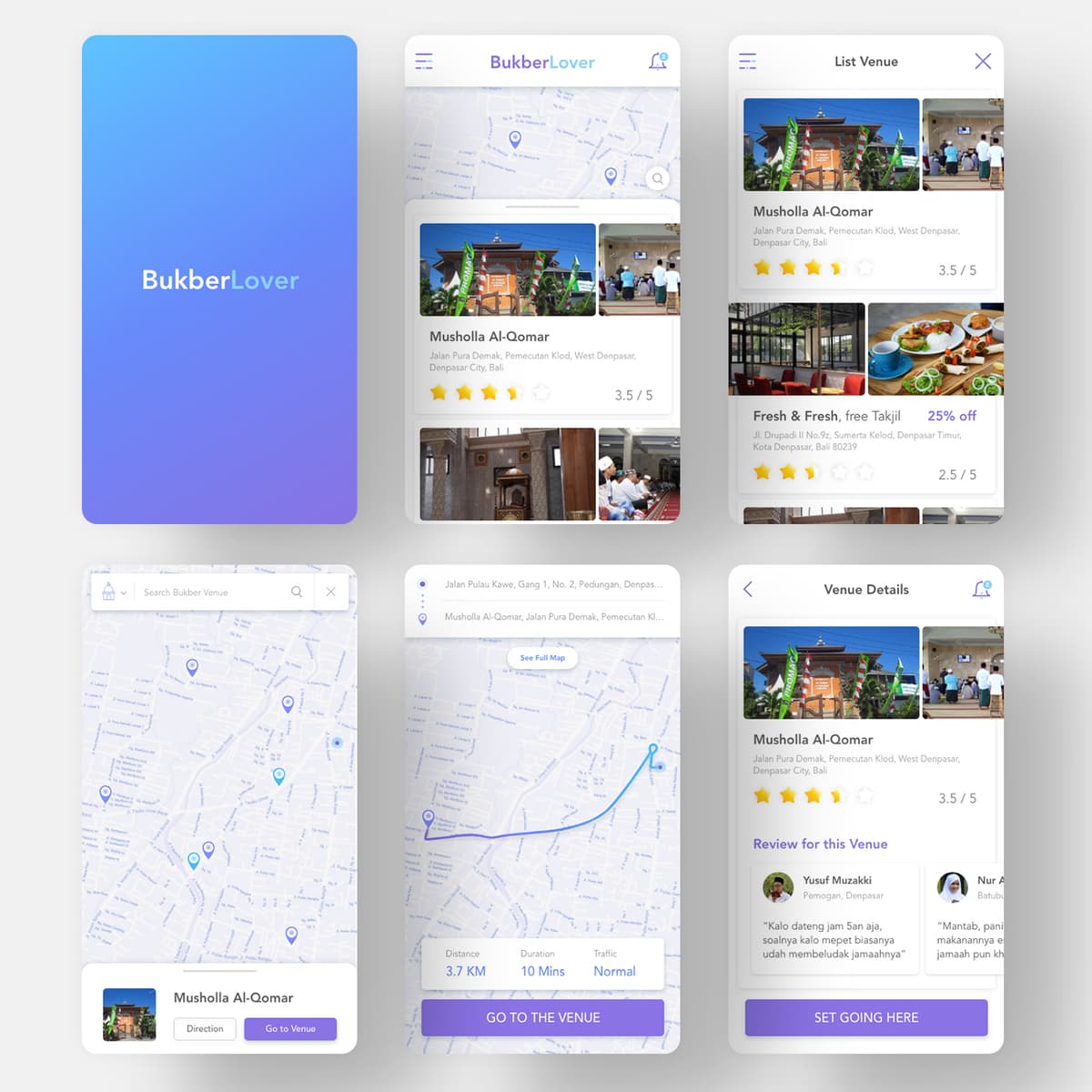
Bukber Lover
{"type":"doc","content":[{"type":"paragraph","attrs":{"textAlign":null},"content":[{"type":"text","text":"Musholla Al-Qomar, 3.7 KM, 10 Minutes, free iftar — BukberLover is the Ramadan app that helps you find where to break your fast without breaking a sweat."}]},{"type":"image","attrs":{"src":"https://farooq-agent.web.app/assets/images/works/large/bukber-lover.jpg","alt":null,"title":null,"width":null,"height":null}},{"type":"paragraph","attrs":{"textAlign":null},"content":[{"type":"text","marks":[{"type":"bold"}],"text":"Mobile Web App — BukberLover"}]},{"type":"paragraph","attrs":{"textAlign":null},"content":[{"type":"text","marks":[{"type":"italic"}],"text":"Ramadan App · Free Iftar Venue Finder · Mobile UI · Indonesia"}]},{"type":"paragraph","attrs":{"textAlign":null},"content":[{"type":"text","text":"A Ramadan-specific mobile web app for BukberLover — a platform that maps mosques, restaurants, and venues offering free iftar (buka puasa) during Ramadan, helping fasting Muslims find where to break their fast in their city."}]},{"type":"paragraph","attrs":{"textAlign":null},"content":[{"type":"text","text":"Five screens cover the complete user journey:"}]},{"type":"paragraph","attrs":{"textAlign":null},"content":[{"type":"text","marks":[{"type":"bold"}],"text":"Splash:"},{"type":"text","text":" A clean blue-to-lavender gradient with the BukberLover wordmark — calm, spiritual, and seasonally appropriate."}]},{"type":"paragraph","attrs":{"textAlign":null},"content":[{"type":"text","marks":[{"type":"bold"}],"text":"Venue Feed:"},{"type":"text","text":" A card-based list of bukber venues with venue photos, name, address, star ratings (Musholla Al-Qomar 3.5/5, Fresh & Fresh 2.5/5), and promotional tags (\"25% off\", \"free Takjil\") — the key information a fasting person evaluating where to go needs at a glance."}]},{"type":"paragraph","attrs":{"textAlign":null},"content":[{"type":"text","marks":[{"type":"bold"}],"text":"Map Search:"},{"type":"text","text":" A full-screen map view with venue pins scattered across Denpasar — location-aware venue discovery for users who want to find the nearest option rather than browse a list."}]},{"type":"paragraph","attrs":{"textAlign":null},"content":[{"type":"text","marks":[{"type":"bold"}],"text":"Directions:"},{"type":"text","text":" A route detail screen showing the path from current location to Musholla Al-Qomar — 3.7 KM, 10 Minutes, Normal traffic — with a \"Go to the Venue\" CTA. Practical, zero-friction navigation."}]},{"type":"paragraph","attrs":{"textAlign":null},"content":[{"type":"text","marks":[{"type":"bold"}],"text":"Venue Detail:"},{"type":"text","text":" Musholla Al-Qomar's full profile — photos, rating, address, and user reviews. Yusuf Muzakki from Denpasar writes: \"Kalo dateng jam 5an aja, soalnya kalo mepet biasanya udah membeludak jamaahnya\" — authentic UGC that makes the platform feel genuinely used and trusted."}]},{"type":"paragraph","attrs":{"textAlign":null},"content":[{"type":"text","text":"The purple-and-blue palette is soft and spiritual, appropriate for a Ramadan context without being heavy-handed about it."}]},{"type":"paragraph","attrs":{"textAlign":null},"content":[{"type":"text","text":"A hyper-local, seasonally specific app that solves a real problem for millions of Indonesian Muslims every year."}]}]}
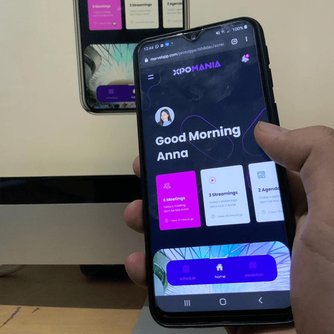
XPOMANIA - Mobile App
{"type":"doc","content":[{"type":"paragraph","attrs":{"textAlign":null},"content":[{"type":"text","text":"XPOMANIA is the virtual event management app that gives every attendee a personalized command center for their XR expo experience."}]},{"type":"image","attrs":{"src":"https://farooq-agent.web.app/assets/images/works/large/pd/xpomania-app.png","alt":null,"title":null,"width":null,"height":null}},{"type":"paragraph","attrs":{"textAlign":null},"content":[{"type":"text","marks":[{"type":"bold"}],"text":"App UI Design — XPOMANIA"}]},{"type":"paragraph","attrs":{"textAlign":null},"content":[{"type":"text","marks":[{"type":"italic"}],"text":"Mobile App · Virtual Event Management · VR / AR / XR / MR · Prototype"}]},{"type":"paragraph","attrs":{"textAlign":null},"content":[{"type":"text","text":"A dark, immersive mobile app UI for XPOMANIA — a virtual event management platform for XR (Extended Reality) exhibitions and conferences, spanning VR, AR, and Mixed Reality event formats. Notably presented as a live prototype running on a real Android device, photographed in-hand — confirming this was a working interactive prototype, not just a static design."}]},{"type":"paragraph","attrs":{"textAlign":null},"content":[{"type":"text","text":"The home screen opens with a personalized greeting: \"Good Morning Anna\" — the user's name front and center, communicating that XPOMANIA treats every attendee as an individual within a potentially massive virtual event. Three countdown stat cards immediately surface the day's schedule: 6 Meetings (Today's meeting, don't be late Anna! — 1 hour 27 mins to go), 3 Streamings (Today's streamings, don't miss it Anna! — 1 hour 26 mins to go), 2 Agendas (Today's agendas, don't be late — 2 hours 33 mins to go) — a dashboard that creates urgency without anxiety, keeping the attendee oriented in a packed virtual event day."}]},{"type":"paragraph","attrs":{"textAlign":null},"content":[{"type":"text","text":"The pink and purple card palette against the deep dark background creates a vibrant, energetic visual identity appropriate for a technology-forward XR event platform. The pill-shaped bottom navigation — Schedule, Home, Exhibition — maps the three core attendee journeys: manage your calendar, return home, explore the virtual exhibition floor."}]},{"type":"paragraph","attrs":{"textAlign":null},"content":[{"type":"text","text":"The visible prototype URL ("},{"type":"text","marks":[{"type":"link","attrs":{"href":"http://marvelapp.com","target":"_blank","rel":"noopener noreferrer nofollow","class":null,"title":null}}],"text":"marvelapp.com"},{"type":"text","text":") confirms this was built in Marvel for interactive testing — a detail that demonstrates a complete design-to-prototype workflow, not just UI delivery."}]},{"type":"paragraph","attrs":{"textAlign":null},"content":[{"type":"text","text":"A virtual event app that makes XR conferences feel as navigable as a physical one — because knowing where to be and when is half the experience."}]}]}
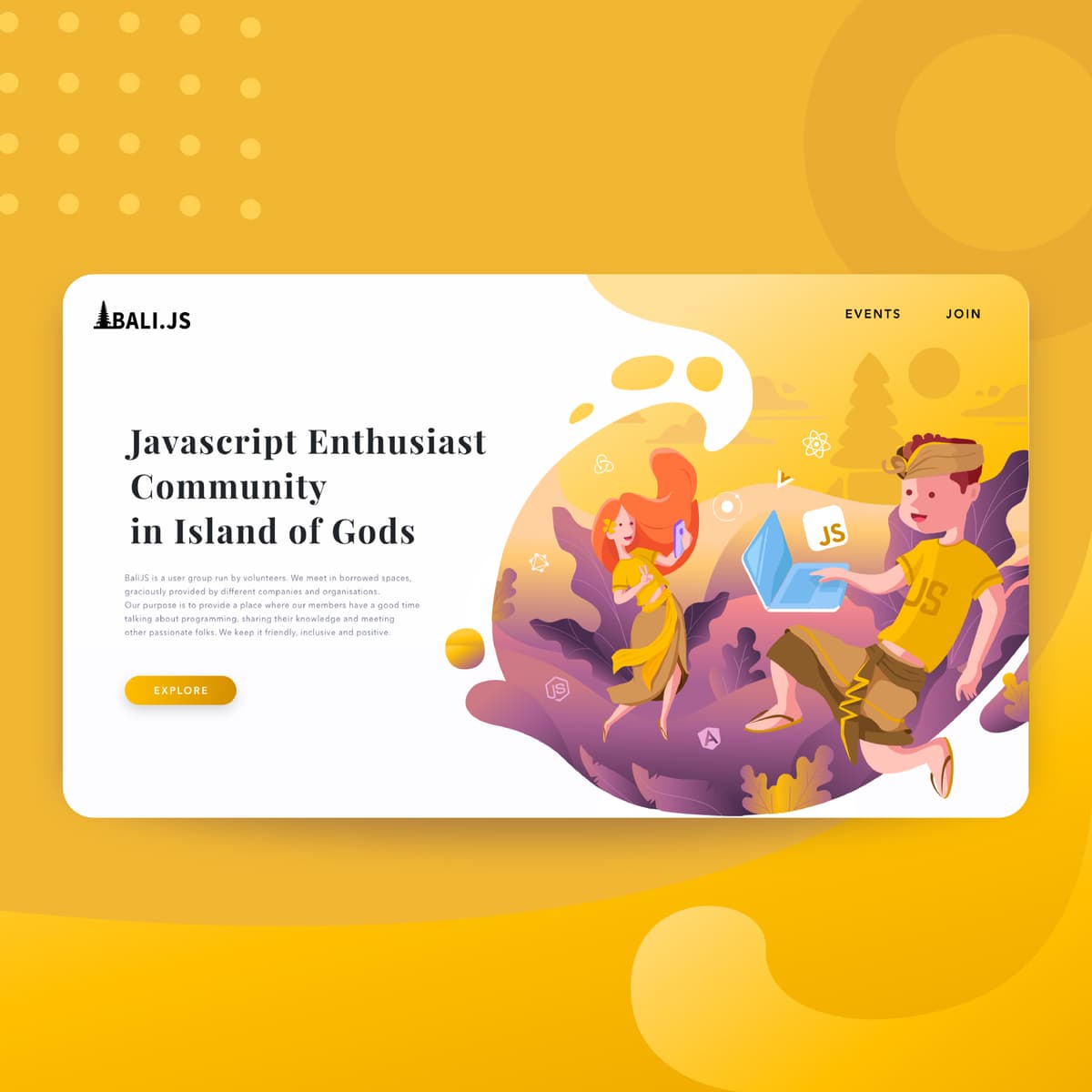
Bali JS
{"type":"doc","content":[{"type":"paragraph","attrs":{"textAlign":null},"content":[{"type":"text","text":"Javascript Enthusiast Community in Island of Gods — Bali.JS's website is as warm and vibrant as the community it represents."}]},{"type":"image","attrs":{"src":"https://farooq-agent.web.app/assets/images/works/large/bali-js.jpg","alt":null,"title":null,"width":null,"height":null}},{"type":"paragraph","attrs":{"textAlign":null},"content":[{"type":"text","marks":[{"type":"bold"}],"text":"Web Design — Bali.JS"}]},{"type":"paragraph","attrs":{"textAlign":null},"content":[{"type":"text","marks":[{"type":"italic"}],"text":"Community Website · JavaScript Developer Community · Bali, Indonesia"}]},{"type":"paragraph","attrs":{"textAlign":null},"content":[{"type":"text","text":"A warm, illustration-forward website for Bali.JS — a volunteer-run JavaScript developer community in Bali, described as \"a place where our members have a good time talking about programming, sharing their knowledge and meeting other passionate folks. We keep it friendly, inclusive and positive.\""}]},{"type":"paragraph","attrs":{"textAlign":null},"content":[{"type":"text","text":"The design is an immediate expression of that spirit. The warm amber-gold background wraps the entire layout in Bali's signature sunshine warmth, while the white card hero creates a clean stage for the illustration — the same Balinese developer duo from the portfolio's hero illustration, here placed in the full website context they were designed for."}]},{"type":"paragraph","attrs":{"textAlign":null},"content":[{"type":"text","text":"The hero copy — \"Javascript Enthusiast Community in Island of Gods\" — is a perfect headline: technically specific (JS community), culturally specific (Island of Gods = Bali), and emotionally warm. It tells you exactly who this is for and makes you feel welcome before you've clicked anything. The subtext confirms the community's ethos: volunteer-run, borrowed spaces, shared knowledge, good vibes."}]},{"type":"paragraph","attrs":{"textAlign":null},"content":[{"type":"text","text":"The minimal navigation — Events, Join — strips the site to its two most important conversion actions: come to an event, become a member. An \"Explore\" CTA below the copy invites deeper browsing for the curious."}]},{"type":"paragraph","attrs":{"textAlign":null},"content":[{"type":"text","text":"A community website that feels like the community itself — open, warm, and built with care."}]}]}
Shalova
{"type":"doc","content":[{"type":"paragraph","attrs":{"textAlign":null},"content":[{"type":"text","text":"Floral White Linen Shirt Used Like New, 70% condition, $5.5 — Shalova is the women's fashion catalog app that turns pre-loved clothes into someone else's new favorite outfit."}]},{"type":"image","attrs":{"src":"https://farooq-agent.web.app/assets/images/works/large/shalova.jpg","alt":null,"title":null,"width":null,"height":null}},{"type":"paragraph","attrs":{"textAlign":null},"content":[{"type":"text","marks":[{"type":"bold"}],"text":"App UI Design — Shalova"}]},{"type":"paragraph","attrs":{"textAlign":null},"content":[{"type":"text","marks":[{"type":"italic"}],"text":"Mobile App · Women's Fashion Catalog · Second-Hand Clothing Marketplace"}]},{"type":"paragraph","attrs":{"textAlign":null},"content":[{"type":"text","text":"A soft, feminine two-screen app UI for Shalova — a women's fashion catalog platform built around clothes sharing and second-hand selling, positioned with the tagline \"Let's share clothes that are not used.\""}]},{"type":"paragraph","attrs":{"textAlign":null},"content":[{"type":"text","marks":[{"type":"bold"}],"text":"Home Screen:"},{"type":"text","text":" A pink banner hero with a woman in a white dress introduces the platform's core social mission — clothes sharing, not just buying. Below it, four category tabs: Shirt, Outher (Outer), Pants, More — a clean taxonomy for the fashion catalog. The product grid below shows \"Popular\" items: Floral White Linen Shirt Used Like New ($5.5, 70% condition, 153 Likes) and Floral White Linen Outher Used Perfect ($5.5, 70%, 153 Likes) — real second-hand fashion items with condition ratings and social engagement metrics. A vertical \"Popular / Recent / Recommended\" tab on the left edge gives additional sort options without cluttering the main layout."}]},{"type":"paragraph","attrs":{"textAlign":null},"content":[{"type":"text","marks":[{"type":"bold"}],"text":"Product Detail:"},{"type":"text","text":" Felicia – New York lists a Floral White Linen Shirt Used Like New — full product photography on a hanger, 3.5-star rating, Condition 70%, Price $5.5, and a description: \"These clothes will be sold or exchanged for other clothes because they are already too loose. The condition is still good & clean as new.\" A pink \"Add to Wishlist\" CTA anchors the bottom — notably not \"Buy Now,\" communicating that this platform prioritizes discovery and curation over hard conversion."}]},{"type":"paragraph","attrs":{"textAlign":null},"content":[{"type":"text","text":"The all-pink palette, script wordmark, and clean white card system communicate exactly who this app is for — young women who care about fashion, sustainability, and community."}]},{"type":"paragraph","attrs":{"textAlign":null},"content":[{"type":"text","text":"A fashion marketplace that treats second-hand as a lifestyle choice, not a compromise."}]}]}
Smart Organic Farm
{"type":"doc","content":[{"type":"paragraph","attrs":{"textAlign":null},"content":[{"type":"text","text":"Grow Smarter, Track Smarter — Smart Organic Farm turns agriculture into a connected, intelligent, and fully traceable ecosystem."}]},{"type":"image","attrs":{"src":"https://farooq-agent.web.app/assets/images/works/details/227-smart-organic-farm/smart-organic-farm.jpg","alt":null,"title":null,"width":null,"height":null}},{"type":"paragraph","attrs":{"textAlign":null},"content":[{"type":"text","marks":[{"type":"bold"}],"text":"IoT & Mobile App Design — Smart Organic Farm"}]},{"type":"paragraph","attrs":{"textAlign":null},"content":[{"type":"text","marks":[{"type":"italic"}],"text":"Smart Agriculture · IoT Integration · Farm Management · Traceability"}]},{"type":"paragraph","attrs":{"textAlign":null},"content":[{"type":"text","text":"A digital platform designed to bring intelligence and traceability to organic farming — Smart Organic Farm combines IoT devices, QR/RFID tracking, and mobile insights to help farmers monitor and manage every aspect of their farm efficiently."}]},{"type":"paragraph","attrs":{"textAlign":null},"content":[{"type":"text","text":"The experience centers on visibility and control. Through connected sensors and tracking codes, users can monitor crop health, irrigation, soil quality, and production cycles in real time. The system provides actionable insights that help optimize yields while maintaining sustainability and organic standards."}]},{"type":"paragraph","attrs":{"textAlign":null},"content":[{"type":"text","text":"The interface likely emphasizes clarity, hierarchy, and actionable data. Farm metrics, device status, and alerts are presented in a digestible format, making it easy for farmers to make informed decisions quickly without being overwhelmed by raw data."}]},{"type":"paragraph","attrs":{"textAlign":null},"content":[{"type":"text","text":"Smart Organic Farm positions itself as more than a monitoring tool. It empowers farmers to plan, manage, and predict outcomes, integrating technology seamlessly into natural processes. By connecting physical operations with digital intelligence, the platform ensures higher efficiency, transparency, and accountability."}]},{"type":"paragraph","attrs":{"textAlign":null},"content":[{"type":"text","text":"Visually, the design likely reflects both natural and technological aesthetics — clear dashboards, color-coded alerts, and intuitive maps for crop locations. The user journey balances simplicity for daily tasks with depth for strategic planning."}]},{"type":"paragraph","attrs":{"textAlign":null},"content":[{"type":"text","text":"This project reflects a broader shift toward smart agriculture — where IoT and data-driven decisions enhance productivity while supporting sustainable practices."}]},{"type":"paragraph","attrs":{"textAlign":null},"content":[{"type":"text","text":"A forward-thinking exploration of technology in farming, where every seed, sensor, and action can be tracked and optimized for a smarter, healthier harvest."}]}]}
MONG Branding
{"type":"doc","content":[{"type":"heading","attrs":{"textAlign":null,"level":1},"content":[{"type":"text","text":"MONG Branding"}]},{"type":"paragraph","attrs":{"textAlign":null},"content":[{"type":"image","attrs":{"src":"https://farooq-agent.web.app/assets/images/works/small/4vFMph3l_work_image.jpg","alt":null,"title":null,"width":300,"height":300}}]},{"type":"paragraph","attrs":{"textAlign":null},"content":[{"type":"text","marks":[{"type":"bold"}],"text":"Brand Identity — MONG"},{"type":"text","text":" "},{"type":"hardBreak"},{"type":"text","marks":[{"type":"italic"}],"text":"Logo Design · Business Consultancy · Strategic Advisory"}]},{"type":"paragraph","attrs":{"textAlign":null},"content":[{"type":"text","text":"An arresting, cosmos-inspired brand identity for MONG — a business consultancy — that positions the brand in a realm far beyond conventional corporate visual language. The logomark is a three-dimensional wireframe \"M\" rendered as a constellation against a deep, star-scattered night sky — a single bold concept executed with striking elegance and conceptual depth."}]},{"type":"paragraph","attrs":{"textAlign":null},"content":[{"type":"text","text":"The 3D geometric letterform is constructed from precise, luminous white lines with key vertices marked by glowing star points, as though the letter itself has been charted across the universe. The isometric perspective gives the mark structural weight and dimensionality, communicating a consultancy that thinks in systems, frameworks, and long-range vision — not surface-level solutions."}]},{"type":"paragraph","attrs":{"textAlign":null},"content":[{"type":"text","text":"The constellation metaphor is layered with meaning: stars as fixed points of reference, navigation, and clarity — precisely what a business consultant provides amid uncertainty and complexity. The choice to render the mark against an actual deep-space photograph rather than a flat dark background elevates the identity from logo to narrative, from brand to worldview."}]},{"type":"paragraph","attrs":{"textAlign":null},"content":[{"type":"text","text":"The restraint is remarkable — no color, no tagline, no decorative addition. Just the mark, the stars, and the infinite. This is a brand that trusts its concept completely."}]},{"type":"paragraph","attrs":{"textAlign":null},"content":[{"type":"text","text":"A conceptually sophisticated identity that communicates intellectual authority, strategic depth, and an ambition that is — quite literally — astronomical. "}]}]}
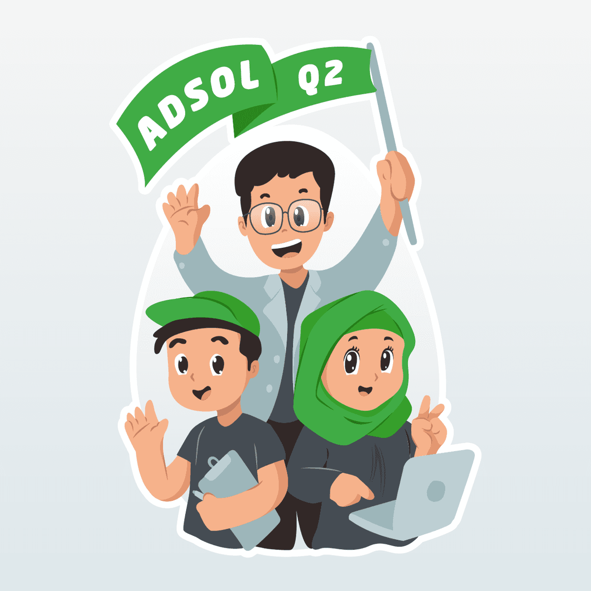
Q2 ADSOL - Illustration Design
{"type":"doc","content":[{"type":"paragraph","attrs":{"textAlign":null},"content":[{"type":"text","text":"Quarter 2, full energy — this ADSOL team illustration captures the spirit of a Tokopedia tribe that shows up every quarter ready to win."}]},{"type":"image","attrs":{"src":"https://farooq-agent.web.app/assets/images/works/large/pd/4/q2.png","alt":null,"title":null,"width":null,"height":null}},{"type":"paragraph","attrs":{"textAlign":null},"content":[{"type":"text","marks":[{"type":"bold"}],"text":"Illustration Design — ADSOL Q2"}]},{"type":"paragraph","attrs":{"textAlign":null},"content":[{"type":"text","marks":[{"type":"italic"}],"text":"Team Mascot Illustration · Tribe ADSOL · Tokopedia · Ads Solution"}]},{"type":"paragraph","attrs":{"textAlign":null},"content":[{"type":"text","text":"A cheerful, character-driven team illustration created during a stint working within Tribe ADSOL — Tokopedia's Ads Solution division — celebrating the energy and camaraderie of the team heading into Quarter 2."}]},{"type":"paragraph","attrs":{"textAlign":null},"content":[{"type":"text","text":"The piece features three illustrated characters representing the diverse, collaborative makeup of the ADSOL tribe: a bespectacled team lead raising a green \"ADSOL Q2\" pennant flag with celebratory energy, flanked by a cap-wearing teammate clutching a tablet and a hijab-wearing colleague with a laptop open — all rendered in a warm, friendly flat-illustration style that reflects Tokopedia's approachable, people-first brand culture."}]},{"type":"paragraph","attrs":{"textAlign":null},"content":[{"type":"text","text":"The character trio is grouped in a tight, cohesive composition — the sticker-style white outline framing the group as a unified team badge, instantly usable across internal presentations, team communications, social posts, and Slack channels. The Tokopedia green saturates the palette — flag, cap, hijab, background — anchoring the illustration firmly within the brand's visual identity while the character designs bring personality, warmth, and cultural representation to the foreground."}]},{"type":"paragraph","attrs":{"textAlign":null},"content":[{"type":"text","text":"An internal team illustration that doubles as a morale booster — the kind of creative work that reminds a product tribe why they show up and what they're building together."}]}]}
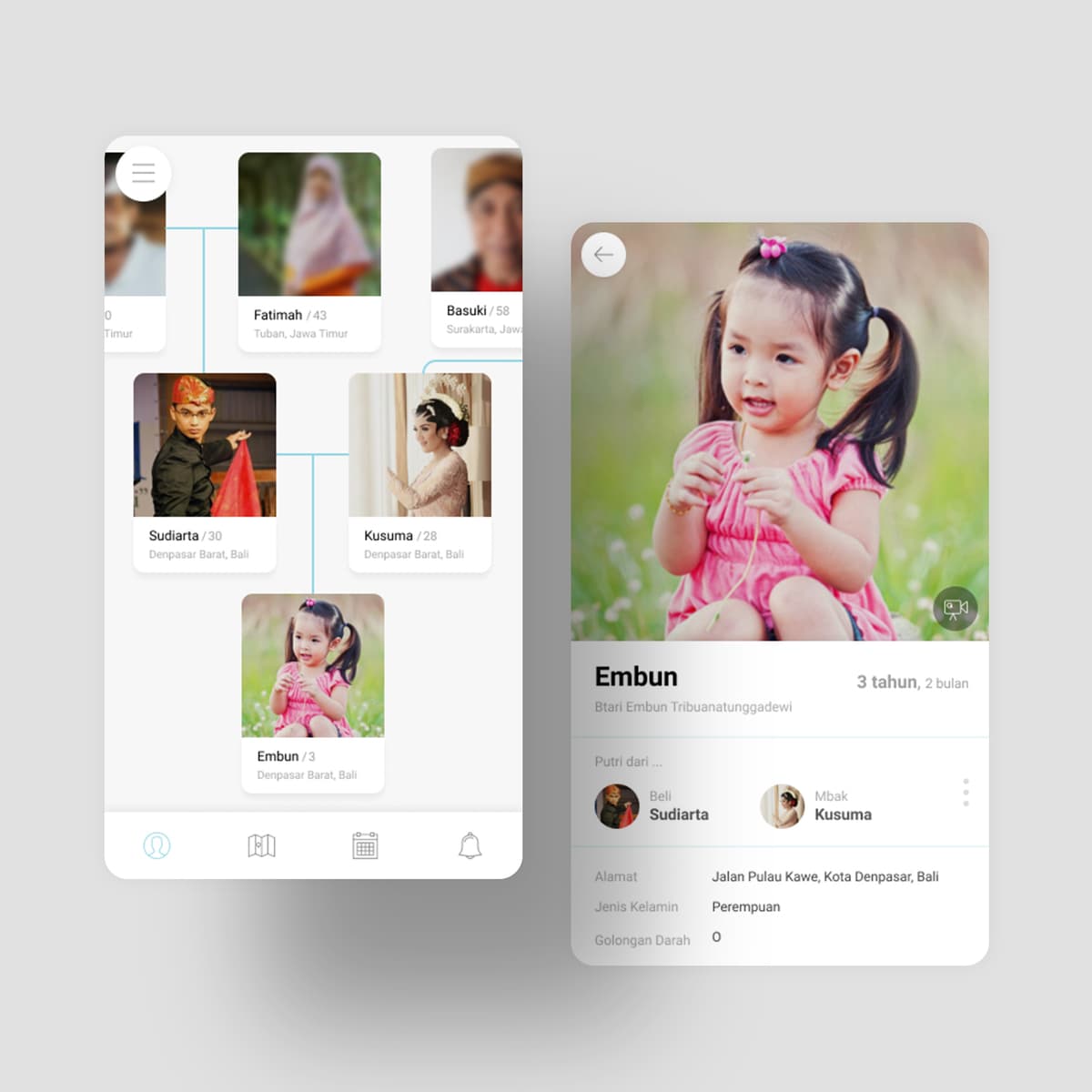
Hana - Family Tree Application
{"type":"doc","content":[{"type":"paragraph","attrs":{"textAlign":null},"content":[{"type":"text","text":"Fatimah, Basuki, Sudiarta, Kusuma, Embun — Hana turns a family tree into something you actually want to open, browse, and add to."}]},{"type":"image","attrs":{"src":"https://farooq-agent.web.app/assets/images/works/large/hana.jpg","alt":null,"title":null,"width":null,"height":null}},{"type":"paragraph","attrs":{"textAlign":null},"content":[{"type":"text","marks":[{"type":"bold"}],"text":"App UI Concept — Hana"}]},{"type":"paragraph","attrs":{"textAlign":null},"content":[{"type":"text","marks":[{"type":"italic"}],"text":"Family Tree Application · Mobile UI · Personal & Social"}]},{"type":"paragraph","attrs":{"textAlign":null},"content":[{"type":"text","text":"A clean, emotionally warm mobile app concept for Hana — a family tree application that replaces the static diagram with a living, photo-first family network."}]},{"type":"paragraph","attrs":{"textAlign":null},"content":[{"type":"text","text":"The tree screen presents family relationships as a visual node graph with real portrait photography at each node — grandparents at the top (Fatimah, Basuki), parents in the middle (Sudiarta, Kusuma in traditional Balinese dress), and the youngest generation below (Embun, a toddler in pink). Connecting lines map the relationships cleanly, the whole structure laid out in a vertical scroll that scales naturally as the family grows. Each node shows name and location — Tuban, Jawa Timur; Denpasar, Bali — communicating the geographic spread of a real Indonesian family across islands."}]},{"type":"paragraph","attrs":{"textAlign":null},"content":[{"type":"text","text":"The member detail screen for \"Embun\" (3 tahun, 2 bulan) is the app's emotional core: a full-screen child photo at the top, age displayed precisely in years and months (the way Indonesian parents count), parents listed with avatars (Bali: Sudiarta, Ibu: Kusuma), address, gender, and blood type — a complete family record in a single, beautifully composed card."}]},{"type":"paragraph","attrs":{"textAlign":null},"content":[{"type":"text","text":"The design is minimal and photo-forward: white backgrounds, light grey structure, warm photography doing all the emotional work. No unnecessary chrome."}]},{"type":"paragraph","attrs":{"textAlign":null},"content":[{"type":"text","text":"A family app that feels like a photo album and functions like a database — exactly what silaturrahim in the digital age should look like."},{"type":"hardBreak"},{"type":"hardBreak"},{"type":"hardBreak"},{"type":"text","text":"14/05/2019"}]}]}
Melati
{"type":"doc","content":[{"type":"paragraph","attrs":{"textAlign":null},"content":[{"type":"text","text":"Speak Freely, Without Fear — Melati creates a safe, anonymous space where sensitive conversations can exist with honesty, dignity, and protection."}]},{"type":"image","attrs":{"src":"https://farooq-agent.web.app/assets/images/works/large/melati.jpg","alt":null,"title":null,"width":null,"height":null}},{"type":"paragraph","attrs":{"textAlign":null},"content":[{"type":"text","marks":[{"type":"bold"}],"text":"Mobile App Design — Melati"}]},{"type":"paragraph","attrs":{"textAlign":null},"content":[{"type":"text","marks":[{"type":"italic"}],"text":"Anonymous Chat · Safe Space · Mental & Social Support · UI/UX Design"}]},{"type":"paragraph","attrs":{"textAlign":null},"content":[{"type":"text","text":"A mobile chat application designed for conversations that are often left unspoken — Melati provides a safe, anonymous environment where users can share, ask, and connect without the pressure of identity."}]},{"type":"paragraph","attrs":{"textAlign":null},"content":[{"type":"text","text":"The experience is built around emotional safety. From onboarding to interaction, the interface likely minimizes exposure while maximizing comfort — allowing users to participate without fear of judgment, stigma, or personal risk. Anonymity is not treated as a feature, but as the foundation of trust."}]},{"type":"paragraph","attrs":{"textAlign":null},"content":[{"type":"text","text":"The visual language is expected to be calm and non-intrusive — soft tones, clear typography, and a distraction-free layout that supports focus on conversation rather than interface. Every design decision serves a single purpose: making users feel secure enough to open up."}]},{"type":"paragraph","attrs":{"textAlign":null},"content":[{"type":"text","text":"Melati reframes chat not as social performance, but as emotional expression. It enables discussions around sensitive topics — mental health, personal struggles, or difficult questions — in a space where vulnerability is protected, not exposed."}]},{"type":"paragraph","attrs":{"textAlign":null},"content":[{"type":"text","text":"In a digital landscape often driven by identity and visibility, this project moves in the opposite direction — prioritizing privacy, empathy, and psychological safety over engagement metrics."}]},{"type":"paragraph","attrs":{"textAlign":null},"content":[{"type":"text","text":"A thoughtful exploration of how design can create not just connection, but trust — where speaking up feels safe, even when the topic is not."}]}]}
Harta
{"type":"doc","content":[{"type":"paragraph","attrs":{"textAlign":null},"content":[{"type":"text","text":"Know What You Own, Shape Where You’re Going — Harta turns scattered assets into a clear, structured view of personal wealth."}]},{"type":"image","attrs":{"src":"https://farooq-agent.web.app/assets/images/works/large/harta.jpg","alt":null,"title":null,"width":null,"height":null}},{"type":"paragraph","attrs":{"textAlign":null},"content":[{"type":"text","marks":[{"type":"bold"}],"text":"Mobile App Design — Harta"}]},{"type":"paragraph","attrs":{"textAlign":null},"content":[{"type":"text","marks":[{"type":"italic"}],"text":"Personal Finance · Wealth Tracking · Asset Management · UI/UX Design"}]},{"type":"paragraph","attrs":{"textAlign":null},"content":[{"type":"text","text":"A mobile application designed to give users a clear and structured understanding of their financial position — Harta focuses on tracking wealth as a whole, not just day-to-day spending."}]},{"type":"paragraph","attrs":{"textAlign":null},"content":[{"type":"text","text":"The experience centers on aggregation and clarity. Instead of isolating transactions, the app brings together various forms of assets — cash, savings, investments, and possibly physical holdings — into a single, cohesive overview. This shift reframes finance from short-term activity into long-term awareness."}]},{"type":"paragraph","attrs":{"textAlign":null},"content":[{"type":"text","text":"The interface likely emphasizes clean data visualization and hierarchy. Key metrics such as total net worth, asset distribution, and growth trends are presented in a way that is both digestible and actionable. Complexity is reduced into clarity, enabling users to quickly understand their financial standing."}]},{"type":"paragraph","attrs":{"textAlign":null},"content":[{"type":"text","text":"Harta positions itself as more than a tracker — it is a decision-making tool. By making wealth visible and structured, it helps users move from passive ownership to intentional financial planning."}]},{"type":"paragraph","attrs":{"textAlign":null},"content":[{"type":"text","text":"The design reflects a more mature perspective on personal finance: not just managing money, but understanding value over time. It supports users in building awareness, discipline, and long-term thinking."}]},{"type":"paragraph","attrs":{"textAlign":null},"content":[{"type":"text","text":"A focused exploration of how digital products can transform financial data into clarity — where knowing what you own becomes the first step toward shaping what comes next."}]}]}

Q3 Finance - Illustration Design
{"type":"doc","content":[{"type":"paragraph","attrs":{"textAlign":null},"content":[{"type":"text","text":"Suited up, shades on, money in hand — the Finance Q3 illustration captures a tribe that means serious business and isn't afraid to show it."}]},{"type":"image","attrs":{"src":"https://farooq-agent.web.app/assets/images/works/large/pd/5/q3.png","alt":null,"title":null,"width":null,"height":null}},{"type":"paragraph","attrs":{"textAlign":null},"content":[{"type":"text","marks":[{"type":"bold"}],"text":"Illustration Design — Finance Q3"}]},{"type":"paragraph","attrs":{"textAlign":null},"content":[{"type":"text","marks":[{"type":"italic"}],"text":"Team Mascot Illustration · Tribe Finance · Tokopedia"}]},{"type":"paragraph","attrs":{"textAlign":null},"content":[{"type":"text","text":"A bold, personality-packed team illustration created during a tenure working within Tribe Finance at Tokopedia — celebrating the energy and confidence of the team heading into Quarter 3 with style to spare."}]},{"type":"paragraph","attrs":{"textAlign":null},"content":[{"type":"text","text":"Where the ADSOL Q2 illustration leaned warm and friendly, Finance Q3 turns the dial up to cool. The three characters arrive in matching black suits and green ties — Tokopedia's signature green now elevated into a power color — each sporting dark sunglasses that give the trio an unmistakable air of financial authority. The lead figure center-stage raises a green \"Finance Q3\" banner flag in one hand and fans out a stack of banknotes in the other, with flying cash bills adding a celebratory, money-in-the-air energy to the composition. The flanking teammates hold a smartphone with stylus and an open laptop — the tools of a finance tribe in full operational flow."}]},{"type":"paragraph","attrs":{"textAlign":null},"content":[{"type":"text","text":"The sticker-style white outline frames the group as a unified badge — instantly deployable across internal decks, team Slack channels, OKR presentations, and quarterly wrap communications. The Tokopedia green runs through every element: flag, tie, cap, background gradient — keeping the illustration firmly within the brand ecosystem while the character design brings humor, confidence, and team pride to the forefront."}]},{"type":"paragraph","attrs":{"textAlign":null},"content":[{"type":"text","text":"An internal illustration that says exactly what a finance team heading into Q3 wants to say: we're organized, we're focused, and we already know how this quarter ends."}]}]}
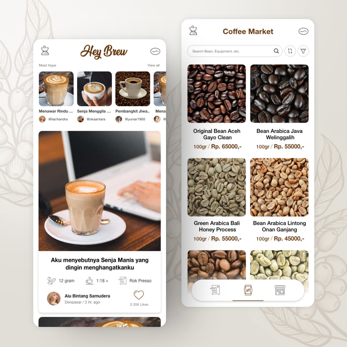
Hey Brew
{"type":"doc","content":[{"type":"paragraph","attrs":{"textAlign":null},"content":[{"type":"text","text":"Original Bean Aceh Gayo Clean, Green Arabica Bali Honey Process, Rok Presso at 1:18 — Hey Brew is where Indonesia's coffee culture comes to share stories and shop for beans in the same breath."}]},{"type":"image","attrs":{"src":"https://farooq-agent.web.app/assets/images/works/large/hey-brew.jpg","alt":null,"title":null,"width":null,"height":null}},{"type":"paragraph","attrs":{"textAlign":null},"content":[{"type":"text","marks":[{"type":"bold"}],"text":"App UI Design — Hey Brew"}]},{"type":"paragraph","attrs":{"textAlign":null},"content":[{"type":"text","marks":[{"type":"italic"}],"text":"Mobile App · Coffee Social Feed + Bean Marketplace · Indonesia"}]},{"type":"paragraph","attrs":{"textAlign":null},"content":[{"type":"text","text":"A rich, warmly designed two-screen app UI for Hey Brew — a coffee lifestyle platform combining a social content feed with a curated coffee bean marketplace. The combination is elegant: coffee lovers share their brews, and then buy the beans to recreate them."}]},{"type":"paragraph","attrs":{"textAlign":null},"content":[{"type":"text","marks":[{"type":"bold"}],"text":"Screen 1 — Social Feed:"},{"type":"text","text":" A Pinterest-style coffee content feed under \"Most Hype\" — user-posted coffee photos with captions, creator handles, and engagement metrics. The featured post — a latte on a wooden desk by Aiu Bintang Samudera from Denpasar, 2,356 likes — carries the caption \"Aku menyebutnya Senja Manis yang dingin menghangatkanku\" (I call it Sweet Dusk that warms me in the cold) — poetic, personal, and exactly the tone of an authentic coffee community. Below the caption: brew specs — 12 gram, 1:18 ratio, Rok Presso — the geeky details that serious home brewers want to share and discover."}]},{"type":"paragraph","attrs":{"textAlign":null},"content":[{"type":"text","marks":[{"type":"bold"}],"text":"Screen 2 — Coffee Market:"},{"type":"text","text":" A clean two-column product grid of Indonesian specialty beans — Original Bean Aceh Gayo Clean (Rp. 65.000/100gr), Bean Arabica Java Welinggalih (Rp. 55.000), Green Arabica Bali Honey Process (Rp. 55.000), Bean Arabica Lintong Onan Ganjang (Rp. 45.000). The macro bean photography is gorgeous — each variety clearly distinguishable, making the marketplace itself a coffee education."}]},{"type":"paragraph","attrs":{"textAlign":null},"content":[{"type":"text","text":"The warm cream and brown palette, coffee bean watermark background, and script \"Hey Brew\" wordmark create a brand identity that feels handcrafted and genuine — a specialty coffee app for people who care deeply about what's in their cup."}]}]}
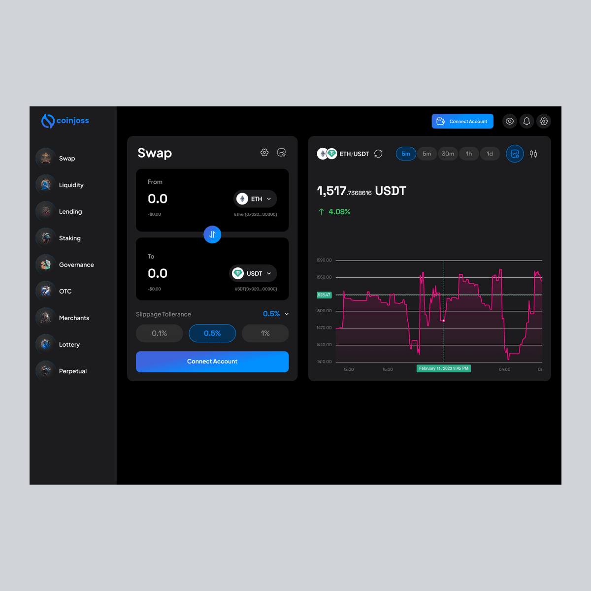
Dex CoinJoss
{"type":"doc","content":[{"type":"paragraph","attrs":{"textAlign":null},"content":[{"type":"text","text":"Trade Confidently, Navigate Seamlessly — Dex CoinJoss brings cryptocurrency management into a secure, intuitive, and modern platform experience."}]},{"type":"image","attrs":{"src":"https://mir-s3-cdn-cf.behance.net/project_modules/fs/0e3688164613463.63f99a6aba20a.png","alt":null,"title":null,"width":null,"height":null}},{"type":"paragraph","attrs":{"textAlign":null},"content":[{"type":"text","marks":[{"type":"bold"}],"text":"Web & Mobile App Design — Dex CoinJoss"}]},{"type":"paragraph","attrs":{"textAlign":null},"content":[{"type":"text","marks":[{"type":"italic"}],"text":"Cryptocurrency · Trading Platform · Digital Finance · UI/UX Design"}]},{"type":"paragraph","attrs":{"textAlign":null},"content":[{"type":"text","text":"A digital platform designed for cryptocurrency trading and management — Dex CoinJoss provides users with a secure, real-time environment for buying, selling, and monitoring digital assets."}]},{"type":"paragraph","attrs":{"textAlign":null},"content":[{"type":"text","text":"The experience emphasizes clarity, trust, and control. Users can track market trends, manage their portfolio, and execute trades with confidence. Real-time charts, alerts, and notifications are presented in a digestible, visually appealing format, helping both beginners and experienced traders make informed decisions."}]},{"type":"paragraph","attrs":{"textAlign":null},"content":[{"type":"text","text":"The interface likely balances data density with usability. Complex financial information is structured through hierarchy, color coding, and interactive elements, ensuring that users can navigate seamlessly without feeling overwhelmed."}]},{"type":"paragraph","attrs":{"textAlign":null},"content":[{"type":"text","text":"Dex CoinJoss positions itself as more than a trading tool — it is a gateway into the cryptocurrency ecosystem. Security, transparency, and ease of use are core principles, empowering users to interact with digital finance safely and efficiently."}]},{"type":"paragraph","attrs":{"textAlign":null},"content":[{"type":"text","text":"Visually, the design conveys modernity and sophistication. Clean lines, bold typography, and dynamic data visualization combine to create an experience that feels both professional and approachable."}]},{"type":"paragraph","attrs":{"textAlign":null},"content":[{"type":"text","text":"This project reflects the growing need for user-centered design in fintech — where complex technology must meet intuitive interaction to build trust and engagement."}]},{"type":"paragraph","attrs":{"textAlign":null},"content":[{"type":"text","text":"A forward-thinking exploration of cryptocurrency management, where trading is not just functional, but secure, transparent, and seamlessly integrated into a modern digital experience."}]}]}
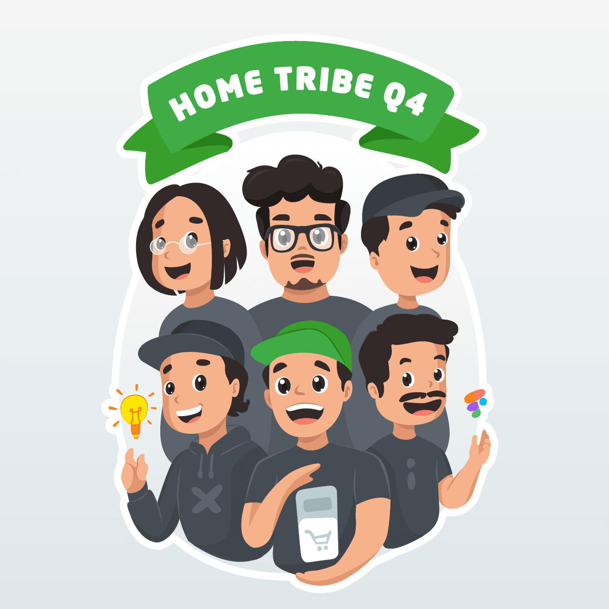
Q4 Home - Illustration Design
{"type":"doc","content":[{"type":"paragraph","attrs":{"textAlign":null},"content":[{"type":"text","text":"Six faces, one tribe, one mission — the Home & Discovery Q4 illustration captures a full product squad heading into the final quarter with ideas, tools, and energy to spare."}]},{"type":"image","attrs":{"src":"https://farooq-agent.web.app/assets/images/works/large/pd/6/q4.png","alt":null,"title":null,"width":null,"height":null}},{"type":"paragraph","attrs":{"textAlign":null},"content":[{"type":"text","marks":[{"type":"bold"}],"text":"Illustration Design — Home Tribe Q4"}]},{"type":"paragraph","attrs":{"textAlign":null},"content":[{"type":"text","marks":[{"type":"italic"}],"text":"Team Mascot Illustration · Tribe Home & Discovery · Tokopedia"}]},{"type":"paragraph","attrs":{"textAlign":null},"content":[{"type":"text","text":"A warm, ensemble team illustration created during a stint within Tribe Home & Discovery at Tokopedia — celebrating the full squad heading into Quarter 4 with the most character-rich and compositionally ambitious entry in the quarterly illustration series."}]},{"type":"paragraph","attrs":{"textAlign":null},"content":[{"type":"text","text":"Where Q2 had three and Q3 had three, Home Tribe Q4 brings six — a full product team rendered in a tight, layered group portrait that fills the frame with faces, personality, and creative energy. The composition is organized across two rows: three characters in the back row and three in the front, each with distinct visual identities — glasses, caps, beards, a green Tokopedia cap front and center — creating a diverse, immediately recognizable team portrait that could belong to no other tribe."}]},{"type":"paragraph","attrs":{"textAlign":null},"content":[{"type":"text","text":"The prop details are the storytelling: a glowing lightbulb held by the left figure speaks to ideation and product thinking; a shopping cart phone screen in the center figure's hands anchors the tribe's core mission in Tokopedia's home and discovery commerce experience; and a Figma logo held by the right figure is the designer's signature easter egg — a knowing wink to the tools of the trade."}]},{"type":"paragraph","attrs":{"textAlign":null},"content":[{"type":"text","text":"The \"Home Tribe Q4\" green ribbon banner arcs above the group in classic Tokopedia green, and the sticker-style white outline frames the ensemble as a unified badge — deployable across decks, Notion pages, Slack channels, and end-of-year wrap communications."}]},{"type":"paragraph","attrs":{"textAlign":null},"content":[{"type":"text","text":"A team illustration that says: we're six people, we use Figma, we have ideas, and Q4 is ours."}]}]}
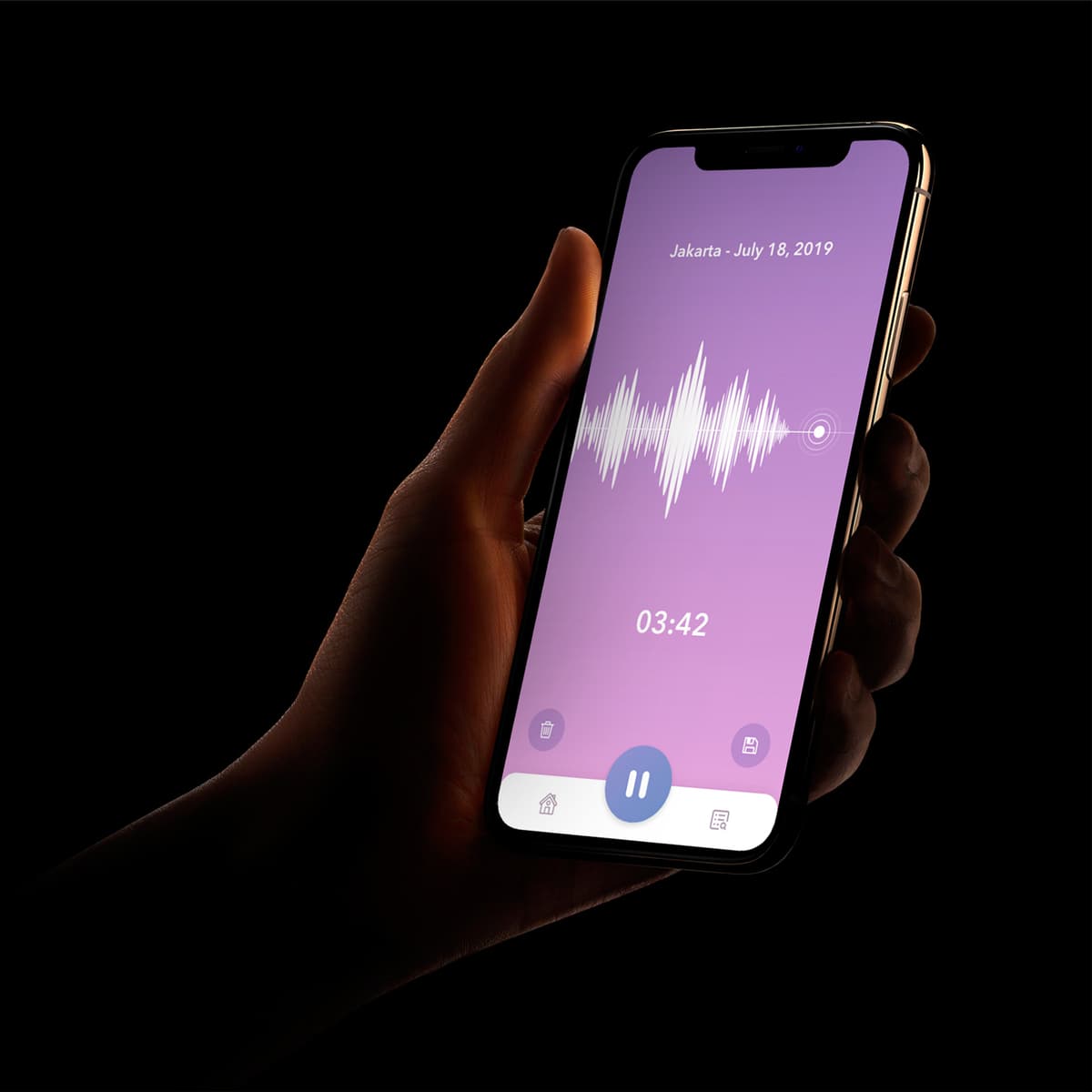
Audiary
{"type":"doc","content":[{"type":"paragraph","attrs":{"textAlign":null},"content":[{"type":"text","text":"Jakarta — July 18, 2019 — 03:42 — Audiary reduces the diary to its most honest form: your voice, the date, and nothing else."}]},{"type":"image","attrs":{"src":"https://farooq-agent.web.app/assets/images/works/large/audiary.jpg","alt":null,"title":null,"width":null,"height":null}},{"type":"paragraph","attrs":{"textAlign":null},"content":[{"type":"text","marks":[{"type":"bold"}],"text":"App UI Design — Audiary"}]},{"type":"paragraph","attrs":{"textAlign":null},"content":[{"type":"text","marks":[{"type":"italic"}],"text":"Mobile App · Audio Diary · Voice Journal"}]},{"type":"paragraph","attrs":{"textAlign":null},"content":[{"type":"text","text":"A strikingly minimal app UI for Audiary — an audio diary app that replaces the written journal with voice recordings, presented in one of the most compositionally confident single-screen designs in the portfolio."}]},{"type":"paragraph","attrs":{"textAlign":null},"content":[{"type":"text","text":"The entire interface is a single recording screen: a soft lavender-purple gradient fills the display, a white waveform visualization pulses at center — alive, dynamic, the visual signature of a voice being captured. Below it, the timestamp: 03:42. Above it, the location and date: \"Jakarta — July 18, 2019.\" A pause button at the bottom center, delete and save icons flanking it, and a minimal two-tab navigation at the base. That's everything. Nothing more is needed."}]},{"type":"paragraph","attrs":{"textAlign":null},"content":[{"type":"text","text":"The design's restraint is its strongest statement. Most diary apps overwhelm with tags, categories, moods, and prompts. Audiary trusts the user to speak — and trusts the voice to carry everything a diary entry needs to contain. The lavender palette adds emotional warmth without sentimentality; the waveform is both functional indicator and expressive art object."}]},{"type":"paragraph","attrs":{"textAlign":null},"content":[{"type":"text","text":"The in-hand iPhone mockup photographed against pure black gives the screen an intimate, almost cinematic quality — a private moment, held in a hand, in the dark."}]},{"type":"paragraph","attrs":{"textAlign":null},"content":[{"type":"text","text":"An app designed around a single truth: sometimes the most honest thing you can do is just press record."}]}]}
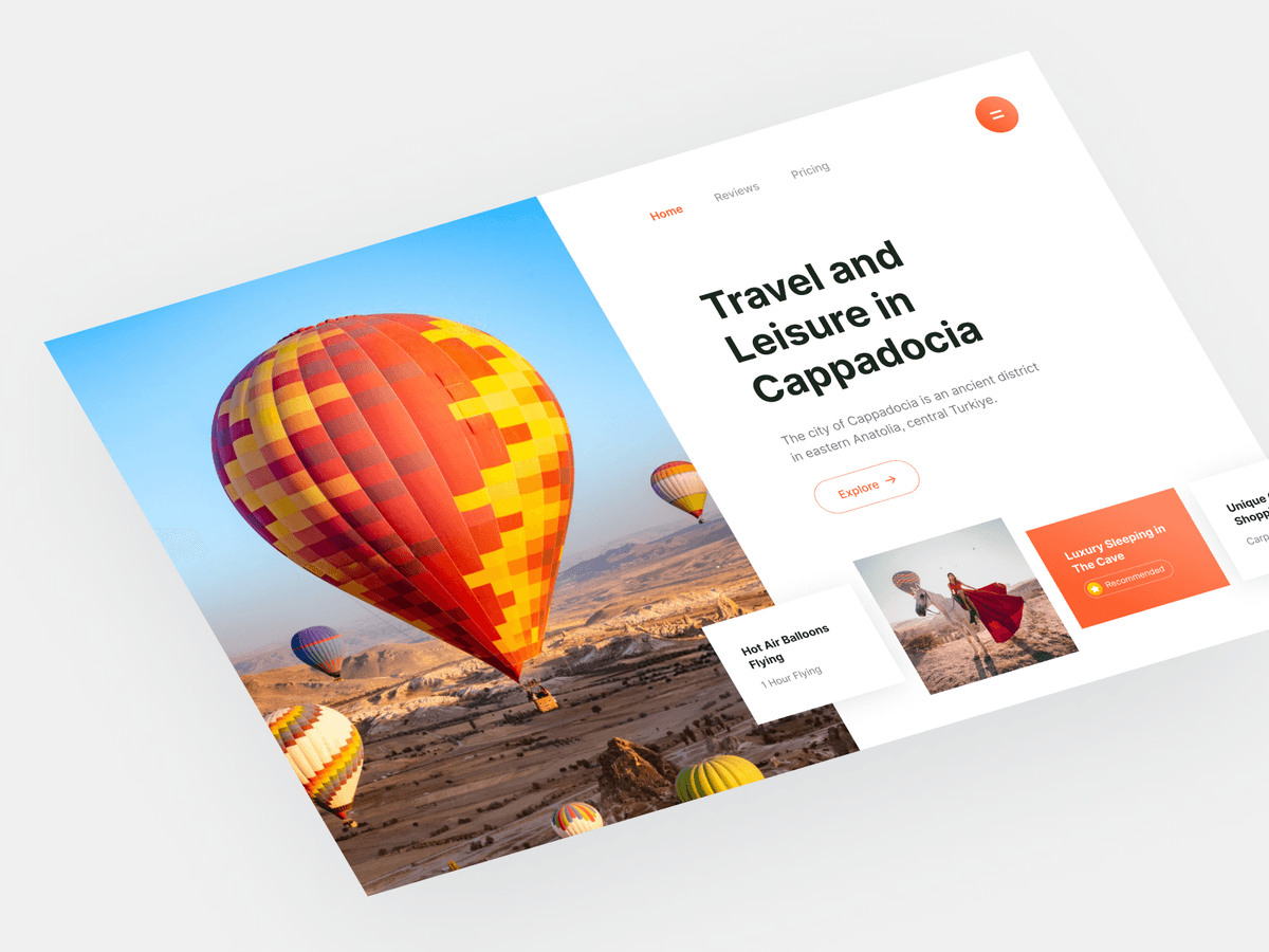
Cappadocia Travel Website
{"type":"doc","content":[{"type":"paragraph","attrs":{"textAlign":null},"content":[{"type":"text","text":"Hey there 🔥"}]},{"type":"paragraph","attrs":{"textAlign":null}},{"type":"paragraph","attrs":{"textAlign":null},"content":[{"type":"text","text":"This is my Exploration for ..."}]},{"type":"paragraph","attrs":{"textAlign":null},"content":[{"type":"text","text":"CAPPA - Cappadocia Travel Website"}]},{"type":"paragraph","attrs":{"textAlign":null},"content":[{"type":"text","text":"This is my new web (section) design exploration about Cappadocia."}]},{"type":"image","attrs":{"src":"https://cdn.dribbble.com/userupload/2584830/file/original-87c5311f2f30c0a9e9cf419c5b71b513.png?resize=752x&vertical=center","alt":null,"title":null,"width":null,"height":null}},{"type":"image","attrs":{"src":"https://mir-s3-cdn-cf.behance.net/project_modules/fs/c7ce39138969789.6227874debcf6.png","alt":null,"title":null,"width":null,"height":null}},{"type":"paragraph","attrs":{"textAlign":null},"content":[{"type":"text","text":"What do you think guys? Let me know in the comments section!"}]},{"type":"paragraph","attrs":{"textAlign":null},"content":[{"type":"text","text":"Hope you enjoy it guys. Click “❤️Like” if you like it."}]},{"type":"paragraph","attrs":{"textAlign":null}},{"type":"paragraph","attrs":{"textAlign":null},"content":[{"type":"text","marks":[{"type":"bold"}],"text":"Have a great project idea?"},{"type":"text","text":" Let us know ✅"}]},{"type":"paragraph","attrs":{"textAlign":null}},{"type":"paragraph","attrs":{"textAlign":null},"content":[{"type":"text","text":"Services we provide:"}]},{"type":"paragraph","attrs":{"textAlign":null},"content":[{"type":"text","text":"🖼️ UI Design | 😄 UX Design | 🎉 Illustration | 🛍 Brand Identity | 📝 Graphic Design | 🌐 Web Development | 📱 Mobile App Development"}]},{"type":"paragraph","attrs":{"textAlign":null}},{"type":"paragraph","attrs":{"textAlign":null},"content":[{"type":"text","text":"Thanks!"}]}]}

The Police Apologized
{"type":"doc","content":[{"type":"image","attrs":{"src":"https://cdn.dribbble.com/userupload/8995292/file/original-c2d4f2d4ef5d0739f4d782794b6e1f3d.png?resize=1504x1128&vertical=center","alt":null,"title":null,"width":null,"height":null}},{"type":"heading","attrs":{"textAlign":"center","level":2},"content":[{"type":"text","marks":[{"type":"bold"}],"text":"Hi Guys!✋🏻"}]},{"type":"paragraph","attrs":{"textAlign":"center"},"content":[{"type":"text","text":"This is another exploration about illustration of the police apologized pose."}]},{"type":"paragraph","attrs":{"textAlign":"center"},"content":[{"type":"text","marks":[{"type":"bold"}],"text":"More preview? enjoy scrolling 🙌"}]},{"type":"paragraph","attrs":{"textAlign":"center"}},{"type":"image","attrs":{"src":"https://cdn.dribbble.com/userupload/8995295/file/original-149584fc5429f9831512494c54ce8e14.png?resize=1504x1128&vertical=center","alt":null,"title":null,"width":null,"height":null}},{"type":"image","attrs":{"src":"https://cdn.dribbble.com/userupload/8995293/file/original-aed2b6d2a206ebe03a21e6869e058464.png?resize=1504x1128&vertical=center","alt":null,"title":null,"width":null,"height":null}},{"type":"image","attrs":{"src":"https://cdn.dribbble.com/userupload/8995294/file/original-8cfce16501fdfae988ac0905f1e6c46f.png?resize=1504x1128&vertical=center","alt":null,"title":null,"width":null,"height":null}},{"type":"paragraph","attrs":{"textAlign":null},"content":[{"type":"text","text":"What do you think guys? Let me know in the comments section!"}]},{"type":"paragraph","attrs":{"textAlign":null},"content":[{"type":"text","text":"Hope you enjoy it guys. Click “❤️Like” if you like it."}]},{"type":"paragraph","attrs":{"textAlign":null}},{"type":"paragraph","attrs":{"textAlign":null},"content":[{"type":"text","marks":[{"type":"bold"}],"text":"Have a great project idea?"},{"type":"text","text":" Let us know ✅"}]},{"type":"paragraph","attrs":{"textAlign":null}},{"type":"paragraph","attrs":{"textAlign":null},"content":[{"type":"text","text":"Services we provide:"}]},{"type":"paragraph","attrs":{"textAlign":null},"content":[{"type":"text","text":"🖼️ UI Design | 😄 UX Design | 🎉 Illustration | 🛍 Brand Identity | 📝 Graphic Design | 🌐 Web Development | 📱 Mobile App Development"}]},{"type":"paragraph","attrs":{"textAlign":null}},{"type":"paragraph","attrs":{"textAlign":null},"content":[{"type":"text","text":"Thanks !"}]}]}
Hunter Indonesia
{"type":"doc","content":[{"type":"paragraph","attrs":{"textAlign":null},"content":[{"type":"text","text":"Proud to be Indonesia — Hunter Indonesia's website opens with a hundred riders on the road and the confidence of a brand that owns the custom motorcycle space in this country."}]},{"type":"image","attrs":{"src":"https://farooq-agent.web.app/assets/images/works/large/hunter-indonesia.jpg","alt":null,"title":null,"width":null,"height":null}},{"type":"paragraph","attrs":{"textAlign":null},"content":[{"type":"text","marks":[{"type":"bold"}],"text":"Web Design — Hunter Indonesia"}]},{"type":"paragraph","attrs":{"textAlign":null},"content":[{"type":"text","marks":[{"type":"italic"}],"text":"Custom Motorcycle & Parts Platform Website · Desktop · Indonesia"}]},{"type":"paragraph","attrs":{"textAlign":null},"content":[{"type":"text","text":"A bold, full-scale desktop website design for Hunter Indonesia — positioned as \"The Largest Motorcycle Custom Corner in Indonesia\" — a platform serving custom motorcycle enthusiasts, parts buyers, and the broader Indonesian riding community."}]},{"type":"paragraph","attrs":{"textAlign":null},"content":[{"type":"text","text":"The hero is a dramatic, cinematic wide-angle photograph of dozens of custom motorcycle riders in formation — helmets, leather, choppers — rendered in high-contrast black and white with the Indonesian flag in the upper left corner. The scale communicates community: this isn't a brand talking to a niche, it's a brand that is the community. \"Proud to be Indonesia\" in gold script with \"INDONESIA\" in bold red-and-white below delivers both national pride and brand identity in a single hero statement."}]},{"type":"paragraph","attrs":{"textAlign":null},"content":[{"type":"text","text":"The navigation maps a comprehensive platform ecosystem: Company Profile, Your Motorcycle, Photo Gallery, Our Store, Owner Resources, Dealer Zone, Event Forum, Contact Hunter — a full-service motorcycle community platform that covers ownership, commerce, community, and events under one roof. The bilingual toggle (Indonesian flag / UK flag) confirms an international audience reach, appropriate for a platform selling global aftermarket parts."}]},{"type":"paragraph","attrs":{"textAlign":null},"content":[{"type":"text","text":"The Hunter emblem at the top center — a winged crest — adds the heraldic weight of a brand that takes its identity seriously, positioned between the two flags as a symbol of Indonesian motorcycle culture on the world stage."}]},{"type":"paragraph","attrs":{"textAlign":null},"content":[{"type":"text","text":"A website that opens with a hundred bikes and makes you feel like you should already be one of them."}]}]}
Scatory
{"type":"doc","content":[{"type":"paragraph","attrs":{"textAlign":null},"content":[{"type":"text","text":"KKN di Desa Penari, Kisah Mistis di Gunung Lawu, Jumat Kliwon di Hotel — Scatory is the dark, immersive app that gives Indonesia's richest horror storytelling tradition the platform it deserves."}]},{"type":"image","attrs":{"src":"https://farooq-agent.web.app/assets/images/works/details/232-scatory/scatory.jpg","alt":null,"title":null,"width":null,"height":null}},{"type":"paragraph","attrs":{"textAlign":null},"content":[{"type":"text","marks":[{"type":"bold"}],"text":"App UI Design — Scatory"}]},{"type":"paragraph","attrs":{"textAlign":null},"content":[{"type":"text","marks":[{"type":"italic"}],"text":"Mobile App · Scary Story Platform · Indonesian Horror Content"}]},{"type":"paragraph","attrs":{"textAlign":null},"content":[{"type":"text","text":"A dark, atmospheric three-screen app UI for Scatory — a platform aggregating and curating Indonesia's vast ecosystem of scary stories, urban legends, and supernatural content from Twitter threads, YouTube, radio programs, and beyond."}]},{"type":"paragraph","attrs":{"textAlign":null},"content":[{"type":"text","marks":[{"type":"bold"}],"text":"Home Screen:"},{"type":"text","text":" The discovery feed opens with a featured video — \"Kisah Mistis, Bertemu Arwah di Pendakian Gunung Lawu\" — a real horror story format popular on Indonesian social media. Below it, \"The best scary stories\" surfaces curated content: KKN di Desa Penari (@simpleman Twitter), Rumah di Malang (Do You See What I See) — real, recognized Indonesian horror content sources that the target audience will immediately recognize and trust."}]},{"type":"paragraph","attrs":{"textAlign":null},"content":[{"type":"text","marks":[{"type":"bold"}],"text":"Search Screen:"},{"type":"text","text":" \"Jumat Kliwon\" — one of the most feared dates in Javanese mystical tradition — typed into the search bar. Results surface across content types and sources: Jumat Kliwon di Hotel (@heysaladin Twitter), Gunung Lawu Jumat Kliwon (Gunung Mistis), Kerata Terakhir (Nightmare Side - Ardan Radio), Sewu Dino / 1000 Days (@simpleman), Gondo Mayit / Ghost Village (@simpleman), Rumah Eyang (Do You See What I See). The multi-source aggregation confirms Scatory's core value: one search, all the horror."}]},{"type":"paragraph","attrs":{"textAlign":null},"content":[{"type":"text","marks":[{"type":"bold"}],"text":"Rating Screen:"},{"type":"text","text":" \"Please rate this story\" — with three dimensions scored separately: Scary Level (Is this story scary enough?), Storyline (Is the storyline interesting?), How to Deliver (How is the delivery?) — each rated on a five-star scale with a red \"Rate\" CTA. The three-dimensional rating system is a smart UX choice for a horror content platform where craft, atmosphere, and narrative quality are each independently important."}]},{"type":"paragraph","attrs":{"textAlign":null},"content":[{"type":"text","text":"The dark charcoal UI with red accents is the only possible palette for this category — and it's executed with restraint, letting the content carry the dread."}]},{"type":"paragraph","attrs":{"textAlign":null},"content":[{"type":"text","text":"An app built for a culture that takes its ghost stories seriously — and tells them better than anyone."}]}]}
Dian Istana Billboard
{"type":"doc","content":[{"type":"paragraph","attrs":{"textAlign":null},"content":[{"type":"text","text":"From the showroom floor to the street — a billboard design that turns a property expo into an unmissable event."}]},{"type":"image","attrs":{"src":"https://farooq-agent.web.app/assets/images/works/large/usKR1Yug_work_image.png","alt":null,"title":null,"width":null,"height":null}},{"type":"paragraph","attrs":{"textAlign":null},"content":[{"type":"text","marks":[{"type":"bold"}],"text":"Billboard & Marketing Collateral — Dian Istana"}]},{"type":"paragraph","attrs":{"textAlign":null},"content":[{"type":"text","marks":[{"type":"italic"}],"text":"Print Design · Property Expo · Surabaya Property Expo"}]},{"type":"paragraph","attrs":{"textAlign":null},"content":[{"type":"text","text":"A high-impact print collateral design for Dian Istana's presence at the Surabaya Property Expo — a busy, competitive environment where a brand has seconds to capture attention and drive footfall. The design rises to that challenge with confident hierarchy and strategic visual layering."}]},{"type":"paragraph","attrs":{"textAlign":null},"content":[{"type":"text","text":"The layout leads with a full-bleed architectural render of the property — a clean, modern residential facade that immediately communicates product quality to the target buyer. The hero imagery anchors the piece in aspiration, giving prospects an instant sense of what they are investing in."}]},{"type":"paragraph","attrs":{"textAlign":null},"content":[{"type":"text","text":"The vibrant green diagonal band cuts across the composition with urgency and energy — carrying the promotional hook \"Hadiah Langsung iPhone 6,\" a bold incentive call-out that speaks directly to the expo audience's impulse decision-making. The geometric low-poly texture within the green band adds contemporary visual interest without cluttering the message."}]},{"type":"paragraph","attrs":{"textAlign":null},"content":[{"type":"text","text":"Event details, contact numbers, and the Surabaya Property Expo branding are laid out in clear, high-contrast type at the base — ensuring the practical information is as legible at distance as the promotional headline. The piece works as both a close-range flyer and a large-format billboard, demonstrating solid command of multi-scale print design."}]},{"type":"paragraph","attrs":{"textAlign":null},"content":[{"type":"text","text":"A results-driven marketing piece built for one purpose: to stop people in their tracks and start a conversation."}]}]}
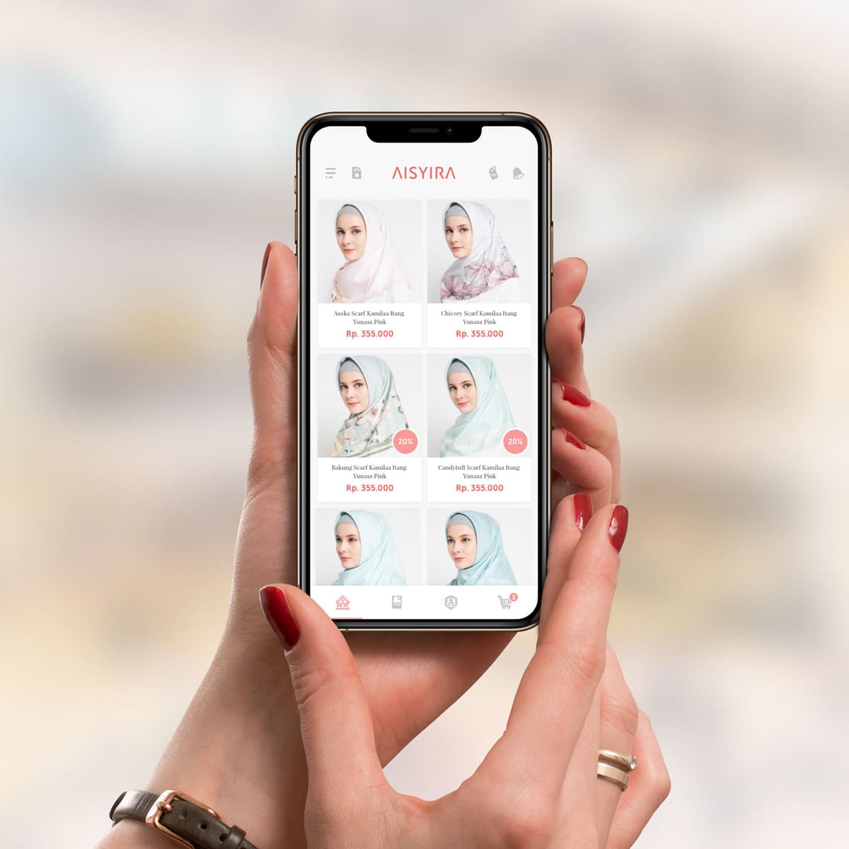
Aisyira
{"type":"doc","content":[{"type":"paragraph","attrs":{"textAlign":null},"content":[{"type":"text","text":"Scarf Kamilaa Itang Yunasz, Rp. 355.000 — Aisyira's mobile store makes modest fashion shopping feel as effortless and elegant as the pieces it sells."}]},{"type":"image","attrs":{"src":"https://farooq-agent.web.app/assets/images/works/large/aisyira-store.jpg","alt":null,"title":null,"width":null,"height":null}},{"type":"paragraph","attrs":{"textAlign":null},"content":[{"type":"text","marks":[{"type":"bold"}],"text":"App UI Design — Aisyira"}]},{"type":"paragraph","attrs":{"textAlign":null},"content":[{"type":"text","marks":[{"type":"italic"}],"text":"Mobile E-Commerce App · Hijab & Modest Fashion · Indonesia"}]},{"type":"paragraph","attrs":{"textAlign":null},"content":[{"type":"text","text":"A clean, product-forward mobile store UI for Aisyira — a modest fashion brand selling premium hijab and scarf collections. The app is photographed in-hand with careful art direction, the blurred pastel background complementing the soft, feminine palette of the UI itself."}]},{"type":"paragraph","attrs":{"textAlign":null},"content":[{"type":"text","text":"The product catalog screen is the full focus: a two-column grid of scarf products — each with a model photo, product name, and price (Rp. 355.000) — laid out in the standard mobile commerce pattern that puts product discovery front and center. Discount badges (20%) on the lower cards add promotional visibility without cluttering the grid. The product photography is consistent and editorial: each scarf styled on a model against clean white backgrounds, communicating both product detail and wearability simultaneously."}]},{"type":"paragraph","attrs":{"textAlign":null},"content":[{"type":"text","text":"The AISYIRA wordmark in coral pink sits centered in the top bar — warm, feminine, and appropriately branded for a modest fashion audience. The bottom tab bar — Home, Orders, Account, Cart — is minimal and functionally complete."}]},{"type":"paragraph","attrs":{"textAlign":null},"content":[{"type":"text","text":"A modest fashion e-commerce app that respects its audience's taste: clean, beautiful, and entirely focused on the product."}]}]}
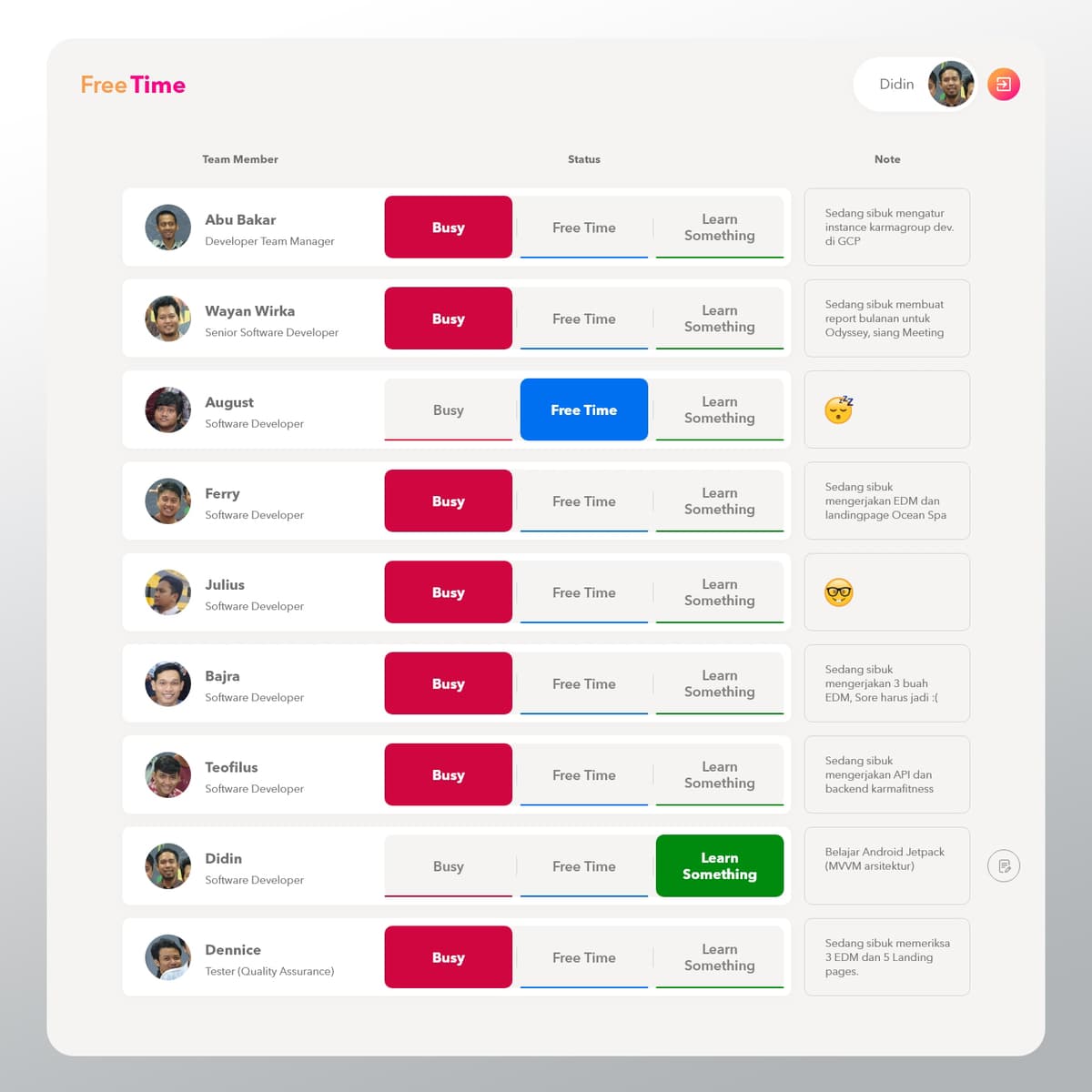
Free Time
{"type":"doc","content":[{"type":"paragraph","attrs":{"textAlign":null},"content":[{"type":"text","text":"Know Who’s Free, Connect in the Moment — Free Time turns team availability into an opportunity for spontaneous collaboration."}]},{"type":"image","attrs":{"src":"https://farooq-agent.web.app/assets/images/works/details/228-free-time/free-time.jpg","alt":null,"title":null,"width":null,"height":null}},{"type":"paragraph","attrs":{"textAlign":null},"content":[{"type":"text","marks":[{"type":"bold"}],"text":"Mobile App Concept — Free Time"}]},{"type":"paragraph","attrs":{"textAlign":null},"content":[{"type":"text","marks":[{"type":"italic"}],"text":"Workplace Tool · Team Availability · Collaboration · UI/UX Design"}]},{"type":"paragraph","attrs":{"textAlign":null},"content":[{"type":"text","text":"A lightweight workplace application designed to make team availability visible and actionable — Free Time helps individuals signal whether they are free or busy, enabling more natural and timely collaboration."}]},{"type":"paragraph","attrs":{"textAlign":null},"content":[{"type":"text","text":"The core idea is simple: presence awareness. Instead of guessing or interrupting, team members can instantly see who is available and initiate quick, informal sessions when the moment is right. This reduces unnecessary meetings while encouraging organic interaction."}]},{"type":"paragraph","attrs":{"textAlign":null},"content":[{"type":"text","text":"The interface likely focuses on clarity and immediacy. Status indicators — free or busy — are highly visible, with minimal input required to update them. The system avoids complexity, allowing users to communicate availability in seconds without disrupting their workflow."}]},{"type":"paragraph","attrs":{"textAlign":null},"content":[{"type":"text","text":"Free Time reframes collaboration from scheduled obligation into opportunity. By surfacing idle moments across the team, it creates space for quick discussions, problem-solving, or knowledge sharing that might otherwise be missed."}]},{"type":"paragraph","attrs":{"textAlign":null},"content":[{"type":"text","text":"In fast-paced work environments, timing is often as important as intent. This concept acknowledges that reality — designing for micro-moments of availability rather than rigid calendars."}]},{"type":"paragraph","attrs":{"textAlign":null},"content":[{"type":"text","text":"A thoughtful exploration of how simple signals can unlock better teamwork — where knowing when someone is free becomes just as valuable as knowing what they do."}]}]}

Dessert Time Logo Design
{"type":"doc","content":[{"type":"paragraph","attrs":{"textAlign":null},"content":[{"type":"text","text":"It's always the right time for something sweet — Dessert Time's logo says it all before the first bite."}]},{"type":"image","attrs":{"src":"https://farooq-agent.web.app/assets/images/works/small/0dX76Xga_work_image.jpg","alt":null,"title":null,"width":null,"height":null}},{"type":"paragraph","attrs":{"textAlign":null},"content":[{"type":"text","marks":[{"type":"bold"}],"text":"Brand Identity — Dessert Time"}]},{"type":"paragraph","attrs":{"textAlign":null},"content":[{"type":"text","marks":[{"type":"italic"}],"text":"Logo Design · Dessert Restaurant · Dine In, Take Away & Delivery"}]},{"type":"paragraph","attrs":{"textAlign":null},"content":[{"type":"text","text":"A charming, wit-driven logo for Dessert Time — a dessert restaurant serving sweet indulgence across dine-in, take away, and delivery channels. The identity is built on a single, delightful visual pun that lands instantly: a clock with a bite taken out of it."}]},{"type":"paragraph","attrs":{"textAlign":null},"content":[{"type":"text","text":"The logomark merges a wall clock with a cookie or biscuit — the familiar round form of a timepiece reimagined as something you'd want to eat. Clock hands mark the hour, hour dots ring the face, but the telltale bite mark on the left edge transforms the symbol from a functional object into a playful food icon. The concept is clean, clever, and completely ownable — communicating both the brand name and its product category in one glance, without a single word."}]},{"type":"paragraph","attrs":{"textAlign":null},"content":[{"type":"text","text":"A ghosted take-away container sits behind the icon as a subtle background element, reinforcing the multi-channel service offering — dine in, take away, delivery — without interrupting the mark's clarity."}]},{"type":"paragraph","attrs":{"textAlign":null},"content":[{"type":"text","text":"The wordmark \"DESSERT TIME\" is set in a bold, wide-spaced uppercase geometric sans-serif in crisp white, grounded and confident against the warm coral-salmon background — a color that feels indulgent, warm, and appetite-stimulating in all the right ways."}]},{"type":"paragraph","attrs":{"textAlign":null},"content":[{"type":"text","text":"A logo that makes you smile before you've even read it — exactly what a dessert brand should do."}]}]}
Nana shop branding
{"type":"doc","content":[{"type":"heading","attrs":{"textAlign":null,"level":1},"content":[{"type":"text","text":"Nana shop branding"}]},{"type":"paragraph","attrs":{"textAlign":null},"content":[{"type":"image","attrs":{"src":"https://farooq-agent.web.app/assets/images/works/small/aS4yWxi6_work_image.jpg","alt":null,"title":null,"width":300,"height":300}}]},{"type":"paragraph","attrs":{"textAlign":null},"content":[{"type":"text","marks":[{"type":"bold"}],"text":"Brand Identity — NN Fashion"},{"type":"text","text":" "},{"type":"hardBreak"},{"type":"text","marks":[{"type":"italic"}],"text":"Logo & Brand Visual · Modest Fashion · Contemporary Muslim Wear"}]},{"type":"paragraph","attrs":{"textAlign":null},"content":[{"type":"text","text":"A vibrant, editorially driven brand identity for NN — a contemporary modest fashion label — presented through a striking campaign image that immediately communicates the brand's aesthetic territory: bold, modern, and unapologetically expressive within the modest fashion space."}]},{"type":"paragraph","attrs":{"textAlign":null},"content":[{"type":"text","text":"The logomark is a clean circular monogram — two interlocking \"N\" letterforms enclosed within a thin white circle — positioned with quiet confidence in the lower left of the frame. The minimalist geometric construction of the mark contrasts beautifully against the rich, pattern-saturated fashion context behind it, demonstrating a logo versatile enough to hold its own against complex visual backgrounds without losing clarity or presence."}]},{"type":"paragraph","attrs":{"textAlign":null},"content":[{"type":"text","text":"The campaign image itself is a masterclass in modest fashion art direction — the model wears a layered composition of a bold geometric-patterned coat in coral, navy, and white, paired with a polka-dot hijab in deep navy. The overall palette bathes in a dreamy violet-magenta gradient, elevating the look from streetwear to editorial. The styling signals a brand that refuses to position modesty as a constraint — instead framing it as a distinct creative language."}]},{"type":"paragraph","attrs":{"textAlign":null},"content":[{"type":"text","text":"The marriage of a restrained, geometric monogram with expressive, maximalist fashion photography creates a brand identity with genuine range — one that can anchor a luxury lookbook as comfortably as it can an Instagram grid."}]},{"type":"paragraph","attrs":{"textAlign":null},"content":[{"type":"text","text":"A confident, market-aware identity for a fashion brand that knows exactly who it is speaking to. "}]}]}

Owl Jr
{"type":"doc","content":[{"type":"paragraph","attrs":{"textAlign":null},"content":[{"type":"text","text":"Small but mighty, green and gold — Owl Jr. is the mascot that captures exactly what it feels like to be a Tokopedia trainee: fresh, eager, and already wearing the badge with pride."}]},{"type":"image","attrs":{"src":"https://farooq-agent.web.app/assets/images/works/large/pd/7/owl-jr.png","alt":null,"title":null,"width":null,"height":null}},{"type":"paragraph","attrs":{"textAlign":null},"content":[{"type":"text","marks":[{"type":"bold"}],"text":"Character Design — Owl Jr."}]},{"type":"paragraph","attrs":{"textAlign":null},"content":[{"type":"text","marks":[{"type":"italic"}],"text":"Mascot Illustration · Tokopedia Trainee Program · Original Character"}]},{"type":"paragraph","attrs":{"textAlign":null},"content":[{"type":"text","text":"A charming, personality-packed mascot illustration created during the Tokopedia Trainee Program — introducing Owl Jr., the junior companion to Tokopedia's iconic owl mascot, designed to represent the spirit of a trainee finding their wings inside one of Indonesia's most beloved tech companies."}]},{"type":"paragraph","attrs":{"textAlign":null},"content":[{"type":"text","text":"The character is an irresistibly round, bright green owl — plump, wide-eyed, and built entirely from soft geometric forms that radiate approachability and warmth. Every design detail is a deliberate character beat: the spinning yellow propeller beanie on top signals a mind always whirring with new ideas; the gold chain with a Tokopedia-green teardrop pendant is a playful nod to earning your place in the company — junior status worn with swagger; the small wing-tips, stubby yellow talons, and oversized expressive eyes complete a character that is equal parts eager and lovable."}]},{"type":"paragraph","attrs":{"textAlign":null},"content":[{"type":"text","text":"The color palette is pure Tokopedia — rich forest green body, bright yellow-gold accents, deep dark green background — rooting the character firmly in the brand's visual ecosystem while giving it enough personality to stand independently as a character worth following."}]},{"type":"paragraph","attrs":{"textAlign":null},"content":[{"type":"text","text":"The layered transparency effect on the body adds a subtle dimensional quality — as if Owl Jr. is still materializing, still becoming — a fitting metaphor for a trainee at the start of their journey."}]},{"type":"paragraph","attrs":{"textAlign":null},"content":[{"type":"text","text":"A mascot that captures the best feeling of being new somewhere: wide-eyed, full of energy, and already wearing the badge like you belong."}]}]}
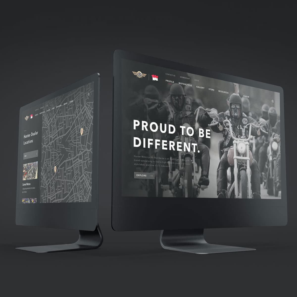
Hunter Indonesia 3.0
{"type":"doc","content":[{"type":"paragraph","attrs":{"textAlign":null},"content":[{"type":"text","text":"Proud to Be Different — Hunter Indonesia 3.0 is the most mature iteration of the brand yet: darker, sharper, and built like the custom bikes it represents."}]},{"type":"image","attrs":{"src":"https://farooq-agent.web.app/assets/images/works/large/hunter-indonesia-v3.jpg","alt":null,"title":null,"width":null,"height":null}},{"type":"paragraph","attrs":{"textAlign":null},"content":[{"type":"text","marks":[{"type":"bold"}],"text":"Web Design — Hunter Indonesia 3.0"}]},{"type":"paragraph","attrs":{"textAlign":null},"content":[{"type":"text","marks":[{"type":"italic"}],"text":"Custom Motorcycle & Parts Platform Website · Desktop · Indonesia"}]},{"type":"paragraph","attrs":{"textAlign":null},"content":[{"type":"text","text":"The third generation of Hunter Indonesia's website — a significant evolution in both visual refinement and platform depth, presented in a dual-monitor mockup that shows both the hero screen and the Dealer Locations feature simultaneously."}]},{"type":"paragraph","attrs":{"textAlign":null},"content":[{"type":"text","text":"The hero screen drops the script typography of previous versions in favor of pure heavy display weight: \"PROUD TO BE DIFFERENT.\" — all caps, bold, uncompromising. The same mass-rider photography hero returns, now with a darker, more cinematic grade that strips the image closer to pure black and white, giving the design more edge and less nostalgia. The sub-copy positions Hunter Motorcycles Worldwide as a specialist brand with a clear lineage now established in Indonesia."}]},{"type":"paragraph","attrs":{"textAlign":null},"content":[{"type":"text","text":"The navigation is more mature and complete: Profile, Motorcycle, Gallery, Store, Resources, Dealer, Forum — with Contact Us, Membership, and Login surfaced in the header utility bar. The two-tier navigation signals a platform that has grown beyond a single-purpose storefront into a full community and commerce ecosystem."}]},{"type":"paragraph","attrs":{"textAlign":null},"content":[{"type":"text","text":"The second monitor reveals the Dealer Locations map screen — an interactive map showing Hunter dealer pins across Indonesian cities, with a sidebar listing the nearest dealers including Central Malang. This is the feature that turns the platform from a national brand into a local service network — bridging the gap between online discovery and physical purchase."}]},{"type":"paragraph","attrs":{"textAlign":null},"content":[{"type":"text","text":"The all-black monitor and deep charcoal environment give the mockup presentation the same visual weight as the brand it houses."}]},{"type":"paragraph","attrs":{"textAlign":null},"content":[{"type":"text","text":"A third iteration that earned its version number."}]}]}

Info BMKG - Redesign
{"type":"doc","content":[{"type":"paragraph","attrs":{"textAlign":null},"content":[{"type":"text","text":"25°C Partly Cloudy, Magnitude 4.0 SR Northeast of Tarakan, Heavy Thunderstorm Warning in Blitar — Info BMKG redesigned is Indonesia's national weather and disaster data, finally presented with the clarity it deserves."}]},{"type":"image","attrs":{"src":"https://cdn.dribbble.com/userupload/3998355/file/original-cee5f9ed235aed41f116e10e90e125da.png","alt":null,"title":null,"width":null,"height":null}},{"type":"paragraph","attrs":{"textAlign":null},"content":[{"type":"text","marks":[{"type":"bold"}],"text":"UI/UX Design — Info BMKG Redesign"}]},{"type":"paragraph","attrs":{"textAlign":null},"content":[{"type":"text","marks":[{"type":"italic"}],"text":"Mobile App Redesign · Weather & Disaster Information · BMKG Indonesia"}]},{"type":"paragraph","attrs":{"textAlign":null},"content":[{"type":"text","text":"A clean, modern redesign of the Info BMKG app — Indonesia's official meteorological, climatological, and geophysical agency platform — transforming critical public safety data into a UI that is as clear and calm as the weather it monitors, and as urgent as the disasters it tracks."}]},{"type":"paragraph","attrs":{"textAlign":null},"content":[{"type":"text","text":"Three screens map the app's core functions:"}]},{"type":"paragraph","attrs":{"textAlign":null},"content":[{"type":"text","marks":[{"type":"bold"}],"text":"Weather Screen:"},{"type":"text","text":" Karangploso, Malang — Today, 13 November 2022 — 25°C, Partly Cloudy. Wind 24 km/h, Humidity 60%, Precipitation 0%. An hourly forecast strip runs below. The dark blue gradient background with a soft illustrated cloud-and-sun icon creates a UI that feels atmospheric and immersive — weather as environment, not just data."}]},{"type":"paragraph","attrs":{"textAlign":null},"content":[{"type":"text","marks":[{"type":"bold"}],"text":"Home/Dashboard:"},{"type":"text","text":" The hub screen combines weather (25°C, Partly Cloudy, Karangploso) with two critical safety layers: a Recent Earthquake card (Magnitude 4.0 SR, Northeast of Tarakan, 2,433 km away) and Early Warning cards for today — Heavy Thunderstorm in Blitar, Jawa Timur and Strong Winds in Denpasar, Bali. Each warning card shows the affected sub-districts. This is BMKG's most important UX challenge solved: surfacing life-safety alerts within a weather app without causing alarm fatigue."}]},{"type":"paragraph","attrs":{"textAlign":null},"content":[{"type":"text","marks":[{"type":"bold"}],"text":"Earthquake Screen:"},{"type":"text","text":" A full map of the Indonesian archipelago with earthquake epicenter pins, filtered by Recent / M≥5 / Felt tabs. The detail panel shows the 13 Nov '22 event: 4.0 SR magnitude, 10 km depth, epicenter 21 km northeast of Tarakan at 8.25°S 116.00°E, felt regions I Tarakan and II Samarinda."}]},{"type":"paragraph","attrs":{"textAlign":null},"content":[{"type":"text","text":"The five-tab bottom navigation — Weather, Air Quality, BMKG logo, Earthquake, More — is a thoughtful IA decision: the BMKG emblem as the center tab communicates institutional identity while keeping the navigation balanced."}]},{"type":"paragraph","attrs":{"textAlign":null},"content":[{"type":"text","text":"A redesign that treats public safety information with the design quality Indonesian citizens deserve."},{"type":"hardBreak"},{"type":"hardBreak"}]},{"type":"image","attrs":{"src":"https://farooq-agent.web.app/assets/images/works/details/226-mata-bencana/mata-bencana.jpg","alt":null,"title":null,"width":null,"height":null}},{"type":"paragraph","attrs":{"textAlign":"center"},"content":[{"type":"text","text":"(Old Idea)"}]}]}
HeySaladin - Web Design Revamp - Dark
{"type":"doc","content":[{"type":"paragraph","attrs":{"textAlign":null},"content":[{"type":"text","text":"Saladin — A Passionate Digital Product Designer — this revamp puts the real designer front and center, replacing the mascot with the man behind the work."}]},{"type":"image","attrs":{"src":"https://farooq-agent.web.app/assets/images/works/large/pd/heysaladin-revamp-dark.png","alt":null,"title":null,"width":null,"height":null}},{"type":"paragraph","attrs":{"textAlign":null},"content":[{"type":"text","marks":[{"type":"bold"}],"text":"Web Design — HeySaladin Revamp (Dark)"}]},{"type":"paragraph","attrs":{"textAlign":null},"content":[{"type":"text","marks":[{"type":"italic"}],"text":"Personal Portfolio Website · Designer Profile · Dark Mode"}]},{"type":"paragraph","attrs":{"textAlign":null},"content":[{"type":"text","text":"The most mature iteration of Adin's personal portfolio website — a full revamp that makes a decisive design shift: where earlier versions featured illustrated mascots and astronaut characters, this version puts Adin himself in the hero frame. A real photograph. Arms crossed. Confident."}]},{"type":"paragraph","attrs":{"textAlign":null},"content":[{"type":"text","text":"The hero is built around presence: \"Hey, I'm Saladin — A Passionate Digital Product Designer\" in bold display type, with UX, UI, and UIx floating labels orbiting the designer's photo in a colorful gradient bubble — communicating both personal brand and professional scope in a single composed frame. The subtext defines the design philosophy: \"I design digital products by understanding the problem and finding the right solution using multidisciplinary knowledge such as research, visual design, good interaction, and also supported by a little coding & business knowledge.\""}]},{"type":"paragraph","attrs":{"textAlign":null},"content":[{"type":"text","text":"The service cards below — User Experience, User Interface, User Interaction — map the three disciplines with clean dark card design and colorful icon badges, each with a concise description that communicates what each service actually involves."}]},{"type":"paragraph","attrs":{"textAlign":null},"content":[{"type":"text","text":"The \"My Works\" portfolio grid follows immediately — DeliFood, Tammwel, and more projects visible — turning the portfolio site into a living showcase of the very apps documented across this portfolio session. Self-referential in the best possible way: the portfolio website contains the portfolio."}]},{"type":"paragraph","attrs":{"textAlign":null},"content":[{"type":"text","text":"A designer profile that finally shows the designer — and trusts the work to speak for itself right below."}]}]}
HeySaladin - Web Design Revamp - Light
{"type":"doc","content":[{"type":"paragraph","attrs":{"textAlign":null},"content":[{"type":"text","text":"A Passionate Digital Product Designer — the light mode revamp of HeySaladin's portfolio opens up, breathes, and shows not just who Adin is, but exactly how he works."}]},{"type":"image","attrs":{"src":"https://farooq-agent.web.app/assets/images/works/large/pd/heysaladin-revamp.png","alt":null,"title":null,"width":null,"height":null}},{"type":"paragraph","attrs":{"textAlign":null},"content":[{"type":"text","marks":[{"type":"bold"}],"text":"Web Design — HeySaladin Revamp (Light)"}]},{"type":"paragraph","attrs":{"textAlign":null},"content":[{"type":"text","marks":[{"type":"italic"}],"text":"Personal Portfolio Website · Designer Profile · Light Mode"}]},{"type":"paragraph","attrs":{"textAlign":null},"content":[{"type":"text","text":"The light mode counterpart to the dark revamp — same structure, entirely different atmosphere. Where dark communicates depth and intensity, light communicates openness, clarity, and approachability. Both are valid designer positioning; together they demonstrate range."}]},{"type":"paragraph","attrs":{"textAlign":null},"content":[{"type":"text","text":"The hero is identical in structure: Adin photographed arms-crossed in a lavender bubble frame, UX / UI / UIx floating labels orbiting in purple and blue, \"Hey, I'm Saladin — A Passionate Digital Product Designer.\" in bold black display type with \"Designer.\" highlighted in purple. Two CTAs — \"Explore more\" and \"Watch Video\" — signal a richer content experience beyond the fold."}]},{"type":"paragraph","attrs":{"textAlign":null},"content":[{"type":"text","text":"The service section below shifts in tone: \"Solving Problem Creatively\" — three discipline cards (User Experience, User Interface, User Interaction) on a clean white background with purple icon badges. The copy is more complete in this version, elaborating on each service's actual method."}]},{"type":"paragraph","attrs":{"textAlign":null},"content":[{"type":"text","text":"The most valuable addition in the light version is the \"My Passionate Creative Work Flow\" section — a visual process diagram showing Discover & Define → Ideate & Prototype → Validate, with circular icons representing each phase. The process transparency is a strong portfolio differentiator: not just showing what was made, but how it was made. The Human-Centered Design methodology is explicitly named in the copy."}]},{"type":"paragraph","attrs":{"textAlign":null},"content":[{"type":"text","text":"The portfolio left panel shows DeliFood and Tresnan projects labeled with their categories — confirming a full case study portfolio structure, not just thumbnail grids."}]},{"type":"paragraph","attrs":{"textAlign":null},"content":[{"type":"text","text":"Two themes, one designer — the ability to switch between them says as much about the craft as any single project in the portfolio."}]}]}
Juba
{"type":"doc","content":[{"type":"paragraph","attrs":{"textAlign":null},"content":[{"type":"text","text":"Junior Banking, account number 80 435 565 45, Jane White Doe — JUBA gives kids their first real banking experience in an interface designed exactly for them."}]},{"type":"image","attrs":{"src":"https://farooq-agent.web.app/assets/images/works/details/242-juba/juba.jpg","alt":null,"title":null,"width":null,"height":null}},{"type":"paragraph","attrs":{"textAlign":null},"content":[{"type":"text","marks":[{"type":"bold"}],"text":"App UI Design — JUBA"}]},{"type":"paragraph","attrs":{"textAlign":null},"content":[{"type":"text","marks":[{"type":"italic"}],"text":"Mobile App · Junior Banking · Children's Banking App"}]},{"type":"paragraph","attrs":{"textAlign":null},"content":[{"type":"text","text":"A warm, playful app UI for JUBA — a junior banking platform designed to introduce children to real financial tools through an interface that is approachable, colorful, and age-appropriate without being condescending."}]},{"type":"paragraph","attrs":{"textAlign":null},"content":[{"type":"text","text":"The home screen centers on the account card — a golden yellow bank card bearing the \"Bank\" logo, account number 80 435 565 45, and the account holder name Jane White Doe — styled with the visual warmth of a product designed for young users while retaining the structure and legitimacy of a real banking card. \"Junior Banking\" sits beneath the bank name as the category identifier, communicating purpose from the first glance."}]},{"type":"paragraph","attrs":{"textAlign":null},"content":[{"type":"text","text":"The feature grid below maps a full banking capability set in colorful rounded icon tiles: Transfer (teal), Payment (purple), Admin (yellow), Information (orange), Cardless (green-yellow), Commerce (green), and additional features partially visible — a surprisingly comprehensive feature architecture for a junior product, communicating that JUBA offers real banking functionality adapted for young users rather than a simplified toy version."}]},{"type":"paragraph","attrs":{"textAlign":null},"content":[{"type":"text","text":"The JUBA wordmark in warm orange-yellow anchors the top center — bold, rounded, and energetic. The notification bell with a warm dot, the child's avatar in the top left, and the white iPhone mockup presented in a dynamic isometric angle give the presentation a fresh, modern quality."}]},{"type":"paragraph","attrs":{"textAlign":null},"content":[{"type":"text","text":"The overall color system — golden yellow, soft pastels for each feature category, clean white background — communicates warmth, safety, and the gentle excitement of a child's first financial independence."}]},{"type":"paragraph","attrs":{"textAlign":null},"content":[{"type":"text","text":"A banking app that teaches kids what money is for — by giving them real tools to manage it."}]}]}
Rent Gear
{"type":"doc","content":[{"type":"paragraph","attrs":{"textAlign":null},"content":[{"type":"text","text":"\"Leave your stress behind — Hike the Mountains, Dive into the Sea\" — RentGear makes the outdoors accessible to everyone who wants the adventure without the gear investment."}]},{"type":"image","attrs":{"src":"https://farooq-agent.web.app/assets/images/works/large/rent-gear.jpg","alt":null,"title":null,"width":null,"height":null}},{"type":"paragraph","attrs":{"textAlign":null},"content":[{"type":"text","marks":[{"type":"bold"}],"text":"App UI Design — RentGear"}]},{"type":"paragraph","attrs":{"textAlign":null},"content":[{"type":"text","marks":[{"type":"italic"}],"text":"Mobile App · Outdoor Gear Rental · Indonesia"}]},{"type":"paragraph","attrs":{"textAlign":null},"content":[{"type":"text","text":"A clean, adventure-forward app UI for RentGear — an outdoor equipment rental platform built on a simple, liberating idea: \"Gak perlu ribet beli barang mahal, rental aja!\" (No need to bother buying expensive gear — just rent!)."}]},{"type":"paragraph","attrs":{"textAlign":null},"content":[{"type":"text","text":"Three screens cover the complete rental journey:"}]},{"type":"paragraph","attrs":{"textAlign":null},"content":[{"type":"text","marks":[{"type":"bold"}],"text":"Home — Category Discovery:"},{"type":"text","text":" A hero shot of a hiker with a full red backpack opens the screen — the aspiration made visual before a word is read. Below it, a category grid: Backpack (highlighted, active), Tent, Footwear, Sleeping Equipment, Cooking, Misc. The category grid is the app's primary navigation — organized around what outdoor adventurers actually need, not abstract product taxonomy. A Testimony carousel at the bottom adds social proof from real users (@senjapt and others)."}]},{"type":"paragraph","attrs":{"textAlign":null},"content":[{"type":"text","marks":[{"type":"bold"}],"text":"Category Listing — Backpacks:"},{"type":"text","text":" A two-column product grid showing the Backpack Aiger 30 liter at Rp. 50,5K/day — consistent pricing, consistent product photography, a search and filter bar at the top. The daily rental pricing model is the page's most important design decision: it reframes expensive outdoor gear from a purchase barrier into an affordable daily expense, making the adventure feel achievable."}]},{"type":"paragraph","attrs":{"textAlign":null},"content":[{"type":"text","marks":[{"type":"bold"}],"text":"Product Detail:"},{"type":"text","text":" Backpack Aiger 30 liter — full product image, description, specifications table (Capacity: 30 liter, Dimension: 30×60×30, Weight: 6.75kg), daily price (50,5K/day), and a prominent orange \"Take this one\" CTA. The spec table is the detail screen's most functional element — exactly the information a first-time renter needs before committing."}]},{"type":"paragraph","attrs":{"textAlign":null},"content":[{"type":"text","text":"The warm autumn-leaf background, orange brand accents, and earthy product photography create a visual identity that feels as much at home in the forest as the gear it rents out."}]}]}
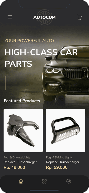
Autocom ELEGANT
{"type":"doc","content":[{"type":"paragraph","attrs":{"textAlign":null},"content":[{"type":"text","text":"Your Powerful Auto, High-Class Car Parts — Autocom's Elegant proposal trades the workshop for the showroom, wrapping industrial spare parts in the visual language of luxury automotive."}]},{"type":"image","attrs":{"src":"https://farooq-agent.web.app/assets/images/works/details/252-autocom//previews/app/ELEGANT-APP-home.png","alt":null,"title":null,"width":null,"height":null}},{"type":"paragraph","attrs":{"textAlign":null},"content":[{"type":"text","marks":[{"type":"bold"}],"text":"App UI Design — Autocom (Elegant Visual Proposal)"}]},{"type":"paragraph","attrs":{"textAlign":null},"content":[{"type":"text","marks":[{"type":"italic"}],"text":"Mobile App · Industrial Spare Parts Marketplace · Heavy Machinery & Automotive"}]},{"type":"paragraph","attrs":{"textAlign":null},"content":[{"type":"text","text":"The Elegant counterpart to the Masculine proposal — same product, entirely different visual register. Where Masculine goes bold red-on-navy, Elegant goes cinematic black-on-black with gold accents, letting a gleaming BMW front grille carry the hero's full emotional weight."}]},{"type":"paragraph","attrs":{"textAlign":null},"content":[{"type":"text","text":"\"Your Powerful Auto / High-Class Car Parts\" lands differently here — less workshop, more showroom. The full-bleed dark automotive photography, the gold \"Your Powerful Auto\" eyebrow text, and the deep charcoal background position Autocom as a premium parts destination, not just a catalog. A thin gold vertical rule adds a subtle luxury detail that signals premium without announcing it."}]},{"type":"paragraph","attrs":{"textAlign":null},"content":[{"type":"text","text":"Featured Products below maintains dark card backgrounds — Fog & Driving Lights at Rp. 49,000 and Rp. 59,000 — with product photography that reads as engineered objects rather than commodity parts. The IDR pricing (vs USD in Masculine) confirms localization for the Indonesian market."}]},{"type":"paragraph","attrs":{"textAlign":null},"content":[{"type":"text","text":"Two directions, one platform — Masculine for the heavy industry buyer, Elegant for the automotive enthusiast. Both designed to convert."}]}]}
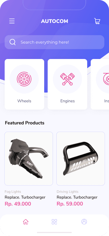
Autocom CASUAL
{"type":"doc","content":[{"type":"paragraph","attrs":{"textAlign":null},"content":[{"type":"text","text":"Search everything here! — Autocom's Casual proposal brings spare parts shopping into the everyday with a friendly purple gradient and the approachability of a consumer app."}]},{"type":"image","attrs":{"src":"https://farooq-agent.web.app/assets/images/works/details/252-autocom//previews/app/CASUAL-APP-home.png","alt":null,"title":null,"width":null,"height":null}},{"type":"paragraph","attrs":{"textAlign":null},"content":[{"type":"text","marks":[{"type":"bold"}],"text":"App UI Design — Autocom (Casual Visual Proposal)"}]},{"type":"paragraph","attrs":{"textAlign":null},"content":[{"type":"text","marks":[{"type":"italic"}],"text":"Mobile App · Industrial Spare Parts Marketplace · Heavy Machinery & Automotive"}]},{"type":"paragraph","attrs":{"textAlign":null},"content":[{"type":"text","text":"The third and lightest direction in the Autocom visual proposal set — Casual trades industrial authority for consumer friendliness, making spare parts feel as approachable as any other online shopping app."}]},{"type":"paragraph","attrs":{"textAlign":null},"content":[{"type":"text","text":"The purple-to-blue gradient header with a prominent \"Search everything here!\" search bar leads with discovery rather than category browsing — a UX-first choice that suits a casual buyer who may not yet know the exact part name. Category cards below — Wheels, Engines, Inside — use pink line-art icons on clean white cards, the pink accent giving the UI warmth and playfulness against the cool purple gradient."}]},{"type":"paragraph","attrs":{"textAlign":null},"content":[{"type":"text","text":"Featured Products maintains the same catalog structure as Masculine and Elegant — Fog Lights (Rp. 49,000) and Driving Lights (Rp. 59,000) — but here they sit on a clean, minimal white background that reads as light and accessible rather than dark and premium."}]},{"type":"paragraph","attrs":{"textAlign":null},"content":[{"type":"text","text":"Three proposals, one platform, three completely different conversations — Masculine for the workshop, Elegant for the showroom, Casual for everyone in between."}]}]}
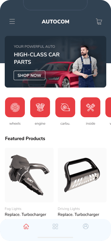
Autocom MASCULINE
{"type":"doc","content":[{"type":"paragraph","attrs":{"textAlign":null},"content":[{"type":"text","text":"Your Powerful Auto, High-Class Car Parts — Autocom's Masculine visual proposal is built for the industrial buyer who knows exactly what they need and wants a platform that matches their seriousness."}]},{"type":"image","attrs":{"src":"https://farooq-agent.web.app/assets/images/works/details/252-autocom//previews/app/MASCULINE-APP-home.png","alt":null,"title":null,"width":null,"height":null}},{"type":"paragraph","attrs":{"textAlign":null},"content":[{"type":"text","marks":[{"type":"bold"}],"text":"App UI Design — Autocom (Masculine Visual Proposal)"}]},{"type":"paragraph","attrs":{"textAlign":null},"content":[{"type":"text","marks":[{"type":"italic"}],"text":"Mobile App · Industrial Spare Parts Marketplace · Heavy Machinery & Automotive"}]},{"type":"paragraph","attrs":{"textAlign":null},"content":[{"type":"text","text":"A visual proposal for Autocom — a spare parts and industrial machinery components marketplace — exploring the \"Masculine\" design direction: dark navy background, bold red category icons, and product photography that lets the hardware speak for itself."}]},{"type":"paragraph","attrs":{"textAlign":null},"content":[{"type":"text","text":"The hero banner — \"Your Powerful Auto / High-Class Car Parts / Shop Now\" with a mechanic and a red sports car — immediately establishes the tone: professional, industrial, no-nonsense. The red-on-dark palette communicates technical authority and energy, the visual language of the workshop floor rather than the consumer showroom."}]},{"type":"paragraph","attrs":{"textAlign":null},"content":[{"type":"text","text":"Category icons in red rounded squares — Wheels, Engine, Carburettor, Inside — organize the catalog for buyers who navigate by part type, not by brand. Featured Products below surfaces Fog Lights and Driving Lights with product photography on clean white cards — the contrast of clean white product cards against the dark UI creates a sharp, premium catalog feel."}]},{"type":"paragraph","attrs":{"textAlign":null},"content":[{"type":"text","text":"A design direction that says: this is a platform built for people who work with machines."}]}]}
DeliFood
{"type":"doc","content":[{"type":"paragraph","attrs":{"textAlign":null},"content":[{"type":"text","text":"Deliver delicious food — DeliFood's bold orange identity makes food ordering feel as warm and energetic as the cuisine it delivers."}]},{"type":"image","attrs":{"src":"https://farooq-agent.web.app/assets/images/works/details/182-drawing-art-2019/delifood.jpg","alt":null,"title":null,"width":null,"height":null}},{"type":"paragraph","attrs":{"textAlign":null},"content":[{"type":"text","marks":[{"type":"bold"}],"text":"App UI Design — DeliFood"}]},{"type":"paragraph","attrs":{"textAlign":null},"content":[{"type":"text","marks":[{"type":"italic"}],"text":"Mobile App · Food Delivery · Multi-Cuisine"}]},{"type":"paragraph","attrs":{"textAlign":null},"content":[{"type":"text","text":"A vibrant, appetite-forward two-screen food delivery app UI for DeliFood — a platform built around the simple promise of \"Deliver delicious food,\" executed with the kind of visual energy that makes you hungry before you've opened a single menu."}]},{"type":"paragraph","attrs":{"textAlign":null},"content":[{"type":"text","text":"The splash screen is a statement in itself: a rich orange-red gradient with organic blob shapes, the DeliFood logo (a cloche with delivery wheels — clever, literal, charming), the wordmark in warm yellow, and the tagline \"Deliver delicious food\" in clean white. The orange is the app's entire personality — warm, fast, appetite-stimulating."}]},{"type":"paragraph","attrs":{"textAlign":null},"content":[{"type":"text","text":"The home screen maintains the energy with cuisine category chips — Asia, Indonesia, America, Europe, Healthy — in the same red-orange gradient tiles. \"Most favorite foods\" surfaces Healthy fruit salad yogurt & greens (5 stars) and Chinese chicken sichuan min (4.5 stars) — a range that signals both health-conscious and indulgent options on the same platform. \"Best promo special for you\" drives conversion with a food photography strip at the bottom."}]},{"type":"paragraph","attrs":{"textAlign":null},"content":[{"type":"text","text":"The bottom navigation — Location, Home (active, orange), Tag — is minimal and purposeful. Clean, warm, done."}]},{"type":"paragraph","attrs":{"textAlign":null},"content":[{"type":"text","text":"A food delivery app that gets out of its own way — and lets the food do the talking."}]}]}
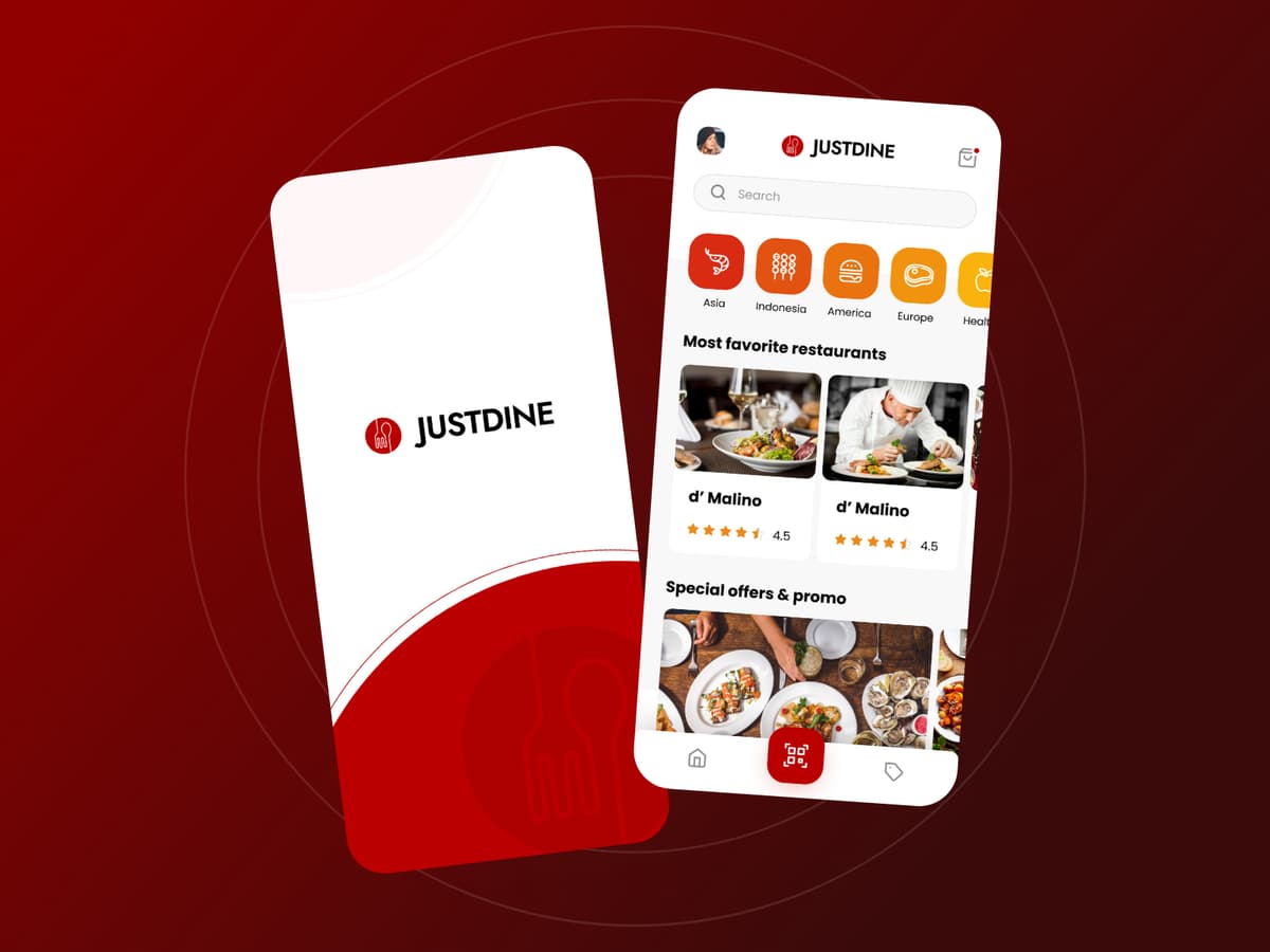
Just Dine
{"type":"doc","content":[{"type":"paragraph","attrs":{"textAlign":null},"content":[{"type":"text","text":"Most favorite restaurants, Asia to Europe, delivered with the full dining experience — Just Dine brings the restaurant to your home without leaving the feeling behind."}]},{"type":"image","attrs":{"src":"https://farooq-agent.web.app/assets/images/works/details/182-drawing-art-2019/justdine-long.jpg","alt":null,"title":null,"width":null,"height":null}},{"type":"paragraph","attrs":{"textAlign":null},"content":[{"type":"text","marks":[{"type":"bold"}],"text":"App UI Design — Just Dine"}]},{"type":"paragraph","attrs":{"textAlign":null},"content":[{"type":"text","marks":[{"type":"italic"}],"text":"Mobile App · Food Delivery & Home Dining Experience · Restaurant Discovery"}]},{"type":"paragraph","attrs":{"textAlign":null},"content":[{"type":"text","text":"A bold, appetite-forward two-screen app UI for Just Dine — a food delivery platform with a distinct positioning: not just delivering food, but replicating the full restaurant dining experience at home."}]},{"type":"paragraph","attrs":{"textAlign":null},"content":[{"type":"text","text":"The splash screen is clean and confident — the JustDine logomark (a cloche/dish cover icon in red) beside the wordmark on a white card with a dramatic red wave at the bottom, against a deep red background. The visual language is immediately premium: this is not a fast-food delivery app."}]},{"type":"paragraph","attrs":{"textAlign":null},"content":[{"type":"text","text":"The home screen opens with cuisine category chips in rich gradient reds and oranges — Asia, Indonesia, America, Europe, Healthy — communicating the platform's international scope while maintaining warmth. The \"Most favorite restaurants\" section features d' Malino (4.5 stars) with restaurant photography that is editorial in quality — plated dishes and a chef in action, communicating the cooking craft behind the delivery, not just the food itself."}]},{"type":"paragraph","attrs":{"textAlign":null},"content":[{"type":"text","text":"The QR code center tab in the bottom navigation is the app's most distinctive UX element — suggesting a table-side or in-restaurant scanning feature that bridges the physical and digital dining experience, consistent with the \"serve like in restaurant but in home\" concept."}]},{"type":"paragraph","attrs":{"textAlign":null},"content":[{"type":"text","text":"\"Special offers & promo\" surfaces a food photography strip at the bottom — oysters, seafood spreads — maintaining the premium appetite appeal throughout."}]},{"type":"paragraph","attrs":{"textAlign":null},"content":[{"type":"text","text":"A food delivery app that understands dining is an experience, not just a transaction."}]}]}
EXPO
{"type":"doc","content":[{"type":"paragraph","attrs":{"textAlign":null},"content":[{"type":"text","text":"360°, fully navigable, and as close to being there as a screen can get — Clean Expo's virtual exhibition platform brings the conference floor into the browser without losing a single square meter of experience."}]},{"type":"image","attrs":{"src":"https://farooq-agent.web.app/assets/images/works/details/255-expo/expo.jpg","alt":null,"title":null,"width":null,"height":null}},{"type":"paragraph","attrs":{"textAlign":null},"content":[{"type":"text","marks":[{"type":"bold"}],"text":"Web Design — EXPO (Clean Expo)"}]},{"type":"paragraph","attrs":{"textAlign":null},"content":[{"type":"text","marks":[{"type":"italic"}],"text":"Virtual Exhibition Platform · Conference & Exhibition · 360° Interactive"}]},{"type":"paragraph","attrs":{"textAlign":null},"content":[{"type":"text","text":"A virtual exhibition website for Clean Expo — a Conference & Exhibition platform — presenting a fully immersive 360° digital booth experience that replicates the physical trade show environment in a browser-native format."}]},{"type":"paragraph","attrs":{"textAlign":null},"content":[{"type":"text","text":"The hero is a 3D-rendered exhibition booth in Clean Expo's teal and white brand palette — a modern, open-plan stand with a curved teal arch entrance, display screens showing presenter faces, product display areas, and a reception counter. Three 3D human figures populate the space — a visitor looking up, an attendee at the booth center, a passerby — giving the virtual environment human scale and social presence that static floor plans never achieve."}]},{"type":"paragraph","attrs":{"textAlign":null},"content":[{"type":"text","text":"The 360° navigation badge in the lower left confirms the immersive interaction model — visitors can pan, rotate, and explore the booth space as if physically walking through it. Navigation controls (prev/next, home, zoom in/out) and utility icons (info, bookmark, share) give the experience the interaction vocabulary of a real virtual tour."}]},{"type":"paragraph","attrs":{"textAlign":null},"content":[{"type":"text","text":"The navigation — Seminar, View Map, View Listings, Enquiry Form, Register — maps the complete conference platform: content discovery, spatial navigation, exhibitor catalog, lead generation, and attendance registration — a full virtual event ecosystem beyond the 3D booth viewer."}]},{"type":"paragraph","attrs":{"textAlign":null},"content":[{"type":"text","text":"The circular wireframe background of the presentation gives the platform an appropriately spatial, architectural quality — hinting at the 360° environment without revealing it before the user enters."}]},{"type":"paragraph","attrs":{"textAlign":null},"content":[{"type":"text","text":"A virtual expo platform that asks the right question: what if the trade show came to you?"}]}]}
Tempo Cepat - Website Design
{"type":"doc","content":[{"type":"paragraph","attrs":{"textAlign":null},"content":[{"type":"text","text":"Tempo Cepat is the music event platform that serves both the concert-goer and the organizer, built around Indonesia's love for live music."}]},{"type":"image","attrs":{"src":"https://farooq-agent.web.app/assets/images/works/large/iiy2uNTa_work_image.jpg","alt":null,"title":null,"width":null,"height":null}},{"type":"paragraph","attrs":{"textAlign":null},"content":[{"type":"text","marks":[{"type":"bold"}],"text":"Web Design — Tempo Cepat"}]},{"type":"paragraph","attrs":{"textAlign":null},"content":[{"type":"text","marks":[{"type":"italic"}],"text":"Concert Ticketing & Music Event Platform · Indonesia"}]},{"type":"paragraph","attrs":{"textAlign":null},"content":[{"type":"text","text":"A dark, music-forward web design for Tempo Cepat — a platform for music event information, concert ticketing, and event management — built for both audiences who want to attend and organizers who want to create events."}]},{"type":"paragraph","attrs":{"textAlign":null},"content":[{"type":"text","text":"The hero is cinematic: a dimly lit stage setup photograph against a near-black background, with the call to action \"Daftarkan Segera — Event Musik Yang Kamu Adakan\" (Register Now — The Music Event You're Organizing) in bold white type and an orange \"Daftarkan Sekarang\" CTA. The dual positioning is clear: this platform isn't just for ticket buyers — it's for anyone running a music event who needs a registration and promotion platform."}]},{"type":"paragraph","attrs":{"textAlign":null},"content":[{"type":"text","text":"The lower section reveals the consumer-facing discovery layer: \"Inilah Artist Idola!\" (These are the Idol Artists!) with what appears to be a popular Indonesian group in a moody black and white photograph, alongside \"Event Cita Rasa Artis\" featuring a concert thumbnail — surfacing real events and real artists to drive ticket discovery."}]},{"type":"paragraph","attrs":{"textAlign":null},"content":[{"type":"text","text":"The navigation — Home, Konser Navi, Mereka Bilang, Indie Dakas, Blog, Log In — maps both the music content platform and the community layer, with \"Mereka Bilang\" (What They Say) suggesting testimonials and \"Indie Dakas\" suggesting an independent music discovery section."}]},{"type":"paragraph","attrs":{"textAlign":null},"content":[{"type":"text","text":"The black, white, and orange palette is the classic music industry color system — high contrast, high energy, impossible to mistake for anything other than a platform that takes live music seriously."}]},{"type":"paragraph","attrs":{"textAlign":null},"content":[{"type":"text","text":"A concert platform that understands music from both sides of the stage."}]}]}
Farooqa Website
{"type":"doc","content":[{"type":"paragraph","attrs":{"textAlign":null},"content":[{"type":"text","text":"The Beauty of Art — Farooqa's design studio website is as dark and deliberate as the creative work it exists to represent: pure black, gold typography, and a philosophy before a portfolio."}]},{"type":"image","attrs":{"src":"https://farooq-agent.web.app/assets/images/works/large/fqnW90nR_work_image.jpg","alt":null,"title":null,"width":null,"height":null}},{"type":"paragraph","attrs":{"textAlign":null},"content":[{"type":"text","marks":[{"type":"bold"}],"text":"Web Design — Farooqa"}]},{"type":"paragraph","attrs":{"textAlign":null},"content":[{"type":"text","marks":[{"type":"italic"}],"text":"Design Studio Website · Portfolio · Creative Agency"}]},{"type":"paragraph","attrs":{"textAlign":null},"content":[{"type":"text","text":"A dramatically minimal website for Farooqa — Adin's design studio brand — built entirely in black with gold typography. No photography, no illustration, no visual noise. Just the name, the philosophy, and the confidence to let that be enough."}]},{"type":"paragraph","attrs":{"textAlign":null},"content":[{"type":"text","text":"The hero is a pure black field anchored by the Farooqa logomark — a stylized \"F\" in a circular badge — and the studio wordmark below. The headline: \"THE BEAUTY OF ART — Use Creativity for Create Beautiful Work\" — rendered in gold display type that glows against the absolute black. The eyebrow copy reads \"The Elements Striving for Create Creative Solution\" — positioning Farooqa as a studio that operates from principles, not just aesthetics."}]},{"type":"paragraph","attrs":{"textAlign":null},"content":[{"type":"text","text":"The carousel dots below suggest multiple hero slides, extending the philosophical framing across multiple statements before any portfolio work is shown. The approach is deliberately unhurried — a studio confident enough to make the visitor wait for the work because the idea comes first."}]},{"type":"paragraph","attrs":{"textAlign":null},"content":[{"type":"text","text":"The Farooqa logomark itself — geometric, precise, and symmetrical — communicates a design sensibility that values structure and intention over decoration. The gold-on-black palette is the visual language of premium creative identity: luxury, craft, and a quiet refusal to compete for attention through loudness."}]},{"type":"paragraph","attrs":{"textAlign":null},"content":[{"type":"text","text":"A studio website that opens with art — and trusts the client to lean in."}]}]}
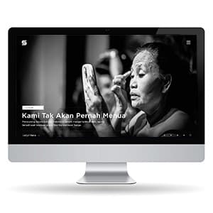
Suroboyo.org - Website Design & Frontend Dev.
{"type":"doc","content":[{"type":"paragraph","attrs":{"textAlign":null},"content":[{"type":"text","text":"Kami Tak Akan Pernah Menua — Suroboyo.org is a local media platform that treats Surabaya's culture and people with the weight and craft of long-form documentary journalism."}]},{"type":"image","attrs":{"src":"https://farooq-agent.web.app/assets/images/works/large/V7fvqktM_work_image.jpg","alt":null,"title":null,"width":null,"height":null}},{"type":"paragraph","attrs":{"textAlign":null},"content":[{"type":"text","marks":[{"type":"bold"}],"text":"Web Design & Frontend Development — Suroboyo.org"}]},{"type":"paragraph","attrs":{"textAlign":null},"content":[{"type":"text","marks":[{"type":"italic"}],"text":"Local Media Website · Culture & Community · Surabaya · Design + Dev"}]},{"type":"paragraph","attrs":{"textAlign":null},"content":[{"type":"text","text":"A visually striking web design and frontend development project for Suroboyo.org — a local cultural media platform dedicated to Surabaya's people, stories, and identity."}]},{"type":"paragraph","attrs":{"textAlign":null},"content":[{"type":"text","text":"The hero is the design's defining statement: a full-bleed, high-contrast black and white documentary photograph of an elderly Javanese woman applying makeup — her face weathered, her gesture deliberate, her expression entirely focused. The caption reads \"Kami Tak Akan Pernah Menua\" (We Will Never Grow Old) — a poetic, defiant line that frames the platform's editorial voice: this is media that finds dignity and beauty in the overlooked and the aging, in the city's true inhabitants rather than its skyline."}]},{"type":"paragraph","attrs":{"textAlign":null},"content":[{"type":"text","text":"The monochrome photography treatment is not minimalism for its own sake — it is an editorial choice that communicates the platform's commitment to human stories over spectacle. The \"S\" logomark in white against the dark header is minimal and typographic, letting the content carry the identity."}]},{"type":"paragraph","attrs":{"textAlign":null},"content":[{"type":"text","text":"The \"Lanjut Baca\" (Continue Reading) CTA confirms an article and long-form content structure — a publication built for readers who stay, not just scrollers who pass through."}]},{"type":"paragraph","attrs":{"textAlign":null},"content":[{"type":"text","text":"A local media website that treats Surabaya as a subject worthy of the same depth and craft as any national publication — because it is."}]}]}
Go Delivery
{"type":"doc","content":[{"type":"paragraph","attrs":{"textAlign":null},"content":[{"type":"text","text":"Deliver Smarter, Faster, Everywhere — Go Delivery transforms multi-destination logistics into a streamlined, optimized mobile experience."}]},{"type":"image","attrs":{"src":"https://farooq-agent.web.app/assets/images/works/large/go-delivery.jpg","alt":null,"title":null,"width":null,"height":null}},{"type":"paragraph","attrs":{"textAlign":null},"content":[{"type":"text","marks":[{"type":"bold"}],"text":"Mobile App Concept — Go Delivery"}]},{"type":"paragraph","attrs":{"textAlign":null},"content":[{"type":"text","marks":[{"type":"italic"}],"text":"Logistics · Route Optimization · Delivery Management · UI/UX Design"}]},{"type":"paragraph","attrs":{"textAlign":null},"content":[{"type":"text","text":"A mobile application designed to optimize delivery operations — Go Delivery helps users plan and execute routes efficiently, especially when handling multiple destinations in a single trip."}]},{"type":"paragraph","attrs":{"textAlign":null},"content":[{"type":"text","text":"The experience centers on speed, clarity, and reliability. Users can input multiple delivery points, and the app calculates the most efficient route, reducing travel time, fuel costs, and potential delays. Notifications and real-time updates ensure users stay on track throughout the journey."}]},{"type":"paragraph","attrs":{"textAlign":null},"content":[{"type":"text","text":"The interface likely emphasizes clean data presentation and actionable insights. Route maps, estimated times, and task lists are displayed in a way that allows quick comprehension, helping delivery personnel or managers focus on execution rather than navigation challenges."}]},{"type":"paragraph","attrs":{"textAlign":null},"content":[{"type":"text","text":"Go Delivery positions itself as more than a routing tool. It serves as a management companion for logistics-heavy operations, enabling both solo couriers and delivery teams to work smarter and meet deadlines consistently."}]},{"type":"paragraph","attrs":{"textAlign":null},"content":[{"type":"text","text":"Visually, the design balances information density with readability. Maps, timelines, and task status indicators are structured for clarity without overwhelming the user, ensuring fast comprehension in dynamic conditions."}]},{"type":"paragraph","attrs":{"textAlign":null},"content":[{"type":"text","text":"This concept reflects a growing demand for intelligent, mobile-first logistics solutions — where optimization, ease of use, and real-time awareness redefine efficiency."}]},{"type":"paragraph","attrs":{"textAlign":null},"content":[{"type":"text","text":"A thoughtful exploration of how technology can simplify complex delivery networks — turning multi-destination planning into a seamless, reliable, and actionable experience."}]}]}
True Valet
{"type":"doc","content":[{"type":"paragraph","attrs":{"textAlign":null},"content":[{"type":"text","text":"Mitsubishi Expander Silver, B 76685 AG, parked 2 hours 32 minutes — one tap on \"Pick up me!\" and your car is on its way."}]},{"type":"image","attrs":{"src":"https://farooq-agent.web.app/assets/images/works/large/true-valet.jpg","alt":null,"title":null,"width":null,"height":null}},{"type":"paragraph","attrs":{"textAlign":null},"content":[{"type":"text","marks":[{"type":"bold"}],"text":"App UI Design — TrueValet"}]},{"type":"paragraph","attrs":{"textAlign":null},"content":[{"type":"text","marks":[{"type":"italic"}],"text":"Mobile App · Valet Parking Service · Indonesia"}]},{"type":"paragraph","attrs":{"textAlign":null},"content":[{"type":"text","text":"A single-screen valet parking app UI for TrueValet — a digitized valet service that replaces the paper ticket with a smart mobile parking tracker, built for premium venues like Grand Indonesia."}]},{"type":"paragraph","attrs":{"textAlign":null},"content":[{"type":"text","text":"The screen is a parking session card — everything a car owner needs to know displayed with elegant economy: the venue (Grand Indonesia Blok A), vehicle (Mitsubishi Expander Silver, plate B 76685 AG), the valet attendant's photo and name (Ngabdi Waluyo Sanusi, ID: TV2465455847845UG), live elapsed parking timer (02:32:46), and the system-estimated cost (IDR 46.000)."}]},{"type":"paragraph","attrs":{"textAlign":null},"content":[{"type":"text","text":"The \"Pick up me!\" CTA at the bottom is the app's defining moment — a single bold yellow button that triggers the car retrieval process. The copy is deliberately casual and human: not \"Request Vehicle\" or \"Retrieve Car\" but \"Pick up me!\" — playful, memorable, and entirely in keeping with an app that wants the valet experience to feel effortless rather than transactional."}]},{"type":"paragraph","attrs":{"textAlign":null},"content":[{"type":"text","text":"The dark olive-gold background gradient communicates premium positioning — this is a valet app for shopping malls and luxury venues, not a parking lot kiosk. The yellow accent color is both the brand color and the action color, creating a visual hierarchy that is impossible to misread: see the yellow button, tap it, your car arrives."}]},{"type":"paragraph","attrs":{"textAlign":null},"content":[{"type":"text","text":"A valet app that makes one of the most anxiety-inducing parts of a mall visit — where's my car, how do I get it back — feel completely under control."}]}]}
Outcome List
{"type":"doc","content":[{"type":"paragraph","attrs":{"textAlign":null},"content":[{"type":"text","text":"Create an Outcome List Mobile App — 75% — an app whose first task is itself, and that kind of recursive self-awareness makes it immediately worth finishing."}]},{"type":"image","attrs":{"src":"https://farooq-agent.web.app/assets/images/works/details/177-dipuja/outcome-list.jpg","alt":null,"title":null,"width":null,"height":null}},{"type":"paragraph","attrs":{"textAlign":null},"content":[{"type":"text","marks":[{"type":"bold"}],"text":"App UI Design — Outcome List"}]},{"type":"paragraph","attrs":{"textAlign":null},"content":[{"type":"text","marks":[{"type":"italic"}],"text":"Mobile App · Goal & Task Tracker · Personal Productivity"}]},{"type":"paragraph","attrs":{"textAlign":null},"content":[{"type":"text","text":"A vibrant, color-coded goal tracking app UI for Outcome List — a personal productivity tool that turns tasks and goals into visual progress tiles, each showing completion percentage at a glance."}]},{"type":"paragraph","attrs":{"textAlign":null},"content":[{"type":"text","text":"The home screen presents six active goals in a two-column card grid, each in a distinct color: amber, blue, teal, coral, purple, and gold — color-coding that creates instant visual differentiation between goals without any icon or label overhead. Each card shows the goal title and its current percentage progress, displayed at the bottom of the card as both a number and an implied progress indicator."}]},{"type":"paragraph","attrs":{"textAlign":null},"content":[{"type":"text","text":"The six goals visible — Create an Outcome List Mobile App (75%), Usability testing for e-invitation app (65%), Create an Animal Rescue Mobile App (55%), Create & upload a Youtube video (35%), Finish a daily chores (25%), Create a Cleaning Service Mobile App (15%) — are a fascinating window into a designer's actual workload and side projects. The fact that \"Create an Outcome List Mobile App\" is itself one of the outcomes being tracked is the app's best meta-joke: building the tool to track the fact that you're building the tool."}]},{"type":"paragraph","attrs":{"textAlign":null},"content":[{"type":"text","text":"The warm amber background, the bold rounded card style, and the high-contrast typography create a UI that feels energetic and motivating — exactly the emotional tone a productivity app needs to make you want to open it daily."}]},{"type":"paragraph","attrs":{"textAlign":null},"content":[{"type":"text","text":"A goal tracker that holds itself accountable — and makes you want to do the same."}]}]}
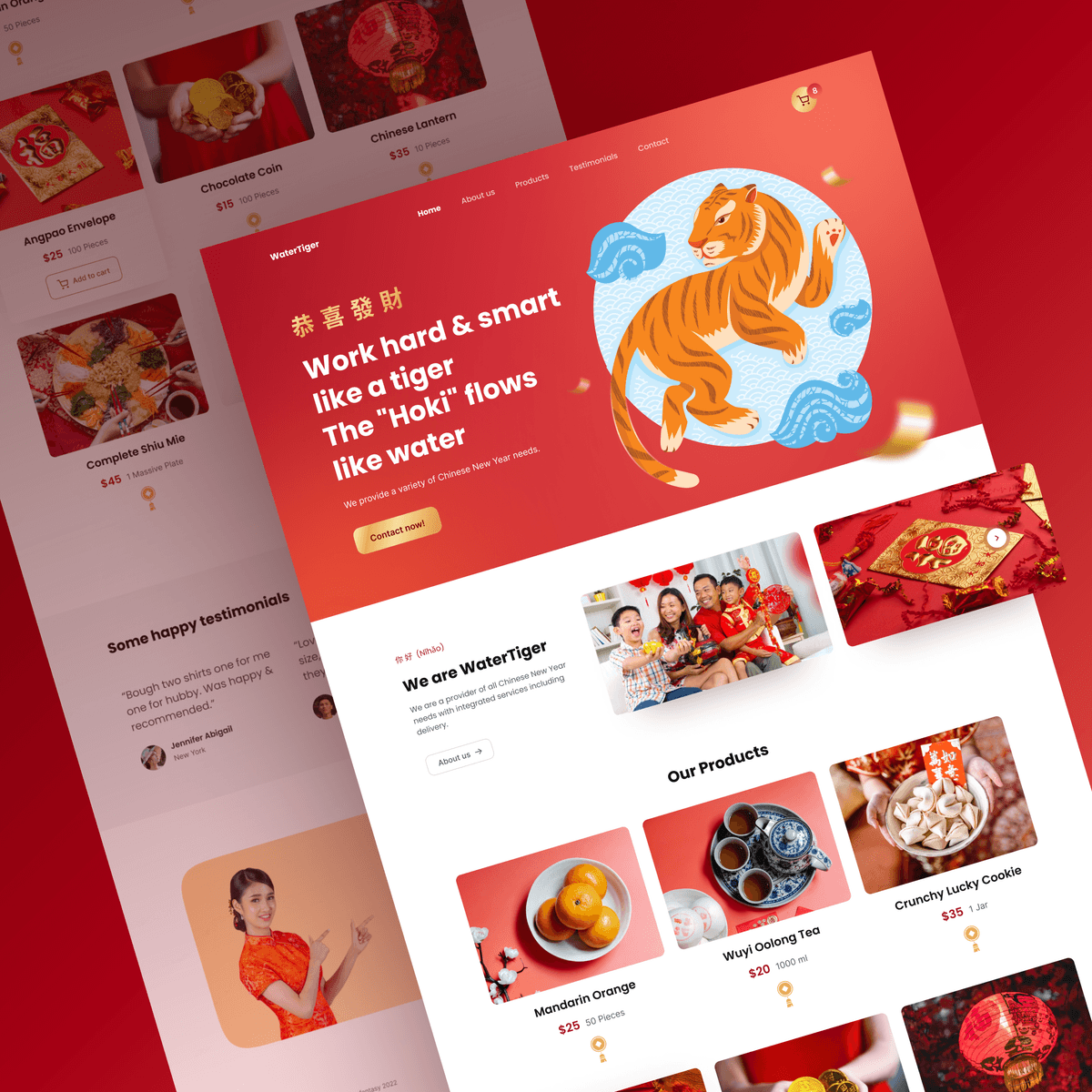
Water Tiger - Chinese New Year - Website Design
{"type":"doc","content":[{"type":"paragraph","attrs":{"textAlign":null},"content":[{"type":"text","text":"A festive Chinese New Year website that sells celebration — bold red, a leaping tiger, and a full product catalog for everything the season demands."}]},{"type":"image","attrs":{"src":"https://farooq-agent.web.app/assets/images/works/large/pd/watig.png","alt":null,"title":null,"width":null,"height":null}},{"type":"paragraph","attrs":{"textAlign":null},"content":[{"type":"text","marks":[{"type":"bold"}],"text":"Web Design — Water Tiger"}]},{"type":"paragraph","attrs":{"textAlign":null},"content":[{"type":"text","marks":[{"type":"italic"}],"text":"Website · Chinese New Year · E-Commerce · Festive"}]},{"type":"paragraph","attrs":{"textAlign":null},"content":[{"type":"text","text":"Water Tiger is a Chinese New Year themed website for a provider of CNY products and services. The hero section opens with a bold bilingual headline — \"恭喜發財 / Work hard & smart like a tiger, The 'Hoki' flows like water\" — paired with a vibrant illustrated tiger set against a circular blue motif, immediately establishing the 2022 Water Tiger year theme. A warm coral-red background saturates the entire above-the-fold experience in festive energy."}]},{"type":"paragraph","attrs":{"textAlign":null},"content":[{"type":"text","text":"Below the hero, the product catalog presents a curated selection of CNY essentials: Mandarin Orange, Wuyi Oolong Tea, Crunchy Lucky Cookie, Chinese Lantern, Chocolate Coin, Angpao Envelope, and Complete Shiu Mie — each with photography, price, and unit quantity. A testimonials section with customer photos and quotes adds social proof, while a woman in traditional cheongsam reinforces the cultural authenticity of the brand."}]},{"type":"paragraph","attrs":{"textAlign":null},"content":[{"type":"text","text":"The layout balances celebration with commerce — festive enough to feel seasonal, structured enough to convert."}]}]}
Tamawal - Landing Page
{"type":"doc","content":[{"type":"paragraph","attrs":{"textAlign":null},"content":[{"type":"text","text":"A fintech landing page that makes borrowing feel effortless — clear headline, bold visuals, and one CTA that gets users straight to the money."}]},{"type":"image","attrs":{"src":"https://mir-s3-cdn-cf.behance.net/project_modules/2800_opt_1/d3dac0154041303.63e528eb01d4e.png","alt":null,"title":null,"width":null,"height":null}},{"type":"paragraph","attrs":{"textAlign":null},"content":[{"type":"text","marks":[{"type":"bold"}],"text":"UI/UX Design — Tamawal"}]},{"type":"paragraph","attrs":{"textAlign":null},"content":[{"type":"text","marks":[{"type":"italic"}],"text":"Landing Page · Fintech · Loan Marketplace · Saudi Arabia"}]},{"type":"paragraph","attrs":{"textAlign":null},"content":[{"type":"text","text":"Tamawal's landing page opens with a confident, conversational hero: \"Make your life easier with Tamawal\" — a headline that immediately humanizes the fintech product. Three user avatars inline with the headline reinforce the community and trust angle before a word is read. A concise subtext positions the platform as a Digital Financing Broker (DFB) that connects borrowers with Saudi banks and financial institutions."}]},{"type":"paragraph","attrs":{"textAlign":null},"content":[{"type":"text","text":"The right side of the hero features a 3D isometric illustration — a smartphone displaying a 150,000 SAR Personal Loan card, surrounded by stacked gold coins and a wallet — translating an abstract financial service into something visually tangible and aspirational. The blue and gold palette reinforces both trust (blue) and financial reward (gold), while a single \"Get ready\" CTA keeps the conversion path clean and uncluttered."}]},{"type":"paragraph","attrs":{"textAlign":null},"content":[{"type":"text","text":"Presented in a MacBook mockup, the design communicates a product that's polished, modern, and ready for market."}]}]}
KonsulAja
{"type":"doc","content":[{"type":"paragraph","attrs":{"textAlign":null},"content":[{"type":"text","text":"An Indonesian expert consultation platform that connects students and professionals with trusted narasumber — consult about anything, from anywhere."}]},{"type":"image","attrs":{"src":"https://farooq-agent.web.app/assets/images/works/large/pd/KonsulAja-Home-Dark-SQUARE.png","alt":null,"title":null,"width":null,"height":null}},{"type":"paragraph","attrs":{"textAlign":null},"content":[{"type":"text","marks":[{"type":"bold"}],"text":"UI/UX Design — KonsulAja"}]},{"type":"paragraph","attrs":{"textAlign":null},"content":[{"type":"text","marks":[{"type":"italic"}],"text":"Web App · Consultation Marketplace · Indonesia"}]},{"type":"paragraph","attrs":{"textAlign":null},"content":[{"type":"text","text":"KonsulAja is an online consultation platform connecting users with verified domain experts (narasumber) across six categories: Karier, Studi, Area Bisnis, Industri, Hukum, and Lainnya. The hero section leads with a confident headline — \"Konsultasi dari mana saja, tentang Apa saja!\" — paired with a search bar and an orange \"Konsul Sekarang\" CTA, making the discovery-to-booking flow immediate. A \"+460 Expert Consultants\" trust badge anchors the top right of the hero, establishing platform credibility at first glance."}]},{"type":"paragraph","attrs":{"textAlign":null},"content":[{"type":"text","text":"The dark teal hero transitions into a clean white content area below, where category tabs and expert profile cards (with star ratings and fresh graduate indicators) carry the browse experience forward. A video call thumbnail in the hero visual reinforces the remote, on-demand nature of the service. The About section frames KonsulAja as a \"One-Stop Service\" for academic and professional decision-making — positioning it squarely as the Indonesian answer to platforms like APDlist or "},{"type":"text","marks":[{"type":"link","attrs":{"href":"http://Clarity.fm","target":"_blank","rel":"noopener noreferrer nofollow","class":null,"title":null}}],"text":"Clarity.fm"},{"type":"text","text":"."}]}]}
Learning Stock Investation Platform
{"type":"doc","content":[{"type":"paragraph","attrs":{"textAlign":null},"content":[{"type":"text","text":"A stock investment super-app that combines social knowledge sharing, expert-led learning, and real portfolio tracking — all built for the Indonesian investor community."}]},{"type":"image","attrs":{"src":"https://mir-s3-cdn-cf.behance.net/project_modules/max_1200/964a27164614065.64060f0f24371.png","alt":null,"title":null,"width":null,"height":null}},{"type":"image","attrs":{"src":"https://mir-s3-cdn-cf.behance.net/project_modules/max_1200/0d048e164614065.64060f0f24f89.png","alt":null,"title":null,"width":null,"height":null}},{"type":"paragraph","attrs":{"textAlign":null},"content":[{"type":"text","marks":[{"type":"bold"}],"text":"UI/UX Design — Stockwise"}]},{"type":"paragraph","attrs":{"textAlign":null},"content":[{"type":"text","marks":[{"type":"italic"}],"text":"Mobile App · Stock Investment · Learning Platform · Indonesia"}]},{"type":"paragraph","attrs":{"textAlign":null},"content":[{"type":"text","text":"Stockwise is a multi-layered investment platform spanning three core sections: Stream, Insider, and Market. The Stream tab functions as a social feed — users post tips, ask questions, and share investment content (text, articles, videos) with filter tabs for Trending, Text, Article, and Video. Verified experts like Felisia Tanuwijaya post alongside regular users, creating a peer-to-peer knowledge exchange at scale."}]},{"type":"paragraph","attrs":{"textAlign":null},"content":[{"type":"text","text":"The Insider section elevates the platform into a learning product — offering structured courses from Basic Investment Knowledge to Advanced Strategy for Stocks, taught by curated \"insiders.\" Most Popular Class cards surface instructor-tagged, difficulty-labeled video courses directly in the feed. The Profile screen ties it all together: a PRO badge system, investment dashboard (12 Assets, $5,564.78 Profits), and a gamified progress tracker (24 Classes, 326 Points) reward consistent learning and engagement."}]},{"type":"paragraph","attrs":{"textAlign":null},"content":[{"type":"text","text":"The dark mode UI uses teal and cyan accents; the light mode shifts to blue and amber — both maintaining the same confident, data-forward visual language across modes."}]}]}
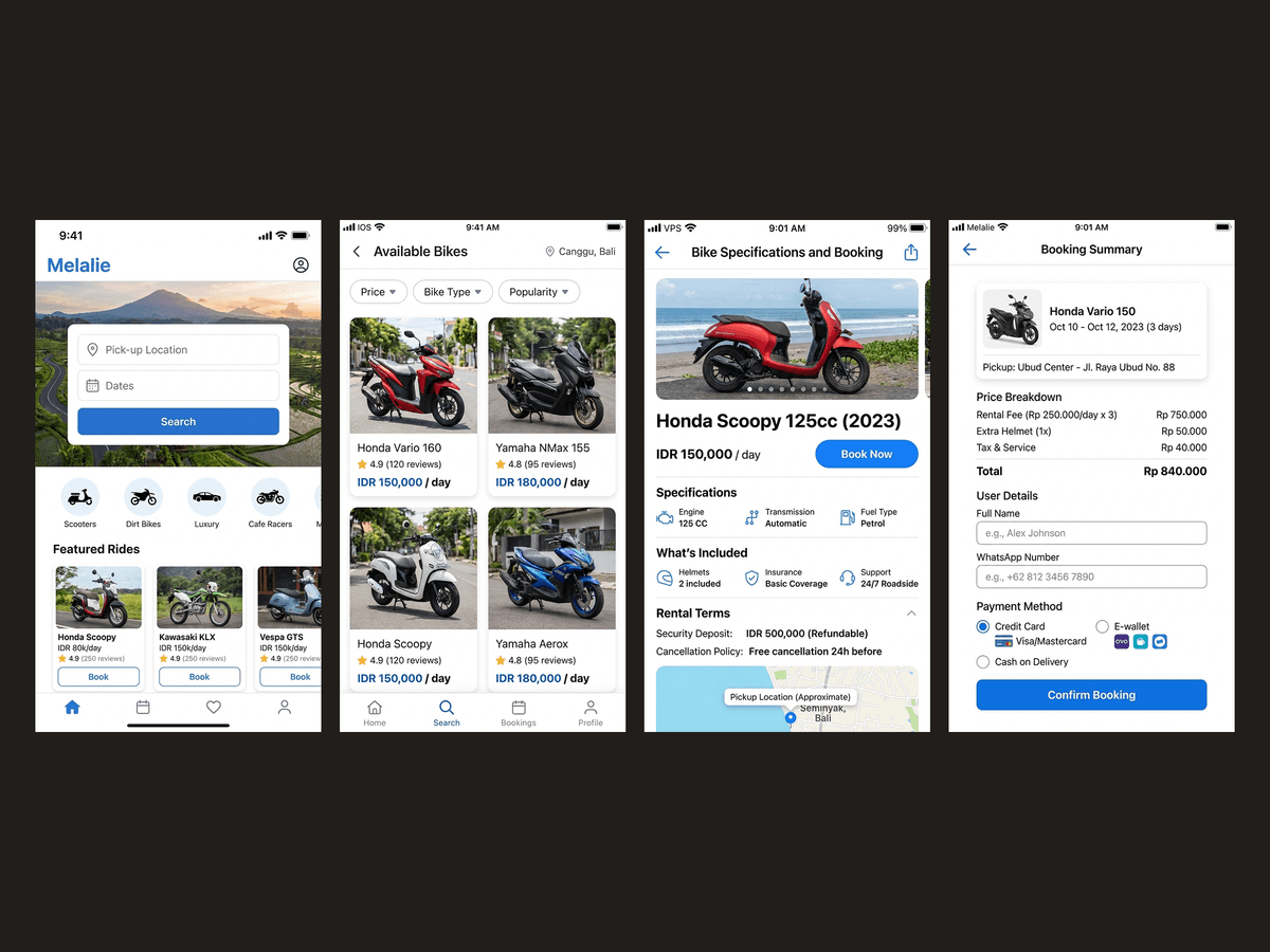
Melalie Mobile Web
{"type":"doc","content":[{"type":"paragraph","attrs":{"textAlign":null},"content":[{"type":"text","text":"Move Freely, Explore Fully — Melalie makes renting a motorbike in Bali as simple as a few taps on your phone."}]},{"type":"image","attrs":{"src":"https://farooq-agent.web.app/assets/images/works/details/233-melalie-homepage-mobile-web/melalie-homepage-mobile-web.jpg","alt":null,"title":null,"width":null,"height":null}},{"type":"paragraph","attrs":{"textAlign":null},"content":[{"type":"text","marks":[{"type":"bold"}],"text":"Mobile Web Design — Melalie"}]},{"type":"paragraph","attrs":{"textAlign":null},"content":[{"type":"text","marks":[{"type":"italic"}],"text":"Travel & Mobility · Motorbike Rental · Bali · UI/UX Design"}]},{"type":"paragraph","attrs":{"textAlign":null},"content":[{"type":"text","text":"A mobile web experience designed for tourists seeking fast and reliable transportation — Melalie simplifies the process of renting a motorbike in Bali through a streamlined, mobile-first interface."}]},{"type":"paragraph","attrs":{"textAlign":null},"content":[{"type":"text","text":"The product focuses on immediacy and accessibility. Travelers, often on the move and relying on their phones, can quickly browse available bikes, compare options, and complete bookings without friction. The mobile web approach ensures no installation barrier, making it instantly usable upon discovery."}]},{"type":"paragraph","attrs":{"textAlign":null},"content":[{"type":"text","text":"The interface likely emphasizes clarity and speed. Key information — pricing, availability, location, and rental terms — is presented upfront, allowing users to make confident decisions in minimal time. The flow is optimized for quick actions, reducing unnecessary steps between intent and booking."}]},{"type":"paragraph","attrs":{"textAlign":null},"content":[{"type":"text","text":"Melalie positions itself as a practical companion for exploration. In a place like Bali, where mobility defines the travel experience, easy access to transportation becomes essential. The product enables users to move independently, explore beyond common routes, and experience the destination on their own terms."}]},{"type":"paragraph","attrs":{"textAlign":null},"content":[{"type":"text","text":"Visually, the design is expected to reflect openness and ease — aligning with the relaxed yet dynamic nature of travel. Navigation remains simple, ensuring usability even in unfamiliar environments or varying connectivity conditions."}]},{"type":"paragraph","attrs":{"textAlign":null},"content":[{"type":"text","text":"This project reflects a broader shift toward frictionless travel tools — where convenience, speed, and accessibility shape the overall experience."}]},{"type":"paragraph","attrs":{"textAlign":null},"content":[{"type":"text","text":"A focused approach to mobility design, where renting a motorbike becomes not just a transaction, but the starting point of a more flexible and personal journey."}]},{"type":"paragraph","attrs":{"textAlign":null}},{"type":"image","attrs":{"src":"https://hyperfantasy.web.app/assets/images/portfolios/b1e057f7-a58b-4bfa-a9c1-c26d20ee43f4/melalie.png","alt":null,"title":null,"width":null,"height":null}},{"type":"paragraph","attrs":{"textAlign":null}}]}
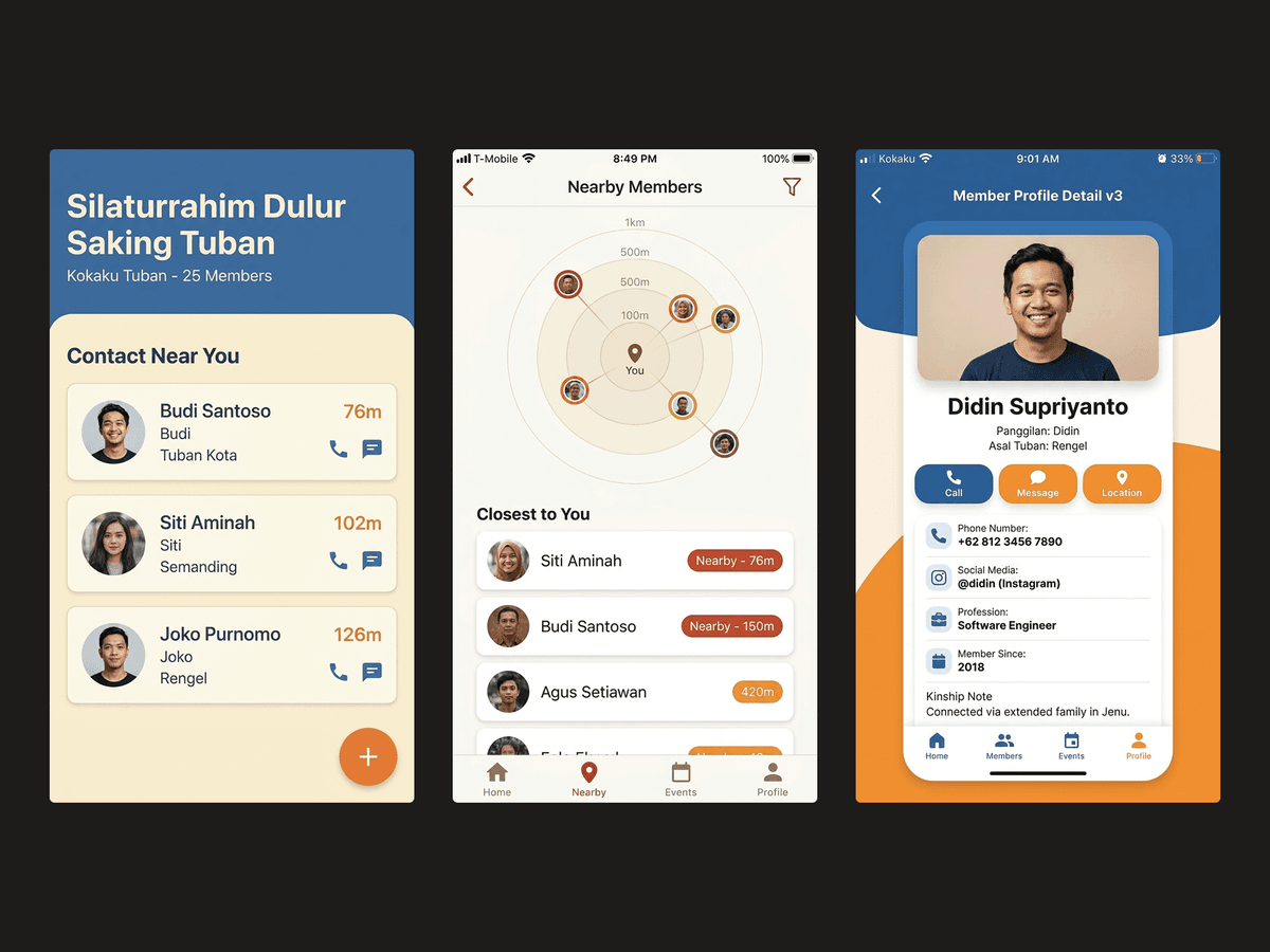
Kokaku
{"type":"doc","content":[{"type":"paragraph","attrs":{"textAlign":null},"content":[{"type":"text","text":"\"Silaturrahim Dulur Saking Tuban\" — Kokaku is a community contact app built around the bonds that matter most: your people, near you, always within reach."}]},{"type":"image","attrs":{"src":"https://farooq-agent.web.app/assets/images/works/large/kokaku.jpg","alt":null,"title":null,"width":null,"height":null}},{"type":"paragraph","attrs":{"textAlign":null},"content":[{"type":"text","marks":[{"type":"bold"}],"text":"App UI Design — Kokaku"}]},{"type":"paragraph","attrs":{"textAlign":null},"content":[{"type":"text","marks":[{"type":"italic"}],"text":"Mobile App · Community Contact Manager · Android · Tuban Community"}]},{"type":"paragraph","attrs":{"textAlign":null},"content":[{"type":"text","text":"A community-focused contact management app designed for the Tuban diaspora — \"Dulur Saking Tuban\" (Brothers and Sisters from Tuban) — built around the concept of silaturrahim (maintaining bonds of kinship) in a digital-first world."}]},{"type":"paragraph","attrs":{"textAlign":null},"content":[{"type":"text","text":"The app goes beyond a standard phone contacts replacement. The six-screen UI spread reveals a complete community contact ecosystem: a personal contact detail view with photo, phone number, nickname, asal (origin), and social handles (@didin, @didingeonk) — a richer profile structure than the default phone contact format, designed for people who want to know more than just a number."}]},{"type":"paragraph","attrs":{"textAlign":null},"content":[{"type":"text","text":"The home screen (\"Silaturrahim Dulur Saking Tuban — 25 March\") surfaces the community layer: a contact list grouped by proximity and shared identity. The standout feature is \"Contact Near You\" — a proximity-based contact discovery screen showing community members by distance (126m, 102m, 76m) — a genuinely useful feature for a diaspora community scattered across a city who want to know when a fellow Tuban native is nearby."}]},{"type":"paragraph","attrs":{"textAlign":null},"content":[{"type":"text","text":"Additional screens cover contact creation (with nickname/panggillan fields), location tagging, and the KOKAKU-branded home screen widget — confirming a fully thought-through product, not just a UI exercise."}]},{"type":"paragraph","attrs":{"textAlign":null},"content":[{"type":"text","text":"Designed using real personal data as placeholder — the kind of detail that only happens when a designer builds something they actually want to use."}]},{"type":"paragraph","attrs":{"textAlign":null}},{"type":"image","attrs":{"src":"https://hyperfantasy.web.app/assets/images/portfolios/66399864-0c44-429e-9caa-f8dc71b208bb/kokaku.png","alt":null,"title":null,"width":null,"height":null}},{"type":"paragraph","attrs":{"textAlign":null}}]}
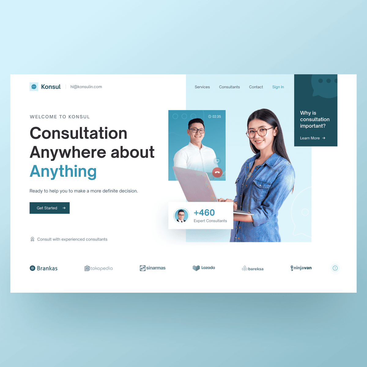
Consultation Web App
{"type":"doc","content":[{"type":"paragraph","attrs":{"textAlign":null},"content":[{"type":"text","text":"The light-mode counterpart to KonsulAja — a clean, trust-forward consultation platform that makes expert access feel as simple as a Google search."}]},{"type":"image","attrs":{"src":"https://mir-s3-cdn-cf.behance.net/project_modules/fs/2efb4c139543567.62318eaf7dfda.png","alt":null,"title":null,"width":null,"height":null}},{"type":"paragraph","attrs":{"textAlign":null},"content":[{"type":"text","marks":[{"type":"bold"}],"text":"UI/UX Design — Konsul"}]},{"type":"paragraph","attrs":{"textAlign":null},"content":[{"type":"text","marks":[{"type":"italic"}],"text":"Web App · Consultation Platform · Indonesia"}]},{"type":"paragraph","attrs":{"textAlign":null},"content":[{"type":"text","text":"Konsul is an expert consultation web platform built around a simple promise: \"Consultation Anywhere about Anything.\" The hero leads with a bold headline, a video call UI thumbnail showing a live session in progress, and a \"+460 Expert Consultants\" trust badge — establishing scale and credibility before a single scroll. A dark teal \"Get Started\" CTA and a \"Why is consultation important?\" info card in the top-right corner give users two distinct entry points: action or education."}]},{"type":"paragraph","attrs":{"textAlign":null},"content":[{"type":"text","text":"Where KonsulAja leans dark and product-heavy, Konsul takes a lighter, more corporate direction — white background, sky-blue accents, and a clean editorial layout that speaks to professional and enterprise audiences. A partner logo strip anchoring the footer — Brankas, Tokopedia, Sinar Mas, Lazada, Bareksa, Ninjavan — signals B2B credibility and positions the platform as trusted infrastructure, not just a consumer app."}]}]}
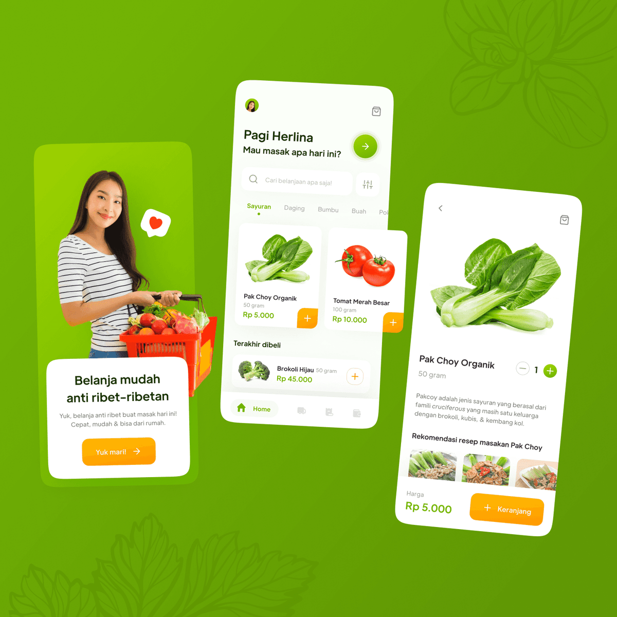
Grofresh
{"type":"doc","content":[{"type":"paragraph","attrs":{"textAlign":null},"content":[{"type":"text","text":"A fresh, no-fuss grocery app that makes daily cooking prep effortless — order organic vegetables from home, skip the market chaos entirely."}]},{"type":"image","attrs":{"src":"https://mir-s3-cdn-cf.behance.net/project_modules/fs/788c03137585517.620e2b2fc71ce.png","alt":null,"title":null,"width":null,"height":null}},{"type":"image","attrs":{"src":"https://mir-s3-cdn-cf.behance.net/project_modules/fs/b3bc56137585517.62277cef565c7.png","alt":null,"title":null,"width":null,"height":null}},{"type":"paragraph","attrs":{"textAlign":null},"content":[{"type":"text","marks":[{"type":"bold"}],"text":"UI/UX Design — Grofresh"}]},{"type":"paragraph","attrs":{"textAlign":null},"content":[{"type":"text","marks":[{"type":"italic"}],"text":"Mobile App · Grocery · Fresh Produce · Indonesia"}]},{"type":"paragraph","attrs":{"textAlign":null},"content":[{"type":"text","text":"Grofresh is an online grocery app targeting home cooks in Indonesia, positioned around a simple promise: \"Belanja mudah anti ribet-ribetan.\" The onboarding splash features a friendly lifestyle photo of a woman with a full grocery basket, immediately signaling the app's everyday, relatable tone. A warm orange CTA — \"Yuk mari\" — contrasts energetically against the vibrant green background, anchoring the brand in freshness and positivity."}]},{"type":"paragraph","attrs":{"textAlign":null},"content":[{"type":"text","text":"The home screen greets users by name (\"Pagi Herlina, Mau masak apa hari ini?\") and surfaces a category tab bar — Sayuran, Daging, Bumbu, Buah — with product cards showing real produce photography, weight, and price (Pak Choy Organik Rp 5.000, Tomat Merah Besar Rp 10.000). A \"Terakhir dibeli\" (Recently bought) row keeps repeat purchases frictionless. The product detail screen adds a short botanical description of each item alongside recipe recommendations — a thoughtful touch that turns a grocery app into a light cooking companion."}]},{"type":"horizontalRule"},{"type":"paragraph","attrs":{"textAlign":null},"content":[{"type":"text","text":" "},{"type":"text","marks":[{"type":"bold"},{"type":"italic"}],"text":"Blonjoan"},{"type":"hardBreak"},{"type":"text","marks":[{"type":"italic"}],"text":"(first idea)"}]},{"type":"image","attrs":{"src":"https://farooq-agent.web.app/assets/images/works/large/blonjoan.jpg","alt":null,"title":null,"width":null,"height":null}},{"type":"paragraph","attrs":{"textAlign":null}}]}
Kuririn Aja
{"type":"doc","content":[{"type":"paragraph","attrs":{"textAlign":null},"content":[{"type":"text","text":"\"Kurir siap di sekitar Anda\" — Kuririn Aja connects senders with nearby couriers in real time, with an interface warm enough to feel personal and fast enough to feel instant."}]},{"type":"image","attrs":{"src":"https://farooq-agent.web.app/assets/images/works/details/181-drawing-art-2018/kuririnaja.jpg","alt":null,"title":null,"width":null,"height":null}},{"type":"paragraph","attrs":{"textAlign":null},"content":[{"type":"text","marks":[{"type":"bold"}],"text":"App UI Design — Kuririn Aja"}]},{"type":"paragraph","attrs":{"textAlign":null},"content":[{"type":"text","marks":[{"type":"italic"}],"text":"On-Demand Courier App · Mobile UI · Indonesia"}]},{"type":"paragraph","attrs":{"textAlign":null},"content":[{"type":"text","text":"A bright, friendly mobile app UI for Kuririn Aja — an on-demand courier platform that connects users with nearby couriers for same-day package delivery. The app is photographed in-hand in a real domestic setting, communicating exactly the everyday context this service is built for."}]},{"type":"paragraph","attrs":{"textAlign":null},"content":[{"type":"text","text":"The home screen leads with a prominent \"Kirim Barang\" (Send Package) action card — a bold orange card with a courier illustration, CTA front and center with no navigation confusion. The card carousel suggests multiple service types, keeping the home screen focused without limiting scope."}]},{"type":"paragraph","attrs":{"textAlign":null},"content":[{"type":"text","text":"Below the action card, \"Kurir siap di sekitar Anda\" (Couriers ready near you) lists available couriers by proximity — Budi Setiawan at 200m, Hendra Setiabudi at 245m, Arif Richman below — each with a real face photo and distance marker. This is a strong UX decision: humanizing the courier with a photo and name before the user has even placed an order builds trust and makes the transaction feel personal rather than transactional."}]},{"type":"paragraph","attrs":{"textAlign":null},"content":[{"type":"text","text":"The warm orange palette communicates the energy and immediacy of a delivery service, while the clean white card layout keeps the UI readable and focused. The overall design is confident, practical, and built for conversion — everything a courier marketplace app needs to be."}]},{"type":"paragraph","attrs":{"textAlign":null}},{"type":"image","attrs":{"src":"https://hyperfantasy.web.app/assets/images/portfolios/064b2b04-29cc-4f6b-a00f-f4b9cab68506/kuririn.png","alt":null,"title":null,"width":null,"height":null}},{"type":"paragraph","attrs":{"textAlign":null}}]}
Ball Qatar
{"type":"doc","content":[{"type":"paragraph","attrs":{"textAlign":null},"content":[{"type":"text","text":"A World Cup fan website that captures the electric anticipation of Qatar 2022 — bold maroon energy, a live countdown, and everything a football pilgrim needs to plan their journey."}]},{"type":"image","attrs":{"src":"https://farooq-agent.web.app/assets/images/works/large/pd/ball-s.png","alt":null,"title":null,"width":null,"height":null}},{"type":"paragraph","attrs":{"textAlign":null},"content":[{"type":"text","marks":[{"type":"bold"}],"text":"Web Design — Ball Qatar"}]},{"type":"paragraph","attrs":{"textAlign":null},"content":[{"type":"text","marks":[{"type":"italic"}],"text":"Website · FIFA World Cup 2022 · Sports · Qatar"}]},{"type":"paragraph","attrs":{"textAlign":null},"content":[{"type":"text","text":"Ball Qatar is a fan-facing website concept for the FIFA World Cup Qatar 2022, built around the excitement of the tournament and the practicalities of attending. The hero opens with full-bleed drama: a Qatar national team player mid-kick against a deep maroon background textured with a subtle world map pattern — immediately establishing national pride and sporting intensity. The headline \"Our football dream starts here!\" is paired with two CTAs — \"Get the ticket\" and \"Watch video\" — converting excitement into action from the first scroll."}]},{"type":"paragraph","attrs":{"textAlign":null},"content":[{"type":"text","text":"A live countdown (303 days, 06 hours, 38 minutes) anchors the hero's base, turning the site into a real-time anticipation engine. Below, a sponsor logo strip — Qatar, FIFA World Cup, FIFA, Qatar Airways, Hisense — adds tournament legitimacy. The Stadiums section follows with aerial photography cards of Qatar's iconic venues, each captioned with its role in the tournament (opening match venue, host for the final). Navigation covers Stadiums, Explore, Readiness, Ticket, and News — a complete journey planner for fans traveling to Qatar."}]}]}
FlyHeal
{"type":"doc","content":[{"type":"paragraph","attrs":{"textAlign":null},"content":[{"type":"text","text":"A Cappadocia travel website that sells the dream before you book — hot air balloons, cave hotels, and the promise of healing through exploration."}]},{"type":"image","attrs":{"src":"https://farooq-agent.web.app/assets/images/works/large/pd/FlyHeal-s.png","alt":null,"title":null,"width":null,"height":null}},{"type":"paragraph","attrs":{"textAlign":null},"content":[{"type":"text","marks":[{"type":"bold"}],"text":"Web Design — FlyHeal"}]},{"type":"paragraph","attrs":{"textAlign":null},"content":[{"type":"text","marks":[{"type":"italic"}],"text":"Website · Travel Agency · Cappadocia · Tourism"}]},{"type":"paragraph","attrs":{"textAlign":null},"content":[{"type":"text","text":"FlyHeal is a travel agency website dedicated to Cappadocia experiences, opening with a cinematic hero: a vibrant hot air balloon soaring against a clear blue sky above the iconic fairy chimneys. The headline — \"Travel for fly, explore and healing\" — positions the trip as therapeutic, not just touristic, with \"healing\" rendered in a warm coral-pink accent that softens the adventurous tone."}]},{"type":"paragraph","attrs":{"textAlign":null},"content":[{"type":"text","text":"An inline booking widget sits directly below the hero: date check-in/out, guest count, and preferred activities (Balloons Fly, Horse Riding, Salt Lake) — all leading to a single \"Find & Book\" CTA that compresses the discovery-to-conversion journey into one screen. Below, a visual activity map connects Cappadocia experiences — Riding, Balloons Fly, Sunset, Healing, Exploration — through a flowing connector path that doubles as a journey narrative."}]},{"type":"paragraph","attrs":{"textAlign":null},"content":[{"type":"text","text":"The right panel surfaces hospitality stats (430 Hotels & Apartments, 86 Restaurants & Cafes, 48 Spa & Wellness) alongside a luxury cave stay feature — positioning FlyHeal as a full-service Cappadocia concierge, not just a balloon booking site."}]}]}
Karma Experience Booking
{"type":"doc","content":[{"type":"paragraph","attrs":{"textAlign":null},"content":[{"type":"text","text":"A luxury hospitality booking app for Karma Group — where every experience, from spa to beachclub, is one elegant tap away."}]},{"type":"image","attrs":{"src":"https://farooq-agent.web.app/assets/images/works/large/karma-experience-booking.jpg","alt":null,"title":null,"width":null,"height":null}},{"type":"paragraph","attrs":{"textAlign":null},"content":[{"type":"text","marks":[{"type":"bold"}],"text":"Karma Experience Booking"}]},{"type":"paragraph","attrs":{"textAlign":null},"content":[{"type":"text","marks":[{"type":"italic"}],"text":"Mobile App · Hospitality · Luxury Booking · Karma Group"}]},{"type":"paragraph","attrs":{"textAlign":null},"content":[{"type":"text","text":"A design exploration for online booking system of Karma Group."}]},{"type":"blockquote","content":[{"type":"paragraph","attrs":{"textAlign":null},"content":[{"type":"text","marks":[{"type":"italic"}],"text":"What’s going on?"}]}]},{"type":"paragraph","attrs":{"textAlign":null},"content":[{"type":"text","text":"Let's read The Data! with GOOGLE Analytics for "},{"type":"text","marks":[{"type":"link","attrs":{"href":"http://karmagroup.com","target":"_blank","rel":"noopener noreferrer nofollow","class":null,"title":null}}],"text":"karmagroup.com"}]},{"type":"paragraph","attrs":{"textAlign":null}},{"type":"image","attrs":{"src":"https://farooq-agent.web.app/assets/images/works/details/218-karma-experience-booking/ga.png","alt":"ga","title":null,"width":null,"height":null}},{"type":"paragraph","attrs":{"textAlign":null},"content":[{"type":"text","text":"The Research Timeframe: Aug 26, 2019 - Nov 26, 2019"}]},{"type":"heading","attrs":{"textAlign":null,"level":2},"content":[{"type":"text","text":"The Keys!"}]},{"type":"paragraph","attrs":{"textAlign":null},"content":[{"type":"text","marks":[{"type":"italic"}],"text":"Acquisition"}]},{"type":"orderedList","attrs":{"start":1,"type":null},"content":[{"type":"listItem","content":[{"type":"paragraph","attrs":{"textAlign":null},"content":[{"type":"text","text":"Acquisition overview => how many visit, and how many new visitors."}]}]},{"type":"listItem","content":[{"type":"paragraph","attrs":{"textAlign":null},"content":[{"type":"text","text":"Traffic sources => from which the user knows the website that we are researching."}]}]}]},{"type":"paragraph","attrs":{"textAlign":null},"content":[{"type":"text","marks":[{"type":"italic"}],"text":"Audience"}]},{"type":"orderedList","attrs":{"start":3,"type":null},"content":[{"type":"listItem","content":[{"type":"paragraph","attrs":{"textAlign":null},"content":[{"type":"text","text":"Visitor => find out about user visits to website pages."}]}]},{"type":"listItem","content":[{"type":"paragraph","attrs":{"textAlign":null},"content":[{"type":"text","text":"User demographics & Locations => data for user demographics as well as user dispersion data based on location."}]}]},{"type":"listItem","content":[{"type":"paragraph","attrs":{"textAlign":null},"content":[{"type":"text","text":"Type of device => from desktop or mobile browser?"}]}]}]},{"type":"paragraph","attrs":{"textAlign":null},"content":[{"type":"text","marks":[{"type":"italic"}],"text":"Behavior"}]},{"type":"orderedList","attrs":{"start":6,"type":null},"content":[{"type":"listItem","content":[{"type":"paragraph","attrs":{"textAlign":null},"content":[{"type":"text","text":"Site Speed => how long does the user wait for the load to finish?"}]}]},{"type":"listItem","content":[{"type":"paragraph","attrs":{"textAlign":null},"content":[{"type":"text","text":"Pageviews => to find out how many people see web pages and what pages are visited most often."}]}]},{"type":"listItem","content":[{"type":"paragraph","attrs":{"textAlign":null},"content":[{"type":"text","text":"Bounce rate => how many users have arrived but immediately left again."}]}]},{"type":"listItem","content":[{"type":"paragraph","attrs":{"textAlign":null},"content":[{"type":"text","text":"Exit pages => to find out which pages are causing visitors to leave (after enduring some time on the website)."}]}]},{"type":"listItem","content":[{"type":"paragraph","attrs":{"textAlign":null},"content":[{"type":"text","text":"Average session duration => to find out how long the user visits the website."}]}]},{"type":"listItem","content":[{"type":"paragraph","attrs":{"textAlign":null},"content":[{"type":"text","text":"Behavior Flow => to find out what flow does the user during a visit to a website page."}]}]}]},{"type":"paragraph","attrs":{"textAlign":null},"content":[{"type":"text","marks":[{"type":"italic"}],"text":"Conversions"}]},{"type":"orderedList","attrs":{"start":12,"type":null},"content":[{"type":"listItem","content":[{"type":"paragraph","attrs":{"textAlign":null},"content":[{"type":"text","text":"Goals & Conversions => to find out how many users have succeeded in reaching the goal that we provide for the user to achieve."}]}]}]},{"type":"heading","attrs":{"textAlign":null,"level":2},"content":[{"type":"text","text":"Acquisition"}]},{"type":"heading","attrs":{"textAlign":null,"level":3},"content":[{"type":"text","text":"Acquisition overview"}]},{"type":"paragraph","attrs":{"textAlign":null},"content":[{"type":"text","text":"Sessions: 1,179,374 New Users: 821,071"}]},{"type":"paragraph","attrs":{"textAlign":null}},{"type":"image","attrs":{"src":"https://farooq-agent.web.app/assets/images/works/details/218-karma-experience-booking/acquisition.png","alt":"acquisition","title":null,"width":null,"height":null}},{"type":"heading","attrs":{"textAlign":null,"level":3},"content":[{"type":"text","text":"Traffic sources"}]},{"type":"paragraph","attrs":{"textAlign":null},"content":[{"type":"text","text":"Direct: 403,084 Facebook Ads.: 398,698"}]},{"type":"paragraph","attrs":{"textAlign":null}},{"type":"image","attrs":{"src":"https://farooq-agent.web.app/assets/images/works/details/218-karma-experience-booking/traffic-sources.png","alt":"traffic sources","title":null,"width":null,"height":null}},{"type":"heading","attrs":{"textAlign":null,"level":2},"content":[{"type":"text","text":"Audience"}]},{"type":"heading","attrs":{"textAlign":null,"level":3},"content":[{"type":"text","text":"Visitor"}]},{"type":"paragraph","attrs":{"textAlign":null},"content":[{"type":"text","text":"% New Sessions: 65.26% Pages / Session (avrg.): 2.27"}]},{"type":"paragraph","attrs":{"textAlign":null}},{"type":"image","attrs":{"src":"https://farooq-agent.web.app/assets/images/works/details/218-karma-experience-booking/visitor.png","alt":"visitor","title":null,"width":null,"height":null}},{"type":"heading","attrs":{"textAlign":null,"level":3},"content":[{"type":"text","text":"User demographics"}]},{"type":"paragraph","attrs":{"textAlign":null},"content":[{"type":"text","text":"Age: 25 - 34: 45.45% ( 81,818 )"}]},{"type":"paragraph","attrs":{"textAlign":null},"content":[{"type":"text","text":"Female: 51.72% Male: 48.28%"}]},{"type":"paragraph","attrs":{"textAlign":null},"content":[{"type":"text","marks":[{"type":"italic"}],"text":"Locations"}]},{"type":"paragraph","attrs":{"textAlign":null},"content":[{"type":"text","text":"Indonesia: 52.37% India: 25.29%"}]},{"type":"paragraph","attrs":{"textAlign":null}},{"type":"image","attrs":{"src":"https://farooq-agent.web.app/assets/images/works/details/218-karma-experience-booking/location.png","alt":"location","title":null,"width":null,"height":null}},{"type":"paragraph","attrs":{"textAlign":null},"content":[{"type":"text","marks":[{"type":"italic"}],"text":"Language"}]},{"type":"paragraph","attrs":{"textAlign":null}},{"type":"image","attrs":{"src":"https://farooq-agent.web.app/assets/images/works/details/218-karma-experience-booking/language.png","alt":"language","title":null,"width":null,"height":null}},{"type":"paragraph","attrs":{"textAlign":null},"content":[{"type":"text","text":"-> "},{"type":"text","marks":[{"type":"italic"}],"text":"English is still good."}]},{"type":"heading","attrs":{"textAlign":null,"level":3},"content":[{"type":"text","text":"Type of device"}]},{"type":"paragraph","attrs":{"textAlign":null},"content":[{"type":"text","text":"Where do people access the Karma Group website?"}]},{"type":"paragraph","attrs":{"textAlign":null},"content":[{"type":"text","text":"82.65% -> from Mobile Devices"}]},{"type":"paragraph","attrs":{"textAlign":null}},{"type":"image","attrs":{"src":"https://farooq-agent.web.app/assets/images/works/details/218-karma-experience-booking/mind-blowing.png","alt":"mind-blowing","title":null,"width":null,"height":null}},{"type":"heading","attrs":{"textAlign":null,"level":3},"content":[{"type":"text","text":"Type of Technology"}]},{"type":"paragraph","attrs":{"textAlign":null},"content":[{"type":"text","text":"Which technology do people use to access the Karma Group website?"}]},{"type":"paragraph","attrs":{"textAlign":null},"content":[{"type":"text","text":"55.63% -> from Android Webview"}]},{"type":"paragraph","attrs":{"textAlign":null}},{"type":"image","attrs":{"src":"https://farooq-agent.web.app/assets/images/works/details/218-karma-experience-booking/cry.png","alt":"cry","title":null,"width":null,"height":null}},{"type":"heading","attrs":{"textAlign":null,"level":2},"content":[{"type":"text","text":"Behavior"}]},{"type":"heading","attrs":{"textAlign":null,"level":3},"content":[{"type":"text","text":"Site Speed"}]},{"type":"paragraph","attrs":{"textAlign":null},"content":[{"type":"text","text":"Avg. Page Load Time: 16.07sec."}]},{"type":"paragraph","attrs":{"textAlign":null}},{"type":"image","attrs":{"src":"https://farooq-agent.web.app/assets/images/works/details/218-karma-experience-booking/time-for-browser.png","alt":"time for browser","title":null,"width":null,"height":null}},{"type":"paragraph","attrs":{"textAlign":null},"content":[{"type":"text","text":"Time for Browser Edge: 7.19 sec."}]},{"type":"paragraph","attrs":{"textAlign":null}},{"type":"image","attrs":{"src":"https://farooq-agent.web.app/assets/images/works/details/218-karma-experience-booking/site-speed.png","alt":"site speed","title":null,"width":null,"height":null}},{"type":"paragraph","attrs":{"textAlign":null},"content":[{"type":"text","marks":[{"type":"italic"}],"text":"Google recommends 5 seconds or less at 3G."}]},{"type":"heading","attrs":{"textAlign":null,"level":3},"content":[{"type":"text","text":"Pageviews"}]},{"type":"paragraph","attrs":{"textAlign":null},"content":[{"type":"text","text":"Pageviews: 140,316 Unique Pageviews: 98,128"}]},{"type":"paragraph","attrs":{"textAlign":null}},{"type":"image","attrs":{"src":"https://farooq-agent.web.app/assets/images/works/details/218-karma-experience-booking/pageviews.png","alt":"pageviews","title":null,"width":null,"height":null}},{"type":"heading","attrs":{"textAlign":null,"level":3},"content":[{"type":"text","text":"Bounce rate"}]},{"type":"paragraph","attrs":{"textAlign":null},"content":[{"type":"text","text":"Pageviews: 140,316 Bounce Rate: 59.93%"}]},{"type":"paragraph","attrs":{"textAlign":null}},{"type":"image","attrs":{"src":"https://farooq-agent.web.app/assets/images/works/details/218-karma-experience-booking/bounce.png","alt":"bounce","title":null,"width":null,"height":null}},{"type":"paragraph","attrs":{"textAlign":null},"content":[{"type":"text","text":"*karmagroup.com/ => 1.60%"}]},{"type":"heading","attrs":{"textAlign":null,"level":3},"content":[{"type":"text","text":"Exit pages"}]},{"type":"paragraph","attrs":{"textAlign":null},"content":[{"type":"text","text":"Pageviews: 140,316 Exits: 44.08%"}]},{"type":"paragraph","attrs":{"textAlign":null}},{"type":"image","attrs":{"src":"https://farooq-agent.web.app/assets/images/works/details/218-karma-experience-booking/exit.png","alt":"exit","title":null,"width":null,"height":null}},{"type":"paragraph","attrs":{"textAlign":null},"content":[{"type":"text","text":"*karmagroup.com/ => 17.18%"}]},{"type":"heading","attrs":{"textAlign":null,"level":3},"content":[{"type":"text","text":"Average session duration"}]},{"type":"paragraph","attrs":{"textAlign":null},"content":[{"type":"text","text":"Pageviews: 140,316 Avg. Time on Page: 00:02:44"}]},{"type":"paragraph","attrs":{"textAlign":null},"content":[{"type":"text","text":"*karmagroup.com/ => 00:01:15"}]},{"type":"heading","attrs":{"textAlign":null,"level":3},"content":[{"type":"text","text":"Behavior Flow"}]},{"type":"paragraph","attrs":{"textAlign":null}},{"type":"image","attrs":{"src":"https://farooq-agent.web.app/assets/images/works/details/218-karma-experience-booking/behavior-flow.png","alt":"behavior flow","title":null,"width":null,"height":null}},{"type":"heading","attrs":{"textAlign":null,"level":2},"content":[{"type":"text","text":"Conversions"}]},{"type":"heading","attrs":{"textAlign":null,"level":3},"content":[{"type":"text","text":"Goals & Conversions"}]},{"type":"paragraph","attrs":{"textAlign":null},"content":[{"type":"text","text":"Goals are not set yet."}]},{"type":"horizontalRule"},{"type":"paragraph","attrs":{"textAlign":null}},{"type":"paragraph","attrs":{"textAlign":null},"content":[{"type":"text","marks":[{"type":"italic"}],"text":"Let's move on from Google Analytics"}]},{"type":"blockquote","content":[{"type":"paragraph","attrs":{"textAlign":null},"content":[{"type":"text","marks":[{"type":"italic"}],"text":"Let’s Talk about Performances"}]}]},{"type":"heading","attrs":{"textAlign":null,"level":3},"content":[{"type":"text","text":"About Heavy Content"}]},{"type":"paragraph","attrs":{"textAlign":null}},{"type":"image","attrs":{"src":"https://farooq-agent.web.app/assets/images/works/details/218-karma-experience-booking/heavy.png","alt":"Problems","title":null,"width":null,"height":null}},{"type":"heading","attrs":{"textAlign":null,"level":3},"content":[{"type":"text","text":"About Heavy Content (embedded videos)"}]},{"type":"paragraph","attrs":{"textAlign":null}},{"type":"image","attrs":{"src":"https://farooq-agent.web.app/assets/images/works/details/218-karma-experience-booking/heavy-embeded.png","alt":"Problems","title":null,"width":null,"height":null}},{"type":"heading","attrs":{"textAlign":null,"level":3},"content":[{"type":"text","text":"Google - PageSpeed Insights"}]},{"type":"paragraph","attrs":{"textAlign":null}},{"type":"image","attrs":{"src":"https://farooq-agent.web.app/assets/images/works/details/218-karma-experience-booking/google-speed-desktop.png","alt":"Problems","title":null,"width":null,"height":null}},{"type":"paragraph","attrs":{"textAlign":null}},{"type":"image","attrs":{"src":"https://farooq-agent.web.app/assets/images/works/details/218-karma-experience-booking/google-speed-mobile.png","alt":"Problems","title":null,"width":null,"height":null}},{"type":"heading","attrs":{"textAlign":null,"level":3},"content":[{"type":"text","marks":[{"type":"link","attrs":{"href":"http://web.dev","target":"_blank","rel":"noopener noreferrer nofollow","class":null,"title":null}}],"text":"web.dev"}]},{"type":"paragraph","attrs":{"textAlign":null}},{"type":"image","attrs":{"src":"https://farooq-agent.web.app/assets/images/works/details/218-karma-experience-booking/webdev.png","alt":"Problems","title":null,"width":null,"height":null}},{"type":"heading","attrs":{"textAlign":null,"level":3},"content":[{"type":"text","text":"Light House Audits - Desktop"}]},{"type":"paragraph","attrs":{"textAlign":null}},{"type":"image","attrs":{"src":"https://farooq-agent.web.app/assets/images/works/details/218-karma-experience-booking/lighthouse-desktop.png","alt":"Problems","title":null,"width":null,"height":null}},{"type":"heading","attrs":{"textAlign":null,"level":3},"content":[{"type":"text","text":"Light House Audits - Mobile"}]},{"type":"paragraph","attrs":{"textAlign":null}},{"type":"image","attrs":{"src":"https://farooq-agent.web.app/assets/images/works/details/218-karma-experience-booking/lighthouse-mobile.png","alt":"Problems","title":null,"width":null,"height":null}},{"type":"horizontalRule"},{"type":"paragraph","attrs":{"textAlign":null}},{"type":"blockquote","content":[{"type":"paragraph","attrs":{"textAlign":null},"content":[{"type":"text","marks":[{"type":"italic"}],"text":"Let’s Talk about The Contents"}]}]},{"type":"paragraph","attrs":{"textAlign":null},"content":[{"type":"text","text":"Which one the best?"}]},{"type":"orderedList","attrs":{"start":1,"type":null},"content":[{"type":"listItem","content":[{"type":"paragraph","attrs":{"textAlign":null},"content":[{"type":"text","text":"Help visitors to recognize all Karma Group products"}]}]},{"type":"listItem","content":[{"type":"paragraph","attrs":{"textAlign":null},"content":[{"type":"text","text":"Help visitors to book Karma Group's product more quickly and easily"}]}]},{"type":"listItem","content":[{"type":"paragraph","attrs":{"textAlign":null},"content":[{"type":"text","text":"Help visitors to join as member at Karma Group (Karma Odyssey)"}]}]}]},{"type":"paragraph","attrs":{"textAlign":null},"content":[{"type":"text","text":"we decided to choose ..."}]},{"type":"blockquote","content":[{"type":"paragraph","attrs":{"textAlign":null},"content":[{"type":"text","text":"“Help visitors to book Karma Group's product more quickly and easily”"}]}]},{"type":"paragraph","attrs":{"textAlign":null},"content":[{"type":"text","text":"because in the end everything will be directed to make a booking."}]},{"type":"horizontalRule"},{"type":"paragraph","attrs":{"textAlign":null}},{"type":"heading","attrs":{"textAlign":null,"level":1},"content":[{"type":"text","text":"Design Thinking"}]},{"type":"heading","attrs":{"textAlign":null,"level":2},"content":[{"type":"text","text":"Empathize"}]},{"type":"paragraph","attrs":{"textAlign":null},"content":[{"type":"text","text":"What the problems"}]},{"type":"paragraph","attrs":{"textAlign":null}},{"type":"image","attrs":{"src":"https://farooq-agent.web.app/assets/images/works/details/218-karma-experience-booking/problems.jpg","alt":"Problems","title":null,"width":null,"height":null}},{"type":"heading","attrs":{"textAlign":null,"level":2},"content":[{"type":"text","text":"Define"}]},{"type":"heading","attrs":{"textAlign":null,"level":3},"content":[{"type":"text","text":"How Might We"}]},{"type":"bulletList","content":[{"type":"listItem","content":[{"type":"paragraph","attrs":{"textAlign":null},"content":[{"type":"text","text":"How Might We determine the single most important goal to convey to visitors, which is \"booking\""}]}]},{"type":"listItem","content":[{"type":"paragraph","attrs":{"textAlign":null},"content":[{"type":"text","text":"How Might We help visitors make bookings quickly and easily"}]}]},{"type":"listItem","content":[{"type":"paragraph","attrs":{"textAlign":null},"content":[{"type":"text","text":"How Might We reduce website load time so that it reaches visitors faster with efficient content and a technical approach to technology"}]}]},{"type":"listItem","content":[{"type":"paragraph","attrs":{"textAlign":null},"content":[{"type":"text","text":"How Might We make a display that appears very well on the size of a mobile device"}]}]},{"type":"listItem","content":[{"type":"paragraph","attrs":{"textAlign":null},"content":[{"type":"text","text":"How Might We make websites still accessible even by using a slow network"}]}]}]},{"type":"heading","attrs":{"textAlign":null,"level":3},"content":[{"type":"text","text":"The Matrics"}]},{"type":"orderedList","attrs":{"start":1,"type":null},"content":[{"type":"listItem","content":[{"type":"paragraph","attrs":{"textAlign":null},"content":[{"type":"text","text":"Website performs very well on the mobile phone screen"}]}]},{"type":"listItem","content":[{"type":"paragraph","attrs":{"textAlign":null},"content":[{"type":"text","text":"The website can be loaded in less than 5 seconds"}]}]},{"type":"listItem","content":[{"type":"paragraph","attrs":{"textAlign":null},"content":[{"type":"text","text":"Website makes it easy for visitors to book"}]}]}]},{"type":"heading","attrs":{"textAlign":null,"level":2},"content":[{"type":"text","text":"Ideation"}]},{"type":"heading","attrs":{"textAlign":null,"level":3},"content":[{"type":"text","text":"Sketching"}]},{"type":"paragraph","attrs":{"textAlign":null},"content":[{"type":"text","text":"Notes"}]},{"type":"bulletList","content":[{"type":"listItem","content":[{"type":"paragraph","attrs":{"textAlign":null},"content":[{"type":"text","text":"Booking Form"}]}]},{"type":"listItem","content":[{"type":"paragraph","attrs":{"textAlign":null},"content":[{"type":"text","text":"Destination (Products)"}]}]},{"type":"listItem","content":[{"type":"paragraph","attrs":{"textAlign":null},"content":[{"type":"text","text":"Exclusive Offers"}]}]}]},{"type":"paragraph","attrs":{"textAlign":null},"content":[{"type":"text","text":"Ideation"}]},{"type":"paragraph","attrs":{"textAlign":null}},{"type":"image","attrs":{"src":"https://farooq-agent.web.app/assets/images/works/details/218-karma-experience-booking/ideation.jpg","alt":"Ideation","title":null,"width":null,"height":null}},{"type":"paragraph","attrs":{"textAlign":null},"content":[{"type":"text","text":"Crazy 8s"}]},{"type":"paragraph","attrs":{"textAlign":null}},{"type":"image","attrs":{"src":"https://farooq-agent.web.app/assets/images/works/details/218-karma-experience-booking/crazy8s.jpg","alt":"Crazy 8s","title":null,"width":null,"height":null}},{"type":"paragraph","attrs":{"textAlign":null},"content":[{"type":"text","text":"Storyboard"}]},{"type":"paragraph","attrs":{"textAlign":null}},{"type":"image","attrs":{"src":"https://farooq-agent.web.app/assets/images/works/details/218-karma-experience-booking/storyboard.jpg","alt":"Storyboard","title":null,"width":null,"height":null}},{"type":"heading","attrs":{"textAlign":null,"level":2},"content":[{"type":"text","text":"Prototype"}]},{"type":"heading","attrs":{"textAlign":null,"level":3},"content":[{"type":"text","text":"Desain UI"}]},{"type":"paragraph","attrs":{"textAlign":null}},{"type":"image","attrs":{"src":"https://farooq-agent.web.app/assets/images/works/details/218-karma-experience-booking/f-keb-1.png","alt":"Trigger for move to web app & Home Default","title":null,"width":null,"height":null}},{"type":"paragraph","attrs":{"textAlign":"center"},"content":[{"type":"text","text":"Trigger for move to web app & Home Default"}]},{"type":"paragraph","attrs":{"textAlign":null}},{"type":"image","attrs":{"src":"https://farooq-agent.web.app/assets/images/works/details/218-karma-experience-booking/f-keb-2.png","alt":"Log In & Home Logged In","title":null,"width":null,"height":null}},{"type":"paragraph","attrs":{"textAlign":"center"},"content":[{"type":"text","text":"Log In & Home Logged In"}]},{"type":"paragraph","attrs":{"textAlign":null}},{"type":"image","attrs":{"src":"https://farooq-agent.web.app/assets/images/works/details/218-karma-experience-booking/f-keb-3.png","alt":"Profile & Recommendations","title":null,"width":null,"height":null}},{"type":"paragraph","attrs":{"textAlign":"center"},"content":[{"type":"text","text":"Profile & Recommendations"}]},{"type":"paragraph","attrs":{"textAlign":null}},{"type":"image","attrs":{"src":"https://farooq-agent.web.app/assets/images/works/details/218-karma-experience-booking/f-keb-4.png","alt":"Booking Status","title":null,"width":null,"height":null}},{"type":"paragraph","attrs":{"textAlign":"center"},"content":[{"type":"text","text":"Booking Status"}]},{"type":"paragraph","attrs":{"textAlign":null}},{"type":"image","attrs":{"src":"https://farooq-agent.web.app/assets/images/works/details/218-karma-experience-booking/f-keb-5.png","alt":"Exclusive Offers","title":null,"width":null,"height":null}},{"type":"paragraph","attrs":{"textAlign":"center"},"content":[{"type":"text","text":"Exclusive Offers"}]},{"type":"paragraph","attrs":{"textAlign":null}},{"type":"image","attrs":{"src":"https://farooq-agent.web.app/assets/images/works/details/218-karma-experience-booking/f-keb-6.png","alt":"Products by Country & Search","title":null,"width":null,"height":null}},{"type":"paragraph","attrs":{"textAlign":"center"},"content":[{"type":"text","text":"Products by Country & Search"}]},{"type":"paragraph","attrs":{"textAlign":null}},{"type":"image","attrs":{"src":"https://farooq-agent.web.app/assets/images/works/details/218-karma-experience-booking/f-keb-7.png","alt":"Products per Country & Product Details","title":null,"width":null,"height":null}},{"type":"paragraph","attrs":{"textAlign":"center"},"content":[{"type":"text","text":"Products per Country & Product Details"}]},{"type":"paragraph","attrs":{"textAlign":null}},{"type":"image","attrs":{"src":"https://farooq-agent.web.app/assets/images/works/details/218-karma-experience-booking/f-keb-8.png","alt":"Product Details Sub Information & More Informations","title":null,"width":null,"height":null}},{"type":"paragraph","attrs":{"textAlign":"center"},"content":[{"type":"text","text":"Product Details Sub Information & More Informations"}]},{"type":"paragraph","attrs":{"textAlign":null}},{"type":"image","attrs":{"src":"https://farooq-agent.web.app/assets/images/works/details/218-karma-experience-booking/f-keb-9.png","alt":"Booking Data","title":null,"width":null,"height":null}},{"type":"paragraph","attrs":{"textAlign":"center"},"content":[{"type":"text","text":"Booking Data"}]},{"type":"paragraph","attrs":{"textAlign":null}},{"type":"image","attrs":{"src":"https://farooq-agent.web.app/assets/images/works/details/218-karma-experience-booking/f-keb-10.png","alt":"Booking Payment","title":null,"width":null,"height":null}},{"type":"paragraph","attrs":{"textAlign":"center"},"content":[{"type":"text","text":"Booking Payment"}]},{"type":"paragraph","attrs":{"textAlign":null}},{"type":"image","attrs":{"src":"https://farooq-agent.web.app/assets/images/works/details/218-karma-experience-booking/f-keb-11.png","alt":"Booking Success & Notifications","title":null,"width":null,"height":null}},{"type":"paragraph","attrs":{"textAlign":"center"},"content":[{"type":"text","text":"Booking Success & Notifications"}]},{"type":"heading","attrs":{"textAlign":null,"level":2},"content":[{"type":"text","text":"Test (Validate)"}]},{"type":"heading","attrs":{"textAlign":null,"level":3},"content":[{"type":"text","text":"Usability Testing (UT)"}]},{"type":"paragraph","attrs":{"textAlign":null},"content":[{"type":"text","text":"The purpose of Usability Testing is to find out whether the application created can be used by the user."}]},{"type":"paragraph","attrs":{"textAlign":null},"content":[{"type":"text","text":"Performed UT to 3 participants."}]},{"type":"paragraph","attrs":{"textAlign":null}},{"type":"image","attrs":{"src":"https://farooq-agent.web.app/assets/images/works/details/218-karma-experience-booking/ut-participant-1a.jpg","alt":"Usability Testing for Karma Experience Booking | 1st Participant","title":null,"width":null,"height":null}},{"type":"paragraph","attrs":{"textAlign":null}},{"type":"image","attrs":{"src":"https://farooq-agent.web.app/assets/images/works/details/218-karma-experience-booking/ut-participant-1b.jpg","alt":"Usability Testing for Karma Experience Booking | 1st Participant","title":null,"width":null,"height":null}},{"type":"paragraph","attrs":{"textAlign":"center"},"content":[{"type":"text","text":"Usability Testing for Karma Experience Booking | 1st Participant"}]},{"type":"paragraph","attrs":{"textAlign":null}},{"type":"image","attrs":{"src":"https://farooq-agent.web.app/assets/images/works/details/218-karma-experience-booking/ut-participant-2.jpg","alt":"Usability Testing for Karma Experience Booking | 2nd Participant","title":null,"width":null,"height":null}},{"type":"paragraph","attrs":{"textAlign":"center"},"content":[{"type":"text","text":"Usability Testing for Karma Experience Booking | 2nd Participant"}]},{"type":"paragraph","attrs":{"textAlign":null}},{"type":"image","attrs":{"src":"https://farooq-agent.web.app/assets/images/works/details/218-karma-experience-booking/ut-participant-3.jpg","alt":"Usability Testing for Karma Experience Booking | 3rd Participant","title":null,"width":null,"height":null}},{"type":"paragraph","attrs":{"textAlign":"center"},"content":[{"type":"text","text":"Usability Testing for Karma Experience Booking | 3rd Participant"}]},{"type":"paragraph","attrs":{"textAlign":null},"content":[{"type":"text","text":"The following are excerpts from the usability test. In this Usability Testing, the team recorded using the following tools:"}]},{"type":"bulletList","content":[{"type":"listItem","content":[{"type":"paragraph","attrs":{"textAlign":null},"content":[{"type":"text","text":"Macbook Pro 13 \"2010 -> recording device"}]}]},{"type":"listItem","content":[{"type":"paragraph","attrs":{"textAlign":null},"content":[{"type":"text","text":"iPhone 6S -> prototype presenter"}]}]},{"type":"listItem","content":[{"type":"paragraph","attrs":{"textAlign":null},"content":[{"type":"text","text":"facetime -> record using camera build-in from Macbook Pro"}]}]},{"type":"listItem","content":[{"type":"paragraph","attrs":{"textAlign":null},"content":[{"type":"text","text":"[letsview] ("},{"type":"text","marks":[{"type":"link","attrs":{"href":"https://letsview.com/","target":"_blank","rel":"noopener noreferrer nofollow","class":null,"title":null}}],"text":"https://letsview.com/"},{"type":"text","text":") -> for mirroring the iPhone to Macbook (need to be installed on Macbook and iPhone)"}]}]},{"type":"listItem","content":[{"type":"paragraph","attrs":{"textAlign":null},"content":[{"type":"text","text":"wifi connection"}]}]},{"type":"listItem","content":[{"type":"paragraph","attrs":{"textAlign":null},"content":[{"type":"text","text":"quicktime player -> to record all screen activities and record sound using the microphone build-in on a macbook"}]}]}]},{"type":"paragraph","attrs":{"textAlign":"center"},"content":[{"type":"text","text":"Clip - Usability Testing for Karma Experience Booking | 1st Participant"}]},{"type":"paragraph","attrs":{"textAlign":"center"},"content":[{"type":"text","text":"Clip - Usability Testing for Karma Experience Booking | 2nd Participant"}]},{"type":"paragraph","attrs":{"textAlign":"center"},"content":[{"type":"text","text":"Clip - Usability Testing for Karma Experience Booking | 3rd Participant"}]},{"type":"paragraph","attrs":{"textAlign":null},"content":[{"type":"text","text":"Some insights obtained from the Usability Testing process:"}]},{"type":"bulletList","content":[{"type":"listItem","content":[{"type":"paragraph","attrs":{"textAlign":null},"content":[{"type":"text","text":"Need to find the best way to create an initial trigger to redirect users from the main karmagroup website to the Karma Experience Booking webapp"}]}]},{"type":"listItem","content":[{"type":"paragraph","attrs":{"textAlign":null},"content":[{"type":"text","text":"Need a better way to display room choices"}]}]},{"type":"listItem","content":[{"type":"paragraph","attrs":{"textAlign":null},"content":[{"type":"text","text":"Need a better way to show the user that the choice of room affects the price per night stated"}]}]},{"type":"listItem","content":[{"type":"paragraph","attrs":{"textAlign":null},"content":[{"type":"text","text":"Need more attractive offers or discounts on the front (home)"}]}]},{"type":"listItem","content":[{"type":"paragraph","attrs":{"textAlign":null},"content":[{"type":"text","text":"List offers like blogs don't look like offers"}]}]},{"type":"listItem","content":[{"type":"paragraph","attrs":{"textAlign":null},"content":[{"type":"text","text":"Need to consider using sticky headers"}]}]},{"type":"listItem","content":[{"type":"paragraph","attrs":{"textAlign":null},"content":[{"type":"text","text":"Display card in gold gradation looks like a button"}]}]}]},{"type":"paragraph","attrs":{"textAlign":null},"content":[{"type":"text","text":"Vote for fixing"}]},{"type":"paragraph","attrs":{"textAlign":null}},{"type":"image","attrs":{"src":"https://farooq-agent.web.app/assets/images/works/details/218-karma-experience-booking/KEB-options-1-TRIGGER-dot.jpg","alt":"Skype ","title":null,"width":null,"height":null}},{"type":"paragraph","attrs":{"textAlign":"center"},"content":[{"type":"text","text":"TRIGGER Options"}]},{"type":"paragraph","attrs":{"textAlign":null}},{"type":"image","attrs":{"src":"https://farooq-agent.web.app/assets/images/works/details/218-karma-experience-booking/KEB-options-2-OFFERS-dot.jpg","alt":"Skype ","title":null,"width":null,"height":null}},{"type":"paragraph","attrs":{"textAlign":"center"},"content":[{"type":"text","text":"OFFERS Options"}]},{"type":"paragraph","attrs":{"textAlign":null}},{"type":"image","attrs":{"src":"https://farooq-agent.web.app/assets/images/works/details/218-karma-experience-booking/KEB-options-3-ACCOMMODATIONS-dot.jpg","alt":"Skype ","title":null,"width":null,"height":null}},{"type":"paragraph","attrs":{"textAlign":"center"},"content":[{"type":"text","text":"ACCOMMODATIONS Options"}]},{"type":"paragraph","attrs":{"textAlign":null}},{"type":"image","attrs":{"src":"https://farooq-agent.web.app/assets/images/works/details/218-karma-experience-booking/vote.jpg","alt":"Skype ","title":null,"width":null,"height":null}},{"type":"paragraph","attrs":{"textAlign":"center"},"content":[{"type":"text","text":"Skype Voting"}]},{"type":"heading","attrs":{"textAlign":null,"level":3},"content":[{"type":"text","text":"Scoring"}]},{"type":"paragraph","attrs":{"textAlign":null},"content":[{"type":"text","text":"For this assessment, we use the Net Promoter Score and emphasize on 3 aspects of assessment, namely Usefulness, Learnability, and Satisfaction. The NPS formula is -> NPS = Promoters - Detractors. The results are as follows:"}]},{"type":"paragraph","attrs":{"textAlign":null},"content":[{"type":"text","marks":[{"type":"bold"}],"text":"Participant 1"}]},{"type":"bulletList","content":[{"type":"listItem","content":[{"type":"paragraph","attrs":{"textAlign":null},"content":[{"type":"text","text":"Usefulness: 9"}]}]},{"type":"listItem","content":[{"type":"paragraph","attrs":{"textAlign":null},"content":[{"type":"text","text":"Learnability: 7"}]}]},{"type":"listItem","content":[{"type":"paragraph","attrs":{"textAlign":null},"content":[{"type":"text","text":"Satisfaction: 7"}]}]}]},{"type":"paragraph","attrs":{"textAlign":null},"content":[{"type":"text","marks":[{"type":"bold"}],"text":"Participant 2"}]},{"type":"bulletList","content":[{"type":"listItem","content":[{"type":"paragraph","attrs":{"textAlign":null},"content":[{"type":"text","text":"Usefulness: 10"}]}]},{"type":"listItem","content":[{"type":"paragraph","attrs":{"textAlign":null},"content":[{"type":"text","text":"Learnability: 8"}]}]},{"type":"listItem","content":[{"type":"paragraph","attrs":{"textAlign":null},"content":[{"type":"text","text":"Satisfaction: 8"}]}]}]},{"type":"paragraph","attrs":{"textAlign":null},"content":[{"type":"text","marks":[{"type":"bold"}],"text":"Participant 3"}]},{"type":"bulletList","content":[{"type":"listItem","content":[{"type":"paragraph","attrs":{"textAlign":null},"content":[{"type":"text","text":"Usefulness: 8"}]}]},{"type":"listItem","content":[{"type":"paragraph","attrs":{"textAlign":null},"content":[{"type":"text","text":"Learnability: 8"}]}]},{"type":"listItem","content":[{"type":"paragraph","attrs":{"textAlign":null},"content":[{"type":"text","text":"Satisfaction: 9"}]}]}]},{"type":"paragraph","attrs":{"textAlign":null},"content":[{"type":"text","text":". . ."}]},{"type":"paragraph","attrs":{"textAlign":null},"content":[{"type":"text","text":"Then the calculation of the Net Promoter Score is as follows:"}]},{"type":"paragraph","attrs":{"textAlign":null},"content":[{"type":"text","marks":[{"type":"bold"}],"text":"Usefulness"}]},{"type":"bulletList","content":[{"type":"listItem","content":[{"type":"paragraph","attrs":{"textAlign":null},"content":[{"type":"text","text":"Promoters (score 9-10): 2"}]}]},{"type":"listItem","content":[{"type":"paragraph","attrs":{"textAlign":null},"content":[{"type":"text","text":"Passives (score 7-8): 1"}]}]},{"type":"listItem","content":[{"type":"paragraph","attrs":{"textAlign":null},"content":[{"type":"text","text":"Detractors (score 0-6): 0"}]}]}]},{"type":"paragraph","attrs":{"textAlign":null},"content":[{"type":"text","marks":[{"type":"bold"}],"text":"NPS for Usefulness: 2 - 0 = 2"},{"type":"text","text":" (Two people are willing to support and promote others in terms of Usefulness)"}]},{"type":"paragraph","attrs":{"textAlign":null},"content":[{"type":"text","marks":[{"type":"bold"}],"text":"Learnability"}]},{"type":"bulletList","content":[{"type":"listItem","content":[{"type":"paragraph","attrs":{"textAlign":null},"content":[{"type":"text","text":"Promoters (score 9-10): 0"}]}]},{"type":"listItem","content":[{"type":"paragraph","attrs":{"textAlign":null},"content":[{"type":"text","text":"Passives (score 7-8): 3"}]}]},{"type":"listItem","content":[{"type":"paragraph","attrs":{"textAlign":null},"content":[{"type":"text","text":"Detractors (score 0-6): 0"}]}]}]},{"type":"paragraph","attrs":{"textAlign":null},"content":[{"type":"text","marks":[{"type":"bold"}],"text":"NPS for Usefulness: 0 - 0 = 0"},{"type":"text","text":" (No one is willing to support and promote to others in terms of Learnability, but also not to speak ill)"}]},{"type":"paragraph","attrs":{"textAlign":null},"content":[{"type":"text","marks":[{"type":"bold"}],"text":"Satisfaction"}]},{"type":"bulletList","content":[{"type":"listItem","content":[{"type":"paragraph","attrs":{"textAlign":null},"content":[{"type":"text","text":"Promoters (score 9-10): 1"}]}]},{"type":"listItem","content":[{"type":"paragraph","attrs":{"textAlign":null},"content":[{"type":"text","text":"Passives (score 7-8): 2"}]}]},{"type":"listItem","content":[{"type":"paragraph","attrs":{"textAlign":null},"content":[{"type":"text","text":"Detractors (score 0-6): 0"}]}]}]},{"type":"paragraph","attrs":{"textAlign":null},"content":[{"type":"text","marks":[{"type":"bold"}],"text":"NPS for Usefulness: 1 - 0 = 1"},{"type":"text","text":" (One person is willing to support and promote to others in terms of Satisfaction)"}]},{"type":"horizontalRule"},{"type":"paragraph","attrs":{"textAlign":null}},{"type":"heading","attrs":{"textAlign":null,"level":2},"content":[{"type":"text","text":"Final Result"}]},{"type":"heading","attrs":{"textAlign":null,"level":3},"content":[{"type":"text","text":"Prototype link"}]},{"type":"paragraph","attrs":{"textAlign":null},"content":[{"type":"text","text":"Prototype link, "},{"type":"text","marks":[{"type":"link","attrs":{"href":"https://marvelapp.com/c992944/screen/64217686","target":"_blank","rel":"noopener noreferrer nofollow","class":null,"title":null}}],"text":"here!"}]},{"type":"paragraph","attrs":{"textAlign":null}},{"type":"image","attrs":{"src":"https://farooq-agent.web.app/assets/images/works/large/karma-experience-booking.jpg","alt":"Karma Experience Booking","title":null,"width":null,"height":null}},{"type":"heading","attrs":{"textAlign":null,"level":3},"content":[{"type":"text","text":"Expected Impacts"}]},{"type":"bulletList","content":[{"type":"listItem","content":[{"type":"paragraph","attrs":{"textAlign":null},"content":[{"type":"text","text":"User can access the website fit and very well on the mobile phone screen"}]}]},{"type":"listItem","content":[{"type":"paragraph","attrs":{"textAlign":null},"content":[{"type":"text","text":"User can load the website in less than 5 seconds"}]}]},{"type":"listItem","content":[{"type":"paragraph","attrs":{"textAlign":null},"content":[{"type":"text","text":"User can do the booking more clearly and easily"}]}]}]},{"type":"horizontalRule"},{"type":"paragraph","attrs":{"textAlign":null}},{"type":"paragraph","attrs":{"textAlign":null},"content":[{"type":"text","text":"Location: Karma Innovation Center Team"}]},{"type":"paragraph","attrs":{"textAlign":null},"content":[{"type":"text","text":"Time: Nov 26, 2019 - Dec 4, 2019 (Extended until 18 January 2020)"}]},{"type":"paragraph","attrs":{"textAlign":null},"content":[{"type":"text","text":"Tools:"}]},{"type":"bulletList","content":[{"type":"listItem","content":[{"type":"paragraph","attrs":{"textAlign":null},"content":[{"type":"text","text":"Adobe XD"}]}]},{"type":"listItem","content":[{"type":"paragraph","attrs":{"textAlign":null},"content":[{"type":"text","text":"MarvelApp"}]}]}]},{"type":"paragraph","attrs":{"textAlign":null},"content":[{"type":"text","text":"Team for this project:"}]},{"type":"bulletList","content":[{"type":"listItem","content":[{"type":"paragraph","attrs":{"textAlign":null},"content":[{"type":"text","marks":[{"type":"bold"}],"text":"Adin (me)"},{"type":"text","text":", Head of UX & UI Design"}]}]},{"type":"listItem","content":[{"type":"paragraph","attrs":{"textAlign":null},"content":[{"type":"text","text":"Teofilus, Head of Technology"}]}]},{"type":"listItem","content":[{"type":"paragraph","attrs":{"textAlign":null},"content":[{"type":"text","text":"Abu Bakar, Team Manager"}]}]},{"type":"listItem","content":[{"type":"paragraph","attrs":{"textAlign":null},"content":[{"type":"text","text":"Wayan Wirka, Senior Web Developer"}]}]},{"type":"listItem","content":[{"type":"paragraph","attrs":{"textAlign":null},"content":[{"type":"text","text":"August, Web Developer"}]}]},{"type":"listItem","content":[{"type":"paragraph","attrs":{"textAlign":null},"content":[{"type":"text","text":"Ferry, Web Developer"}]}]},{"type":"listItem","content":[{"type":"paragraph","attrs":{"textAlign":null},"content":[{"type":"text","text":"Bajra, Web Developer"}]}]},{"type":"listItem","content":[{"type":"paragraph","attrs":{"textAlign":null},"content":[{"type":"text","text":"Julius, Web Developer"}]}]},{"type":"listItem","content":[{"type":"paragraph","attrs":{"textAlign":null},"content":[{"type":"text","text":"Dennice, Web Tester & Part of UI Design"}]}]}]},{"type":"horizontalRule"},{"type":"paragraph","attrs":{"textAlign":null}},{"type":"blockquote","content":[{"type":"paragraph","attrs":{"textAlign":null},"content":[{"type":"text","text":"This project is still running and entering the development stage ..."}]}]},{"type":"heading","attrs":{"textAlign":null,"level":1},"content":[{"type":"text","text":"Thank You"}]},{"type":"paragraph","attrs":{"textAlign":null}}]}
CUBICLE
{"type":"doc","content":[{"type":"paragraph","attrs":{"textAlign":null},"content":[{"type":"text","text":"Design Once, Scale Everywhere — CUBICLE builds a unified system where consistency, speed, and clarity power every product experience."}]},{"type":"image","attrs":{"src":"https://farooq-agent.web.app/assets/images/works/details/197-cubicle/cubicle.jpg","alt":null,"title":null,"width":null,"height":null}},{"type":"paragraph","attrs":{"textAlign":null},"content":[{"type":"text","marks":[{"type":"bold"}],"text":"Design System — CUBICLE"}]},{"type":"paragraph","attrs":{"textAlign":null},"content":[{"type":"text","marks":[{"type":"italic"}],"text":"Design System · UI Kit · Product Consistency · Scalable Design"}]},{"type":"paragraph","attrs":{"textAlign":null},"content":[{"type":"text","text":"A comprehensive design system created to bring consistency and scalability across digital products — CUBICLE serves as a single source of truth for design and development teams."}]},{"type":"paragraph","attrs":{"textAlign":null},"content":[{"type":"text","text":"At its core, the system standardizes visual language and interaction patterns. From typography and color palettes to components and layouts, every element is defined, reusable, and structured to ensure coherence across different platforms and features."}]},{"type":"paragraph","attrs":{"textAlign":null},"content":[{"type":"text","text":"The experience focuses on efficiency and alignment. Designers can move faster with ready-to-use components, while developers benefit from predictable structures and clear guidelines. This reduces redundancy, minimizes inconsistencies, and accelerates product iteration."}]},{"type":"paragraph","attrs":{"textAlign":null},"content":[{"type":"text","text":"CUBICLE positions itself as more than a UI kit. It is a framework for collaboration — bridging the gap between design and engineering, and ensuring that every decision aligns with a shared system."}]},{"type":"paragraph","attrs":{"textAlign":null},"content":[{"type":"text","text":"The interface likely reflects clarity and modularity. Components are organized, documented, and easy to navigate, allowing teams to understand, adopt, and extend the system without friction."}]},{"type":"paragraph","attrs":{"textAlign":null},"content":[{"type":"text","text":"This project reflects a mature approach to product design — where scalability and consistency are not afterthoughts, but foundational principles."}]},{"type":"paragraph","attrs":{"textAlign":null},"content":[{"type":"text","text":"A thoughtful exploration of how systems thinking can elevate digital products — turning individual screens into a cohesive, reliable, and scalable experience."},{"type":"hardBreak"},{"type":"hardBreak"},{"type":"hardBreak"},{"type":"text","text":"21/03/2022"}]}]}
The Day Care - Website Hero Section
{"type":"doc","content":[{"type":"paragraph","attrs":{"textAlign":null},"content":[{"type":"text","text":"A Bali daycare website that speaks directly to vacationing parents — let the kids be happy while you enjoy the island of beauty."}]},{"type":"image","attrs":{"src":"https://cdn.dribbble.com/userupload/4491066/file/original-232e2fdce73f6455ba0d73f8a1a91387.png","alt":null,"title":null,"width":null,"height":null}},{"type":"paragraph","attrs":{"textAlign":null},"content":[{"type":"text","marks":[{"type":"bold"}],"text":"Web Design — The Day Care (Smiley Day Care)"}]},{"type":"paragraph","attrs":{"textAlign":null},"content":[{"type":"text","marks":[{"type":"italic"}],"text":"Website · Hero Section · Childcare · Bali, Indonesia"}]},{"type":"paragraph","attrs":{"textAlign":null},"content":[{"type":"text","text":"Smiley Day Care's website hero is designed for one specific audience: parents visiting Bali who need trusted, quality childcare while they explore the island. The headline does all the selling in one line — \"Let them be happy while you enjoy the island of beauty\" — a direct, emotionally intelligent message that resolves a real vacation anxiety without a single extra word."}]},{"type":"paragraph","attrs":{"textAlign":null},"content":[{"type":"text","text":"The visual composition pairs playful children photography (two girls exploring from inside a cardboard box) with a Bali Island location stamp and a \"Happy Vacation for All Family Members\" circular badge — grounding the service firmly in the Bali travel context. Floating photo cutouts of a teacher and a Balinese dancer add warmth and cultural authenticity. Below the hero, three service cards — Day Care During Vacation in Bali ($75 Package), Home Day Care for Short Time, and Become a Day Care Educator — immediately segment the audience and open three distinct conversion paths. The bright blue, coral, and yellow palette keeps the interface energetic, child-friendly, and unmistakably optimistic."}]}]}
HappyJob Job Hunting - Mobile App
{"type":"doc","content":[{"type":"paragraph","attrs":{"textAlign":null},"content":[{"type":"text","text":"A job hunting app that makes career searching feel exciting, not exhausting — discover dream roles from top companies, nearby and worldwide, in one cheerful interface."}]},{"type":"image","attrs":{"src":"https://cdn.dribbble.com/userupload/4176953/file/original-cd2823715b3039f6a0c92bd7ef1a97dc.png","alt":null,"title":null,"width":null,"height":null}},{"type":"paragraph","attrs":{"textAlign":null},"content":[{"type":"text","marks":[{"type":"bold"}],"text":"UI/UX Design — HappyJob Job Hunting"}]},{"type":"paragraph","attrs":{"textAlign":null},"content":[{"type":"text","marks":[{"type":"italic"}],"text":"Mobile App · Job Marketplace · Career · Indonesia"}]},{"type":"paragraph","attrs":{"textAlign":null},"content":[{"type":"text","text":"HappyJob opens with a warm yellow splash screen featuring a confident professional woman and a clear promise: \"Find the job you've always dreamed of — one stop solution to get a job that best suits your interests and qualifications.\" A soft purple \"Get Started\" CTA contrasts the yellow background just enough to pull the eye without aggression."}]},{"type":"paragraph","attrs":{"textAlign":null},"content":[{"type":"text","text":"The home screen greets users personally (\"Hello Paramitha, Start your new journey\") with a search bar front and center. Most Popular Jobs surfaces highlighted cards — Spotify Product Designer (Fulltime, $700–$950, Jakarta) alongside Amazon and other major brands — while a Nearby Jobs section below lists active openings at META and Airbnb with employment type tags and an \"Almost gone\" urgency badge that drives faster applications."}]},{"type":"paragraph","attrs":{"textAlign":null},"content":[{"type":"text","text":"The job detail screen (Google Sr. Customer Engineer, Jakarta) takes a clean, structured approach: company logo, role title, location, and tabbed navigation across Description, Company, Reviews, and more. Preferred qualifications are listed clearly, with a dual CTA — \"Almost gone\" status indicator paired with a bold \"Apply Now\" button — communicating both scarcity and action in a single breath."}]}]}
Transip Transportation Booking App
{"type":"doc","content":[{"type":"paragraph","attrs":{"textAlign":null},"content":[{"type":"text","text":"A multi-modal Indonesian travel app that books flights, buses, trains, and taxis in one place — from \"where do you want to go?\" to ticket in hand, without the hassle."}]},{"type":"image","attrs":{"src":"https://cdn.dribbble.com/userupload/4176958/file/original-1c4eae3d620cac0b8a93f46d1e441835.png","alt":null,"title":null,"width":null,"height":null}},{"type":"paragraph","attrs":{"textAlign":null},"content":[{"type":"text","marks":[{"type":"bold"}],"text":"UI/UX Design — Transip Transportation Booking"}]},{"type":"paragraph","attrs":{"textAlign":null},"content":[{"type":"text","marks":[{"type":"italic"}],"text":"Mobile App · Travel · Transportation · Indonesia"}]},{"type":"paragraph","attrs":{"textAlign":null},"content":[{"type":"text","text":"Transip is a one-stop transportation booking app covering four modes — Flight, Bus, Train, and Taxi — with a home screen split into two smart entry points: \"Give me some ticket!\" for users who know their route, and \"Give me a recommendation!\" for those who don't. A destination search bar and a popular destination tag cloud (Kenjiran, Kuta, Lembang, Malioboro, Bunaken, Gadang) make discovery frictionless for spontaneous travelers. A SIP Points loyalty counter in the header adds a rewards layer that encourages repeat bookings."}]},{"type":"paragraph","attrs":{"textAlign":null},"content":[{"type":"text","text":"The Flight Tickets results screen (Jakarta → Surabaya, 28 Dec 2022, 4 Passengers, Economy) lists options from Garuda Indonesia, Lion Air, and Citilink with departure/arrival times, duration, seat availability, and strikethrough original pricing — making fare comparison fast and transparent. \"Recommended\" and \"Bestseller\" badges guide users toward trusted choices without overwhelming the list."}]},{"type":"paragraph","attrs":{"textAlign":null},"content":[{"type":"text","text":"The My Tickets screen surfaces an upcoming flight reminder card — \"Your Flight in 2 Days\" — showing the full itinerary (CGK → SUB, GA 715, ECO, 4 passengers) co-branded with Garuda Indonesia and Allianz travel insurance, turning the ticket into a complete pre-trip brief."}]}]}
AlimBank Financial - Mobile App
{"type":"doc","content":[{"type":"paragraph","attrs":{"textAlign":null},"content":[{"type":"text","text":"A modern Islamic banking app that makes everyday transactions seamless — from balance overview to QRIS scan-to-pay and instant digital receipts, all in one dark, trustworthy interface."}]},{"type":"image","attrs":{"src":"https://cdn.dribbble.com/userupload/4158984/file/original-560589645321a693a7e04abb034e562e.png","alt":null,"title":null,"width":null,"height":null}},{"type":"paragraph","attrs":{"textAlign":null},"content":[{"type":"text","marks":[{"type":"bold"}],"text":"UI/UX Design — AlimBank Financial"}]},{"type":"paragraph","attrs":{"textAlign":null},"content":[{"type":"text","marks":[{"type":"italic"}],"text":"Mobile App · Islamic Banking · Fintech · Indonesia"}]},{"type":"paragraph","attrs":{"textAlign":null},"content":[{"type":"text","text":"AlimBank is a digital banking app designed with a clean dark-and-green visual identity that communicates both modernity and the trustworthiness expected of an Islamic financial institution. The home screen greets users by name (\"Good Evening, Fatimah Azzahrah\") with an Account Balance card ($2,235.1145) and four quick-action shortcuts — Transfer, Withdraw, Deposit, and Pay & Buy. A Promos & Reminders section surfaces cashback offers ($15.25 discount for non-cash transactions) and upcoming financial activities, keeping users engaged beyond just balance checks."}]},{"type":"paragraph","attrs":{"textAlign":null},"content":[{"type":"text","text":"The QRIS scan screen puts Indonesia's national QR payment standard front and center — a full-screen camera overlay scans merchant QR codes (shown here for HYPERSHOP, NMID: ID1022165554901) with the GPN and QRIS logos confirming regulatory compliance. The payment flow closes with a clean digital receipt screen: \"Transaction Success\" confirmed in green, with full transaction details — date, time, reference number, source, destination, recipient alias, and total ($10.525) — all laid out in a receipt-style card that users can share directly."}]},{"type":"paragraph","attrs":{"textAlign":null},"content":[{"type":"text","text":"The dark background with forest-green accents strikes the right balance between premium fintech and the conservative trust signals an Islamic bank needs to project."}]}]}
SHM Stock - Mobile App
{"type":"doc","content":[{"type":"paragraph","attrs":{"textAlign":null},"content":[{"type":"text","text":"A clean, light-mode stock trading app that gives Indonesian investors a global portfolio — track TSLA and GOTO side by side, chart the details, and top up in seconds."}]},{"type":"image","attrs":{"src":"https://mir-cdn.behance.net/v1/rendition/project_modules/fs/98d856157175839.63744b43be172.png","alt":null,"title":null,"width":null,"height":null}},{"type":"paragraph","attrs":{"textAlign":null},"content":[{"type":"text","marks":[{"type":"bold"}],"text":"UI/UX Design — SHM Stock"}]},{"type":"paragraph","attrs":{"textAlign":null},"content":[{"type":"text","marks":[{"type":"italic"}],"text":"Mobile App · Stock Trading · Investment · Indonesia"}]},{"type":"paragraph","attrs":{"textAlign":null},"content":[{"type":"text","text":"SHM is a stock trading app designed around clarity and speed. The home screen opens with a \"My Stocks\" horizontal card carousel — dark portfolio cards showing TSLA ($156,273.56, +0.73%) and GOTO ($64,973.96, +0.56%) with mini sparkline charts and quick Sell/Top Up CTAs, keeping the most important positions immediately actionable. A Top Trending Stocks list below tracks ANTM, BBCA, and TLKM with real-time price changes and color-coded trend lines across selectable time frames (24h, 7d, 30d, 6m)."}]},{"type":"paragraph","attrs":{"textAlign":null},"content":[{"type":"text","text":"The Details screen drills into BBCA (Bank BCA, $985.34, +0.73%) with a full interactive price chart spanning multiple timeframes, tabbed views for Chart, Profile, Statistics, and Order Book, and a \"My buying power\" indicator ($1,500.00) anchored just above the blue \"Buy Now\" CTA — giving users all the context they need to commit to a trade."}]},{"type":"paragraph","attrs":{"textAlign":null},"content":[{"type":"text","text":"The Top Up screen handles lot-based investing cleanly: a selected stock card (GOTO), an amount input field, lot-size suggestion chips (1 Lot, 10 Lots, 100 Lots, 1,000 Lots, 10,000 Lots), and a saved payment method — all leading to a satisfying \"Swipe to Confirm\" gesture CTA. The crisp white UI with teal sparklines and blue CTAs keeps the experience trustworthy and distraction-free."}]}]}
SaaS for Image Manager
{"type":"doc","content":[{"type":"heading","attrs":{"textAlign":null,"level":1},"content":[{"type":"text","marks":[{"type":"bold"}],"text":"Project Summary — Gump"}]},{"type":"paragraph","attrs":{"textAlign":null},"content":[{"type":"text","text":"Gump is a SaaS platform for photographers to upload, organize, share, and collaborate on photos with clients in one place."}]},{"type":"image","attrs":{"src":"https://assets.hongkiat.com/uploads/10-free-photo-managing-software-you-should-at-least-know/photos-for-os-x.jpg","alt":null,"title":null,"width":null,"height":null}},{"type":"paragraph","attrs":{"textAlign":null},"content":[{"type":"text","text":"Instead of using Google Drive + WhatsApp + screenshots + endless revisions, Gump creates a smooth workflow where clients can:"}]},{"type":"bulletList","content":[{"type":"listItem","content":[{"type":"paragraph","attrs":{"textAlign":null},"content":[{"type":"text","text":"view galleries"}]}]},{"type":"listItem","content":[{"type":"paragraph","attrs":{"textAlign":null},"content":[{"type":"text","text":"select photos"}]}]},{"type":"listItem","content":[{"type":"paragraph","attrs":{"textAlign":null},"content":[{"type":"text","text":"leave comments"}]}]},{"type":"listItem","content":[{"type":"paragraph","attrs":{"textAlign":null},"content":[{"type":"text","text":"approve final results"}]}]}]},{"type":"paragraph","attrs":{"textAlign":null},"content":[{"type":"text","text":"The platform also uses AI features such as:"}]},{"type":"bulletList","content":[{"type":"listItem","content":[{"type":"paragraph","attrs":{"textAlign":null},"content":[{"type":"text","text":"face recognition"}]}]},{"type":"listItem","content":[{"type":"paragraph","attrs":{"textAlign":null},"content":[{"type":"text","text":"smart photo grouping"}]}]},{"type":"listItem","content":[{"type":"paragraph","attrs":{"textAlign":null},"content":[{"type":"text","text":"duplicate/blurry detection"}]}]},{"type":"listItem","content":[{"type":"paragraph","attrs":{"textAlign":null},"content":[{"type":"text","text":"intelligent search"}]}]}]},{"type":"paragraph","attrs":{"textAlign":null},"content":[{"type":"text","text":"Its goal is to help photographers save time, look more professional, and handle more clients efficiently."}]},{"type":"paragraph","attrs":{"textAlign":null}},{"type":"heading","attrs":{"textAlign":null,"level":1},"content":[{"type":"text","marks":[{"type":"bold"}],"text":"Main Workflow"}]},{"type":"paragraph","attrs":{"textAlign":null},"content":[{"type":"text","text":"Photographer Uploads Photos"}]},{"type":"paragraph","attrs":{"textAlign":null},"content":[{"type":"text","text":" ↓"}]},{"type":"paragraph","attrs":{"textAlign":null},"content":[{"type":"text","text":" Create Gallery"}]},{"type":"paragraph","attrs":{"textAlign":null},"content":[{"type":"text","text":" ↓"}]},{"type":"paragraph","attrs":{"textAlign":null},"content":[{"type":"text","text":" Share to Client"}]},{"type":"paragraph","attrs":{"textAlign":null},"content":[{"type":"text","text":" ↓"}]},{"type":"paragraph","attrs":{"textAlign":null},"content":[{"type":"text","text":" Client Selects & Comments"}]},{"type":"paragraph","attrs":{"textAlign":null},"content":[{"type":"text","text":" ↓"}]},{"type":"paragraph","attrs":{"textAlign":null},"content":[{"type":"text","text":" Photographer Revises"}]},{"type":"paragraph","attrs":{"textAlign":null},"content":[{"type":"text","text":" ↓"}]},{"type":"paragraph","attrs":{"textAlign":null},"content":[{"type":"text","text":" Client Approves"}]},{"type":"paragraph","attrs":{"textAlign":null}},{"type":"horizontalRule"},{"type":"paragraph","attrs":{"textAlign":null}},{"type":"paragraph","attrs":{"textAlign":null},"content":[{"type":"text","text":"Wedding Virtual Tour"}]},{"type":"paragraph","attrs":{"textAlign":null},"content":[{"type":"image","attrs":{"src":"https://farooq-agent.web.app/assets/images/works/details/222-wedding-virtual-tour/wedding-virtual-tour.jpg","alt":null,"title":null,"width":1000,"height":1000}}]}]}

JAB
{"type":"doc","content":[{"type":"paragraph","attrs":{"textAlign":null},"content":[{"type":"text","text":"A bold, no-nonsense fashion app that matches its outerwear energy — sharp orange branding, direct copy, and a product experience that gets you to checkout fast."}]},{"type":"image","attrs":{"src":"https://cdn.dribbble.com/users/8414462/screenshots/16648897/media/87dbef500374291102878a7620f4f9ee.png?compress=1&resize=1600x1200","alt":null,"title":null,"width":null,"height":null}},{"type":"paragraph","attrs":{"textAlign":null},"content":[{"type":"text","marks":[{"type":"bold"}],"text":"UI/UX Design — JAB"}]},{"type":"paragraph","attrs":{"textAlign":null},"content":[{"type":"text","marks":[{"type":"italic"}],"text":"Mobile App · Fashion E-Commerce · Clothing · Outerwear"}]},{"type":"paragraph","attrs":{"textAlign":null},"content":[{"type":"text","text":"JAB opens with attitude — a full-bleed editorial photo of a male model in an orange parka, overlaid with oversized italic copy: \"WHAT ARE YOU WAITING FOR? Let's go!\" The splash screen doubles as a brand statement, establishing JAB's confident, street-ready personality before a single product is shown."}]},{"type":"paragraph","attrs":{"textAlign":null},"content":[{"type":"text","text":"The home screen shifts to clean white with an orange wordmark, surfacing category icons (Hats, Jackets, T-Shirts, Pants) and a \"Recommended for you\" product grid. Strikethrough pricing with \"25% OFF\" badges on Thermal Padded Parka ($150 → $200) and Street Hoodie Yellow ($75 → $100) create immediate purchase motivation, while a \"GET 50% OFF\" banner anchors the bottom fold."}]},{"type":"paragraph","attrs":{"textAlign":null},"content":[{"type":"text","text":"The product detail screen for the Thermal Padded Parka Detachable Hood ($125) presents three color variants (red, grey, blue) as thumbnail swatches, a concise product description, a size selector (M to XXXL), and a full-width orange \"Add to cart\" CTA — keeping the purchase path frictionless from browse to bag."}]}]}

Meditation Audio Player Mobile App
{"type":"doc","content":[{"type":"paragraph","content":[{"type":"image","attrs":{"src":"https://cdn.dribbble.com/userupload/5321010/file/original-b4f1fde0a002a220839f1ca6e3773c2f.png?compress=1&resize=1504x1128","width":1140,"height":855}}]},{"type":"paragraph","content":[{"type":"text","text":"Hello Peace Souls ❤️"}]},{"type":"paragraph","content":[{"type":"text","text":"This is my Exploration of \"Mediheal: Meditation Audio Player\" Mobile App."}]},{"type":"paragraph","content":[{"type":"text","text":"Mediheal is a mobile app that serves as a meditation audio player, designed to help users reduce stress and anxiety and improve their overall mental health and well-being. The app offers a variety of guided meditation tracks, including mindfulness, breathing exercises, and relaxation techniques, all of which are led by experienced meditation teachers."}]},{"type":"paragraph","content":[{"type":"text","text":"Users can customize their meditation experience by selecting different themes, durations, and ambient sounds, such as nature sounds or white noise. The app also includes a progress tracker to help users monitor their meditation practice and set goals."}]},{"type":"paragraph","content":[{"type":"text","text":"Overall, Mediheal is a convenient and effective tool for those looking to incorporate meditation into their daily routine."}]}]}
JobHunt Job Hunting App
{"type":"doc","content":[{"type":"paragraph","attrs":{"textAlign":null},"content":[{"type":"text","text":"A job hunting app with the energy of a career breakthrough — bold navy, electric green, and a UI that makes finding your next role feel like a win before you even apply."}]},{"type":"image","attrs":{"src":"https://mir-s3-cdn-cf.behance.net/project_modules/fs/3d3cbd142316711.6264a72601a4b.png","alt":null,"title":null,"width":null,"height":null}},{"type":"paragraph","attrs":{"textAlign":null},"content":[{"type":"text","marks":[{"type":"bold"}],"text":"UI/UX Design — JobHunt"}]},{"type":"paragraph","attrs":{"textAlign":null},"content":[{"type":"text","marks":[{"type":"italic"}],"text":"Mobile App · Job Marketplace · Career · Indonesia"}]},{"type":"paragraph","attrs":{"textAlign":null},"content":[{"type":"text","text":"JobHunt opens with a dark navy splash screen featuring a jubilant man mid-celebration, surrounded by bold lime-green squiggly lines and an arrow motif — visual shorthand for momentum, direction, and career energy. The \"Get Started\" CTA on a white pill button punches cleanly against the dark background, setting an optimistic, forward-moving tone from the first tap."}]},{"type":"paragraph","attrs":{"textAlign":null},"content":[{"type":"text","text":"The home screen greets users personally (\"Hello Rangga, Start your new journey\") and surfaces a job search bar alongside a Most Popular Jobs carousel — Spotify Product Designer (Fulltime, $700–$950, Jakarta) and Amazon leads the visible cards, with employment type and salary displayed upfront. A Nearby Jobs list below highlights time-sensitive listings from META and Airbnb, with an \"Almost gone\" urgen with an “Almost gone” urgency tag that nudges quick decision-making and taps into scarcity psychology."}]},{"type":"paragraph","attrs":{"textAlign":null},"content":[{"type":"text","text":"The job detail screen shifts focus to clarity and trust. A familiar company header (Google) anchors credibility, followed by a segmented tab system (Description, Company, Reviews) that structures dense information into digestible layers. The description prioritizes context first (“About the opportunity”), then qualifications — maintaining a logical reading flow for scanning users. A persistent “Apply Now” CTA in lime green stays visually dominant, ensuring conversion is always within reach."}]},{"type":"paragraph","attrs":{"textAlign":null},"content":[{"type":"text","text":"Overall, JobHunt balances energy and usability — bold visual branding on entry, then progressively calming into structured, decision-focused interfaces. The use of salary transparency, urgency labels, and familiar company signals reduces friction and accelerates user confidence in applying."}]}]}
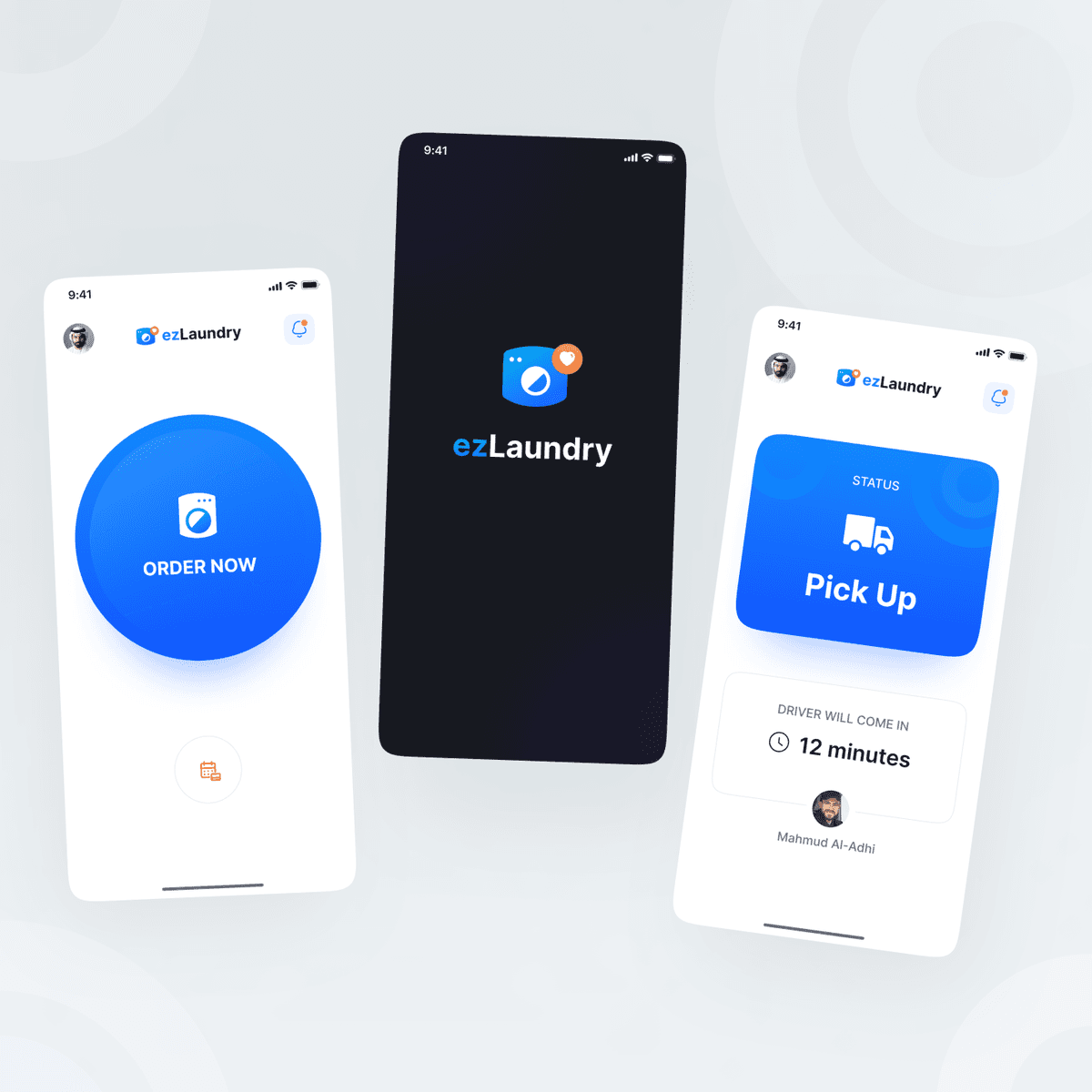
ezLaundry Mobile App
{"type":"doc","content":[{"type":"paragraph","attrs":{"textAlign":null},"content":[{"type":"text","text":"An on-demand laundry app that reduces the whole experience to one tap — order, track your pickup, and get your clothes back without the hassle."}]},{"type":"image","attrs":{"src":"https://mir-s3-cdn-cf.behance.net/project_modules/fs/a15fc3143398329.627a190b75f45.png","alt":null,"title":null,"width":null,"height":null}},{"type":"paragraph","attrs":{"textAlign":null},"content":[{"type":"text","marks":[{"type":"bold"}],"text":"UI/UX Design — ezLaundry"}]},{"type":"paragraph","attrs":{"textAlign":null},"content":[{"type":"text","marks":[{"type":"italic"}],"text":"Mobile App · On-Demand Laundry · Home Services"}]},{"type":"paragraph","attrs":{"textAlign":null},"content":[{"type":"text","text":"ezLaundry strips the laundry pickup experience down to its absolute simplest. The splash screen opens with the brand mark on a clean black background — a washing machine icon with an orange notification dot, signaling both utility and real-time status awareness. The home screen takes radical simplicity further: a single large blue \"Order Now\" button dominates the entire screen, making the primary action unmissable and the interface near-effortless for users of all ages."}]},{"type":"paragraph","attrs":{"textAlign":null},"content":[{"type":"text","text":"The order tracking screen kicks in post-booking with a blue Status card displaying \"Pick Up\" mode — a delivery truck icon communicating the active stage at a glance. Below, \"Driver will come in 12 minutes\" with a countdown timer and the assigned driver's name and photo (Mahmud Al-Adhi) close the real-time loop, giving users full visibility without needing to make a call."}]},{"type":"paragraph","attrs":{"textAlign":null},"content":[{"type":"text","text":"The minimal blue and white palette, generous whitespace, and icon-forward design language make ezLaundry feel less like a tech product and more like a reliable neighborhood service that happens to live on your phone."}]}]}
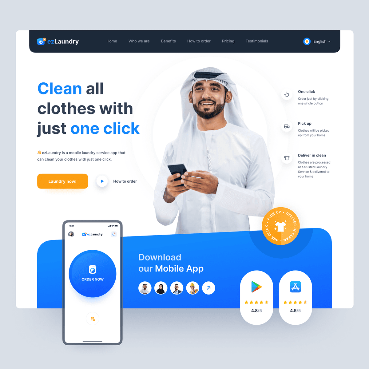
ezLaundry Web Landing Page
{"type":"doc","content":[{"type":"paragraph","attrs":{"textAlign":null},"content":[{"type":"text","text":"A laundry service landing page that closes the pitch in one headline — \"Clean all clothes with just one click\" — and backs it up with a three-step promise before you scroll."}]},{"type":"image","attrs":{"src":"https://mir-s3-cdn-cf.behance.net/project_modules/1400/0f132d144347603.629ae7957542e.png","alt":null,"title":null,"width":null,"height":null}},{"type":"paragraph","attrs":{"textAlign":null},"content":[{"type":"text","marks":[{"type":"bold"}],"text":"Web Design — ezLaundry Landing Page"}]},{"type":"paragraph","attrs":{"textAlign":null},"content":[{"type":"text","marks":[{"type":"italic"}],"text":"Landing Page · On-Demand Laundry · Middle East"}]},{"type":"paragraph","attrs":{"textAlign":null},"content":[{"type":"text","text":"ezLaundry's landing page is built for instant clarity. The hero leads with a bold blue-and-black headline — \"Clean all clothes with just one click\" — alongside a smiling Arabic man in traditional dress holding a phone, immediately signaling the app's Middle Eastern market positioning. Three service pillars sit on the right: One Click (order with a single button), Pick Up (collected from your home), and Deliver in Clean (processed and returned) — compressing the entire service promise into three scannable lines."}]},{"type":"paragraph","attrs":{"textAlign":null},"content":[{"type":"text","text":"Two CTAs sit side by side — a prominent orange \"Laundry now!\" button and a softer \"How to order\" video link — catering to ready-to-convert users and first-time visitors alike. Navigation covers Who We Are, Benefits, How to Order, Pricing, and Testimonials, with an English language toggle signaling a multilingual, regionally aware product."}]},{"type":"paragraph","attrs":{"textAlign":null},"content":[{"type":"text","text":"The lower section transitions into a vibrant blue app download panel — featuring the mobile app UI preview with the signature \"Order Now\" button, user avatar strip, and Google Play / App Store ratings (4.8/5 and 4.5/5) — converting desktop visitors into mobile app users with a seamless hand-off."}]}]}
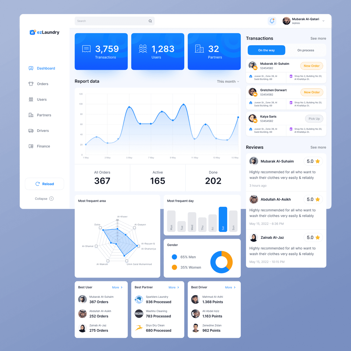
ezLaundry Dashboard
{"type":"doc","content":[{"type":"paragraph","attrs":{"textAlign":null},"content":[{"type":"text","text":"A comprehensive laundry operations dashboard that gives admins eyes on everything — from live order status and driver performance to customer demographics and top partner rankings."}]},{"type":"image","attrs":{"src":"https://mir-s3-cdn-cf.behance.net/project_modules/fs/9ae92c144093801.628620bdbbdcc.png","alt":null,"title":null,"width":null,"height":null}},{"type":"paragraph","attrs":{"textAlign":null},"content":[{"type":"text","marks":[{"type":"bold"}],"text":"UI/UX Design — ezLaundry Dashboard"}]},{"type":"paragraph","attrs":{"textAlign":null},"content":[{"type":"text","marks":[{"type":"italic"}],"text":"Web App · Admin Dashboard · On-Demand Laundry · Backoffice"}]},{"type":"paragraph","attrs":{"textAlign":null},"content":[{"type":"text","text":"The ezLaundry admin dashboard consolidates the full operational picture of an on-demand laundry platform into one clean, blue-accented interface. Three top-level KPI cards set the stage immediately: 3,759 Transactions, 1,283 Users, and 32 Partners — each on a bold blue tile that commands attention before the data details begin. A monthly Report Data area chart below tracks order volume trends across the month, with summary stats showing 367 All Orders, 165 Active, and 202 Done."}]},{"type":"paragraph","attrs":{"textAlign":null},"content":[{"type":"text","text":"The analytics section goes deeper with two geographic and behavioral charts: a radar chart mapping Most Frequent Area across Qatari districts (Al-Khor, Al-Daayen, Al-Rayyan, Al-Wakrah and more), and a bar chart identifying Saturday as the Most Frequent Day — giving operations teams actionable scheduling intelligence. A donut chart breaks down the Gender split (65% Men, 35% Women), rounding out the demographic picture."}]},{"type":"paragraph","attrs":{"textAlign":null},"content":[{"type":"text","text":"The right panel keeps live operations front and center: a Transactions feed shows orders \"On the Way\" and \"On Process\" with customer addresses, pickup and delivery locations, and status badges (New Order, Pick Up). A Reviews section surfaces fresh 5-star ratings in real time. Bottom leaderboard cards rank Best User (Mubarak Al-Suhaim, 367 orders), Best Partner (Sparklers Laundry, 936 processed), and Best Driver (Mahmud Al-Adhi, 1,368 points) — creating healthy performance visibility across the platform ecosystem."}]}]}
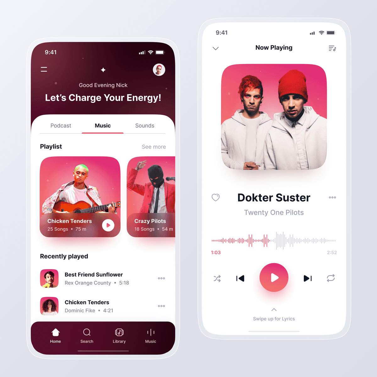
Myuzic Music Player App
{"type":"doc","content":[{"type":"paragraph","attrs":{"textAlign":null},"content":[{"type":"text","text":"A music player that matches the energy of the music itself — dark, vibrant, and personal, with every screen designed to keep you in the zone."}]},{"type":"image","attrs":{"src":"https://mir-s3-cdn-cf.behance.net/project_modules/fs/bd178d142316617.6264a64556a52.png","alt":null,"title":null,"width":null,"height":null}},{"type":"paragraph","attrs":{"textAlign":null},"content":[{"type":"text","marks":[{"type":"bold"}],"text":"UI/UX Design — Myuzic Music Player"}]},{"type":"paragraph","attrs":{"textAlign":null},"content":[{"type":"text","marks":[{"type":"italic"}],"text":"Mobile App · Music Player · Entertainment"}]},{"type":"paragraph","attrs":{"textAlign":null},"content":[{"type":"text","text":"Myuzic opens with a warm welcome — \"Good Evening Nick, Let's Charge Your Energy!\" — immediately setting a personal, mood-driven tone. The home screen organizes content across three tabs (Podcast, Music, Sounds) with a Playlist card grid showcasing artist cover art alongside song count and runtime (Chicken Tenders — 25 songs, 75 min; Crazy Pilots — 18 songs, 54 min). A Recently Played list below surfaces quick-access tracks from Rex Orange County and Dominic Fike — keeping familiar favorites within one tap. The deep burgundy-to-black gradient creates a premium, club-like atmosphere that keeps the focus on the music."}]},{"type":"paragraph","attrs":{"textAlign":null},"content":[{"type":"text","text":"The Now Playing screen shifts to a clean light mode — a full artist photo card for Twenty One Pilots, playing \"Dokter Suster\" with a pink waveform progress bar showing 1:03 of 2:52. Playback controls (shuffle, previous, play, next, repeat) are centered and generously spaced, with a pink play button as the clear focal point. A \"Swipe up for Lyrics\" gesture hint at the bottom adds depth to the listening experience without cluttering the screen."}]},{"type":"paragraph","attrs":{"textAlign":null},"content":[{"type":"text","text":"The contrast between the dark home and light player screens creates a satisfying visual shift — from browsing mode to full immersion."}]}]}

Myuzic - Music Player Web App
{"type":"doc","content":[{"type":"image","attrs":{"src":"https://cdn.dribbble.com/userupload/10635693/file/original-8583df7af017f368581633dbe0e84457.png?resize=1504x1127&vertical=center","alt":null,"title":null,"width":null,"height":null}},{"type":"paragraph","attrs":{"textAlign":null},"content":[{"type":"text","text":"Hey Groovy People "},{"type":"text","marks":[{"type":"link","attrs":{"href":"https://emojipedia.org/guitar/","target":"_blank","rel":"noopener noreferrer nofollow","class":null,"title":null}}],"text":"🎸"}]},{"type":"paragraph","attrs":{"textAlign":null}},{"type":"paragraph","attrs":{"textAlign":null},"content":[{"type":"text","text":"This is my Exploration for ..."}]},{"type":"paragraph","attrs":{"textAlign":null},"content":[{"type":"text","text":"\"Myuzic - Music Player Mobile App\""}]},{"type":"paragraph","attrs":{"textAlign":null}},{"type":"paragraph","attrs":{"textAlign":null},"content":[{"type":"text","text":"What do you think guys? Let me know in the comments section!"}]},{"type":"paragraph","attrs":{"textAlign":null},"content":[{"type":"text","text":"Hope you enjoy it guys. Click “❤️Like” if you like it."}]}]}
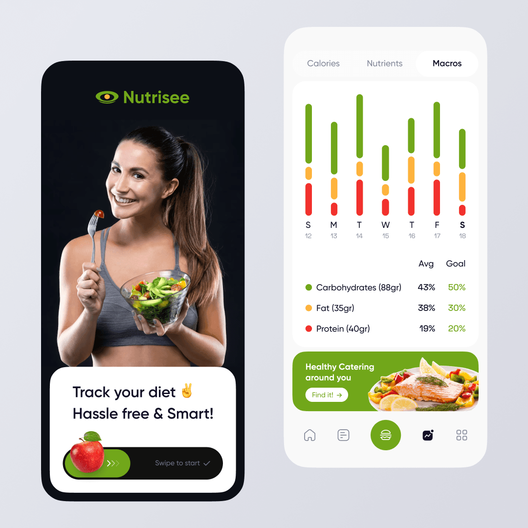
Nutrisee Mobile App
{"type":"doc","content":[{"type":"paragraph","attrs":{"textAlign":null},"content":[{"type":"text","text":"A smart diet tracking app that makes nutrition visible — see your macros, hit your goals, and find healthy catering nearby, all hassle-free."}]},{"type":"image","attrs":{"src":"https://mir-s3-cdn-cf.behance.net/project_modules/max_1200/2e0e40164614065.63f9a1d210361.png","alt":null,"title":null,"width":null,"height":null}},{"type":"paragraph","attrs":{"textAlign":null},"content":[{"type":"text","marks":[{"type":"bold"}],"text":"UI/UX Design — Nutrisee"}]},{"type":"paragraph","attrs":{"textAlign":null},"content":[{"type":"text","marks":[{"type":"italic"}],"text":"Mobile App · Nutrition Tracker · Health & Diet"}]},{"type":"paragraph","attrs":{"textAlign":null},"content":[{"type":"text","text":"Nutrisee opens with a confident dark splash screen — a fit woman holding a fresh salad bowl, overlaid with the tagline \"Track your diet ✌️ Hassle free & Smart!\" and a swipe-to-start gesture CTA. The eye-shaped logomark in acid green immediately signals the app's core promise: nutritional visibility."}]},{"type":"paragraph","attrs":{"textAlign":null},"content":[{"type":"text","text":"The macros tracking screen shifts to a clean white layout with a weekly bar chart showing daily macro breakdowns across three stacked segments — Carbohydrates (green), Fat (amber), Protein (red) — each bar representing a day of the week. An Avg vs Goal comparison table below gives users an instant read on where they're over or under: Carbs at 43% (goal 50%), Fat at 38% (goal 30%), Protein at 19% (goal 20%). The traffic-light color system makes deviations scannable at a glance without needing to read the numbers."}]},{"type":"paragraph","attrs":{"textAlign":null},"content":[{"type":"text","text":"A \"Healthy Catering around you\" banner at the bottom adds a discovery layer — bridging personal nutrition tracking with real-world food options nearby."}]}]}
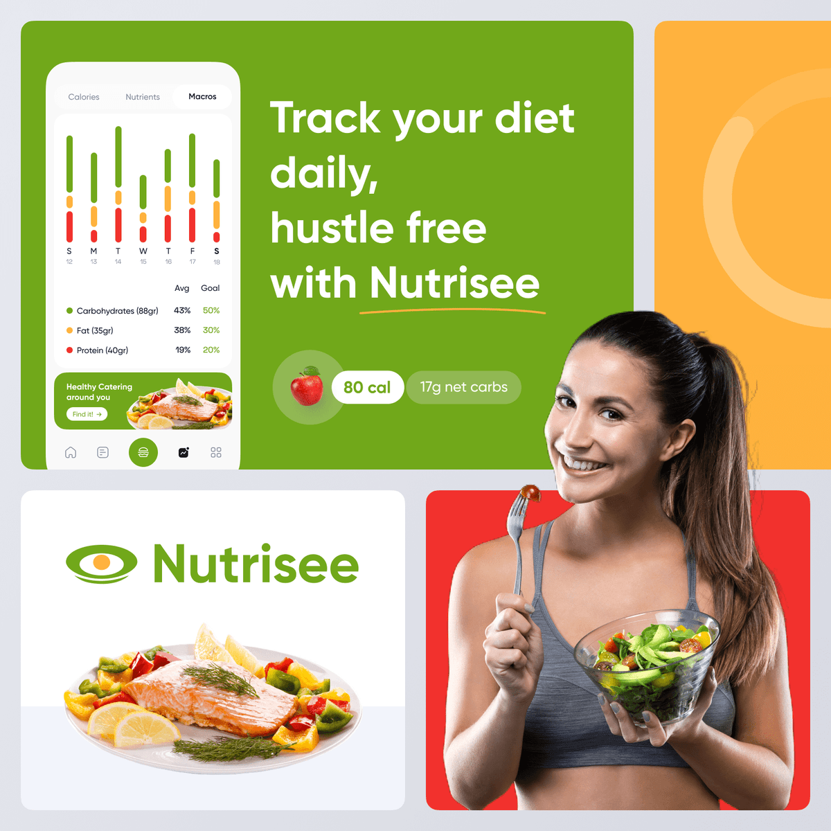
Nutrisee Brand
{"type":"doc","content":[{"type":"paragraph","attrs":{"textAlign":null},"content":[{"type":"text","text":"A nutrition brand that makes healthy living look as good as it feels — bold greens, warm food photography, and an eye that sees everything you eat."}]},{"type":"image","attrs":{"src":"https://mir-s3-cdn-cf.behance.net/project_modules/fs/08bf52164614065.63f9a1d2112a5.png","alt":null,"title":null,"width":null,"height":null}},{"type":"paragraph","attrs":{"textAlign":null},"content":[{"type":"text","marks":[{"type":"bold"}],"text":"Brand Identity — Nutrisee"}]},{"type":"paragraph","attrs":{"textAlign":null},"content":[{"type":"text","marks":[{"type":"italic"}],"text":"Branding · Nutrition App · Visual Identity · Health"}]},{"type":"paragraph","attrs":{"textAlign":null},"content":[{"type":"text","text":"Nutrisee's brand identity is built around a deceptively simple logomark — a stylized eye formed from a circle and leaf shape — that doubles as both a \"nutrition lens\" and a nod to the app's core promise: visibility into what you eat. Rendered in acid green with a clean sans-serif wordmark, the logo reads confidently across white and colored backgrounds alike."}]},{"type":"paragraph","attrs":{"textAlign":null},"content":[{"type":"text","text":"The color system tells the brand's nutritional story directly: green for on-track macros (Carbohydrates), amber for watch-zone (Fat), and red for attention-needed (Protein) — the same traffic-light logic from the app UI carried into the brand palette. Three background tiles — green, amber, and red — show how each color activates across marketing materials while staying cohesive as a system."}]},{"type":"paragraph","attrs":{"textAlign":null},"content":[{"type":"text","text":"Food photography anchors the brand in real, appetizing meals: a grilled salmon with vegetables and a fresh avocado salad bowl, both shot cleanly against white for maximum versatility. Paired with lifestyle imagery of a fit, smiling woman eating well, the brand communicates that tracking nutrition doesn't mean sacrificing joy — Nutrisee makes healthy feel achievable, not punishing."}]}]}

Storage Manager Platform - STOREJ
{"type":"doc","content":[{"type":"image","attrs":{"src":"https://cdn.dribbble.com/userupload/8620859/file/original-a29b30a336490350588dffceb2c082da.png?resize=1504x1128&vertical=center","alt":null,"title":null,"width":null,"height":null}},{"type":"heading","attrs":{"textAlign":"center","level":2},"content":[{"type":"text","marks":[{"type":"bold"}],"text":"Hi Guys!✋🏻"}]},{"type":"paragraph","attrs":{"textAlign":"center"},"content":[{"type":"text","text":"This is another exploration about Storage Manager Platform called STOREJ."}]},{"type":"paragraph","attrs":{"textAlign":"center"},"content":[{"type":"text","marks":[{"type":"bold"}],"text":"More preview? enjoy scrolling 🙌"},{"type":"hardBreak"},{"type":"hardBreak"}]},{"type":"image","attrs":{"src":"https://cdn.dribbble.com/userupload/8620860/file/original-7f0801361b45098d321bc0794134139d.png?resize=2048x1536&vertical=center","alt":null,"title":null,"width":null,"height":null}},{"type":"image","attrs":{"src":"https://cdn.dribbble.com/userupload/8620861/file/original-a11daee9a8f9e04c3c75f83a47691fad.png?resize=2048x1536&vertical=center","alt":null,"title":null,"width":null,"height":null}},{"type":"image","attrs":{"src":"https://cdn.dribbble.com/userupload/8620862/file/original-265cd0a4b11f7e4c77dde4eb5128bf8d.png?resize=2048x1536&vertical=center","alt":null,"title":null,"width":null,"height":null}},{"type":"paragraph","attrs":{"textAlign":"center"},"content":[{"type":"hardBreak"},{"type":"hardBreak"},{"type":"text","marks":[{"type":"bold"}],"text":"Thank You!"}]},{"type":"paragraph","attrs":{"textAlign":"center"},"content":[{"type":"text","text":"Hope you like it!"}]}]}

AI Assistant - Brand Identity Design - Qorin
{"type":"doc","content":[{"type":"image","attrs":{"src":"https://cdn.dribbble.com/userupload/8649887/file/original-70223e7663a4b1626b0b863617a6c6c7.png?resize=1504x1128&vertical=center","alt":null,"title":null,"width":null,"height":null}},{"type":"heading","attrs":{"textAlign":"center","level":2},"content":[{"type":"text","marks":[{"type":"bold"}],"text":"Hi Guys!✋🏻"}]},{"type":"paragraph","attrs":{"textAlign":"center"},"content":[{"type":"text","text":"This is another exploration about AI Assistant Software - Brand Identity Design called Qorin."}]},{"type":"paragraph","attrs":{"textAlign":"center"},"content":[{"type":"text","marks":[{"type":"bold"}],"text":"More preview? enjoy scrolling 🙌"},{"type":"hardBreak"},{"type":"hardBreak"}]},{"type":"image","attrs":{"src":"https://cdn.dribbble.com/userupload/8649884/file/original-370f154350d417cf6d7437dfd6ca9b88.png?resize=2048x1536&vertical=center","alt":null,"title":null,"width":null,"height":null}},{"type":"image","attrs":{"src":"https://cdn.dribbble.com/userupload/8649885/file/original-2c33dc57e83c7aec13ae3ac1149aed07.png?resize=2048x1536&vertical=center","alt":null,"title":null,"width":null,"height":null}},{"type":"image","attrs":{"src":"https://cdn.dribbble.com/userupload/8649886/file/original-4480497a88c722db5bef76cc67120bd2.png?resize=2048x1536&vertical=center","alt":null,"title":null,"width":null,"height":null}},{"type":"paragraph","attrs":{"textAlign":"center"},"content":[{"type":"hardBreak"},{"type":"text","marks":[{"type":"bold"}],"text":"Soo, what do you think?"}]},{"type":"paragraph","attrs":{"textAlign":"center"},"content":[{"type":"text","text":"Hope you like it!"},{"type":"hardBreak"}]}]}

Single Partner Split View - WebApp Taurus
{"type":"doc","content":[{"type":"image","attrs":{"src":"https://cdn.dribbble.com/userupload/11372245/file/original-5cb1b6b4a7348520ea7790ff5d1b599b.png?resize=2048x1536&vertical=center","alt":null,"title":null,"width":null,"height":null}},{"type":"paragraph","attrs":{"textAlign":null},"content":[{"type":"text","text":"Hey Friends 👋"}]},{"type":"paragraph","attrs":{"textAlign":null},"content":[{"type":"text","text":"Today I'll share the results of my design of \"the Single Partner Split View\", part of Dashboard Web App Design - Taurus."}]},{"type":"paragraph","attrs":{"textAlign":null},"content":[{"type":"text","text":"Taurus WebApp Dashboard offers layout options for building next-generation web applications that follow the latest trends in web design and user experience."}]},{"type":"paragraph","attrs":{"textAlign":null},"content":[{"type":"text","text":"Press the heart icon if you like it. Cheers! ✨"},{"type":"hardBreak"},{"type":"hardBreak"}]},{"type":"image","attrs":{"src":"https://cdn.dribbble.com/userupload/11372247/file/original-d63e8d2b0632e31551badb93164deb4d.png?resize=2048x1536&vertical=center","alt":null,"title":null,"width":null,"height":null}},{"type":"image","attrs":{"src":"https://cdn.dribbble.com/userupload/11372248/file/original-586869520bf5202689022322e60b2d6a.png?resize=2048x1536&vertical=center","alt":null,"title":null,"width":null,"height":null}},{"type":"image","attrs":{"src":"https://cdn.dribbble.com/userupload/11372249/file/original-8fee8feb4b326d4d8025d12e806dd73a.png?resize=2048x1536&vertical=center","alt":null,"title":null,"width":null,"height":null}},{"type":"paragraph","attrs":{"textAlign":null},"content":[{"type":"hardBreak"},{"type":"hardBreak"},{"type":"text","marks":[{"type":"bold"}],"text":"Have a great project idea?"},{"type":"text","text":" Let us know ✅"}]},{"type":"paragraph","attrs":{"textAlign":null}},{"type":"paragraph","attrs":{"textAlign":null},"content":[{"type":"text","text":"Services we provide:"}]},{"type":"paragraph","attrs":{"textAlign":null},"content":[{"type":"text","text":"🖼️ UI Design | 😄 UX Design | 🎉 Illustration | 🛍 Brand Identity | 📝 Graphic Design | 🌐 Web Development | 📱 Mobile App Development"}]},{"type":"paragraph","attrs":{"textAlign":null}},{"type":"paragraph","attrs":{"textAlign":null},"content":[{"type":"text","text":"Thanks!"}]}]}

Order Table - WebApp Taurus
{"type":"doc","content":[{"type":"image","attrs":{"src":"https://cdn.dribbble.com/userupload/11610144/file/original-b744d3f571636d0b1a6003caad3e8709.png?resize=2048x1536&vertical=center","alt":null,"title":null,"width":null,"height":null}},{"type":"paragraph","attrs":{"textAlign":null},"content":[{"type":"text","text":"Hey Friends 👋"}]},{"type":"paragraph","attrs":{"textAlign":null},"content":[{"type":"text","text":"Today I'll share the results of my design of \"Order Table\", part of Dashboard Web App Design - Taurus."}]},{"type":"paragraph","attrs":{"textAlign":null},"content":[{"type":"text","text":"Taurus WebApp Dashboard offers layout options for building next-generation web applications that follow the latest trends in web design and user experience."}]},{"type":"paragraph","attrs":{"textAlign":null},"content":[{"type":"text","text":"Press the heart icon if you like it. Cheers! ✨"},{"type":"hardBreak"},{"type":"hardBreak"}]},{"type":"image","attrs":{"src":"https://cdn.dribbble.com/userupload/11610145/file/original-a76d76b4aea063c7843d907d08bd81b5.png?resize=1504x1128&vertical=center","alt":null,"title":null,"width":null,"height":null}},{"type":"image","attrs":{"src":"https://cdn.dribbble.com/userupload/11610146/file/original-33131bc28c2ff8d863bfd9fbf348d285.png?resize=1504x1128&vertical=center","alt":null,"title":null,"width":null,"height":null}},{"type":"paragraph","attrs":{"textAlign":null},"content":[{"type":"text","marks":[{"type":"bold"}],"text":"Have a great project idea?"},{"type":"text","text":" Let us know ✅"}]},{"type":"paragraph","attrs":{"textAlign":null}},{"type":"paragraph","attrs":{"textAlign":null},"content":[{"type":"text","text":"Services we provide:"}]},{"type":"paragraph","attrs":{"textAlign":null},"content":[{"type":"text","text":"🖼️ UI Design | 😄 UX Design | 🎉 Illustration | 🛍 Brand Identity | 📝 Graphic Design | 🌐 Web Development | 📱 Mobile App Development"}]},{"type":"paragraph","attrs":{"textAlign":null}},{"type":"paragraph","attrs":{"textAlign":null},"content":[{"type":"text","text":"Thanks!"}]}]}
Electric Motorcycle Web Design
{"type":"doc","content":[{"type":"paragraph","attrs":{"textAlign":null},"content":[{"type":"image","attrs":{"src":"https://cdn.dribbble.com/userupload/2907398/file/original-f05a4b3b954dc4c4c32577fa0945a7f1.png","alt":null,"title":null,"width":1140,"height":855}}]},{"type":"paragraph","attrs":{"textAlign":null},"content":[{"type":"image","attrs":{"src":"https://cdn.dribbble.com/userupload/2907399/file/original-5c4fc3c9324c5cb04123f20209bcb64b.png","alt":null,"title":null,"width":1140,"height":855}}]},{"type":"paragraph","attrs":{"textAlign":null},"content":[{"type":"image","attrs":{"src":"https://cdn.dribbble.com/userupload/2907400/file/original-7eb9262c28f131560656c15ae993196d.png","alt":null,"title":null,"width":1140,"height":855}}]},{"type":"paragraph","attrs":{"textAlign":null},"content":[{"type":"image","attrs":{"src":"https://cdn.dribbble.com/userupload/2907401/file/original-05a06171e691c927101533ca4518780c.png","alt":null,"title":null,"width":1140,"height":1140}}]},{"type":"paragraph","attrs":{"textAlign":null},"content":[{"type":"text","text":" Hello Earth Lovers 🌎"}]},{"type":"paragraph","attrs":{"textAlign":null},"content":[{"type":"text","text":" "}]},{"type":"paragraph","attrs":{"textAlign":null},"content":[{"type":"text","text":"This time I want to share my UI design exploration..."}]},{"type":"paragraph","attrs":{"textAlign":null},"content":[{"type":"text","text":"“🛵 Quest - Website Design Concept” - Unofficial."}]},{"type":"paragraph","attrs":{"textAlign":null},"content":[{"type":"text","text":"This is unofficial concept of electric motorcycle website design."}]},{"type":"paragraph","attrs":{"textAlign":null},"content":[{"type":"text","text":"Photo & Content Credit: "},{"type":"text","marks":[{"type":"link","attrs":{"href":"https://questmotors.id/","target":"_blank","rel":"noopener noreferrer nofollow","class":null,"title":null}}],"text":"https://questmotors.id/"}]},{"type":"paragraph","attrs":{"textAlign":null},"content":[{"type":"text","text":" "}]},{"type":"paragraph","attrs":{"textAlign":null},"content":[{"type":"text","text":"Hope you guys like it 🍃"}]}]}
CEER Website Showcase
{"type":"doc","content":[{"type":"paragraph","attrs":{"textAlign":null},"content":[{"type":"text","text":"Designing the digital showroom for Saudi Arabia's first electric vehicle brand — where cinematic visuals meet precision-engineered UX."}]},{"type":"image","attrs":{"src":"https://mir-cdn.behance.net/v1/rendition/project_modules/fs_webp/bd5056245648777.69b21e062dc5f.png","alt":null,"title":null,"width":null,"height":null}},{"type":"image","attrs":{"src":"https://mir-cdn.behance.net/v1/rendition/project_modules/1400_webp/4be231245648777.69b21e062f2c8.png","alt":null,"title":null,"width":null,"height":null}},{"type":"paragraph","attrs":{"textAlign":null},"content":[{"type":"text","marks":[{"type":"bold"}],"text":"UI Design — CEER Motors Vehicle Configurator"},{"type":"hardBreak"},{"type":"text","marks":[{"type":"italic"}],"text":"Web Design · Automotive · Saudi Arabia"},{"type":"hardBreak"},{"type":"hardBreak"},{"type":"text","text":"A premium automotive web experience designed for CEER Motors — Saudi Arabia's first electric vehicle brand. The interface leads with a cinematic full-width vehicle showcase set against a moody, desaturated landscape, immediately establishing a tone of sophistication and engineering confidence."}]},{"type":"paragraph","attrs":{"textAlign":null},"content":[{"type":"text","text":"The vehicle selection carousel below employs a clean thumbnail-grid system, allowing users to browse across the full lineup — from C-SUV to D-SUV Coupe — with a clear active-state indicator that anchors context without visual noise. The restrained monochromatic palette, punctuated by a single bold red accent vehicle, demonstrates deliberate use of contrast to guide attention."}]},{"type":"paragraph","attrs":{"textAlign":null},"content":[{"type":"text","text":"Navigation is spare and confident: minimal typeset in all-caps, generous whitespace, and a subtle Arabic language toggle — a considered nod to the brand's regional identity. Three CTA buttons at the base — \"Start design,\" \"Search inventory,\" and \"Download design\" — are elegantly balanced with pill-shaped outlines, maintaining visual hierarchy without competing for dominance."}]},{"type":"paragraph","attrs":{"textAlign":null},"content":[{"type":"text","text":"A masterclass in luxury automotive web design that balances global premium aesthetics with cultural relevance."}]},{"type":"image","attrs":{"src":"https://mir-cdn.behance.net/v1/rendition/project_modules/max_1200_webp/523605245648777.69b21e062e816.png","alt":null,"title":null,"width":null,"height":null}},{"type":"paragraph","attrs":{"textAlign":"left"}}]}

Combat UAV - Landing Page Hero Section
{"type":"doc","content":[{"type":"image","attrs":{"src":"https://cdn.dribbble.com/userupload/11733553/file/original-b794b3adc47300996d36e749e27ecf5e.png?resize=1504x1128&vertical=center","alt":null,"title":null,"width":null,"height":null}},{"type":"paragraph","attrs":{"textAlign":null},"content":[{"type":"text","text":"Hey Friends 👋"}]},{"type":"paragraph","attrs":{"textAlign":null},"content":[{"type":"text","text":"Today I'll share the results of my design of the \"Combat UAV\" web design landing page's header (hero section)."}]},{"type":"paragraph","attrs":{"textAlign":null},"content":[{"type":"text","text":"Press the heart icon if you like it. Cheers! ✨"}]},{"type":"paragraph","attrs":{"textAlign":null},"content":[{"type":"text","text":"Tell me you're opinion, waiting for it. Thank you 🙌"},{"type":"hardBreak"}]},{"type":"image","attrs":{"src":"https://cdn.dribbble.com/userupload/11733732/file/original-a8c2c114c78224e1b02d2dc06f25a06a.png?resize=2048x1536&vertical=center","alt":null,"title":null,"width":null,"height":null}},{"type":"image","attrs":{"src":"https://cdn.dribbble.com/userupload/11733734/file/original-7e046dc862a51fa7c4cdfcf575bdab79.png?resize=2048x1536&vertical=center","alt":null,"title":null,"width":null,"height":null}},{"type":"image","attrs":{"src":"https://cdn.dribbble.com/userupload/11733733/file/original-61a7d745643f08f045d0ba409089dea8.png?resize=2048x1536&vertical=center","alt":null,"title":null,"width":null,"height":null}},{"type":"image","attrs":{"src":"https://cdn.dribbble.com/userupload/11733735/file/original-c8453af4db901d774991036d92a9e51c.png?resize=2048x1536&vertical=center","alt":null,"title":null,"width":null,"height":null}},{"type":"paragraph","attrs":{"textAlign":null},"content":[{"type":"hardBreak"},{"type":"text","marks":[{"type":"bold"}],"text":"Have a great project idea?"},{"type":"text","text":" Let us know ✅"}]},{"type":"paragraph","attrs":{"textAlign":null}},{"type":"paragraph","attrs":{"textAlign":null},"content":[{"type":"text","text":"Services we provide:"}]},{"type":"paragraph","attrs":{"textAlign":null},"content":[{"type":"text","text":"🖼️ UI Design | 😄 UX Design | 🎉 Illustration | 🛍 Brand Identity | 📝 Graphic Design | 🌐 Web Development | 📱 Mobile App Development"}]},{"type":"paragraph","attrs":{"textAlign":null}},{"type":"paragraph","attrs":{"textAlign":null},"content":[{"type":"text","text":"Thanks!"}]}]}
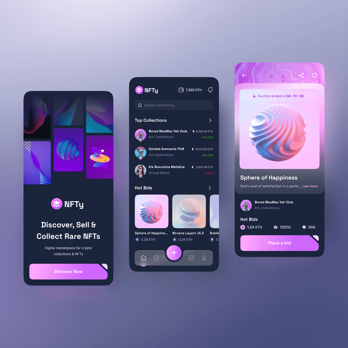
NFTy Mobile App
{"type":"doc","content":[{"type":"paragraph","attrs":{"textAlign":null},"content":[{"type":"text","text":"The NFTy experience goes mobile — discover rare NFTs, track top collections, and place bids on 3D masterpieces, all from your pocket."}]},{"type":"image","attrs":{"src":"https://mir-s3-cdn-cf.behance.net/project_modules/fs/29e985138970301.622808f0746ba.png","alt":"NFTy Mobile App","title":null,"width":null,"height":null}},{"type":"paragraph","attrs":{"textAlign":null},"content":[{"type":"text","marks":[{"type":"bold"}],"text":"UI/UX Design — NFTy Mobile App"}]},{"type":"paragraph","attrs":{"textAlign":null},"content":[{"type":"text","marks":[{"type":"italic"}],"text":"Mobile App · NFT Marketplace · Crypto · Web3"}]},{"type":"paragraph","attrs":{"textAlign":null},"content":[{"type":"text","text":"NFTy's mobile app translates the full Web3 marketplace experience into three tightly designed screens. The splash screen mirrors the landing page's headline — \"Discover, Sell & Collect Rare NFTs\" — with a mosaic of 3D abstract artworks as the hero visual and a pink \"Discover Now\" CTA, establishing instant brand continuity from web to mobile."}]},{"type":"paragraph","attrs":{"textAlign":null},"content":[{"type":"text","text":"The home screen leads with a wallet balance indicator (7.320 ETH) and a global search bar, followed by a Top Collections leaderboard — Bored MasMas Yah Club (+175.76%), Zombie Aremania 11v8 (+85.24%), Kia Buzuzima Metalive (+3.93%) — showing ETH valuation and price change at a glance. Hot Bids cards below surface trending auctions in a horizontal scroll, with ETH prices and creator attribution on each tile."}]},{"type":"paragraph","attrs":{"textAlign":null},"content":[{"type":"text","text":"The NFT detail screen for \"Sphere of Happiness\" shows a full-bleed 3D render, live auction countdown (04:10:69), collection attribution (Bored MasMas Yah Club), and key bid stats — 1.24 ETH current bid, 12,502 views, 346 favorites — capped by a full-width pink \"Place a Bid\" CTA. The dark purple UI with violet and pink gradients stays fully consistent with the web experience across every screen."}]}]}
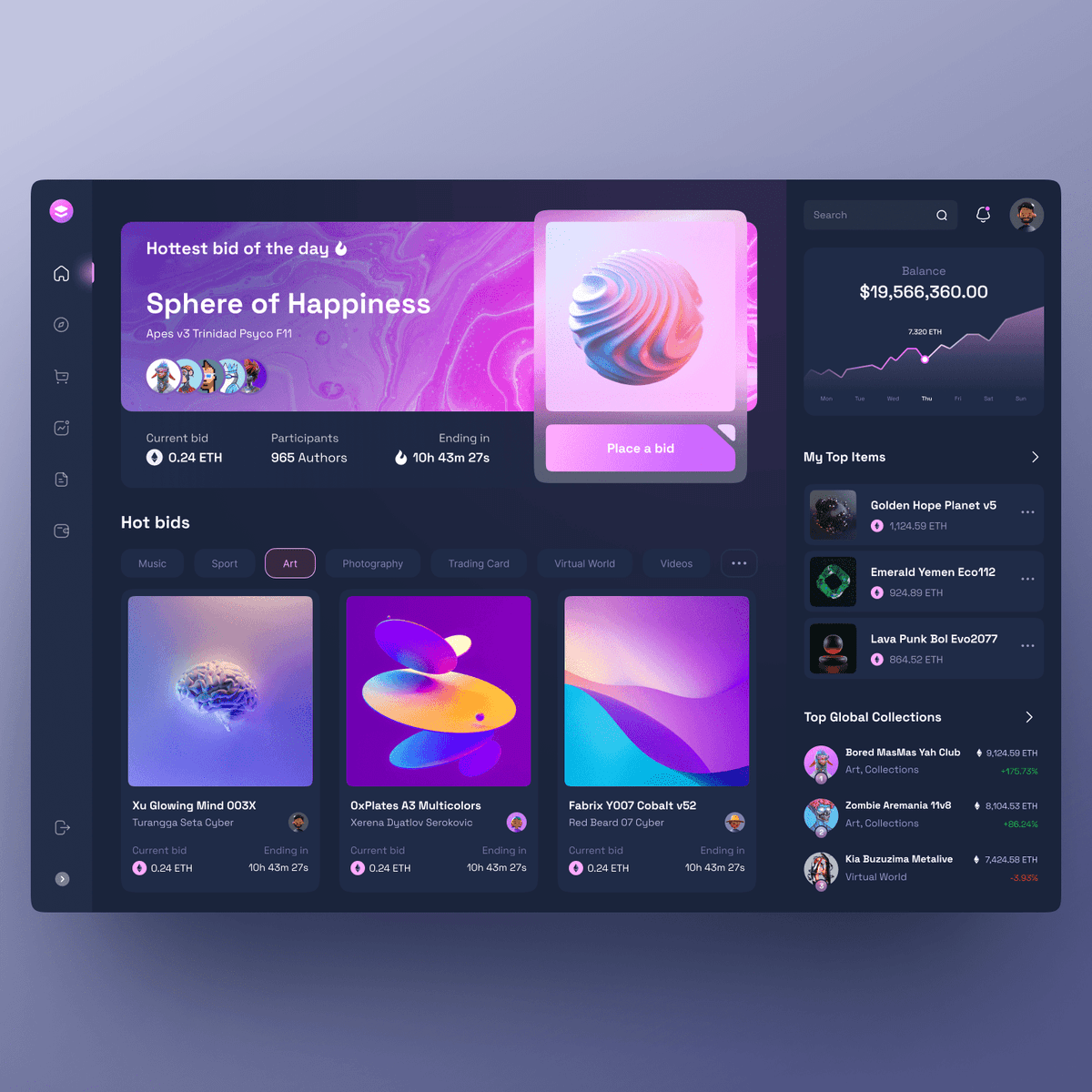
NFTy Dashboard
{"type":"doc","content":[{"type":"paragraph","attrs":{"textAlign":null},"content":[{"type":"text","text":"A collector's command center for the NFT market — track your portfolio balance, catch the hottest bids of the day, and monitor top global collections without switching tabs."}]},{"type":"image","attrs":{"src":"https://mir-s3-cdn-cf.behance.net/project_modules/fs/4bfd4c138970509.622809b25f730.png","alt":null,"title":null,"width":null,"height":null}},{"type":"paragraph","attrs":{"textAlign":null},"content":[{"type":"text","marks":[{"type":"bold"}],"text":"UI/UX Design — NFTy Dashboard"}]},{"type":"paragraph","attrs":{"textAlign":null},"content":[{"type":"text","marks":[{"type":"italic"}],"text":"Web App · NFT Marketplace · Collector Dashboard · Web3"}]},{"type":"paragraph","attrs":{"textAlign":null},"content":[{"type":"text","text":"The NFTy dashboard consolidates the entire collector experience into a single dark, immersive interface. The hero panel spotlights \"Hottest bid of the day\" — currently \"Sphere of Happiness\" by Apes v3 Trinidad Psyco F11 — with a live auction strip showing the current bid (0.24 ETH), 965 participating authors, and a 10h 43m countdown. A pink \"Place a Bid\" CTA floats over the featured NFT card, making it impossible to miss."}]},{"type":"paragraph","attrs":{"textAlign":null},"content":[{"type":"text","text":"Below, the Hot Bids section organizes the marketplace by category tabs — Music, Sport, Art, Photography, Trading Card, Virtual World, Videos — with a three-column NFT card grid showing 3D artworks (Xu Glowing Mind 003X, OxPlates A3 Multicolors, Fabrix Y007 Cobalt v52), each with current bid and time-remaining data."}]},{"type":"paragraph","attrs":{"textAlign":null},"content":[{"type":"text","text":"The right panel handles portfolio intelligence: a wallet balance card ($19,566,360.00 / 7,320 ETH) with a 7-day performance sparkline, a My Top Items list (Golden Hope Planet v5, Emerald Yemen Eco112, Lava Punk Bol Evo2077) with ETH valuations, and a Top Global Collections leaderboard tracking the market's biggest movers. The icon-only left sidebar keeps navigation minimal — maximizing canvas space"}]}]}
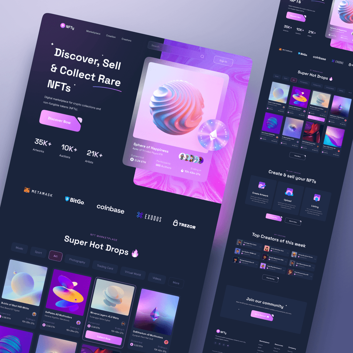
NFTy Website
{"type":"doc","content":[{"type":"paragraph","attrs":{"textAlign":null},"content":[{"type":"text","text":"A deep-purple NFT marketplace that makes digital art feel rare and electric — discover hot drops, collect 3D masterpieces, and trade on the blockchain without leaving the vibe."}]},{"type":"image","attrs":{"src":"https://mir-s3-cdn-cf.behance.net/project_modules/fs/6b1d54138970043.622807cba6242.png","alt":"NFTy - Website","title":null,"width":null,"height":null}},{"type":"paragraph","attrs":{"textAlign":null},"content":[{"type":"text","marks":[{"type":"bold"}],"text":"Web Design — NFTy"}]},{"type":"paragraph","attrs":{"textAlign":null},"content":[{"type":"text","marks":[{"type":"italic"}],"text":"Landing Page · NFT Marketplace · Crypto · Web3"}]},{"type":"paragraph","attrs":{"textAlign":null},"content":[{"type":"text","text":"NFTy is a full-featured NFT marketplace landing page built for the Web3 audience. The hero leads with bold confidence — \"Discover, Sell & Collect Rare NFTs\" — backed by three platform stats (35K+ Artworks, 10K+ Auctions, 21K+ Artists) and a featured NFT card showcasing \"Sphere of Happiness\" with a live auction countdown, current bid in ETH, and participant avatars. A pink \"Discover Now\" CTA pops against the near-black background, cutting through with urgency."}]},{"type":"paragraph","attrs":{"textAlign":null},"content":[{"type":"text","text":"A wallet integration strip — MetaMask, BitGo, Coinbase, Exodus, Trezor — immediately establishes Web3 credibility and signals broad ecosystem compatibility. The \"Super Hot Drops\" section below organizes the marketplace by category tabs (Music, Sport, Art, Photography, Trading Card, Virtual World, Videos) with NFT cards displaying 3D abstract artworks, creator names, ETH prices, and bid timers."}]},{"type":"paragraph","attrs":{"textAlign":null},"content":[{"type":"text","text":"Further down, a three-step \"Create & Sell\" flow (Create Artwork → Upload → Listing) lowers the barrier for new creators, while a Top Creators leaderboard and community join CTA round out the full conversion funnel. The deep purple, violet, and pink gradient system gives the entire page a premium, otherworldly energy consistent with the NFT aesthetic."}]}]}
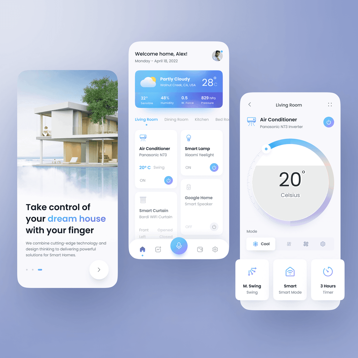
HOM Smart Home Mobile App
{"type":"doc","content":[{"type":"paragraph","attrs":{"textAlign":null},"content":[{"type":"text","text":"Hello happy people 👋"}]},{"type":"paragraph","attrs":{"textAlign":null},"content":[{"type":"text","text":"This time I want to share my exploration UI design “🏠 HOM - Smart Home Mobile App” Hope you guys like it🍃"}]},{"type":"image","attrs":{"src":"https://mir-s3-cdn-cf.behance.net/project_modules/fs/c425b8142316551.6264a5a7e008f.png","alt":null,"title":null,"width":null,"height":null}},{"type":"paragraph","attrs":{"textAlign":null},"content":[{"type":"text","text":"What do you think guys? Let me know in the comments section!"}]},{"type":"paragraph","attrs":{"textAlign":null},"content":[{"type":"text","text":"Hope you enjoy it guys. Click “❤️Like” if you like it."}]},{"type":"paragraph","attrs":{"textAlign":null}},{"type":"paragraph","attrs":{"textAlign":null},"content":[{"type":"text","marks":[{"type":"bold"}],"text":"Have a great project idea?"},{"type":"text","text":" Let us know ✅"}]},{"type":"paragraph","attrs":{"textAlign":null}},{"type":"paragraph","attrs":{"textAlign":null},"content":[{"type":"text","text":"Services we provide:"}]},{"type":"paragraph","attrs":{"textAlign":null},"content":[{"type":"text","text":"🖼️ UI Design | 😄 UX Design | 🎉 Illustration | 🛍 Brand Identity | 📝 Graphic Design | 🌐 Web Development | 📱 Mobile App Development"}]},{"type":"paragraph","attrs":{"textAlign":null}},{"type":"paragraph","attrs":{"textAlign":null},"content":[{"type":"text","text":"Thanks!"}]}]}
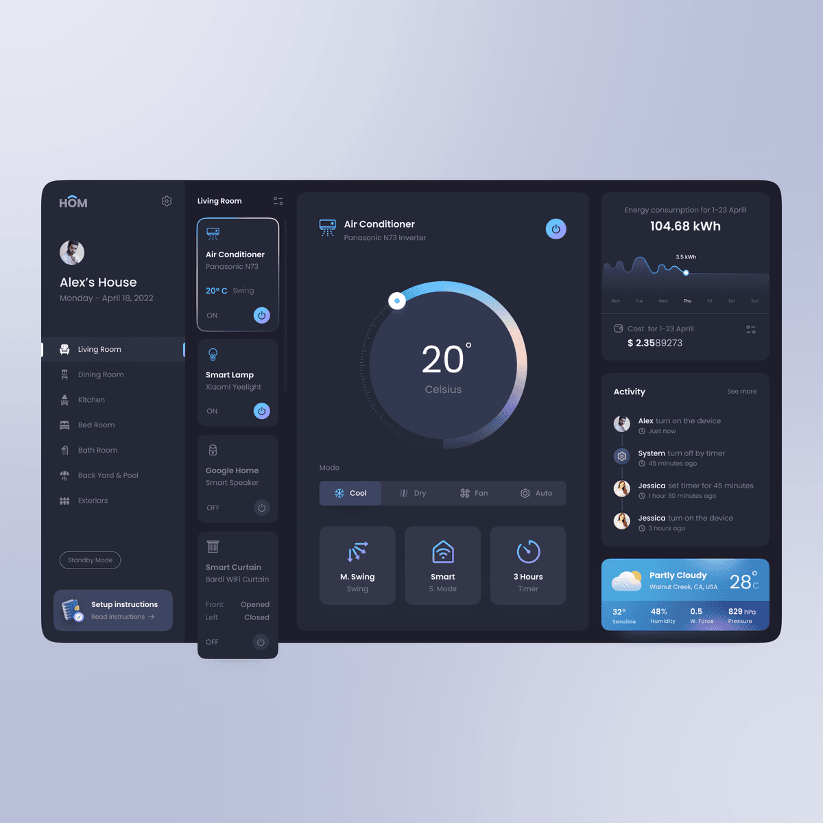
HOM Smart Home App Dark Tablet
{"type":"doc","content":[{"type":"paragraph","attrs":{"textAlign":null},"content":[{"type":"text","text":"Hello happy people 👋"}]},{"type":"paragraph","attrs":{"textAlign":null},"content":[{"type":"text","text":"This time I want to share my exploration UI design “🏠 HOM - Smart Home App” - Dark Mode - Tablet Version."}]},{"type":"image","attrs":{"src":"https://mir-s3-cdn-cf.behance.net/project_modules/fs/38ae0c142316807.6264a81a99d53.png","alt":null,"title":null,"width":null,"height":null}},{"type":"paragraph","attrs":{"textAlign":null},"content":[{"type":"text","text":"What do you think guys? Let me know in the comments section!"}]},{"type":"paragraph","attrs":{"textAlign":null},"content":[{"type":"text","text":"Hope you enjoy it guys. Click “❤️Like” if you like it."}]},{"type":"paragraph","attrs":{"textAlign":null}},{"type":"paragraph","attrs":{"textAlign":null},"content":[{"type":"text","marks":[{"type":"bold"}],"text":"Have a great project idea?"},{"type":"text","text":" Let us know ✅"}]},{"type":"paragraph","attrs":{"textAlign":null}},{"type":"paragraph","attrs":{"textAlign":null},"content":[{"type":"text","text":"Services we provide:"}]},{"type":"paragraph","attrs":{"textAlign":null},"content":[{"type":"text","text":"🖼️ UI Design | 😄 UX Design | 🎉 Illustration | 🛍 Brand Identity | 📝 Graphic Design | 🌐 Web Development | 📱 Mobile App Development"}]},{"type":"paragraph","attrs":{"textAlign":null}},{"type":"paragraph","attrs":{"textAlign":null},"content":[{"type":"text","text":"Thanks!"}]}]}
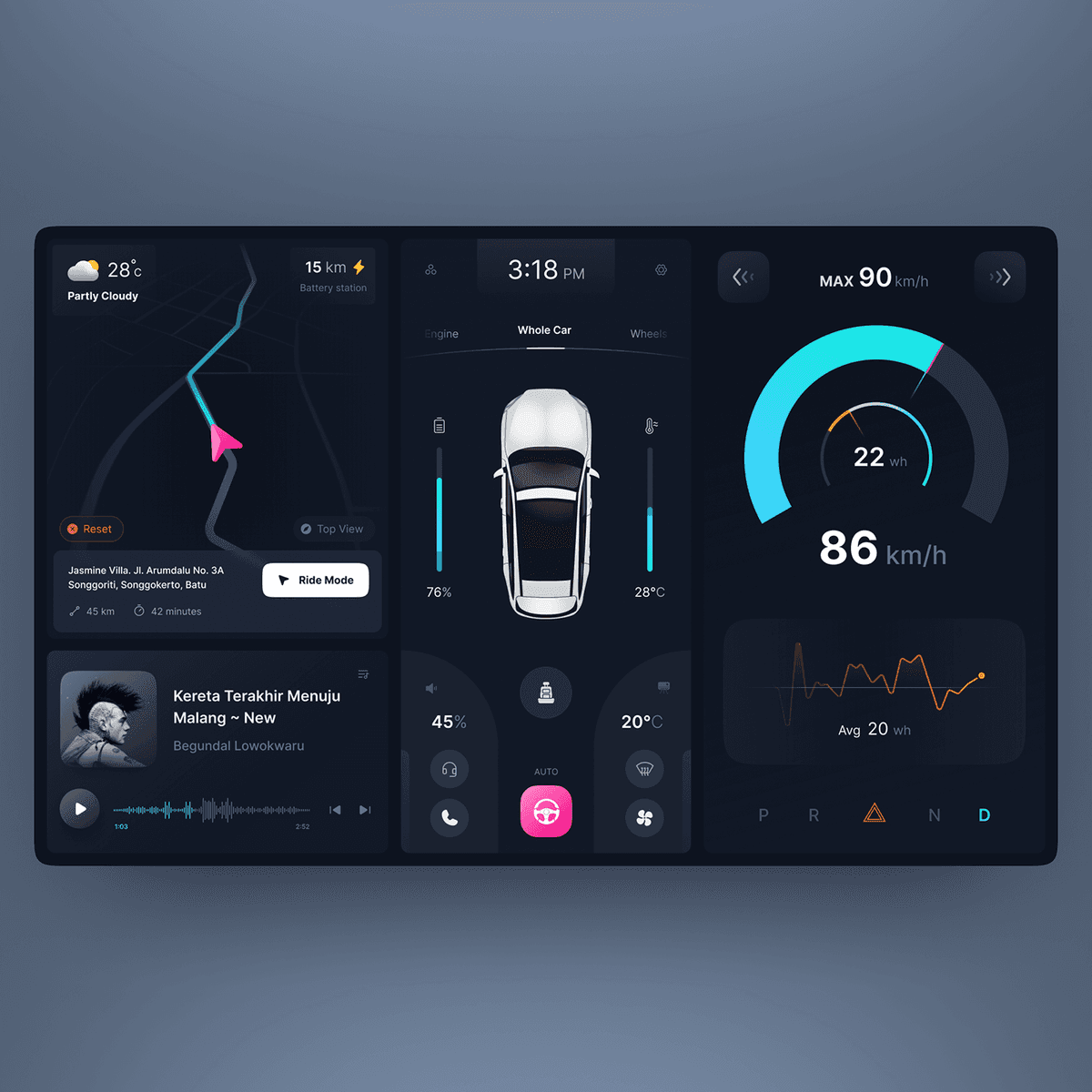
AutoDash
{"type":"doc","content":[{"type":"paragraph","attrs":{"textAlign":null},"content":[{"type":"text","text":"A cinematic EV dashboard UI that puts navigation, vehicle status, speed, and music controls all on one immersive dark screen — driving meets design."}]},{"type":"image","attrs":{"src":"https://mir-cdn.behance.net/v1/rendition/project_modules/1400_opt_1/233e44144916473.62a4718b79623.png","alt":null,"title":null,"width":null,"height":null}},{"type":"paragraph","attrs":{"textAlign":null},"content":[{"type":"text","marks":[{"type":"bold"}],"text":"UI/UX Design — AutoDash"}]},{"type":"paragraph","attrs":{"textAlign":null},"content":[{"type":"text","marks":[{"type":"italic"}],"text":"Dashboard UI · Electric Vehicle · In-Car Interface"}]},{"type":"paragraph","attrs":{"textAlign":null},"content":[{"type":"text","text":"AutoDash is an in-car dashboard interface designed for electric vehicles, built around a three-panel layout that keeps every critical system within the driver's visual field. The left panel combines real-time navigation (active route to Jasmine Villa, Batu — 45 km, 42 minutes) with weather context (28°C, Partly Cloudy) and a now-playing music widget showing the current track with waveform visualizer and playback controls."}]},{"type":"paragraph","attrs":{"textAlign":null},"content":[{"type":"text","text":"The center panel houses vehicle diagnostics in a top-down 3D car view with tabbed controls across Engine, Whole Car, and Wheels. Live readings surface battery level (76%), cabin temperature (28°C), AC output (20°C AUTO), and a prominent pink steering wheel autopilot toggle — communicating drive mode at a single glance."}]},{"type":"paragraph","attrs":{"textAlign":null},"content":[{"type":"text","text":"The right panel owns performance data: a large cyan arc speedometer showing 86 km/h with a 90 km/h max cap, energy consumption (22 wh current, 20 wh avg) plotted on a live waveform chart, and a gear selector strip (P R N D) across the bottom. The near-black background with cyan, pink, and amber accents gives the interface a premium, futuristic character that feels at home in a next-generation EV cabin."}]}]}

Beabox Brand Identity Design
{"type":"doc","content":[{"type":"paragraph","attrs":{"textAlign":null},"content":[{"type":"text","text":"A cloud storage brand built around a lovable beaver mascot — warm, industrious, and dependable, just like the digital cabinet it represents."}]},{"type":"image","attrs":{"src":"https://cdn.dribbble.com/userupload/4803971/file/original-a6f5bc391ef0e57d8a5f3cb7db811ea0.png?compress=1&resize=2048x1535","alt":null,"title":null,"width":null,"height":null}},{"type":"paragraph","attrs":{"textAlign":null},"content":[{"type":"text","marks":[{"type":"bold"}],"text":"Brand Identity Design — Beabox"}]},{"type":"paragraph","attrs":{"textAlign":null},"content":[{"type":"text","marks":[{"type":"italic"}],"text":"Brand Identity · Cloud Storage · Mascot Design · SaaS"}]},{"type":"paragraph","attrs":{"textAlign":null},"content":[{"type":"text","text":"Beabox's brand identity centers on a single powerful idea: a beaver as the face of organized, reliable cloud storage. The choice is deliberate — beavers build, structure, and store with precision, making it a perfect metaphor for a platform that prioritizes folder neatness and file accessibility. The mascot is rendered in two forms: a clean diamond-shaped icon mark for the wordmark and a full 3D illustrated character in a yellow hard hat carrying a file box — industrious, confident, and instantly memorable."}]},{"type":"paragraph","attrs":{"textAlign":null},"content":[{"type":"text","text":"The wordmark pairs the beaver icon with a clean lowercase logotype, striking the balance between approachable and professional. The core palette — coral orange, warm chocolate brown, and off-white — gives Beabox a distinctly human warmth in a category saturated with cold blues and corporate grays. The \"let's build our cloud based file cabinet\" brand tagline reinforces the construction/organization metaphor throughout."}]},{"type":"paragraph","attrs":{"textAlign":null},"content":[{"type":"text","text":"UI preview tiles show the brand system applied consistently across the product: file list cards, storage usage gauge, and the illustrated cloud illustration from the landing page — all cohesive, all recognizably Beabox."}]}]}

Beabox Web Landing Page Design
{"type":"doc","content":[{"type":"paragraph","attrs":{"textAlign":null},"content":[{"type":"text","text":"A cloud storage platform that treats your files like a digital cabinet — organized, secure, and always accessible, with a charming beaver mascot to guide the way."}]},{"type":"image","attrs":{"src":"https://cdn.dribbble.com/userupload/4899099/file/original-ec1a644b5f8fcfac27755ca46a92790a.png?compress=1&resize=1504x1128","alt":null,"title":null,"width":null,"height":null}},{"type":"paragraph","attrs":{"textAlign":null},"content":[{"type":"text","marks":[{"type":"bold"}],"text":"Web Design — Beabox Cloud Storage"}]},{"type":"paragraph","attrs":{"textAlign":null},"content":[{"type":"text","marks":[{"type":"italic"}],"text":"Landing Page · Cloud Storage · SaaS · File Management"}]},{"type":"paragraph","attrs":{"textAlign":null},"content":[{"type":"text","text":"Beabox positions itself not just as cloud storage, but as a sophisticated digital filing system — and the landing page sells that promise from the first headline: \"Organized, secure, always accessible.\" The hero pairs this with a warm, illustrative visual of Beabox's beaver mascot hauling file boxes into the cloud — an instantly lovable character that makes what could be a dry SaaS product feel approachable and personality-driven."}]},{"type":"paragraph","attrs":{"textAlign":null},"content":[{"type":"text","text":"A dashboard preview card surfaces below the hero, showing the \"My files\" panel with real file names (Contract.pdf, Tax Documents, Beaver.jpg, March Deck.key) and a storage usage gauge broken down by category — Documents, Photos, Videos, Music & Audios — giving visitors a concrete feel for the product before signing up. A \"Manage your plan with the Beabox app\" section reinforces the cross-platform nature of the service."}]},{"type":"paragraph","attrs":{"textAlign":null},"content":[{"type":"text","text":"The pricing section closes the page with two clean plans — Standard (200 GB, IDR 430,000/year) and Premium (2 TB, IDR 1,350,000/year) — with the Standard plan highlighted as \"Recommended\" in an orange card. The warm off-white background, orange CTAs, and illustrated UI style give Beabox a distinct, friendly SaaS identity in a category typically dominated by cold corporate aesthetics."}]}]}

Beabox Mascot Design
{"type":"doc","content":[{"type":"paragraph","attrs":{"textAlign":null},"content":[{"type":"text","text":"Organized, secure, always accessible — Beabox is the cloud storage platform that thinks like a cabinet, moves like a beaver, and feels like it was designed for the way real people actually manage their files."}]},{"type":"image","attrs":{"src":"https://cdn.dribbble.com/userupload/4876248/file/original-e9fa53b9306b99a9d9aa6b1e53a0aff5.png?compress=1&resize=1504x1128","alt":null,"title":null,"width":null,"height":null}},{"type":"paragraph","attrs":{"textAlign":null},"content":[{"type":"text","marks":[{"type":"bold"}],"text":"Mascot Design & UI/UX — Beabox"}]},{"type":"paragraph","attrs":{"textAlign":null},"content":[{"type":"text","marks":[{"type":"italic"}],"text":"Cloud Storage Platform · Product Design · Hyperfantasy"}]},{"type":"paragraph","attrs":{"textAlign":null},"content":[{"type":"text","text":"An end-to-end product design exploration for Beabox — a cloud storage and file management platform built around a single organizing philosophy: your digital files deserve the same care, structure, and accessibility as a sophisticated physical cabinet. The project spans mascot design, brand identity, and full UI design across web and mobile."}]},{"type":"paragraph","attrs":{"textAlign":null},"content":[{"type":"text","marks":[{"type":"bold"}],"text":"The Mascot"}]},{"type":"paragraph","attrs":{"textAlign":null},"content":[{"type":"text","text":"The Beabox beaver is the brand's most immediately recognizable asset — a hardworking, grinning courier in a yellow uniform and backwards cap, arms wrapped around a white delivery box. The beaver is a deliberate and perfect mascot choice: nature's most industrious builder and organizer, a creature that constructs complex, orderly systems from raw materials. For a platform built on organized digital storage, no animal communicates the brand promise more directly. The character's wide toothy grin signals approachability; the uniform signals reliability; the box signals delivery on every promise."}]},{"type":"paragraph","attrs":{"textAlign":null},"content":[{"type":"text","marks":[{"type":"bold"}],"text":"The Platform"}]},{"type":"paragraph","attrs":{"textAlign":null},"content":[{"type":"text","text":"The web UI leads with a hero headline — \"Organized, secure, always accessible\" — set against a warm, isometric illustration world where the beaver mascot moves between floating file boxes and cloud storage nodes. The visual language is warm and inviting, deliberately distancing Beabox from the cold, utilitarian aesthetic of most cloud storage competitors."}]},{"type":"paragraph","attrs":{"textAlign":null},"content":[{"type":"text","text":"The dashboard reveals a file management system of genuine usability depth: color-coded storage categories (Documents, Photos, Videos, Music & Archives), real-time storage meters, collaborative file sharing with avatar indicators, and a clean list view with drag-to-upload functionality. The pricing UI presents Standard (200 GB) and Premium (2 TB) tiers with a clear recommendation callout — conversion-optimized and visually unambiguous."}]},{"type":"paragraph","attrs":{"textAlign":null},"content":[{"type":"text","text":"The mobile app extends the same warm system into a compact format, demonstrating a designer who thinks in ecosystems, not isolated screens."}]},{"type":"paragraph","attrs":{"textAlign":null},"content":[{"type":"text","text":"A product design that gives cloud storage a soul — and a mascot worth remembering."}]}]}
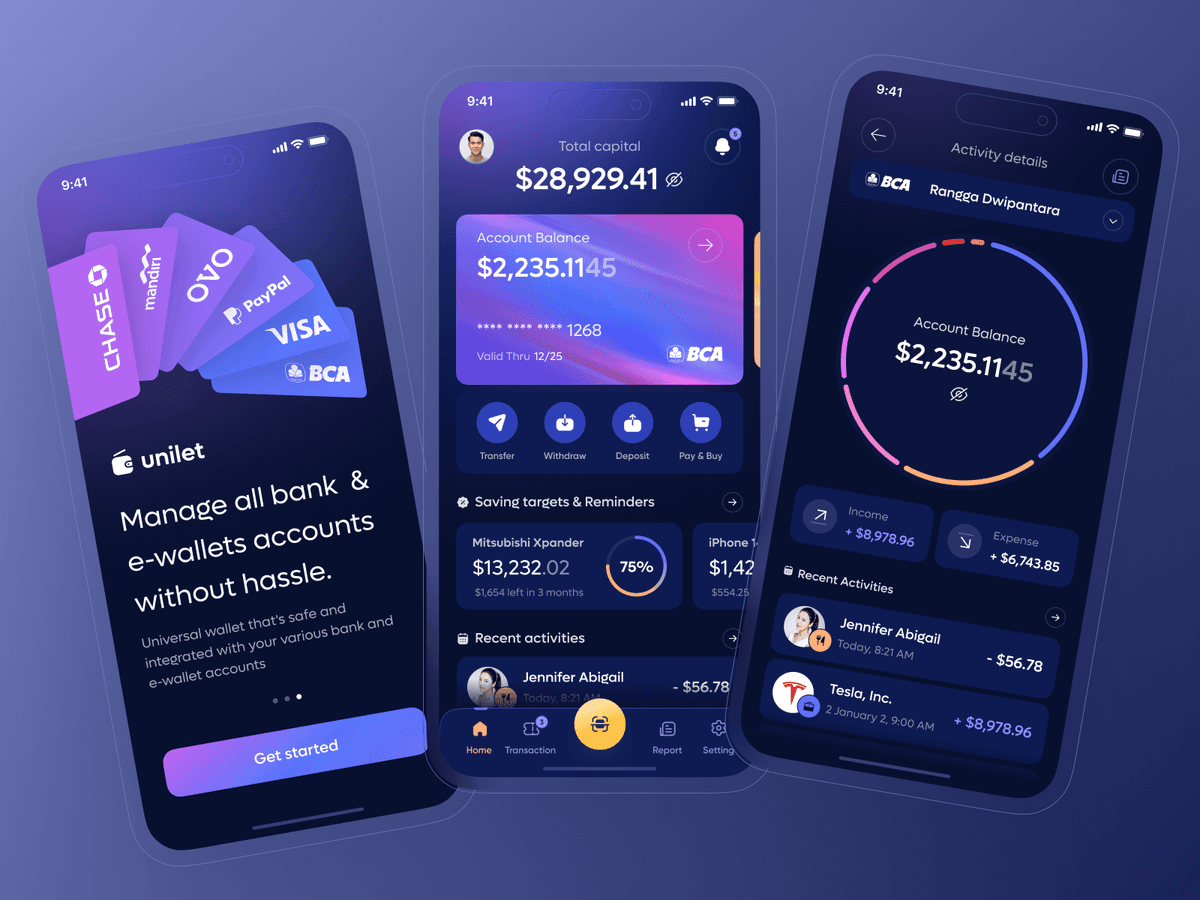
Universal Digital Wallet for various Banks and eWallets
{"type":"doc","content":[{"type":"paragraph","attrs":{"textAlign":null},"content":[{"type":"text","text":"One app to rule them all — Unilet unifies your bank accounts and e-wallets into a single dark, elegant dashboard so you never juggle apps again."}]},{"type":"image","attrs":{"src":"https://cdn.dribbble.com/userupload/4394995/file/original-76bb747005b619a94a3e30f5b7d20a11.png","alt":null,"title":null,"width":null,"height":null}},{"type":"paragraph","attrs":{"textAlign":null},"content":[{"type":"text","marks":[{"type":"bold"}],"text":"UI/UX Design — Universal Digital Wallet (Unilet)"}]},{"type":"paragraph","attrs":{"textAlign":null},"content":[{"type":"text","marks":[{"type":"italic"}],"text":"Mobile App · Fintech · Digital Wallet · Multi-Bank"}]},{"type":"paragraph","attrs":{"textAlign":null},"content":[{"type":"text","text":"Unilet is a universal wallet app that aggregates multiple bank and e-wallet accounts — Chase, Mandiri, OVO, PayPal, Visa, BCA — into one unified interface. The onboarding screen opens with a stacked card visual showing all supported providers and a clear value proposition: \"Manage all bank & e-wallets accounts without hassle.\" A purple gradient \"Get started\" CTA closes the pitch cleanly."}]},{"type":"paragraph","attrs":{"textAlign":null},"content":[{"type":"text","text":"The home dashboard surfaces total capital ($28,929.41) at the top, with the active BCA card below — masked card number, expiry, and a gradient purple-to-orange card design. Four quick actions (Transfer, Withdraw, Deposit, Pay & Buy) keep core operations one tap away. A Saving Targets & Reminders section tracks goal progress (Mitsubishi Xpander at 75%, iPhone in progress), while Recent Activities logs the latest transactions."}]},{"type":"paragraph","attrs":{"textAlign":null},"content":[{"type":"text","text":"The Activity Details screen drills into a single account (BCA — Rangga Dwipantara) with a bold circular balance gauge, income vs. expense breakdown (+$8,978.96 / +$6,743.85), and a timestamped transaction feed. The deep navy and violet palette with gradient accents gives the app a premium, trustworthy fintech feel without sacrificing visual energy."}]}]}
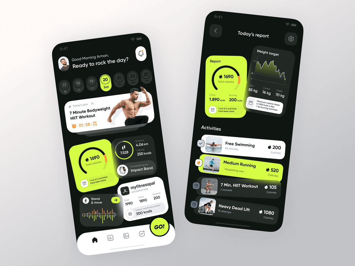
Impactfit Fitness App
{"type":"doc","content":[{"type":"paragraph","attrs":{"textAlign":null},"content":[{"type":"text","text":"A high-energy fitness app that keeps you locked in — daily workout plans, real-time calorie tracking, and progress reports wrapped in a dark, electric UI."}]},{"type":"image","attrs":{"src":"https://cdn.dribbble.com/userupload/4029144/file/original-4218bf4ee17eb0d1e2b2ed9041ff85c3.png","alt":null,"title":null,"width":null,"height":null}},{"type":"paragraph","attrs":{"textAlign":null},"content":[{"type":"text","marks":[{"type":"bold"}],"text":"UI/UX Design — Impactfit Fitness"}]},{"type":"paragraph","attrs":{"textAlign":null},"content":[{"type":"text","marks":[{"type":"italic"}],"text":"Mobile App · Fitness & Health · Workout Tracker"}]},{"type":"paragraph","attrs":{"textAlign":null},"content":[{"type":"text","text":"Impactfit opens with a motivating personal greeting — \"Good Morning Arman, Ready to rock the day?\" — anchored by a date strip and today's workout plan front and center: a 7 Minute Bodyweight HIIT Workout with a live countdown timer. A bold circular calorie gauge (1,690 total calories) dominates the dashboard alongside step count (7,528), distance (4.06 km), and a connected Impact Band wearable indicator. MyFitnessPal integration surfaces food and exercise calories side by side, giving users a full energy balance at a glance."}]},{"type":"paragraph","attrs":{"textAlign":null},"content":[{"type":"text","text":"The Today's Report screen breaks down activity completions across Free Swimming, Medium Running, 7 Min. HIIT Workout, and Heavy Dead Lift — each with duration, calorie burn, and a completion status indicator. A weight target tracker plots the journey from 85 kg start to 70 kg goal, with current progress (76 kg) charted on a compact line graph."}]},{"type":"paragraph","attrs":{"textAlign":null},"content":[{"type":"text","text":"The near-black background punched with acid lime green creates an aggressive, sport-forward visual identity — energetic without being loud, data-rich without feeling cluttered."}]}]}

Dashboard Sidebar Navigation - Taurus
{"type":"doc","content":[{"type":"image","attrs":{"src":"https://cdn.dribbble.com/userupload/9838450/file/original-fa437e041731bdc0d2247159a6061df4.png?resize=2048x1536&vertical=center","alt":null,"title":null,"width":null,"height":null}},{"type":"paragraph","attrs":{"textAlign":null},"content":[{"type":"text","text":"Hey Friends 👋"}]},{"type":"paragraph","attrs":{"textAlign":null},"content":[{"type":"text","text":"Today I'll share the results of my design of the Sidebar Navigation for Dashboard."}]},{"type":"paragraph","attrs":{"textAlign":null},"content":[{"type":"text","text":"Press the heart icon if you like it. Cheers! ✨"},{"type":"hardBreak"},{"type":"hardBreak"}]},{"type":"image","attrs":{"src":"https://cdn.dribbble.com/userupload/9838451/file/original-fe385981552c17f0efbf2bd186dc6fb9.png?resize=2048x1536&vertical=center","alt":null,"title":null,"width":null,"height":null}},{"type":"image","attrs":{"src":"https://cdn.dribbble.com/userupload/9838454/file/original-b5c3b026a79004ed22eb4f1d67a5ca7f.png?resize=2048x1536&vertical=center","alt":null,"title":null,"width":null,"height":null}},{"type":"image","attrs":{"src":"https://cdn.dribbble.com/userupload/9838453/file/original-f4e88b34c3acad919fedfa10d8f6419c.png?resize=2048x1536&vertical=center","alt":null,"title":null,"width":null,"height":null}},{"type":"image","attrs":{"src":"https://cdn.dribbble.com/userupload/9838455/file/original-ebc716344d5a2422eb4a98e83aaac1fc.png?resize=2048x1536&vertical=center","alt":null,"title":null,"width":null,"height":null}},{"type":"image","attrs":{"src":"https://cdn.dribbble.com/userupload/9838452/file/original-fc9df1351044eebc3a783a793d070359.png?resize=2048x1536&vertical=center","alt":null,"title":null,"width":null,"height":null}},{"type":"paragraph","attrs":{"textAlign":null},"content":[{"type":"text","text":"What do you think guys? Let me know in the comments section!"}]},{"type":"paragraph","attrs":{"textAlign":null},"content":[{"type":"text","text":"Hope you enjoy it guys. Click “❤️Like” if you like it."}]},{"type":"paragraph","attrs":{"textAlign":null},"content":[{"type":"text","marks":[{"type":"bold"}],"text":"Need the design services?"},{"type":"text","text":" Please just focus on building your product, don't bother yourself with crafting branding, marketing design, or even the website."}]},{"type":"image","attrs":{"src":"https://cdn.dribbble.com/userupload/9839013/file/original-9aad0b372bbc363a1af8fb80ae3c5a90.png?resize=1504x1128&vertical=center","alt":null,"title":null,"width":null,"height":null}},{"type":"paragraph","attrs":{"textAlign":null},"content":[{"type":"text","marks":[{"type":"bold"}],"text":"Have a great project idea?"},{"type":"text","text":" Let us know ✅"}]},{"type":"paragraph","attrs":{"textAlign":null}},{"type":"paragraph","attrs":{"textAlign":null},"content":[{"type":"text","text":"Services we provide:"}]},{"type":"paragraph","attrs":{"textAlign":null},"content":[{"type":"text","text":"🖼️ UI Design | 😄 UX Design | 🎉 Illustration | 🛍 Brand Identity | 📝 Graphic Design | 🌐 Web Development | 📱 Mobile App Development"}]},{"type":"paragraph","attrs":{"textAlign":null}},{"type":"paragraph","attrs":{"textAlign":null},"content":[{"type":"text","text":"Thanks!"}]}]}

Dashboard WebApp Design - Taurus
{"type":"doc","content":[{"type":"image","attrs":{"src":"https://cdn.dribbble.com/userupload/10029229/file/original-38d08e65a93bee5cf670d621acfcb290.png?resize=2048x1536&vertical=center","alt":null,"title":null,"width":null,"height":null}},{"type":"paragraph","attrs":{"textAlign":null},"content":[{"type":"text","text":"Hey Friends 👋"}]},{"type":"paragraph","attrs":{"textAlign":null},"content":[{"type":"text","text":"Today I'll share the results of my design of the Dashboard Web App Design."}]},{"type":"paragraph","attrs":{"textAlign":null},"content":[{"type":"text","text":"Taurus WebApp Dashboard offers layout options for building next-generation web applications that follow the latest trends in web design and user experience."}]},{"type":"paragraph","attrs":{"textAlign":null},"content":[{"type":"text","text":"Press the heart icon if you like it. Cheers! ✨"},{"type":"hardBreak"},{"type":"hardBreak"}]},{"type":"image","attrs":{"src":"https://cdn.dribbble.com/userupload/10029231/file/original-d4c3a372c8318067e7f4a5a5d9818363.png?resize=2048x1536&vertical=center","alt":null,"title":null,"width":null,"height":null}},{"type":"image","attrs":{"src":"https://cdn.dribbble.com/userupload/10029230/file/original-43ffca543434969cbcfe5b7192782914.png?resize=2048x1536&vertical=center","alt":null,"title":null,"width":null,"height":null}},{"type":"paragraph","attrs":{"textAlign":null},"content":[{"type":"hardBreak"},{"type":"hardBreak"},{"type":"text","marks":[{"type":"bold"}],"text":"Have a great project idea?"},{"type":"text","text":" Let us know ✅"}]},{"type":"paragraph","attrs":{"textAlign":null}},{"type":"paragraph","attrs":{"textAlign":null},"content":[{"type":"text","text":"Services we provide:"}]},{"type":"paragraph","attrs":{"textAlign":null},"content":[{"type":"text","text":"🖼️ UI Design | 😄 UX Design | 🎉 Illustration | 🛍 Brand Identity | 📝 Graphic Design | 🌐 Web Development | 📱 Mobile App Development"}]},{"type":"paragraph","attrs":{"textAlign":null}},{"type":"paragraph","attrs":{"textAlign":null},"content":[{"type":"text","text":"Thanks!"}]}]}
Yin Da Branding
{"type":"doc","content":[{"type":"paragraph","attrs":{"textAlign":null},"content":[{"type":"text","text":"Gold on charcoal, craft in every curve — Yin Da Indah Property's brand identity speaks the language of luxury real estate before a single word is read."}]},{"type":"image","attrs":{"src":"https://farooq-agent.web.app/assets/images/works/large/a2mcSgYa_work_image.jpg","alt":null,"title":null,"width":1140,"height":1140}},{"type":"paragraph","attrs":{"textAlign":null},"content":[{"type":"text","marks":[{"type":"bold"}],"text":"Logo Design — Yin Da Indah Property"},{"type":"hardBreak"},{"type":"text","marks":[{"type":"italic"}],"text":"Brand Identity · Real Estate · Luxury Segment"}]},{"type":"paragraph","attrs":{"textAlign":null},"content":[{"type":"hardBreak"},{"type":"text","text":"A refined brand identity crafted for Yin Da Indah Property, presented here as a dark-surface mockup that immediately communicates premium positioning. The mark is rendered in gold against a deep charcoal black card — a deliberate pairing that signals luxury, trust, and architectural distinction."}]},{"type":"paragraph","attrs":{"textAlign":null},"content":[{"type":"text","text":"The icon is a geometric mandala-inspired emblem built from interlocking petal-like forms, creating a symmetrical, floriated knot structure. The layered linework gives the mark a sense of depth and craftsmanship — evoking both the ornate detail of fine architecture and the cultural richness of Indonesian heritage. The rotational symmetry suggests balance and permanence, qualities deeply resonant in property and real estate."}]},{"type":"paragraph","attrs":{"textAlign":null},"content":[{"type":"text","text":"The wordmark \"Yin Da\" is set in a clean, modern serif with generous letter-spacing, exuding confidence without ostentation. The tagline \"Indah Property\" sits below in a lighter weight, providing context with quiet elegance."}]},{"type":"paragraph","attrs":{"textAlign":null},"content":[{"type":"text","text":"The mockup presentation on a textured dark card surface is a strong portfolio choice — demonstrating not just the mark itself, but an understanding of how brand identity performs in real-world, tactile contexts."}]},{"type":"paragraph","attrs":{"textAlign":null},"content":[{"type":"text","text":"A mature, market-ready logo that positions the brand firmly in the premium real estate space."}]}]}

Vaksini - Website
{"type":"doc","content":[{"type":"paragraph","attrs":{"textAlign":null},"content":[{"type":"text","text":"Vaksini, a mobile application design concept to help the Covid-19 vaccination process in Indonesia easier, more reliable, and integrated."}]},{"type":"image","attrs":{"src":"https://cdn.dribbble.com/users/8414462/screenshots/16384402/media/c6780abbdc2f8767015da1ee17462fcb.jpg?compress=1&resize=1200x900&vertical=top","alt":null,"title":null,"width":null,"height":null}},{"type":"image","attrs":{"src":"https://cdn.dribbble.com/userupload/33191028/file/original-fac78f831d2da61e979b67753e3262d9.jpg?resize=2048x1536&vertical=center","alt":null,"title":null,"width":null,"height":null}},{"type":"paragraph","attrs":{"textAlign":null},"content":[{"type":"text","marks":[{"type":"bold"}],"text":"UI/UX Design — Vaksini"}]},{"type":"paragraph","attrs":{"textAlign":null},"content":[{"type":"text","marks":[{"type":"italic"}],"text":"Web Platform · Vaccination · Health · Indonesia"}]},{"type":"paragraph","attrs":{"textAlign":null},"content":[{"type":"text","text":"Vaksini is an integrated vaccination information and registration platform designed to simplify Indonesia's public vaccination process end-to-end. The landing page opens with confident directness — \"Vaksinasi dimana? ya di sini! vaksini\" — alongside a healthcare worker in full PPE, immediately establishing medical authority and urgency. A four-step access flow below (Pelajari Vaksinnya → Temukan Lokasinya → Daftarkan Diri → Vaksinasi) maps the complete user journey in a single scannable row, removing ambiguity for first-time visitors."}]},{"type":"paragraph","attrs":{"textAlign":null},"content":[{"type":"text","text":"A vaccine comparison section surfaces AstraZeneca and Pfizer-BionTech side by side — type, doses, and efficacy (70%) — giving users the information they need to make an informed choice before registering. The mobile app preview highlights real-time vaccine location mapping and queue management."}]},{"type":"paragraph","attrs":{"textAlign":null},"content":[{"type":"text","text":"The Layanan page drills into operational detail: an interactive map (shown over Jakarta) pinpoints active vaccination sites with location cards showing venue name, address, available vaccine brand, quota (1,000 doses), and appointment date. A registration form collects NIK (national ID), address, and KTP photo upload — streamlining the administrative process that typically requires a physical queue. Post-vaccination guidelines are clearly presented alongside each location card, closing the care loop from registration to recovery."}]}]}

Vaksini - Mobile App
{"type":"doc","content":[{"type":"paragraph","attrs":{"textAlign":null},"content":[{"type":"text","text":"Vaksini, a mobile application design concept to help the Covid-19 vaccination process in Indonesia easier, more reliable, and integrated."}]},{"type":"image","attrs":{"src":"https://cdn.dribbble.com/userupload/33093412/file/original-69fbc7565e06e0485b0f97bcc5cdd90d.jpg?resize=2048x1536&vertical=center","alt":null,"title":null,"width":null,"height":null}},{"type":"image","attrs":{"src":"https://cdn.dribbble.com/userupload/33093425/file/original-dc9cbf20e618249ae25b527969b61976.jpg?resize=2048x1536&vertical=center","alt":null,"title":null,"width":null,"height":null}},{"type":"image","attrs":{"src":"https://cdn.dribbble.com/userupload/33171274/file/original-78f1a5cdc98ccbfaf9c7344e169f4f9e.jpg?resize=2048x1536&vertical=center","alt":null,"title":null,"width":null,"height":null}},{"type":"image","attrs":{"src":"https://cdn.dribbble.com/userupload/33172519/file/original-31ec2c401b2d09c687dfc52f7e30bed2.jpg?resize=2048x1536&vertical=center","alt":null,"title":null,"width":null,"height":null}},{"type":"image","attrs":{"src":"https://cdn.dribbble.com/userupload/33172946/file/original-65d43419d27d760eea56cf434ccef55b.jpg?resize=2048x1536&vertical=center","alt":null,"title":null,"width":null,"height":null}},{"type":"image","attrs":{"src":"https://cdn.dribbble.com/userupload/33190605/file/original-304ecadd1d1f94ef730818b749d0b894.jpg?resize=2048x1536&vertical=center","alt":null,"title":null,"width":null,"height":null}},{"type":"image","attrs":{"src":"https://cdn.dribbble.com/userupload/33190549/file/original-35b6b037d5d913a4ecffd2171b9bcf69.jpg?resize=2048x1536&vertical=center","alt":null,"title":null,"width":null,"height":null}},{"type":"image","attrs":{"src":"https://cdn.dribbble.com/userupload/33190600/file/original-36fa115421e5e880cefa7f0b00dcf57f.jpg?resize=2048x1536&vertical=center","alt":null,"title":null,"width":null,"height":null}},{"type":"image","attrs":{"src":"https://cdn.dribbble.com/userupload/33190594/file/original-186cf14316d80c743f3b9178bcb70677.jpg?resize=2048x1536&vertical=center","alt":null,"title":null,"width":null,"height":null}},{"type":"image","attrs":{"src":"https://cdn.dribbble.com/userupload/33190670/file/original-1f31bb259bbdbc2171bb0b35c21051e3.jpg?resize=2048x1536&vertical=center","alt":null,"title":null,"width":null,"height":null}},{"type":"image","attrs":{"src":"https://cdn.dribbble.com/userupload/33190789/file/original-fd0758da6734c619012b82060db1d88d.jpg?resize=2048x1536&vertical=center","alt":null,"title":null,"width":null,"height":null}},{"type":"image","attrs":{"src":"https://cdn.dribbble.com/userupload/33190865/file/original-f7135a895481fb9065e7fb6caeef8abb.jpg?resize=2048x1536&vertical=center","alt":null,"title":null,"width":null,"height":null}},{"type":"image","attrs":{"src":"https://cdn.dribbble.com/userupload/33191000/file/original-3ae69d19eac80dccf2c1b51555969df3.jpg?resize=2048x1536&vertical=center","alt":null,"title":null,"width":null,"height":null}},{"type":"image","attrs":{"src":"https://cdn.dribbble.com/userupload/33191026/file/original-73d6cee6e9094c8eb6d58f17a8f04e75.jpg?resize=2048x1536&vertical=center","alt":null,"title":null,"width":null,"height":null}},{"type":"image","attrs":{"src":"https://cdn.dribbble.com/userupload/33190989/file/original-4f46b09433c9ce76114a40d4d6f6dcf4.jpg?resize=2048x1536&vertical=center","alt":null,"title":null,"width":null,"height":null}},{"type":"image","attrs":{"src":"https://cdn.dribbble.com/userupload/33191042/file/original-c5dd546c0a1f98252db46c66bc23c6de.jpg?resize=2048x1536&vertical=center","alt":null,"title":null,"width":null,"height":null}},{"type":"horizontalRule"},{"type":"paragraph","attrs":{"textAlign":null},"content":[{"type":"text","marks":[{"type":"bold"}],"text":"Have a great project idea?"},{"type":"text","text":" Let us know ✅"}]},{"type":"paragraph","attrs":{"textAlign":null},"content":[{"type":"text","text":"Services we provide:"},{"type":"hardBreak"},{"type":"text","text":"🖼️ UI Design | 😄 UX Design | 🎉 Illustration | 🛍 Brand Identity | 📝 Graphic Design | 🌐 Web Development | 📱 Mobile App Development"}]},{"type":"paragraph","attrs":{"textAlign":null},"content":[{"type":"text","text":"Thanks!"}]}]}
Vaksini Logo Design
{"type":"doc","content":[{"type":"paragraph","attrs":{"textAlign":null},"content":[{"type":"text","text":"VAKsin + SINI"}]},{"type":"paragraph","attrs":{"textAlign":null},"content":[{"type":"text","text":"Vaksini, a mobile application design concept to help the Covid-19 vaccination process in Indonesia easier, more reliable, and integrated."}]},{"type":"image","attrs":{"src":"https://cdn.dribbble.com/users/8414462/screenshots/16294202/media/702fd2eb7950c5a03f2122ff5ae8dd85.jpg","alt":null,"title":null,"width":null,"height":null}},{"type":"horizontalRule"},{"type":"image","attrs":{"src":"https://cdn.dribbble.com/userupload/33031590/file/original-b9a29b10dc8892e2852981d48c42fffa.jpg?resize=2048x1536&vertical=center","alt":null,"title":null,"width":null,"height":null}},{"type":"image","attrs":{"src":"https://cdn.dribbble.com/userupload/33054079/file/original-d9393b338b8fee61d0632a6ea4dcf876.jpg?resize=2048x1536&vertical=center","alt":null,"title":null,"width":null,"height":null}},{"type":"image","attrs":{"src":"https://cdn.dribbble.com/userupload/33063338/file/original-1798375adc2ca7cbebe06a8f16c7405e.jpg?resize=2048x1536&vertical=center","alt":null,"title":null,"width":null,"height":null}},{"type":"image","attrs":{"src":"https://cdn.dribbble.com/userupload/33079583/file/original-102c7af85665457ebf8425f2bb72b587.jpg?resize=2048x1536&vertical=center","alt":null,"title":null,"width":null,"height":null}},{"type":"image","attrs":{"src":"https://cdn.dribbble.com/userupload/33079580/file/original-5a353cbc1ff08fe601342528c9906241.jpg?resize=752x&vertical=center","alt":null,"title":null,"width":null,"height":null}},{"type":"horizontalRule"},{"type":"paragraph","attrs":{"textAlign":null},"content":[{"type":"text","marks":[{"type":"bold"}],"text":"Have a great project idea?"},{"type":"text","text":" Let us know ✅"}]},{"type":"paragraph","attrs":{"textAlign":null},"content":[{"type":"text","text":"Services we provide:"},{"type":"hardBreak"},{"type":"text","text":"🖼️ UI Design | 😄 UX Design | 🎉 Illustration | 🛍 Brand Identity | 📝 Graphic Design | 🌐 Web Development | 📱 Mobile App Development"}]},{"type":"paragraph","attrs":{"textAlign":null},"content":[{"type":"text","text":"Thanks!"}]}]}
Nomadstay Logo Design
{"type":"doc","content":[{"type":"paragraph","attrs":{"textAlign":null},"content":[{"type":"text","text":"A logo that says \"home\" and \"journey\" in the same breath — the Nomadstay mark is a house, a letter, and a traveler's path, all in one continuous line."}]},{"type":"image","attrs":{"src":"https://cdn.dribbble.com/users/8414462/screenshots/17216266/media/b1c288ff145b3b714f18f5ff71881381.png","alt":null,"title":null,"width":null,"height":null}},{"type":"paragraph","attrs":{"textAlign":null},"content":[{"type":"text","marks":[{"type":"bold"}],"text":"Logo Design — Nomadstay"}]},{"type":"paragraph","attrs":{"textAlign":null},"content":[{"type":"text","marks":[{"type":"italic"}],"text":"Brand Identity · Logo · Properties & Travel App"}]},{"type":"paragraph","attrs":{"textAlign":null},"content":[{"type":"text","text":"The Nomadstay logo is built around a single continuous line — a clever dual-reading mark that simultaneously reads as a house rooftop and the letter \"N.\" The two legs of the form curve inward at the base with rounded terminals, giving the mark a fluid, organic quality that feels modern without being cold. It communicates both the stability of a home and the movement of a nomadic lifestyle — the exact tension the brand lives in."}]},{"type":"paragraph","attrs":{"textAlign":null},"content":[{"type":"text","text":"The clean sans-serif lowercase wordmark \"nomadstay\" sits directly below, balancing the mark's geometric precision with approachable softness. Presented on a deep slate-blue gradient background, the white-on-dark treatment gives the logo an aspirational, premium quality — confident enough for a travel and property platform that wants to be taken seriously without sacrificing warmth. A minimal, elegant brand mark that scales from app icon to billboard without losing its identity."}]},{"type":"horizontalRule"},{"type":"image","attrs":{"src":"https://cdn.dribbble.com/userupload/2582564/file/original-2711e9af05d94fd1e58004a68c330a67.png?resize=752x&vertical=center","alt":null,"title":null,"width":null,"height":null}},{"type":"image","attrs":{"src":"https://cdn.dribbble.com/userupload/2585241/file/original-4307a93ccc64df2b2f4c4bd4d8cdde72.png?resize=752x&vertical=center","alt":null,"title":null,"width":null,"height":null}},{"type":"image","attrs":{"src":"https://cdn.dribbble.com/userupload/2585242/file/original-82c93404996e77040524e0f6d7b14e4a.png?resize=752x&vertical=center","alt":null,"title":null,"width":null,"height":null}},{"type":"image","attrs":{"src":"https://cdn.dribbble.com/userupload/2585240/file/original-b629f1bcb9b4b4875a9872e121dad3fe.png?resize=752x&vertical=center","alt":null,"title":null,"width":null,"height":null}},{"type":"image","attrs":{"src":"https://cdn.dribbble.com/userupload/2585244/file/original-d5b543c38599afb9e2ec5935f7509ec3.png?resize=752x&vertical=center","alt":null,"title":null,"width":null,"height":null}},{"type":"image","attrs":{"src":"https://cdn.dribbble.com/userupload/2585239/file/original-62f05ba6b076175ec82c593cff3af3af.png?resize=752x&vertical=center","alt":null,"title":null,"width":null,"height":null}},{"type":"image","attrs":{"src":"https://cdn.dribbble.com/userupload/2585243/file/original-e5090210e045eb7d9642d5380080cd07.png?resize=752x&vertical=center","alt":null,"title":null,"width":null,"height":null}},{"type":"horizontalRule"},{"type":"heading","attrs":{"textAlign":"center","level":3},"content":[{"type":"text","marks":[{"type":"bold"}],"text":"AVAILABLE FOR NEW PROJECT"}]},{"type":"paragraph","attrs":{"textAlign":"center"},"content":[{"type":"text","text":"🖼️ UI Design | 😄 UX Design | 🎉 Illustration | 🛍 Brand Identity | 📝 Graphic Design | 🌐 Web Development | 📱 Mobile App Development"}]}]}
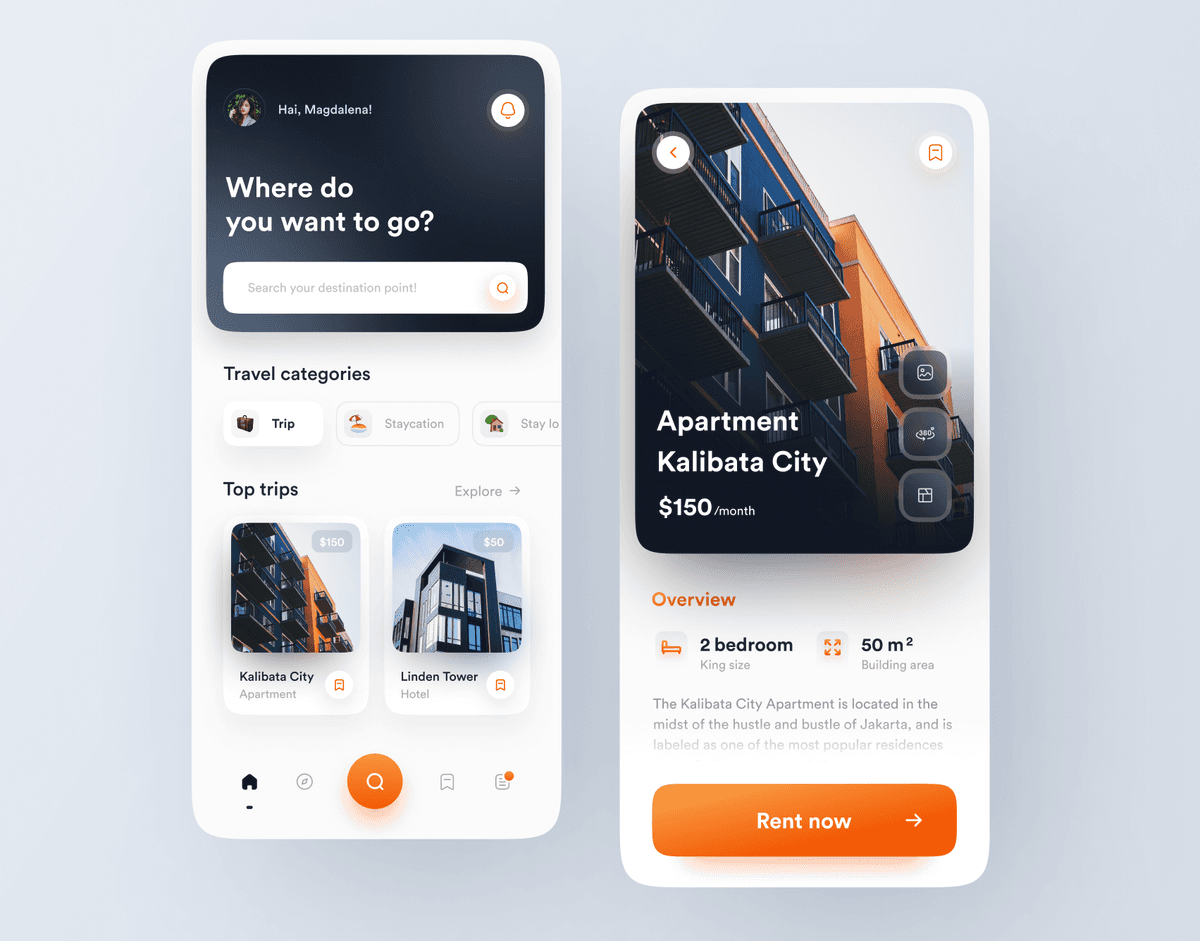
Nomadstay
{"type":"doc","content":[{"type":"paragraph","attrs":{"textAlign":null},"content":[{"type":"text","text":"Nomadstay is a brand of Properties and Travel App, which aims to help travelers or newcomers to easily find a place to stay, whether for a temporary stay or a long stay."}]},{"type":"image","attrs":{"src":"https://cdn.dribbble.com/userupload/2582828/file/original-0f841afee9aae886bf5727f7f9fc2cb2.png","alt":null,"title":null,"width":null,"height":null}},{"type":"horizontalRule"},{"type":"heading","attrs":{"textAlign":"center","level":1},"content":[{"type":"text","marks":[{"type":"bold"}],"text":"USER EXPERIENCE"}]},{"type":"heading","attrs":{"textAlign":null,"level":3},"content":[{"type":"text","marks":[{"type":"bold"}],"text":"Background"}]},{"type":"paragraph","attrs":{"textAlign":null},"content":[{"type":"text","text":"Everyone needs a job. The job sometimes require people to move from one city to another, even across countries. The question that often arises is how do we adapt to the many factors in a new place. Living costs, housing, culture, transpotation, etc. It takes a lot of time and effort to do research as to what kind of place we are going and how to plan for the future life in a new place. In fact, sometimes people are reckless and take risks until they finally feel uncomfortable in new place."}]},{"type":"heading","attrs":{"textAlign":null,"level":3},"content":[{"type":"text","marks":[{"type":"bold"}],"text":"Brief"}]},{"type":"paragraph","attrs":{"textAlign":null},"content":[{"type":"text","text":"We need an app that can show people places to live that can be rented or purchased. Then the user can find out all the details about the place that will be their residence such as living cost, housing, surrounding facilities, culture, transportation, etc."}]},{"type":"heading","attrs":{"textAlign":null,"level":3},"content":[{"type":"text","marks":[{"type":"bold"}],"text":"User stories"}]},{"type":"image","attrs":{"src":"https://cdn.dribbble.com/userupload/2591146/file/original-f07ff54c7f380f889f06b9674ace6cb4.png?resize=1504x1128&vertical=center","alt":null,"title":null,"width":null,"height":null}},{"type":"paragraph","attrs":{"textAlign":null},"content":[{"type":"text","marks":[{"type":"bold"}],"text":"Case 1"}]},{"type":"paragraph","attrs":{"textAlign":null},"content":[{"type":"text","text":"Adi (27 years old) is an employee in an office in Surabaya, and needs to meet some clients in Jakarta for a presentation. The official trip will take about 2 days in Jakarta."},{"type":"hardBreak"}]},{"type":"paragraph","attrs":{"textAlign":null},"content":[{"type":"text","marks":[{"type":"bold"}],"text":"Case 2"}]},{"type":"paragraph","attrs":{"textAlign":null},"content":[{"type":"text","text":"Magdalena (25 years old) is an employee at a large startup in Jakarta, and WFH. Wanting to experience a new atmosphere, Magda wanted to stay in Bali for 4 weeks for work as well as vacation."},{"type":"hardBreak"}]},{"type":"paragraph","attrs":{"textAlign":null},"content":[{"type":"text","marks":[{"type":"bold"}],"text":"Case 3"}]},{"type":"paragraph","attrs":{"textAlign":null},"content":[{"type":"text","text":"Marvel (23 years old) is a fresh graduate in Malang who was accepted as a contract employee for 6 months at a company in California, USA. After the visa & other matters are completed, Marvel has to move to San Jose, California, USA in 3 months."}]},{"type":"heading","attrs":{"textAlign":null,"level":2},"content":[{"type":"text","marks":[{"type":"bold"}],"text":"Hook Model"}]},{"type":"image","attrs":{"src":"https://cdn.dribbble.com/userupload/2591145/file/original-92709f3b7c9feac4aa2154a2f08a24ee.png?resize=1504x1128&vertical=center","alt":null,"title":null,"width":null,"height":null}},{"type":"heading","attrs":{"textAlign":null,"level":2},"content":[{"type":"text","marks":[{"type":"bold"}],"text":"How Might We"}]},{"type":"image","attrs":{"src":"https://cdn.dribbble.com/userupload/2591144/file/original-5debdbd47c8864b330f643a9abf5d94a.png?resize=1504x1128&vertical=center","alt":null,"title":null,"width":null,"height":null}},{"type":"heading","attrs":{"textAlign":null,"level":2},"content":[{"type":"text","marks":[{"type":"bold"}],"text":"Flow"}]},{"type":"image","attrs":{"src":"https://cdn.dribbble.com/userupload/2591147/file/original-f74ee4bc78ba25a6735ba5bbcb8eb850.png?resize=1504x1128&vertical=center","alt":null,"title":null,"width":null,"height":null}},{"type":"horizontalRule"},{"type":"heading","attrs":{"textAlign":"center","level":1},"content":[{"type":"text","marks":[{"type":"bold"}],"text":"USER INTERFACE DESIGN"}]},{"type":"image","attrs":{"src":"https://cdn.dribbble.com/userupload/2582829/file/original-63ca51b89aa859d609342ee52e084435.png?resize=1504x1128&vertical=center","alt":null,"title":null,"width":null,"height":null}},{"type":"image","attrs":{"src":"https://cdn.dribbble.com/userupload/2591070/file/original-a8edf3ad5b915bf57c36954391c593c7.png?resize=1504x1128&vertical=center","alt":null,"title":null,"width":null,"height":null}},{"type":"heading","attrs":{"textAlign":null,"level":2},"content":[{"type":"text","marks":[{"type":"bold"}],"text":"Discover, search, filter & find accommodation"}]},{"type":"image","attrs":{"src":"https://cdn.dribbble.com/userupload/2591071/file/original-7ba9094c036130aca01d5d9b523a440f.png?resize=1504x1128&vertical=center","alt":null,"title":null,"width":null,"height":null}},{"type":"heading","attrs":{"textAlign":null,"level":2},"content":[{"type":"text","marks":[{"type":"bold"}],"text":"Search result, details & virtual tour"}]},{"type":"image","attrs":{"src":"https://cdn.dribbble.com/userupload/2591074/file/original-5b72e691bcdc3d0759fed42aa78a93db.png?resize=752x&vertical=center","alt":null,"title":null,"width":null,"height":null}},{"type":"heading","attrs":{"textAlign":null,"level":2},"content":[{"type":"text","marks":[{"type":"bold"}],"text":"Accommodation details"}]},{"type":"image","attrs":{"src":"https://cdn.dribbble.com/userupload/2591068/file/original-a364dce26f00d096fe62c431031aa20b.png?resize=752x&vertical=center","alt":null,"title":null,"width":null,"height":null}},{"type":"heading","attrs":{"textAlign":null,"level":2},"content":[{"type":"text","marks":[{"type":"bold"}],"text":"Accommodation detail UI comparison"}]},{"type":"paragraph","attrs":{"textAlign":null},"content":[{"type":"text","text":"There is a slight difference in content when users have determined their destination or not (just looking at accommodation details)."}]},{"type":"paragraph","attrs":{"textAlign":null},"content":[{"type":"text","text":"If you have determined the destination point, there will be additional information such as how far it is from the accommodation location, even the estimated price of transportation between the two points. Meanwhile, if you have not determined the point, the additional information is not available."}]},{"type":"image","attrs":{"src":"https://cdn.dribbble.com/userupload/2591069/file/original-8ed8a983904cbf2a2e27e76c8f3a2782.png?resize=1504x1128&vertical=center","alt":null,"title":null,"width":null,"height":null}},{"type":"heading","attrs":{"textAlign":null,"level":2},"content":[{"type":"text","marks":[{"type":"bold"}],"text":"Payment"}]},{"type":"image","attrs":{"src":"https://cdn.dribbble.com/userupload/2591073/file/original-8445b55196e5449234c8f9ad221c6787.png?resize=752x&vertical=center","alt":null,"title":null,"width":null,"height":null}},{"type":"horizontalRule"},{"type":"heading","attrs":{"textAlign":"center","level":1},"content":[{"type":"text","marks":[{"type":"bold"}],"text":"CONCLUSION"}]},{"type":"paragraph","attrs":{"textAlign":null},"content":[{"type":"text","text":"With Nomadstay, traveling to a new place, temporarily or for a long time, becomes more calm and pleasant, because it is easy to obtain accommodation information at the destination along with supporting information."}]},{"type":"image","attrs":{"src":"https://cdn.dribbble.com/userupload/2591072/file/original-537c2ec308f24a1c3df8cef9974c3025.png?resize=1504x1128&vertical=center","alt":null,"title":null,"width":null,"height":null}},{"type":"horizontalRule"},{"type":"heading","attrs":{"textAlign":"center","level":3},"content":[{"type":"text","marks":[{"type":"bold"}],"text":"AVAILABLE FOR NEW PROJECT"}]},{"type":"paragraph","attrs":{"textAlign":"center"},"content":[{"type":"text","text":"🖼️ UI Design | 😄 UX Design | 🎉 Illustration | 🛍 Brand Identity | 📝 Graphic Design | 🌐 Web Development | 📱 Mobile App Development"}]}]}
Logo Design - Ma'em Food Delivery Brand
{"type":"doc","content":[{"type":"paragraph","attrs":{"textAlign":null},"content":[{"type":"text","text":"A bold wordmark that tastes as good as it looks — Ma'em's coral-orange display type and diamond accent mark make food delivery feel like a brand worth remembering."}]},{"type":"image","attrs":{"src":"https://cdn.dribbble.com/userupload/3223593/file/original-8c70ce82e7e2fc4330a0fae3cc629344.png","alt":null,"title":null,"width":null,"height":null}},{"type":"paragraph","attrs":{"textAlign":"left"},"content":[{"type":"text","text":"🍔 Hello Food Lovers,"}]},{"type":"paragraph","attrs":{"textAlign":null},"content":[{"type":"text","text":"This is my exploration about \"Logo Design\" of Ma’em - Food Delivery Service Mobile App."}]},{"type":"image","attrs":{"src":"https://cdn.dribbble.com/userupload/3223594/file/original-5f9408930bcdbeb712e3680e034c2d7b.png?resize=1504x1128&vertical=center","alt":null,"title":null,"width":null,"height":null}},{"type":"image","attrs":{"src":"https://cdn.dribbble.com/userupload/3223595/file/original-6dd4f17e8c03267e7766faa02d0fb922.png?resize=1504x1128&vertical=center","alt":null,"title":null,"width":null,"height":null}},{"type":"image","attrs":{"src":"https://cdn.dribbble.com/userupload/3223598/file/original-922b7b8a6f4e84859f107134b44eb819.png?resize=752x&vertical=center","alt":null,"title":null,"width":null,"height":null}},{"type":"image","attrs":{"src":"https://cdn.dribbble.com/userupload/3223596/file/original-d55ea6a7d5ae06e85e921497b7b4e5bb.png?resize=752x&vertical=center","alt":null,"title":null,"width":null,"height":null}},{"type":"image","attrs":{"src":"https://cdn.dribbble.com/userupload/3223599/file/original-3c561b66a3d525c78b8c1816600ccb9a.png?resize=752x&vertical=center","alt":null,"title":null,"width":null,"height":null}},{"type":"image","attrs":{"src":"https://cdn.dribbble.com/userupload/3223597/file/original-5c89b75d6cae323d0c704f1255fd9ed4.png?resize=752x&vertical=center","alt":null,"title":null,"width":null,"height":null}},{"type":"horizontalRule"},{"type":"paragraph","attrs":{"textAlign":"left"},"content":[{"type":"text","marks":[{"type":"bold"}],"text":"Have a great project idea?"},{"type":"text","text":" Let us know ✅"}]},{"type":"paragraph","attrs":{"textAlign":null},"content":[{"type":"text","text":"Services we provide:"},{"type":"hardBreak"},{"type":"text","text":"🖼️ UI Design | 😄 UX Design | 🎉 Illustration | 🛍 Brand Identity | 📝 Graphic Design | 🌐 Web Development | 📱 Mobile App Development"}]},{"type":"paragraph","attrs":{"textAlign":null},"content":[{"type":"text","text":"Thanks!"}]}]}
Ma’em - Food Delivery App
{"type":"doc","content":[{"type":"paragraph","attrs":{"textAlign":null},"content":[{"type":"text","text":"A food delivery app that answers the hungry scroll with speed and clarity — find a meal, place an order, and get it delivered before the craving fades."}]},{"type":"image","attrs":{"src":"https://cdn.dribbble.com/userupload/3223425/file/original-e4ec2c93d78160d853ff4f41d0bb60c2.png","alt":null,"title":null,"width":null,"height":null}},{"type":"horizontalRule"},{"type":"paragraph","attrs":{"textAlign":null},"content":[{"type":"text","text":"One sunny morning, it happened again..."}]},{"type":"paragraph","attrs":{"textAlign":null},"content":[{"type":"text","text":"Yongki, a student who lives in the boarding house, just woke up and was shocked when he saw that it was already 10 am."}]},{"type":"image","attrs":{"src":"https://cdn.dribbble.com/userupload/3223458/file/original-ee7638400f7c3df958dcf63ce5a191e5.png?resize=1504x1128&vertical=center","alt":null,"title":null,"width":null,"height":null}},{"type":"paragraph","attrs":{"textAlign":null},"content":[{"type":"text","text":"Woke up at that hour, Yongki felt hungry, Yongki thought "},{"type":"text","marks":[{"type":"italic"}],"text":"“What should I eat? The breakfast restaurants have run out and are closed, while the lunch restaurants haven't opened yet.\""}]},{"type":"paragraph","attrs":{"textAlign":null},"content":[{"type":"text","marks":[{"type":"bold"},{"type":"italic"}],"text":"OK, let's stop here!"},{"type":"text","text":" What can we do to help Yongki not starve? "},{"type":"text","marks":[{"type":"italic"}],"text":"Let's go!"}]},{"type":"heading","attrs":{"textAlign":null,"level":2},"content":[{"type":"text","marks":[{"type":"bold"}],"text":"Problems"}]},{"type":"bulletList","content":[{"type":"listItem","content":[{"type":"paragraph","attrs":{"textAlign":null},"content":[{"type":"text","text":"Yongki is a boarding house boy, who doesn't have any cooking utensils and ingredients to cook"}]}]}]},{"type":"bulletList","content":[{"type":"listItem","content":[{"type":"paragraph","attrs":{"textAlign":null},"content":[{"type":"text","text":"Yongki wakes up at the wrong time, not breakfast time nor lunch time"}]}]}]},{"type":"heading","attrs":{"textAlign":null,"level":2},"content":[{"type":"text","marks":[{"type":"bold"}],"text":"Looking for solution ideas for Yongki"}]},{"type":"bulletList","content":[{"type":"listItem","content":[{"type":"paragraph","attrs":{"textAlign":null},"content":[{"type":"text","text":"Help Yongki get food without the hassle of cooking"}]}]},{"type":"listItem","content":[{"type":"paragraph","attrs":{"textAlign":null},"content":[{"type":"text","text":"Tell Yongki which restaurants are still open in the vicinity and serve food at 10 am"}]}]},{"type":"listItem","content":[{"type":"paragraph","attrs":{"textAlign":null},"content":[{"type":"text","text":"Deliver food from restaurants that Yongki is interested in, so that Yongki doesn't have to drive far when he's hungry"}]}]}]},{"type":"image","attrs":{"src":"https://cdn.dribbble.com/userupload/3223449/file/original-b87fee0a547df55a5286efbd7e3b35f5.png?resize=1588x1191&vertical=center","alt":null,"title":null,"width":null,"height":null}},{"type":"image","attrs":{"src":"https://cdn.dribbble.com/userupload/3223450/file/original-02c58c4c3197d83f702d0e800e0d978f.png?resize=1588x1191&vertical=center","alt":null,"title":null,"width":null,"height":null}},{"type":"image","attrs":{"src":"https://cdn.dribbble.com/userupload/3223454/file/original-978372a5defdcc2049ce52535618c758.png?resize=1588x1191&vertical=center","alt":null,"title":null,"width":null,"height":null}},{"type":"heading","attrs":{"textAlign":null,"level":2},"content":[{"type":"text","marks":[{"type":"bold"}],"text":"Let's work with big data (artificial intelligence)"}]},{"type":"paragraph","attrs":{"textAlign":null},"content":[{"type":"text","text":"According to the story above, this is not the first time Yongki has ordered food at 10 am, all of Yongki's orders have been recorded in Ma'em's database so this pattern will be easily seen. By utilizing this pattern, Artificial intelligence compiled by big data owned by Ma'em will be able to be used to display a special banner that will appear on Yongki's Home Screen and all users who have the same habits as Yongki, for example, often wake up at 10 am → hungry → order food delivery. They will get information that there are restaurants that actually provide Brunch (breakfast and lunch) menus."}]},{"type":"paragraph","attrs":{"textAlign":null},"content":[{"type":"text","text":"The same pattern can also be applied in other cases, for example if it is found that users often buy food late at night (above 10 pm). They will get information that there is a restaurant that actually provides a Supper menu (meal at late night)."}]},{"type":"paragraph","attrs":{"textAlign":null},"content":[{"type":"text","text":"By looking at this data, it is very open to see other patterns made by users, and once again opens up opportunities for Ma'em to make other innovative breakthroughs."}]},{"type":"image","attrs":{"src":"https://cdn.dribbble.com/userupload/3223474/file/original-b2f3f8222651198ca4a1e9cbbdef2261.png?resize=1588x1191&vertical=center","alt":null,"title":null,"width":null,"height":null}},{"type":"heading","attrs":{"textAlign":null,"level":2},"content":[{"type":"text","marks":[{"type":"bold"}],"text":"The benefits obtained are as follows:"}]},{"type":"bulletList","content":[{"type":"listItem","content":[{"type":"paragraph","attrs":{"textAlign":null},"content":[{"type":"text","text":"For users: Users who are hungry from 10am to 12pm or when the night is past 10pm will still be able to enjoy the food they need when hungry at inopportune times"}]}]},{"type":"listItem","content":[{"type":"paragraph","attrs":{"textAlign":null},"content":[{"type":"text","text":"For merchants (restaurants): Restaurants that are open at non-meal hours or even provide special Brunch or Supper food will still be easy to find and order by the right users so that sales will also get better"}]}]}]},{"type":"image","attrs":{"src":"https://cdn.dribbble.com/userupload/3223453/file/original-f71768b10b400b61f90f591aecb99641.png?resize=1588x1191&vertical=center","alt":null,"title":null,"width":null,"height":null}},{"type":"image","attrs":{"src":"https://cdn.dribbble.com/userupload/3223448/file/original-bcb006a672840d2886605b183d5cf591.png?resize=1588x1191&vertical=center","alt":null,"title":null,"width":null,"height":null}},{"type":"image","attrs":{"src":"https://cdn.dribbble.com/userupload/3223452/file/original-5cbd21e3e17e2ddb1d02278d8f175049.png?resize=1588x1191&vertical=center","alt":null,"title":null,"width":null,"height":null}},{"type":"heading","attrs":{"textAlign":null,"level":2},"content":[{"type":"text","marks":[{"type":"bold"}],"text":"Custom navbar to increase user awareness"}]},{"type":"paragraph","attrs":{"textAlign":null},"content":[{"type":"text","text":"When you have processed the order payment, one of the things that the user is sure to do is to monitor the orders that have just been made. To help users more easily find and monitor the ongoing order process, we provide a special UX for the bottom nav bar."}]},{"type":"paragraph","attrs":{"textAlign":null}},{"type":"paragraph","attrs":{"textAlign":null},"content":[{"type":"text","text":"The design is as below..."}]},{"type":"image","attrs":{"src":"https://cdn.dribbble.com/userupload/3223475/file/original-cca194d56bd65a269f0d12f95b1af563.png?resize=1504x1128&vertical=center","alt":null,"title":null,"width":null,"height":null}},{"type":"image","attrs":{"src":"https://cdn.dribbble.com/userupload/3223451/file/original-4b28e5e4680cfd26f85a2817622fc063.png?resize=1588x1191&vertical=center","alt":null,"title":null,"width":null,"height":null}},{"type":"image","attrs":{"src":"https://cdn.dribbble.com/userupload/3223456/file/original-5a488207eab716c81459ef2c1c3456ba.png?resize=1588x1191&vertical=center","alt":null,"title":null,"width":null,"height":null}},{"type":"image","attrs":{"src":"https://cdn.dribbble.com/userupload/3223455/file/original-e5b84acd94d4e5dd87f23c78458299cf.png?resize=1588x1191&vertical=center","alt":null,"title":null,"width":null,"height":null}},{"type":"paragraph","attrs":{"textAlign":null}},{"type":"paragraph","attrs":{"textAlign":null},"content":[{"type":"text","marks":[{"type":"bold"},{"type":"italic"}],"text":"Yay!!! Congratulations we have helped Yongki survive hunger."}]},{"type":"paragraph","attrs":{"textAlign":null},"content":[{"type":"text","text":"We have helped Yongki find the most suitable food, customize orders, add food to the shopping cart, make payments and even monitor orders until the order arrives at Yongki's location."}]},{"type":"horizontalRule"},{"type":"heading","attrs":{"textAlign":"left","level":1},"content":[{"type":"text","text":"🍔"}]},{"type":"paragraph","attrs":{"textAlign":"left"},"content":[{"type":"text","text":"Hello Food Lovers 🍴"}]},{"type":"paragraph","attrs":{"textAlign":null},"content":[{"type":"text","text":"This is my exploration about Ma’em - Food Delivery Service Mobile App."}]},{"type":"image","attrs":{"src":"https://cdn.dribbble.com/userupload/3223457/file/original-89438d0921f4131bc793b99d167c16b2.png?resize=752x&vertical=center","alt":null,"title":null,"width":null,"height":null}},{"type":"horizontalRule"},{"type":"paragraph","attrs":{"textAlign":null},"content":[{"type":"text","marks":[{"type":"bold"}],"text":"Have a great project idea?"},{"type":"text","text":" Let us know ✅"}]},{"type":"paragraph","attrs":{"textAlign":null},"content":[{"type":"text","text":"Services we provide:"},{"type":"hardBreak"},{"type":"text","text":"🖼️ UI Design | 😄 UX Design | 🎉 Illustration | 🛍 Brand Identity | 📝 Graphic Design | 🌐 Web Development | 📱 Mobile App Development"}]},{"type":"paragraph","attrs":{"textAlign":null},"content":[{"type":"text","text":"Thanks!"}]}]}