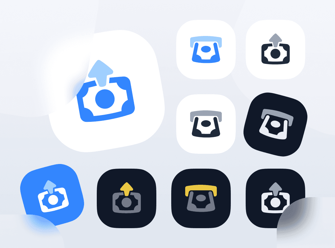
{"type":"doc","content":[{"type":"paragraph","attrs":{"textAlign":null},"content":[{"type":"text","text":"One concept, nine expressions — this deposit and withdraw icon exploration demonstrates how a single fintech action can be designed with depth, versatility, and visual system thinking."}]},{"type":"image","attrs":{"src":"https://mir-s3-cdn-cf.behance.net/project_modules/max_1200/d7e6aa145783977.62a46dab6ad3f.png","alt":null,"title":null,"width":null,"height":null}},{"type":"paragraph","attrs":{"textAlign":null},"content":[{"type":"text","marks":[{"type":"bold"}],"text":"Icon Design Exploration — Deposit & Withdraw"}]},{"type":"paragraph","attrs":{"textAlign":null},"content":[{"type":"text","marks":[{"type":"italic"}],"text":"UI Icon Set · Fintech · App Icon Design"}]},{"type":"paragraph","attrs":{"textAlign":null},"content":[{"type":"text","text":"A thorough icon design exploration for deposit and withdraw actions — two of the most fundamental interactions in any fintech or digital wallet application. The project presents a single core concept iterated across nine distinct visual treatments, demonstrating a mature, system-aware approach to icon design that goes far beyond a single deliverable."}]},{"type":"paragraph","attrs":{"textAlign":null},"content":[{"type":"text","text":"The icon's core metaphor is elegant and immediately legible: a coin or token dropping into or emerging from a tray-like container, with a directional arrow indicating the flow of funds. This abstraction is precise enough to convey financial transaction, yet simple enough to read at 24px — the true test of any UI icon."}]},{"type":"paragraph","attrs":{"textAlign":null},"content":[{"type":"text","text":"The nine variants explore the full design system spectrum systematically: light mode on white, light mode on blue, monochrome on white, monochrome on dark, full-color on dark with yellow accent, glassmorphism with frosted white background, sticker-style with shadow peel, and solid app icon formats in both light and dark themes. Each treatment answers a different UI context question — what does this icon look like in dark mode? In a colored CTA button? As an app icon on a home screen?"}]},{"type":"paragraph","attrs":{"textAlign":null},"content":[{"type":"text","text":"The hero variant — a large glassmorphism treatment in blue with a frosted white card — is the most refined, demonstrating current design trend literacy while maintaining functional clarity. The yellow-accent dark variant signals a secondary action state, while the monochrome versions confirm the icon's structural integrity when color is removed entirely."}]},{"type":"paragraph","attrs":{"textAlign":null},"content":[{"type":"text","text":"An icon exploration that doesn't just design one icon — it designs an entire icon system."}]}]}
Tech Stack
Tags
Completed
June 2022
Project Scale
short Project