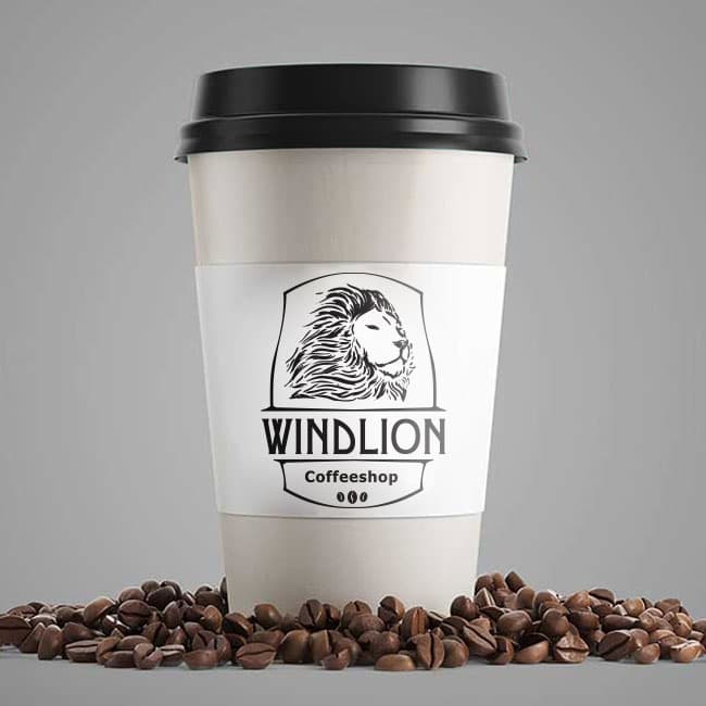
{"type":"doc","content":[{"type":"paragraph","attrs":{"textAlign":null},"content":[{"type":"text","text":"Bold as a lion, smooth as the wind — Windlion Coffeeshop is the brand that commands your morning before the first sip."}]},{"type":"image","attrs":{"src":"https://farooq-agent.web.app/assets/images/works/large/windlion.jpg","alt":null,"title":null,"width":null,"height":null}},{"type":"paragraph","attrs":{"textAlign":null},"content":[{"type":"text","marks":[{"type":"bold"}],"text":"Brand Identity — Windlion Coffeeshop"}]},{"type":"paragraph","attrs":{"textAlign":null},"content":[{"type":"text","marks":[{"type":"italic"}],"text":"Logo & Packaging Design · Coffee Shop · F&B Retail"}]},{"type":"paragraph","attrs":{"textAlign":null},"content":[{"type":"text","text":"A commanding, character-driven brand identity for Windlion Coffeeshop — a coffee brand that wears its personality with the same quiet confidence as the animal at its center. The identity is built around a single, powerful image: a lion, rendered in fine engraving-style illustration, set within a structured crest frame that signals heritage, quality, and craft."}]},{"type":"paragraph","attrs":{"textAlign":null},"content":[{"type":"text","text":"The logomark is a detailed, hand-etched lion portrait — mane flowing with wild elegance, gaze fixed with calm authority. The illustration style draws from vintage apothecary labels and artisan food packaging, communicating a brand that takes its craft seriously and respects the traditions of great coffee. Enclosed within a shield-like crest, the mark has the weight and legitimacy of a brand that has been around long enough to earn its reputation."}]},{"type":"paragraph","attrs":{"textAlign":null},"content":[{"type":"text","text":"The wordmark \"WINDLION\" is set in a bold, condensed uppercase serif directly beneath the crest — strong, grounded, and legible at cup-sleeve scale. The tagline \"Coffeeshop\" sits in a lighter serif below, flanked by three coffee bean icons that add a subtle product reference without interrupting the mark's authority."}]},{"type":"paragraph","attrs":{"textAlign":null},"content":[{"type":"text","text":"The entire identity is executed in a strict monochromatic black-and-white system — a deliberate choice that ensures maximum versatility across cup sleeves, packaging, signage, and merchandise, while projecting a sense of premium restraint. On the takeaway cup mockup, surrounded by scattered coffee beans, the logo performs exactly as a great coffeeshop brand should: instantly recognizable, quietly confident, and deeply craveable."}]},{"type":"paragraph","attrs":{"textAlign":null},"content":[{"type":"text","text":"A coffeeshop identity with the soul of a classic and the presence of a predator."}]}]}
Tech Stack
Tags
Completed
March 2019
Project Scale
short Project