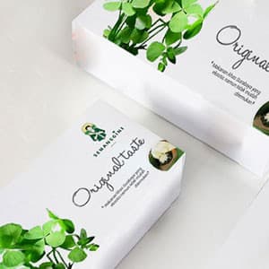
{"type":"doc","content":[{"type":"paragraph","attrs":{"textAlign":null},"content":[{"type":"text","text":"Fresh from the streets of Surabaya to the palm of your hand — Semanggine's packaging turns a humble street food into an artisan product worth gifting."}]},{"type":"image","attrs":{"src":"https://farooq-agent.web.app/assets/images/works/large/6JwwoPGo_work_image.jpg","alt":null,"title":null,"width":null,"height":null}},{"type":"paragraph","attrs":{"textAlign":null},"content":[{"type":"text","marks":[{"type":"bold"}],"text":"Packaging Design — Semanggine"}]},{"type":"paragraph","attrs":{"textAlign":null},"content":[{"type":"text","marks":[{"type":"italic"}],"text":"Product Packaging · Original Taste · Javanese Street Food Brand"}]},{"type":"paragraph","attrs":{"textAlign":null},"content":[{"type":"text","text":"A beautifully composed packaging design for Semanggine — the Javanese street food brand rooted in the heritage of Surabaya's iconic semanggi dish — that elevates a beloved local delicacy into a premium, gift-worthy product experience. The packaging is where the brand's botanical identity fully blooms."}]},{"type":"paragraph","attrs":{"textAlign":null},"content":[{"type":"text","text":"The box design is built on a pristine white base — clean, modern, and uncluttered — that allows the lush semanggi botanical illustration to take complete visual ownership of the surface. Fresh, vivid green clover-leaf sprigs cascade across the packaging in a naturalistic arrangement, immediately communicating the product's herbal, plant-based authenticity. The botanical illustration style — detailed, painterly, and abundant — is the visual language of artisan food brands that take provenance seriously."}]},{"type":"paragraph","attrs":{"textAlign":null},"content":[{"type":"text","text":"The brand mark — the Semanggine mascot in her traditional Javanese attire — sits quietly in the upper corner, grounding the packaging in its cultural origin story without competing with the botanical hero. The script wordmark \"Original taste\" flows across the face of the box in a hand-lettered style, warm and personal — the handwriting of someone who made this for you, not a factory that produced it for the masses."}]},{"type":"paragraph","attrs":{"textAlign":null},"content":[{"type":"text","text":"A small circular food photography window offers a preview of the product itself — an elegant detail that bridges the artisan packaging aesthetic with real consumer purchasing behavior."}]},{"type":"paragraph","attrs":{"textAlign":null},"content":[{"type":"text","text":"Two boxes presented together in a flat-lay product photography setting confirm the design's real-world performance: stacked, angled, and lit, Semanggine's packaging looks as good on a café counter as it does in a gift bag."}]},{"type":"paragraph","attrs":{"textAlign":null},"content":[{"type":"text","text":"Packaging that makes the product feel like it was always destined to be this beautiful."}]}]}
Tech Stack
Tags
Completed
September 2016
Project Scale
short Project