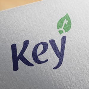
{"type":"doc","content":[{"type":"image","attrs":{"src":"https://farooq-agent.web.app/assets/images/works/large/JPrR4n5n_work_image.jpg","alt":null,"title":null,"width":null,"height":null}},{"type":"paragraph","attrs":{"textAlign":null},"content":[{"type":"text","marks":[{"type":"bold"}],"text":"Brand Identity — Key"},{"type":"text","text":" "},{"type":"hardBreak"},{"type":"text","marks":[{"type":"italic"}],"text":"Logo Design · Agricultural Fertilizer Brand · Farming & Agribusiness"}]},{"type":"paragraph","attrs":{"textAlign":null},"content":[{"type":"text","text":"A quietly clever brand identity for Key — an agricultural fertilizer brand — that distills a complex dual promise into a single, elegantly integrated logomark. The design's central insight is the seamless fusion of two symbols: a leaf and a key, merged into one unified icon that sits atop the wordmark's ascending \"y\" stroke."}]},{"type":"paragraph","attrs":{"textAlign":null},"content":[{"type":"text","text":"The leaf form, rendered in a fresh, confident green, represents nature, growth, and agricultural vitality — the foundational values of any agri-brand. Embedded within it, a classic key silhouette rendered in white delivers the brand name literally while layering in a deeper symbolic meaning: this product is the "},{"type":"text","marks":[{"type":"italic"}],"text":"key"},{"type":"text","text":" to unlocking your soil's potential, the key to a better harvest, the key to agricultural prosperity. The concept is direct yet sophisticated — it rewards a second look."}]},{"type":"paragraph","attrs":{"textAlign":null},"content":[{"type":"text","text":"The wordmark \"Key\" is set in a warm, flowing script typeface in deep navy blue — a deliberate contrast to the category norm of bright greens and earthy browns. The navy lends the brand a sense of credibility and trustworthiness that sets it apart from more rustic competitors, while the handwritten character of the script keeps it approachable and human — important for a brand speaking to farmers and agronomists alike."}]},{"type":"paragraph","attrs":{"textAlign":null},"content":[{"type":"text","text":"Presented on a textured paper mockup, the logo demonstrates clean print performance and tactile warmth."}]},{"type":"paragraph","attrs":{"textAlign":null},"content":[{"type":"text","text":"A deceptively simple logo that carries real conceptual depth — the kind of identity that makes clients nod and say "},{"type":"text","marks":[{"type":"italic"}],"text":"\"of course, that's exactly right.\""}]}]}
Tags
Completed
December 2014
Project Scale
short Project