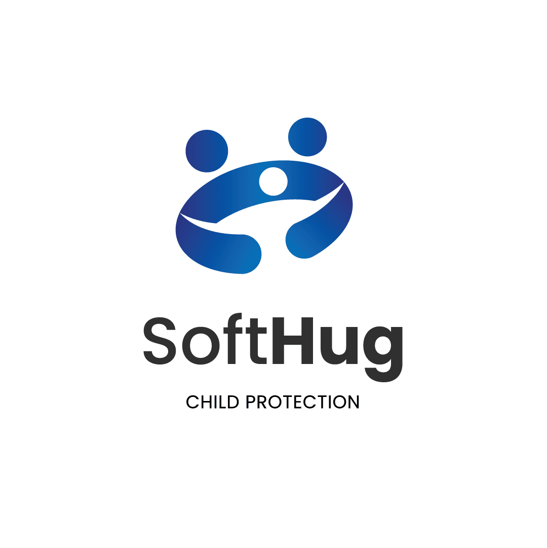
{"type":"doc","content":[{"type":"paragraph","attrs":{"textAlign":null},"content":[{"type":"text","text":"Because every child deserves to be held safe — SoftHug is the brand that wraps protection in warmth, and turns advocacy into identity."}]},{"type":"image","attrs":{"src":"https://farooq-agent.web.app/assets/images/works/large/pd/SoftHug/SoftHug-02.png","alt":null,"title":null,"width":null,"height":null}},{"type":"paragraph","attrs":{"textAlign":null},"content":[{"type":"text","marks":[{"type":"bold"}],"text":"Brand Identity — SoftHug"}]},{"type":"paragraph","attrs":{"textAlign":null},"content":[{"type":"text","marks":[{"type":"italic"}],"text":"Logo Design · Child Protection Organization · Social & Advocacy"}]},{"type":"paragraph","attrs":{"textAlign":null},"content":[{"type":"text","text":"A deeply human brand identity for SoftHug — a child protection organization whose name alone communicates its entire mission: the gentleness of care wrapped around the firmness of safety. The logo translates this mission into a single, emotionally resonant mark that speaks universally across age, culture, and language."}]},{"type":"paragraph","attrs":{"textAlign":null},"content":[{"type":"text","text":"The logomark depicts three abstract human figures arranged in a circular embrace — two adult figures on the outer edges, arms extended inward to cradle a smaller child figure at the center, rendered as a glowing white form protected within the arc of the surrounding arms. The composition is unmistakable: this is a hug, formalized into a symbol. The protective circle formed by the adult figures creates both a physical shelter and a visual boundary — the child held safely within, never exposed to what lies outside."}]},{"type":"paragraph","attrs":{"textAlign":null},"content":[{"type":"text","text":"The gradient treatment — deep cobalt blue flowing into a brighter, hopeful blue — gives the mark a sense of depth, warmth, and institutional trust. Blue is a deliberate choice for a child protection brand: calm, stable, and universally associated with safety, authority, and care. The gradient adds dimension without softness, ensuring the mark feels both approachable and credible."}]},{"type":"paragraph","attrs":{"textAlign":null},"content":[{"type":"text","text":"The wordmark \"SoftHug\" is set in a rounded, semi-bold sans-serif with mixed case — the capitalization of both \"Soft\" and \"Hug\" giving the name equal weight, neither diminishing the gentleness of \"soft\" nor the strength of \"hug.\" The tagline \"CHILD PROTECTION\" is set in spaced, uppercase light-weight type beneath, grounding the brand in its serious purpose without abandoning its warmth."}]},{"type":"paragraph","attrs":{"textAlign":null},"content":[{"type":"text","text":"A logo that communicates protection, love, and safety in a single glance — exactly what a child protection brand must do."}]}]}
Tech Stack
Tags
Completed
April 2021
Project Scale
short Project