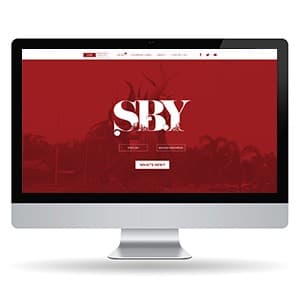
{"type":"doc","content":[{"type":"paragraph","attrs":{"textAlign":null},"content":[{"type":"text","text":"Deep red, bold type, the city name as a headline — SBY's magazine website makes Surabaya feel like the most important city in the world, because for its readers, it is."}]},{"type":"image","attrs":{"src":"https://farooq-agent.web.app/assets/images/works/small/fkiFKacN_work_image.jpg","alt":null,"title":null,"width":null,"height":null}},{"type":"paragraph","attrs":{"textAlign":null},"content":[{"type":"text","marks":[{"type":"bold"}],"text":"Web Design — SBY"}]},{"type":"paragraph","attrs":{"textAlign":null},"content":[{"type":"text","marks":[{"type":"italic"}],"text":"Magazine Media Website · Surabaya · Digital Publication"}]},{"type":"paragraph","attrs":{"textAlign":null},"content":[{"type":"text","text":"A dramatically atmospheric website design for SBY — a magazine media brand dedicated to Surabaya, Indonesia's second-largest city — built around a visual identity as confident and distinct as the city it covers. Presented in an iMac desktop mockup that frames the design's full editorial impact."}]},{"type":"paragraph","attrs":{"textAlign":null},"content":[{"type":"text","text":"The hero section is the design's centerpiece and its most powerful statement: a full-width deep crimson red field — rich, saturated, unmistakably bold — layered over a dimmed editorial photograph of figures or a cityscape, the imagery visible as texture beneath the color wash. Rising from this field, the \"SBY\" masthead is set in an enormous, dramatically weighted display typeface — white letterforms that blend editorial elegance with the visual aggression of a magazine that knows its market and refuses to whisper."}]},{"type":"paragraph","attrs":{"textAlign":null},"content":[{"type":"text","text":"The typographic treatment of \"SBY\" is the design's defining craft moment: the letterforms carry stylistic ink-trap details and contrasting thick-thin strokes that speak to editorial tradition — a publication that takes its city seriously and its design even more so. The masthead feels simultaneously like a newspaper nameplate and a rock poster, communicating a brand with cultural authority and genuine attitude."}]},{"type":"paragraph","attrs":{"textAlign":null},"content":[{"type":"text","text":"Two language toggle buttons — English and Bahasa Indonesia — sit beneath the masthead, confirming the publication's bilingual ambitions and its awareness of both local and international readership. A \"What's New?\" CTA button invites immediate content discovery, keeping the hero section conversion-aware without sacrificing its editorial drama."}]},{"type":"paragraph","attrs":{"textAlign":null},"content":[{"type":"text","text":"The navigation bar is clean and minimal in white against the header band — publication categories, About, and social links anchored right — keeping the information architecture accessible without competing with the hero's visual authority."}]},{"type":"paragraph","attrs":{"textAlign":null},"content":[{"type":"text","text":"A magazine website that makes its city feel unmissable — because that's exactly what a great city publication should do."}]}]}
Tech Stack
Tags
Completed
March 2013
Project Scale
short Project