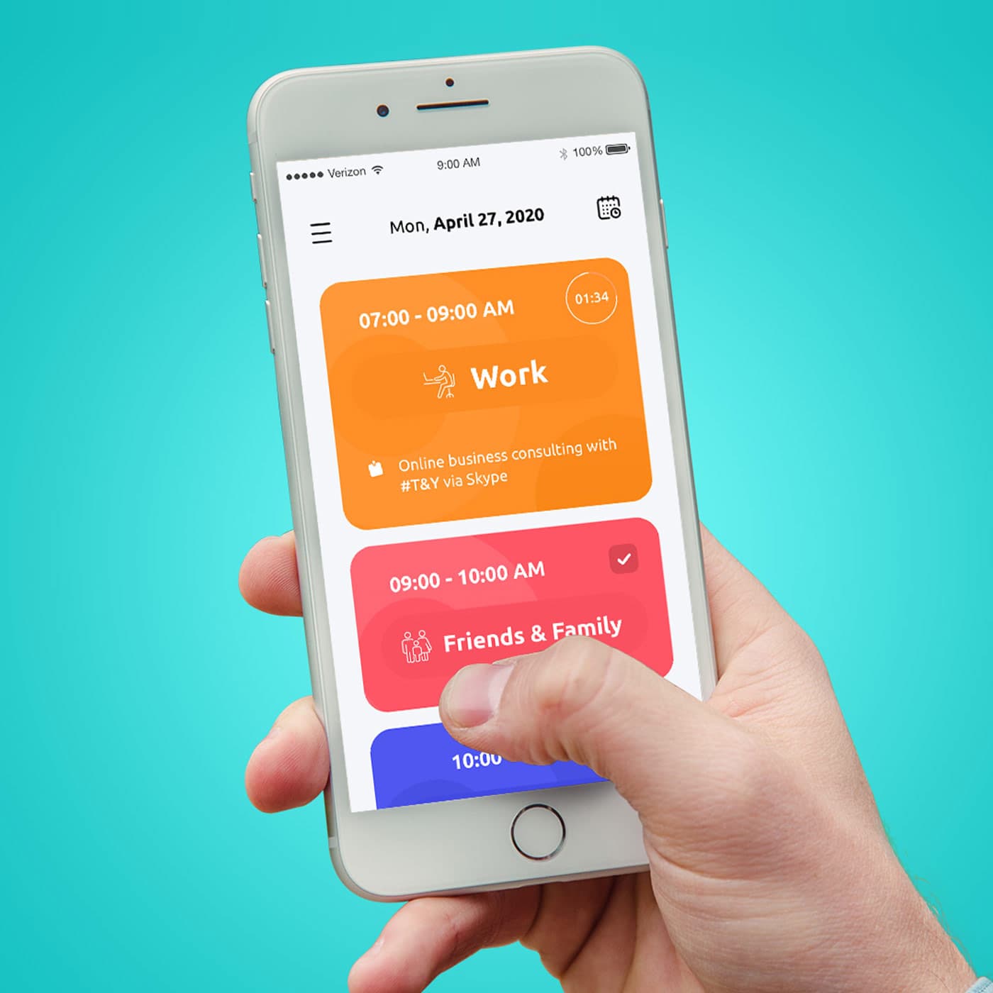
{"type":"doc","content":[{"type":"image","attrs":{"src":"https://farooq-agent.web.app/assets/images/works/details/251-jiyu/jiyu.jpg","alt":null,"title":null,"width":null,"height":null}},{"type":"heading","attrs":{"textAlign":null,"level":3},"content":[{"type":"text","marks":[{"type":"bold"}],"text":"UI/UX Design — Jiyu"},{"type":"text","text":" "},{"type":"hardBreak"},{"type":"text","marks":[{"type":"italic"}],"text":"Mobile App Design · Daily Scheduler & Life Productivity · iOS"}]},{"type":"paragraph","attrs":{"textAlign":null},"content":[{"type":"text","text":"A vibrant, category-first daily scheduling app designed to bring color-coded clarity to how people organize their lives. Jiyu's UI philosophy is immediately legible: each life domain — Work, Friends & Family, and beyond — is assigned a bold, distinct color block that fills the screen with purposeful warmth and visual energy."}]},{"type":"paragraph","attrs":{"textAlign":null},"content":[{"type":"text","text":"The interface centers on a daily timeline view, where time-blocked activities are presented as large, rounded cards in a vertically scrollable stack. The generous card size ensures each activity gets the visual real estate it deserves — no more squinting at cramped calendar grids. A live countdown timer badge in the top-right corner of the active card (\"01:34\") adds a subtle productivity pulse, keeping the user anchored in the present moment without intrusion."}]},{"type":"paragraph","attrs":{"textAlign":null},"content":[{"type":"text","text":"The color system does the heavy cognitive lifting: warm amber for Work, coral-pink for Friends & Family, and a teasing glimpse of indigo blue for the next block below the fold — together creating an at-a-glance emotional map of the day. The completed task in the \"Friends & Family\" block is indicated with a clean white checkmark, providing instant satisfaction feedback."}]},{"type":"paragraph","attrs":{"textAlign":null},"content":[{"type":"text","text":"Typography is confident and friendly — bold category names paired with lighter activity descriptions strike a balance between structure and approachability. The minimal navigation (hamburger menu + calendar icon) keeps the chrome unobtrusive, letting the schedule itself breathe."}]},{"type":"paragraph","attrs":{"textAlign":null},"content":[{"type":"text","text":"Presented in a hand-holding mockup against a fresh teal background, the image communicates the app's core promise: that organizing your day should feel as natural — and as human — as holding your phone."}]},{"type":"paragraph","attrs":{"textAlign":null},"content":[{"type":"text","text":"A polished, emotionally intelligent productivity app UI that understands that time management is ultimately about life management."}]}]}
Tags
Completed
April 2020
Project Scale
short Project