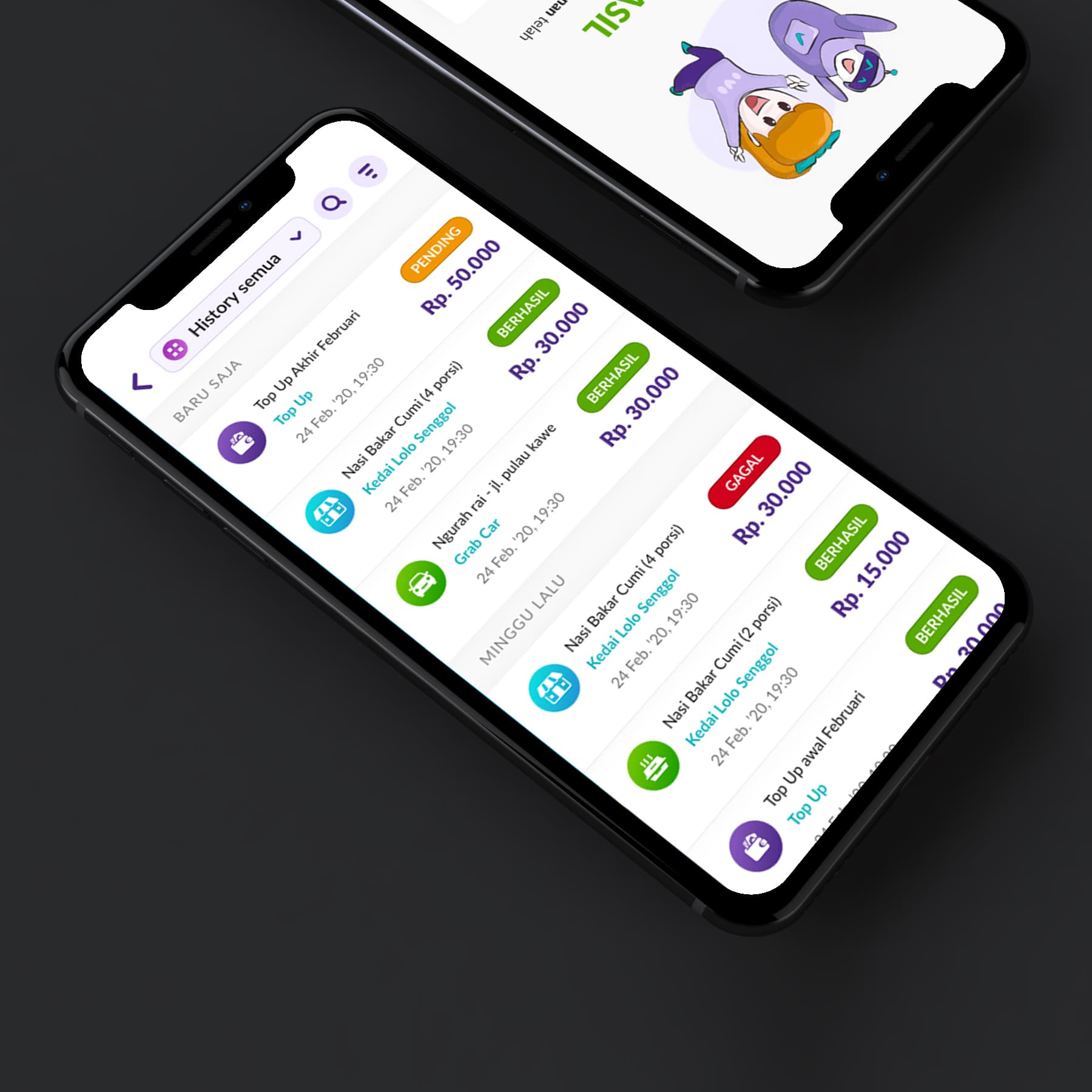
{"type":"doc","content":[{"type":"paragraph","attrs":{"textAlign":null},"content":[{"type":"text","text":"Top Up, Nasi Bakar Cumi at Kedai Lolo Senggol, Grab Car, Berhasil, Gagal — Dompet Digital's transaction history screen captures the full texture of everyday Indonesian digital wallet life in a single scrollable feed."}]},{"type":"image","attrs":{"src":"https://farooq-agent.web.app/assets/images/works/details/243-dompet-digital/dompet-digital.jpg","alt":null,"title":null,"width":null,"height":null}},{"type":"paragraph","attrs":{"textAlign":null},"content":[{"type":"text","marks":[{"type":"bold"}],"text":"App UI Design — Dompet Digital"}]},{"type":"paragraph","attrs":{"textAlign":null},"content":[{"type":"text","marks":[{"type":"italic"}],"text":"Mobile App · Digital Wallet · OVO Requirement Test · Indonesia"}]},{"type":"paragraph","attrs":{"textAlign":null},"content":[{"type":"text","text":"A clean, color-coded transaction history UI designed as part of an OVO product requirement test — demonstrating a well-considered approach to one of the most important and frequently visited screens in any digital wallet app: the transaction history."}]},{"type":"paragraph","attrs":{"textAlign":null},"content":[{"type":"text","text":"The \"History Semua\" (All History) screen organizes transactions chronologically in two groups — \"Baru Saja\" (Just Now) and \"Minggu Lalu\" (Last Week) — a temporal grouping that gives users immediate context for recent versus past activity without requiring date parsing."}]},{"type":"paragraph","attrs":{"textAlign":null},"content":[{"type":"text","text":"Each transaction row follows a consistent visual pattern: a colored service icon (food, transport, top-up), transaction name and merchant (Nasi Bakar Cumi at Kedai Lolo Senggol, Grab Car at Ngurah Rai - Jl. Pulau Kawe, Top Up), timestamp (24 Feb '20, 19:30), and a colored status badge — Berhasil (Successful, green), Pending (orange), Gagal (Failed, red) — with the transaction amount displayed prominently. The color-coded status system communicates outcome at a glance without requiring the user to read: green = done, orange = waiting, red = problem."}]},{"type":"paragraph","attrs":{"textAlign":null},"content":[{"type":"text","text":"The diagonal isometric phone mockup presentation places both screens in context — the transaction list on the foreground phone, a mascot/onboarding screen visible on the phone behind it, suggesting a complete app design beyond just this single screen."}]},{"type":"paragraph","attrs":{"textAlign":null},"content":[{"type":"text","text":"A transaction history design that respects the user's need to understand their money at a glance — clear, scannable, and honest about what succeeded and what didn't."}]}]}
Tech Stack
Tags
Completed
March 2020
Project Scale
short Project