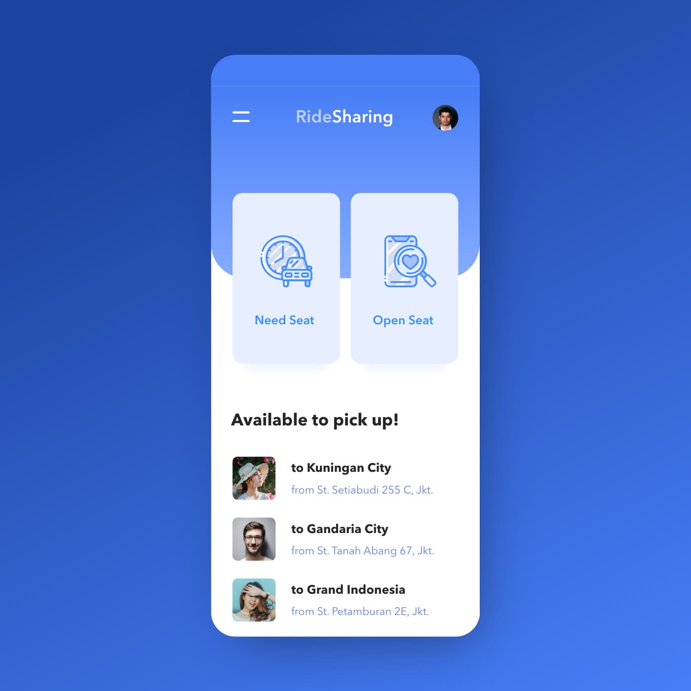
{"type":"doc","content":[{"type":"paragraph","attrs":{"textAlign":null},"content":[{"type":"text","text":"Need Seat or Open Seat — RideSharing's two-button home screen makes the entire carpooling proposition clear before a single scroll."}]},{"type":"image","attrs":{"src":"https://farooq-agent.web.app/assets/images/works/large/ride-sharing.jpg","alt":null,"title":null,"width":null,"height":null}},{"type":"paragraph","attrs":{"textAlign":null},"content":[{"type":"text","marks":[{"type":"bold"}],"text":"App UI Design — RideSharing"}]},{"type":"paragraph","attrs":{"textAlign":null},"content":[{"type":"text","marks":[{"type":"italic"}],"text":"Mobile App Concept · Ride Sharing / Carpooling · Jakarta"}]},{"type":"paragraph","attrs":{"textAlign":null},"content":[{"type":"text","text":"A clean, single-screen app concept for RideSharing — a peer-to-peer carpooling platform where commuters either offer seats in their vehicle or look for a ride heading the same direction."}]},{"type":"paragraph","attrs":{"textAlign":null},"content":[{"type":"text","text":"The home screen is built around a binary user intent split: two large, equal-weight action cards — \"Need Seat\" (I need a ride) and \"Open Seat\" (I'm offering a ride) — positioned side by side as the primary navigation. The icon design reinforces each mode: a scheduled car icon for Need Seat, a phone with a heart/search for Open Seat. It's a rare two-option home screen that works precisely because the product has exactly two user modes and no ambiguity between them."}]},{"type":"paragraph","attrs":{"textAlign":null},"content":[{"type":"text","text":"Below the action cards, \"Available to pick up!\" surfaces three live ride offers — all Jakarta routes: to Kuningan City from St. Setiabudi 255 C, to Gandaria City from St. Tanah Abang 67, to Grand Indonesia from St. Petamburan 2E. Each listing shows the driver/rider profile photo, destination, and departure point — the minimum viable information for a commuter deciding in seconds whether a route matches theirs."}]},{"type":"paragraph","attrs":{"textAlign":null},"content":[{"type":"text","text":"The all-blue palette — deep cobalt background, lighter blue card surfaces, blue icon line work — creates a cohesive, trust-forward visual identity appropriate for a service built on sharing a car with a stranger. The card float on the blue background gives the UI a clean, modern depth."}]},{"type":"paragraph","attrs":{"textAlign":null},"content":[{"type":"text","text":"A carpooling app concept that solves the UX challenge of serving two distinct user types — passenger and driver — with a single home screen that handles both without confusion."}]}]}
Tech Stack
Tags
Completed
November 2019
Project Scale
short Project