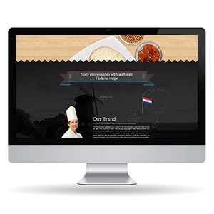
{"type":"doc","content":[{"type":"image","attrs":{"src":"https://farooq-agent.web.app/assets/images/works/small/Gfa29C2h_work_image.jpg","alt":null,"title":null,"width":null,"height":null}},{"type":"paragraph","attrs":{"textAlign":null},"content":[{"type":"text","text":" "},{"type":"text","marks":[{"type":"bold"}],"text":"Web Design — Stroopwafel Food Brand"},{"type":"text","text":" "},{"type":"hardBreak"},{"type":"text","marks":[{"type":"italic"}],"text":"Website Design · Dutch Artisan Food · F&B Sector"}]},{"type":"paragraph","attrs":{"textAlign":null},"content":[{"type":"text","text":"A warmly crafted web presence for a stroopwafel brand rooted in authentic Dutch heritage, presented here in a desktop monitor mockup that showcases the full homepage experience. The design masterfully balances appetite appeal with cultural storytelling — a combination essential for any artisan food brand with a geographic identity to defend."}]},{"type":"paragraph","attrs":{"textAlign":null},"content":[{"type":"text","text":"The hero section leads with a warm, overhead food photography composition on a natural wood surface — stroopwafels and accompanying condiments bathed in warm light — immediately triggering sensory engagement. The textured zigzag border that transitions the hero into the dark body section is a clever typographic nod to the waffle's signature grid pattern, seamlessly connecting visual language to product identity."}]},{"type":"paragraph","attrs":{"textAlign":null},"content":[{"type":"text","text":"The lower body adopts a deep charcoal backdrop that creates a dramatic, premium contrast against the warmth above. A ribbon banner headline — "},{"type":"text","marks":[{"type":"italic"}],"text":"\"Tasty stroopwafels with authentic Holland recipe\""},{"type":"text","text":" — is centered with classical confidence, while a silhouette of a Dutch windmill and the Netherlands flag ground the brand firmly in its geographic origin story."}]},{"type":"paragraph","attrs":{"textAlign":null},"content":[{"type":"text","text":"The \"Our Brand\" section introduces a chef in traditional whites alongside a map of the Netherlands, reinforcing authenticity and craft. The overall layout communicates a brand that is simultaneously inviting and authoritative — proud of its origins, confident in its craft."}]},{"type":"paragraph","attrs":{"textAlign":null},"content":[{"type":"text","text":"A well-composed food brand web design that uses cultural identity as its primary differentiator."}]}]}
Tech Stack
Tags
Completed
March 2013
Project Scale
short Project