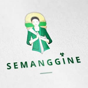
{"type":"doc","content":[{"type":"image","attrs":{"src":"https://farooq-agent.web.app/assets/images/works/small/YpXEsVUX_work_image.jpg","alt":null,"title":null,"width":null,"height":null}},{"type":"heading","attrs":{"textAlign":null,"level":3},"content":[{"type":"hardBreak"},{"type":"text","marks":[{"type":"bold"}],"text":"Logo Design — Semanggine"},{"type":"text","text":" "},{"type":"hardBreak"},{"type":"text","marks":[{"type":"italic"}],"text":"Brand Identity · Cultural / Food & Beverage · Javanese Heritage"}]},{"type":"paragraph","attrs":{"textAlign":null},"content":[{"type":"text","text":"A graceful, character-driven logo for Semanggine — a brand name derived from "},{"type":"text","marks":[{"type":"italic"}],"text":"semanggi"},{"type":"text","text":", the beloved Javanese street herb dish — brought to life through an illustrated mascot that is both culturally rooted and quietly charming. The central figure depicts a traditional Javanese woman in a deep green kebaya, hands pressed together in a respectful greeting gesture ("},{"type":"text","marks":[{"type":"italic"}],"text":"sembah"},{"type":"text","text":"), her head framed by a warm golden halo-like headpiece adorned with a green accent — evoking the iconic appearance of a semanggi street vendor from Surabaya."}]},{"type":"paragraph","attrs":{"textAlign":null},"content":[{"type":"text","text":"The illustration style is deliberately delicate and hand-drawn in character, with soft linework and a restrained color palette anchored in forest green and warm gold — colors that simultaneously reference fresh herbs, nature, and cultural warmth. The figure radiates approachability and authenticity, communicating a brand deeply connected to its origins."}]},{"type":"paragraph","attrs":{"textAlign":null},"content":[{"type":"text","text":"Below, the wordmark \"SEMANGGINE\" is set in a clean, widely-spaced uppercase sans-serif in matching deep green, with a small clover-like botanical mark dotting the letter \"i\" — a refined typographic detail that ties the wordmark back to the brand's herbal identity."}]},{"type":"paragraph","attrs":{"textAlign":null},"content":[{"type":"text","text":"Presented on a textured paper mockup, the logo feels at home on premium packaging, café menus, or artisan food branding — a confident translation of Javanese street food culture into a contemporary, market-ready identity."}]},{"type":"paragraph","attrs":{"textAlign":null},"content":[{"type":"text","text":" "}]}]}
Tags
Completed
November 2015
Project Scale
short Project