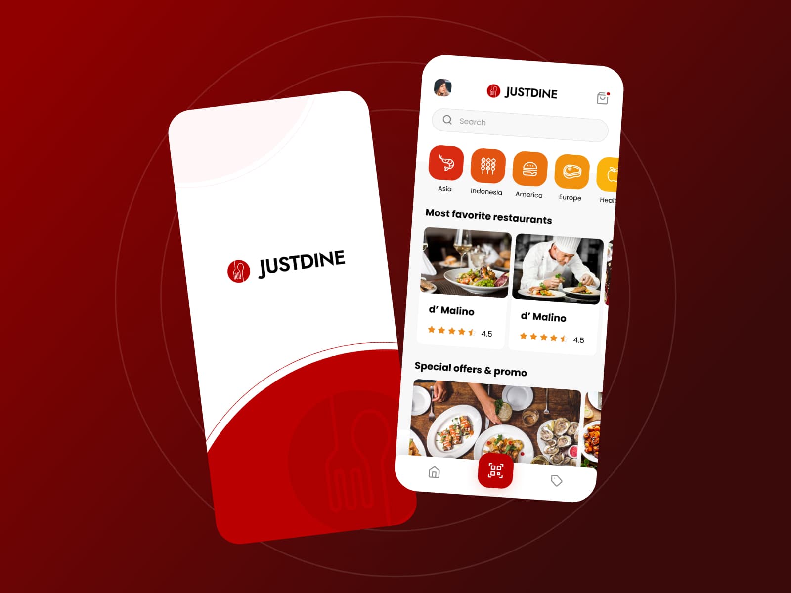
{"type":"doc","content":[{"type":"paragraph","attrs":{"textAlign":null},"content":[{"type":"text","text":"Most favorite restaurants, Asia to Europe, delivered with the full dining experience — Just Dine brings the restaurant to your home without leaving the feeling behind."}]},{"type":"image","attrs":{"src":"https://farooq-agent.web.app/assets/images/works/details/182-drawing-art-2019/justdine-long.jpg","alt":null,"title":null,"width":null,"height":null}},{"type":"paragraph","attrs":{"textAlign":null},"content":[{"type":"text","marks":[{"type":"bold"}],"text":"App UI Design — Just Dine"}]},{"type":"paragraph","attrs":{"textAlign":null},"content":[{"type":"text","marks":[{"type":"italic"}],"text":"Mobile App · Food Delivery & Home Dining Experience · Restaurant Discovery"}]},{"type":"paragraph","attrs":{"textAlign":null},"content":[{"type":"text","text":"A bold, appetite-forward two-screen app UI for Just Dine — a food delivery platform with a distinct positioning: not just delivering food, but replicating the full restaurant dining experience at home."}]},{"type":"paragraph","attrs":{"textAlign":null},"content":[{"type":"text","text":"The splash screen is clean and confident — the JustDine logomark (a cloche/dish cover icon in red) beside the wordmark on a white card with a dramatic red wave at the bottom, against a deep red background. The visual language is immediately premium: this is not a fast-food delivery app."}]},{"type":"paragraph","attrs":{"textAlign":null},"content":[{"type":"text","text":"The home screen opens with cuisine category chips in rich gradient reds and oranges — Asia, Indonesia, America, Europe, Healthy — communicating the platform's international scope while maintaining warmth. The \"Most favorite restaurants\" section features d' Malino (4.5 stars) with restaurant photography that is editorial in quality — plated dishes and a chef in action, communicating the cooking craft behind the delivery, not just the food itself."}]},{"type":"paragraph","attrs":{"textAlign":null},"content":[{"type":"text","text":"The QR code center tab in the bottom navigation is the app's most distinctive UX element — suggesting a table-side or in-restaurant scanning feature that bridges the physical and digital dining experience, consistent with the \"serve like in restaurant but in home\" concept."}]},{"type":"paragraph","attrs":{"textAlign":null},"content":[{"type":"text","text":"\"Special offers & promo\" surfaces a food photography strip at the bottom — oysters, seafood spreads — maintaining the premium appetite appeal throughout."}]},{"type":"paragraph","attrs":{"textAlign":null},"content":[{"type":"text","text":"A food delivery app that understands dining is an experience, not just a transaction."}]}]}
Tech Stack
Tags
Completed
October 2020
Project Scale
short Project