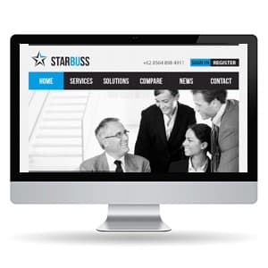
{"type":"doc","content":[{"type":"paragraph","attrs":{"textAlign":null},"content":[{"type":"text","text":"Professional, direct, and built for business — StarBuss's corporate website puts the right faces and the right navigation in front of every visitor from the very first scroll."}]},{"type":"image","attrs":{"src":"https://farooq-agent.web.app/assets/images/works/details/55-starbuss-website-design/corporate.jpg","alt":null,"title":null,"width":null,"height":null}},{"type":"paragraph","attrs":{"textAlign":null},"content":[{"type":"text","marks":[{"type":"bold"}],"text":"Web Design — StarBuss"}]},{"type":"paragraph","attrs":{"textAlign":null},"content":[{"type":"text","marks":[{"type":"italic"}],"text":"Corporate Website Exploration · Business Services"}]},{"type":"paragraph","attrs":{"textAlign":null},"content":[{"type":"text","text":"A clean, professional corporate website design exploration for StarBuss — a business services company whose digital presence communicates institutional credibility, approachability, and the organized confidence of a firm that knows its clients and what they need."}]},{"type":"paragraph","attrs":{"textAlign":null},"content":[{"type":"text","text":"The hero section leads with a full-width black and white editorial photograph of a business team in active collaboration — a senior executive with glasses engaged in conversation with three professional colleagues — a deliberate visual choice that communicates people-first business values. The desaturated treatment gives the image a timeless, editorial quality while keeping the focus entirely on human interaction rather than environment, signaling that StarBuss's primary value is its people and their expertise."}]},{"type":"paragraph","attrs":{"textAlign":null},"content":[{"type":"text","text":"The StarBuss logo anchors the header with a clean star icon mark — a five-pointed star with a dimensional cut, rendered in blue-grey — beside the \"STARBUSS\" wordmark in a bold, condensed typeface. The logo communicates aspiration and precision in equal measure. A phone number sits aligned right in the header, immediately surfacing the most direct path to human contact for visitors who arrived ready to talk."}]},{"type":"paragraph","attrs":{"textAlign":null},"content":[{"type":"text","text":"The navigation bar — Home (active, blue), Services, Solutions, Compare, News, Contact — is structured with the logic of a B2B buyer's journey: understand the brand, explore services, evaluate solutions, compare options, read credibility signals, then contact. The blue active state on \"Home\" establishes the brand's accent color with economy."}]},{"type":"paragraph","attrs":{"textAlign":null},"content":[{"type":"text","text":"The Sign In and Register buttons in the upper right confirm a platform dimension to the business — client portals, account-based access, or membership services — adding functional depth to what reads as a clean, trustworthy corporate front door."}]},{"type":"paragraph","attrs":{"textAlign":null},"content":[{"type":"text","text":"A corporate website that does its job without decoration — because in B2B, clarity is the most sophisticated design choice of all."}]}]}
Tech Stack
Tags
Completed
March 2013
Project Scale
short Project