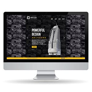
{"type":"doc","content":[{"type":"paragraph","attrs":{"textAlign":null},"content":[{"type":"text","text":"Dark, bold, and built to impress — David Jack's construction company website makes \"Powerful Design\" feel like a promise the building in the hero image has already kept."}]},{"type":"image","attrs":{"src":"https://farooq-agent.web.app/assets/images/works/small/RragmKzj_work_image.jpg","alt":null,"title":null,"width":null,"height":null}},{"type":"paragraph","attrs":{"textAlign":null},"content":[{"type":"text","marks":[{"type":"bold"}],"text":"Web Design — David Jack"}]},{"type":"paragraph","attrs":{"textAlign":null},"content":[{"type":"text","marks":[{"type":"italic"}],"text":"Website Design · Construction Company · Corporate Web"}]},{"type":"paragraph","attrs":{"textAlign":null},"content":[{"type":"text","text":"A striking, high-contrast website design for David Jack — a construction company whose digital presence communicates the same qualities as its physical work: strength, precision, and visual authority. Presented in an iMac desktop mockup that grounds the design in its natural viewing context."}]},{"type":"paragraph","attrs":{"textAlign":null},"content":[{"type":"text","text":"The hero section is built on a dramatic black-dominant palette — a full-width background mosaic of architectural project photography, desaturated to near-black, creating a rich textural depth that positions the company as an organization with a substantial portfolio behind every claim it makes. The visual effect is that of a construction legacy made tangible: every building they've touched, present on the page at once."}]},{"type":"paragraph","attrs":{"textAlign":null},"content":[{"type":"text","text":"Center stage: a sharp, modern high-rise tower rendered in grey-silver architectural photography, its angular profile piercing upward with the kind of vertical ambition that only confident structural engineering produces. Beside it, the hero headline \"POWERFUL DESIGN\" is set in a bold, condensed white display typeface — maximum weight, maximum confidence. A bilingual subtext in Chinese characters beneath the English headline confirms the brand's international market orientation, communicating fluency across two of the world's most significant construction economies."}]},{"type":"paragraph","attrs":{"textAlign":null},"content":[{"type":"text","text":"A gold CTA button — the site's single accent color — anchors the action call at the base of the hero text block, providing the warmth and premium signal that black-and-white corporate sites need to feel inviting rather than merely authoritative. The gold carries through into a horizontal accent bar at the footer section, tying the brand color system with quiet consistency."}]},{"type":"paragraph","attrs":{"textAlign":null},"content":[{"type":"text","text":"A web design that looks as structural as the buildings it represents — and performs just as reliably."}]}]}
Tech Stack
Tags
Completed
March 2013
Project Scale
short Project